
Categories
- 3d CGI
- Amusements
- Animation
- Anime & Manga
- Art Materials
- Art Videos
- Blogroll
- Cartoons
- Color
- Comics
- Concept & Visual Dev.
- Creativity
- Digital Art
- Digital Painting
- Displaying Art on the Web
- Drawing
- Eye Candy for Today
- Gallery and Museum Art
- High-res Art Images
- Illustration
- Motion Graphics & Flash
- Museums
- Online Museums
- Outsider Art
- Painting
- Painting a Day
- Paleo Art
- Pastel, Conté & Chalk
- Pen & Ink
- Prints and Printmaking
- Reviews
- Sc-fi and Fantasy
- Sculpture & Dimensional
- Site Comments
- Sketching
- Storyboards
- Tools and Techniques
- Uncategorized
- Vector Art
- Videos & Podcasts
- Vision and Optics
- Watercolor and Gouache
- Webcomics
Archives
- May 2026
- April 2026
- March 2026
- February 2026
- January 2026
- December 2025
- November 2025
- October 2025
- September 2025
- August 2025
- July 2025
- June 2025
- May 2025
- January 2025
- December 2024
- November 2024
- October 2024
- September 2024
- August 2024
- June 2024
- April 2024
- March 2024
- February 2024
- January 2024
- December 2023
- November 2023
- October 2023
- September 2023
- August 2023
- July 2023
- May 2023
- April 2023
- March 2023
- February 2023
- January 2023
- December 2022
- November 2022
- September 2022
- August 2022
- July 2022
- June 2022
- May 2022
- April 2022
- March 2022
- February 2022
- January 2022
- December 2021
- November 2021
- October 2021
- September 2021
- August 2021
- July 2021
- June 2021
- May 2021
- April 2021
- March 2021
- February 2021
- January 2021
- December 2020
- November 2020
- October 2020
- September 2020
- August 2020
- July 2020
- June 2020
- May 2020
- April 2020
- March 2020
- February 2020
- January 2020
- December 2019
- November 2019
- October 2019
- September 2019
- August 2019
- July 2019
- June 2019
- May 2019
- April 2019
- March 2019
- February 2019
- January 2019
- December 2018
- November 2018
- October 2018
- September 2018
- August 2018
- July 2018
- June 2018
- May 2018
- April 2018
- March 2018
- February 2018
- January 2018
- December 2017
- November 2017
- October 2017
- September 2017
- August 2017
- July 2017
- June 2017
- May 2017
- April 2017
- March 2017
- February 2017
- January 2017
- December 2016
- November 2016
- October 2016
- September 2016
- August 2016
- July 2016
- June 2016
- May 2016
- April 2016
- March 2016
- February 2016
- January 2016
- December 2015
- November 2015
- October 2015
- September 2015
- August 2015
- July 2015
- June 2015
- May 2015
- April 2015
- March 2015
- February 2015
- January 2015
- December 2014
- November 2014
- October 2014
- September 2014
- August 2014
- July 2014
- June 2014
- May 2014
- April 2014
- March 2014
- February 2014
- January 2014
- December 2013
- November 2013
- October 2013
- September 2013
- August 2013
- July 2013
- June 2013
- May 2013
- April 2013
- March 2013
- February 2013
- January 2013
- December 2012
- November 2012
- October 2012
- September 2012
- August 2012
- July 2012
- June 2012
- May 2012
- April 2012
- March 2012
- February 2012
- January 2012
- December 2011
- November 2011
- October 2011
- September 2011
- August 2011
- July 2011
- June 2011
- May 2011
- April 2011
- March 2011
- February 2011
- January 2011
- December 2010
- November 2010
- October 2010
- September 2010
- August 2010
- July 2010
- June 2010
- May 2010
- April 2010
- March 2010
- February 2010
- January 2010
- December 2009
- November 2009
- October 2009
- September 2009
- August 2009
- July 2009
- June 2009
- May 2009
- April 2009
- March 2009
- February 2009
- January 2009
- December 2008
- November 2008
- October 2008
- September 2008
- August 2008
- July 2008
- June 2008
- May 2008
- April 2008
- March 2008
- February 2008
- January 2008
- December 2007
- November 2007
- October 2007
- September 2007
- August 2007
- July 2007
- June 2007
- May 2007
- April 2007
- March 2007
- February 2007
- January 2007
- December 2006
- November 2006
- October 2006
- September 2006
- August 2006
- July 2006
- June 2006
- May 2006
- April 2006
- March 2006
- February 2006
- January 2006
- December 2005
- November 2005
- October 2005
- September 2005
- August 2005
Relevant Blogs
Art, Painting & Sketch
- Gurney Journey
- Underpaintings
- Art and Influence
- Painting Perceptions
- Oil Painters of America
- Vasari Paint POV
- Flying Fox
- Urban Sketchers
- Bento (Smithsonian)
- Art Inconnu
- The Hidden Place
- Still Life
- Making a Mark
- The Art of the Landscape
- Exploring Color & Creativity
- Art Contrarian
- Artist A Day
- beinArt Surreal Art Collective
- Eye Level
- David Dunlop
- p.i.g.m.e.n.t.i.u.m
- CultureGrrl
- Joaquín Sorolla blog
- Artists in Pastel
“Painting a Day”
- A Painting a Day (Keiser)
- On Painting (Keiser)
- Julian Merrow-Smith
- Karen Jurick
- Jeffrey Hayes
- Carol Marine
- Abbey Ryan
- Daily Paintworks
Other Painting Blogs
- Virtual Gouache Land
- Neil Hollingsworth
- Marc Hanson
- Kevin Menck
- Marc Dalessio
- Larry Seiler
- Stapleton Kearns
- Colin Page
- Roos Schuring
- Hans Versfelt
- Titus Meeuws
- Régis Pettinari
- René Plein Air
- Belinda Del Pesco
- Robin Weiss
- Nathan Fowkes (Land Sketch)
- William Wray
- Frank Serrano
- Stephen Magsig
- Michael Chesley Johnson
- Twice a Week
- Sarah Wimperis
- Rob Adams
- Michael Cole Manley
- The Dirty Palette Club
- Mike Manley’s Draw!
Gallery Art & Illustration mix
Illustration
- Howard Pyle
- 100 Years of Illustration
- BibliOdyssey
- Illustration Art
- Today’s Inspiration
- Illustration Mundo
- Little Chimp Society
- Danny Gregory
- R D (John Martz
- Illustration Friday blog
- Monster Brains
- Illustrators & Illustrations (RU)
- Elwood H. Smith
- DaniDraws.com
- Designers Who Blog
- iSpot Blog
Sci-Fi & Fantasy
Illustration & Comics
Comics & Cartoons
- Comics Beat
- Robot 6
- Newsarama Blog
- Comic Vine
- Comics Alliance
- Forbidden Planet Int.
- Paolo Rivera
- Bolt City
- Flight
- Scott McCloud
- The Comics Journal
- Comixpedia
- Funnybook Babylon
- James Baker
- Middleton’s Sketchbook
- Boneville
- The Hotel Fred
- Paul Rivoche
- Daily Cartoonist
- Mad About Cartoons (William Wray)
- Digital Strips
Illustration & Concept
Animation & Concept
- Cartoon Brew
- Animation Blog
- Cold Hard Flash
- Concept Art World
- The CAB
- FY Concept Art
- Concept Ships
- Concept Robots
- John Nevarez
- Armand Serrano
- Marcos Mateu-Mestre
- all kinds of stuff (Kricfalusi)
- Yacin the faun (Man Arenas)
- Kelsey Mann
- Cre8tivemarks Blog
- Ice-Cream Monster Toon Cafe
- AAU Character & Creature Design
- AAU Animation Notes
- Articles and Texticles
Paleo & Scientific
Tools & Techniques
Other
Lists of Art Blogs
Art Image Resource Links
Historic Art Images
- Wikimedia Commons: Paintings
- Wikimedia Commons: Drawings
- The Athenaeum
- WikiArt (WikiPaintings)
- Google Art Project: Artists
- Google Art Project: Collections (Museums)
- ArtCyclopedia
- Web Gallery of Art
- Art Renewal Center
- Web Gallery of Impressionism
Auction Consolidation sites
Auction sites
- Sotheby’s
- Bonham’s
- Christies
- Heritage Auctions: Fine Art
- Heritage Auctions: Illustration
- Freeman’s Auctions
- Bukowskis
- Shannon’s
Image Search
Reverse Image Search (search by image)
- Tin Eye
- RevImg
- Google Image Search (camera icon)
- Bing Image Search (camera icon)
Promoting some friends and some clients of my website design business
- Twin Willows T’ai Chi studio in Wilmington DE. Taiji classes with Bryan Davis.
- Ray Hayward, Inspired Teacher of T’ai Chi ( Taiji ) in Minneapolis, Founder of Mindful Motion Tai Chi Academy
- OldHead Tattoo studio and Art Gallery in Wilmington DE. Tattoos and paintings by Bruce Gulick
- Sharon Domenico Art, pet portrait oil paintings
- Platinum Paperhanging, wallpaper hanging, Main Line and Philadelphia, PA
- Lisa Stone Design, interior designer, Main Line and Philadelphia, PA
- Studio12KPT, original art, prints, calendars and other custom printed items by Van Sickle & Rolleri
-
Tom Lovell

Art can be a time machine, transporting us backward not only with paintings that have survived from the past, but with reconstructions of the past by contemporary artists.Tom Lovell considered himself “…a storyteller with a brush, a custodian of the past.” Best know as one of the premiere painters of the historical American West, he also created a famous series of paintings of the battles and events of the American Civil War for Life magazine, commemorating the centennial of the war’s end. He also painted other works depicting events from the Civil War, including the painting above, for National Geographic magazine.
Lovell was born in New York and his childhood fascination with the American Indian was fueled by visits to the collections in the Museum of Natural History where he would spend hours sketching the exhibits.
Armed with a fine arts degree from Syracuse University, he became an illustrator for pulp magazines like The Shadow and Wild West Weekly, eventually moving up to better paying assignments for mainstream magazines like Colliers, Cosmopolitan, Time, Life, National Geographic, and others.
In 1944 Lovell enlisted in the U.S. Marines, with the intention of becoming a combat artist, but was instead assigned to Leatherneck Magazine.
In the 1970’s Lovell was commissioned to paint a series of historical paintings portraying events in the Permian Basin in Western Texas for the Abell-Hanger Foundation. These are in the collection of The Petroleum Museum in Midland, Texas.
Lovell has also painted other historical scenes; here is a page with a pencil drawing, color rough and finished painting for The Battle of Hastings.
Lovell remains a very popular Western and historic artist and you will find prints of his work on many of the commercial print services, as well as limited edition prints.
The Art of Tom Lovell: An Invitation to History and Tom Lovell : Storyteller with a Brush are both out of print, but can be found used.
Lovell’s paintings are richly colored, often dramatically composed and filled with the kind of visual textures, details and touches that make a historical scene feel alive.
One of Lovell’s notable illustration clients was National Geographic magazine. Among his commissioned works for the magazine was the painting shown here, Surrender at Appomaomattox, in which the Civil War came to its official end.
This painting is part of a collection of paintings from the National Geographic Archives that will be on display at the Allentown Art Museum in Pennsylvania starting this weekend (more information about that exhibition in tomorrow’s post).
In this image, Lovell’s use of rough scumbling for textures of the walls is in marked contrast to the refined handling of the faces, which are rich with subtle colors.
What strikes me about this painting in particular is the composition. Lee and his military secretary are awash with light in the foreground, appearing dignified and gentlemanly as Lee signs the surrender papers, and commanding the generous space around them. Almost pushed into the corner, Grant and his Union brass form a dark mass in the background. Grant is seated a much less imposing table (perhaps this is historically accurate, I don’t know) and seems to have a troubled expression on his face, as if worried that Lee might change his mind at any second. The other Union officers seem likewise impatient. I don’t know anything about Lovell’s feelings about the role of the two factions in the Civil War; it’s just… interesting.
The interpretation of the past, whether in words or painted images, requires a point of view.
Categories:
-
Mian Situ

Mian Situ is a Chinese-American painter who was born in Guangdong (Canton), where he trained in a realist European style. I learned from his bio that this style was introduced to China from Russia as Socialist Realism, an inheritor of the 19th Century European Academic painting traditions that flourished in Russia under the Czars.Situ has tempered that realism with the influence of his ventures into California plein air painting, producing a blend of influences similar in approach to some of the more Academic-leaning American Impressionists, basically a painterly realism. Somehow looking through his work brings to my mind such seemingly diverse painters as William Merrit Chase, Sergi Bongart, Sargent, Sorolla and Daniel Ridgeway Knight.
Situ traveled extensively in his home province in China, studying and documenting the day-do-day look and feeling of life, traditional ways of dress and the visual texture of the time and place, which he understood was rapidly changing.
He has also made a study of the first wave of Chinese immigration to the U.S., particularly in the Chinese communities of San Francisco at the turn of the last century. This is largely the subject matter you will find in the Historical Works section of his web site. The story-telling component of these paintings give them some of the visual charm and emotional appeal of classic illustration, combined with the wonderful textures of the streets, buildings, and clothing that were present in that rough-edged time.
Situ’s fascination with the American West has carried over into his landscape paintings, which are more straightforwardly modern, but still painted with that crisp combination of realism and painterly brushwork.
It is in his Figurative Works that you will find all of these influences coming together, with images from the historical and contemporary American West and the rural communities of China; images that tell stories with dress, location, and most of all, with the emotive faces of the individuals he portrays.
It’s interesting in particular to watch what Situ does with value relationships. Many of his paintings are bathed in light and shadow, or accentuated with sharp value contrasts between shadows and brightly colored or white garments. In many others, however, he keeps his values restrained within a narrow range, for a very different visual and emotional feel.
Categories:
-
Donato Giancola (update)

There are a number of science fiction and fantasy artists who will acknowledge their study of old master painting techniques and tell how it has influenced their work; there are few, however, whose work demonstrates that heritage as visibly as Donato Giancola.Giancola is one of the finest science fiction and fantasy artists working in the field today, and to my mind, one of the best in the history of the genre. His extensive list of honors and awards, including multiple Chesley’s, Spectrum Gold and Silver Medals, World Fantasy Awards for Best Artist, the 2006 and 2007 Hugo Awards for Best Professional Artist, First Place in the Figurative category of the First International Art Renewal Center Open Salon and recognition in this year’s ARC event, indicates that not only do his contemporary artists and editors agree, but he is receiving notice in realist art circles at large. And well he should; Giancola is a terrific painter by any standard.
When I first wrote about Donato Giancola back in 2005, his web site was fairly well developed, but since then it has been expanded considerably, even if the appearance of the site hasn’t changed a great deal.
Giancola has added many new and larger images, and some paintings are accompanied by supplementary images of preliminary drawings, painted sketches and even works in progress on the easel.
Giancola’s excellent draftsmanship, graceful compositions and dramatic but refined use of color make his work a joy to look at. His blending and application of color in particular is exceptional, both in the overall composition and within the detailed rendering of individual subjects, particularly in in the portrayal of figures and faces. There his use of greens and multiple red hues give the sense of the varied and veinous character of caucasian skin found in Renaissance and Baroque painting.
He wears some of his other classical influences on his sleeve as well. His figures are painted with a chiaroscuro and drama inspired by Caravaggio and color and dynamism inherited from a study of Rubens. Some of his historical images reflect the influence of great illustrators like Howard Pyle and N.C. Wyeth. Most of all, though, Giancola seems enthralled with the painting mastery of Valezquez. (If you’re going to learn, learn from the best.)
Whether painting gleaming robots, intricate spaceship cockpits, towering dragons or armored warriors, Giancola’s study of old master painting gives his wildly imaginative fantasy and science fiction subjects a force and gravitas that is uncommon not only for the genre, but in contemporary illustration in general.
His site includes extensive galleries of science fiction and fantasy illustration, work done for the Magic: The Gathering collectable card game and a selection of concept art as well as a section of very nice life drawings. Unfortunately the latter two are hampered by one those annoying navigation schemes that require you to hover your mouse over little squares to view the images instead of simply clicking on them; but hey, I’ll take whatever Giancola art I can get.
The site also includes a section on technique that includes a discussion of his palette, a brief step-through of the editorial illustration process, a discussion of influences and a few step-through painting sequences (again with the roll-over dots navigation, but I’m picking nits).
In addition there is a Bio, a FAQ and a section of books, prints, card proofs and original art for sale.
The News section indicates that Giancola will be participating, along with Dan Dos Santos, Julie Bell, Boris Vallejo, Scott Fisher, Rebecca Guay and Greg Manchess, in a week-long Illustration Master Class to be held in Amherst, MA from June 16-22, 2008. (If you’re interested, act soon; attendance is limited to 90.) Special guest for the event will be Tor/Forge/Starscape Books art director extraordinaire Irene Gallo, whose informative and fascinating blog The Art Department features several mentions of Giancola.
Categories:
-
Eric Feng
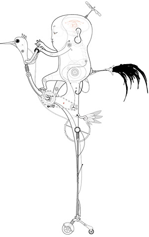 Eric Feng, a.k.a. Freic, draws images of what might be called constructs, combining mechanical elements with stylized forms from humans, birds, insects and other animals.
He draws them in elegant vector lines, usually monochromatic, but with delicate traceries of softer tones and transparencies, giving them a feeling of depth and x-ray dimensionality. The resulting drawings have a charm and informality that belies their vector origin.
His… entities have a charming whimsical appeal and are fascinating in their blending of the mechanical and natural forms. A bobbin-headed, Buddha-faced, doll-like character fishes out of the head of an elephantine mechanism apparently equipped for water and air travel. Owls have wheels. His Buddha-faced child wears an airplane. Mechanical birds sit in trees, and monkeys perch on the branches of a mechanical tree.
The galleries on his site, Fericstudio, are divided into Fevolution I, Fevoultion II and Inside Out. The later contains animated pieces as well as stills from a longer animation by that title. (There is a link to a video, but I couldn’t get it to come up in Safari or Firefox for Mac.)
In the still image galleries, many of the drawings have options to view enlargements or image variations.
[Link via Netdiver]
Categories:
-
Stephen Rothwell

In 1934 Max Ernst published a Une Semaine de Bonté (A Week of Kindness), a Surrealist novel in collage. Ernst created his work, which I think is one of the earliest works that could be called a “graphic novel”, by painstakingly cutting out images from engraved catalog and periodical illustrations and arranging them in fascinating, sometimes jarring scenes that reel out into a dreamlike, subconscious narrative.Modern computer technology makes the process of image based or photo-collage considerably simpler (as I can attest from my forays into X-acto knife and rubber cement collage as a teenager), but creating good, effective collage is still a challenge to the creative eye and imagination. (See my post on the remarkable photo-collages of Emily Allchurch).
Stephen Rothwell, about whom I can find little other information on the web, has created a modern collage story in a similar spirit to Ernst called Dark House Quarter. Rothwell draws on archival photographs rather then engravings, but with a similar tone of staid images from former years rendered asunder by their dream state juxtapositions.
Rothwell, like Ernst, matches his source imagery in a way that produces pictures that feel consistent and whole within themselves. Rothwell’s compostions are sometimes in sepia tones and sometimes in color that has been added to black and white images.
Also like his Surrealist predecessors, Rothwell intends for his images to provoke and disturb, but I never get the feeling he’s going for the cheap shock value present in some of the lowbrow art and so-called “Pop Surrealism” that is currently popular.
The narrative, such as it is, is more subconscious than overt. Apparently something bad has happened, or is happening, perhaps war. The images, though, are fascinating, each one a tableaux of disparate components that fit together with emotive effect.
[Link via BoingBoing]
Categories:
-
Basil Gogos

Basil Gogos is a master of monsters.I tend to think of him as a post-pulp pulp artist. He got to paint wonderfully lurid illustrations of famous movie monsters years after the high-period for pulp art had closed.
His delightfully ghastly portraits of Dracula, The Mummy, The Phantom of the Opera, The Metaluna Mutant, The Wolf Man and dozens of other creatures that crawled out of Hollywood’s “B” movie dungeons in the middle of the 20th Century graced the covers of issue after issue of Famous Monsters of Filmland. Not the least of them was Frankenstein’s monster, who Gogos portrayed numerous times and in a multitude of approaches, from horrific to sympathetic.
Famous Monsters of Filmland was edited by monster expert extraordinaire Forrest J. Ackerman and published by James Warren. Warren also published Creepy and Eerie, black and white comics magazines that featured some of amazing artists like Al Williamson, Wally Wood, Berni Wrightson, Alex Toth and others. Gogos did covers for some of those and a range of other magazines as well.
Gogos studied at The National School of Design, The School of Visual Arts and the Art Students League of New York, where he studied under the renowned illustrator and teacher Frank J. Reilly.
Gogo’s monster images are foot-off-the-brakes, no-color-barred excursions into monsteriffic sensationalism, with wonderful spooky spotlighting, eerie backlighting and great blocks of shadow defining the forms. Glaring colors wash over the looming faces like intense stage lighting, and the characters jump out at you as if screaming “Kid, you better buy this magazine if you want to see more cool stuff like this!”. Wonderful.
Gogos’ creepy creations and eerie evocations of monsters made famous in films have been collected in a new book, Famous Monster Movie Art of Basil Gogos, edited by illustrator Kerry Gammil and J. David Spurlok and with an foreword by Rob Zombie. (Gogos also did some album covers for Rob Zombie, The Misfits and Electric Frankenstein.)
The official Basil Gogos site is pretty minimal and the images are small, there are some larger ones in this page on Gathering Darkness.
Enjoy them…, if you dare!
Addendum, May 19, 2010: Unfortunately, the BasilGogos.com site is now gone. I don’t know of a replacement.
Categories:


Charley’s Picks
Bookshop.org
(Bookshop.org affilliate links; sales benefit independent bookshop owners; I get a small percentage to help support my work on Lines and Colors)

John Singer Sargent: Watercolors


Urban Sketching: Understanding Perspective


Charley’s Picks
Amazon
(Amazon.com affiliate links; sales go to a larger yacht for Jeff Bezos; but I get a small percentage to help support my work on Lines and Colors)
John Singer Sargent: Watercolors
Urban Sketching: Understanding Perspective