
Categories
- 3d CGI
- Amusements
- Animation
- Anime & Manga
- Art Materials
- Art Videos
- Blogroll
- Cartoons
- Color
- Comics
- Concept & Visual Dev.
- Creativity
- Digital Art
- Digital Painting
- Displaying Art on the Web
- Drawing
- Eye Candy for Today
- Gallery and Museum Art
- High-res Art Images
- Illustration
- Motion Graphics & Flash
- Museums
- Online Museums
- Outsider Art
- Painting
- Painting a Day
- Paleo Art
- Pastel, Conté & Chalk
- Pen & Ink
- Prints and Printmaking
- Reviews
- Sc-fi and Fantasy
- Sculpture & Dimensional
- Site Comments
- Sketching
- Storyboards
- Tools and Techniques
- Uncategorized
- Vector Art
- Videos & Podcasts
- Vision and Optics
- Watercolor and Gouache
- Webcomics
Archives
- May 2026
- April 2026
- March 2026
- February 2026
- January 2026
- December 2025
- November 2025
- October 2025
- September 2025
- August 2025
- July 2025
- June 2025
- May 2025
- January 2025
- December 2024
- November 2024
- October 2024
- September 2024
- August 2024
- June 2024
- April 2024
- March 2024
- February 2024
- January 2024
- December 2023
- November 2023
- October 2023
- September 2023
- August 2023
- July 2023
- May 2023
- April 2023
- March 2023
- February 2023
- January 2023
- December 2022
- November 2022
- September 2022
- August 2022
- July 2022
- June 2022
- May 2022
- April 2022
- March 2022
- February 2022
- January 2022
- December 2021
- November 2021
- October 2021
- September 2021
- August 2021
- July 2021
- June 2021
- May 2021
- April 2021
- March 2021
- February 2021
- January 2021
- December 2020
- November 2020
- October 2020
- September 2020
- August 2020
- July 2020
- June 2020
- May 2020
- April 2020
- March 2020
- February 2020
- January 2020
- December 2019
- November 2019
- October 2019
- September 2019
- August 2019
- July 2019
- June 2019
- May 2019
- April 2019
- March 2019
- February 2019
- January 2019
- December 2018
- November 2018
- October 2018
- September 2018
- August 2018
- July 2018
- June 2018
- May 2018
- April 2018
- March 2018
- February 2018
- January 2018
- December 2017
- November 2017
- October 2017
- September 2017
- August 2017
- July 2017
- June 2017
- May 2017
- April 2017
- March 2017
- February 2017
- January 2017
- December 2016
- November 2016
- October 2016
- September 2016
- August 2016
- July 2016
- June 2016
- May 2016
- April 2016
- March 2016
- February 2016
- January 2016
- December 2015
- November 2015
- October 2015
- September 2015
- August 2015
- July 2015
- June 2015
- May 2015
- April 2015
- March 2015
- February 2015
- January 2015
- December 2014
- November 2014
- October 2014
- September 2014
- August 2014
- July 2014
- June 2014
- May 2014
- April 2014
- March 2014
- February 2014
- January 2014
- December 2013
- November 2013
- October 2013
- September 2013
- August 2013
- July 2013
- June 2013
- May 2013
- April 2013
- March 2013
- February 2013
- January 2013
- December 2012
- November 2012
- October 2012
- September 2012
- August 2012
- July 2012
- June 2012
- May 2012
- April 2012
- March 2012
- February 2012
- January 2012
- December 2011
- November 2011
- October 2011
- September 2011
- August 2011
- July 2011
- June 2011
- May 2011
- April 2011
- March 2011
- February 2011
- January 2011
- December 2010
- November 2010
- October 2010
- September 2010
- August 2010
- July 2010
- June 2010
- May 2010
- April 2010
- March 2010
- February 2010
- January 2010
- December 2009
- November 2009
- October 2009
- September 2009
- August 2009
- July 2009
- June 2009
- May 2009
- April 2009
- March 2009
- February 2009
- January 2009
- December 2008
- November 2008
- October 2008
- September 2008
- August 2008
- July 2008
- June 2008
- May 2008
- April 2008
- March 2008
- February 2008
- January 2008
- December 2007
- November 2007
- October 2007
- September 2007
- August 2007
- July 2007
- June 2007
- May 2007
- April 2007
- March 2007
- February 2007
- January 2007
- December 2006
- November 2006
- October 2006
- September 2006
- August 2006
- July 2006
- June 2006
- May 2006
- April 2006
- March 2006
- February 2006
- January 2006
- December 2005
- November 2005
- October 2005
- September 2005
- August 2005
Relevant Blogs
Art, Painting & Sketch
- Gurney Journey
- Underpaintings
- Art and Influence
- Painting Perceptions
- Oil Painters of America
- Vasari Paint POV
- Flying Fox
- Urban Sketchers
- Bento (Smithsonian)
- Art Inconnu
- The Hidden Place
- Still Life
- Making a Mark
- The Art of the Landscape
- Exploring Color & Creativity
- Art Contrarian
- Artist A Day
- beinArt Surreal Art Collective
- Eye Level
- David Dunlop
- p.i.g.m.e.n.t.i.u.m
- CultureGrrl
- Joaquín Sorolla blog
- Artists in Pastel
“Painting a Day”
- A Painting a Day (Keiser)
- On Painting (Keiser)
- Julian Merrow-Smith
- Karen Jurick
- Jeffrey Hayes
- Carol Marine
- Abbey Ryan
- Daily Paintworks
Other Painting Blogs
- Virtual Gouache Land
- Neil Hollingsworth
- Marc Hanson
- Kevin Menck
- Marc Dalessio
- Larry Seiler
- Stapleton Kearns
- Colin Page
- Roos Schuring
- Hans Versfelt
- Titus Meeuws
- Régis Pettinari
- René Plein Air
- Belinda Del Pesco
- Robin Weiss
- Nathan Fowkes (Land Sketch)
- William Wray
- Frank Serrano
- Stephen Magsig
- Michael Chesley Johnson
- Twice a Week
- Sarah Wimperis
- Rob Adams
- Michael Cole Manley
- The Dirty Palette Club
- Mike Manley’s Draw!
Gallery Art & Illustration mix
Illustration
- Howard Pyle
- 100 Years of Illustration
- BibliOdyssey
- Illustration Art
- Today’s Inspiration
- Illustration Mundo
- Little Chimp Society
- Danny Gregory
- R D (John Martz
- Illustration Friday blog
- Monster Brains
- Illustrators & Illustrations (RU)
- Elwood H. Smith
- DaniDraws.com
- Designers Who Blog
- iSpot Blog
Sci-Fi & Fantasy
Illustration & Comics
Comics & Cartoons
- Comics Beat
- Robot 6
- Newsarama Blog
- Comic Vine
- Comics Alliance
- Forbidden Planet Int.
- Paolo Rivera
- Bolt City
- Flight
- Scott McCloud
- The Comics Journal
- Comixpedia
- Funnybook Babylon
- James Baker
- Middleton’s Sketchbook
- Boneville
- The Hotel Fred
- Paul Rivoche
- Daily Cartoonist
- Mad About Cartoons (William Wray)
- Digital Strips
Illustration & Concept
Animation & Concept
- Cartoon Brew
- Animation Blog
- Cold Hard Flash
- Concept Art World
- The CAB
- FY Concept Art
- Concept Ships
- Concept Robots
- John Nevarez
- Armand Serrano
- Marcos Mateu-Mestre
- all kinds of stuff (Kricfalusi)
- Yacin the faun (Man Arenas)
- Kelsey Mann
- Cre8tivemarks Blog
- Ice-Cream Monster Toon Cafe
- AAU Character & Creature Design
- AAU Animation Notes
- Articles and Texticles
Paleo & Scientific
Tools & Techniques
Other
Lists of Art Blogs
Art Image Resource Links
Historic Art Images
- Wikimedia Commons: Paintings
- Wikimedia Commons: Drawings
- The Athenaeum
- WikiArt (WikiPaintings)
- Google Art Project: Artists
- Google Art Project: Collections (Museums)
- ArtCyclopedia
- Web Gallery of Art
- Art Renewal Center
- Web Gallery of Impressionism
Auction Consolidation sites
Auction sites
- Sotheby’s
- Bonham’s
- Christies
- Heritage Auctions: Fine Art
- Heritage Auctions: Illustration
- Freeman’s Auctions
- Bukowskis
- Shannon’s
Image Search
Reverse Image Search (search by image)
- Tin Eye
- RevImg
- Google Image Search (camera icon)
- Bing Image Search (camera icon)
Promoting some friends and some clients of my website design business
- Twin Willows T’ai Chi studio in Wilmington DE. Taiji classes with Bryan Davis.
- Ray Hayward, Inspired Teacher of T’ai Chi ( Taiji ) in Minneapolis, Founder of Mindful Motion Tai Chi Academy
- OldHead Tattoo studio and Art Gallery in Wilmington DE. Tattoos and paintings by Bruce Gulick
- Sharon Domenico Art, pet portrait oil paintings
- Platinum Paperhanging, wallpaper hanging, Main Line and Philadelphia, PA
- Lisa Stone Design, interior designer, Main Line and Philadelphia, PA
- Studio12KPT, original art, prints, calendars and other custom printed items by Van Sickle & Rolleri
-
Walt Kelly
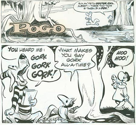
“We have met the enemy and he is us.”Walt Kelley’s revision of an 1813 quote from Commodore Perry (“We have met the enemy, and they are ours”), and his famous reworking of a classic Christmas song as “Deck the Halls with Boston Charlie”, may actually be familiar to a larger number of people than Kelly’s masterwork of the comics art form, Pogo, which is downright unfortunate.
Walt Kelly was one of the all time great cartoonists. Pogo, his beautifully drawn, keenly intelligent, highly witty and politically daring syndicated comic strip ran for a quarter of a century. Amid hilarious funny animal hijinks, wonderfully loopy wordplay, and multi-leveled stories set in the Okefenokee Swamp (Georgia side), Kelly’s characters mouthed some biting social and political commentary, even to the point of taking shots at “Communist under every bed” witch-hunter Senator Joseph McCarthy, who he portrayed as a gun-toting wildcat named “Simple J. Malarkey”. McCarthy’s “if you aren’t with us, you’re a Communist” tactics had given him considerable power, enough to ruin numerous careers in Hollywood and elsewhere, and taking him on took some nerve.
Kelly also took on the far right-wing John Birch Society, J. Edgar Hoover, John Mitchell and Spiro Agnew and, during the 1968 presidential campaign, he ridiculed the group of hopeful presidential nominees he called the “wind-up candidates”, including Eugene McCarthy, Richard Nixon, Hubert Humphrey, George wallace and Robert F. Kennedy. In 1952, Pogo himself became the possum of choice with a gag candidacy based around “I Go Pogo” buttons (lampooning Eisenhower’s “I Like Ike” campaign slogan).
Pogo can be read as a simple, and simply delightful, “funny animal” strip if you prefer, and kids love it as much as adults. It is one of the best drawn newspaper comics ever, owing a good bit to Kelly’s six-year stint working for Walt Disney Productions, during which he worked on such classic animated features as Snow White and the Seven Dwarfs, Fantasia and Dumbo as well as a number of Donald Duck shorts. He also did comic book work for Dell Comics, during which he created the character that would become his life’s work.
Kelly’s Pogo strips are masterpieces of fluid, expressive brush and ink drawing and superb graphic storytelling. His elegant calligraphic brush lines are complimented by the judicious application of hatching and expertly balanced spotting of blacks. Kelly has been tremendously influential on subsequent generations of cartoonists. You can see direct inspiration in Jeff Smith’s beautiful work on Bone in particular.
There are a number of books that have been published over the years and are in various states of availability, including the famously titled We Have Met the Enemy and He is Us. Also out of print but available used is Ten Ever-Lovin Blue Eyed Years with Pogo, which is a good introduction and overview, and reprints some great strips.
Of particular interest, though, is the new series of complete Pogo strips from Fantagraphics, starting with Pogo: The Complete Daily & Sunday Comic Strips Vol. 1: “Into the Wild Blue Wonder”, and continuing with Pogo, Vol 2.
There is an “official” Pogo Possum site, with lots of news, info and links, but not much artwork. There are other sites that fit a similar niche, lots of info, not enough artwork.
The amazing ASIFA-Hollywood Animation Archive comes through again, however, with an article on Walt Kelly’s Pogo that features some absolutely great scans of Walt Kelly original Pogo art courtesy of Mike Fontanelli. There are three high-resolution Pogo Sunday pages, in which you can not only see Kelly’s beautiful brush and ink finishes, but his underlying blue-line pencils as well (click on the images for the larger versions). I’ve had the pleasure of seeing some of Kelly’s originals in person and these scans do a great job of showing the work of this master cartoonist as it actually looks.
In the meanwhile, if someone asks me who I’m supporting in the U.S. presidential primaries, I Go Pogo!.
Categories:
-
Glenn Harrington

Glenn Harrington’s figures, portraits and landscapes display a painterly approach and fascination with light that reminds me of Sorolla, Sargent, and some of the painters generally called “American Impressionists“, but with the chiaroscuro temperament of Rembrandt and Carravaggio demanding equal time for darkness. Perhaps the most direct comparison I’m tempted to make would be with William Merritt Chase, who exhibited some of those same qualities.You can see it in Harrington’s evocative portraits, and his masterful figurative works, but I was particularly taken by these characteristics in his landscape paintings, which are simply striking. They are marvels of intertwined light and darkness, in which sun and shadow almost seem to be struggling for dominance.
Though his painting approach uses the fresh, open brushwork of the 19th Century painters who took the influence of French Impressionism and combined it with underlying solidity of Academic painting, he particularly seeks out the dark with the light, eschewing the open sun common among landscape painters for the dramatic spotlighting of overcast skies, in which the sun has managed to punch a temporary rift or find edges around which it can barely seep.
Unfortunately the galleries on his site are arranged in a manner that requires you to hold your mouse over the thumbnail to view the images (which I find particularly annoying, your mileage may vary), and the images themselves are frustratingly small. That said, if you go through a number of his landscape paintings you may come away, as I did, with an overall impression of an emotional quality in the interplay of light and dark, leaving the feeling the what light can be gleaned is precious, fleeting and not to be taken for granted.
Even in those compositions in which broad daylight is present, it must make its way to us through tangles of branches, walls of trees and and thickets as dark as night.
His landscapes of Pennsylvania are often of river, creek and canal-side, possibly of the New Hope area (see my posts on New Hope and Lambertville, Daniel Garber and Fern Coppedge). Harrington’s landscapes of the American South are of a somewhat different nature, and often include wildlife and figures.
His figurative work, in keeping with many of the 19th Century painters, is frequently theatrical, not just in terms of the drama of the lighting, but in the use of costume and unusual dress for the models.
Harrington is also an accomplished illustrator, and brings his painterly approach and chiaroscuro drama to the publications like The New Yorker, The New York Times, and Sports Illustrated, He has also painted covers for numerous books in including classics like Wuthering Heights, Pride and Prejudice, and A Room With a View for which his visual drama is a perfect compliment to literary drama.
Categories:
-
Benoit Mandelbrot Fractal Art Contest 2007
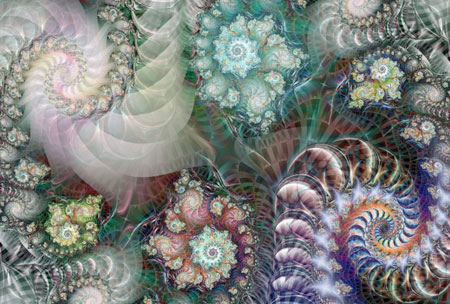
The winners of the 2007 Benoit Mandelbrot Fractal Art Contest have been posted. This is the second international contest and the entries are stunning examples of the visual beauty and intellectual fascination to be found in fractal based art.Benoit Mandelbrot, the mathematician responsible for coining the term “fractal” and creating the deceptively simple expressions that artists (and mathematicians) use to make the startling images commonly called “fractals”, is the Honorary Chairman of this contest that bears his name.
The contest’s web site has an archive of the 49 winners, like “Crowded Street” by Yvonne Mous (above), and a more extensive page for the entries.
Fifteen of the winners have been selected to be in a physical exhibition, although the site isn’t very informative about that exhibition.
It’s also not very precise about the defined limits of how much of a given piece should be fractal-based in order to be eligible, apparently leaving that up to the discretion of the judges.
It seems as though the major portion of the work bust be fractal based, however, and the images on the site can give you a nice introduction to some of the potential in the dazzling beauty of mathematical infinity.
For more on fractal art and the science behind it, see my 2006 post about Benoit Mandelbrot.
[Link via Boing Boing]
Categories:
-
Aleksi Briclot

Aleksi Briclot is a Paris-based concept artist and art director for the gaming industry as well as an illustrator and comics artist.His game credits include lead artist on ColdFear, a horror themed action game from DarkWorks and Ubisoft, Splinter Cell Double Agent and the new titles Haze from Ubisoft and Dungeon Runners from NCSoft.
He has done numerous illustrations for RPG books, magazines and comics, including covers for Mage, C.O.P.S. Rpgs, Privateer Press, and World of Warcraft, as well as an extensive series of paintings for the Wizards of the Coast card series Magic: the Gathering, Dreamblade.
His comics industry work includes the videogame adaptation Alone in the Dark 4, Spawn: Simony and the new Spawn graphic album Architects of Fear, as well as covers for Marvel’s Annihilation: Conquest series and the Hellgate limited series from Dark Horse. His comics interiors are in the fully painted approach rather than the traditional line and color method.
Briclot is also an instructor for the international ConceptArt/Massive Black workshops, and his work has been featured in several anthologies of digital and fantastic art, including being chosen for the back cover of the recent Spectrum 14.
Briclot is obviously a busy fellow and his web site hasn’t been updated for a long time. Though the home page is hung with apologetic notes that might give you the idea it’s closed until renovations can happen, it is in fact open and you can view his gallery of earlier work.
He is for the moment throwing more recent work up on his informal MySpace page. I’ve also found a few other resources and listed them for you below.
Briclot often works his fantasy and horror-themed compositions in swirls of form and suggested movement, at times almost in concentric rings. His flaming demons and maniacally grimacing monsters spin out at you, with their intense colors pushing them forward from muted low-chroma backgrounds, or brightly surge from haunted layers of darkness.
He also does terrific dragons, writhing and twisting, turning their spiky heads in imminent threat displays. His work for C.O.P.S. displays a science fiction edge that stands out a bit from his other work and would be interesting to see more of. All of his work utilizes texture to both give grit and substance to the images and to tie them together as a visual whole.
Briclot is also involved in a European artbook called Merlin in collaboration with artist Jean-Sebastien Rossbach (and possibly others, I’m not certain). The project is represented on MySpace as if it were Merlin’s own MySpace page.
Categories:
-
Jason Waskey

Jason Waskey is an Seattle based artist who has applied his talents in several areas of artistic endeavor. He has been in turns a freelance illustrator, art director for a newspaper and a comic book company, instructor for the Art Institute of Seattle, comic book artist, painter and gallery artist; and is currently an art director for The Giant Software Company That Must Not Be Named.Somehow, his finds time to paint almost every day and post small paintings on his blog, much in keeping with the manner of many “painting a day” painters. These small works are of small common objects and have that un-fussed with quality of quickly done paintings that are an immediate response to the subject. He also writes a bit about the subject and the painting process and occasionally about other topics as well. Of particular interest on his blog are the posts linked in the right-hand column under the heading of “On Inspiration and Influence”.
In addition to the small works featured on the blog, you can see some of his more finished gallery works in the gallery section of his web site. These are often of figures in interiors. They are open, painterly and, to my eye, seem inspired by “American impressionists” like Sargent, Hassem and Tarbell as well as the more obvious influence of Hopper. His interiors are sometimes of airy, window-lit spaces and at other times of the subdued low contrast tones of indirect interior lighting.
There is a pop-up gallery of “small paintings for sale“, reflecting the smaller works featured on the blog.
There is also a “what’s on the easel now” section that is not updated nearly as frequently as the blog, but features a number of step-by-step progressions through the painting process, as well as notes on the creation of larger works.
In addition there is a “photos” section that includes photos of his palette and working setup; as well as a “links” section with links to artists, blogs and other resources of interest.
He also has one of those excellent sketchbook posts in which real sketchbook pages (possibly Moleskine) are posted as they look, rather than as carefully selected sketches out of context. (I can’t give you direct links to the web site sections because the site in in frames.)
Waskey is represented by the dezart one gallery in Palm Springs.
Categories:
-
2008 Bloggie Nominations
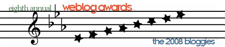
I’m normally not all that concerned with awards unless they serve a purpose other than ego massage, but I’m going to ask you to help out and nominate lines and colors for these awards because there is such a purpose here, namely the possibility of wider exposure for the blog, and by extension, for the topics, people and kinds of art featured on lines and colors.I haven’t done this in the two years plus that I’ve been writing the blog, but this year there is a new category for “best art or craft weblog” into which lines and colors would fit nicely. (Previously there was “arts and entertainment” in which no art blog could outmatch the popularity of film, TV and music blogs, and “crafts”, which wasn’t quite appropriate.)
One of my stated reasons for writing lines and colors is the desire to open as many eyes as possible to the amazing visual treasures that exist in various times, styles, genres and approaches to visual art; and in particular, to expose people to visual arts in areas other than their usual favorites; in effect to cross-pollinate the genres.
Obviously, the wider reach a blog like this has, the more effective that effort becomes; so I would like you to help me do this by taking a few minutes to go to the nomination page for the Eighth Annual Weblog Awards and nominating lines and colors in the category for “best art or craft weblog”. (That category is about half-way down the page, on the left.)
There is a “what you need to know” section at the top of the page, but here are the most salient points:
You must supply a URL for the weblog (for lines and colors, that would be “http://www.linesandcolors.com”).
You can only submit one nomination form; if you attempt to re-submit at some point your new ballot will replace the previous one.
You can nominate as many other blogs in various categories as you like, but you must nominate at least 3 different blogs total somewhere on the form for it to be a valid nomination. I’m sure you all have some favorite blogs in other categories, and additional choices in the “best art or craft weblog” that you would like to see promoted. To nominate three blogs should only take you about 5 minutes.
You are required to supply a valid email address, but I believe they have a good privacy policy.
If you want a chance to participate in the final judging of nominees, be sure to check the checkbox at the bottom of the page, above the space where you enter your email. Three panels of 50 participants will have the ability to vote by email in the final judging.
The nominations close at 10 PM Eastern Standard Time (GMT-5) on Friday, January 11, 2008.
I believe that the nomination process is more important here than the final voting. The objective isn’t to be “winner”, but to get lines and colors listed as a nominee, thereby exposing the blog, and the topics I cover on painting, drawing, illustration, comics, cartoons, concept art, matte painting, animation, paleo art, science fiction and fantasy art, digital painting, artist tools, painting-a-day, museum shows, the great classic illustrators, and all of the individual artists that I write about, to a broader audience.
If you feel that what I’m doing with lines and colors is worthwhile, this will be a great way to show your support.
Thanks!
-Charley
Addendum: Nominations have closed. Thanks to all of you who took the time to nominate lines and colors. Whether lines and colors is on the final ballot or not, you can vote for the 2008 Bloggies from January 22 to January 31.
Categories:


Charley’s Picks
Bookshop.org
(Bookshop.org affilliate links; sales benefit independent bookshop owners; I get a small percentage to help support my work on Lines and Colors)

John Singer Sargent: Watercolors


Urban Sketching: Understanding Perspective


Charley’s Picks
Amazon
(Amazon.com affiliate links; sales go to a larger yacht for Jeff Bezos; but I get a small percentage to help support my work on Lines and Colors)
John Singer Sargent: Watercolors
Urban Sketching: Understanding Perspective