
Categories
- 3d CGI
- Amusements
- Animation
- Anime & Manga
- Art Materials
- Art Videos
- Blogroll
- Cartoons
- Color
- Comics
- Concept & Visual Dev.
- Creativity
- Digital Art
- Digital Painting
- Displaying Art on the Web
- Drawing
- Eye Candy for Today
- Gallery and Museum Art
- High-res Art Images
- Illustration
- Motion Graphics & Flash
- Museums
- Online Museums
- Outsider Art
- Painting
- Painting a Day
- Paleo Art
- Pastel, Conté & Chalk
- Pen & Ink
- Prints and Printmaking
- Reviews
- Sc-fi and Fantasy
- Sculpture & Dimensional
- Site Comments
- Sketching
- Storyboards
- Tools and Techniques
- Uncategorized
- Vector Art
- Videos & Podcasts
- Vision and Optics
- Watercolor and Gouache
- Webcomics
Archives
- May 2026
- April 2026
- March 2026
- February 2026
- January 2026
- December 2025
- November 2025
- October 2025
- September 2025
- August 2025
- July 2025
- June 2025
- May 2025
- January 2025
- December 2024
- November 2024
- October 2024
- September 2024
- August 2024
- June 2024
- April 2024
- March 2024
- February 2024
- January 2024
- December 2023
- November 2023
- October 2023
- September 2023
- August 2023
- July 2023
- May 2023
- April 2023
- March 2023
- February 2023
- January 2023
- December 2022
- November 2022
- September 2022
- August 2022
- July 2022
- June 2022
- May 2022
- April 2022
- March 2022
- February 2022
- January 2022
- December 2021
- November 2021
- October 2021
- September 2021
- August 2021
- July 2021
- June 2021
- May 2021
- April 2021
- March 2021
- February 2021
- January 2021
- December 2020
- November 2020
- October 2020
- September 2020
- August 2020
- July 2020
- June 2020
- May 2020
- April 2020
- March 2020
- February 2020
- January 2020
- December 2019
- November 2019
- October 2019
- September 2019
- August 2019
- July 2019
- June 2019
- May 2019
- April 2019
- March 2019
- February 2019
- January 2019
- December 2018
- November 2018
- October 2018
- September 2018
- August 2018
- July 2018
- June 2018
- May 2018
- April 2018
- March 2018
- February 2018
- January 2018
- December 2017
- November 2017
- October 2017
- September 2017
- August 2017
- July 2017
- June 2017
- May 2017
- April 2017
- March 2017
- February 2017
- January 2017
- December 2016
- November 2016
- October 2016
- September 2016
- August 2016
- July 2016
- June 2016
- May 2016
- April 2016
- March 2016
- February 2016
- January 2016
- December 2015
- November 2015
- October 2015
- September 2015
- August 2015
- July 2015
- June 2015
- May 2015
- April 2015
- March 2015
- February 2015
- January 2015
- December 2014
- November 2014
- October 2014
- September 2014
- August 2014
- July 2014
- June 2014
- May 2014
- April 2014
- March 2014
- February 2014
- January 2014
- December 2013
- November 2013
- October 2013
- September 2013
- August 2013
- July 2013
- June 2013
- May 2013
- April 2013
- March 2013
- February 2013
- January 2013
- December 2012
- November 2012
- October 2012
- September 2012
- August 2012
- July 2012
- June 2012
- May 2012
- April 2012
- March 2012
- February 2012
- January 2012
- December 2011
- November 2011
- October 2011
- September 2011
- August 2011
- July 2011
- June 2011
- May 2011
- April 2011
- March 2011
- February 2011
- January 2011
- December 2010
- November 2010
- October 2010
- September 2010
- August 2010
- July 2010
- June 2010
- May 2010
- April 2010
- March 2010
- February 2010
- January 2010
- December 2009
- November 2009
- October 2009
- September 2009
- August 2009
- July 2009
- June 2009
- May 2009
- April 2009
- March 2009
- February 2009
- January 2009
- December 2008
- November 2008
- October 2008
- September 2008
- August 2008
- July 2008
- June 2008
- May 2008
- April 2008
- March 2008
- February 2008
- January 2008
- December 2007
- November 2007
- October 2007
- September 2007
- August 2007
- July 2007
- June 2007
- May 2007
- April 2007
- March 2007
- February 2007
- January 2007
- December 2006
- November 2006
- October 2006
- September 2006
- August 2006
- July 2006
- June 2006
- May 2006
- April 2006
- March 2006
- February 2006
- January 2006
- December 2005
- November 2005
- October 2005
- September 2005
- August 2005
Relevant Blogs
Art, Painting & Sketch
- Gurney Journey
- Underpaintings
- Art and Influence
- Painting Perceptions
- Oil Painters of America
- Vasari Paint POV
- Flying Fox
- Urban Sketchers
- Bento (Smithsonian)
- Art Inconnu
- The Hidden Place
- Still Life
- Making a Mark
- The Art of the Landscape
- Exploring Color & Creativity
- Art Contrarian
- Artist A Day
- beinArt Surreal Art Collective
- Eye Level
- David Dunlop
- p.i.g.m.e.n.t.i.u.m
- CultureGrrl
- Joaquín Sorolla blog
- Artists in Pastel
“Painting a Day”
- A Painting a Day (Keiser)
- On Painting (Keiser)
- Julian Merrow-Smith
- Karen Jurick
- Jeffrey Hayes
- Carol Marine
- Abbey Ryan
- Daily Paintworks
Other Painting Blogs
- Virtual Gouache Land
- Neil Hollingsworth
- Marc Hanson
- Kevin Menck
- Marc Dalessio
- Larry Seiler
- Stapleton Kearns
- Colin Page
- Roos Schuring
- Hans Versfelt
- Titus Meeuws
- Régis Pettinari
- René Plein Air
- Belinda Del Pesco
- Robin Weiss
- Nathan Fowkes (Land Sketch)
- William Wray
- Frank Serrano
- Stephen Magsig
- Michael Chesley Johnson
- Twice a Week
- Sarah Wimperis
- Rob Adams
- Michael Cole Manley
- The Dirty Palette Club
- Mike Manley’s Draw!
Gallery Art & Illustration mix
Illustration
- Howard Pyle
- 100 Years of Illustration
- BibliOdyssey
- Illustration Art
- Today’s Inspiration
- Illustration Mundo
- Little Chimp Society
- Danny Gregory
- R D (John Martz
- Illustration Friday blog
- Monster Brains
- Illustrators & Illustrations (RU)
- Elwood H. Smith
- DaniDraws.com
- Designers Who Blog
- iSpot Blog
Sci-Fi & Fantasy
Illustration & Comics
Comics & Cartoons
- Comics Beat
- Robot 6
- Newsarama Blog
- Comic Vine
- Comics Alliance
- Forbidden Planet Int.
- Paolo Rivera
- Bolt City
- Flight
- Scott McCloud
- The Comics Journal
- Comixpedia
- Funnybook Babylon
- James Baker
- Middleton’s Sketchbook
- Boneville
- The Hotel Fred
- Paul Rivoche
- Daily Cartoonist
- Mad About Cartoons (William Wray)
- Digital Strips
Illustration & Concept
Animation & Concept
- Cartoon Brew
- Animation Blog
- Cold Hard Flash
- Concept Art World
- The CAB
- FY Concept Art
- Concept Ships
- Concept Robots
- John Nevarez
- Armand Serrano
- Marcos Mateu-Mestre
- all kinds of stuff (Kricfalusi)
- Yacin the faun (Man Arenas)
- Kelsey Mann
- Cre8tivemarks Blog
- Ice-Cream Monster Toon Cafe
- AAU Character & Creature Design
- AAU Animation Notes
- Articles and Texticles
Paleo & Scientific
Tools & Techniques
Other
Lists of Art Blogs
Art Image Resource Links
Historic Art Images
- Wikimedia Commons: Paintings
- Wikimedia Commons: Drawings
- The Athenaeum
- WikiArt (WikiPaintings)
- Google Art Project: Artists
- Google Art Project: Collections (Museums)
- ArtCyclopedia
- Web Gallery of Art
- Art Renewal Center
- Web Gallery of Impressionism
Auction Consolidation sites
Auction sites
- Sotheby’s
- Bonham’s
- Christies
- Heritage Auctions: Fine Art
- Heritage Auctions: Illustration
- Freeman’s Auctions
- Bukowskis
- Shannon’s
Image Search
Reverse Image Search (search by image)
- Tin Eye
- RevImg
- Google Image Search (camera icon)
- Bing Image Search (camera icon)
Promoting some friends and some clients of my website design business
- Twin Willows T’ai Chi studio in Wilmington DE. Taiji classes with Bryan Davis.
- Ray Hayward, Inspired Teacher of T’ai Chi ( Taiji ) in Minneapolis, Founder of Mindful Motion Tai Chi Academy
- OldHead Tattoo studio and Art Gallery in Wilmington DE. Tattoos and paintings by Bruce Gulick
- Sharon Domenico Art, pet portrait oil paintings
- Platinum Paperhanging, wallpaper hanging, Main Line and Philadelphia, PA
- Lisa Stone Design, interior designer, Main Line and Philadelphia, PA
- Studio12KPT, original art, prints, calendars and other custom printed items by Van Sickle & Rolleri
-
Li-An


[For some time, I’ve wanted to feature more comics artists from non-English speaking countries — particularly Belgian and French comics (bandes-dessinées) — but I’ve been put off by the challenges of providing links to images and information across language barriers. With this article, I’m going to try a method of providing both original language and Google Translate links to relevant sites and pages.]
Li-An (Jean-Michel Meyer) is a French comics artist perhaps best known for his work on The Tschai Cycle (Le Cycle de Tschaï) (Google Translate link), a multi-volume graphic album adaptation of four novels by Jack Vance (Planet of Adventure) in cooperation with writer Jean-David Morvan.
Li-An was influenced early on by French comics artists like André Franquin and Jean Giraud (Moebius – link to my articles), and his style has developed in a manner in keeping with the aesthetics of Franco-Belgian comics, a clear fresh alternative to the sometimes overworked styles in many mainstream American comics.
Li-An has also worked on numerous other comics projects, from science fiction to documentary to adaptations of classic literature, like Guy de Maupassant’s Famous short story, Boule de Suif (Translate), also with Jean-David Morvan.
Among his other documentary style graphic stories are a fictionalized account of Gauguin’s time in Tahiti (Translate), and a biography of Pierre-François Pascal Guerlain (Translate), part of a series on the history of the Guerlain perfume house.
You will find pages and images from these and other projects on Li-An’s Blog (Translate) under the heading of “Mon Travail” (My Work).
His blog in general covers other topics, including articles on other comics and comics creators, under the topic BD (bandes-dessinées) – (Translate). You can also filter the blog posts to show blog posts about Li-An’s own work (Translate), as well as some of his online comics (Translate).
Li-An’s blog is extensive, and worth exploring. Once you enter by way of a Google translate link, the system should continue to provide paths to translated pages.
Categories:
-
Eye Candy for Today: The corner of the villa, by Edward John Poynter


The corner of the villa, Edward John Poynter
Oil on canvas, roughly 24 x 24 inches (62 x 62 cm); link is to Wikimedia Commons; their image comes from a sale through Sotheby’s in 2007, so I assume the original is currently in a private collection.
In this finessed composition, Victorian era painter Edward Poynter give us luxuriously draped figures, a marbled and tiled interior, mosaics, a fountain, potted plants, elements of still life, and of course, birds.
Categories:
-
Hugh Bolton Jones
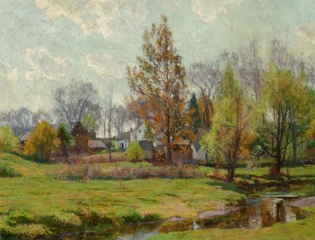

Hugh Bolton Jones Was an American landscape painter active in the late 19th and early 20th centuries. Originally from Baltimore, Maryland, he began his art education at the Maryland Institute. He traveled and painted in Europe for four years, primarily in France, where he was introduced to the practice of plein air painting.
On his return, he shared a studio in New York with his brother, Francis Coates Jones, who was noted for his paintings of elegant figures in gardens and interiors.
Hugh Bolton Jones approached his early landscapes with a sharp, detailed realism that showed the influence of Frederic Edwin Church and the Hudson River School of American painting. In his middle and later work his style became more painterly and poetic, showing the European influence of the Barbizon painters and the French Impressionists.
He often painted with controlled value ranges, particularly in his paintings of early spring meadows, in which the tree foliage consists of delicate whisps against the sky.
In the latter part of his career, critics dismissed him as “predictable” for his continued devotion to the scenes he loved of streams, woods and fields in New Jersey and Massachussetts. Some of those “predictable” landscapes are among my personal favorites in American painting.
Categories:
-
Hendrick Goltzius, The Resurrection


The Resurrection, from The Passion of Christ, Hendrik Goltzius,
Engraving, roughly 8 x 5 inches (20 x 13 cm), in the collection of the Metropolitan Museum of Art.
Hendrick Goltzius was a German born Dutch printmaker, draftsman and painter active in the late 16th and early 17th centuries. Among his other accomplishments was a folio of prints depicting The Passion of Christ, from which this is an instance of The Resurrection.
Like most prints, there are multiple impressions of this one, the Met itself appears to have a second version, and there is one from the collection of the Oklahoma City Museum of Art that can be viewed i more detail on the Google Art Project.
The figure of Jesus is less than prominent in the composition than the foreground figures of the soldiers guarding the tomb, the foremost of which seems almost oblivious to the events behind him. The figure looks posed, and it’s highly likely that Goltzius had a model to work from.
The artist’s engraving lines, though solidly placed on the foundation of his superb draftsmanship, have a casual quality more in common with etching or pen and ink than engraving. Goltzious was also an accomplished pen artist.
I really admire his use of line in the depiction of drapery, particularly in the figure of the angel, and the contrast with his hatching on the stone and dirt surfaces.
Categories:
-
Mac Smith, Scurry
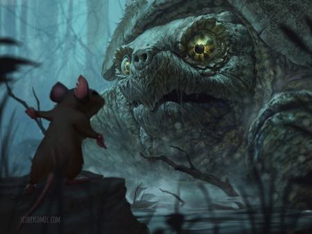

Mac Smith is is a concept artist and illustrator who has largely put aside his work in the gaming industry to concentrate on his own comics project.
Scurry is a post-apocalyptic survival story in which the protagonists are mice. The setting is an abandoned house and the surrounding woods, now mysteriously devoid of humans. With the disappearance of the humans has gone the availability of food their presence provided.
The mouse colony, within which Smith has developed distinct characters and political factions, is faced with the dangers of moving vs. the inevitable decline of food supplies. Scouts are sent out, facing terrifying challenges in the form of cats, wolves, birds of prey and the other dangers that real mice might encounter. These are seen largely in upshots, from the point of view of the mice.
This is the setting in which Smith unwinds his story, told with the cinematic acumen of an experienced concept artist, and beautifully drawn and rendered, with nicely textural attention to naturalistic environments. I particularly enjoy the way he handles rain, mist and similar atmospheric scenes.
Scurry can be read online as a webcomic, which Smith has been supporting through Patreon, offering, among other things, tutorials, walk-throughs and PSD files as perks for supporters.
Smith has also been offering Scurry as a series of printed graphic stories, two of which are available as both hardback and paperback. He is currently raising funds for the third book.
You can find examples of his artwork for the strip on his Artstation and deviantART galleries, and some videos and instructional material on YouTube.
Categories:
-
Eye Candy for Today: William Hughes grapevines


Grapevines, White and Grapevines, Red, William Hughes
Two panels of a diptych, oil and gold paint on canvas, each roughly 40 x 17 inches (100 x 44 cm). The source for the images is an auction house, so I assume these are now in a privete collection.
Of the two panels, that of the white grapes fares better in reproduction, revealing the artist’s nicely painterly approach and his use of texture, both in the plant forms and the background.
Categories:


Charley’s Picks
Bookshop.org
(Bookshop.org affilliate links; sales benefit independent bookshop owners; I get a small percentage to help support my work on Lines and Colors)

John Singer Sargent: Watercolors


Urban Sketching: Understanding Perspective


Charley’s Picks
Amazon
(Amazon.com affiliate links; sales go to a larger yacht for Jeff Bezos; but I get a small percentage to help support my work on Lines and Colors)
John Singer Sargent: Watercolors
Urban Sketching: Understanding Perspective