
Categories
- 3d CGI
- Amusements
- Animation
- Anime & Manga
- Art Materials
- Art Videos
- Blogroll
- Cartoons
- Color
- Comics
- Concept & Visual Dev.
- Creativity
- Digital Art
- Digital Painting
- Displaying Art on the Web
- Drawing
- Eye Candy for Today
- Gallery and Museum Art
- High-res Art Images
- Illustration
- Motion Graphics & Flash
- Museums
- Online Museums
- Outsider Art
- Painting
- Painting a Day
- Paleo Art
- Pastel, Conté & Chalk
- Pen & Ink
- Prints and Printmaking
- Reviews
- Sc-fi and Fantasy
- Sculpture & Dimensional
- Site Comments
- Sketching
- Storyboards
- Tools and Techniques
- Uncategorized
- Vector Art
- Videos & Podcasts
- Vision and Optics
- Watercolor and Gouache
- Webcomics
Archives
- May 2026
- April 2026
- March 2026
- February 2026
- January 2026
- December 2025
- November 2025
- October 2025
- September 2025
- August 2025
- July 2025
- June 2025
- May 2025
- January 2025
- December 2024
- November 2024
- October 2024
- September 2024
- August 2024
- June 2024
- April 2024
- March 2024
- February 2024
- January 2024
- December 2023
- November 2023
- October 2023
- September 2023
- August 2023
- July 2023
- May 2023
- April 2023
- March 2023
- February 2023
- January 2023
- December 2022
- November 2022
- September 2022
- August 2022
- July 2022
- June 2022
- May 2022
- April 2022
- March 2022
- February 2022
- January 2022
- December 2021
- November 2021
- October 2021
- September 2021
- August 2021
- July 2021
- June 2021
- May 2021
- April 2021
- March 2021
- February 2021
- January 2021
- December 2020
- November 2020
- October 2020
- September 2020
- August 2020
- July 2020
- June 2020
- May 2020
- April 2020
- March 2020
- February 2020
- January 2020
- December 2019
- November 2019
- October 2019
- September 2019
- August 2019
- July 2019
- June 2019
- May 2019
- April 2019
- March 2019
- February 2019
- January 2019
- December 2018
- November 2018
- October 2018
- September 2018
- August 2018
- July 2018
- June 2018
- May 2018
- April 2018
- March 2018
- February 2018
- January 2018
- December 2017
- November 2017
- October 2017
- September 2017
- August 2017
- July 2017
- June 2017
- May 2017
- April 2017
- March 2017
- February 2017
- January 2017
- December 2016
- November 2016
- October 2016
- September 2016
- August 2016
- July 2016
- June 2016
- May 2016
- April 2016
- March 2016
- February 2016
- January 2016
- December 2015
- November 2015
- October 2015
- September 2015
- August 2015
- July 2015
- June 2015
- May 2015
- April 2015
- March 2015
- February 2015
- January 2015
- December 2014
- November 2014
- October 2014
- September 2014
- August 2014
- July 2014
- June 2014
- May 2014
- April 2014
- March 2014
- February 2014
- January 2014
- December 2013
- November 2013
- October 2013
- September 2013
- August 2013
- July 2013
- June 2013
- May 2013
- April 2013
- March 2013
- February 2013
- January 2013
- December 2012
- November 2012
- October 2012
- September 2012
- August 2012
- July 2012
- June 2012
- May 2012
- April 2012
- March 2012
- February 2012
- January 2012
- December 2011
- November 2011
- October 2011
- September 2011
- August 2011
- July 2011
- June 2011
- May 2011
- April 2011
- March 2011
- February 2011
- January 2011
- December 2010
- November 2010
- October 2010
- September 2010
- August 2010
- July 2010
- June 2010
- May 2010
- April 2010
- March 2010
- February 2010
- January 2010
- December 2009
- November 2009
- October 2009
- September 2009
- August 2009
- July 2009
- June 2009
- May 2009
- April 2009
- March 2009
- February 2009
- January 2009
- December 2008
- November 2008
- October 2008
- September 2008
- August 2008
- July 2008
- June 2008
- May 2008
- April 2008
- March 2008
- February 2008
- January 2008
- December 2007
- November 2007
- October 2007
- September 2007
- August 2007
- July 2007
- June 2007
- May 2007
- April 2007
- March 2007
- February 2007
- January 2007
- December 2006
- November 2006
- October 2006
- September 2006
- August 2006
- July 2006
- June 2006
- May 2006
- April 2006
- March 2006
- February 2006
- January 2006
- December 2005
- November 2005
- October 2005
- September 2005
- August 2005
Relevant Blogs
Art, Painting & Sketch
- Gurney Journey
- Underpaintings
- Art and Influence
- Painting Perceptions
- Oil Painters of America
- Vasari Paint POV
- Flying Fox
- Urban Sketchers
- Bento (Smithsonian)
- Art Inconnu
- The Hidden Place
- Still Life
- Making a Mark
- The Art of the Landscape
- Exploring Color & Creativity
- Art Contrarian
- Artist A Day
- beinArt Surreal Art Collective
- Eye Level
- David Dunlop
- p.i.g.m.e.n.t.i.u.m
- CultureGrrl
- Joaquín Sorolla blog
- Artists in Pastel
“Painting a Day”
- A Painting a Day (Keiser)
- On Painting (Keiser)
- Julian Merrow-Smith
- Karen Jurick
- Jeffrey Hayes
- Carol Marine
- Abbey Ryan
- Daily Paintworks
Other Painting Blogs
- Virtual Gouache Land
- Neil Hollingsworth
- Marc Hanson
- Kevin Menck
- Marc Dalessio
- Larry Seiler
- Stapleton Kearns
- Colin Page
- Roos Schuring
- Hans Versfelt
- Titus Meeuws
- Régis Pettinari
- René Plein Air
- Belinda Del Pesco
- Robin Weiss
- Nathan Fowkes (Land Sketch)
- William Wray
- Frank Serrano
- Stephen Magsig
- Michael Chesley Johnson
- Twice a Week
- Sarah Wimperis
- Rob Adams
- Michael Cole Manley
- The Dirty Palette Club
- Mike Manley’s Draw!
Gallery Art & Illustration mix
Illustration
- Howard Pyle
- 100 Years of Illustration
- BibliOdyssey
- Illustration Art
- Today’s Inspiration
- Illustration Mundo
- Little Chimp Society
- Danny Gregory
- R D (John Martz
- Illustration Friday blog
- Monster Brains
- Illustrators & Illustrations (RU)
- Elwood H. Smith
- DaniDraws.com
- Designers Who Blog
- iSpot Blog
Sci-Fi & Fantasy
Illustration & Comics
Comics & Cartoons
- Comics Beat
- Robot 6
- Newsarama Blog
- Comic Vine
- Comics Alliance
- Forbidden Planet Int.
- Paolo Rivera
- Bolt City
- Flight
- Scott McCloud
- The Comics Journal
- Comixpedia
- Funnybook Babylon
- James Baker
- Middleton’s Sketchbook
- Boneville
- The Hotel Fred
- Paul Rivoche
- Daily Cartoonist
- Mad About Cartoons (William Wray)
- Digital Strips
Illustration & Concept
Animation & Concept
- Cartoon Brew
- Animation Blog
- Cold Hard Flash
- Concept Art World
- The CAB
- FY Concept Art
- Concept Ships
- Concept Robots
- John Nevarez
- Armand Serrano
- Marcos Mateu-Mestre
- all kinds of stuff (Kricfalusi)
- Yacin the faun (Man Arenas)
- Kelsey Mann
- Cre8tivemarks Blog
- Ice-Cream Monster Toon Cafe
- AAU Character & Creature Design
- AAU Animation Notes
- Articles and Texticles
Paleo & Scientific
Tools & Techniques
Other
Lists of Art Blogs
Art Image Resource Links
Historic Art Images
- Wikimedia Commons: Paintings
- Wikimedia Commons: Drawings
- The Athenaeum
- WikiArt (WikiPaintings)
- Google Art Project: Artists
- Google Art Project: Collections (Museums)
- ArtCyclopedia
- Web Gallery of Art
- Art Renewal Center
- Web Gallery of Impressionism
Auction Consolidation sites
Auction sites
- Sotheby’s
- Bonham’s
- Christies
- Heritage Auctions: Fine Art
- Heritage Auctions: Illustration
- Freeman’s Auctions
- Bukowskis
- Shannon’s
Image Search
Reverse Image Search (search by image)
- Tin Eye
- RevImg
- Google Image Search (camera icon)
- Bing Image Search (camera icon)
Promoting some friends and some clients of my website design business
- Twin Willows T’ai Chi studio in Wilmington DE. Taiji classes with Bryan Davis.
- Ray Hayward, Inspired Teacher of T’ai Chi ( Taiji ) in Minneapolis, Founder of Mindful Motion Tai Chi Academy
- OldHead Tattoo studio and Art Gallery in Wilmington DE. Tattoos and paintings by Bruce Gulick
- Sharon Domenico Art, pet portrait oil paintings
- Platinum Paperhanging, wallpaper hanging, Main Line and Philadelphia, PA
- Lisa Stone Design, interior designer, Main Line and Philadelphia, PA
- Studio12KPT, original art, prints, calendars and other custom printed items by Van Sickle & Rolleri
-
Guy Billout

Guy Billout seems fascinated with patterns, whether of hedgerow mazes, the multiple columns of colonnades, tiled floors or repeated structures; particularly those patterns that lead us to one conclusion, only to be presented with another.Billout is a French illustrator who deals in quiet irony. His images are still and contemplative, even when portraying dramatic events like a ship being turned upside down under the crest of an enormous wave, lightning strikes being reeled in by a man on a roof with a boat hook or the prehistoric filling of the Mediterranean Sea as viewed by modern tourists at Gibraltar.
He invites you into a seemingly normal scene, in which he quietly but firmly pulls the rug out from under your expectations as you notice the details.
Lighthouse lights bend to surmount cliffs, or provide a walkway for the operator, a couple warm themselves by a fireplace, which on closer inspection contains the fire of a city being bombed, people walk on parts of an image, the sky line or horizon line, a white dune is climbed on one side by a desert traveller, on the other by an arctic hunter, bridges stop and resume in mid-crossing or are constructed by rolling out girders like duct tape in midair.
Billout has been a long time contributor to the Atlantic Monthly and other major publications, as well as doing a variety of commercial work. He is a faculty member of the Parsons Illustration Department and his books include The Frog Who Wanted to See the Sea, Bus 24 and a new collection, Something’s Not Quite Right
At times his reminds me of Magritte, twisting our preconceptions of how the world is arranged, sometimes of the juxtaposition of multiple worlds by magic realists like Rob Gonsalves; at other times he can bring to mind the over the edge humorous rearrangements of reality by Saul Steinberg or B. Kliban.
Like all of those artists, Billout excels at that aspect of art that brings us to a refreshingly different point of view on the world. He lays out a a geometric grid of stillness to quite our minds, and then drops a pebble of irony into the pool, allowing it to gently ripple through our unconscious mind until it dawns on us that, indeed, something’s not quite right here; but not quite right in a most delightful way.
It’s unfortunate that most of the images available are somewhat small, because the devil, as they say, is in the details.
Categories:
-
Illusionistic 3-D painting on sidewalks and walls

I’ve written before about the illusionistic 3-D sidewalk “paintings” in chalk by artists like Kurt Wenner and Julian Beever, as well as the large scale illusionistic murals by Eric Grohe.Web Urbanist has posted a nice overview, Amazing 3D Art from the Best Street Artists, with a selection of work by Wenner (image above), Beever, and others; including Edgar Muller and Manfred Stader, Tracy Lee Stum, Eduardo Relero, Rod Tryon and Anthony Cappetto, giving you a quick look at some highlights of this apparently growing phenomenon. It also features muralists like Grohe and Greg Brown, and even a 3-D graffiti artist known as Diam.
Some of the pavement chalk art takes the form of large scale reproductions of famous works by artists like Da Vinci, Vermeer, Rembrandt and others.
Much of the work that has made this a phenomenon is based on anamorphoses, images that are distorted in such a way that they only look “right” form a certain vantage point. The limitation is a trade off for the illusionistic power the images can have to appear three dimensional when seen from that viewpoint. You can see an example of how this works here.
Anamorphosis has been used in art for centuries; you can see a particularly striking example of it in Hans Holbien the Younger’s famous double portrait The Ambassadors, which contains the anamorphic apparition of a skull.
The new urban sidewalk artists have used this approach to create images of objects and environments that, when viewed from the correct vantage point, appear to extend above or below the pavement on which they are painted.
Wenner has gotten new, upscale website since I wrote about him, casting himself as available for corporate commissions and highlighting his architectural designs. Beever is still coasting along like a street artist, with a homemade looking, 90’s style site, but he has added additional images.
Wenner’s site includes some videos of him working, and there are some others on YouTube of a short documentary, Masterpieces in Chalk.
If you look around, you’ll find a few not covered in the Urbanist article, like Cuong Nguyen.
Muralists like Grohe or Brown are in the long artistic tradition of “trompe l’oeil” (French for “trick the eye”), in which artists have created images that appear to have dimensionality beyond the surface on which they are painted, relying less on anamorphosis and more on realism. This tradition includes some of the fantastic dome paintings in which the vault of heaven, filled with angels and religious figures floating in apparent disregard for gravity, is projected on the interior of a dome.
Of course, if you step back and think about it, the modernists were right; all representational art is an illusion.
Categories:
-
John Ottis Adams

John Ottis Adams, often referred to as “J. Ottis Adams”, was an Indiana painter, generally known as an American Impressionist, who studied in London at the South Kensington School of Art and in Germany at the Muinch Academy.Traveling to Europe to study was not uncommon for American artists in the late 1800’s, and Adams was one of a number of them who came away impressed with the European avant-guard painters of the time, i.e. the Impressionists.
On his return, Adams settled in Muncie and devoted himself to the portrayal of the landscape of Indiana, as well as painting the lake area in Michigan, where he vacationed, and Florida, where he wintered.
Adams helped to found and became an instructor at he Herron Art School, now the Herron School of Art and Design in Indianapolis.
He was a member of the Hoosier Group, along with painters William Forsyth, Richard Gruelle and Theodore Steele; and he and his wife shared a house called The Hermitage in Brookville, Indiana with Steel and his wife. The area was a focal point for the group and the artists thought of it as the Barbizon of Indiana.
Adams and Forsyth were also influential on the American Impressionist painter Francis Focer Brown.
In some of Adams’ earlier work, you’ll find echoes of European traditionalist painters, figurative subjects, still life and a darker palette.
The work for which he is best known is brighter and dappled with the textures of impressionist brushstrokes, though Adams generally preferred a more reserved and naturalistic palette than the European Impressionists and many of their American counterparts.
I particularly enjoy the overall texture his brushwork gives to the surface of his paintings and his handling of streams and small rivers.
Categories:
-
Stephan Martiniere (update)

Since I wrote about Stephan Martiniere a couple of years ago, he has updated his site, and his career, with numerous additions.Martiniere is a concept artist, art director and science fiction artist with a fertile imagine, superb skills as an artist and long, impressive resumé. In addition to his many stunning book covers and beautiful concept work for films like The Fifth Element, Star Wars II and III, I Robot and Star Trek XI; he has moved headlong into the gaming industry, “shapeshifting” his career, as his current bio puts it.
Martiniere has worked for three years as visual art director at Cyan, on their visually lavish games like Uru: Ages Beyond Myst, Uru: The Path of the Shell and Myst 5. He has now assumed the role of Creative Visual Art Director for Midway Games.
His expanded web site is a cornucopia of strikingly imaginative works in all of his areas of endeavor, including work for animated cartoons and theme park environments. Martiniere has a fresh crisp drawing style in his sketches and roughs, and a remarkable talent for projecting scale, atmospheric distance and detail in his more finished works. You can see where he has been influenced by greats in the field like John Berkey and Syd Mead.
There are two collections of his Martiniere’s work available, Quantum Dreams: The Art of Stephan Martiniere and the recent Quantumscapes: The Art of Stephan Martiniere, as well as the more specific Art of Midway: Before Pixels and Polygons.
If you are fond of concept art or science fiction illustration, be aware that his site can be a major time-sink. It’s easy to get happily lost in Martiniere’s dazzling visions of other worlds.
Categories:
-
Carl Zimmer’s Science Tattoo Emporium

Quick, think of a subject for a tattoo!Did an image of a skull come to mind?
I mean, skulls can be cool, and I’ve seen some rather amazing skulls in the course of looking at tattoo art, but if you see enough tattoos, you begin to get a feeling of “C’mon now, how many &@$%#! skulls can we look at?”.
Well, what if the skull was a scientifically accurate Australopithecus skull, or a triceratops skull? Now we’re getting into interestingly different territory.
Carl Zimmer is a science writer, a contributor to the New York Times, National Geographic, Science and Scientific American; as well as the author of six books on scientific subjects.
In addition to his blog, The Loom, “a blog about life, past and future”, Zimmer has developed a fascination with scientists who have tattoos related to scientific subjects, and writes another blog, Carl Zimmer’s Science Tattoo Emporium in which he posts about this novel topic.
Didn’t think of geeky scientists as likely to offer up their bodies as canvasses for tattoo art? Think again.
The choice of a tattoo, an image to be permanently (in essence) inscribed on the wearer’s body, is undeniably a reflection of that person’s self image, or ideas of what is important, enjoyable or of primary interest. Scientists, it seems, often choose subjects that attempt to distill the essence of some concept or idea that they feel is central to their take on the natural world and its varied phenomena.
In Zimmer’s posts you will find tattoos of diatoms, galaxies, prehistoric cave paintings, microscopes, fossils, geometric solids, logarithmic spirals, scientific laws and maxims, chemical formulas for lysergic acid diethylamide and valium, maps of the solar system, carbon atoms, dna structures, partial and complete renderings of the periodic table of the elements, mathematical formulas for quantum physics, fluid dynamics and the golden ratio, Dawrin’s ship, the ascent of man, apes, lizards, fish, squid (with anatomical labeling), jellyfish, trilobites (always a favorite of mine), all manner of other animals; and, of course, dinosaurs.
The above image is a tattoo of Dienonychus sported by University of Alaska geology student Jeremiah Drewel.
Skulls, you say?
[Link via The Ink Nerd}
Categories:
-
Ambera Wellman
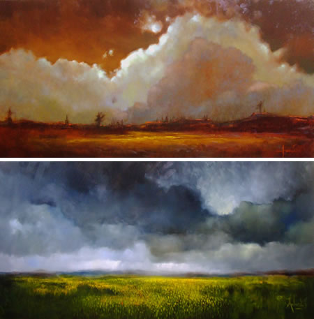
Ambera Wellman started experimenting with oil painting in 2004 at the age of 22. She has just moved from being a self taught artist to being a student at the Nova Scotia College of Art and Design last year. She already seems to be finding a mature voice, at least in one series of paintings.If you browse back through her blog you will find paintings, and a few drawings, of a variety of subjects, but it is her series of paintings of skies and clouds that immediately grabbed my attention.
Great sheets of cloud masses, in turn glowing with brilliant color or dark with more subtle tones, roil and billow across her canvasses. Some of her skies are luminescent with reflected light, almost as if the clouds were generating their own light. In the darker canvasses, they have the opposite feeling. as though the cloud forms were devouring the light.
In her older works, the landscape above which the clouds do their stuff is more varied and often busier with foreground objects; in her more recent work, she keeps the foreground in check and lets the clouds and skies dominate.
Wellman also has a dedicated web site, in which, in addition to her land/cloudscapes, you will find her photorealistic portraits as well as an interesting selection of reproductions, in which she has replicated well-known paintings.
Unlike the more common factory-like process of churning out reproductions of the same painting over an over (see my post on Dafen, China), Wellman has made the copying of these paintings part of her learning process. I don’t know if she chose the paintings to reproduce, or if they were commissioned on request, but they vary from Ingres to Modigliani to Vermeer to Chagall to Delacroix, and she apparently picked a few things about skies from her study of Monet and N.C. Wyeth.
In preparing for a new exhibit of her cloud-themed landscapes at the Black Duck Gallery, in Lunenburg, NS, she recently asked her blog readers to give her feedback on which of five paintings to choose for the advertisements to accompany the show; perhaps indicating that though she is mature enough as a painter to have a clear voice, she is young and open minded enough to step back and look at the response her images elicit from others in judging her path.
Categories:


Charley’s Picks
Bookshop.org
(Bookshop.org affilliate links; sales benefit independent bookshop owners; I get a small percentage to help support my work on Lines and Colors)

John Singer Sargent: Watercolors


Urban Sketching: Understanding Perspective


Charley’s Picks
Amazon
(Amazon.com affiliate links; sales go to a larger yacht for Jeff Bezos; but I get a small percentage to help support my work on Lines and Colors)
John Singer Sargent: Watercolors
Urban Sketching: Understanding Perspective