
Categories
- 3d CGI
- Amusements
- Animation
- Anime & Manga
- Art Materials
- Art Videos
- Blogroll
- Cartoons
- Color
- Comics
- Concept & Visual Dev.
- Creativity
- Digital Art
- Digital Painting
- Displaying Art on the Web
- Drawing
- Eye Candy for Today
- Gallery and Museum Art
- High-res Art Images
- Illustration
- Motion Graphics & Flash
- Museums
- Online Museums
- Outsider Art
- Painting
- Painting a Day
- Paleo Art
- Pastel, Conté & Chalk
- Pen & Ink
- Prints and Printmaking
- Reviews
- Sc-fi and Fantasy
- Sculpture & Dimensional
- Site Comments
- Sketching
- Storyboards
- Tools and Techniques
- Uncategorized
- Vector Art
- Videos & Podcasts
- Vision and Optics
- Watercolor and Gouache
- Webcomics
Archives
- May 2026
- April 2026
- March 2026
- February 2026
- January 2026
- December 2025
- November 2025
- October 2025
- September 2025
- August 2025
- July 2025
- June 2025
- May 2025
- January 2025
- December 2024
- November 2024
- October 2024
- September 2024
- August 2024
- June 2024
- April 2024
- March 2024
- February 2024
- January 2024
- December 2023
- November 2023
- October 2023
- September 2023
- August 2023
- July 2023
- May 2023
- April 2023
- March 2023
- February 2023
- January 2023
- December 2022
- November 2022
- September 2022
- August 2022
- July 2022
- June 2022
- May 2022
- April 2022
- March 2022
- February 2022
- January 2022
- December 2021
- November 2021
- October 2021
- September 2021
- August 2021
- July 2021
- June 2021
- May 2021
- April 2021
- March 2021
- February 2021
- January 2021
- December 2020
- November 2020
- October 2020
- September 2020
- August 2020
- July 2020
- June 2020
- May 2020
- April 2020
- March 2020
- February 2020
- January 2020
- December 2019
- November 2019
- October 2019
- September 2019
- August 2019
- July 2019
- June 2019
- May 2019
- April 2019
- March 2019
- February 2019
- January 2019
- December 2018
- November 2018
- October 2018
- September 2018
- August 2018
- July 2018
- June 2018
- May 2018
- April 2018
- March 2018
- February 2018
- January 2018
- December 2017
- November 2017
- October 2017
- September 2017
- August 2017
- July 2017
- June 2017
- May 2017
- April 2017
- March 2017
- February 2017
- January 2017
- December 2016
- November 2016
- October 2016
- September 2016
- August 2016
- July 2016
- June 2016
- May 2016
- April 2016
- March 2016
- February 2016
- January 2016
- December 2015
- November 2015
- October 2015
- September 2015
- August 2015
- July 2015
- June 2015
- May 2015
- April 2015
- March 2015
- February 2015
- January 2015
- December 2014
- November 2014
- October 2014
- September 2014
- August 2014
- July 2014
- June 2014
- May 2014
- April 2014
- March 2014
- February 2014
- January 2014
- December 2013
- November 2013
- October 2013
- September 2013
- August 2013
- July 2013
- June 2013
- May 2013
- April 2013
- March 2013
- February 2013
- January 2013
- December 2012
- November 2012
- October 2012
- September 2012
- August 2012
- July 2012
- June 2012
- May 2012
- April 2012
- March 2012
- February 2012
- January 2012
- December 2011
- November 2011
- October 2011
- September 2011
- August 2011
- July 2011
- June 2011
- May 2011
- April 2011
- March 2011
- February 2011
- January 2011
- December 2010
- November 2010
- October 2010
- September 2010
- August 2010
- July 2010
- June 2010
- May 2010
- April 2010
- March 2010
- February 2010
- January 2010
- December 2009
- November 2009
- October 2009
- September 2009
- August 2009
- July 2009
- June 2009
- May 2009
- April 2009
- March 2009
- February 2009
- January 2009
- December 2008
- November 2008
- October 2008
- September 2008
- August 2008
- July 2008
- June 2008
- May 2008
- April 2008
- March 2008
- February 2008
- January 2008
- December 2007
- November 2007
- October 2007
- September 2007
- August 2007
- July 2007
- June 2007
- May 2007
- April 2007
- March 2007
- February 2007
- January 2007
- December 2006
- November 2006
- October 2006
- September 2006
- August 2006
- July 2006
- June 2006
- May 2006
- April 2006
- March 2006
- February 2006
- January 2006
- December 2005
- November 2005
- October 2005
- September 2005
- August 2005
Relevant Blogs
Art, Painting & Sketch
- Gurney Journey
- Underpaintings
- Art and Influence
- Painting Perceptions
- Oil Painters of America
- Vasari Paint POV
- Flying Fox
- Urban Sketchers
- Bento (Smithsonian)
- Art Inconnu
- The Hidden Place
- Still Life
- Making a Mark
- The Art of the Landscape
- Exploring Color & Creativity
- Art Contrarian
- Artist A Day
- beinArt Surreal Art Collective
- Eye Level
- David Dunlop
- p.i.g.m.e.n.t.i.u.m
- CultureGrrl
- Joaquín Sorolla blog
- Artists in Pastel
“Painting a Day”
- A Painting a Day (Keiser)
- On Painting (Keiser)
- Julian Merrow-Smith
- Karen Jurick
- Jeffrey Hayes
- Carol Marine
- Abbey Ryan
- Daily Paintworks
Other Painting Blogs
- Virtual Gouache Land
- Neil Hollingsworth
- Marc Hanson
- Kevin Menck
- Marc Dalessio
- Larry Seiler
- Stapleton Kearns
- Colin Page
- Roos Schuring
- Hans Versfelt
- Titus Meeuws
- Régis Pettinari
- René Plein Air
- Belinda Del Pesco
- Robin Weiss
- Nathan Fowkes (Land Sketch)
- William Wray
- Frank Serrano
- Stephen Magsig
- Michael Chesley Johnson
- Twice a Week
- Sarah Wimperis
- Rob Adams
- Michael Cole Manley
- The Dirty Palette Club
- Mike Manley’s Draw!
Gallery Art & Illustration mix
Illustration
- Howard Pyle
- 100 Years of Illustration
- BibliOdyssey
- Illustration Art
- Today’s Inspiration
- Illustration Mundo
- Little Chimp Society
- Danny Gregory
- R D (John Martz
- Illustration Friday blog
- Monster Brains
- Illustrators & Illustrations (RU)
- Elwood H. Smith
- DaniDraws.com
- Designers Who Blog
- iSpot Blog
Sci-Fi & Fantasy
Illustration & Comics
Comics & Cartoons
- Comics Beat
- Robot 6
- Newsarama Blog
- Comic Vine
- Comics Alliance
- Forbidden Planet Int.
- Paolo Rivera
- Bolt City
- Flight
- Scott McCloud
- The Comics Journal
- Comixpedia
- Funnybook Babylon
- James Baker
- Middleton’s Sketchbook
- Boneville
- The Hotel Fred
- Paul Rivoche
- Daily Cartoonist
- Mad About Cartoons (William Wray)
- Digital Strips
Illustration & Concept
Animation & Concept
- Cartoon Brew
- Animation Blog
- Cold Hard Flash
- Concept Art World
- The CAB
- FY Concept Art
- Concept Ships
- Concept Robots
- John Nevarez
- Armand Serrano
- Marcos Mateu-Mestre
- all kinds of stuff (Kricfalusi)
- Yacin the faun (Man Arenas)
- Kelsey Mann
- Cre8tivemarks Blog
- Ice-Cream Monster Toon Cafe
- AAU Character & Creature Design
- AAU Animation Notes
- Articles and Texticles
Paleo & Scientific
Tools & Techniques
Other
Lists of Art Blogs
Art Image Resource Links
Historic Art Images
- Wikimedia Commons: Paintings
- Wikimedia Commons: Drawings
- The Athenaeum
- WikiArt (WikiPaintings)
- Google Art Project: Artists
- Google Art Project: Collections (Museums)
- ArtCyclopedia
- Web Gallery of Art
- Art Renewal Center
- Web Gallery of Impressionism
Auction Consolidation sites
Auction sites
- Sotheby’s
- Bonham’s
- Christies
- Heritage Auctions: Fine Art
- Heritage Auctions: Illustration
- Freeman’s Auctions
- Bukowskis
- Shannon’s
Image Search
Reverse Image Search (search by image)
- Tin Eye
- RevImg
- Google Image Search (camera icon)
- Bing Image Search (camera icon)
Promoting some friends and some clients of my website design business
- Twin Willows T’ai Chi studio in Wilmington DE. Taiji classes with Bryan Davis.
- Ray Hayward, Inspired Teacher of T’ai Chi ( Taiji ) in Minneapolis, Founder of Mindful Motion Tai Chi Academy
- OldHead Tattoo studio and Art Gallery in Wilmington DE. Tattoos and paintings by Bruce Gulick
- Sharon Domenico Art, pet portrait oil paintings
- Platinum Paperhanging, wallpaper hanging, Main Line and Philadelphia, PA
- Lisa Stone Design, interior designer, Main Line and Philadelphia, PA
- Studio12KPT, original art, prints, calendars and other custom printed items by Van Sickle & Rolleri
-
Jean Frédéric Bazille

I think of Frédéric Bazille as the “lost” Impressionist, both in the sense that he is often overlooked in discussions of the principle figures in the Impressionist movement; and in the sense that he was lost to the Impressionists, and the world, when he foolishly joined Napoleon’s army at the outbreak of the Franco-Prussian War, and lost his life in a “minor skirmish” at the age of 29.In 1862 the young Bazille, son of a well-off family from Montpelier, whose friends included art patrons who owned paintings by Delacroix that inspired him to study painting, moved to Paris and enrolled in the atelier of Charles Gleyre, where he met some other young art students, notably Claude Monet, Pierre Auguste Renoir and Alfred Sisley.
Gleyre, though traditional in his emphasis on paintings having “meaning” and idealized beauty, as was the norm at the time, was also an advocate of plein air painting, and those four young painters spent many hours painting on location in the Forest of Fontainebleau. (Side notes: Gleyre’s previous students included the American painter James McNeil Whistler. Gleyre himself added watercolor painting to his skills under the tutelage of Richard Parkes Bonington.)
Bazille shared his friends’ enthusiasm for painting from life, and was also very influenced by Edouard Manet, who was a friend to the Impressionists but not one of them, and Gustav Courbet. He developed a loose, bold brushstroke, and in many ways shared the experimental temperament of the early Impressionist circle, but he did not reject the academic subject matter of portraits and figure painting in favor of landscape as they did. His paintings also were regularly accepted at the Salon (as were Manet’s), when the other young Impressionists were turned away; though some of his most modern and ambitious works, like La Toilette were rejected..
Bazille’s large, outdoor scenes of figures in landscapes were notable as the nexus of these influences, and the most famous of them, Family Reunion is interesting to compare to Monet’s abandoned attempt at a similar large-scale tableau, Déjeuner sur l’Herbe (also here and alternate version here).
Though he didn’t consider landscape his forté, Bazille’s landscapes can be wonderful, like his beautiful but unfinished The Terrace at Méric (Oleander), in which you can see the ghostly drawing of a figure that was being blocked into the composition, perhaps after he had considered it finished at one point.
My favorites of Bazille’s paintings, though, are his images of his own studios, Bazzille’s Studio; 9 rue de la Condamine, and in particular, Studio in the rue de Furstenberg (above, with detail). I always enjoy painters’ images of their own (or their fellow artists’), studios. In their direct, painterly realism, Bazille’s studio images remind me of the later studio portrayals of William Merritt Chase and other American painters influenced by the Impressionists.
Bazille was very much a part of the initial development of French Impressionism, but he died before the full flowering of what would come to be known as the Impressionist style.
Most people have the impression (sorry, couldn’t resist), that the revolutionary French painting style bloomed amid tranquil times similar to those in La Belle Epoch, but Napoleon’s war with Prussia, and its aftermath, including the bloody turmoil of the Paris Commune, interrupted its development with a time of terror and strife. Among the tragic losses in that period was the potential remaining lifetime of brilliant painting from Frédéric Bazille.
Categories:
-
The Vadeboncoeur Collection of ImageS
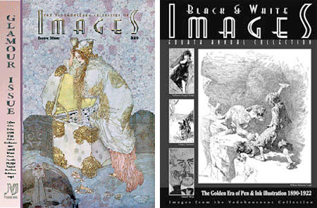
I’ll let you in on a little secret.Some of you may be under the impression from my posts on the subject that I’m an expert on the field and history of illustration, but that’s not the case. I simply know a little bit about some terrific illustrators that I’ve come across over the years. Compared to a real expert, like Jim Vadeboncoeur Jr., my knowledge is like a creek compared to a river (it might be the Brandywine Creek, but a creek nonetheless).
But that’s not the secret I wanted to let you in on. The secret is The Vadeboncoeur Collection of ImageS, at least it’s more of a secret than it should be (and no, the capital “S” is not a typo, that’s the way it’s written).
Since 2001, Vadeboncoeur has been publishing a periodical, I hesitate to call it a magazine because it defies the conventions of most magazines, featuring beautiful images from some of history’s greatest illustrators, both well known and obscure; as well as work from artists from the same time period as the Golden Age of illustration.
It’s a secret because, unless you frequent BPIB (formerly Bud Plant Illustrated Books), a web resource to which I have occasionally sent you in reference to the history of great illustrators, chances are you haven’t seen the modest link to the ImageS pages.
The web site itself is a little, um… stuck in the 90’s, (when entering the site through the home page, choose “No Frames“, because frames suck), but the heart of the site is a wonderful collection short but of terrific, and often definitive, articles on great illustrators, from Edwin Austin Abbey to Newell Convers Wyeth.
You could spend hours here lost among the articles and (unfortunately somewhat small) images from these greats, but why settle for that when you can get Vadeboncoeur’s beautifully printed collections full of stunning, high-resolution images of works that you just won’t find anywhere else.
These collections, (again, I hesitate to call them magazines, and they’re not quite books) are printed larger than most magazines (9″x12″), are up to 44 pages each; and, in recent issues, feature amazing reproductions by way of Stochastic printing (a process that eliminates the traditional limitation of process dots and looks amazingly like a photograph).
The early issues are starting to disappear, but a number of back issues are still available, including the special Black & White ImageS Annual Collections, which showcase some of the most amazing pen and ink illustration ever produced. These are thicker than the color collections, up to 112 pages, and the fourth one was just released. Like the color collections, these are printed on 100 lb paper and the reproductions are superb.
Unfortunately, the web site doesn’t do a very good job of presenting the collections, with a small, too-quick, GIF animations of a few pages, that you can’t even focus on for more than a second, as the only preview.
Vadeboncoeur should take a page from Dan Zimmer’s Illustration Magazine previews, which give a thumbnail of every page in the magazine (see my posts on Illustration Magazine); or, better yet, feature two or three large images to give some idea of how beautiful these pieces really are.
In the meanwhile, lacking better previews, take my word for it. These collections are head-spinningly beautiful and a must-have for any serious fan of Golden Age illustration.
But don’t let too many people in on our little secret, at least not until we get a chance to snap up those back issues.
Categories:
-
Richard Parkes Bonington
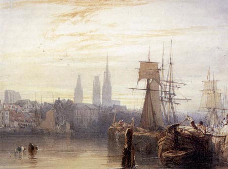
Richard Parkes Bonington was one of the great English landscape painters at the height of the grand era of landscape painting in the 1800’s, and a notable figure in the English watercolor movement.He is credited with carrying the influence of both of those artistic waves to Continental Europe and inspiring many European painters to take up the practice of painting with watercolor, including Delacroix.
In his tragically short life of twenty six years, and a career as a painter that lasted only ten, he produced a notable body of work; with fresh, atmospheric paintings that bent the rules of what was acceptable in painting at the time, and helped lay the groundwork on which later sharp breaks with tradition (i.e. Impressionism) would be based.
He preferred to work outdoors, and took his compositions from modern life rather than composing “history paintings” in which the landscape was subservient to some concept of classical antiquity or religious significance.
His paintings are notable for their sweeping skies, atmospheric haze and quick suggestions of texture in place of labored rendering.
Categories:
-
Mark Bischel
Mark Bischel is another of those illustrators whose work I’ve encountered, but about whom I know little. His web presence is minimalist to a fault, consisting of a series of (unfortunately horizontally) scrolling thumbnails and the larger images they link to; which can also be navigated (fortunately) by forward and back arrows.His images range from dark and thickly textured monochrome charcoal drawings to brusquely textured oil paintings to graphic and somewhat monochromatic silkscreen, and what appear to be ink and watercolor paintings.
As fascinating as the slikscreens are, it’s the ink and watercolor pieces I find most appealing. They have a a loose, fresh feeling, and carry the best qualities of an on-location sketch, with free line work and lightly applied areas of color.
A brief search for Bischel produced little additional information other than the fact that he is a graduate of the School of Visual Arts. He has also been in the Communication Arts Illustration Annuals, which is where I encountered his work.
Perhaps Bischel will update his site at some point with additional images and maybe even a little information.
Categories:
-
American Artist’s Self-Portrait Competition
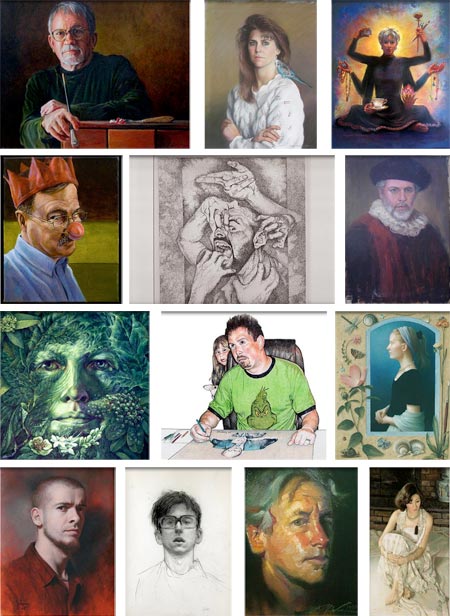
I’ve always been fascinated by self-portraits (not that I’ve done that many myself). Here is not only the artist’s personality expressed through their work, but through their own inner or outer vision of themselves.Many of history’s great paintings have been self portraits, from Durer and Rembrandt to Sargent and Van Gogh, artists have made self-portraits into powerful statements with the full force of their personality and artistic skills.
One of the most intriguing things about self-portraits is the variety of approach, in terms of materials, the nature of the composition, attitude of the artist as sitter, and the background, setting and objects an artist can choose to surround themselves with.
American Artist, the venerable artists’ magazine, has opened the entry process on this year’s Self-Portrait Competition, in which the selected winners will have their self-portraits published in the magazine. The magazine’s web site has a slide-show of recent entries, about 70 of them at this point, which already constitute a colorful (in more ways then one) assortment of approaches and interpretations of the idea of self portraiture.
In addition, they have provided an inspirational gallery of self-portraits from the history of art, including some greats like Durer’s Christ-like advertisement for his painting skills as a young artist, Chardin’s lifted-eyebrow self-appraisal of his scarfed head, three of Rembrandt’s always remarkable self-images, Sargent’s dignified banker-esque stare, Élisabeth-Louis Vigée-Lebrun’s beautiful 3/4 length portrait with palette, brushes and full-dress finery, Anders Zorn’s frank self-appraisal, several of Ergon Scheel’s stark, gaunt visages and van Gogh’s hauntingly electric, blue and green study of intensity and emotional chaos.
That said, you can submit your own portraits, haunting or otherwise, to the competition for their entry fee of $20, and $5 for additional entries. The info page has general information and the registration page has the terms and conditions. The deadline is May 1, 2008 and entry is limited to U.S. residents.
I don’t know how many pieces will be displayed in the magazine. At any rate, it should be worth checking the recent entries page occasionally just to see the the variety and range of the entries.
(Image above, left to right, Row 1: Ted Burn, Dianne Panarelli Miller, Virginia Blechman; Row 2: Daniel van Benthuysen, Peter Nuchims, David Frank; Row 3: Johanna Uribes, Jim Kilmartin, Koo Schadler; Row 4: Cesar Santos, Spencer Sharp, F. Michael Wood, Ying-He Liu. The unfortunate shadow at the top of each image is the product of the cheesy slide show application the magazine has, for reasons that are beyond me, chosen for this display.)
Categories:
-
Une Semaine de Bonté at the Albertina
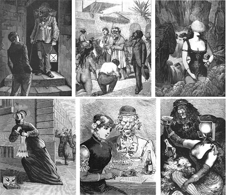
In 1934, Surrealist Max Ernst created an extraordinary collage novel (or, as I pointed out a few years ago, “graphic novel”), composed of collage images constructed of cut-outs from popular French periodicals and catalogs of the time.The result is a fascinating, spooky, wondrous and eye-opening excursion into the mind of a Surrealist master on the cusp of World War II. Here is my post about Une Semaine de Bonté, ou Les Sept Éléments Capitaux (A Week of Kindness, or the Seven Deadly Sins) from 2005.
This month, the Albertina museum in Vienna is displaying some of Ernst’s original collages for the book (how many is unclear). This is the first time the works have been exhibited since 1936. The show runs until the 9th of April, 2008. The museum’s site has a 6 thumbnails posted of images in the exhibition, though, inexplicably, no larger versions. I’ve found corresponding images in my files and posted them above.
Though I consider it legitimately a “graphic novel” (and long-time lines and colors readers will know I’m cranky about the inaccurate use of that term), it is not arranged in comic-strip form, as my composite above might suggest. Each of these images is a full page, but they are part of a narrative sequence (the images above are out of sequence from various parts of the book). The narrative is loose and dreamlike, or “stream of consciousness”, if you will. This is actually in keeping with the Surrealists’ prose and poetry, and could more correctly be called “stream of unconsciousness”, as one of their professed aims was to create art directly from their unconscious minds.
For those of us for whom a trip to Vienna is not practical, good old Dover Books is still keeping their delightfully inexpensive version, Une Semaine De Bonte: A Surrealistic Novel in Collage, in print after all these years (as well they should, it’s a classic, despite their slightly off title). I’ve had my dog-eared copy since I was a teenager, and the work still manages to surprise and delight me with repeated viewings.
When I wrote my previous post, there was an online version of the entire book available that has since disappeared. But, as the Internet giveth and the Internet taketh away, there is now a version on Google Books that looks reasonably complete.
You will also find some images, often with larger versions, on Giornale Nuovo and La Boîte à Images.
If you are at all intrigued, though, opt for the print version.
Categories:


Charley’s Picks
Bookshop.org
(Bookshop.org affilliate links; sales benefit independent bookshop owners; I get a small percentage to help support my work on Lines and Colors)

John Singer Sargent: Watercolors


Urban Sketching: Understanding Perspective


Charley’s Picks
Amazon
(Amazon.com affiliate links; sales go to a larger yacht for Jeff Bezos; but I get a small percentage to help support my work on Lines and Colors)
John Singer Sargent: Watercolors
Urban Sketching: Understanding Perspective