
Categories
- 3d CGI
- Amusements
- Animation
- Anime & Manga
- Art Materials
- Art Videos
- Blogroll
- Cartoons
- Color
- Comics
- Concept & Visual Dev.
- Creativity
- Digital Art
- Digital Painting
- Displaying Art on the Web
- Drawing
- Eye Candy for Today
- Gallery and Museum Art
- High-res Art Images
- Illustration
- Motion Graphics & Flash
- Museums
- Online Museums
- Outsider Art
- Painting
- Painting a Day
- Paleo Art
- Pastel, Conté & Chalk
- Pen & Ink
- Prints and Printmaking
- Reviews
- Sc-fi and Fantasy
- Sculpture & Dimensional
- Site Comments
- Sketching
- Storyboards
- Tools and Techniques
- Uncategorized
- Vector Art
- Videos & Podcasts
- Vision and Optics
- Watercolor and Gouache
- Webcomics
Archives
- May 2026
- April 2026
- March 2026
- February 2026
- January 2026
- December 2025
- November 2025
- October 2025
- September 2025
- August 2025
- July 2025
- June 2025
- May 2025
- January 2025
- December 2024
- November 2024
- October 2024
- September 2024
- August 2024
- June 2024
- April 2024
- March 2024
- February 2024
- January 2024
- December 2023
- November 2023
- October 2023
- September 2023
- August 2023
- July 2023
- May 2023
- April 2023
- March 2023
- February 2023
- January 2023
- December 2022
- November 2022
- September 2022
- August 2022
- July 2022
- June 2022
- May 2022
- April 2022
- March 2022
- February 2022
- January 2022
- December 2021
- November 2021
- October 2021
- September 2021
- August 2021
- July 2021
- June 2021
- May 2021
- April 2021
- March 2021
- February 2021
- January 2021
- December 2020
- November 2020
- October 2020
- September 2020
- August 2020
- July 2020
- June 2020
- May 2020
- April 2020
- March 2020
- February 2020
- January 2020
- December 2019
- November 2019
- October 2019
- September 2019
- August 2019
- July 2019
- June 2019
- May 2019
- April 2019
- March 2019
- February 2019
- January 2019
- December 2018
- November 2018
- October 2018
- September 2018
- August 2018
- July 2018
- June 2018
- May 2018
- April 2018
- March 2018
- February 2018
- January 2018
- December 2017
- November 2017
- October 2017
- September 2017
- August 2017
- July 2017
- June 2017
- May 2017
- April 2017
- March 2017
- February 2017
- January 2017
- December 2016
- November 2016
- October 2016
- September 2016
- August 2016
- July 2016
- June 2016
- May 2016
- April 2016
- March 2016
- February 2016
- January 2016
- December 2015
- November 2015
- October 2015
- September 2015
- August 2015
- July 2015
- June 2015
- May 2015
- April 2015
- March 2015
- February 2015
- January 2015
- December 2014
- November 2014
- October 2014
- September 2014
- August 2014
- July 2014
- June 2014
- May 2014
- April 2014
- March 2014
- February 2014
- January 2014
- December 2013
- November 2013
- October 2013
- September 2013
- August 2013
- July 2013
- June 2013
- May 2013
- April 2013
- March 2013
- February 2013
- January 2013
- December 2012
- November 2012
- October 2012
- September 2012
- August 2012
- July 2012
- June 2012
- May 2012
- April 2012
- March 2012
- February 2012
- January 2012
- December 2011
- November 2011
- October 2011
- September 2011
- August 2011
- July 2011
- June 2011
- May 2011
- April 2011
- March 2011
- February 2011
- January 2011
- December 2010
- November 2010
- October 2010
- September 2010
- August 2010
- July 2010
- June 2010
- May 2010
- April 2010
- March 2010
- February 2010
- January 2010
- December 2009
- November 2009
- October 2009
- September 2009
- August 2009
- July 2009
- June 2009
- May 2009
- April 2009
- March 2009
- February 2009
- January 2009
- December 2008
- November 2008
- October 2008
- September 2008
- August 2008
- July 2008
- June 2008
- May 2008
- April 2008
- March 2008
- February 2008
- January 2008
- December 2007
- November 2007
- October 2007
- September 2007
- August 2007
- July 2007
- June 2007
- May 2007
- April 2007
- March 2007
- February 2007
- January 2007
- December 2006
- November 2006
- October 2006
- September 2006
- August 2006
- July 2006
- June 2006
- May 2006
- April 2006
- March 2006
- February 2006
- January 2006
- December 2005
- November 2005
- October 2005
- September 2005
- August 2005
Relevant Blogs
Art, Painting & Sketch
- Gurney Journey
- Underpaintings
- Art and Influence
- Painting Perceptions
- Oil Painters of America
- Vasari Paint POV
- Flying Fox
- Urban Sketchers
- Bento (Smithsonian)
- Art Inconnu
- The Hidden Place
- Still Life
- Making a Mark
- The Art of the Landscape
- Exploring Color & Creativity
- Art Contrarian
- Artist A Day
- beinArt Surreal Art Collective
- Eye Level
- David Dunlop
- p.i.g.m.e.n.t.i.u.m
- CultureGrrl
- Joaquín Sorolla blog
- Artists in Pastel
“Painting a Day”
- A Painting a Day (Keiser)
- On Painting (Keiser)
- Julian Merrow-Smith
- Karen Jurick
- Jeffrey Hayes
- Carol Marine
- Abbey Ryan
- Daily Paintworks
Other Painting Blogs
- Virtual Gouache Land
- Neil Hollingsworth
- Marc Hanson
- Kevin Menck
- Marc Dalessio
- Larry Seiler
- Stapleton Kearns
- Colin Page
- Roos Schuring
- Hans Versfelt
- Titus Meeuws
- Régis Pettinari
- René Plein Air
- Belinda Del Pesco
- Robin Weiss
- Nathan Fowkes (Land Sketch)
- William Wray
- Frank Serrano
- Stephen Magsig
- Michael Chesley Johnson
- Twice a Week
- Sarah Wimperis
- Rob Adams
- Michael Cole Manley
- The Dirty Palette Club
- Mike Manley’s Draw!
Gallery Art & Illustration mix
Illustration
- Howard Pyle
- 100 Years of Illustration
- BibliOdyssey
- Illustration Art
- Today’s Inspiration
- Illustration Mundo
- Little Chimp Society
- Danny Gregory
- R D (John Martz
- Illustration Friday blog
- Monster Brains
- Illustrators & Illustrations (RU)
- Elwood H. Smith
- DaniDraws.com
- Designers Who Blog
- iSpot Blog
Sci-Fi & Fantasy
Illustration & Comics
Comics & Cartoons
- Comics Beat
- Robot 6
- Newsarama Blog
- Comic Vine
- Comics Alliance
- Forbidden Planet Int.
- Paolo Rivera
- Bolt City
- Flight
- Scott McCloud
- The Comics Journal
- Comixpedia
- Funnybook Babylon
- James Baker
- Middleton’s Sketchbook
- Boneville
- The Hotel Fred
- Paul Rivoche
- Daily Cartoonist
- Mad About Cartoons (William Wray)
- Digital Strips
Illustration & Concept
Animation & Concept
- Cartoon Brew
- Animation Blog
- Cold Hard Flash
- Concept Art World
- The CAB
- FY Concept Art
- Concept Ships
- Concept Robots
- John Nevarez
- Armand Serrano
- Marcos Mateu-Mestre
- all kinds of stuff (Kricfalusi)
- Yacin the faun (Man Arenas)
- Kelsey Mann
- Cre8tivemarks Blog
- Ice-Cream Monster Toon Cafe
- AAU Character & Creature Design
- AAU Animation Notes
- Articles and Texticles
Paleo & Scientific
Tools & Techniques
Other
Lists of Art Blogs
Art Image Resource Links
Historic Art Images
- Wikimedia Commons: Paintings
- Wikimedia Commons: Drawings
- The Athenaeum
- WikiArt (WikiPaintings)
- Google Art Project: Artists
- Google Art Project: Collections (Museums)
- ArtCyclopedia
- Web Gallery of Art
- Art Renewal Center
- Web Gallery of Impressionism
Auction Consolidation sites
Auction sites
- Sotheby’s
- Bonham’s
- Christies
- Heritage Auctions: Fine Art
- Heritage Auctions: Illustration
- Freeman’s Auctions
- Bukowskis
- Shannon’s
Image Search
Reverse Image Search (search by image)
- Tin Eye
- RevImg
- Google Image Search (camera icon)
- Bing Image Search (camera icon)
Promoting some friends and some clients of my website design business
- Twin Willows T’ai Chi studio in Wilmington DE. Taiji classes with Bryan Davis.
- Ray Hayward, Inspired Teacher of T’ai Chi ( Taiji ) in Minneapolis, Founder of Mindful Motion Tai Chi Academy
- OldHead Tattoo studio and Art Gallery in Wilmington DE. Tattoos and paintings by Bruce Gulick
- Sharon Domenico Art, pet portrait oil paintings
- Platinum Paperhanging, wallpaper hanging, Main Line and Philadelphia, PA
- Lisa Stone Design, interior designer, Main Line and Philadelphia, PA
- Studio12KPT, original art, prints, calendars and other custom printed items by Van Sickle & Rolleri
-
Blurb and Lulu

Suppose you’re meeting an art director and you want to leave behind printed samples of your work.You could print out some pages on your home printer and try to assemble them in an office store report cover, or you could go down to Kinkos and have them print and bind it in some kind of corporate report package; you could give them a disk and hope they take the trouble to view it, or you could just give up and beg them to bookmark your web site.
Imagine the difference, though, if instead of a printed pamphlet, you leave a full-color, glossy, hardbound book of your work, complete with dust jacket.
Or…
Suppose you’ve been asked to present a gallery with some photographs of your work as a form of initial contact. Some galleries still ask specifically for slides, but if it’s up to you would you rather give them a pile of photos, computer print-outs, bound or not, or… a book of your paintings that looks like you just picked it up off the shelf at Barnes and Noble?
Or…
Perhaps you’d like to collect your work in a book and offer it for sale on your web site, something I know many artists would love to do, but consider out of reach. (I can see all of the “painting a day” artists sitting up and taking notice.)
Or…
Maybe you’d just like to have your paintings, or even a collection of your travel photos, arranged as a book that you can give to friends and family as gifts.
“But, Charley,” you say, looking at your computer screen with a quizzical and/or bemused expression, “this all sounds great, but I don’t recall inheriting a fortune lately, I can’t afford to pay thousands of dollars to have a book printed. Have you gone daft?”
“Why, no,” I say, “well, maybe…, but that doesn’t alter the fact that one-off printing of individual books has become practical and, in fact, is now remarkably affordable and easy.”
It used to be that printing a full-color book required and outlay of thousands for an extensive print run, making such things impractical unless you could attract the attention of a publisher willing to invest in publishing your book to a wide audience. In printing the general rule has always been that the more copies you printed, the cheaper each copy became, and you had to print a relatively high number to get the price point per copy to be remotely viable, particularly in color. The idea of printing a single copy of a full-color book was absurd.
Printing technology, though still slow to change by the standards of digital media, has made some amazing progress while we were busy being dazzled by the internet. New on-demand printing techniques, utilizing sophisticated ink-jet technology, have finally made the low print run and one-off printing of full color books, even hard-bound books, practical.
You can now put together an 8″x10″ (20×25 cm) 40 page full-color hard-bound book and print one copy for as little as $30, soft-cover for $20!
There are several companies now that offer inexpensive short-run or one-off on-demand printing using this new technology; the one I have experience with, and can recommend almost without reservation, is Blurb.
In the case of Blurb, the technology is the HP Indigo 5000 digital press. Some of you may be familiar with Apple’s iPhoto books, which use the same principle but are much more expensive.
You don’t have to be a graphic designer, or know how to use Quark or InDesign, to put a book together for printing by Blurb. You download Booksmart, their book template software for Mac or Windows (I used the Mac version) into which you load your digital images and arrange them in a choice of book sizes and page template variations. The software is well thought out and very easy for someone with no design experience to use. Graphics professionals will actually find it a bit restrictive, but it’s not aimed at us, and as a work-around you can use your own typography and layout in the form of full-page images. The process even allows you to do full bleeds (images that extend to the edges of the page) at no additional cost.
It’s suggested you do a test print from your home printer, and then upload the book to your Blurb account through the Booksmart software. In 7-10 working days (1-2 weeks) the UPS driver will plop your shiny new securely packaged book into your eager hands.
You can print in several sizes, from 7×7 inches (18x18cm), starting at $13 for up to 40 pages paperback, to their “coffee-table book” at 13×11 inches (33x28cm), which is hardcover only starting at $55.
Most importantly you will blown away by the quality of the results (providing, of course that you are careful in the preparation of the book on your end). The books look fantastic, the printing and color are absolutely beautiful and look remarkably professional. They may be printed on-demand, but these are bookstore quality books that you would be proud to offer for sale on your web site.
For more information, I’ll refer you to a more extensive review by Kevin Kelly, a reviewer whose opinion I trust and from whom I learned about Blurb, who also reviews another on-demand printing service, Lulu.
I don’t have direct experience with Lulu, but I mention it because Kelly does and because Blurb is about printing in color, it’s not the ideal solution for black and white printing, which should be much cheaper than even the remarkably inexpensive color of Blurb books. Lulu may be of particular interest to those printing black and white comics.
When preparing a book for Blurb printing, be sure to heed Kelly’s advice about blurred images, take care to photograph your work sharply and as professionally as possible. (I list a few resources about photographing artwork at the end of this post.)
Once your book is complete (and you’re seen at least one copy of the finished article to make sure that it’s the way you want it), you can order more, at a discount if it’s over 10 copies. You can also offer the book for sale through the Blurb bookstore.
When I was investigating Blurb, I didn’t have enough artwork in a state that I wanted to print in a book yet, so as a test I put together a book of photographs I took in Venice and published a 20 page Blurb book. You can see it here in the Blurb bookstore. Below the image of the book cover is a link where you can download a PDF preview of the first 15 pages that will give you some idea of the Booksmart template layouts, at least as I have used them.
The image above shows that book in the Booksmart software on screen, the actual delivered book open to the same page and the book cover (inset).
If you’re at all curious about Blurb, you can create a small Blurb book for as little as $13 (plus shipping) just to check out the process. A friend of mine just did that and was delighted and amazed with the results.
So what are you waiting for? You’re only a couple of weeks away from being a published!
Categories:
-
Steve Rude: Artist in Motion

I received a copy of Steve Rude: Artist in Motion from Flesk Publications.Flesk is a small specialty art book publisher that was the subject of one of my first posts on lines and colors in which I praised their terrific collections of the work of pen and ink greats Joseph Clement Coll and Franklin Booth.
Since then, much to my delight, they have continued to expand and produce terrific books on illustrators like James Bama and contemporary comics artists like Mark Schultz and Steve Rude; and I wrote a follow up post on Flesk last Summer.
Over that time I’ve come to expect high standards in the production of their books, which are simply excellent, but I have to admit I was actually surprised at what a beautiful book they have produced in this latest volume. Not only is it a larger and more extensive book than I had expected, it covers a range of Rude’s work that was eye-opening.
Steve Rude is best known as a comic book artist. He is the co-creator, with writer Mike Baron, of Nexus, one of the most unique takes on the science fiction/super-hero genre ever produced. Rude has also applied his superb draftsmanship and story-telling skills to several other comics projects, including his own character The Moth, and mainstream characters like Superman, and even Space Ghost.
There is, of course, plenty of art from Nexus and Rude’s other comics work here, including preliminary sketches, model sheets, penciled and inked pages (often of the same page or panel, which I particularly enjoy). There are also many of his painted comics covers. In addition, however, are a large number of his other paintings, which is where the book really shines.
Rude is an artist who isn’t afraid to wear his influences on his sleeve. He has taken as his favorites some of the best, Alex Raymond, Jack Kirby and Russ Manning in the comics field, and for painting some of the terrific and under-appreciated illustrators of the mid-20th century like Harry Anderson, John Gannam, Haddon Sundblom, and in particular, Andrew Loomis.
Rude was instrumental in the production of the book, and in fact shares writing credit with publisher John Fleskes; and he is not only quick to acknowledge his admiration for these artists, but goes into some detail about them and also discusses his process of learning and discovering techniques form the study of their work.
That’s another remarkable thing about the book, in the process of creating a dazzling art book of Rude’s work, there are enough studies, preliminaries, and step-throughs that the book is also instructional. In several cases it includes original reference photos and preliminary sketches next to the finished work. There are also sections of Rude’s life drawing and animation work.
If you’re not familiar with Rude’s work, you can browse through the small gallery on the Flesk site and also click on the right two images on the book’s page. Unfortunately, the images are small and the ones chosen fall way short of giving a feeling for the real nature of the book.
You can also see some of Rude’s work on his own site, including a clip of one of the painting demos he has been giving in various locations.
All in all, this is a beautiful book notable to those interested in both comic book art and illustration in the classic tradition.
Steve Rude: Artist in Motion can be ordered directly from Flesk Publications, from Amazon, or from your local bookstore or comic book store.
Categories:
-
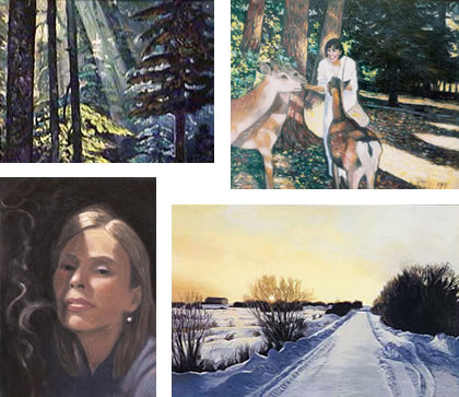
Joni Mitchell
A surprising number of well-known popular musicians, particularly among those who rose to prominence in the 1960’s, went to art school or or majored in visual art in college.Among them are John Lennon and Stu Stuttcliff, his band’s original drummer, David Byrne, Keith Richards, Ron Wood, Bryan Ferry, David Bowie, several members of Queen, Grace Slick, Gerry Garcia, and the Who’s John Entwistle. I’m sure someone else could provide a more comprehensive list.
Many of these, and several more latecomers, continue to dabble in painting as celebrity artists, whose work sells primarily because of name recognition. (Someone famous sneezed in this hankie! What am I bid?) Though I have a fondness for John Lennon’s Thurberesque cartoons, most of the rock star art I’ve encountered is pretty lackluster. You can see why most of them seem happy to have left their art school days and unexplored artistic career behind.
There are exceptions, like Ron Wood, and another standout, Joni Mitchell. Mitchell has pursued her role as a painter unflaggingly throughout her musical career, and has been quoted as saying she thinks of herself as a painter who does music more than the other way around.
You can find her work on the covers of many (if not all) of her albums, from the first one on.
Musically, Mitchell was typecast as a “sensitive singer-songwriter”, but she was actually a restless experimenter, gradually moving from folk to rock to jazz and back through, pulling the strands of all of her influences into a new whole. Similarly, she has explored several avenues of visual art over the years.
There is a section of her official web site devoted to her endeavors as a painter. The images are frustratingly small, but you can use the links at page right to browse through her work by year or by style, and then browse in your local music shop to look at some of her actual work as reproduced on her CD covers.
I think she is most successful as a landscape painter, in which she falls into the “painterly realist” school and can have a rich sense of color and tone (something that’s a little hard to tell from the small images on her site). Her figurative work, including many self-portraits, varies more and she seems unabashed about having some of her weaker work posted on the site along with the stronger pieces. Lately she is leaning more toward her occasional forays into manipulated photo-collage, which is my least favorite of her styles.
You can also see her copying from painters she admires, as most artists will do as they continue to learn, including some of the “American Impressionists”, members of the Ashcan School and even Bouguereau.
If anyone comes across a significant number of larger reproductions of her paintings on the web, I would be interested to know. In the meanwhile, even the small images can give you a hint of this artist/musician’s experiments, improvisations and formal compositions, in which she occasionally plays a clunker, but often hits a high note.
Categories:
-
Lorland Chen

For some reason I haven’t been able to fathom, a lot of artists who work digitally in fantasy art or concept art seem to feel the need to go by pseudonyms, sometimes multiple ones.Lorland Chen is alternately known as lorlandchain, Lorland Chain, Wei Chain and Wei Chen. I think one of the last two is actually his real name. Take your pick.
Chen is an illustrator from Chengdu China. He is also an instructor at the ChengDu Fine Art Academy.
Chen exhibits a fascinating range of influences. His sometimes intricate and elaborate compositions of fantasy themed works draw on Chinese mythology and history for their subject matter, but are painted in the traditions of Western art. Chen works in both traditional media like watercolor and in digital painting applications like Painter and Photoshop, and sometimes combinations of digital and traditional media.
His figures in flowing robes walk through fantasy palaces or enchanted forests amid great trees that sometimes show the influence classic American illustrators like Maxfield Parrish. There are nods to classical European painting and contemporary fantasy art alike.
His digital paintings are sometimes extensively detailed, giving the impression that Chen was just having so much fun rendering out the intricate bits that he didn’t want to stop.
Chen’s own site, though it has an English version and information about the artist, is difficult to recommend for viewing his work because the images are marred with watermarking. The site also has some technical problems (won’t stop trying to load in Safari) and plays unrequested music (and long time readers know how much I love that). Still, if you like Chen’s work, it’s worth checking out the info about his work and his self-published how-to book.
Fortunately, you can see a number of his images without the annoyance of watermarking on his gallery spaces on deviantArt and CGSociety, which are often accompanied by his comments on the works and his digital painting process.
[Link via startdrawing.org]
Categories:
-
John Mattos

John Mattos has applied his crisp, colorful illustration style to editorial illustrations for publications like Time, Newsweek, Forbes, and Fortune; and commercial clients like Apple, Adobe, Microsoft and Citibank. He has taught illustration and drawing at De Anza College, Academy of Art University, and California College of Arts and Crafts and has lectured at UC Berkeley, Stanford, and the School of Visual Arts in NY.His bright vector based illustration technique combines the artful use of gradient tones and a knack for “lost and found edges” that give a simultaneous feeling of dimensionality and strongly graphic composition.
His sleek, forceful image of a skier carving her way through a turn was chosen for the U.S. Postal Service’s official commemorative stamp for the 2006 Winter Olympics.
Mattos’ online portfolio is unfortunately brief (though don’t miss the link to a second page), but there are a few additional images on his iSpot portfolio. His web site also includes a very quick look as some of his film work.
He will sometimes push his colors way back, fading them as if under a gentle glaze, and at other times punch them forward with intense hues.
I love the way in the illustration shown here Mattos lets you hang for moment to get your bearings before the dizzyness sets in.
Categories:
-
Walt Kelly
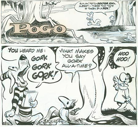
“We have met the enemy and he is us.”Walt Kelley’s revision of an 1813 quote from Commodore Perry (“We have met the enemy, and they are ours”), and his famous reworking of a classic Christmas song as “Deck the Halls with Boston Charlie”, may actually be familiar to a larger number of people than Kelly’s masterwork of the comics art form, Pogo, which is downright unfortunate.
Walt Kelly was one of the all time great cartoonists. Pogo, his beautifully drawn, keenly intelligent, highly witty and politically daring syndicated comic strip ran for a quarter of a century. Amid hilarious funny animal hijinks, wonderfully loopy wordplay, and multi-leveled stories set in the Okefenokee Swamp (Georgia side), Kelly’s characters mouthed some biting social and political commentary, even to the point of taking shots at “Communist under every bed” witch-hunter Senator Joseph McCarthy, who he portrayed as a gun-toting wildcat named “Simple J. Malarkey”. McCarthy’s “if you aren’t with us, you’re a Communist” tactics had given him considerable power, enough to ruin numerous careers in Hollywood and elsewhere, and taking him on took some nerve.
Kelly also took on the far right-wing John Birch Society, J. Edgar Hoover, John Mitchell and Spiro Agnew and, during the 1968 presidential campaign, he ridiculed the group of hopeful presidential nominees he called the “wind-up candidates”, including Eugene McCarthy, Richard Nixon, Hubert Humphrey, George wallace and Robert F. Kennedy. In 1952, Pogo himself became the possum of choice with a gag candidacy based around “I Go Pogo” buttons (lampooning Eisenhower’s “I Like Ike” campaign slogan).
Pogo can be read as a simple, and simply delightful, “funny animal” strip if you prefer, and kids love it as much as adults. It is one of the best drawn newspaper comics ever, owing a good bit to Kelly’s six-year stint working for Walt Disney Productions, during which he worked on such classic animated features as Snow White and the Seven Dwarfs, Fantasia and Dumbo as well as a number of Donald Duck shorts. He also did comic book work for Dell Comics, during which he created the character that would become his life’s work.
Kelly’s Pogo strips are masterpieces of fluid, expressive brush and ink drawing and superb graphic storytelling. His elegant calligraphic brush lines are complimented by the judicious application of hatching and expertly balanced spotting of blacks. Kelly has been tremendously influential on subsequent generations of cartoonists. You can see direct inspiration in Jeff Smith’s beautiful work on Bone in particular.
There are a number of books that have been published over the years and are in various states of availability, including the famously titled We Have Met the Enemy and He is Us. Also out of print but available used is Ten Ever-Lovin Blue Eyed Years with Pogo, which is a good introduction and overview, and reprints some great strips.
Of particular interest, though, is the new series of complete Pogo strips from Fantagraphics, starting with Pogo: The Complete Daily & Sunday Comic Strips Vol. 1: “Into the Wild Blue Wonder”, and continuing with Pogo, Vol 2.
There is an “official” Pogo Possum site, with lots of news, info and links, but not much artwork. There are other sites that fit a similar niche, lots of info, not enough artwork.
The amazing ASIFA-Hollywood Animation Archive comes through again, however, with an article on Walt Kelly’s Pogo that features some absolutely great scans of Walt Kelly original Pogo art courtesy of Mike Fontanelli. There are three high-resolution Pogo Sunday pages, in which you can not only see Kelly’s beautiful brush and ink finishes, but his underlying blue-line pencils as well (click on the images for the larger versions). I’ve had the pleasure of seeing some of Kelly’s originals in person and these scans do a great job of showing the work of this master cartoonist as it actually looks.
In the meanwhile, if someone asks me who I’m supporting in the U.S. presidential primaries, I Go Pogo!.
Categories:


Charley’s Picks
Bookshop.org
(Bookshop.org affilliate links; sales benefit independent bookshop owners; I get a small percentage to help support my work on Lines and Colors)

John Singer Sargent: Watercolors


Urban Sketching: Understanding Perspective


Charley’s Picks
Amazon
(Amazon.com affiliate links; sales go to a larger yacht for Jeff Bezos; but I get a small percentage to help support my work on Lines and Colors)
John Singer Sargent: Watercolors
Urban Sketching: Understanding Perspective