
Categories
- 3d CGI
- Amusements
- Animation
- Anime & Manga
- Art Materials
- Art Videos
- Blogroll
- Cartoons
- Color
- Comics
- Concept & Visual Dev.
- Creativity
- Digital Art
- Digital Painting
- Displaying Art on the Web
- Drawing
- Eye Candy for Today
- Gallery and Museum Art
- High-res Art Images
- Illustration
- Motion Graphics & Flash
- Museums
- Online Museums
- Outsider Art
- Painting
- Painting a Day
- Paleo Art
- Pastel, Conté & Chalk
- Pen & Ink
- Prints and Printmaking
- Reviews
- Sc-fi and Fantasy
- Sculpture & Dimensional
- Site Comments
- Sketching
- Storyboards
- Tools and Techniques
- Uncategorized
- Vector Art
- Videos & Podcasts
- Vision and Optics
- Watercolor and Gouache
- Webcomics
Archives
- May 2026
- April 2026
- March 2026
- February 2026
- January 2026
- December 2025
- November 2025
- October 2025
- September 2025
- August 2025
- July 2025
- June 2025
- May 2025
- January 2025
- December 2024
- November 2024
- October 2024
- September 2024
- August 2024
- June 2024
- April 2024
- March 2024
- February 2024
- January 2024
- December 2023
- November 2023
- October 2023
- September 2023
- August 2023
- July 2023
- May 2023
- April 2023
- March 2023
- February 2023
- January 2023
- December 2022
- November 2022
- September 2022
- August 2022
- July 2022
- June 2022
- May 2022
- April 2022
- March 2022
- February 2022
- January 2022
- December 2021
- November 2021
- October 2021
- September 2021
- August 2021
- July 2021
- June 2021
- May 2021
- April 2021
- March 2021
- February 2021
- January 2021
- December 2020
- November 2020
- October 2020
- September 2020
- August 2020
- July 2020
- June 2020
- May 2020
- April 2020
- March 2020
- February 2020
- January 2020
- December 2019
- November 2019
- October 2019
- September 2019
- August 2019
- July 2019
- June 2019
- May 2019
- April 2019
- March 2019
- February 2019
- January 2019
- December 2018
- November 2018
- October 2018
- September 2018
- August 2018
- July 2018
- June 2018
- May 2018
- April 2018
- March 2018
- February 2018
- January 2018
- December 2017
- November 2017
- October 2017
- September 2017
- August 2017
- July 2017
- June 2017
- May 2017
- April 2017
- March 2017
- February 2017
- January 2017
- December 2016
- November 2016
- October 2016
- September 2016
- August 2016
- July 2016
- June 2016
- May 2016
- April 2016
- March 2016
- February 2016
- January 2016
- December 2015
- November 2015
- October 2015
- September 2015
- August 2015
- July 2015
- June 2015
- May 2015
- April 2015
- March 2015
- February 2015
- January 2015
- December 2014
- November 2014
- October 2014
- September 2014
- August 2014
- July 2014
- June 2014
- May 2014
- April 2014
- March 2014
- February 2014
- January 2014
- December 2013
- November 2013
- October 2013
- September 2013
- August 2013
- July 2013
- June 2013
- May 2013
- April 2013
- March 2013
- February 2013
- January 2013
- December 2012
- November 2012
- October 2012
- September 2012
- August 2012
- July 2012
- June 2012
- May 2012
- April 2012
- March 2012
- February 2012
- January 2012
- December 2011
- November 2011
- October 2011
- September 2011
- August 2011
- July 2011
- June 2011
- May 2011
- April 2011
- March 2011
- February 2011
- January 2011
- December 2010
- November 2010
- October 2010
- September 2010
- August 2010
- July 2010
- June 2010
- May 2010
- April 2010
- March 2010
- February 2010
- January 2010
- December 2009
- November 2009
- October 2009
- September 2009
- August 2009
- July 2009
- June 2009
- May 2009
- April 2009
- March 2009
- February 2009
- January 2009
- December 2008
- November 2008
- October 2008
- September 2008
- August 2008
- July 2008
- June 2008
- May 2008
- April 2008
- March 2008
- February 2008
- January 2008
- December 2007
- November 2007
- October 2007
- September 2007
- August 2007
- July 2007
- June 2007
- May 2007
- April 2007
- March 2007
- February 2007
- January 2007
- December 2006
- November 2006
- October 2006
- September 2006
- August 2006
- July 2006
- June 2006
- May 2006
- April 2006
- March 2006
- February 2006
- January 2006
- December 2005
- November 2005
- October 2005
- September 2005
- August 2005
Relevant Blogs
Art, Painting & Sketch
- Gurney Journey
- Underpaintings
- Art and Influence
- Painting Perceptions
- Oil Painters of America
- Vasari Paint POV
- Flying Fox
- Urban Sketchers
- Bento (Smithsonian)
- Art Inconnu
- The Hidden Place
- Still Life
- Making a Mark
- The Art of the Landscape
- Exploring Color & Creativity
- Art Contrarian
- Artist A Day
- beinArt Surreal Art Collective
- Eye Level
- David Dunlop
- p.i.g.m.e.n.t.i.u.m
- CultureGrrl
- Joaquín Sorolla blog
- Artists in Pastel
“Painting a Day”
- A Painting a Day (Keiser)
- On Painting (Keiser)
- Julian Merrow-Smith
- Karen Jurick
- Jeffrey Hayes
- Carol Marine
- Abbey Ryan
- Daily Paintworks
Other Painting Blogs
- Virtual Gouache Land
- Neil Hollingsworth
- Marc Hanson
- Kevin Menck
- Marc Dalessio
- Larry Seiler
- Stapleton Kearns
- Colin Page
- Roos Schuring
- Hans Versfelt
- Titus Meeuws
- Régis Pettinari
- René Plein Air
- Belinda Del Pesco
- Robin Weiss
- Nathan Fowkes (Land Sketch)
- William Wray
- Frank Serrano
- Stephen Magsig
- Michael Chesley Johnson
- Twice a Week
- Sarah Wimperis
- Rob Adams
- Michael Cole Manley
- The Dirty Palette Club
- Mike Manley’s Draw!
Gallery Art & Illustration mix
Illustration
- Howard Pyle
- 100 Years of Illustration
- BibliOdyssey
- Illustration Art
- Today’s Inspiration
- Illustration Mundo
- Little Chimp Society
- Danny Gregory
- R D (John Martz
- Illustration Friday blog
- Monster Brains
- Illustrators & Illustrations (RU)
- Elwood H. Smith
- DaniDraws.com
- Designers Who Blog
- iSpot Blog
Sci-Fi & Fantasy
Illustration & Comics
Comics & Cartoons
- Comics Beat
- Robot 6
- Newsarama Blog
- Comic Vine
- Comics Alliance
- Forbidden Planet Int.
- Paolo Rivera
- Bolt City
- Flight
- Scott McCloud
- The Comics Journal
- Comixpedia
- Funnybook Babylon
- James Baker
- Middleton’s Sketchbook
- Boneville
- The Hotel Fred
- Paul Rivoche
- Daily Cartoonist
- Mad About Cartoons (William Wray)
- Digital Strips
Illustration & Concept
Animation & Concept
- Cartoon Brew
- Animation Blog
- Cold Hard Flash
- Concept Art World
- The CAB
- FY Concept Art
- Concept Ships
- Concept Robots
- John Nevarez
- Armand Serrano
- Marcos Mateu-Mestre
- all kinds of stuff (Kricfalusi)
- Yacin the faun (Man Arenas)
- Kelsey Mann
- Cre8tivemarks Blog
- Ice-Cream Monster Toon Cafe
- AAU Character & Creature Design
- AAU Animation Notes
- Articles and Texticles
Paleo & Scientific
Tools & Techniques
Other
Lists of Art Blogs
Art Image Resource Links
Historic Art Images
- Wikimedia Commons: Paintings
- Wikimedia Commons: Drawings
- The Athenaeum
- WikiArt (WikiPaintings)
- Google Art Project: Artists
- Google Art Project: Collections (Museums)
- ArtCyclopedia
- Web Gallery of Art
- Art Renewal Center
- Web Gallery of Impressionism
Auction Consolidation sites
Auction sites
- Sotheby’s
- Bonham’s
- Christies
- Heritage Auctions: Fine Art
- Heritage Auctions: Illustration
- Freeman’s Auctions
- Bukowskis
- Shannon’s
Image Search
Reverse Image Search (search by image)
- Tin Eye
- RevImg
- Google Image Search (camera icon)
- Bing Image Search (camera icon)
Promoting some friends and some clients of my website design business
- Twin Willows T’ai Chi studio in Wilmington DE. Taiji classes with Bryan Davis.
- Ray Hayward, Inspired Teacher of T’ai Chi ( Taiji ) in Minneapolis, Founder of Mindful Motion Tai Chi Academy
- OldHead Tattoo studio and Art Gallery in Wilmington DE. Tattoos and paintings by Bruce Gulick
- Sharon Domenico Art, pet portrait oil paintings
- Platinum Paperhanging, wallpaper hanging, Main Line and Philadelphia, PA
- Lisa Stone Design, interior designer, Main Line and Philadelphia, PA
- Studio12KPT, original art, prints, calendars and other custom printed items by Van Sickle & Rolleri
-
James Gurney (update)

I received a note through James Gurney’s mailing list that his Dinotopia site has been completely redone and expanded with new content, largely in support of the newest book in his Dinotopia series, Dinotopia: Journey to Chandara.In addition, Gurney has a new blog, Gurney Journey, in which he intends to chronicle the people and places he and his wife (who is also an artist) encounter as they travel on the book release tour.
As I mentioned in my previous post about Gurney, Dinotopia (images above, top and middle) is a series of illustrated fantasy stories, in which the illustration/text ratio is nicely weighted toward illustration. The stories are about a land where intelligent dinosaurs co-exist with people in a vaguely late 19th Century level culture; and in them Gurney mixes a fascination with dinosaurs with a passion for Victorian painting and 19th Century academic art (particularly Sir Lawrence Alma-Tadema).
You can tell that Gurney keeps abreast of the latest paleontological discoveries, as his portrayal of various dinosaurs has changed to reflect scientific revisions over time, in spite of the overtly fantastic setting.
If your only exposure to the Dinotopia stories is by way of the cable TV mini-series, the books are much more engaging, largely because of Gurney’s wonderful illustrations; and the new book promises to be one of the most visually striking of the series. You can see some sample pages on the Dinotopia site and the publisher, Andrews and McMeel, also has a web space devoted to Journey to Chandra.
What isn’t made obvious on the Dinotopia site or the blog is that Gurney is also a landscape painter (image above, bottom), working in the area, and somewhat in the tradition, of the Hudson River School.
In looking at the rich, high-chroma palette in his landscape paintings, it’s easy to think that he has carried some of his illustration style into the landscape work, but I think the style flows more dramatically in the other direction, in that his landscape painting from life informs and enlivens the invented landscapes in his illustrations.
Addendum: Those in Los Angeles, CA and Oshkosh, WI will have the opportunity this fall to see Gurney’s work in person in the form of two exhibits: Dinotopia: The Fantastical Art of James Gurney is at the Los Angeles Public Library from Aug 4, 2007 – Jan 6, 2008, and Return to Dinotopia will be at the Oshkosh Public Museum, November 3, 2007 through January 27, 2008. For more details see the Dinotopia Exhibitions page on the Dinotopia site.
Categories:
-
Virtual Gouache Land (Erik Tiemens)

Erik Tiemens is a concept artist and designer working for LucasFilm who also does gallery paintings in oil and gouache, as well as digital sketching.I first reported on Tiemens in September of 2006. Since then his web site doesn’t look like it has gotten a great deal of attention (there is still a promise of Star Wars Episode III concept art to be added in April 2005 in the Concept Art gallery), but he has been maintaining a more frequently updated blog entitled Virtual Gouache Land.
In the blog Tiemens posts landscape sketches, sometimes digital, but often in gouache. The images are usually linked to larger versions, big enough to get a real feeling for the works, which are generally small-scale to begin with, and to see his wonderfully succinct notation of complex forms (image above, top, with detail, bottom).
He usually annotates the images with a brief description of the time and place, and sometimes the process, indicating when he is trying out new paints or other materials.
In contrast to small watercolor paintings or gouache sketches by many contemporary artists, Tiemens’ work has a flavor of the early watercolor artists of the Barbizon school, and English landscape artists like Turner and Constable. His small images, and digital paintings, are often dark overall, punctuated with brilliant patches of light poking through roiling clouds or the dark canopies of trees.
Categories:
-
Matt Cavotta
 According to his brief bio, illustrator Matt Cavotta grew up playing games like Scrabble, Balderdash and Boggle, grew into a fascination with fantasy games like Dungeons and Dragons and Magic: The Gathering, and carried his love of gaming into a career largely focused on illustrations for games.
Notably, his work for the Magic: The Gathering card based series and his magazine covers for Dungeon and Dragon show a splendiferous range of grotesque and sometimes gruesome images of fantasy themes. His magical animals, wizards, trolls, dragons, monsters and other bizarre characters are rendered with a strong sense of solidity, texture and atmosphere, which makes them all the more fun. Cavotta uses a strong range of value and high chroma palette to give his images a feeling of intensity and drama.
Unfortunately, the images reproduced on Cavotta’s site are inexplicably small. I came across a nice big reproduction of one of his pieces in a Spectrum collection and was impressed with it at the size of a full page. I was subsequently disappointed that the images on his site are not larger. The good news is that there are quite a few images shown, so you can get an idea of the breadth of Cavotta’s work, if not the depth.
The bad news is that you’ll need to be patient and perseverant to see many of them because navigation is a bit awkward, requiring you to click and click back to view each image. There’s also no obvious indication that the button labeled “Cavotta Home” at the top of the pages is actually a drop-down menu for the other site sections.
There is a menu at the page top for “Other Artists” which leads to a circle of sites of several artists with whom Cavotta apparently shares the masthead of “Daydream Graphics” (including Adam Rex, who I’ve previously profiled).
Some of Cavotta’s more imaginative images start to edge out past the traditional subject treatments for fantasy illustration into territory usually associated with fantastic or visionary gallery art, and the rendering of horns and scaly skin on his dragons and other fantasy animals make me think he would be interesting as a paleo artist.
I know that that his work for Magic: The Gathering is meant to be reproduced at a relatively small size on the cards (list here), but some of his larger format work is for magazine covers, and all of it is so rich in detail that I think it’s really unfortunate that he hasn’t reproduced at least a few pieces on his site at a larger size.
Categories:
-
Claes Oldenburg
 If you’ve been following lines and colors for the last month or so, you know I’ve been using the PBS broadcast on Monday nights of Simon Schama’s The Power of Art as a springboard for posts about related painters. Tonight’s show, however, is about Mark Rothko. Even though I occasionally like Rothko’s early Miro-like fantasies, and the later paintings of big, rough edged rectangles of color for which he is most known, I find it hard to generate any enthusiasm about him.
I’m resisting the temptation to write an entire post expressing my dumbfounded amazement at his inclusion with the great painters and sculptors that have been the other subjects of Schama’s series; which I’ve likened to doing a special on Mozart, Bach, Beethoven and Brahams and tossing in Axl Rose.
I’ve also mercifully decided against one of my acerbic rants about post-war modernism. Instead I thought “Why not write about a post-war modernist that I actually do like?” Though that’s a small group, the first one to pop into my mind was Claes Oldenburg, a post-war modernist whose work puts a genuine smile on my face, not simply one of bemusement.
In the midst of a wave of modernist painters who took themselves way too seriously (e.g. Rothko), Oldenburg was a breath of fresh air. His giant renditions of ordinary objects are at once hilarious and thought-provoking.
Oldenburg is primarily known for his large scale outdoor sculptures, usually of mundane objects that have been recreated at many times their original size and placed out of context not only by proportion and by being displayed in public spaces, but also by arrangement in unique and fun ways; like a sculpture of giant handlebars, partially visible so as to suggest a Buried Bicycle, a giant Dropped Bowl that has spilled 6-foot long apple slices and peels, or a half sunken bowling ball and an arrangement of 24 ft long Flying Pins.
One of the best gifts an artist can bestow on the viewer is to make that miraculous connection in the brain that allows you to see the world, or some small part of it, with fresh eyes.
Have you really looked at that pencil eraser on your desk? Have you noticed what that button on your dresser really looks like? Did you pay attention to the way your garden hose curled when you last walked by it?
Art that takes things out of their ordinary context, from Marcel Duchamp’s signed urinal and upturned bicycle wheel in a stool, to the work of the pop artists of the sixties, with whom Oldenburg is loosely associated, utilizes the juxtaposition of ordinary objects with unusual settings, sizes or presentations to make us stop and shift our perceptions; and can often, particularly in the case of Oldenburg, be hilarious.
Oldenburg’s smaller scale indoor works are frequently of commonplace objects that appear to be melting or soft. You can see some of his large scale works on the web site he shares with his wife and collaborator, sculptor Coosje van Bruggen, and some preliminary drawings and concepts on Ciudad de la pintura.
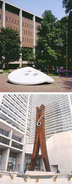
There was a time when I was frequently on the University of Pennsylvania campus, and I would often walk by the University Library, outside of which was Oldenburg’s Split Button (also here), a 16 foot wide white enameled aluminum sculpture of a broken button, that never failed to make me smile. (In a hilarious send-up of the story behind Alexander Stirling Calder’s Swann Fountain in Logan Circle, Oldenberg said of the button: “The Split represents the Schuylkill. It divides the button into four parts–for William Penn’s original Philadelphia squares.” — For more on Calder, see my post on his son, Alexander Calder.)
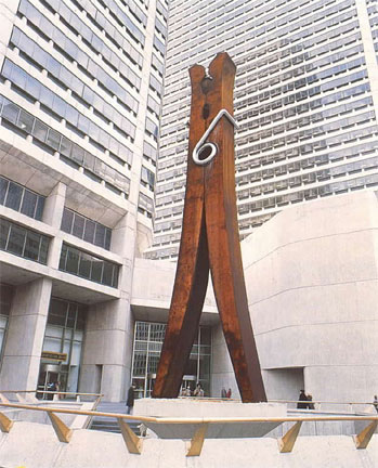
The next year I had occasion to frequently walk down 15th Street in Philadelphia, near City Hall, and past Oldenburg’s Clothespin (also here and here), a stainless steel representation of the familiar object that is 45 feet high and has over the years acquired a patina of rust, making it even more interesting. Anyone who lives or works in Center City Philadelphia knows it as simply “The Clothespin”, whether they’re aware of Oldenburg or not.
It’s hard to look at something like that, poised against he beautiful tower of City Hall with its Alexander Milne Calder sculptures, and the oh-so-serious and businesslike skyscrapers of Center Square Plaza, and not want to chuckle, give a mental thumbs-up and think. “OK, Claes!”
Categories:
-
Colin Page
I was really glad that I caught a show of paintings by Maine artist Colin Page at the F.A.N. Gallery here in Philadelphia. Yesterday was the last day of the show and I managed to fit it into my schedule to drop by the gallery. It was evidently a successful show as all but two of the paintings were marked as sold. (Personally, I think his work was underpriced.)Page lives in Maine, but apparently has some Philadelphia connection. In addition to being represented by a gallery here, a number of his paintings, particularly those in this show, are of Philadelphia scenes.
Page has a loose, open style with lots of juicy brushstrokes and rich splashes of color defining his forms. What is unfortunately difficult to see in the relatively small images posted on his site, and on the sites of the galleries in Maine and Philadelphia that represent him, are the textured brushstrokes and areas of rough blending and broken color that make the surface of his paintings richly textured. (The recent images on the F.A.N. gallery site are a bit larger.)
Though he occasionally paints landscapes, particularly of rocky coastal scenes in Maine, he more often paints cityscapes, townscapes and interiors, finding his compositions in the geometry of buildings and objects as well as in the negative spaces they define.
Page has a great talent for simplifying his compositions to just the right degree to leave them strongly graphic but visually rich. He leaves the surfaces of his subjects briefly noted, instead letting the application of the areas of paint provide visual as well as physical texture.
You’ll find a variety of his work on his own site and the three galleries listed below.
[Links and suggestion courtesy of Deirdre Tessmann and Elek Hendrickson]
Categories:
-
Willy Pogany’s Art of Drawing

When I wrote my post about “Golden Age” illustrator Willy Pogany in June, I was disappointed that I couldn’t find much in the way of online examples form his terrific drawing instruction book, The Art of Drawing.Well Stephen Worth and the good folks at the ASIFA-Hollywood Animation Archive, as part of their continuing campaign to make the web an even more wondrous and useful place, have dropped another gem on us. They’ve posted a 17 page taste of figure drawing instruction from Willy Pogany’s Drawing Lessons.
I’m a little unclear whether the currently available The Art of Drawing is a retitled version of Drawing Lessons, or if they simply share a lot of common material. Little matter, in that The Art of Drawing is easily available and is terrific.
This is not so much a book on drawing the figure from life in a direct “draw what you see” way, as it is in the constructive tradition of teachers like Andrew Loomis and George Bridgeman, who teach how to construct the figure through an understanding of anatomy, perspective and the perception of the underlying solid geometry of living forms.
As such, it belongs, along with books by Loomis, Bridgeman and Walt Reed, on the reference shelf of any artist who works with constructing figures from the imagination. In particular this means comic book artists and illustrators; though any artists who want a better feeling of solidity and three dimensional reality to their figures would benefit from the study of all of these instructors.
The ASIFA excerpt from the book consists of 17 beautiful high-resoultion scans that are reproduced large enough (approximately 1200 x 1500) to get a real feeling for the solid draftsmanship and fresh, confident linework in Pogany’s drawings. The actual book is over 125 pages and remarkably inexpensive.
While you’re at the ASIFA Animation Archive, be sure to check out some of the other amazing resources on the site, including great articles on drawing instruction, Golden Age illustrators, cartoons and many other topics in addition to animation. (Major time-sink warning)
Categories:


Charley’s Picks
Bookshop.org
(Bookshop.org affilliate links; sales benefit independent bookshop owners; I get a small percentage to help support my work on Lines and Colors)

John Singer Sargent: Watercolors


Urban Sketching: Understanding Perspective


Charley’s Picks
Amazon
(Amazon.com affiliate links; sales go to a larger yacht for Jeff Bezos; but I get a small percentage to help support my work on Lines and Colors)
John Singer Sargent: Watercolors
Urban Sketching: Understanding Perspective