
Categories
- 3d CGI
- Amusements
- Animation
- Anime & Manga
- Art Materials
- Art Videos
- Blogroll
- Cartoons
- Color
- Comics
- Concept & Visual Dev.
- Creativity
- Digital Art
- Digital Painting
- Displaying Art on the Web
- Drawing
- Eye Candy for Today
- Gallery and Museum Art
- High-res Art Images
- Illustration
- Motion Graphics & Flash
- Museums
- Online Museums
- Outsider Art
- Painting
- Painting a Day
- Paleo Art
- Pastel, Conté & Chalk
- Pen & Ink
- Prints and Printmaking
- Reviews
- Sc-fi and Fantasy
- Sculpture & Dimensional
- Site Comments
- Sketching
- Storyboards
- Tools and Techniques
- Uncategorized
- Vector Art
- Videos & Podcasts
- Vision and Optics
- Watercolor and Gouache
- Webcomics
Archives
- May 2026
- April 2026
- March 2026
- February 2026
- January 2026
- December 2025
- November 2025
- October 2025
- September 2025
- August 2025
- July 2025
- June 2025
- May 2025
- January 2025
- December 2024
- November 2024
- October 2024
- September 2024
- August 2024
- June 2024
- April 2024
- March 2024
- February 2024
- January 2024
- December 2023
- November 2023
- October 2023
- September 2023
- August 2023
- July 2023
- May 2023
- April 2023
- March 2023
- February 2023
- January 2023
- December 2022
- November 2022
- September 2022
- August 2022
- July 2022
- June 2022
- May 2022
- April 2022
- March 2022
- February 2022
- January 2022
- December 2021
- November 2021
- October 2021
- September 2021
- August 2021
- July 2021
- June 2021
- May 2021
- April 2021
- March 2021
- February 2021
- January 2021
- December 2020
- November 2020
- October 2020
- September 2020
- August 2020
- July 2020
- June 2020
- May 2020
- April 2020
- March 2020
- February 2020
- January 2020
- December 2019
- November 2019
- October 2019
- September 2019
- August 2019
- July 2019
- June 2019
- May 2019
- April 2019
- March 2019
- February 2019
- January 2019
- December 2018
- November 2018
- October 2018
- September 2018
- August 2018
- July 2018
- June 2018
- May 2018
- April 2018
- March 2018
- February 2018
- January 2018
- December 2017
- November 2017
- October 2017
- September 2017
- August 2017
- July 2017
- June 2017
- May 2017
- April 2017
- March 2017
- February 2017
- January 2017
- December 2016
- November 2016
- October 2016
- September 2016
- August 2016
- July 2016
- June 2016
- May 2016
- April 2016
- March 2016
- February 2016
- January 2016
- December 2015
- November 2015
- October 2015
- September 2015
- August 2015
- July 2015
- June 2015
- May 2015
- April 2015
- March 2015
- February 2015
- January 2015
- December 2014
- November 2014
- October 2014
- September 2014
- August 2014
- July 2014
- June 2014
- May 2014
- April 2014
- March 2014
- February 2014
- January 2014
- December 2013
- November 2013
- October 2013
- September 2013
- August 2013
- July 2013
- June 2013
- May 2013
- April 2013
- March 2013
- February 2013
- January 2013
- December 2012
- November 2012
- October 2012
- September 2012
- August 2012
- July 2012
- June 2012
- May 2012
- April 2012
- March 2012
- February 2012
- January 2012
- December 2011
- November 2011
- October 2011
- September 2011
- August 2011
- July 2011
- June 2011
- May 2011
- April 2011
- March 2011
- February 2011
- January 2011
- December 2010
- November 2010
- October 2010
- September 2010
- August 2010
- July 2010
- June 2010
- May 2010
- April 2010
- March 2010
- February 2010
- January 2010
- December 2009
- November 2009
- October 2009
- September 2009
- August 2009
- July 2009
- June 2009
- May 2009
- April 2009
- March 2009
- February 2009
- January 2009
- December 2008
- November 2008
- October 2008
- September 2008
- August 2008
- July 2008
- June 2008
- May 2008
- April 2008
- March 2008
- February 2008
- January 2008
- December 2007
- November 2007
- October 2007
- September 2007
- August 2007
- July 2007
- June 2007
- May 2007
- April 2007
- March 2007
- February 2007
- January 2007
- December 2006
- November 2006
- October 2006
- September 2006
- August 2006
- July 2006
- June 2006
- May 2006
- April 2006
- March 2006
- February 2006
- January 2006
- December 2005
- November 2005
- October 2005
- September 2005
- August 2005
Relevant Blogs
Art, Painting & Sketch
- Gurney Journey
- Underpaintings
- Art and Influence
- Painting Perceptions
- Oil Painters of America
- Vasari Paint POV
- Flying Fox
- Urban Sketchers
- Bento (Smithsonian)
- Art Inconnu
- The Hidden Place
- Still Life
- Making a Mark
- The Art of the Landscape
- Exploring Color & Creativity
- Art Contrarian
- Artist A Day
- beinArt Surreal Art Collective
- Eye Level
- David Dunlop
- p.i.g.m.e.n.t.i.u.m
- CultureGrrl
- Joaquín Sorolla blog
- Artists in Pastel
“Painting a Day”
- A Painting a Day (Keiser)
- On Painting (Keiser)
- Julian Merrow-Smith
- Karen Jurick
- Jeffrey Hayes
- Carol Marine
- Abbey Ryan
- Daily Paintworks
Other Painting Blogs
- Virtual Gouache Land
- Neil Hollingsworth
- Marc Hanson
- Kevin Menck
- Marc Dalessio
- Larry Seiler
- Stapleton Kearns
- Colin Page
- Roos Schuring
- Hans Versfelt
- Titus Meeuws
- Régis Pettinari
- René Plein Air
- Belinda Del Pesco
- Robin Weiss
- Nathan Fowkes (Land Sketch)
- William Wray
- Frank Serrano
- Stephen Magsig
- Michael Chesley Johnson
- Twice a Week
- Sarah Wimperis
- Rob Adams
- Michael Cole Manley
- The Dirty Palette Club
- Mike Manley’s Draw!
Gallery Art & Illustration mix
Illustration
- Howard Pyle
- 100 Years of Illustration
- BibliOdyssey
- Illustration Art
- Today’s Inspiration
- Illustration Mundo
- Little Chimp Society
- Danny Gregory
- R D (John Martz
- Illustration Friday blog
- Monster Brains
- Illustrators & Illustrations (RU)
- Elwood H. Smith
- DaniDraws.com
- Designers Who Blog
- iSpot Blog
Sci-Fi & Fantasy
Illustration & Comics
Comics & Cartoons
- Comics Beat
- Robot 6
- Newsarama Blog
- Comic Vine
- Comics Alliance
- Forbidden Planet Int.
- Paolo Rivera
- Bolt City
- Flight
- Scott McCloud
- The Comics Journal
- Comixpedia
- Funnybook Babylon
- James Baker
- Middleton’s Sketchbook
- Boneville
- The Hotel Fred
- Paul Rivoche
- Daily Cartoonist
- Mad About Cartoons (William Wray)
- Digital Strips
Illustration & Concept
Animation & Concept
- Cartoon Brew
- Animation Blog
- Cold Hard Flash
- Concept Art World
- The CAB
- FY Concept Art
- Concept Ships
- Concept Robots
- John Nevarez
- Armand Serrano
- Marcos Mateu-Mestre
- all kinds of stuff (Kricfalusi)
- Yacin the faun (Man Arenas)
- Kelsey Mann
- Cre8tivemarks Blog
- Ice-Cream Monster Toon Cafe
- AAU Character & Creature Design
- AAU Animation Notes
- Articles and Texticles
Paleo & Scientific
Tools & Techniques
Other
Lists of Art Blogs
Art Image Resource Links
Historic Art Images
- Wikimedia Commons: Paintings
- Wikimedia Commons: Drawings
- The Athenaeum
- WikiArt (WikiPaintings)
- Google Art Project: Artists
- Google Art Project: Collections (Museums)
- ArtCyclopedia
- Web Gallery of Art
- Art Renewal Center
- Web Gallery of Impressionism
Auction Consolidation sites
Auction sites
- Sotheby’s
- Bonham’s
- Christies
- Heritage Auctions: Fine Art
- Heritage Auctions: Illustration
- Freeman’s Auctions
- Bukowskis
- Shannon’s
Image Search
Reverse Image Search (search by image)
- Tin Eye
- RevImg
- Google Image Search (camera icon)
- Bing Image Search (camera icon)
Promoting some friends and some clients of my website design business
- Twin Willows T’ai Chi studio in Wilmington DE. Taiji classes with Bryan Davis.
- Ray Hayward, Inspired Teacher of T’ai Chi ( Taiji ) in Minneapolis, Founder of Mindful Motion Tai Chi Academy
- OldHead Tattoo studio and Art Gallery in Wilmington DE. Tattoos and paintings by Bruce Gulick
- Sharon Domenico Art, pet portrait oil paintings
- Platinum Paperhanging, wallpaper hanging, Main Line and Philadelphia, PA
- Lisa Stone Design, interior designer, Main Line and Philadelphia, PA
- Studio12KPT, original art, prints, calendars and other custom printed items by Van Sickle & Rolleri
-
Alfred Sisley

Along with Gustav Caillebotte Alfred Sisley is one of my two favorite “ignored” Impressionists.Sisley is usually lost in the glare surrounding Monet, the “star” of Impressionism, particularly since Sisley’s work at its most “Impressionistic” resembles a slightly anemic version of Monet’s prismatic marvels.
Often referred to as “the English Impressionist” Sisley was actually born in Paris of English parents. He became friends with Monet, Renoir and Bazille as a student in the atelier of Marc-Charles-Gabriel Gleyre. With them, Sisley was one of the founding members of the Impressionist movement and is sometimes referred to as a “typical” impressionist.
This attitude, along with a lack of substantial biographical information and the overwhelming presence of Monet and other Impressionist painters with more distinctive styles, has long pushed Sisley into the background.
What I find most appealing about Sisley, however, can be found in his paintings that live somewhere on the realist side of full-blown Impressionist technique, painted honestly and directly with more of an eye to the color and light of the scene than to the abstract notions of purity of color and optical mixing of hues. The result is a fresh, painterly approach in which the feeling of light and color are more important than technique.
His palette is also likely to be more subdued than Monet at his most explosive, preferring a more naturalistic harmony of color. Although very influenced by his Impressionist compatriots, Sisley considered himself a student of Corot and also showed the influence of Courbet and even Constable.
He was fascintated with the effects of light and shadow and the process of capturing them by plein air painting. Sisley, even more than the other Impressionists, was a painter of water. His canvasses were often divided into horizontal bands of sky, land and water, as in the examples above.
I have occasionally seen his work referred to as “cold” or “reserved” but I’ve never felt that. I’ve always thought of his paintings of the French countryside and, in particular, the River Seine, the Thames in London and other streams, as quiet and contemplative, without the splashy drama of Monet or Renoir.
Compared to the more prominent Impressionists, there are few books available on Sisley, representative of the general tendency to ignore him on the way to cashing in on the most popular names. This catalog from a 1992 retrospective is out of print, but nice if you can find a copy. Richard Shone’s scholarly study, Sisley, is probably the most widely available book, and has nice reproductions as well. If you’re lucky, you might find Janice Anderson’s little hardback Life and Works of Sisley on a chain store discount shelf for $3.
The good news is that seeing a real Sisley in person is relatively easy. His paintings can be found in collections and Museums throughout the US and Europe. There is a listing to start with on the Artcyclopedia site. I’m delighted to say there are at least 6 here in the Philadelphia Museum of Art (although only 2 or 3 are likely to be on display at any one time).
The tendency to ignore Sisley when thinking of Impressionist painting is sad, particularly as a parallel to the difficulties he faced later in his life and career. To me he is a hidden gem, a treasure waiting to be discovered and enjoyed.
Spend some quiet time with Sisley’s subtle masterpieces and you may agree.
Categories:
-
Masters of American Comics
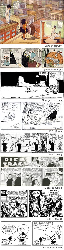 In a joint exhibition at the Newark Museum in Newark, New Jersey and the Jewish Museum in New York City, Masters of American Comics will present almost 600 works by some of the greats of the comics art form.
The images shown here are not necessarily in the exhibit, I’ve just pulled them out as examples.
The Newark Museum will play host to artists who worked in the medium of newspaper comics from the “golden age” of the early 20th Century to to the middle of the century:
Winsor McCay, creator of the astonishing Nittle Nemo in Slumberland,
Lyonel Feininger, a painter who “dabbled” in comics for a year in 1906-07, bringing his modernist sensibilities to comic art in the pages of the Chicago Tribune,
George Herriman, whose innovative, adventurous and startlingly original work of genius, Krazy Kat, was never wildly popular but was tremendously influential on other artists (in comics and other areas) and is dearly loved by those who are devoted to it (myself included),
E.C. Segar, creator of Thimble Theatre, whose chief character became Popeye, and was a much more powerful and sophisticated strip than the TV cartoons would ever let you believe,
Frank King, creator of Gasoline Alley, an innovative and involving strip with characters that grew, changed, grew old and died over the course of the years in defiance of all “continuing story” conventions,
Chester Gould, creator of of Dick Tracy, iron-jawed, tough as nails detective with the roster of demented villains and science fictiony gadgets that would lay the groundwork for Bob Kane’s Batman,
Milton Caniff, master of pen and ink chiaroscuro and creator of the great adventure strips Terry and the Pirates and Steve Canyon
and Charles M. Schultz, whose Peanuts was one of the most popular and beloved comics ever.
The Jewish Museum will showcase comics from the middle of the century to the present, with an emphasis on comic book artists:
 Will Eisner, creator of The Spirit and one of the medium’s most brilliant and influential creators and a sort of guiding beacon for those who try to create superbly crafted comics even to this day,
Jack Kirby, who essentially invented most of visual language and conventions of modern super-hero comics, co-created The Fantastic Four, The Hulk and many of the popular characters that Stan Lee takes too much credit for and was more imaginative than any roomful of current superhero artists put together,
Harvey Kurtzman, the brilliant, irreverent comic genius behind the original Mad comics, working with the great Wally Wood, Jack Davis and Will Elder, who he also collaborated with on the underrated Little Annie Fanny in Playboy,
Robert Crumb, who Zapped us all with the instigation of underground comix in the 60’s, the influence of which still ripples through every maverick, underground, self-published and independent comic as well as resonating in the spirit of the more adventurous web comics,
Gary Panter, creator of punk sensibility comics for Raw and Slash,
and Chris Ware, who combines comics, design and fanatical attention to detail in books that are crafted as works beyond the mere printed material on the pages.
Together, this is a tour-de-force of comic art, a history of the development of the art form and an eye-opening adventure into what comics are, have been and can be. It should just be an absolute blast to spend a day energizing your eyeballs with all of this great comic art.
The exhibit was created and originally presented in a joint exhibition by the Hammer Museum in Los Angeles and The Museum of Contemporary Art, Los Angeles. West coast readers hopefully saw the listings I had in the “Exhibitions” section of the lines and colors sidebar for several months earlier this year.
It’s our turn now on the east coast. The joint exhibition in New York and New Jersey runs from September 15, 2006 to January 28, 2007. The Jewish Museum is concurrently running another exhibit, Superheroes: Good and Evil in American Comics.
There is an excellent article on Art Knowledge News from which I borrowed he listing order of the artist names and gleaned some of the exhibit information.
Running down this list makes me feel like a slacker because of my unfinished posts on Herriman, Segar, Caniff, Eisner, Kirby, and Crumb, but I’ll get them finished and posted eventually.
Categories:
-
Carl Critchlow
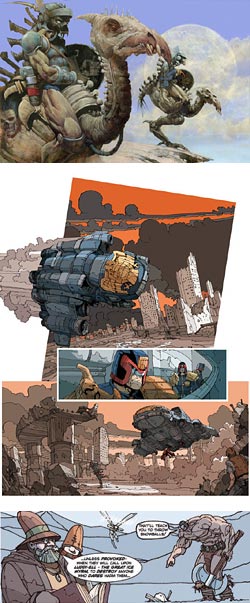 I’m always fascinated to watch to watch artists develop, particularly if their style changes or evolves over time.
Carl Critchlow is UK comics artist and illustrator who has a painting style that has that kind of grungy, textured look preferred by many who like science fiction and fantasy art that leans toward the grotesque and violent, as exemplified in comics by artists like Simon Bisley.
Critchlow’s nicely horrific painting style is well suited to his illustrations of dragons and monsters for Magic The Gathering cards and a number of appropriately grotesque comic book covers he’s done for companies in the UK and the US.
Given that, you would think that a similar highly-rendered style full of textural details would be a predictable choice for his UK comic book interior art for titles like Nemsis and Judge Dredd, In the 2000 AD tradition of gritty, gruesome and gratuitously violent comic art.
Instead, Critchlow’s approach has evolved in his recent comic book work to an almost linge claire style, more like the French bandes desinnées artists that the typical 2000AD crosshatch-fest.
This approach, along with nicely graphic color, works very well, both for his science fiction approach to Judge Dredd (images at left, middle) and his own wonderfully over-the-top Thrud the Barbarian (left, bottom). Interesting also, is the use of limited line weights in his comic drawings, which adds to the open, graphic feel of the work, and the addition of bits of texture, more as accents than an overwhelming character of the art.
The galleries on Cricthlow’s site show several aspects of his work, including sketches and other stuff, but it’s the recent comic art and Thrud the Barbarian pages that I find most appealing.
Categories:
-
Bill Mather (update)
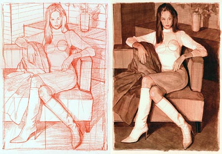
Bill Mather loves to draw and paint women. If that wasn’t obvious enough from the galleries on his site, he’s named his blog Painter of Women.I wrote about Mather in September of last year. Since then he has added to his online galleries and started a blog. The blog isn’t frequently updated, so you’ll find more artwork on the main site.
Mather’s site has several online galleries, largely consisting of lively portrait drawings, paintings and painted studies of women in various media: chalk, conté crayon, vine charcoal, pencil, acrylic, gouache and oil. Many of the thumbnail images have additional links below them to detail images in which you can see the surface of the drawing or painting in enough detail to see how the media were applied.
The work he features most prominently, and is more recent, is actually not the work I find most appealing. In the newer work he surrounds his figures and faces with swirls and splashes of texture and wild scrawls of colored line. While it makes for interesting compositions, I find I prefer his work when he approaches his subjects more directly, with just a bit of the graphic enthusiasm popping in around the edges. These images have a great balance of solid draftsmanship, confident application of materials and fun graphic experimentation.
The nice variety of his approach and the freedom of his linework make all of the galleries worth investigating. There are also drawing class figure studies and, if you look hard enough, a section of landscapes.
Oddly enough, what you won’t find on the main site, or on the blog, is a mention of the fact that Mather is a high-end concept artist by profession and has done matte painting and design work for films like War of the Worlds, the Star Wars Trilogy, Forest Gump, Jumanji and The Polar Express. He received an Academy Award nomination in 1993 for his work on Batman Returns.
As a concept artist, Mather is affiliated with Doug Chiang’s Ice Blink Studios, members of which have been the subject of several posts on lines and colors.
Mather also teaches figure drawing at the Academy of Art College in San Francisco.
Addendum: I neglected to mention that Mather has published two collections of his drawings and paintngs, DRAWN TO BEAUTY: Collected Sketches by Bill Mather Vol 1 and DRAWN TO BEAUTY: Collected Sketches by Bill Mather Vol 2. The links are to the excellent Bud Plant online store.
Categories:
-
Rhonda Nass

I came across Rhonda Nass on a site dedicated to botanical illustration and was struck by the textural qualities and dimensionality of her plant paintings.There isn’t any information about technique on her site, but I assume from the look of her paintings that she works from photographs in the studio, even utilizing the out of focus background effect often found in photographs to control your eye in the composition of her paintings.
She uses detail and texture to bring her subjects into high relief, giving them a tactile quality, and also emphasizes the play of light across their surfaces.
Her site includes examples of her commercial work, stock images and available originals. In addition to her botanical illustrations there are paintings of birds and objects like gloves and jackets.
Nass is married to illustrator Rick Nass, and the web site divided on the home page between her work with his highly rendered cartoon style images.
Categories:
-
Dave’s [comic book artist] Art Nouveau Collection
 This is a collection of Art Nouveau style images by modern comic book artists.
It’s part of a larger collection called Dave’s Gallery of Comic Art, which, in turn, is part of the Digital Medusa site.
Digital Medusa contains other comic art collections, including a unique collection of Artistic Interpretations of Literary Figures by comic book artists that I wrote this post about back in October of last year.
Dave’s Art Nouveau Collection contains drawings and sketches by people like Paul Chadwick, Brom, Tony DiTerlizzi, Rick Geary, JG Jones, Rudy Nebres, George Perez, Steve Rude, Michael Whelan, Mike Kaluta and Aaron Lopresti (image at left), among others.
Some of them are convention sketches, some are more finished pieces and the quality varies. Also the term “art nouveau’ is pretty vaguely interpreted (basically meaning, “I have a book on Mucha“), but the results are a lot of fun.
The site contains some teasing “cheesecake” style nudity. You can avoid it if you’re likely to be offended.
Categories:


Charley’s Picks
Bookshop.org
(Bookshop.org affilliate links; sales benefit independent bookshop owners; I get a small percentage to help support my work on Lines and Colors)

John Singer Sargent: Watercolors


Urban Sketching: Understanding Perspective


Charley’s Picks
Amazon
(Amazon.com affiliate links; sales go to a larger yacht for Jeff Bezos; but I get a small percentage to help support my work on Lines and Colors)
John Singer Sargent: Watercolors
Urban Sketching: Understanding Perspective