
Categories
- 3d CGI
- Amusements
- Animation
- Anime & Manga
- Art Materials
- Art Videos
- Blogroll
- Cartoons
- Color
- Comics
- Concept & Visual Dev.
- Creativity
- Digital Art
- Digital Painting
- Displaying Art on the Web
- Drawing
- Eye Candy for Today
- Gallery and Museum Art
- High-res Art Images
- Illustration
- Motion Graphics & Flash
- Museums
- Online Museums
- Outsider Art
- Painting
- Painting a Day
- Paleo Art
- Pastel, Conté & Chalk
- Pen & Ink
- Prints and Printmaking
- Reviews
- Sc-fi and Fantasy
- Sculpture & Dimensional
- Site Comments
- Sketching
- Storyboards
- Tools and Techniques
- Uncategorized
- Vector Art
- Videos & Podcasts
- Vision and Optics
- Watercolor and Gouache
- Webcomics
Archives
- June 2026
- May 2026
- April 2026
- March 2026
- February 2026
- January 2026
- December 2025
- November 2025
- October 2025
- September 2025
- August 2025
- July 2025
- June 2025
- May 2025
- January 2025
- December 2024
- November 2024
- October 2024
- September 2024
- August 2024
- June 2024
- April 2024
- March 2024
- February 2024
- January 2024
- December 2023
- November 2023
- October 2023
- September 2023
- August 2023
- July 2023
- May 2023
- April 2023
- March 2023
- February 2023
- January 2023
- December 2022
- November 2022
- September 2022
- August 2022
- July 2022
- June 2022
- May 2022
- April 2022
- March 2022
- February 2022
- January 2022
- December 2021
- November 2021
- October 2021
- September 2021
- August 2021
- July 2021
- June 2021
- May 2021
- April 2021
- March 2021
- February 2021
- January 2021
- December 2020
- November 2020
- October 2020
- September 2020
- August 2020
- July 2020
- June 2020
- May 2020
- April 2020
- March 2020
- February 2020
- January 2020
- December 2019
- November 2019
- October 2019
- September 2019
- August 2019
- July 2019
- June 2019
- May 2019
- April 2019
- March 2019
- February 2019
- January 2019
- December 2018
- November 2018
- October 2018
- September 2018
- August 2018
- July 2018
- June 2018
- May 2018
- April 2018
- March 2018
- February 2018
- January 2018
- December 2017
- November 2017
- October 2017
- September 2017
- August 2017
- July 2017
- June 2017
- May 2017
- April 2017
- March 2017
- February 2017
- January 2017
- December 2016
- November 2016
- October 2016
- September 2016
- August 2016
- July 2016
- June 2016
- May 2016
- April 2016
- March 2016
- February 2016
- January 2016
- December 2015
- November 2015
- October 2015
- September 2015
- August 2015
- July 2015
- June 2015
- May 2015
- April 2015
- March 2015
- February 2015
- January 2015
- December 2014
- November 2014
- October 2014
- September 2014
- August 2014
- July 2014
- June 2014
- May 2014
- April 2014
- March 2014
- February 2014
- January 2014
- December 2013
- November 2013
- October 2013
- September 2013
- August 2013
- July 2013
- June 2013
- May 2013
- April 2013
- March 2013
- February 2013
- January 2013
- December 2012
- November 2012
- October 2012
- September 2012
- August 2012
- July 2012
- June 2012
- May 2012
- April 2012
- March 2012
- February 2012
- January 2012
- December 2011
- November 2011
- October 2011
- September 2011
- August 2011
- July 2011
- June 2011
- May 2011
- April 2011
- March 2011
- February 2011
- January 2011
- December 2010
- November 2010
- October 2010
- September 2010
- August 2010
- July 2010
- June 2010
- May 2010
- April 2010
- March 2010
- February 2010
- January 2010
- December 2009
- November 2009
- October 2009
- September 2009
- August 2009
- July 2009
- June 2009
- May 2009
- April 2009
- March 2009
- February 2009
- January 2009
- December 2008
- November 2008
- October 2008
- September 2008
- August 2008
- July 2008
- June 2008
- May 2008
- April 2008
- March 2008
- February 2008
- January 2008
- December 2007
- November 2007
- October 2007
- September 2007
- August 2007
- July 2007
- June 2007
- May 2007
- April 2007
- March 2007
- February 2007
- January 2007
- December 2006
- November 2006
- October 2006
- September 2006
- August 2006
- July 2006
- June 2006
- May 2006
- April 2006
- March 2006
- February 2006
- January 2006
- December 2005
- November 2005
- October 2005
- September 2005
- August 2005
Relevant Blogs
Art, Painting & Sketch
- Gurney Journey
- Underpaintings
- Art and Influence
- Painting Perceptions
- Oil Painters of America
- Vasari Paint POV
- Flying Fox
- Urban Sketchers
- Bento (Smithsonian)
- Art Inconnu
- The Hidden Place
- Still Life
- Making a Mark
- The Art of the Landscape
- Exploring Color & Creativity
- Art Contrarian
- Artist A Day
- beinArt Surreal Art Collective
- Eye Level
- David Dunlop
- p.i.g.m.e.n.t.i.u.m
- CultureGrrl
- Joaquín Sorolla blog
- Artists in Pastel
“Painting a Day”
- A Painting a Day (Keiser)
- On Painting (Keiser)
- Julian Merrow-Smith
- Karen Jurick
- Jeffrey Hayes
- Carol Marine
- Abbey Ryan
- Daily Paintworks
Other Painting Blogs
- Virtual Gouache Land
- Neil Hollingsworth
- Marc Hanson
- Kevin Menck
- Marc Dalessio
- Larry Seiler
- Stapleton Kearns
- Colin Page
- Roos Schuring
- Hans Versfelt
- Titus Meeuws
- Régis Pettinari
- René Plein Air
- Belinda Del Pesco
- Robin Weiss
- Nathan Fowkes (Land Sketch)
- William Wray
- Frank Serrano
- Stephen Magsig
- Michael Chesley Johnson
- Twice a Week
- Sarah Wimperis
- Rob Adams
- Michael Cole Manley
- The Dirty Palette Club
- Mike Manley’s Draw!
Gallery Art & Illustration mix
Illustration
- Howard Pyle
- 100 Years of Illustration
- BibliOdyssey
- Illustration Art
- Today’s Inspiration
- Illustration Mundo
- Little Chimp Society
- Danny Gregory
- R D (John Martz
- Illustration Friday blog
- Monster Brains
- Illustrators & Illustrations (RU)
- Elwood H. Smith
- DaniDraws.com
- Designers Who Blog
- iSpot Blog
Sci-Fi & Fantasy
Illustration & Comics
Comics & Cartoons
- Comics Beat
- Robot 6
- Newsarama Blog
- Comic Vine
- Comics Alliance
- Forbidden Planet Int.
- Paolo Rivera
- Bolt City
- Flight
- Scott McCloud
- The Comics Journal
- Comixpedia
- Funnybook Babylon
- James Baker
- Middleton’s Sketchbook
- Boneville
- The Hotel Fred
- Paul Rivoche
- Daily Cartoonist
- Mad About Cartoons (William Wray)
- Digital Strips
Illustration & Concept
Animation & Concept
- Cartoon Brew
- Animation Blog
- Cold Hard Flash
- Concept Art World
- The CAB
- FY Concept Art
- Concept Ships
- Concept Robots
- John Nevarez
- Armand Serrano
- Marcos Mateu-Mestre
- all kinds of stuff (Kricfalusi)
- Yacin the faun (Man Arenas)
- Kelsey Mann
- Cre8tivemarks Blog
- Ice-Cream Monster Toon Cafe
- AAU Character & Creature Design
- AAU Animation Notes
- Articles and Texticles
Paleo & Scientific
Tools & Techniques
Other
Lists of Art Blogs
Art Image Resource Links
Historic Art Images
- Wikimedia Commons: Paintings
- Wikimedia Commons: Drawings
- The Athenaeum
- WikiArt (WikiPaintings)
- Google Art Project: Artists
- Google Art Project: Collections (Museums)
- ArtCyclopedia
- Web Gallery of Art
- Art Renewal Center
- Web Gallery of Impressionism
Auction Consolidation sites
Auction sites
- Sotheby’s
- Bonham’s
- Christies
- Heritage Auctions: Fine Art
- Heritage Auctions: Illustration
- Freeman’s Auctions
- Bukowskis
- Shannon’s
Image Search
Reverse Image Search (search by image)
- Tin Eye
- RevImg
- Google Image Search (camera icon)
- Bing Image Search (camera icon)
Promoting some friends and some clients of my website design business
- Twin Willows T’ai Chi studio in Wilmington DE. Taiji classes with Bryan Davis.
- Ray Hayward, Inspired Teacher of T’ai Chi ( Taiji ) in Minneapolis, Founder of Mindful Motion Tai Chi Academy
- OldHead Tattoo studio and Art Gallery in Wilmington DE. Tattoos and paintings by Bruce Gulick
- Sharon Domenico Art, pet portrait oil paintings
- Platinum Paperhanging, wallpaper hanging, Main Line and Philadelphia, PA
- Lisa Stone Design, interior designer, Main Line and Philadelphia, PA
- Studio12KPT, original art, prints, calendars and other custom printed items by Van Sickle & Rolleri
-
Fred Wessel
 After taking a trip to Italy to view the art of the Renaissance, Fred Wessel was inspired to explore not only Renaissance painting techniques but the idea, common in that time but almost unknown now, of the painting as a precious object.
His sharply incised portraits, nudes, flower studies and still lifes are often set against patterned backgrounds, at times prepared with gold leaf, combining realist painting with the decoration of surface and the use of precious materials. They are also often displayed in elaborate frames, again with gold leaf as was also a common practice in the Renaissance.
Wessel’s site contains a Technique section in which he steps through the process of creating an egg tempera portrait of his daughter in the traditional Renaissance painting methods outlined by Cennino d’Andrea Cennini’s Il Libro dell’ Arte, one of the respected painting manuals from the middle ages that is still used by artists today. Wessel goes through the process from the base drawing in ink to the terre verde grisaille to the application of warm skin tones layered thinly over the greens to produce the final portrait.
Wessel also conducts workshop tours of Italy, along with watercolorist Jeremiah Patterson, in which he teaches such traditional Renaissance techniques as egg tempera painting, gold leaf guilding, and silverpoint drawing.
Wessel’s site also provides links to some resources including The Society of Egg Tempera Painters, where you will find more information about technique and history of the medium as well as a gallery of artists.
Link via Art Knowledge News.
Categories:
-
Elizabeth Shippen Green
 Sometimes who we encounter as a teacher can have a dramatic effect on our development as an artist, and even who we are as a person. Elizabeth Shippen Green encountered Howard Pyle.
Green began her study of art at the Pennsylvania Academy of the Fine Arts, drawing from plaster casts of classical sculpture for a year before moving on to life drawing. Among her teachers there were such notable artists and teachers as Thomas Anshutz, Robert Vonnoh and Thomas Eakins.
Even before graduating from the Academy she had begun working as an illustrator in Philadelphia, illustrating newspaper articles and then creating advertising illustrations for the large Strawbridge and Clothier department store.
After graduating she decided to continue her study and enrolled in Howard Pyle’s illustration classes at Drexel. (The Academy had actually declined Pyle’s offer to teach there, snobbishly refusing to have classes in illustration at the fine arts school.) Green had learned some of the technical side of illustration, which had to be prepared for reproduction by engravers, from her father, Jasper Green, who was a former Academy student and an artist/correspondent for Harper’s during the Civil War.
Under Pyle’s tutelage Elizabeth Shippen Green developed into a superb illustrator. It was also at Pyle’s classes that she met Jessie Wilcox Smith, and Violet Oakley. The three young women were to become lifelong friends and would spend much of their lives sharing studios at Cogslea and The Red Rose Inn, both outside of Philadelphia. All three would achieve a striking degree of success in the overwhelming male profession of illustration. (Pyle was notable for the serious training of women illustrators at a time when women were thought of as likely to drop their interest in such things when they found a husband and thus their “proper place” in life.)
Green worked in charcoal, a medium favored for drawing at the Academy (even to this day), and in pen and ink, creating drawings strongly influenced by her mentor. With the advent of color printing, Green, along with Smith, developed a multimedia approach to illustration. The initial illustration would be a charcoal drawing to which fixative would be applied, allowing for the addition of color with watercolor or thin glazes of oil. Additional layers of charcoal, fixative and color could be added. The result is a beautiful marriage of painting and drawing that carries much of the appeal of both. There is a good description of her working methods here.
Green was also in advance of her contemporary illustrators by being one of the first to utilize the new medium of photography, to which she was introduced at the Academy, to create reference images for her illustrations, something that is now a common practice.
Green eventually married Huger Elliot, a professor of architecture, (signing her later works Elizabeth Shippen Green Elliot) and left the studios she had shared with Smith and Oakley and moved to New England, New York and eventually back to Philadelphia. All the while she continued to produce notable work and left a rich legacy of beautiful images.
I’ll point you to some resources, in particular Paul Giambarba’s wonderful “Elizabeth Shippen Green; An Appreciation” on his consistently excellent blog, 100 Years of Illustration and Design. (See my previous posts about 100 Years of Illustration and Design and Howard Pyle.)
There is also a very good online resource about Green and her work from an exhibition mounted by the Library of Congress in 2001, A Petal From The Rose: Illustrations by Elizabeth Shippen Green.
I will highly recommend a book on the three artists, Green, Smith and Oakley, by Alice A. Carter: The Red Rose Girls : An Uncommon Story of Art and Love. It is a fascinating personal story, an informative look at a key period in American illustration and is, of course, beautifully illustrated.
Categories:
-
Dust Art
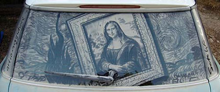
Just for a little amusement on a Friday morning, and to point out that anything that allows you to make a mark can be a medium for visual expression, here’s an article from the Austin American-Statesman about Scott Wade, who draws reasonably complex images in the road dust that accumulates on the back of his Mini Cooper.Wade uses his fingers, as you might expect, but also paintbrushes, to lightly smear or lift off the dust, and popsicle sticks, I assume for a “palette knife” effect.
Talk about temporary art.
Categories:
-
Flight 3
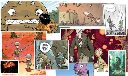
Yesterday was Wednesday, the day when most comic shops get their new comics for the week. I stopped into Between Books, the unique little bookstore/comics shop in Delaware where I buy my comics, and was delighted to find a shiny new copy of Flight 3 waiting for me.Flight 3 is the third and much-anticipated installment in the Flight series of comics anthologies. The Flight books are about the potential – more than that, the realized potential – of alternative comics, of the revitalization of the anthology as a viable comics format, of the transition of comics artists from the web to print and of the artistic voices of a new generation of comics creators.
If you find superhero comics unappealing (or just a bit tiresome), or if you are just curious about what else the comics art form has to offer, here’s a great place to start: 26 independent comics artists gathered in one volume with fresh, vital and individualistic visions of what comics can do and say.
Among the creators in Flight 3 are a number of artists that I’ve profiled in previous posts here on lines and colors, including Rad Sechrist, Kean Soo, Michel Gagné (also here) and Kazu Kibuishi (also here), who is the driving force behind the Flight anthologies.
For more information see the the Flight blog, and Kibuishi’s Bolt City. Also see my previous post on the preview for Flight 3.
The Flight blog features a terrific Flight 3 Preview section with lots of sample artwork. (There is even a Flight 4 mini-preview on Newsarama.)
Here is an Amazon link for Flight 3, as well as the previous volumes, Flight 1 and Flight 2.
Even if you think you don’t like alternative comics, or especially if you think you don’t like comics at all (I’m talking to the fine art contingent here), try to find a copy in a comics shop or bookstore and just leaf through it. You may be surprised at how you take to Flight.
Categories:
-
Brad Aldridge

Utah artist Brad Aldridge paints landscapes that seem at once generalized and specific. They may or may not refer to actual places. He eschews grandiose, dramatic landscapes and opts for intimate, quiet scenes, often of small streams, which I particularly enjoy.Aldridge works in oil on prepared panels and prefers a muted palette with understated colors, subtle tones and an emphasis on the visual texture of his scenes. There is very often a subtle focal point of an individual shrub or tree. If you study several of his paintings, you’ll realize that his has deftly controlled the path your eye takes around his compositions.
The frames for Aldridge’s paintings are unique and seem specific to the individual paintings, as if they were considered part of the finished work and not simply a showcase for it. Alridge creates most (or all) of these frames himself.
In many cases he has created paintings on panels cut to unique shapes, often incorporating rounded or gothic arches at the top of the panel, that have corresponding frames, cut to emphasize the unusual shape of the panels.
I haven’t found a dedicated site for Aldridge, but he is represented by a few galleries who feature his work in their sites. The Joyce Robins Gallery has a good section of Aldridge’s work, as well as a nice essay on the artist by the gallery’s owner.
Bennett Galleries has a smaller selection. Leslie Levy Fine Art has 7.
Despite an awkward and inconveniently “clever” horizontally scrolling interface (in which you must hover your mouse over a link and wait for the Flash script to scroll the images at its pace, not yours), the Arcadia Gallery site still has the best selection of Aldridge’s work I have been able to find, as well as the largest images.
[Addendum, December 2010: The links provided seem to have gone bad in the past four years. Here are current links to Brad Aldridge on Susan Calloway Fine Art, Gallery 71, and McLarry Fine Art.]
Categories:
-
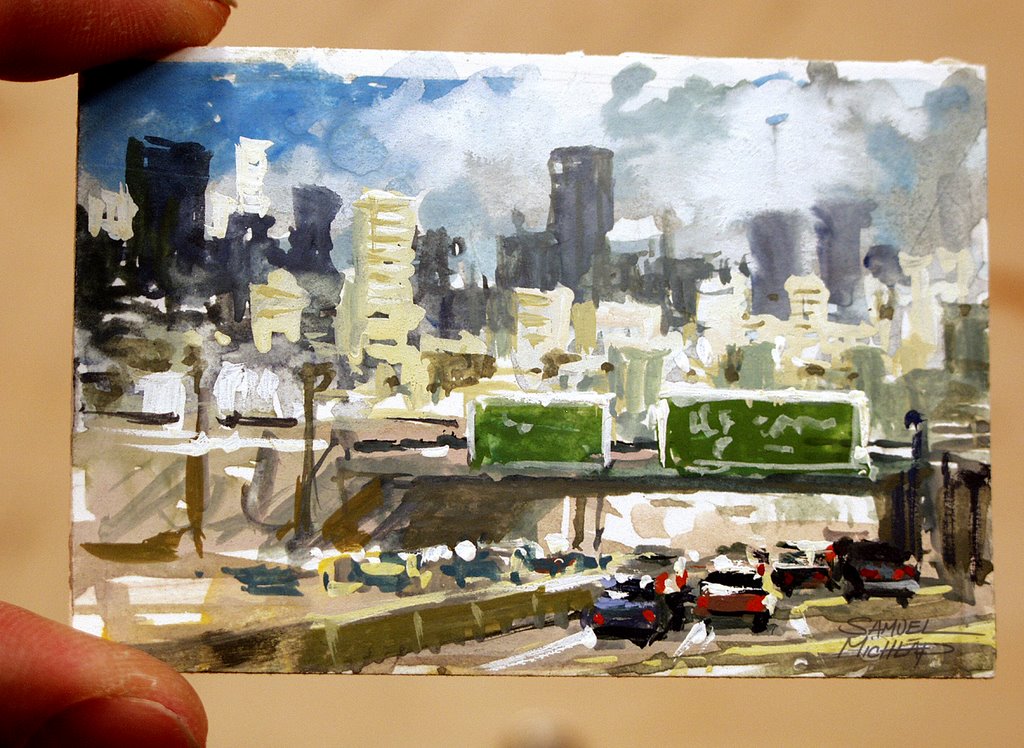
Samuel Michlap

One of the really great trends I’ve noticed in the past year is an increase in the number of animators, production designers, storyboard artists and character designers who are keeping blogs, posting their work and often discussing their creative process.Samuel Michlap has been a layout artist, art director and production designer, working for companies like Disney and Dreamworks. He has worked on films like The Lion King, Sinbad, Shark Tale, Eldorado and The Hunchback of Notre Dame.
He works in acrylic, gouache, and, when time allows, in oil, as well as working digitally in Photoshop. Some of his comps are done in Prismacolor pencil on a heavy toothed board.
He has just recently started a blog, featuring some of his professional work as well as sketches and quick studies, including work done in front of the TV or while riding in the car.
His blog is not currently linked to his web site, which appears to be under construction but still has some of his figurative and gallery work. You can also find some of his gallery paintings, with a nice emphasis on trains from the mid 20th Century, in the Howard Manville Gallery site.
Through the variety of his work, you will find a broad variation in approach in terms of texture, brush handling, composition and overall palette. You will find consistency, however, in his deft handling of color and value. He controls mood, light, the focus of attention with careful color relationships that are sometimes subtle, sometimes bold, but always effective.
I particularly enjoy his evocation of 19th Century Paris (image above), done after visiting Paris while working on Disney’s Hunchback of Notre Dame.
(I just have to take an aside here and say I would have loved to have been at the meeting where somebody pitched the idea for that movie. “It’s the Hunchback of Notre Dame, see, except without so much… well, tragedy.. instead, it’ll be a musical! Right! …with singing gargoyles…” Hello?!)
Anyway, Michlap’s blog is still new, he just started in April, and there isn’t a great deal posted yet, so you may want to bookmark it and stop back to watch for more. I know I will.
Link via John Nevarez.
Categories:


Charley’s Picks
Bookshop.org
(Bookshop.org affilliate links; sales benefit independent bookshop owners; I get a small percentage to help support my work on Lines and Colors)

John Singer Sargent: Watercolors


Urban Sketching: Understanding Perspective


Charley’s Picks
Amazon
(Amazon.com affiliate links; sales go to a larger yacht for Jeff Bezos; but I get a small percentage to help support my work on Lines and Colors)
John Singer Sargent: Watercolors
Urban Sketching: Understanding Perspective