
Categories
- 3d CGI
- Amusements
- Animation
- Anime & Manga
- Art Materials
- Art Videos
- Blogroll
- Cartoons
- Color
- Comics
- Concept & Visual Dev.
- Creativity
- Digital Art
- Digital Painting
- Displaying Art on the Web
- Drawing
- Eye Candy for Today
- Gallery and Museum Art
- High-res Art Images
- Illustration
- Motion Graphics & Flash
- Museums
- Online Museums
- Outsider Art
- Painting
- Painting a Day
- Paleo Art
- Pastel, Conté & Chalk
- Pen & Ink
- Prints and Printmaking
- Reviews
- Sc-fi and Fantasy
- Sculpture & Dimensional
- Site Comments
- Sketching
- Storyboards
- Tools and Techniques
- Uncategorized
- Vector Art
- Videos & Podcasts
- Vision and Optics
- Watercolor and Gouache
- Webcomics
Archives
- June 2026
- May 2026
- April 2026
- March 2026
- February 2026
- January 2026
- December 2025
- November 2025
- October 2025
- September 2025
- August 2025
- July 2025
- June 2025
- May 2025
- January 2025
- December 2024
- November 2024
- October 2024
- September 2024
- August 2024
- June 2024
- April 2024
- March 2024
- February 2024
- January 2024
- December 2023
- November 2023
- October 2023
- September 2023
- August 2023
- July 2023
- May 2023
- April 2023
- March 2023
- February 2023
- January 2023
- December 2022
- November 2022
- September 2022
- August 2022
- July 2022
- June 2022
- May 2022
- April 2022
- March 2022
- February 2022
- January 2022
- December 2021
- November 2021
- October 2021
- September 2021
- August 2021
- July 2021
- June 2021
- May 2021
- April 2021
- March 2021
- February 2021
- January 2021
- December 2020
- November 2020
- October 2020
- September 2020
- August 2020
- July 2020
- June 2020
- May 2020
- April 2020
- March 2020
- February 2020
- January 2020
- December 2019
- November 2019
- October 2019
- September 2019
- August 2019
- July 2019
- June 2019
- May 2019
- April 2019
- March 2019
- February 2019
- January 2019
- December 2018
- November 2018
- October 2018
- September 2018
- August 2018
- July 2018
- June 2018
- May 2018
- April 2018
- March 2018
- February 2018
- January 2018
- December 2017
- November 2017
- October 2017
- September 2017
- August 2017
- July 2017
- June 2017
- May 2017
- April 2017
- March 2017
- February 2017
- January 2017
- December 2016
- November 2016
- October 2016
- September 2016
- August 2016
- July 2016
- June 2016
- May 2016
- April 2016
- March 2016
- February 2016
- January 2016
- December 2015
- November 2015
- October 2015
- September 2015
- August 2015
- July 2015
- June 2015
- May 2015
- April 2015
- March 2015
- February 2015
- January 2015
- December 2014
- November 2014
- October 2014
- September 2014
- August 2014
- July 2014
- June 2014
- May 2014
- April 2014
- March 2014
- February 2014
- January 2014
- December 2013
- November 2013
- October 2013
- September 2013
- August 2013
- July 2013
- June 2013
- May 2013
- April 2013
- March 2013
- February 2013
- January 2013
- December 2012
- November 2012
- October 2012
- September 2012
- August 2012
- July 2012
- June 2012
- May 2012
- April 2012
- March 2012
- February 2012
- January 2012
- December 2011
- November 2011
- October 2011
- September 2011
- August 2011
- July 2011
- June 2011
- May 2011
- April 2011
- March 2011
- February 2011
- January 2011
- December 2010
- November 2010
- October 2010
- September 2010
- August 2010
- July 2010
- June 2010
- May 2010
- April 2010
- March 2010
- February 2010
- January 2010
- December 2009
- November 2009
- October 2009
- September 2009
- August 2009
- July 2009
- June 2009
- May 2009
- April 2009
- March 2009
- February 2009
- January 2009
- December 2008
- November 2008
- October 2008
- September 2008
- August 2008
- July 2008
- June 2008
- May 2008
- April 2008
- March 2008
- February 2008
- January 2008
- December 2007
- November 2007
- October 2007
- September 2007
- August 2007
- July 2007
- June 2007
- May 2007
- April 2007
- March 2007
- February 2007
- January 2007
- December 2006
- November 2006
- October 2006
- September 2006
- August 2006
- July 2006
- June 2006
- May 2006
- April 2006
- March 2006
- February 2006
- January 2006
- December 2005
- November 2005
- October 2005
- September 2005
- August 2005
Relevant Blogs
Art, Painting & Sketch
- Gurney Journey
- Underpaintings
- Art and Influence
- Painting Perceptions
- Oil Painters of America
- Vasari Paint POV
- Flying Fox
- Urban Sketchers
- Bento (Smithsonian)
- Art Inconnu
- The Hidden Place
- Still Life
- Making a Mark
- The Art of the Landscape
- Exploring Color & Creativity
- Art Contrarian
- Artist A Day
- beinArt Surreal Art Collective
- Eye Level
- David Dunlop
- p.i.g.m.e.n.t.i.u.m
- CultureGrrl
- Joaquín Sorolla blog
- Artists in Pastel
“Painting a Day”
- A Painting a Day (Keiser)
- On Painting (Keiser)
- Julian Merrow-Smith
- Karen Jurick
- Jeffrey Hayes
- Carol Marine
- Abbey Ryan
- Daily Paintworks
Other Painting Blogs
- Virtual Gouache Land
- Neil Hollingsworth
- Marc Hanson
- Kevin Menck
- Marc Dalessio
- Larry Seiler
- Stapleton Kearns
- Colin Page
- Roos Schuring
- Hans Versfelt
- Titus Meeuws
- Régis Pettinari
- René Plein Air
- Belinda Del Pesco
- Robin Weiss
- Nathan Fowkes (Land Sketch)
- William Wray
- Frank Serrano
- Stephen Magsig
- Michael Chesley Johnson
- Twice a Week
- Sarah Wimperis
- Rob Adams
- Michael Cole Manley
- The Dirty Palette Club
- Mike Manley’s Draw!
Gallery Art & Illustration mix
Illustration
- Howard Pyle
- 100 Years of Illustration
- BibliOdyssey
- Illustration Art
- Today’s Inspiration
- Illustration Mundo
- Little Chimp Society
- Danny Gregory
- R D (John Martz
- Illustration Friday blog
- Monster Brains
- Illustrators & Illustrations (RU)
- Elwood H. Smith
- DaniDraws.com
- Designers Who Blog
- iSpot Blog
Sci-Fi & Fantasy
Illustration & Comics
Comics & Cartoons
- Comics Beat
- Robot 6
- Newsarama Blog
- Comic Vine
- Comics Alliance
- Forbidden Planet Int.
- Paolo Rivera
- Bolt City
- Flight
- Scott McCloud
- The Comics Journal
- Comixpedia
- Funnybook Babylon
- James Baker
- Middleton’s Sketchbook
- Boneville
- The Hotel Fred
- Paul Rivoche
- Daily Cartoonist
- Mad About Cartoons (William Wray)
- Digital Strips
Illustration & Concept
Animation & Concept
- Cartoon Brew
- Animation Blog
- Cold Hard Flash
- Concept Art World
- The CAB
- FY Concept Art
- Concept Ships
- Concept Robots
- John Nevarez
- Armand Serrano
- Marcos Mateu-Mestre
- all kinds of stuff (Kricfalusi)
- Yacin the faun (Man Arenas)
- Kelsey Mann
- Cre8tivemarks Blog
- Ice-Cream Monster Toon Cafe
- AAU Character & Creature Design
- AAU Animation Notes
- Articles and Texticles
Paleo & Scientific
Tools & Techniques
Other
Lists of Art Blogs
Art Image Resource Links
Historic Art Images
- Wikimedia Commons: Paintings
- Wikimedia Commons: Drawings
- The Athenaeum
- WikiArt (WikiPaintings)
- Google Art Project: Artists
- Google Art Project: Collections (Museums)
- ArtCyclopedia
- Web Gallery of Art
- Art Renewal Center
- Web Gallery of Impressionism
Auction Consolidation sites
Auction sites
- Sotheby’s
- Bonham’s
- Christies
- Heritage Auctions: Fine Art
- Heritage Auctions: Illustration
- Freeman’s Auctions
- Bukowskis
- Shannon’s
Image Search
Reverse Image Search (search by image)
- Tin Eye
- RevImg
- Google Image Search (camera icon)
- Bing Image Search (camera icon)
Promoting some friends and some clients of my website design business
- Twin Willows T’ai Chi studio in Wilmington DE. Taiji classes with Bryan Davis.
- Ray Hayward, Inspired Teacher of T’ai Chi ( Taiji ) in Minneapolis, Founder of Mindful Motion Tai Chi Academy
- OldHead Tattoo studio and Art Gallery in Wilmington DE. Tattoos and paintings by Bruce Gulick
- Sharon Domenico Art, pet portrait oil paintings
- Platinum Paperhanging, wallpaper hanging, Main Line and Philadelphia, PA
- Lisa Stone Design, interior designer, Main Line and Philadelphia, PA
- Studio12KPT, original art, prints, calendars and other custom printed items by Van Sickle & Rolleri
-
Thomas Eakins

As a student at the Pennsylvania Academy of the Fine Arts I always felt that the great American painter and teacher Thomas Eakins (pronounced A-kins, with a long a) was a presence there, if a somewhat ghostly one.By that I don’t mean that he walked the halls, palette in hand, offering critiques of student cast drawing from beyond the veil; just that his association with the school was as oddly strained in modern times as it was when he was studying, later teaching and eventually the director there in the late 19th Century.
On one hand the Academy of the 20th Century was proud to be associated with Eakins, who was unquestionably one of the greatest American painters; on the other hand there were the, um… controversies, with which the Academy seemed as uncomfortable in the 20th Century as it had been in the 19th, when Eakins was fired from his position for a history of insubordination to the board of directors and “improprieties”, of which the camel-back-breaking straw was the removal of a male model’s loincloth in a class of female art students.
The Academy’s web site, brushes over this whole era with a few words and little mention of controversy. Read enough biographies of Eakins and you will find mention of Eakins as a champion of the importance of the human form in art and an opponent of repressive attitudes toward teaching figure drawing, side by side with stories of rumored improprieties, rudeness, accusations of abuse and possible mental illness.
Leaving the social drama behind, you will find Eakins’ unswerving commitment to gritty realism, keen draughtsmanship, mastery of painting technique and the revelation of form through value and contrast. His mastery is evident in his portraits, including group portraits of physicians in operating theaters, artists, lawyers, and literary figures (like Walt Whitman, whose portrait by Eakins was said to be his favorite and is still in the collection of the Academy). Eakins was also a master of perspective, as often revealed in his paintings and studies of sculls on the Schuylkill River (image above, with perspective study, inset).
Although his work is highly regarded now, at the time he was something of an outcast from artistic circles. He was apparently very respected by his students, who asked him to carry on teaching after his dismissal from the Academy at drawing sessions arranged by the Philadelphia’s Art Students League.
The sessions were held at what is now the Philadelphia Sketch Club, the nation’s oldest continuing arts organization, which carries on the tradition of life drawing sessions to this day, and over the years has been a great resource for many artists and art students in Philadelphia, including this one.
Categories:
-
Sky-Doll in Heavy Metal
 For those familiar with Italian comics artist Alessandro Barbucci and writer/colorist Barbara Canepa there is a special treat in the current (Summer 2006) issue of Heavy Metal Magazine.
The issue is a special that collects all three of the French comics albums of Barbucci and Canepa’s Sky-Doll series and presents them together, conveniently translated into English.
If you’re not familiar with Sky-Doll, see my previous post on Barbucci and Canepa.
In addition to Sky-Doll, Barbucci and Canepa are also the artists/writers of the French Witch children’s comics series (from which the American TV series W.I.T.C.H. was adapted) and the delightful Monster Allergy stories (first three issues, I think).
If, like me, you’re a fan of Barbucci and Canepa’s charmingly stylized and wonderfully imaginative comic art, you would be perfectly happy to pay upward of 20 Euros for each of the three French Sky-Doll albums, plus who knows how much for importing and shipping, and be happy to have them in French. To have all three translated in one magazine for $6.95 is an amazing treat.
(You have to ignore the entirely unrelated cover. What were they thinking? With so much striking Barbucci art available, why… oh, it’s Heavy Metal Magazine… never mind.)
There is still a Sky-Doll album not reprinted here, Sky-Doll: Doll’s Factory (Amazon France link here), which is essentially a “making-of” book, with sketches and penciled pages.
Note: Sky-Doll, Heavy Metal Magazine and some of the sites linked here contain nudity and sexually suggestive images. Avoid them if you’re likely to be offended.
Addendum: Hai writes that Barberra and Canepa contributed content to the first six issues of Monster Allergy and supervised the rest. There is new monsterallergy.com web site devoted to the new animated series. I don’t know the degree of B & C’s involvement with development of the show.
Categories:
-
Matthew Woodson
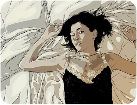
I really enjoy the work of young artists, whether still in art school, recently graduated or on their own independent course of learning. There is a particular appeal to that part of an artist’s development when their style and approach has not yet “hardened” into a set path.Illustrator and comics artist Matthew Woodson is a recent graduate of The School of the Art Institute of Chicago.
His sometimes stark, sometimes poetic images are spare, usually consisting of linework and a few tones of gray or muted color. He works in pen, brush and ink, occasionally with the addition of color in gouache and frequently with color added digitally in Photoshop.
His subjects are people, often portrayed with unflattering directness and occasionally in compositions that don’t include the head, studies of natural objects like plants and animal skulls, and landscapes.
His site features comics as well as illustration, including a story called “Tendergrass” that was published in the Flight 2 anthology.
I can’t give you direct links to his site sections because his web site is in frames (for no apparent resaon). His site (and business?) is called “ghostco”, the introductory page for which informs us that most of his work can’t be displayed because of contractual limitations, but promises more in the future. My thought is that his progress will be worth watching.
Link via The Art Blog, which included a “Bonus Link” to Woodson’s “How to Ink Like an Idiot” tutorial on deviantArt.
Categories:
-
Caspar David Friedrich

“Caspar David Friedrich…”, wrote sculptor Pierre-Jean David d’Angers, “created a new genre: the tragedy of landscape.”Friedrich attempted to create Christian religious art without the traditional biblical scenes, instead using allegorical landscape to convey religious themes. In spite of its message of Christian redemption, his work is steeped in loneliness, isolation and desolation, perhaps because of tragedy in childhood. He witnessed his brother drowning in the Baltic after falling through thin ice while attempting to rescue him from the same fate, his mother died when he was 7 and two of his sisters died by the time he was 18.
His fascination with ruins of churches, graveyards, shipwrecks, isolated individuals among hauntingly portrayed landscapes and mist enshrouded planes populated by bare trees made him a favorite of the Surrealists, who saw him as a visionary painter.
Similarly, he had a great impact on Symbolist painters like Arnold Böcklin, whose own tragic life and fascination with death undoubtedly found resonance in Friedrich’s silent stones and “haunted, frightened trees” (to borrow a wonderfully appropriate line from Bob Dylan).
Friedrich started his career doing sepia ink and wash drawings of landscapes; he didn’t take up oil painting until he was 30. In the course of his career he became one of the masters of romantic landscape painting along with Turner and Constable. Toward the end of his life he was crippled by a stroke and, unable to paint in oil, he returned to sepia drawings.
Unfortunately, some of his work was lost, both to fire and to the Allied bombing of Dresden in World War II. We have only photographic records, mostly in black and white, of some of his masterworks, although some have been colorized by modern artists in an attempt to reconstruct their original appearance.
Categories:
-
Raphaël Lacoste
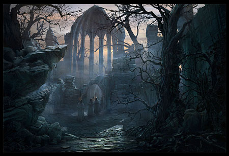
If you, like many people, envision the process of 3-D CGI (Computer Graphics Imaging) as arranging a few wireframe shapes and pressing the “render” button, you may as well say painting is as easy as taking a brush and slapping some color on a canvas.The same skills of composition, proportion, perspective, color and, yes, drawing, are as important in the creation of a successful CGI image as they are in traditional painting. Yes, it’s possible for an amateur to make an image in a 3-D application without knowing those things, and the results are similar to someone trying to paint without them. I’ve seen enough poorly done amateur CGI, and have worked in 3-D applications myself just enough to have some idea of how important those skills are to a good CGI image.
Raphaël Lacoste is a French matte painter and concept artist now living in Canada. He is also an award-winning art director for high-end games in the Prince of Persia series. He uses a combination of 3-D CGI and 2-D digital painting in Photoshop to create beautifully atmospheric images that are at times evocative of classical and 19th century paintings.
The image above, Path to the Gothic Choir (large version here), is the subject of a feature article on the CGSociety site that goes into some detail about the process of creating this kind of image, including preliminary sketches, initial renderings, details and an image of a painting by 19th Century German romantic painter Caspar David Fredrich called Cloister Graveyard in the Snow, that was the inspiration for Lacoste’s image.
Lacoste’s own site has a nice selection of his moody and atmospheric matte paintings and concept art, including a wonderful evocation of Arnold Böcklin’s The Isle of the Dead. (See my previous post on Arnold Böcklin.)
There is also a gallery of his work on the CGSociety’s site.
Categories:
-
Tim Jessell (update)
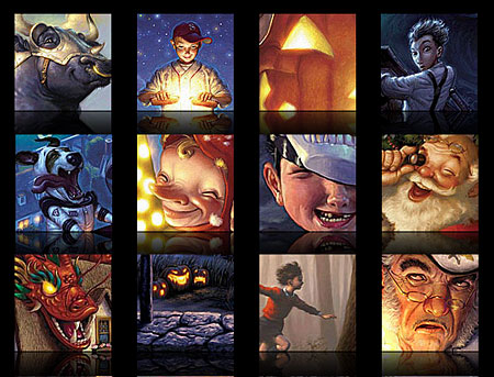
I first wrote about illustrator Tim Jessell and his “realistic with a twist” style in this post back in October of 2005.Since then, his site has been completely redone and the Portfolio section expanded with larger versions of his editorial and advertising illustrations for the likes of Time Magazine, American Airlines, Nike, Polaroid and Apple Computer.
Jessell also illustrates children’s books, including the Secrets Of Droon series by Tony Abbott, Superhero Christmas, a children’s book written by Marvel Comics’ Stan Lee, and Amorak, written and illustrated by Jessell (details here).
His style is at once varied and consistent, changing with his subject but retaining a foundation in realistic painting and solid draftsmanship. Browsing his portfolio, you can find a straightforward portrait next to a fearsome dragon in from the Droon series next to lighthearted children’s fantasy.
His new galleries also feature a display gimmick that I’m a sucker for, showing a “reflection” of each image as if the painting was sitting on a dark reflective floor. The effect is repeated on the gallery thumbnail page and I’ve chosen to use a section of that here, rather than try to choose a “representative” image among his broad variety of subjects.
Categories:


Charley’s Picks
Bookshop.org
(Bookshop.org affilliate links; sales benefit independent bookshop owners; I get a small percentage to help support my work on Lines and Colors)

John Singer Sargent: Watercolors


Urban Sketching: Understanding Perspective


Charley’s Picks
Amazon
(Amazon.com affiliate links; sales go to a larger yacht for Jeff Bezos; but I get a small percentage to help support my work on Lines and Colors)
John Singer Sargent: Watercolors
Urban Sketching: Understanding Perspective