
Categories
- 3d CGI
- Amusements
- Animation
- Anime & Manga
- Art Materials
- Art Videos
- Blogroll
- Cartoons
- Color
- Comics
- Concept & Visual Dev.
- Creativity
- Digital Art
- Digital Painting
- Displaying Art on the Web
- Drawing
- Eye Candy for Today
- Gallery and Museum Art
- High-res Art Images
- Illustration
- Motion Graphics & Flash
- Museums
- Online Museums
- Outsider Art
- Painting
- Painting a Day
- Paleo Art
- Pastel, Conté & Chalk
- Pen & Ink
- Prints and Printmaking
- Reviews
- Sc-fi and Fantasy
- Sculpture & Dimensional
- Site Comments
- Sketching
- Storyboards
- Tools and Techniques
- Uncategorized
- Vector Art
- Videos & Podcasts
- Vision and Optics
- Watercolor and Gouache
- Webcomics
Archives
- May 2026
- April 2026
- March 2026
- February 2026
- January 2026
- December 2025
- November 2025
- October 2025
- September 2025
- August 2025
- July 2025
- June 2025
- May 2025
- January 2025
- December 2024
- November 2024
- October 2024
- September 2024
- August 2024
- June 2024
- April 2024
- March 2024
- February 2024
- January 2024
- December 2023
- November 2023
- October 2023
- September 2023
- August 2023
- July 2023
- May 2023
- April 2023
- March 2023
- February 2023
- January 2023
- December 2022
- November 2022
- September 2022
- August 2022
- July 2022
- June 2022
- May 2022
- April 2022
- March 2022
- February 2022
- January 2022
- December 2021
- November 2021
- October 2021
- September 2021
- August 2021
- July 2021
- June 2021
- May 2021
- April 2021
- March 2021
- February 2021
- January 2021
- December 2020
- November 2020
- October 2020
- September 2020
- August 2020
- July 2020
- June 2020
- May 2020
- April 2020
- March 2020
- February 2020
- January 2020
- December 2019
- November 2019
- October 2019
- September 2019
- August 2019
- July 2019
- June 2019
- May 2019
- April 2019
- March 2019
- February 2019
- January 2019
- December 2018
- November 2018
- October 2018
- September 2018
- August 2018
- July 2018
- June 2018
- May 2018
- April 2018
- March 2018
- February 2018
- January 2018
- December 2017
- November 2017
- October 2017
- September 2017
- August 2017
- July 2017
- June 2017
- May 2017
- April 2017
- March 2017
- February 2017
- January 2017
- December 2016
- November 2016
- October 2016
- September 2016
- August 2016
- July 2016
- June 2016
- May 2016
- April 2016
- March 2016
- February 2016
- January 2016
- December 2015
- November 2015
- October 2015
- September 2015
- August 2015
- July 2015
- June 2015
- May 2015
- April 2015
- March 2015
- February 2015
- January 2015
- December 2014
- November 2014
- October 2014
- September 2014
- August 2014
- July 2014
- June 2014
- May 2014
- April 2014
- March 2014
- February 2014
- January 2014
- December 2013
- November 2013
- October 2013
- September 2013
- August 2013
- July 2013
- June 2013
- May 2013
- April 2013
- March 2013
- February 2013
- January 2013
- December 2012
- November 2012
- October 2012
- September 2012
- August 2012
- July 2012
- June 2012
- May 2012
- April 2012
- March 2012
- February 2012
- January 2012
- December 2011
- November 2011
- October 2011
- September 2011
- August 2011
- July 2011
- June 2011
- May 2011
- April 2011
- March 2011
- February 2011
- January 2011
- December 2010
- November 2010
- October 2010
- September 2010
- August 2010
- July 2010
- June 2010
- May 2010
- April 2010
- March 2010
- February 2010
- January 2010
- December 2009
- November 2009
- October 2009
- September 2009
- August 2009
- July 2009
- June 2009
- May 2009
- April 2009
- March 2009
- February 2009
- January 2009
- December 2008
- November 2008
- October 2008
- September 2008
- August 2008
- July 2008
- June 2008
- May 2008
- April 2008
- March 2008
- February 2008
- January 2008
- December 2007
- November 2007
- October 2007
- September 2007
- August 2007
- July 2007
- June 2007
- May 2007
- April 2007
- March 2007
- February 2007
- January 2007
- December 2006
- November 2006
- October 2006
- September 2006
- August 2006
- July 2006
- June 2006
- May 2006
- April 2006
- March 2006
- February 2006
- January 2006
- December 2005
- November 2005
- October 2005
- September 2005
- August 2005
Relevant Blogs
Art, Painting & Sketch
- Gurney Journey
- Underpaintings
- Art and Influence
- Painting Perceptions
- Oil Painters of America
- Vasari Paint POV
- Flying Fox
- Urban Sketchers
- Bento (Smithsonian)
- Art Inconnu
- The Hidden Place
- Still Life
- Making a Mark
- The Art of the Landscape
- Exploring Color & Creativity
- Art Contrarian
- Artist A Day
- beinArt Surreal Art Collective
- Eye Level
- David Dunlop
- p.i.g.m.e.n.t.i.u.m
- CultureGrrl
- Joaquín Sorolla blog
- Artists in Pastel
“Painting a Day”
- A Painting a Day (Keiser)
- On Painting (Keiser)
- Julian Merrow-Smith
- Karen Jurick
- Jeffrey Hayes
- Carol Marine
- Abbey Ryan
- Daily Paintworks
Other Painting Blogs
- Virtual Gouache Land
- Neil Hollingsworth
- Marc Hanson
- Kevin Menck
- Marc Dalessio
- Larry Seiler
- Stapleton Kearns
- Colin Page
- Roos Schuring
- Hans Versfelt
- Titus Meeuws
- Régis Pettinari
- René Plein Air
- Belinda Del Pesco
- Robin Weiss
- Nathan Fowkes (Land Sketch)
- William Wray
- Frank Serrano
- Stephen Magsig
- Michael Chesley Johnson
- Twice a Week
- Sarah Wimperis
- Rob Adams
- Michael Cole Manley
- The Dirty Palette Club
- Mike Manley’s Draw!
Gallery Art & Illustration mix
Illustration
- Howard Pyle
- 100 Years of Illustration
- BibliOdyssey
- Illustration Art
- Today’s Inspiration
- Illustration Mundo
- Little Chimp Society
- Danny Gregory
- R D (John Martz
- Illustration Friday blog
- Monster Brains
- Illustrators & Illustrations (RU)
- Elwood H. Smith
- DaniDraws.com
- Designers Who Blog
- iSpot Blog
Sci-Fi & Fantasy
Illustration & Comics
Comics & Cartoons
- Comics Beat
- Robot 6
- Newsarama Blog
- Comic Vine
- Comics Alliance
- Forbidden Planet Int.
- Paolo Rivera
- Bolt City
- Flight
- Scott McCloud
- The Comics Journal
- Comixpedia
- Funnybook Babylon
- James Baker
- Middleton’s Sketchbook
- Boneville
- The Hotel Fred
- Paul Rivoche
- Daily Cartoonist
- Mad About Cartoons (William Wray)
- Digital Strips
Illustration & Concept
Animation & Concept
- Cartoon Brew
- Animation Blog
- Cold Hard Flash
- Concept Art World
- The CAB
- FY Concept Art
- Concept Ships
- Concept Robots
- John Nevarez
- Armand Serrano
- Marcos Mateu-Mestre
- all kinds of stuff (Kricfalusi)
- Yacin the faun (Man Arenas)
- Kelsey Mann
- Cre8tivemarks Blog
- Ice-Cream Monster Toon Cafe
- AAU Character & Creature Design
- AAU Animation Notes
- Articles and Texticles
Paleo & Scientific
Tools & Techniques
Other
Lists of Art Blogs
Art Image Resource Links
Historic Art Images
- Wikimedia Commons: Paintings
- Wikimedia Commons: Drawings
- The Athenaeum
- WikiArt (WikiPaintings)
- Google Art Project: Artists
- Google Art Project: Collections (Museums)
- ArtCyclopedia
- Web Gallery of Art
- Art Renewal Center
- Web Gallery of Impressionism
Auction Consolidation sites
Auction sites
- Sotheby’s
- Bonham’s
- Christies
- Heritage Auctions: Fine Art
- Heritage Auctions: Illustration
- Freeman’s Auctions
- Bukowskis
- Shannon’s
Image Search
Reverse Image Search (search by image)
- Tin Eye
- RevImg
- Google Image Search (camera icon)
- Bing Image Search (camera icon)
Promoting some friends and some clients of my website design business
- Twin Willows T’ai Chi studio in Wilmington DE. Taiji classes with Bryan Davis.
- Ray Hayward, Inspired Teacher of T’ai Chi ( Taiji ) in Minneapolis, Founder of Mindful Motion Tai Chi Academy
- OldHead Tattoo studio and Art Gallery in Wilmington DE. Tattoos and paintings by Bruce Gulick
- Sharon Domenico Art, pet portrait oil paintings
- Platinum Paperhanging, wallpaper hanging, Main Line and Philadelphia, PA
- Lisa Stone Design, interior designer, Main Line and Philadelphia, PA
- Studio12KPT, original art, prints, calendars and other custom printed items by Van Sickle & Rolleri
-
Eye Candy for Today: A Deception by Raphaelle Peale

Venus Rising From the Sea — A Deception, Raphaelle Peale.Raphaelle Peale, son of pioneering American artist Charles Wilson Peale and America’s first great still life painter, serves up a trompe l’oeil of a woman behind a cloth — a tour de force drapery study and a comment on the repressive standards applied to figure drawing and painting in U.S. art schools at the time.
On Google Art Project. Click on image for zoom controls.
Categories:
-
The Movie Titles Stills Collection
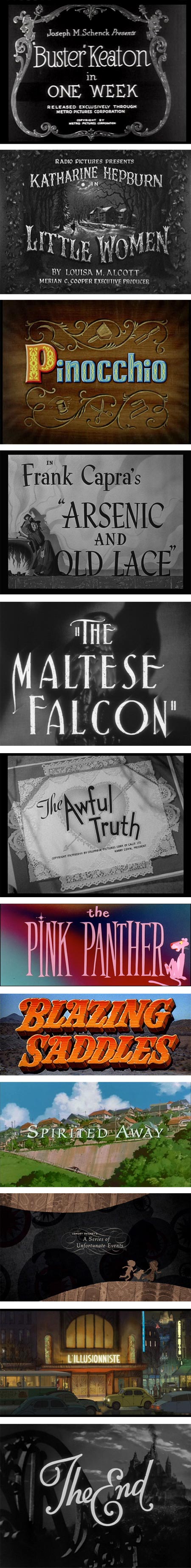
Wow.The Movie Titles Stills Collection.
What a treasure trove this is for those who love:
• movies
• design
• typography
• and (to a lesser extent) illustration.Designer Christian Annyas has assembled a collection of still images of movie titles, from the 1920’s to the present. Though far from complete (how could it be?), the collection is extensive and growing.
The movies are arranged by decades, and within that, by year. Note that the first set of decade links is page top, above the main heading, and the second below; there are separate links for sub-collections of film noir, westerns, and recent updates.
It’s also easy to miss the fact that within a given decade, the listings are usually divided into two pages, for the first and second half of the decade, and the only links for navigating between those is at the bottom of the pages.
These are long (long) scrolling pages full of images. Let them load and keep scrolling down.
Many, though not all, are linked to pages with larger images, and in some cases additional stills of ending titles. Most have Amazon links to purchase the films.
I love the way titles for the first color films start to appear in the 1930’s, and color and black and white films are interspersed into the 1950’s.
The quality of the titles takes a distinct hit in the second half of the 20th century (with a low point, like movies themselves, in the 1970’s). In fact many of the titles from the 1970’s to the present look like tossed off afterthoughts, in sharp contrast to the highly valued and marvelously designed titles of the first half of the century.
Time Sink Warning.
[Via Francis Vallejo]
Categories:
-
Snehal Page

Snehal Page is an artist from Maharashtra, India. She acquired diplomas in Applied Art and Art Education at Abhinav Kala Mahavidyalaya in Pune, India, and also studied for three years at Studio Incamminati in Philadelphia, here in the U.S. (see my recent profile of Studio Incamminati founder and Artistic Director Nelson Shanks).Page’s website has galleries of her work in landscape, still life, portrait and figurative subjects. In all of them she has a direct, painterly style, but also experiments with different approaches. Some of the experimentation is likely from her studies.
Among her portraits are a portrait of Studio Incamminati instructor Stephen Early (above, third down, right), a self portrait (third down, left) and the painting “Voluntary Simplicity” (above, top) which was awarded certificate of excellence in the International Portrait Conference of the Portrait Society of America.
Her landscapes, in oil and watercolor, appear to be primarily of India, with depictions of both dramatic architecture and commonplace scenes.
[Via FineArtViews]
Categories:
-
Eye Candy for Today: Georges Michel Stormy Landscape

, Georges Michel. In the National Gallery, London — use fullscreen and zoom at right of image.Wonderful clouds from a French artist who was two steps back in the lineage of Impressionism.
Categories:
-
Aaron Horkey

Aaron Horkey is an artist and designer from Minnesota whose intricate, richly detailed images can be both beautiful and disconcerting simultaneously.Horkey has designed and illustrated posters, album covers, skateboard graphics, magazine covers and clothing designs as well as creating graphics for reproduction as limited edition prints.
Unfortunately, he doesn’t seem to have a dedicated web presence, and his publishing company, Dead Arts Publishing, ceased production in the time since I put him on my list for a post and finally getting to writing one.
He is represented by Jacky Winter Group, and there is a gallery of his work on their site, but the images are frustratingly small, particularly given the sometimes astonishing level of detail in Horkey’s images.
One of the best sources I’ve found for his work is a series of posts on the Shrieking Tree blog, including a two part interview (and here). These include large (sometimes quite large) images of Horkey’s intricate drawings, often in their preliminary form before color is applied, that give you a much better idea of the nature of his work.
You can also find some of Horkeys posters reproduced reasonably large on OMG Posters, and a selection on Ufunk.
Horkey’s designs often include highly stylized lettering and design elements, on which as much attention is lavished as the imagery, sometimes more. The words are intricate in a way that reminds me of 1960’s psychedelic poster art, with a similar aesthetic of “if you can’t read it, you don’t get it”.
Categories:
-
Ivan Grohar
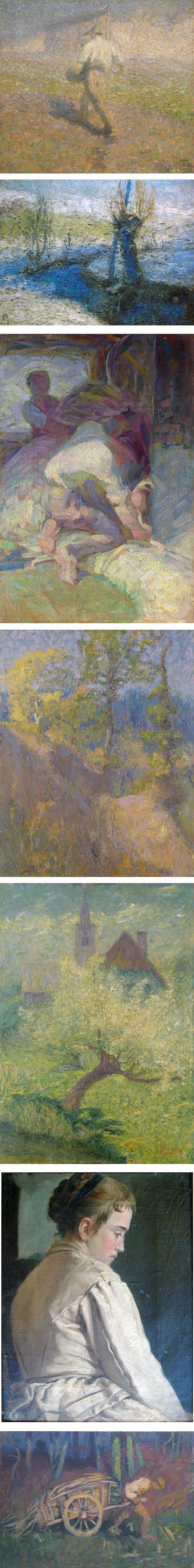
Though it's acceptance among critics and collectors was slow, the influence of the revolution of French Impressionism on other artists, and the spread of that impact to other countries in Europe and elsewhere was dramatic.
In Slovenia, several artists picked up on the bright broken color, lively impasto application of paint and freedom from academic restraints that characterized the new direction in painting. Notable among the was Ivan Grohar.
Grohar was orphaned at an early age and left in poverty, and though his abilities eventually enabled him to study art, his life and career were marked by difficulty. He gained the respect of his fellow artists, however and left a legacy of noteworthy paintings after his untimely death from terberculosis oin his mid forties.
He started his career as a painter of religious subjects, moved into a form of realism and then into his later style that showed the influence of Imprssionism.
He is known particularly for images like “The Sower” (image above, top).
There is an Ivan Grohar Gallery at the Loski Museum in Ljubljana.
Categories:


Charley’s Picks
Bookshop.org
(Bookshop.org affilliate links; sales benefit independent bookshop owners; I get a small percentage to help support my work on Lines and Colors)

John Singer Sargent: Watercolors


Urban Sketching: Understanding Perspective


Charley’s Picks
Amazon
(Amazon.com affiliate links; sales go to a larger yacht for Jeff Bezos; but I get a small percentage to help support my work on Lines and Colors)
John Singer Sargent: Watercolors
Urban Sketching: Understanding Perspective