
Categories
- 3d CGI
- Amusements
- Animation
- Anime & Manga
- Art Materials
- Art Videos
- Blogroll
- Cartoons
- Color
- Comics
- Concept & Visual Dev.
- Creativity
- Digital Art
- Digital Painting
- Displaying Art on the Web
- Drawing
- Eye Candy for Today
- Gallery and Museum Art
- High-res Art Images
- Illustration
- Motion Graphics & Flash
- Museums
- Online Museums
- Outsider Art
- Painting
- Painting a Day
- Paleo Art
- Pastel, Conté & Chalk
- Pen & Ink
- Prints and Printmaking
- Reviews
- Sc-fi and Fantasy
- Sculpture & Dimensional
- Site Comments
- Sketching
- Storyboards
- Tools and Techniques
- Uncategorized
- Vector Art
- Videos & Podcasts
- Vision and Optics
- Watercolor and Gouache
- Webcomics
Archives
- April 2026
- March 2026
- February 2026
- January 2026
- December 2025
- November 2025
- October 2025
- September 2025
- August 2025
- July 2025
- June 2025
- May 2025
- January 2025
- December 2024
- November 2024
- October 2024
- September 2024
- August 2024
- June 2024
- April 2024
- March 2024
- February 2024
- January 2024
- December 2023
- November 2023
- October 2023
- September 2023
- August 2023
- July 2023
- May 2023
- April 2023
- March 2023
- February 2023
- January 2023
- December 2022
- November 2022
- September 2022
- August 2022
- July 2022
- June 2022
- May 2022
- April 2022
- March 2022
- February 2022
- January 2022
- December 2021
- November 2021
- October 2021
- September 2021
- August 2021
- July 2021
- June 2021
- May 2021
- April 2021
- March 2021
- February 2021
- January 2021
- December 2020
- November 2020
- October 2020
- September 2020
- August 2020
- July 2020
- June 2020
- May 2020
- April 2020
- March 2020
- February 2020
- January 2020
- December 2019
- November 2019
- October 2019
- September 2019
- August 2019
- July 2019
- June 2019
- May 2019
- April 2019
- March 2019
- February 2019
- January 2019
- December 2018
- November 2018
- October 2018
- September 2018
- August 2018
- July 2018
- June 2018
- May 2018
- April 2018
- March 2018
- February 2018
- January 2018
- December 2017
- November 2017
- October 2017
- September 2017
- August 2017
- July 2017
- June 2017
- May 2017
- April 2017
- March 2017
- February 2017
- January 2017
- December 2016
- November 2016
- October 2016
- September 2016
- August 2016
- July 2016
- June 2016
- May 2016
- April 2016
- March 2016
- February 2016
- January 2016
- December 2015
- November 2015
- October 2015
- September 2015
- August 2015
- July 2015
- June 2015
- May 2015
- April 2015
- March 2015
- February 2015
- January 2015
- December 2014
- November 2014
- October 2014
- September 2014
- August 2014
- July 2014
- June 2014
- May 2014
- April 2014
- March 2014
- February 2014
- January 2014
- December 2013
- November 2013
- October 2013
- September 2013
- August 2013
- July 2013
- June 2013
- May 2013
- April 2013
- March 2013
- February 2013
- January 2013
- December 2012
- November 2012
- October 2012
- September 2012
- August 2012
- July 2012
- June 2012
- May 2012
- April 2012
- March 2012
- February 2012
- January 2012
- December 2011
- November 2011
- October 2011
- September 2011
- August 2011
- July 2011
- June 2011
- May 2011
- April 2011
- March 2011
- February 2011
- January 2011
- December 2010
- November 2010
- October 2010
- September 2010
- August 2010
- July 2010
- June 2010
- May 2010
- April 2010
- March 2010
- February 2010
- January 2010
- December 2009
- November 2009
- October 2009
- September 2009
- August 2009
- July 2009
- June 2009
- May 2009
- April 2009
- March 2009
- February 2009
- January 2009
- December 2008
- November 2008
- October 2008
- September 2008
- August 2008
- July 2008
- June 2008
- May 2008
- April 2008
- March 2008
- February 2008
- January 2008
- December 2007
- November 2007
- October 2007
- September 2007
- August 2007
- July 2007
- June 2007
- May 2007
- April 2007
- March 2007
- February 2007
- January 2007
- December 2006
- November 2006
- October 2006
- September 2006
- August 2006
- July 2006
- June 2006
- May 2006
- April 2006
- March 2006
- February 2006
- January 2006
- December 2005
- November 2005
- October 2005
- September 2005
- August 2005
Relevant Blogs
Art, Painting & Sketch
- Gurney Journey
- Underpaintings
- Art and Influence
- Painting Perceptions
- Oil Painters of America
- Vasari Paint POV
- Flying Fox
- Urban Sketchers
- Bento (Smithsonian)
- Art Inconnu
- The Hidden Place
- Still Life
- Making a Mark
- The Art of the Landscape
- Exploring Color & Creativity
- Art Contrarian
- Artist A Day
- beinArt Surreal Art Collective
- Eye Level
- David Dunlop
- p.i.g.m.e.n.t.i.u.m
- CultureGrrl
- Joaquín Sorolla blog
- Artists in Pastel
“Painting a Day”
- A Painting a Day (Keiser)
- On Painting (Keiser)
- Julian Merrow-Smith
- Karen Jurick
- Jeffrey Hayes
- Carol Marine
- Abbey Ryan
- Daily Paintworks
Other Painting Blogs
- Virtual Gouache Land
- Neil Hollingsworth
- Marc Hanson
- Kevin Menck
- Marc Dalessio
- Larry Seiler
- Stapleton Kearns
- Colin Page
- Roos Schuring
- Hans Versfelt
- Titus Meeuws
- Régis Pettinari
- René Plein Air
- Belinda Del Pesco
- Robin Weiss
- Nathan Fowkes (Land Sketch)
- William Wray
- Frank Serrano
- Stephen Magsig
- Michael Chesley Johnson
- Twice a Week
- Sarah Wimperis
- Rob Adams
- Michael Cole Manley
- The Dirty Palette Club
- Mike Manley’s Draw!
Gallery Art & Illustration mix
Illustration
- Howard Pyle
- 100 Years of Illustration
- BibliOdyssey
- Illustration Art
- Today’s Inspiration
- Illustration Mundo
- Little Chimp Society
- Danny Gregory
- R D (John Martz
- Illustration Friday blog
- Monster Brains
- Illustrators & Illustrations (RU)
- Elwood H. Smith
- DaniDraws.com
- Designers Who Blog
- iSpot Blog
Sci-Fi & Fantasy
Illustration & Comics
Comics & Cartoons
- Comics Beat
- Robot 6
- Newsarama Blog
- Comic Vine
- Comics Alliance
- Forbidden Planet Int.
- Paolo Rivera
- Bolt City
- Flight
- Scott McCloud
- The Comics Journal
- Comixpedia
- Funnybook Babylon
- James Baker
- Middleton’s Sketchbook
- Boneville
- The Hotel Fred
- Paul Rivoche
- Daily Cartoonist
- Mad About Cartoons (William Wray)
- Digital Strips
Illustration & Concept
Animation & Concept
- Cartoon Brew
- Animation Blog
- Cold Hard Flash
- Concept Art World
- The CAB
- FY Concept Art
- Concept Ships
- Concept Robots
- John Nevarez
- Armand Serrano
- Marcos Mateu-Mestre
- all kinds of stuff (Kricfalusi)
- Yacin the faun (Man Arenas)
- Kelsey Mann
- Cre8tivemarks Blog
- Ice-Cream Monster Toon Cafe
- AAU Character & Creature Design
- AAU Animation Notes
- Articles and Texticles
Paleo & Scientific
Tools & Techniques
Other
Lists of Art Blogs
Art Image Resource Links
Historic Art Images
- Wikimedia Commons: Paintings
- Wikimedia Commons: Drawings
- The Athenaeum
- WikiArt (WikiPaintings)
- Google Art Project: Artists
- Google Art Project: Collections (Museums)
- ArtCyclopedia
- Web Gallery of Art
- Art Renewal Center
- Web Gallery of Impressionism
Auction Consolidation sites
Auction sites
- Sotheby’s
- Bonham’s
- Christies
- Heritage Auctions: Fine Art
- Heritage Auctions: Illustration
- Freeman’s Auctions
- Bukowskis
- Shannon’s
Image Search
Reverse Image Search (search by image)
- Tin Eye
- RevImg
- Google Image Search (camera icon)
- Bing Image Search (camera icon)
Promoting some friends and some clients of my website design business
- Twin Willows T’ai Chi studio in Wilmington DE. Taiji classes with Bryan Davis.
- Ray Hayward, Inspired Teacher of T’ai Chi ( Taiji ) in Minneapolis, Founder of Mindful Motion Tai Chi Academy
- OldHead Tattoo studio and Art Gallery in Wilmington DE. Tattoos and paintings by Bruce Gulick
- Sharon Domenico Art, pet portrait oil paintings
- Platinum Paperhanging, wallpaper hanging, Main Line and Philadelphia, PA
- Lisa Stone Design, interior designer, Main Line and Philadelphia, PA
- Studio12KPT, original art, prints, calendars and other custom printed items by Van Sickle & Rolleri
-
Art and the River
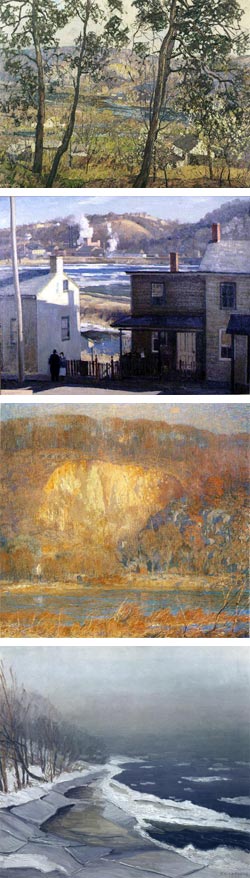 In the late 19th and early 20th Century, New York and Boston were major centers of American Impressionism. These were American artists who had traveled to Europe and encountered the French Impressionists and their daring new approach to painting, or had been impressed by their work in exhibits mounted in the U.S., and incorporated some of their techniques into heir own uniquely American approach to painting.
This influence was less evident here in Philadelphia, the third major East Coast art center of the time, perhaps because of the traditional values emphasized by the dominant figure of Thomas Eakins and his followers at the Pennsylvania Academy of the Fine Arts.
Instead, New Hope, Pennsylvania, a small town in nearby Bucks County, became the focal point for the group painters who are now known as the Pennsylvania Impressionists, as I mentioned in my article on New Hope, PA and Lambertville, NJ from last year.
For these painters, New Hope and the surrounding area became their own Giverny, their artist colony on the river, akin to the American Impressionist centers in Cos Cobb and Old Lyme Connecticut (see my post on Impressionist Giverny: American Painters in France, 1885-1915).
The James A. Michener Art Museum, in Doylestown, which has one of the most important collections of Pennsylvania Impressionist works, has mounted an exhibit in their smaller satellite museum in New Hope called Art and the River.
The exhibit focuses on interpretations of the Delaware River and related waterways in the area of the New Hope colony and features works from a number of the major figures of Pennsylvania Impressionism, including Daniel Garber, Edward Redfield, William Lathrop, Harry Leith-Ross, George Sotter and Fern Coppedge, as well as some less well known artists like Kenneth Newmaker (see my previous posts about Daniel Garber and Fern Coppedge).
The exhibit also features work from the New Hope modernist painters from the 1930’s and a selection of contemporary Bucks County artists like Paul Matthews, Daniel Anthonisen, Jan Lipes and Robert Beck and several others.
The museum has a page and press release about the exhibit, but they contain few images. The Michener does have a long list of articles about Bucks County Artists, with four of five images for each. Unfortunately, these are rather small. You can supplement them with somewhat larger images from commercial print supplier Encore Editions, which has a fairly large catalog of Pennsylvania Impressionists. I’ve linked to a few highlights below, and I plan to feature many of these artists in more detail in future posts.
I’ll also mention an excellent and beautiful book, Pennsylvania Impressionism, edited by Brian H. Peterson, who is Senior Curator at the Michener. There is also a large and beautiful, though perhaps less scholarly definitive book, New Hope for American Art, published by Jim’s of Lambertville, a local gallery that specializes in Pennsylvania Impressionist works, and written by the gallery’s owner, Jim Alterman. The gallery is a co-sponsor of the Art and the River exhibit. I had a chance to stop by the gallery on this visit, and was duly impressed with their selection of Pennsylvania Impressionist artists.
Though the exhibit is not large, it’s extensive enough to give a nice cross section of some of the Pennsylvania Impressionists, as well as some contemporary painters who have found a connection, and source of inspiration, in the same place on the river.
Art and the River at James A. Michener Art Museum runs until until October 5, 2008.
(Image above: Edward Redfield, Harry Leith-Ross, Daniel Garber, Kenneth Newmaker)
Categories:
-
Junko Ono Rothwell

August and September are times when many people think of travel, and travel makes me think of travel sketches.There is a particular pleasure in travel sketches; they carry a personal view and flavor quite unlike travel photographs, in that the artist is showing you their vision and feeling for the place and time in addition to a representation of its appearance.
Junko Ono Rothwell, an artist based in Georgia in the Southeastern U.S. has posted a number of her travel sketches in watercolor and pastel on her web site. These are from her visits to Italy (above, left), France (above, right) and Ireland.
Her sketches bring to bear her experience in painting landscapes in both oil and pastel. Her landscapes here in the U.S. often focus on marshlands and small streams, both Groegia and on the mid-Atlantic coast.
On her site you will also find her nicely realized still life paintings, also in both pastel and oil, and her watercolor floral studies. There is also a selection of figure work.
Her pastel renderings make good use of the textural characteristics of the medium, which lies somewhere between painting and drawing, and she brings some of that surface texture into her oil painting to very nice effect, with textural paint strokes and a wonderful use of broken color.
Rothwell studied in Japan at Okayama University and in the U.S. at Cornell. Her work has been in exhibitions and collections in both the U.S. and Japan and has been featured in a number of books and magazine articles on pastel, floral painting, and landscape.
Rothwell’s landscapes are done en plein air (see my recent post on pochade boxes), catching the fleeting atmospherics and light only available to the painter’s eye on location, just as she captures the immediate feeling of of a foreign place and time in her travel sketches.
Categories:
-
Adam Brockbank

I can tell you little about Adam Brockbank, except that he is a film industry concept and storyboard artist, and quite a good one.His site doesn’t include any biographical information, but does, fortunately, showcase a number of his terrific concept paintings and drawings for movies like Harry Potter and the Order of the Phoenix, Harry Potter and the Goblet of Fire, Harry Potter and the Prisoner of Azkaban (image above), Harry Potter and the Chamber of Secrets, Alexander, Troy, Spiderman 2, Tomb Raider, Tomb Raider 2, Fire from Heaven, X-Men and Sleepy Hollow.
There is also a selection of storyboard work from films and television productions like Harry Potter and the Philosophers Stone, Dinotopia, Alice in Wonderland, Lost in Space and The Borrowers.
You can see a more complete list on the IMDB site.
His storyboards are clear and crisp, with just enough tone work to suggest lighting and atmosphere. His concept art ranges from briefly notated sketches to fully rendered paintings of complex and large scale scenes. He seems particularly adept at portraying the cities and scenes of ancient civilizations as depicted in movies like Alexander, Troy and Fire from Heaven; combining a National Geographic feeling of historical reconstruction with a cinematic flair for drama.
In between his lightly rendered and highly rendered approaches are paintings that frequently look more rendered than they are, in which his artful economy of notation conveys a great deal of atmosphere and mood in the choice of large areas of color balanced with smaller passages of detail.
There is also no indication of medium or technique on the site, but it looks like he paints digitally, though his work can have a feeling of traditional painterly materials.
I can’t give you direct links to sections because the site is in Flash, but be sure to view his wonderfully realized historically themed paintings for Fire from Heaven.
Addendum: Adam was kind enough to write and let us know that he has been working on a new comic called Mezolith, written by Ben Haggarty, that debuts next week in issue 15 of The DFC, a UK kids comics anthology. You can see a preview here.
Categories:
-
David Jon Kassan

Brooklyn based artist David Jon Kassan was born in Arkansas and studied in Philadelphia, New York and Florence, Italy.He has lectured, taught and given workshops at numerous universities and art centers, including the Rochester Institute of Technology, Western Illinois University, Syracuse University, National Academy School of Fine Art, the University of Alabama, the National Academy of Design and the Salmagundi Center of American Art.
On his web site you will find examples of his striking realist portrait and figurative paintings, in which he often contrasts the colors and textures of his subjects with the rough textures of age-worn urban interiors. He seems so fascinated with the latter that he actually does preparatory studies of wall sections, investigating the textures of aging plaster, exposed lath and peeling paint.
His real fascination, though, is portraiture, and specifically, the anatomy underlying the portrait and figure. There is a time-lapse video on his site of a portrait demonstration at the Salmagundi Club in New York, three hours condensed into 8 minutes (image above, lower right), in which you can see the emphasis he places on the underlying geometry of the face.
There is also a PDF booklet available for a modest fee, of An Artist’s Guide to Portrait Anatomicae, originally prepared for his students.
There is a selection of his drawings on the site. Though they are brought to a fairly high state of rendering, they are largely anatomical studies.
Kassan also has a blog, in which you can see some works in progress, studio and demonstration photos and a video showing his paintings on display at the L.A. Art Show.
His paintings show the kind of naturalistic fidelity that only comes from careful and incisive observation, combined with a solid grounding in traditional technique and anatomical study.
His palette is intentionally subdued, as are his compositions, so that the highest chroma passages are often in the warm skin tones in faces where small blood vessels run closest to the surface.
[Link courtesy of Michael Connors]
Categories:
-
Richard Cowdrey

Richard Cowdrey is an Ohio based illustrator with a particular affinity for animals. He has illustrated numerous books for children and teens including the popular Bad Dog, Marley and its follow-up A Very Marley Christmas, as well as the NYT Bestselling series Guardians of Ga’hoole.In addition to owls and dogs, other animals feature prominently in his editorial illustration, all rendered with a devoted attention to detail and texture, particularly evident in his handling of the textures of furred animals. You can see that to advantage on his web site in his gallery of illustrations for Calendars and Cards and his selection of Prints.
Cowdrey’s clients include Macmillan McGraw Hill, Workman, Harper Collins and Bantam Books, as well as other commercial and institutional clients.
In addition to his own site, there is an extensive portfolio of his work, and perhaps a wider range of his subject matter, on the Shannon Associates site, which also has larger images.
Categories:
-
Richard Schmid

Richard Schmid, though a well known and well respected contemporary American painter, is perhaps even better known as a teacher, through his widely read book and, more recently, series of instructional videos.His web site doesn’t do much to change this, in that the images of his work, though presented well enough, are frustratingly small. At least they’re frustrating to me, as I’m particularly interested in his economical and beautifully handled brush work, which you can only really appreciate in large images.
You can still see in the reproductions his beautiful handling of color and value, his remarkable ability with “lost and found” edges, and his wonderful control of texture, light and atmosphere. When viewing work on his site, there are images in the Lithographs section in addition to Available Work and Archive Gallery.
Schmid paints alla prima; an a Italian phrase meaning “at once” or “at the first”, that defines the kind of painting done all in one session while the paint is wet, as opposed to the layers of paint used in classical painting. Most “plein air” painting (see my recent post on pochade boxes) is done alla prima.
It is also the title of Schmid’s highly regarded instructional book, Alla Prima: Everything I Know About Painting. (You will find used copies listed for unreasonably high prices on Amazon and elsewhere; it’s in print and reasonable ($50 paperback) from Schmid’s own site.)
Whether the subtitle is true, I don’t know. I suspect Schmid knows considerably more about painting than can be put in one book, but the book is valuable and he has put a great deal of information into its 200 or so pages.
This is not a painting instruction book in the sense of “here is what brush to use” and “here’s how to paint water”. Neither is it conceptual in the manner of books by Hawthorne or Henri, it’s somewhere between those two types of painting books, simultaneously high-concept and down to earth instructional.
The book is divided into chapters like “Starting”, “Values”, “Edges”, “Color and Light” and “Composition”, that are filled with both both practical techniques and food for thought about your approach and intent, with the end goal of using the natural world as your final arbiter in choosing colors, arranging compositions and conveying light and atmosphere.
Not that Schmid is slavishly realistic, far from it. His paintings are quite poetic, but they are based firmly in direct observation of the visual world.
Occasionally you may find him waxing philosophical; and you might disagree with some of his pronouncements. For instance he asserts that there are no such thing as “neutralized” colors; and while I understand his argument, I think it’s a matter of semantics and the term is a useful one. I disagree with him in a number of areas, but bear in mind that he is a better painter than I by a couple orders of magnitude (grin).
My impression of Schmid, and his sometimes lofty tone of voice in the book, was dramatically softened when I watched one of his videos, in which his personal demeanor and tone are much more appealing.
Schmid has a series of four instructional landscape DVDs and one on portraiture. I’ve seen the second in the series, Richard Schmid Paints the Landscape: June (bottom two images, above), and I found it well done, well paced and full of useful information and techniques; particularly for those who are painting alla prima, en plen air (I’m just having fun with painting terms today).
Unlike some instructional videos, this one proceeds at a relaxed pace, in keeping with a pace appropriate for the mindset of painting, and allowing time to see a great deal of his painting process in detail. It’s truncated in places, but the jumps are artfully chosen. The shoot is well directed, dwelling where appropriate on his palette and color mixing process, with close ups of the canvas and shots of the subject that emphasize the points he makes while painting.
The DVD has two parts, the first is a complete on location painting session, from sketch to finished painting, and the second, in the studio, revisits the painting for analysis and goes beyond; into a discussion of color range and the control of edges and color transitions that alone is worthwhile as an instructional video.
Like similar art instruction videos, these are not inexpensive ($75), and the site doesn’t give you a preview video clip to let you know how you might like it (which I think would be a good selling point), though it does offer a few stills from each video.
There is a brief excerpt from one of his videos on YouTube, unfortunately, it’s not a very good or representational segment, and the video compression distorts the image quality, so I wouldn’t judge the videos by it.
Another nice thing about his videos is that you finally get to see his brushwork close up, something that is missing even in the book.
In both his book and videos, Schmid emphasizes some fundamentals that are often glossed over, but are worth being reminded of. One in particular is “doing the charts”; a process that young art students often think is onerous busywork, but seasoned painters know is as invaluable to a painter as practicing scales is to a musician.
This is the process of painting your own color charts, in which you mix a value scale of each color, and then value scales of each color in combination with each of the other colors in your basic palette. It is a process that gives you more color mixing knowledge than a truckload of color mixing books and preprinted charts could ever begin to provide.
It is this kind of adherence to the time tested painting fundamentals, that work and have been successful for representational painters through history, that is the basis for both Schmid’s teaching and his beautifully economical and lyrically poetic paintings.
Categories:


Charley’s Picks
Bookshop.org
(Bookshop.org affilliate links; sales benefit independent bookshop owners; I get a small percentage to help support my work on Lines and Colors)

John Singer Sargent: Watercolors


Urban Sketching: Understanding Perspective


Charley’s Picks
Amazon
(Amazon.com affiliate links; sales go to a larger yacht for Jeff Bezos; but I get a small percentage to help support my work on Lines and Colors)
John Singer Sargent: Watercolors
Urban Sketching: Understanding Perspective