
Categories
- 3d CGI
- Amusements
- Animation
- Anime & Manga
- Art Materials
- Art Videos
- Blogroll
- Cartoons
- Color
- Comics
- Concept & Visual Dev.
- Creativity
- Digital Art
- Digital Painting
- Displaying Art on the Web
- Drawing
- Eye Candy for Today
- Gallery and Museum Art
- High-res Art Images
- Illustration
- Motion Graphics & Flash
- Museums
- Online Museums
- Outsider Art
- Painting
- Painting a Day
- Paleo Art
- Pastel, Conté & Chalk
- Pen & Ink
- Prints and Printmaking
- Reviews
- Sc-fi and Fantasy
- Sculpture & Dimensional
- Site Comments
- Sketching
- Storyboards
- Tools and Techniques
- Uncategorized
- Vector Art
- Videos & Podcasts
- Vision and Optics
- Watercolor and Gouache
- Webcomics
Archives
- April 2026
- March 2026
- February 2026
- January 2026
- December 2025
- November 2025
- October 2025
- September 2025
- August 2025
- July 2025
- June 2025
- May 2025
- January 2025
- December 2024
- November 2024
- October 2024
- September 2024
- August 2024
- June 2024
- April 2024
- March 2024
- February 2024
- January 2024
- December 2023
- November 2023
- October 2023
- September 2023
- August 2023
- July 2023
- May 2023
- April 2023
- March 2023
- February 2023
- January 2023
- December 2022
- November 2022
- September 2022
- August 2022
- July 2022
- June 2022
- May 2022
- April 2022
- March 2022
- February 2022
- January 2022
- December 2021
- November 2021
- October 2021
- September 2021
- August 2021
- July 2021
- June 2021
- May 2021
- April 2021
- March 2021
- February 2021
- January 2021
- December 2020
- November 2020
- October 2020
- September 2020
- August 2020
- July 2020
- June 2020
- May 2020
- April 2020
- March 2020
- February 2020
- January 2020
- December 2019
- November 2019
- October 2019
- September 2019
- August 2019
- July 2019
- June 2019
- May 2019
- April 2019
- March 2019
- February 2019
- January 2019
- December 2018
- November 2018
- October 2018
- September 2018
- August 2018
- July 2018
- June 2018
- May 2018
- April 2018
- March 2018
- February 2018
- January 2018
- December 2017
- November 2017
- October 2017
- September 2017
- August 2017
- July 2017
- June 2017
- May 2017
- April 2017
- March 2017
- February 2017
- January 2017
- December 2016
- November 2016
- October 2016
- September 2016
- August 2016
- July 2016
- June 2016
- May 2016
- April 2016
- March 2016
- February 2016
- January 2016
- December 2015
- November 2015
- October 2015
- September 2015
- August 2015
- July 2015
- June 2015
- May 2015
- April 2015
- March 2015
- February 2015
- January 2015
- December 2014
- November 2014
- October 2014
- September 2014
- August 2014
- July 2014
- June 2014
- May 2014
- April 2014
- March 2014
- February 2014
- January 2014
- December 2013
- November 2013
- October 2013
- September 2013
- August 2013
- July 2013
- June 2013
- May 2013
- April 2013
- March 2013
- February 2013
- January 2013
- December 2012
- November 2012
- October 2012
- September 2012
- August 2012
- July 2012
- June 2012
- May 2012
- April 2012
- March 2012
- February 2012
- January 2012
- December 2011
- November 2011
- October 2011
- September 2011
- August 2011
- July 2011
- June 2011
- May 2011
- April 2011
- March 2011
- February 2011
- January 2011
- December 2010
- November 2010
- October 2010
- September 2010
- August 2010
- July 2010
- June 2010
- May 2010
- April 2010
- March 2010
- February 2010
- January 2010
- December 2009
- November 2009
- October 2009
- September 2009
- August 2009
- July 2009
- June 2009
- May 2009
- April 2009
- March 2009
- February 2009
- January 2009
- December 2008
- November 2008
- October 2008
- September 2008
- August 2008
- July 2008
- June 2008
- May 2008
- April 2008
- March 2008
- February 2008
- January 2008
- December 2007
- November 2007
- October 2007
- September 2007
- August 2007
- July 2007
- June 2007
- May 2007
- April 2007
- March 2007
- February 2007
- January 2007
- December 2006
- November 2006
- October 2006
- September 2006
- August 2006
- July 2006
- June 2006
- May 2006
- April 2006
- March 2006
- February 2006
- January 2006
- December 2005
- November 2005
- October 2005
- September 2005
- August 2005
Relevant Blogs
Art, Painting & Sketch
- Gurney Journey
- Underpaintings
- Art and Influence
- Painting Perceptions
- Oil Painters of America
- Vasari Paint POV
- Flying Fox
- Urban Sketchers
- Bento (Smithsonian)
- Art Inconnu
- The Hidden Place
- Still Life
- Making a Mark
- The Art of the Landscape
- Exploring Color & Creativity
- Art Contrarian
- Artist A Day
- beinArt Surreal Art Collective
- Eye Level
- David Dunlop
- p.i.g.m.e.n.t.i.u.m
- CultureGrrl
- Joaquín Sorolla blog
- Artists in Pastel
“Painting a Day”
- A Painting a Day (Keiser)
- On Painting (Keiser)
- Julian Merrow-Smith
- Karen Jurick
- Jeffrey Hayes
- Carol Marine
- Abbey Ryan
- Daily Paintworks
Other Painting Blogs
- Virtual Gouache Land
- Neil Hollingsworth
- Marc Hanson
- Kevin Menck
- Marc Dalessio
- Larry Seiler
- Stapleton Kearns
- Colin Page
- Roos Schuring
- Hans Versfelt
- Titus Meeuws
- Régis Pettinari
- René Plein Air
- Belinda Del Pesco
- Robin Weiss
- Nathan Fowkes (Land Sketch)
- William Wray
- Frank Serrano
- Stephen Magsig
- Michael Chesley Johnson
- Twice a Week
- Sarah Wimperis
- Rob Adams
- Michael Cole Manley
- The Dirty Palette Club
- Mike Manley’s Draw!
Gallery Art & Illustration mix
Illustration
- Howard Pyle
- 100 Years of Illustration
- BibliOdyssey
- Illustration Art
- Today’s Inspiration
- Illustration Mundo
- Little Chimp Society
- Danny Gregory
- R D (John Martz
- Illustration Friday blog
- Monster Brains
- Illustrators & Illustrations (RU)
- Elwood H. Smith
- DaniDraws.com
- Designers Who Blog
- iSpot Blog
Sci-Fi & Fantasy
Illustration & Comics
Comics & Cartoons
- Comics Beat
- Robot 6
- Newsarama Blog
- Comic Vine
- Comics Alliance
- Forbidden Planet Int.
- Paolo Rivera
- Bolt City
- Flight
- Scott McCloud
- The Comics Journal
- Comixpedia
- Funnybook Babylon
- James Baker
- Middleton’s Sketchbook
- Boneville
- The Hotel Fred
- Paul Rivoche
- Daily Cartoonist
- Mad About Cartoons (William Wray)
- Digital Strips
Illustration & Concept
Animation & Concept
- Cartoon Brew
- Animation Blog
- Cold Hard Flash
- Concept Art World
- The CAB
- FY Concept Art
- Concept Ships
- Concept Robots
- John Nevarez
- Armand Serrano
- Marcos Mateu-Mestre
- all kinds of stuff (Kricfalusi)
- Yacin the faun (Man Arenas)
- Kelsey Mann
- Cre8tivemarks Blog
- Ice-Cream Monster Toon Cafe
- AAU Character & Creature Design
- AAU Animation Notes
- Articles and Texticles
Paleo & Scientific
Tools & Techniques
Other
Lists of Art Blogs
Art Image Resource Links
Historic Art Images
- Wikimedia Commons: Paintings
- Wikimedia Commons: Drawings
- The Athenaeum
- WikiArt (WikiPaintings)
- Google Art Project: Artists
- Google Art Project: Collections (Museums)
- ArtCyclopedia
- Web Gallery of Art
- Art Renewal Center
- Web Gallery of Impressionism
Auction Consolidation sites
Auction sites
- Sotheby’s
- Bonham’s
- Christies
- Heritage Auctions: Fine Art
- Heritage Auctions: Illustration
- Freeman’s Auctions
- Bukowskis
- Shannon’s
Image Search
Reverse Image Search (search by image)
- Tin Eye
- RevImg
- Google Image Search (camera icon)
- Bing Image Search (camera icon)
Promoting some friends and some clients of my website design business
- Twin Willows T’ai Chi studio in Wilmington DE. Taiji classes with Bryan Davis.
- Ray Hayward, Inspired Teacher of T’ai Chi ( Taiji ) in Minneapolis, Founder of Mindful Motion Tai Chi Academy
- OldHead Tattoo studio and Art Gallery in Wilmington DE. Tattoos and paintings by Bruce Gulick
- Sharon Domenico Art, pet portrait oil paintings
- Platinum Paperhanging, wallpaper hanging, Main Line and Philadelphia, PA
- Lisa Stone Design, interior designer, Main Line and Philadelphia, PA
- Studio12KPT, original art, prints, calendars and other custom printed items by Van Sickle & Rolleri
-
Fred Gambino
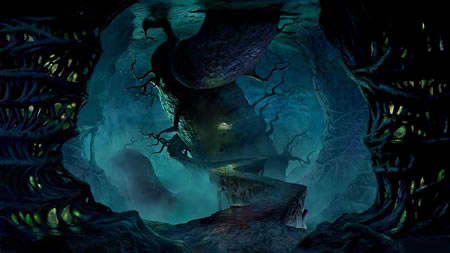 For years Fred Gmbino’s refined, confidently rendered and highly accomplished paintings have been gracing the covers of science fiction and fantasy books, as well as serving the needs of clients like National Geographic, Scientific American, Der Speigel, Lego, Mattel and The US Postal Service.
Over that time his approach has changed, from oil to acrylic to airbrush, and then, in the late 90’s, Gambino started to work with GCI imagery and combine it with his more traditional methods, leading to a fusion of the two that gave him more freedom to experiment and allowed a more dramatic approach to perspective and composition.
In 2001 he began working with DNA Productions as a concept artist and matte painter on the Oscar nominated Jimmy Neutron Boy Genius, followed up by work on the visual development of the TV series Project X; and from 2003 to 2006, he created production art and matte paintings for the feature film The Ant Bully (image above).
Since then he has worked on The Star Beast and Life in a Pickle and is currently Art Director on Escape from Planet Earth from Rainmaker Entertainment; and he continues to find time to create illustrations.
A collection of his work was published as Ground Zero from Paper Tiger. His latest book is Life-Size Dragons; and he is also one of the featured artists in Fantasy Art Masters, which includes details of his working methods.
Categories:
-
The Macchiaioli

As fond as I am of the French Impressionists, I’m drawn even more to painters at the edges of their circle; painters who were influenced by their approach, like the so-called “American Impressionists”, or predecessors, like Gustav Courbet or Camille Corot and other members of the Barbizon School, who presaged and influenced the Impressionists in their break from the academic traditions.A little know counterpart to the French artists of the Barbizon school was a group of Italian painters in Florence and surrounding Tuscany called the Macchiaioli (pronounced mah-key-ay-OH-li) who were active around the same time.
The middle of the 19th century was a time of revolution and political upheaval in many parts of Europe, and the artistic revolutions of time were part of the same social fabric. The artists who were most influential in forming the Macchiaioli, however, were directly involved in uprisings, joining other intellectuals and idealists who fought to wrest a united Italian state from the smaller independent areas that were often under the control of foreign powers.
Though that goal was eventually reached, the artists soon realized that their ideal democratic state was not to be a reality (politics is always politics, after all, and personal power trumps idealism), and turned their revolutionary zeal to freeing themselves from the restraints of academic formalism in their paintings.
They retreated to the countryside around Florence, feeling themselves inheritors of the Renaissance that bloomed there, and began to devote themselves to directly capturing the countryside in plein air paintings, using bold patches of color known as “macchia”, meaning splotch or spot, from which the name of their school is derived.
They often worked with a strong chiaroscuro, accented by dappled areas; isolating brighter colors into these spots and leading to effects that seem like sparkles of light.
In their use of broken color, brilliant sunlight, plein air painting and the direct observation of landscape, they were direct forerunners of the Impressionists, though the Macchiaioli received little notice and are only in recent years being rediscovered. Notable members of the circle included Giovanni Fattori, Silvestro Lega and Telemarco Signorini, along with Gusieppe Abbati, Vincenzo Cablanca and others.
I think they are wonderful painters and I’ll try to feature some of them individually on lines and colors in the future.
(Image above: Silvestro Lega, larger version here)
Categories:
-
Many Faces of Batman

Here’s a fun little diversion.Few comic book characters have been interpreted and reinterpreted as often, or in quite the variety of was, as Batman. Created in the late 1930’s by artist Bob Kane and writer Bill Finger, the character, originally called the Bat-Man, and at times “the Batman”, was a synthesis of other pop culture characters, notably The Shadow, Doc Savage and possibly Zorro.
He has become a familiar pop-culture icon and has been portrayed over the years by a succession of artists and writers whose interpretations have been simplistic, complex, silly, dark and everything in between. It seems like every mainstream comic book artist harbors a secret (or not so secret) desire to do their take on the Batman.
Many Faces of Batman is a web site that has collected some images by a number of the artists who have drawn (and/or painted) the character, and displays then in galleries arranged by artist.
If you can tolerate the ads and the slow server speed, you can flip through a mini-tour of 20th Century super-hero comics, get a quick look at some different artist’s styles (though some are not well represented by the particular choice of image) and see how varied the approaches have been to the portrayal of one character over the years. (Notice the different lengths of the ears.)
[Image above, left to right: Bob Kane, Jim Aparo, Neal Adams, Frank Miller, Brian Bolland, AlexRoss.]
Categories:
-
Spectrum 14
 There are a number of illustration annuals, showcasing the editors’ choices for notable contemporary illustration. I look forward to several of them, The Society of Illustrator’s Annual, for example, but for many years (14 to be exact) my favorite illustration annual has been Spectrum: The Best in Contemporary Fantastic Art, edited by Cathy Fenner and Arine Fenner.
They are aided each year by a jury of top artists in the field, and, in addition to displaying the work chosen from hundreds of submissions, they bestow several awards, including a Grand Master Award, honoring a respected veteran who has made an outstanding contribution to the field, which this year goes to Syd Mead.
Submissions are open to anyone, though there is an entry fee ($20), and the selection is competitive. The Call for Entries for the next volume, Spectrum 15, is now open. The deadline is January 25, 2008.
There is a good article on Irene Gallo’s always informative blog The Art Department from almost exactly a year ago, in which she writes about the Call for Entries for the volume that just came out. In it she discusses why an artist would pay to have their work considered for entry in the collections. (See also my previous post on Irene Gallo.)
Originally concentrating on fantasy, science fiction and horror illustration, with a minor in comics, the selection of work for the Spectrum collections has widened in recent years to include film and gaming concept art, as well as more mainstream illustrators whose work can fit into those categories.
My first reaction when I encountered Spectrum 14 years ago and leafed through it’s pages full of gloriously imaginative and beautifully executed work was “Wow, cool!”, which has continued to be my reaction each subsequent year, as the editors show a remarkable tendency to showcase illustration, comics and fantasy art that I really like.
They have in fact, included work form a remarkable number of artists that I’ve featured for you here in lines and colors posts. There is a partial list of them in my post from last year on Spectrum 13.
Spectrum 14 just hit the stores yesterday, at least for those of us who buy their copy in bookstores that sell comics. Other bookstores should have it soon.
I’m second to none in my appreciation of artwork on the web, but there is one factor that is still lacking. Compared to print, computer monitors are low-resolution (maybe 100ppi tops for the most part; though advances in the Apple’s new Leopard operating system are laying the groundwork for true high resolution (200-300ppi) computer screens in the near future).
In the meantime, if you like the fantastic art that I’ve featured over the years on lines and colors, I can pretty much guarantee that you’ll enjoy seeing the work in the Spectrum collections, in the high resolution print medium for which it was intended.
Categories:
-
Readers and writers blog
A tip of the hat to Sid Leavitt for his complimentary review of lines and colors on Readers and writers blog. Overseen by Leavitt, Readers and writers blog is devoted to hosting experimental writing and seeking out and highlighting good writing in the blogosphere.
His reviews of other blogs can lead to an interesting cross-section of that sphere, covering a wide variety of topics, but with a common thread of good writing. He is fond of The Dilbert Blog, for example, not because he is an avid fan of the strip (he’s not), but because the blog itself is entertaining and well written, something I probably wouldn’t have discovered without Leavitt’s review.
In addition to the featured writing and reviews of other blogs, there is a slowly growing blogroll of well-written blogs.
Categories:
-
Nickolai N. Dudka
 Nick Dudka is a contemporary German born artist, currently living in Russia, who has become a modern proponent of the traditional Tibetan Buddhist art of the thangka, or scroll painting.
After formal training in Western art in Ulan-Ude, Russia and at the Academy of Art in Kiev, Dudka became interested in the spiritual and artistic traditions of Tibetan Buddhism and studied thangka painting over many years, in numerous visits to Mongolia, Nepal and India.
Thangkas are painted on linen or cotton, and occasionally silk, prepared with animal glue and talcum, stitched along the edges and stretched on a frame. This is similar in some respects to the European tradition of painting on cotton or linen canvas stretched on a frame and prepared with animal skin glue and chalk whiting (gesso). The pigments are from sources like malachite and cinnabar, and are mixed with animal glue and ox bile.
The galleries on Dudka’s site include some of his preliminary charcoal drawings.
Thangkas are most often of religious subjects, portraits of Buddhas, and stories from the lives of other religious figures. The images are a striking mixture of figurative and decorative elements. Alive with intricate detail, swirling eddies of texture and color are contrasted with anchored elements of preternatural stillness. Fierce, tranquil or blissful deities gaze out at you from amidst the push and pull of these polar forces of stillness and motion.
The image shown at left, and in detail at bottom, is of Palden Lhamo, a fierce protector diety, and one of the few female figures in the major group. She is the Tibetan version of the goddess known as Shri Devi in India.
The figures are sometimes cast as giants atop small floating islands, in streams swirling with their own eddies and currents, and arrays of lotus blossoms, all indicative of elements in Buddhist teachings. The stylized clouds that often fill the backgrounds also have suggestions of swirling moment, suggesting invisible currents in the air, along with dramatic roiling masses of flame, smoke or other elements, intertwined with the flowing robes and garments of the figures.
In contrast to all of the movement and dynamics are large decorative elements, often surrounding the figures with large golden “halos” that are tempting to compare to the halos surrounding religious figures in European art.
I don’t know enough about thangka painting to make an informed comparison between Dudka’s contemporary versions and traditional paintings. You can see some traditional Thangka paintings on Exotic India, Buddahnet and Circle of Bliss.
[Link via Metafilter]
Categories:


Charley’s Picks
Bookshop.org
(Bookshop.org affilliate links; sales benefit independent bookshop owners; I get a small percentage to help support my work on Lines and Colors)

John Singer Sargent: Watercolors


Urban Sketching: Understanding Perspective


Charley’s Picks
Amazon
(Amazon.com affiliate links; sales go to a larger yacht for Jeff Bezos; but I get a small percentage to help support my work on Lines and Colors)
John Singer Sargent: Watercolors
Urban Sketching: Understanding Perspective