
Categories
- 3d CGI
- Amusements
- Animation
- Anime & Manga
- Art Materials
- Art Videos
- Blogroll
- Cartoons
- Color
- Comics
- Concept & Visual Dev.
- Creativity
- Digital Art
- Digital Painting
- Displaying Art on the Web
- Drawing
- Eye Candy for Today
- Gallery and Museum Art
- High-res Art Images
- Illustration
- Motion Graphics & Flash
- Museums
- Online Museums
- Outsider Art
- Painting
- Painting a Day
- Paleo Art
- Pastel, Conté & Chalk
- Pen & Ink
- Prints and Printmaking
- Reviews
- Sc-fi and Fantasy
- Sculpture & Dimensional
- Site Comments
- Sketching
- Storyboards
- Tools and Techniques
- Uncategorized
- Vector Art
- Videos & Podcasts
- Vision and Optics
- Watercolor and Gouache
- Webcomics
Archives
- April 2026
- March 2026
- February 2026
- January 2026
- December 2025
- November 2025
- October 2025
- September 2025
- August 2025
- July 2025
- June 2025
- May 2025
- January 2025
- December 2024
- November 2024
- October 2024
- September 2024
- August 2024
- June 2024
- April 2024
- March 2024
- February 2024
- January 2024
- December 2023
- November 2023
- October 2023
- September 2023
- August 2023
- July 2023
- May 2023
- April 2023
- March 2023
- February 2023
- January 2023
- December 2022
- November 2022
- September 2022
- August 2022
- July 2022
- June 2022
- May 2022
- April 2022
- March 2022
- February 2022
- January 2022
- December 2021
- November 2021
- October 2021
- September 2021
- August 2021
- July 2021
- June 2021
- May 2021
- April 2021
- March 2021
- February 2021
- January 2021
- December 2020
- November 2020
- October 2020
- September 2020
- August 2020
- July 2020
- June 2020
- May 2020
- April 2020
- March 2020
- February 2020
- January 2020
- December 2019
- November 2019
- October 2019
- September 2019
- August 2019
- July 2019
- June 2019
- May 2019
- April 2019
- March 2019
- February 2019
- January 2019
- December 2018
- November 2018
- October 2018
- September 2018
- August 2018
- July 2018
- June 2018
- May 2018
- April 2018
- March 2018
- February 2018
- January 2018
- December 2017
- November 2017
- October 2017
- September 2017
- August 2017
- July 2017
- June 2017
- May 2017
- April 2017
- March 2017
- February 2017
- January 2017
- December 2016
- November 2016
- October 2016
- September 2016
- August 2016
- July 2016
- June 2016
- May 2016
- April 2016
- March 2016
- February 2016
- January 2016
- December 2015
- November 2015
- October 2015
- September 2015
- August 2015
- July 2015
- June 2015
- May 2015
- April 2015
- March 2015
- February 2015
- January 2015
- December 2014
- November 2014
- October 2014
- September 2014
- August 2014
- July 2014
- June 2014
- May 2014
- April 2014
- March 2014
- February 2014
- January 2014
- December 2013
- November 2013
- October 2013
- September 2013
- August 2013
- July 2013
- June 2013
- May 2013
- April 2013
- March 2013
- February 2013
- January 2013
- December 2012
- November 2012
- October 2012
- September 2012
- August 2012
- July 2012
- June 2012
- May 2012
- April 2012
- March 2012
- February 2012
- January 2012
- December 2011
- November 2011
- October 2011
- September 2011
- August 2011
- July 2011
- June 2011
- May 2011
- April 2011
- March 2011
- February 2011
- January 2011
- December 2010
- November 2010
- October 2010
- September 2010
- August 2010
- July 2010
- June 2010
- May 2010
- April 2010
- March 2010
- February 2010
- January 2010
- December 2009
- November 2009
- October 2009
- September 2009
- August 2009
- July 2009
- June 2009
- May 2009
- April 2009
- March 2009
- February 2009
- January 2009
- December 2008
- November 2008
- October 2008
- September 2008
- August 2008
- July 2008
- June 2008
- May 2008
- April 2008
- March 2008
- February 2008
- January 2008
- December 2007
- November 2007
- October 2007
- September 2007
- August 2007
- July 2007
- June 2007
- May 2007
- April 2007
- March 2007
- February 2007
- January 2007
- December 2006
- November 2006
- October 2006
- September 2006
- August 2006
- July 2006
- June 2006
- May 2006
- April 2006
- March 2006
- February 2006
- January 2006
- December 2005
- November 2005
- October 2005
- September 2005
- August 2005
Relevant Blogs
Art, Painting & Sketch
- Gurney Journey
- Underpaintings
- Art and Influence
- Painting Perceptions
- Oil Painters of America
- Vasari Paint POV
- Flying Fox
- Urban Sketchers
- Bento (Smithsonian)
- Art Inconnu
- The Hidden Place
- Still Life
- Making a Mark
- The Art of the Landscape
- Exploring Color & Creativity
- Art Contrarian
- Artist A Day
- beinArt Surreal Art Collective
- Eye Level
- David Dunlop
- p.i.g.m.e.n.t.i.u.m
- CultureGrrl
- Joaquín Sorolla blog
- Artists in Pastel
“Painting a Day”
- A Painting a Day (Keiser)
- On Painting (Keiser)
- Julian Merrow-Smith
- Karen Jurick
- Jeffrey Hayes
- Carol Marine
- Abbey Ryan
- Daily Paintworks
Other Painting Blogs
- Virtual Gouache Land
- Neil Hollingsworth
- Marc Hanson
- Kevin Menck
- Marc Dalessio
- Larry Seiler
- Stapleton Kearns
- Colin Page
- Roos Schuring
- Hans Versfelt
- Titus Meeuws
- Régis Pettinari
- René Plein Air
- Belinda Del Pesco
- Robin Weiss
- Nathan Fowkes (Land Sketch)
- William Wray
- Frank Serrano
- Stephen Magsig
- Michael Chesley Johnson
- Twice a Week
- Sarah Wimperis
- Rob Adams
- Michael Cole Manley
- The Dirty Palette Club
- Mike Manley’s Draw!
Gallery Art & Illustration mix
Illustration
- Howard Pyle
- 100 Years of Illustration
- BibliOdyssey
- Illustration Art
- Today’s Inspiration
- Illustration Mundo
- Little Chimp Society
- Danny Gregory
- R D (John Martz
- Illustration Friday blog
- Monster Brains
- Illustrators & Illustrations (RU)
- Elwood H. Smith
- DaniDraws.com
- Designers Who Blog
- iSpot Blog
Sci-Fi & Fantasy
Illustration & Comics
Comics & Cartoons
- Comics Beat
- Robot 6
- Newsarama Blog
- Comic Vine
- Comics Alliance
- Forbidden Planet Int.
- Paolo Rivera
- Bolt City
- Flight
- Scott McCloud
- The Comics Journal
- Comixpedia
- Funnybook Babylon
- James Baker
- Middleton’s Sketchbook
- Boneville
- The Hotel Fred
- Paul Rivoche
- Daily Cartoonist
- Mad About Cartoons (William Wray)
- Digital Strips
Illustration & Concept
Animation & Concept
- Cartoon Brew
- Animation Blog
- Cold Hard Flash
- Concept Art World
- The CAB
- FY Concept Art
- Concept Ships
- Concept Robots
- John Nevarez
- Armand Serrano
- Marcos Mateu-Mestre
- all kinds of stuff (Kricfalusi)
- Yacin the faun (Man Arenas)
- Kelsey Mann
- Cre8tivemarks Blog
- Ice-Cream Monster Toon Cafe
- AAU Character & Creature Design
- AAU Animation Notes
- Articles and Texticles
Paleo & Scientific
Tools & Techniques
Other
Lists of Art Blogs
Art Image Resource Links
Historic Art Images
- Wikimedia Commons: Paintings
- Wikimedia Commons: Drawings
- The Athenaeum
- WikiArt (WikiPaintings)
- Google Art Project: Artists
- Google Art Project: Collections (Museums)
- ArtCyclopedia
- Web Gallery of Art
- Art Renewal Center
- Web Gallery of Impressionism
Auction Consolidation sites
Auction sites
- Sotheby’s
- Bonham’s
- Christies
- Heritage Auctions: Fine Art
- Heritage Auctions: Illustration
- Freeman’s Auctions
- Bukowskis
- Shannon’s
Image Search
Reverse Image Search (search by image)
- Tin Eye
- RevImg
- Google Image Search (camera icon)
- Bing Image Search (camera icon)
Promoting some friends and some clients of my website design business
- Twin Willows T’ai Chi studio in Wilmington DE. Taiji classes with Bryan Davis.
- Ray Hayward, Inspired Teacher of T’ai Chi ( Taiji ) in Minneapolis, Founder of Mindful Motion Tai Chi Academy
- OldHead Tattoo studio and Art Gallery in Wilmington DE. Tattoos and paintings by Bruce Gulick
- Sharon Domenico Art, pet portrait oil paintings
- Platinum Paperhanging, wallpaper hanging, Main Line and Philadelphia, PA
- Lisa Stone Design, interior designer, Main Line and Philadelphia, PA
- Studio12KPT, original art, prints, calendars and other custom printed items by Van Sickle & Rolleri
-
Da Vinci’s Last Supper, in high resolution servings

OK all you conspiracy buffs and fans of The Da Vinci Code, here’s your chance to get all up close and personal with the master’s famous fresco from the comfort of your computer chair.The folks at Haltadefinizione, who previously posted zoomable ultra-high resolution images of Gaudenzio Ferrari’s wonderfully intricate Vita di Cristo, and Andrea Pozzo’s amazing trompe l’oeil vault, Gloria di Sant’Ignazio, at 8.6 and 9.8 gigapixels respectively, have posted a new 16 (count ’em!) gigapixel image of Da Vinci’s The Last Supper.
To give you some idea, that’s 1,600 times higher resolution than a typical 10 megapixel digital camera. You can get down to the level of examining individual chips of plaster if you want, but you’ll probably want to stay out at about 6-10% of the potential magnification just to be able to see recognizable parts of the image.
Actually, I find the hi-res version of Pozzo’s ceiling more rewarding to explore this way, flying in and out through his imaginary sky. The controls allow you to immediately turn off the inexplicable music, zoom and scroll, and even tuck the smaller preview window out of the way.
The da Vinci image is unfortunately watermarked, but it’s still fascinating to be able to see it up close. The curator points out: “You can see how Leonardo made the cups transparent, something you can’t ordinarily see.”
Intended to make examination of the painting possible for numerous scholars, particularly amid some controversy about Milan’s ability to protect the work, which has deteriorated seriously, from the city’s severe pollution problem, the image has been made available to the public, and you can zoom, scroll and examine to your heart’s content.
Leonardo reportedly used some experimental techniques in the painting, diverging from the traditional methods of fresco that have made it one of the most durable painting methods known to mankind, with unfortunate results.
For those interested in the pop-culture phenomenon of the Dan Brown’s book and the atrendant movie, you can zoom in on the figure to Christ’s right and see that it is pretty easy to interpret it as feminine. Also, if you print the image out on a vinyl disc and play it backwards on a phonograph, it says “I buried Paul…”.
[Link courtesy of Karl Kofoed]
Categories:
-
Allan R. Banks

When thinking about “plein air” painting, which is simply a French term for painting out of doors, the thought is naturally one of landscape. More unusual is the practice of plein air portrait painting, as practiced by classical realist painter Allan R. Banks.The infrequent pursuit of this approach is understandable. The usual controlled lighting and background conditions, employed to make portrait painting easier, are replaced with the much harder to manage background integration (painting essentially a portrait and a landscape) and the fleeting lighting conditions inherent to outdoor painting.
The result of taking on that challenge, however, is a refreshingly different kind of portrait.
Banks works in the tradition of academic painters from the late 19th Century who also did notable figutative works set in landscapes, like Jules Bastien-Lepage and Daniel Ridgeway Knight, as well as “impressionistic” realists like Sorolla and Sargent.
Banks studieed with noted painters Richard Lack and R.H. Ives Gammel and has achieved notice in realist and naturalist painting circles and has for some time been the President of the American Society of Classical Realism. His essay, Clarion Call, from the Classical Realism Journal, is prominently reprinted on the Art Renewal Center, which also features a gallery of his work.
For a number of years his web presence has been a section at classicalrealism.com, which is essentially an extension of the Gandy Gallery.
Those pages have apparently not been updated for a few years, and Banks has a new site at allanbanks.com. Though the new site is notable for having newer works, the older presence is still relevant as the new site is apparently suffering some newbie pains, like galleries without thumbnails and some incorrect links.
One of the problems, though, turns out to be a plus. What I thought at first was a slow sever connection, resulting in glacial page loading even over high bandwidth, turned out to be the result of a common amateur web design mistake of resizing large images in the HTML rather than providing correctly sized images for the pages, linked to larger ones. Also, whoever is doing the site is posting huge, uncompressed BMP files instead of compressed JPEGs.
Much to my delight, however, the images that are posted are large in physical size as well as file size, which is one of the areas where many artist’s sites fail, providing images that are too small to really get a good impression of the work. If you contextual-click on the images on Banks’ new site and open them in a new window, you’ll find many of them are large enough for you to actually get a real feeling for the appeal of his work; which is beautifully handled, rewarding in the details, and surprisingly painterly; characteristics that smaller images don’t reveal.
Hopefully, the new site will eventually get thumbnail navigation and correct image file handling, but I certainly hope the large images of Banks’ paintings remain. You will also find some reasonably large images of Banks’ work on the Art Renewal Center.
In addition to his plein air portraits, Banks paints more traditional indoor portraits, plein air compositions in which the landscape is dominant (thought they usually also include figures) and still life.
Banks often chooses the subdued lighting of overcast days or places his figures in shadow, perhaps partially for the easier handling of diffused outdoor lighting which doesn’t change as dramatically in short periods of time as direct sun, but perhaps more to be in keeping with that practice among the artists who have worked in that tradition.
Categories:
-
Kevin Mack
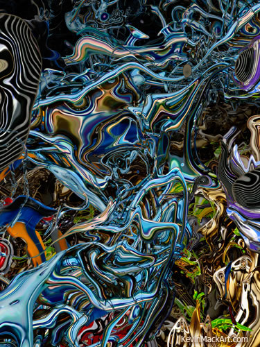
Kevin Mack’s digital compositions are like a roller coaster for your eyes.You glide into them on big swooping forms that recede into the depths, looping and swirling among themselves like the veinous system of an android, or vibrating into a crenulated landscape of primary colors. As you go further into the images (and “into” is the operative word), traceries of liquid strands twist around floating islands of Henry Moore forms, and sinuous wires multi-colored quicksilver explode into blossoms of robotic flowers.
If I seem to be waxing poetic, it’s because Mack’s images are conducive to the kind of dreamlike interpretation and “animals in the clouds” visions that are characteristic of the fantastical landscapes of Max Ernst or Robert Venosa; sort of a hyperdimensional Jackson Pollock on digital steroids, or Yves Tanguy in a blender.
It’s hard for me to look at these and not think of them as digital sculptures, and marvel at how fantastic they would be if they could be made into actual physical objects that you could walk around (or through).
Mack creates his images digitally using mathematical models that are the outgrowth of his work as a film industry concept and matte artist, which led to work in “artifiical life” and rule based systems that can be used to “grow” 3-D CGI forms based on sets of programming criteria.
His work in that area was utilized in films like What Dreams May Come and Fight Club and inspired the development of software that is being used to simulate the growth of biological tissues for virtual stem cell research.
Mack is the child of two Disney artists and studied Fine Art, Illustration and Film at the Art Center College of Design. He is now an Academy Award wining Visual Effects Supervisor and received the Oscar for his work on What Dreams May Come.
His other film credits include Vanilla Sky, Apollo 13, The Fifth Element, Big Fish and A Beautiful Mind.
Mack’s digital pieces are produced as limited edition giclee prints (image above: Neurosymphonic Self Reflection, 36 x 48″ giclee print on canvas). His digital art has been exhibited at The Los Angeles Center for Digital Art, Siggraph, and Sony Pictures Imageworks.
[Link via BoingBoing]
Categories:
-
Jacek Yerka (update)

The temptation is there, of course, when attempting to describe Jacek Yerka’s fantastical and dreamlike paintings, to use the term “surreal”. I will persist, though, in my cranky insistence on reserving that term to refer to a specific group of artists, and the devotion to images derived from the unconscious that was their manifesto.So I’ll use “magic realism” to refer to Yerka’s visions of doorways to other worlds, disorienting juxtapositions of scale, brain-tickling suggestions of relationships between the seemingly unrelated, and clever manipulation of perspective, proportion and other visual cues.
I wrote about Jacek Yerka back in 2006. Since then, he has acquired a domain name, yerkaland.com, and handed maintenance of his site over to others, and the site has been revised and updated. My other post still has relevant links to books and other galleries.
Unfortunately, I think the new site is a bit more scattered in the presentation of images than the old one. You will find several pages (links at the bottom) of images in the Giclee gallery as well as in the How do I create my paintings page, as well as in the My worlds and Art for sale sections. The Art for sale section has the largest reproductions.
There is also now a Jacek Yerka gallery on beinArt Surreal Art Collective, and I came across a nice article with images on Dark Roasted Blend.
Categories:
-
Jack Unruh
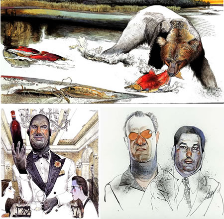
Interestingly, Kansas illustrator Jack Unruh divides his online portfolio into two enigmatically defined sections, What is real and What is not real.Presumably, the latter has more conceptual and imagination based illustrations, although in both you will find his wonderfully drawn portrait/caricatures of well known figures, images of fish, bears and other wildlife, and scenes of a variety of things and places.
Unruh has a passion for the outdoors, and fishing in particular, judging by the many illustrations of specific species of game fish in his Prints and Stock sections. His illustrations have appeared in Field and Stream, Sports Afield and Sports Illustrated, as well as a roster of major periodicals like Atlantic Monthly, Rolling Stone, Time, National Geographic and New York Magazine.
He also has done illustrations for numerous corporate and advertising clients. His illustrations have had a continuing presence in graphic arts magazines like Communication Arts, American Illustration, Graphis, AIGA and Print, and he also has a well deserved list of awards from the Society of Illustrators and others.
(An interesting side note for readers that have been following my series of articles about displaying your art on the web: all of the galleries on Unruh’s site have what I think is an excellent navigation system for online galleries (one that I’ve used myself), in which a convenient vertical (note: vertical not horizontal) scrolling frame on the right gives immediate access to images that appear in a large area to the left. The scroll bar is thus in the natural position for a scrolling web page, where the user expects it to be. Also the frames in this case are in their own page that can be bookmarked, at least for the major sections.)
Unruh’s approach looks like a combination of pen and ink and watercolor. His pen and ink underdrawing often has stippling and texture not often present in drawings that are intended for the application of color, and he will frequently leave parts of the pen and ink drawing uncolored, leading to a really interesting blend of the two types of image.
Your eye goes back an forth from islands of color to pen and ink textures in a visual smorgasbord that amuses with its variety, but never sidetracks or detracts from the intent of the illustration.
Unruh makes the color and black and white areas flow together in a coherent whole, as if the lines, hatching, spatters, squiggles and dots of pen and ink are just additional “colors” in his palette.
There is an online article about him from the Sep/Oct 2002 issue of Graphis, and an interview on Illustration is Easy.
Categories:
-
Doug Braithwaite

First, a little bit of Wikipedia-style disambiguation. Since I’m likely to write here about either topic, I’ll point out that this article is about the gallery artist named Doug Braithwaite, as opposed to the comic book artist that some readers might associate the name.Doug Braithwaite is a painter who works primarily en plein air, or on studio works that are based on plein air studies. His subject matter comes from his surrounding Utah countryside, mountains or town scenes.
He says in his artist’s statement: “I often worry that it will be hard to continue to be a landscape painter in a place where you have lived and worked all your life. But I have found that what used to seem a limited resource is, in fact, quite limitless. The more I paint, the more options for paintings are opened up.”
Braithwaite approaches his subjects with a fresh, painterly style that comes from the brevity of notation necessary for successful plein air painting.
“Painterly” is a term frequently used to describe paintings in which brush strokes or the surface of the paint itself are a visible characteristic of the image. Though it’s not always easy to tell because the images of his paintings are not reproduced as large on the web as they might be, Braithwaite seems to have the ability to capture many of the major shapes or “color notes” in his paintings with single brushstrokes.
It might be a fence post, a tree trunk, the side of a distant house or the plane of a face of rock, Braithwaite captures it with a quick confidence that leaves the impression that the painting was executed without hesitation or doubt.
His color notes are so accurate that the images can at times appear “photographic”, but I think that is again a limitation of the size at which they’re reproduced, and closer examination gives a suggestion of their geometric lattice of visible brush strokes.
In keeping with the geometry of his strokes, Braithwaite’s compositions have a strong underlying geometry as well. In this regard, viewing the even smaller versions of the thumbnail images lets you see the large, bold shapes of color areas that form the foundation of his paintings.
[Suggestion courtesy of Karin Jurick, (see my post on Karin Jurick)]
Categories:


Charley’s Picks
Bookshop.org
(Bookshop.org affilliate links; sales benefit independent bookshop owners; I get a small percentage to help support my work on Lines and Colors)

John Singer Sargent: Watercolors


Urban Sketching: Understanding Perspective


Charley’s Picks
Amazon
(Amazon.com affiliate links; sales go to a larger yacht for Jeff Bezos; but I get a small percentage to help support my work on Lines and Colors)
John Singer Sargent: Watercolors
Urban Sketching: Understanding Perspective