
Categories
- 3d CGI
- Amusements
- Animation
- Anime & Manga
- Art Materials
- Art Videos
- Blogroll
- Cartoons
- Color
- Comics
- Concept & Visual Dev.
- Creativity
- Digital Art
- Digital Painting
- Displaying Art on the Web
- Drawing
- Eye Candy for Today
- Gallery and Museum Art
- High-res Art Images
- Illustration
- Motion Graphics & Flash
- Museums
- Online Museums
- Outsider Art
- Painting
- Painting a Day
- Paleo Art
- Pastel, Conté & Chalk
- Pen & Ink
- Prints and Printmaking
- Reviews
- Sc-fi and Fantasy
- Sculpture & Dimensional
- Site Comments
- Sketching
- Storyboards
- Tools and Techniques
- Uncategorized
- Vector Art
- Videos & Podcasts
- Vision and Optics
- Watercolor and Gouache
- Webcomics
Archives
- April 2026
- March 2026
- February 2026
- January 2026
- December 2025
- November 2025
- October 2025
- September 2025
- August 2025
- July 2025
- June 2025
- May 2025
- January 2025
- December 2024
- November 2024
- October 2024
- September 2024
- August 2024
- June 2024
- April 2024
- March 2024
- February 2024
- January 2024
- December 2023
- November 2023
- October 2023
- September 2023
- August 2023
- July 2023
- May 2023
- April 2023
- March 2023
- February 2023
- January 2023
- December 2022
- November 2022
- September 2022
- August 2022
- July 2022
- June 2022
- May 2022
- April 2022
- March 2022
- February 2022
- January 2022
- December 2021
- November 2021
- October 2021
- September 2021
- August 2021
- July 2021
- June 2021
- May 2021
- April 2021
- March 2021
- February 2021
- January 2021
- December 2020
- November 2020
- October 2020
- September 2020
- August 2020
- July 2020
- June 2020
- May 2020
- April 2020
- March 2020
- February 2020
- January 2020
- December 2019
- November 2019
- October 2019
- September 2019
- August 2019
- July 2019
- June 2019
- May 2019
- April 2019
- March 2019
- February 2019
- January 2019
- December 2018
- November 2018
- October 2018
- September 2018
- August 2018
- July 2018
- June 2018
- May 2018
- April 2018
- March 2018
- February 2018
- January 2018
- December 2017
- November 2017
- October 2017
- September 2017
- August 2017
- July 2017
- June 2017
- May 2017
- April 2017
- March 2017
- February 2017
- January 2017
- December 2016
- November 2016
- October 2016
- September 2016
- August 2016
- July 2016
- June 2016
- May 2016
- April 2016
- March 2016
- February 2016
- January 2016
- December 2015
- November 2015
- October 2015
- September 2015
- August 2015
- July 2015
- June 2015
- May 2015
- April 2015
- March 2015
- February 2015
- January 2015
- December 2014
- November 2014
- October 2014
- September 2014
- August 2014
- July 2014
- June 2014
- May 2014
- April 2014
- March 2014
- February 2014
- January 2014
- December 2013
- November 2013
- October 2013
- September 2013
- August 2013
- July 2013
- June 2013
- May 2013
- April 2013
- March 2013
- February 2013
- January 2013
- December 2012
- November 2012
- October 2012
- September 2012
- August 2012
- July 2012
- June 2012
- May 2012
- April 2012
- March 2012
- February 2012
- January 2012
- December 2011
- November 2011
- October 2011
- September 2011
- August 2011
- July 2011
- June 2011
- May 2011
- April 2011
- March 2011
- February 2011
- January 2011
- December 2010
- November 2010
- October 2010
- September 2010
- August 2010
- July 2010
- June 2010
- May 2010
- April 2010
- March 2010
- February 2010
- January 2010
- December 2009
- November 2009
- October 2009
- September 2009
- August 2009
- July 2009
- June 2009
- May 2009
- April 2009
- March 2009
- February 2009
- January 2009
- December 2008
- November 2008
- October 2008
- September 2008
- August 2008
- July 2008
- June 2008
- May 2008
- April 2008
- March 2008
- February 2008
- January 2008
- December 2007
- November 2007
- October 2007
- September 2007
- August 2007
- July 2007
- June 2007
- May 2007
- April 2007
- March 2007
- February 2007
- January 2007
- December 2006
- November 2006
- October 2006
- September 2006
- August 2006
- July 2006
- June 2006
- May 2006
- April 2006
- March 2006
- February 2006
- January 2006
- December 2005
- November 2005
- October 2005
- September 2005
- August 2005
Relevant Blogs
Art, Painting & Sketch
- Gurney Journey
- Underpaintings
- Art and Influence
- Painting Perceptions
- Oil Painters of America
- Vasari Paint POV
- Flying Fox
- Urban Sketchers
- Bento (Smithsonian)
- Art Inconnu
- The Hidden Place
- Still Life
- Making a Mark
- The Art of the Landscape
- Exploring Color & Creativity
- Art Contrarian
- Artist A Day
- beinArt Surreal Art Collective
- Eye Level
- David Dunlop
- p.i.g.m.e.n.t.i.u.m
- CultureGrrl
- Joaquín Sorolla blog
- Artists in Pastel
“Painting a Day”
- A Painting a Day (Keiser)
- On Painting (Keiser)
- Julian Merrow-Smith
- Karen Jurick
- Jeffrey Hayes
- Carol Marine
- Abbey Ryan
- Daily Paintworks
Other Painting Blogs
- Virtual Gouache Land
- Neil Hollingsworth
- Marc Hanson
- Kevin Menck
- Marc Dalessio
- Larry Seiler
- Stapleton Kearns
- Colin Page
- Roos Schuring
- Hans Versfelt
- Titus Meeuws
- Régis Pettinari
- René Plein Air
- Belinda Del Pesco
- Robin Weiss
- Nathan Fowkes (Land Sketch)
- William Wray
- Frank Serrano
- Stephen Magsig
- Michael Chesley Johnson
- Twice a Week
- Sarah Wimperis
- Rob Adams
- Michael Cole Manley
- The Dirty Palette Club
- Mike Manley’s Draw!
Gallery Art & Illustration mix
Illustration
- Howard Pyle
- 100 Years of Illustration
- BibliOdyssey
- Illustration Art
- Today’s Inspiration
- Illustration Mundo
- Little Chimp Society
- Danny Gregory
- R D (John Martz
- Illustration Friday blog
- Monster Brains
- Illustrators & Illustrations (RU)
- Elwood H. Smith
- DaniDraws.com
- Designers Who Blog
- iSpot Blog
Sci-Fi & Fantasy
Illustration & Comics
Comics & Cartoons
- Comics Beat
- Robot 6
- Newsarama Blog
- Comic Vine
- Comics Alliance
- Forbidden Planet Int.
- Paolo Rivera
- Bolt City
- Flight
- Scott McCloud
- The Comics Journal
- Comixpedia
- Funnybook Babylon
- James Baker
- Middleton’s Sketchbook
- Boneville
- The Hotel Fred
- Paul Rivoche
- Daily Cartoonist
- Mad About Cartoons (William Wray)
- Digital Strips
Illustration & Concept
Animation & Concept
- Cartoon Brew
- Animation Blog
- Cold Hard Flash
- Concept Art World
- The CAB
- FY Concept Art
- Concept Ships
- Concept Robots
- John Nevarez
- Armand Serrano
- Marcos Mateu-Mestre
- all kinds of stuff (Kricfalusi)
- Yacin the faun (Man Arenas)
- Kelsey Mann
- Cre8tivemarks Blog
- Ice-Cream Monster Toon Cafe
- AAU Character & Creature Design
- AAU Animation Notes
- Articles and Texticles
Paleo & Scientific
Tools & Techniques
Other
Lists of Art Blogs
Art Image Resource Links
Historic Art Images
- Wikimedia Commons: Paintings
- Wikimedia Commons: Drawings
- The Athenaeum
- WikiArt (WikiPaintings)
- Google Art Project: Artists
- Google Art Project: Collections (Museums)
- ArtCyclopedia
- Web Gallery of Art
- Art Renewal Center
- Web Gallery of Impressionism
Auction Consolidation sites
Auction sites
- Sotheby’s
- Bonham’s
- Christies
- Heritage Auctions: Fine Art
- Heritage Auctions: Illustration
- Freeman’s Auctions
- Bukowskis
- Shannon’s
Image Search
Reverse Image Search (search by image)
- Tin Eye
- RevImg
- Google Image Search (camera icon)
- Bing Image Search (camera icon)
Promoting some friends and some clients of my website design business
- Twin Willows T’ai Chi studio in Wilmington DE. Taiji classes with Bryan Davis.
- Ray Hayward, Inspired Teacher of T’ai Chi ( Taiji ) in Minneapolis, Founder of Mindful Motion Tai Chi Academy
- OldHead Tattoo studio and Art Gallery in Wilmington DE. Tattoos and paintings by Bruce Gulick
- Sharon Domenico Art, pet portrait oil paintings
- Platinum Paperhanging, wallpaper hanging, Main Line and Philadelphia, PA
- Lisa Stone Design, interior designer, Main Line and Philadelphia, PA
- Studio12KPT, original art, prints, calendars and other custom printed items by Van Sickle & Rolleri
-
Illustration Magazine and illo.
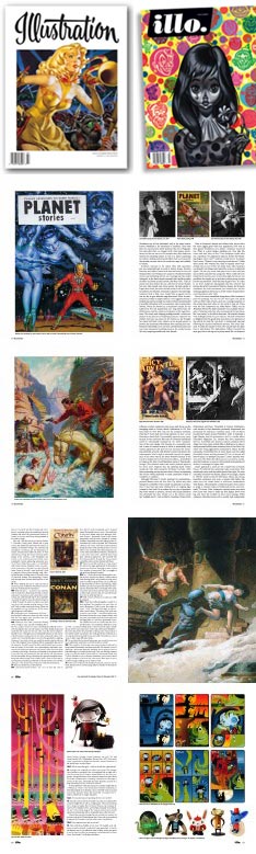 For 18 issues, Illustration Magazine has been featuring artists form the history of American illustration. Illustration is beautifully printed and full of great illustrations from the “Golden Age” through the late 20th Century.
In 2005 publisher and executive editor Daniel Zimmer launched a new title, Illustration’05, in a similar format, but devoted to contemporary illustration. Both magazines are superb and of interest to any one interested in American illustration.
The Illustration’05 title became Illustration’06 and Illustration’07, much to the confusion of readers and magazine dealers, and did not fare as well as it might have.
I’m happy to say that Zimmer has relaunched Illustraton’0whatever as Illo., starting the numbering over at issue#1, in the same beautiful format. That format is 80 pages, focusing on four in-depth articles about contemporary American illustrators, with page after glossy, high-resolution page of beautifully reproduced artwork.
The magazine is rounded out with a couple of shorter articles and reviews, features very few ads; and the ads themselves are for things like Last Gasp Publishing, Flesk Publications and shows at the Society of Illustrators, that are as much of interest to readers as the articles.
Though the web site currently says that Illo. #1 is still at the printer, it is actually out and I picked up my copy yesterday.
I’m fortunate to have an amazing independent book/comic store nearby in Delaware that makes a point of carrying magazines like Illustraton and Illo., but If you can’t convince a magazine dealer or bookstore near you to carry them (it’s worth a try), you can order them online directly from the publisher.
Illo. is published quarterly and a four issue subscription is $40 U.S.; individual issues are $10 (cover price), postpaid. In addition you can order back issues of Illustration ’05.
You can also order subscriptions and back issues of Illustration Magazine, which, like Illo., is published quarterly for $10 an issue.
The newly published issue #1 of Illo. features Mitch O’Connell, Mark Schultz, Nathan Jurevicius, Brian Taylor and an interview with Nancy Stahl. You can see thumbnail previews of the entire issue here. (The article on Mark Schultz is in the form of an extensive interview conducted by John Fleskes of Flesk Publications, which I profiled as one of the first posts on lines and colors.)
Issue 18 of Illustration features Allen Anderson, The Cooper Studio (part 2), Alberto Vargas, Jack Potter and others. Thumbnail previews here.
(Image above left, Illustration Magazine: top left, second row and third row, Illo.: top right, fourth row, bottom row.)
Categories:
-
Stéphane Halleux

Stéphane Halleux creates sculptures of characters and objects that have a feeling of Tim Burton meets Rube Goldberg by way of 1930’s animated cartoons.His tiny-wheeled cars, junk-dealer robots, Charles Adamsish characters, mechanized chairs and enigmatic “engines” are wonderful visual fun. Their textured and weathered surfaces, strange shapes, and arrangements of odd parts are imaginative and entertaining.
Halleux’s objects are appealing in a way that makes you want to pick them up, or at least be able to view them from a wide variety of angles. Though he often provides images from more than one angle, it’s unfortunate that Quicktime VR isn’t as easy as standard digital photography, it would be great to be able to rotate these images.
Halleux’s web site is apparently new, as the biography section is still “coming soon”, and some other sections are also incomplete. Though there is a section of preliminary design sketches (“croquis”) for some of his pieces, there is no information on his creations in terms of materials, technique, intention or size. Hopefully, that will be added in the near future. In the mean time, we’ll have to settle for looking through his galleries of wonderfully eccentric objects.
Categories:
-
Jessica Joslin
 Jessica Joslin makes unusual objects that are a collision of sculpture, assemblage, jewelry and perhaps taxidermy.
Seemingly displays in an unnatural history museum, Joslin’s sculptures consist of bone (real, cast or modeled), brass, sculpted and painted leather, beads, lamp fittings, wire, machine bolts, pins, feathers, pewter, glass eyes, and various antique hardware items arranged into bizarre animal forms.
The result is an eerily disconcerting menagerie of “characters” to which she has assigned names like Serafina, Callisto, Ludwig, Valeria and Cosimo (at left).
Joslin is quick to point out in her FAQ that when she does use real bone or animal skulls, she obtains them from the same suppliers that provide them ethically to natural history museums. She often uses casts or modeled pieces as well, and does her best to make it unclear which is which. When viewing her galleries, note that you can often click in the text area on links for detail images.
Her objects vary in size from one inch tall to nearly six feet, and her site arranges them according to series done in particular years. Joslin works professionally as a commercial model maker, crating prototypes for toys (perhaps for an extra-dimensional toy company).
Link courtesy of Leah Palmer Preiss
Categories:
-
Metamorphosis and the beinArt Collective
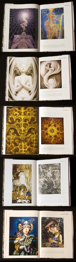 Metamorphosis is a new book of contemporary fantastic, visionary, outsider, and magic realist art published by the beinAart International Surreal Art Collective.
Founded in 2002 by Jon Beinart as the beinArt Australian Surreal Art Collective and expanded internationally in 2006, the collective has a presence in the form of a web site with galleries of work by the participating artists.
The Collective is a treasure trove of fantastic art with, as Beinart puts it, a representation of both “light” and “dark” themes. The book follows suit, and from the preview pages posted in the Collective’s Forum (click on the images for larger versions), promises to be a definitive collection of contemporary artists working in this vein.
If I were going to pick nits, and I’m obviously about to, I would balk at the casual misuse of the terms “Surreal” and “Surrealist”; even though I’m occasionally guilty of it myself. My point is not even that Surrealism was a specific art movement from a particular time, but that Surrealism was an art devoted to specific principles and intentions, and not just a catch-all term for art that includes bizarre imagery.
Surrealism was primarily a literary movement, to which the visual art was considered an adjunct; even though it overshadows the literary component in the public mind. Both aspects of Surrealism, however, were devoted to social, political and psychological upheaval; a revolution that was to be brought about by art created through expressions of the unconscious mind. This intention was laid out in the Surrealist Manifestos of the poet André Breton, who was the leader of the Surrealist movement. (You can read more about true Surrealism here, including an essay by Breton.)
I doubt that many of the artists in the “Surreal Art Collective” (or most of those contemporary artists referred to as “Surrealist”) concern themselves with automatism or the other elements of Surrealist creative process. I wouldn’t even call Ernst Fuchs, who I recognize as an important figure in fantastic painting, a Surrealist, and I doubt that he would classify himself as such.
The desire to misappropriate the term is common and understandable, though; the more correct terms of fantastic art, visionary art, magic realism or fantastic realism don’t have the same zing and brand-name recognition as “Surrealism”, but they are more accurate.
Now that I’ve got that out of my system (for the moment), I’ll go on to say that the new book from the beinArt Collective looks terrific and includes work from a number of artists I’ve featured previously on lines and colors, including Sergi Aparin, Brom, Andrew Gonzalez and Alex Grey.
There is a full artist list here in which the artists’ names are linked to examples of their work. You can spend hours discovering amazing work in the beinArt Collective’s online galleries (as I have done on occasion), but as with much visual art, there is a great deal to be said about the appearance of high-resolution images in print, quite different from viewing the same images in low resolution on screen.
Images above, from top: Alex Grey, Andrew Gonzalez, Pavel Surma, Ernst Fuchs, Carrie Anne Baade.
Addendum: The beinArt Surreal Art Collective also has a blog at: http://beinart.org/info/art-news.php
Categories:
-
Xiangyuan Jie

Xiangyuan Jie is a Chinese painter, born in Hunan province, now living in Florida. He originally studied theatre set design and graduated from the Central Academy of Drama in Beijing with a BFA in that specialty, to which, in a way, he would later come full circle as a background artist for animated films.He taught for several years at Hunan University and then traveled and lectured in Europe as a visiting scholar. He eventually settled in the U.S., taught at Auburn University as a visiting professor and later studied and taught at the College of Architecture at Georgia Tech.
Somehow, his background eventually led him to working with the Disney Feature Animation Studio in Florida, where he has done concept and background art for features like Mulan, Tarzan, Lilo and Stitch and Brother Bear (image above, top) and Ice Age 2. Jie is also an accomplished plein air painter, painting in a wonderfully open and colorful style informed by the early work of Impressionist inspired painters from Europe, Russia and the U.S. (images above, bottom).
His web site, although it still says “coming soon” in several places, is at least partially functional and has a section for his gallery art and a section for film work, though the content of both is limited at the moment.
You can find much more of his visual development work on his Visual development art for films blog, including multiple versions of backgrounds, working sketches and color keys. His work for Brother Bear, in particular, was done in a fresh, painterly style that came out of his work painting real landscapes.
Jie also maintains a painting blog, Art of Xiangyuan Jie, on which he posts recent work, photos of plein air painting excursions and links to extensive web albums of his landscape paintings, portrait studies and commissioned portraits, in which you can see the influence of Sargent and perhaps Anders Zorn.
There is now a book available of Jie’s landscape paintings. Ordering information can be found on his blog.
Link via startdrawing.org
Categories:
-
Antoine Blanchard
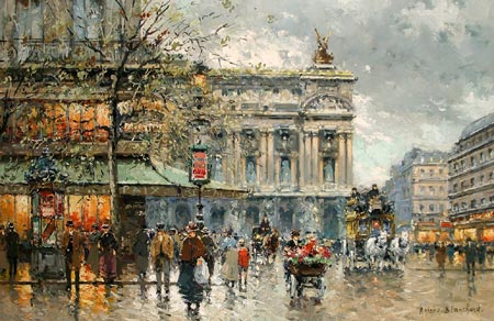
Antoine Blanchard was not a major figure in French painting, and it might be easy to dismiss him as formulaic, but I think his appeal goes beyond the obvious superficial charms of his paintings and his work is most interesting for the elements that you don’t notice at first.Blanchard’s paintings seem almost calculated for appeal in some ways. They are usually of Paris street scenes and very often include famous landmarks. They employ repetitive themes and similar composition. You can often find two, three or more versions of the same scene that at first glance look almost identical, but on closer inspection reveal themselves to be alternate versions. This is not an uncommon practice for artists (see my post on Gilbert Stuart), but in Blanchard’s case may be the result of a desire to paint a different time, as preserved in the relatively new technology of photography.
Blanchard’s Parisian avenues are thronged with pedestrians, parading past shop windows alight with bright yellows and oranges. His shop windows and lighted cafe fronts seem intended to stand out like jewels in sharp contrast to the blue-grays or muted siennas of his backgrounds. Though he employs short, painterly brush strokes and in some respects seems very influenced by the Impressionists, his brush handling is more graphic, with less intention for optical blending, and his use of light is decidedly different.
In marked contrast to the Impressionists’ pursuit of sunlight and its effects, Blanchard seeks out gray, overcast, rainy or snowy days. His gray skies and subdued backgrounds are a stage for the bright lights of his cafe, shop and streetcar windows. His repetition of these themes can again be seen as formulaic, but it isn’t the high chroma accents, meant to immediately attract the eye, that appeal to me in Blanchard’s paintings; it’s actually his backgrounds that I enjoy most.
His dark, overcast skies are painted with wonderful painterly suggestions of the shifting layers of rain clouds, at times dense and heavy with impending rain, at other times broken with hints of blue, indicating that the rain that turned the streets into shimmering mirrors has passed. His buildings, too, though obviously meant to play background to his brightly colored passages, are of more interest than his foreground subjects, with a marvelous economy of notation in which complex architecture is reduced to a few elegant brush strokes.
Blanchard was born in a small village and studied in Rennes at the Ecole de Beaux-Arts there, followed by study at the Ecole de Beaux-Arts in Paris, a city that would be his major source of subject matter. His career was interrupted by the 2nd World War and later by the death of his father, which compelled him to take over administering the family business. When he later returned to Paris, and to painting, he found himself nostalgic for a more idealized past and began to paint using images he had collected of Paris in La Belle Époque, particularly the 1890’s.
His work seems strongly influenced by Édouard Cortès, a contemporary of Blanchard’s who is better known, and who employs similar themes of overcast skies and darkened Parisian streets punctuated with warm artificial lights. The tenor and tone of the two artists’ work, however, their handling of light and dark, their brushwork and choice of color range is very different. Their intention seems different as well. Cortés shows us his contemporary Paris bustling with early 20th Century automobiles and electric lights. Antoine Blanchard lets us walk back with him through the leisurely Parisian streets of a more relaxed and romantic time.
Categories:


Charley’s Picks
Bookshop.org
(Bookshop.org affilliate links; sales benefit independent bookshop owners; I get a small percentage to help support my work on Lines and Colors)

John Singer Sargent: Watercolors


Urban Sketching: Understanding Perspective


Charley’s Picks
Amazon
(Amazon.com affiliate links; sales go to a larger yacht for Jeff Bezos; but I get a small percentage to help support my work on Lines and Colors)
John Singer Sargent: Watercolors
Urban Sketching: Understanding Perspective