
Categories
- 3d CGI
- Amusements
- Animation
- Anime & Manga
- Art Materials
- Art Videos
- Blogroll
- Cartoons
- Color
- Comics
- Concept & Visual Dev.
- Creativity
- Digital Art
- Digital Painting
- Displaying Art on the Web
- Drawing
- Eye Candy for Today
- Gallery and Museum Art
- High-res Art Images
- Illustration
- Motion Graphics & Flash
- Museums
- Online Museums
- Outsider Art
- Painting
- Painting a Day
- Paleo Art
- Pastel, Conté & Chalk
- Pen & Ink
- Prints and Printmaking
- Reviews
- Sc-fi and Fantasy
- Sculpture & Dimensional
- Site Comments
- Sketching
- Storyboards
- Tools and Techniques
- Uncategorized
- Vector Art
- Videos & Podcasts
- Vision and Optics
- Watercolor and Gouache
- Webcomics
Archives
- April 2026
- March 2026
- February 2026
- January 2026
- December 2025
- November 2025
- October 2025
- September 2025
- August 2025
- July 2025
- June 2025
- May 2025
- January 2025
- December 2024
- November 2024
- October 2024
- September 2024
- August 2024
- June 2024
- April 2024
- March 2024
- February 2024
- January 2024
- December 2023
- November 2023
- October 2023
- September 2023
- August 2023
- July 2023
- May 2023
- April 2023
- March 2023
- February 2023
- January 2023
- December 2022
- November 2022
- September 2022
- August 2022
- July 2022
- June 2022
- May 2022
- April 2022
- March 2022
- February 2022
- January 2022
- December 2021
- November 2021
- October 2021
- September 2021
- August 2021
- July 2021
- June 2021
- May 2021
- April 2021
- March 2021
- February 2021
- January 2021
- December 2020
- November 2020
- October 2020
- September 2020
- August 2020
- July 2020
- June 2020
- May 2020
- April 2020
- March 2020
- February 2020
- January 2020
- December 2019
- November 2019
- October 2019
- September 2019
- August 2019
- July 2019
- June 2019
- May 2019
- April 2019
- March 2019
- February 2019
- January 2019
- December 2018
- November 2018
- October 2018
- September 2018
- August 2018
- July 2018
- June 2018
- May 2018
- April 2018
- March 2018
- February 2018
- January 2018
- December 2017
- November 2017
- October 2017
- September 2017
- August 2017
- July 2017
- June 2017
- May 2017
- April 2017
- March 2017
- February 2017
- January 2017
- December 2016
- November 2016
- October 2016
- September 2016
- August 2016
- July 2016
- June 2016
- May 2016
- April 2016
- March 2016
- February 2016
- January 2016
- December 2015
- November 2015
- October 2015
- September 2015
- August 2015
- July 2015
- June 2015
- May 2015
- April 2015
- March 2015
- February 2015
- January 2015
- December 2014
- November 2014
- October 2014
- September 2014
- August 2014
- July 2014
- June 2014
- May 2014
- April 2014
- March 2014
- February 2014
- January 2014
- December 2013
- November 2013
- October 2013
- September 2013
- August 2013
- July 2013
- June 2013
- May 2013
- April 2013
- March 2013
- February 2013
- January 2013
- December 2012
- November 2012
- October 2012
- September 2012
- August 2012
- July 2012
- June 2012
- May 2012
- April 2012
- March 2012
- February 2012
- January 2012
- December 2011
- November 2011
- October 2011
- September 2011
- August 2011
- July 2011
- June 2011
- May 2011
- April 2011
- March 2011
- February 2011
- January 2011
- December 2010
- November 2010
- October 2010
- September 2010
- August 2010
- July 2010
- June 2010
- May 2010
- April 2010
- March 2010
- February 2010
- January 2010
- December 2009
- November 2009
- October 2009
- September 2009
- August 2009
- July 2009
- June 2009
- May 2009
- April 2009
- March 2009
- February 2009
- January 2009
- December 2008
- November 2008
- October 2008
- September 2008
- August 2008
- July 2008
- June 2008
- May 2008
- April 2008
- March 2008
- February 2008
- January 2008
- December 2007
- November 2007
- October 2007
- September 2007
- August 2007
- July 2007
- June 2007
- May 2007
- April 2007
- March 2007
- February 2007
- January 2007
- December 2006
- November 2006
- October 2006
- September 2006
- August 2006
- July 2006
- June 2006
- May 2006
- April 2006
- March 2006
- February 2006
- January 2006
- December 2005
- November 2005
- October 2005
- September 2005
- August 2005
Relevant Blogs
Art, Painting & Sketch
- Gurney Journey
- Underpaintings
- Art and Influence
- Painting Perceptions
- Oil Painters of America
- Vasari Paint POV
- Flying Fox
- Urban Sketchers
- Bento (Smithsonian)
- Art Inconnu
- The Hidden Place
- Still Life
- Making a Mark
- The Art of the Landscape
- Exploring Color & Creativity
- Art Contrarian
- Artist A Day
- beinArt Surreal Art Collective
- Eye Level
- David Dunlop
- p.i.g.m.e.n.t.i.u.m
- CultureGrrl
- Joaquín Sorolla blog
- Artists in Pastel
“Painting a Day”
- A Painting a Day (Keiser)
- On Painting (Keiser)
- Julian Merrow-Smith
- Karen Jurick
- Jeffrey Hayes
- Carol Marine
- Abbey Ryan
- Daily Paintworks
Other Painting Blogs
- Virtual Gouache Land
- Neil Hollingsworth
- Marc Hanson
- Kevin Menck
- Marc Dalessio
- Larry Seiler
- Stapleton Kearns
- Colin Page
- Roos Schuring
- Hans Versfelt
- Titus Meeuws
- Régis Pettinari
- René Plein Air
- Belinda Del Pesco
- Robin Weiss
- Nathan Fowkes (Land Sketch)
- William Wray
- Frank Serrano
- Stephen Magsig
- Michael Chesley Johnson
- Twice a Week
- Sarah Wimperis
- Rob Adams
- Michael Cole Manley
- The Dirty Palette Club
- Mike Manley’s Draw!
Gallery Art & Illustration mix
Illustration
- Howard Pyle
- 100 Years of Illustration
- BibliOdyssey
- Illustration Art
- Today’s Inspiration
- Illustration Mundo
- Little Chimp Society
- Danny Gregory
- R D (John Martz
- Illustration Friday blog
- Monster Brains
- Illustrators & Illustrations (RU)
- Elwood H. Smith
- DaniDraws.com
- Designers Who Blog
- iSpot Blog
Sci-Fi & Fantasy
Illustration & Comics
Comics & Cartoons
- Comics Beat
- Robot 6
- Newsarama Blog
- Comic Vine
- Comics Alliance
- Forbidden Planet Int.
- Paolo Rivera
- Bolt City
- Flight
- Scott McCloud
- The Comics Journal
- Comixpedia
- Funnybook Babylon
- James Baker
- Middleton’s Sketchbook
- Boneville
- The Hotel Fred
- Paul Rivoche
- Daily Cartoonist
- Mad About Cartoons (William Wray)
- Digital Strips
Illustration & Concept
Animation & Concept
- Cartoon Brew
- Animation Blog
- Cold Hard Flash
- Concept Art World
- The CAB
- FY Concept Art
- Concept Ships
- Concept Robots
- John Nevarez
- Armand Serrano
- Marcos Mateu-Mestre
- all kinds of stuff (Kricfalusi)
- Yacin the faun (Man Arenas)
- Kelsey Mann
- Cre8tivemarks Blog
- Ice-Cream Monster Toon Cafe
- AAU Character & Creature Design
- AAU Animation Notes
- Articles and Texticles
Paleo & Scientific
Tools & Techniques
Other
Lists of Art Blogs
Art Image Resource Links
Historic Art Images
- Wikimedia Commons: Paintings
- Wikimedia Commons: Drawings
- The Athenaeum
- WikiArt (WikiPaintings)
- Google Art Project: Artists
- Google Art Project: Collections (Museums)
- ArtCyclopedia
- Web Gallery of Art
- Art Renewal Center
- Web Gallery of Impressionism
Auction Consolidation sites
Auction sites
- Sotheby’s
- Bonham’s
- Christies
- Heritage Auctions: Fine Art
- Heritage Auctions: Illustration
- Freeman’s Auctions
- Bukowskis
- Shannon’s
Image Search
Reverse Image Search (search by image)
- Tin Eye
- RevImg
- Google Image Search (camera icon)
- Bing Image Search (camera icon)
Promoting some friends and some clients of my website design business
- Twin Willows T’ai Chi studio in Wilmington DE. Taiji classes with Bryan Davis.
- Ray Hayward, Inspired Teacher of T’ai Chi ( Taiji ) in Minneapolis, Founder of Mindful Motion Tai Chi Academy
- OldHead Tattoo studio and Art Gallery in Wilmington DE. Tattoos and paintings by Bruce Gulick
- Sharon Domenico Art, pet portrait oil paintings
- Platinum Paperhanging, wallpaper hanging, Main Line and Philadelphia, PA
- Lisa Stone Design, interior designer, Main Line and Philadelphia, PA
- Studio12KPT, original art, prints, calendars and other custom printed items by Van Sickle & Rolleri
-
PJ Loughran
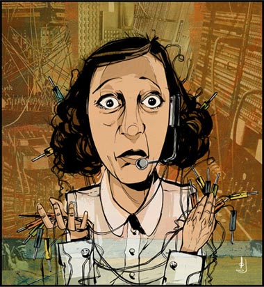
PJ Loughran is a busy guy.In addition to his career as an illustrator, creating his wonderful line and color illustrations for clients like The New York Times, Newsweek, Time, Sports Illustrated, Nike, Ford, Simon and Schuster and Harper Collins, he has served as the Design Director and Creative Director at the AGENCY.COM, and has recently founded his own firm, Kerosense Creative Services.
If that weren’t enough, Loughran is a musician and songwriter, with two full length records to his credit and performances that have included opening for the likes of R.E.M, Taj Mahal, Todd Rundgren, REO SPeedwagon and the North Mississippi All-Stars.
Oh yes, Loughran is also an adjunct professor at Parsons, teaching classes in web design, illustration and drawing, and has been a guest lecturer at a number of other art schools and universities.
And I thought I had a busy schedule.
While wearing his illustrator’s hat, Loughran has garnered recognition from The Art Directors Club of New York, Communication Arts Magazine, Print Magazine and the Society of Illustrators (more details here).
His illustrations have a wonderfully loose, almost casual feeling, with lots of varied-weight to his ink lines, bright, freely-applied areas of color, interesting suggestions of texture and the frequent use of open, irregularly shaped compositions, in which the image is not constrained by a rectangle. He sometimes incorporates collage-like elements of photographs, colored and integrated with the drawings.
His portfolio opens to an initial page from which you choose a category of subject matter. Once in a sub-section, you can click on one of the large images for an enlarged view, which opens in a pop-up that allows you to conveniently click forward and aback through all of the images if you like. (Are you paying attention, all you designers of artists’ web sites who think that “pop-up and close, pop-up and close” is a good arrangement for an artist’s portfolio?)
There is an article about Loughran from a few years ago on the Adobe site that features a brief how-to for one of his sports themed images.
Categories:
-
David Cunningham

David Cunningham is a contemporary American realist painter originally from Tennessee and now living in Indianapolis.Cunningham practices a crisp, sharply focused realism, concentrating on still life and blending over into trompe l’oiel.
His still life paintings begin with carefully arranged tableaux of personal objects, chosen both for personal meaning and, I would think, as a challenge the artist poses for himself to handle not only complex compositions but a variety of surfaces, colors, shapes and textures.
It’s easy to miss the fact that there are additional galleries of still life on his site (linked with page-bottom text links) here and here.
I doubt if Cunningham deliberately set out to work in trompe l’oiel, as it feels like a natural progression from his keenly observed and meticulously handled still life subjects.
There is also a page of drawings, many of which, unfortunately, are not linked to larger images. I might wish for larger images all around, actually. It would be nice to see his precise handling of both drawing and painting media in more detail.
Cunningham is also a professor of art at Franklin College, and there are some pages of drawings and paintings by his students posted on the site.
(Suggestion for this post courtesy of Tim Allen)
Categories:
-
James Akers
 I’m constantly amazed at the way in which we, as artists, allow ourselves to be locked into restrictive little boxes by accepting and participating in an unspoken hierarchy of the artistic value of different genres of visual arts.
Those in the fine arts community, even within all of the strata it contains, look down on illustrators as “not artists”. Mainstream illustrators look down on science fiction and fantasy illustrators, who, in turn, look down on comics artists, and so on; stratification within stratification. By accepting these distinctions, we culture elements of mutual disdain to coddle our tender egos, in the process allowing ourselves to be classified and pigeonholed.
Not only is this unfortunate for individual artists, and the appreciation of different styles, it allows wonderful art to go ignored by those unwilling to cross boundaries within these strata. Fighting this tendency is actually at the core of what I try to accomplish with lines and colors, and I take particular delight in finding terrific visual art in areas that, while respected and valued within their own industry, are often ignored by the larger artistic community, like scientific, medical and botanical illustration, paleontological reconstruction art and entertainment industry concept art.
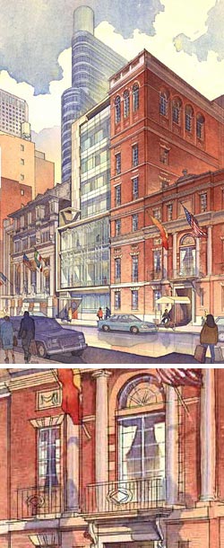
Closely related to the latter is the field of architectural rendering, in that it involves the imagining and visual conceptualization of things that don’t yet exist.
Unfortunately, this is a field where the convenience of 3-D CGI is replacing a lot of the traditional rendering with boringly adequate renderings of 3-D models. In the cases where the presentation requirements are more sophisticated, however, hand-drawn and painted renderings are still in demand.
What a delight it is to see a proposed architectural work portrayed, not as a blandly rendered CGI model, but as a fresh, clear ink and watercolor drawing, as in the beautiful work of James Akers.
Akers is an award winning architectural renderer whose work has been featured in shows for the American Society of Perspectivists and the New York Society of Renderers. His renderings (a convenient term in this case, as ink and watercolor works could easily be called either drawings or paintings) not only convey the appearance of the proposed structure, but have a refined sense of color and a superb feeling of texture, materials, place and atmosphere. If the buildings were not in the process of being imagined, you might assume that these were simply wonderfully precise works drawn and painted from life.
Akers has a knack for including just enough detail in the surrounding elements to make the proposed building fit seamlessly with its environment, while making it clear that the proposed structure is the highlight and subject of the image.
Akers works on a variety of projects and the galleries on his site feature renderings related to Hospitality and Entertainment, Institutions, Retail and Office, Sports and larger scale Planning and Urban Design. The highest resolution images, in which you can get the best feeling for his watercolor technique, are in the Recent Work section. (This is unfortunately displayed by way of a randomized script, so you may have to persevere through repeats of several images to see the larger variety.) There is also a Sketchbook section that includes travel sketches.
I would particularly encourage artists interested in concept design for the film and gaming industries to study the masterful way Akers handles the representation of structures and physical spaces in both linear and atmospheric perspective, and his naturalistic handling of the structures in their environment. (While you’re at it, also look at the work of Thomas Schaller).
Categories:
-
Howard Pyle and the American Renaissance

In 1876 the Centennial Exposition (officially the “International Exhibition of Arts, Manufactures and Products of the Soil and Mine”) was held here in Philadelphia, where the Declaration of Independence had been signed 100 years earlier.It was the first major World’s Fair to be held in the United States and served as announcement of the nation’s emergence as a major industrial world power. The exhibition was also announcement of the new nation flexing its cultural muscles, and the exhibit of American art that accompanied it must have been something to see.
It was around this time that a number of American artists and architects, among them the great illustrator and teacher Howard Pyle, come to feel that not only was American art coming into its own, but that it had matured enough to inherit the mantle of the great traditions of the European Renaissance and classical antiquity.
Though the artists themselves used it for awhile, the term “American Renaissance” isn’t in common use these days. The period isn’t widely recognized as a coherent art movement, and you won’t find more than cursory mentions of it in most sources. In fact, if you search for the phrase “American Renaissance” on the web, you’ll find more references to a literary movement earlier in the Century.
Pyle felt that painting, and illustration in particular, could have a civilizing influence on large numbers of people, and it was within his fascination with the classical ideals that he emphasized history painting. In his case, of course, it was not European history that he portrayed, but the history of his own nation. Pyle became renowned for his paintings of the American Revolution. His ideas influenced his students, who included many of the greatest American illustrators.
The Brandywine River Museum, a gem of a small museum in Chadds Ford, Pennsylvania, where Pyle taught his classes in the summer, and not far from Wilmington, Delaware, where Pyle was born and had his studio, has picked up this theme for a wonderful exhibition called “Howard Pyle and the American Renaissance”, with works by Pyle and many of his contemporaries who were influenced by this ideal.
The show features many seldom seen Pyles, like his illustrations for Quo Vadis, as well as many of the best from the collections of the Brandywine and the Delaware Art Museum, which houses the single largest collection of his work; and includes a newly acquired painting, Richard de Bury Tutoring Young Edward III, jointly purchased by the two museums.
Other artists represented in the exhibition include Edwin Austin Abbey, Joseph Clement Cole, Augustus Saint-Gaudens and Kenyon Cox. The N.C. Wyeth illustrations that are the stars of the museum’s collection have been temporarily replaced by his infrequently displayed landscapes. The exhibit includes European and English artists who influenced the Americans; among them is Sir Lawrence Alma-Tadema, whose beautiful “Sappho and Alcaeus” (image above, bottom) is on loan from the Walters Art Museum in Baltimore.
If you’re fortunate enough to catch the exhibition, which runs until May 20th, 2007, don’t miss another exhibit of American Illustration, on display in a separate gallery that is not well marked (straight ahead as you leave the Pyle exhibition).
Here are some web links for Howard Pyle; there are additional links on my earlier post about Pyle.
Categories:
-
Vladimir Kush

Vladimir Kush is a Russian painter who studied at the Moscow Art Institute and is now living in the U.S. He works in a vein of fantastic art obviously influenced by Surrealists like Dali and Magritte, but with a distinctly different emotional context.His paintings have something of a visionary mystical quality and many of them feature recurrent themes like butterflies, sailing ships, fruits and other natural forms, and visions within cloud formations.
His images often deal with interesting combinations of visual elements. Sailing ships are masted with stalks of gladiolus, their blossoms unfurled as sails. Giant butterflies catch the wind on another ship (above), or form the blades of fantasy windmills. Giant mechanical fish and dragonflies and a monumental rhinoceros undergo maintenance. The rising sun is revealed to be the yolk of a giant egg or the pearl of an oyster. A half pear is envisioned as a lute, and a half apple as a butterfly. Through many of the works, beautifully stylized and textured clouds roil and tumble revealing visions of seas and harbors or taking on forms like hot air balloons.
Unfortunately, the images on Kush’s own web site are too small to get a real feeling for his paintings. Fortunately, his work is represented on the web on the sites of galleries that carry his prints or originals.
There is a nice selection with large images on the Reflections Gallery, and another selection with somewhat smaller images on the Art Center Gallery. There is a particularly nice selection of images featured on the Dark Roasted Blend blog, some of which are linked to even larger versions on Flickr.
There are print collections of his work, but I’ve had trouble establishing their availability (it may be primarily through galleries rather than traditional book sources). One is called Metaphorical Journey and seems to be pricey ($200) as a used book on Amazon. On the books page of Kush’s site two other titles are shown, The Bronze Drops of Time and Journey to the Edge of Time, which is apparently new and more readily available.
Journey to the Edge of Time isn’t a collection, per se, but a coffee-table science fiction book, arranged as diary with many of Kush’s paintings as illustrations. The authors are Oleg Kush and Mikhil Kush, though I don’t know their relation to Vladimir.
Link suggestion courtesy of Karl Kofoed
Categories:
-
Dan Gheno
 Dan Gheno is an artist and teacher who places a special emphasis on figure drawing. He teaches at The Art Students League and The National Academy School in New York and is Prefessor Emeritus, The Lyme Academy College in Old Lyme, Connecticut.
I’m particularly fond of his life drawings because his approach is similar to my own, in that it is a combination of line and tone, heavily influenced by an admiration for the drawings of masters like Michelangelo, Raphael and Rubens.
Gheno also credits his approach to an early fascination with comic book art, and the corresponding desire to develop the ability to draw the figure from his imagination; a path that gave him the impetus to approach figure drawing with special emphasis on a solid sense of geometry underlying the form and a feeling for the volumetric nature of the human form in three dimensional space.
One of the key skills that sets comic book artists apart from other illustrators or cartoonists is the need to develop a consistent ability to invent and quickly draw figures from the imagination, portraying the human form, however exaggerated, in an enormous variety of positions and spatial relationships, often with severe foreshortening.
Dramatic foreshortening and dynamic projections of the figure in space are also hallmarks of masters like Michelangelo, Raphael, Carracci, Tiepolo and Pontormo; and I’ve always suggested that comic book artists and illustrators who work with the invented figure would do well to supplement their life drawing with the study of these artists’ drawings, along with more traditional sources of instruction like the books of Andrew Loomis, George Bridgeman and Walt Reed. (Would-be comic book artists who study only the work of other comic book artists are simply lost.)
To that list of instructional inspiration, I would easily add Dan Gheno, not only for comic book artists and illustrators, but for any artist interested in drawing the figure.
Though Gheno has not yet written a book of his instructional methods, he has over time written a series of articles on figure drawing for American Artist magazine and American Artist’s Drawing magazine. These have been collected into a special issue of Drawing Highlights that is now on the newsstands.
This is essentially a figure drawing instruction book in magazine form and is a tremendous resource for under $10. Gheno supplements his clear and thoughtful instruction not only with his own accomplished drawings, but with the work of a variety of master draftsmen, including the artists mentioned above and a host of others, like Rembrandt, Ingres, Goltzius, Rodin, Durer, Da Vinci, Prud’hon, Greuze and Charles Dana Gibson.
There are articles on drawing the figure, the hand, the head, actions and gestures and the seldom covered subject of drapery on the human form, i.e. folds in clothing.
You can also find somewhat truncated versions of some of these articles on Gheno’s web site in the Teachings section.
Unfortunately, Gheno’s site is one of those awkward, mid-90’s style nightmares with scrolling pages full of centered text and oversize linked headings, but you’ll find it worth the trouble to dig around and find your way to his drawings, metaphorical figurative paintings, landscapes, teachings, reading list and materials list. (The navigation links that should be on the home page are strewn down this page. Click on the large text links that look like headings for the subsections; the images are linked to their larger versions. In the galleries, only the images with red dots are linked to larger versions, the others are empty links that will leave you 404.) Gheno has also provided a nice set of links to art resources he has found of value.
There is also a transcript of an online chat with Gheno on the American Artist site. The special issue of Drawing Highlights should be on the newsstands for a few months (or until it sells out).
Addendum: The managing editor of American Artist was kind enough to write and let me know that the issue of Drawing Highlights mentioned here can be ordered directly from them through this link.
Categories:


Charley’s Picks
Bookshop.org
(Bookshop.org affilliate links; sales benefit independent bookshop owners; I get a small percentage to help support my work on Lines and Colors)

John Singer Sargent: Watercolors


Urban Sketching: Understanding Perspective


Charley’s Picks
Amazon
(Amazon.com affiliate links; sales go to a larger yacht for Jeff Bezos; but I get a small percentage to help support my work on Lines and Colors)
John Singer Sargent: Watercolors
Urban Sketching: Understanding Perspective