
Categories
- 3d CGI
- Amusements
- Animation
- Anime & Manga
- Art Materials
- Art Videos
- Blogroll
- Cartoons
- Color
- Comics
- Concept & Visual Dev.
- Creativity
- Digital Art
- Digital Painting
- Displaying Art on the Web
- Drawing
- Eye Candy for Today
- Gallery and Museum Art
- High-res Art Images
- Illustration
- Motion Graphics & Flash
- Museums
- Online Museums
- Outsider Art
- Painting
- Painting a Day
- Paleo Art
- Pastel, Conté & Chalk
- Pen & Ink
- Prints and Printmaking
- Reviews
- Sc-fi and Fantasy
- Sculpture & Dimensional
- Site Comments
- Sketching
- Storyboards
- Tools and Techniques
- Uncategorized
- Vector Art
- Videos & Podcasts
- Vision and Optics
- Watercolor and Gouache
- Webcomics
Archives
- April 2026
- March 2026
- February 2026
- January 2026
- December 2025
- November 2025
- October 2025
- September 2025
- August 2025
- July 2025
- June 2025
- May 2025
- January 2025
- December 2024
- November 2024
- October 2024
- September 2024
- August 2024
- June 2024
- April 2024
- March 2024
- February 2024
- January 2024
- December 2023
- November 2023
- October 2023
- September 2023
- August 2023
- July 2023
- May 2023
- April 2023
- March 2023
- February 2023
- January 2023
- December 2022
- November 2022
- September 2022
- August 2022
- July 2022
- June 2022
- May 2022
- April 2022
- March 2022
- February 2022
- January 2022
- December 2021
- November 2021
- October 2021
- September 2021
- August 2021
- July 2021
- June 2021
- May 2021
- April 2021
- March 2021
- February 2021
- January 2021
- December 2020
- November 2020
- October 2020
- September 2020
- August 2020
- July 2020
- June 2020
- May 2020
- April 2020
- March 2020
- February 2020
- January 2020
- December 2019
- November 2019
- October 2019
- September 2019
- August 2019
- July 2019
- June 2019
- May 2019
- April 2019
- March 2019
- February 2019
- January 2019
- December 2018
- November 2018
- October 2018
- September 2018
- August 2018
- July 2018
- June 2018
- May 2018
- April 2018
- March 2018
- February 2018
- January 2018
- December 2017
- November 2017
- October 2017
- September 2017
- August 2017
- July 2017
- June 2017
- May 2017
- April 2017
- March 2017
- February 2017
- January 2017
- December 2016
- November 2016
- October 2016
- September 2016
- August 2016
- July 2016
- June 2016
- May 2016
- April 2016
- March 2016
- February 2016
- January 2016
- December 2015
- November 2015
- October 2015
- September 2015
- August 2015
- July 2015
- June 2015
- May 2015
- April 2015
- March 2015
- February 2015
- January 2015
- December 2014
- November 2014
- October 2014
- September 2014
- August 2014
- July 2014
- June 2014
- May 2014
- April 2014
- March 2014
- February 2014
- January 2014
- December 2013
- November 2013
- October 2013
- September 2013
- August 2013
- July 2013
- June 2013
- May 2013
- April 2013
- March 2013
- February 2013
- January 2013
- December 2012
- November 2012
- October 2012
- September 2012
- August 2012
- July 2012
- June 2012
- May 2012
- April 2012
- March 2012
- February 2012
- January 2012
- December 2011
- November 2011
- October 2011
- September 2011
- August 2011
- July 2011
- June 2011
- May 2011
- April 2011
- March 2011
- February 2011
- January 2011
- December 2010
- November 2010
- October 2010
- September 2010
- August 2010
- July 2010
- June 2010
- May 2010
- April 2010
- March 2010
- February 2010
- January 2010
- December 2009
- November 2009
- October 2009
- September 2009
- August 2009
- July 2009
- June 2009
- May 2009
- April 2009
- March 2009
- February 2009
- January 2009
- December 2008
- November 2008
- October 2008
- September 2008
- August 2008
- July 2008
- June 2008
- May 2008
- April 2008
- March 2008
- February 2008
- January 2008
- December 2007
- November 2007
- October 2007
- September 2007
- August 2007
- July 2007
- June 2007
- May 2007
- April 2007
- March 2007
- February 2007
- January 2007
- December 2006
- November 2006
- October 2006
- September 2006
- August 2006
- July 2006
- June 2006
- May 2006
- April 2006
- March 2006
- February 2006
- January 2006
- December 2005
- November 2005
- October 2005
- September 2005
- August 2005
Relevant Blogs
Art, Painting & Sketch
- Gurney Journey
- Underpaintings
- Art and Influence
- Painting Perceptions
- Oil Painters of America
- Vasari Paint POV
- Flying Fox
- Urban Sketchers
- Bento (Smithsonian)
- Art Inconnu
- The Hidden Place
- Still Life
- Making a Mark
- The Art of the Landscape
- Exploring Color & Creativity
- Art Contrarian
- Artist A Day
- beinArt Surreal Art Collective
- Eye Level
- David Dunlop
- p.i.g.m.e.n.t.i.u.m
- CultureGrrl
- Joaquín Sorolla blog
- Artists in Pastel
“Painting a Day”
- A Painting a Day (Keiser)
- On Painting (Keiser)
- Julian Merrow-Smith
- Karen Jurick
- Jeffrey Hayes
- Carol Marine
- Abbey Ryan
- Daily Paintworks
Other Painting Blogs
- Virtual Gouache Land
- Neil Hollingsworth
- Marc Hanson
- Kevin Menck
- Marc Dalessio
- Larry Seiler
- Stapleton Kearns
- Colin Page
- Roos Schuring
- Hans Versfelt
- Titus Meeuws
- Régis Pettinari
- René Plein Air
- Belinda Del Pesco
- Robin Weiss
- Nathan Fowkes (Land Sketch)
- William Wray
- Frank Serrano
- Stephen Magsig
- Michael Chesley Johnson
- Twice a Week
- Sarah Wimperis
- Rob Adams
- Michael Cole Manley
- The Dirty Palette Club
- Mike Manley’s Draw!
Gallery Art & Illustration mix
Illustration
- Howard Pyle
- 100 Years of Illustration
- BibliOdyssey
- Illustration Art
- Today’s Inspiration
- Illustration Mundo
- Little Chimp Society
- Danny Gregory
- R D (John Martz
- Illustration Friday blog
- Monster Brains
- Illustrators & Illustrations (RU)
- Elwood H. Smith
- DaniDraws.com
- Designers Who Blog
- iSpot Blog
Sci-Fi & Fantasy
Illustration & Comics
Comics & Cartoons
- Comics Beat
- Robot 6
- Newsarama Blog
- Comic Vine
- Comics Alliance
- Forbidden Planet Int.
- Paolo Rivera
- Bolt City
- Flight
- Scott McCloud
- The Comics Journal
- Comixpedia
- Funnybook Babylon
- James Baker
- Middleton’s Sketchbook
- Boneville
- The Hotel Fred
- Paul Rivoche
- Daily Cartoonist
- Mad About Cartoons (William Wray)
- Digital Strips
Illustration & Concept
Animation & Concept
- Cartoon Brew
- Animation Blog
- Cold Hard Flash
- Concept Art World
- The CAB
- FY Concept Art
- Concept Ships
- Concept Robots
- John Nevarez
- Armand Serrano
- Marcos Mateu-Mestre
- all kinds of stuff (Kricfalusi)
- Yacin the faun (Man Arenas)
- Kelsey Mann
- Cre8tivemarks Blog
- Ice-Cream Monster Toon Cafe
- AAU Character & Creature Design
- AAU Animation Notes
- Articles and Texticles
Paleo & Scientific
Tools & Techniques
Other
Lists of Art Blogs
Art Image Resource Links
Historic Art Images
- Wikimedia Commons: Paintings
- Wikimedia Commons: Drawings
- The Athenaeum
- WikiArt (WikiPaintings)
- Google Art Project: Artists
- Google Art Project: Collections (Museums)
- ArtCyclopedia
- Web Gallery of Art
- Art Renewal Center
- Web Gallery of Impressionism
Auction Consolidation sites
Auction sites
- Sotheby’s
- Bonham’s
- Christies
- Heritage Auctions: Fine Art
- Heritage Auctions: Illustration
- Freeman’s Auctions
- Bukowskis
- Shannon’s
Image Search
Reverse Image Search (search by image)
- Tin Eye
- RevImg
- Google Image Search (camera icon)
- Bing Image Search (camera icon)
Promoting some friends and some clients of my website design business
- Twin Willows T’ai Chi studio in Wilmington DE. Taiji classes with Bryan Davis.
- Ray Hayward, Inspired Teacher of T’ai Chi ( Taiji ) in Minneapolis, Founder of Mindful Motion Tai Chi Academy
- OldHead Tattoo studio and Art Gallery in Wilmington DE. Tattoos and paintings by Bruce Gulick
- Sharon Domenico Art, pet portrait oil paintings
- Platinum Paperhanging, wallpaper hanging, Main Line and Philadelphia, PA
- Lisa Stone Design, interior designer, Main Line and Philadelphia, PA
- Studio12KPT, original art, prints, calendars and other custom printed items by Van Sickle & Rolleri
-
Mark Reep

Color, particularly in this era of hyper-kinetic, cathode ray, plasma and LCD display multi-media dazzle, can sometimes make us jaded about our appreciation for the subtle charm of monochromatic works. Like city dwellers taking the time to get away to the country, we might find it worth the trouble to slow down and look for quieter pleasures.Mark Reep creates black and white tone drawings of imaginary landscapes. He has repeated themes of stratified cliffs, punctuated with rocky outcroppings or freestanding pillars of rock jutting up through valleys of mist and cloud, often with a lone tree managing to cling to life in the otherwise barren stone formations. The scenes sometimes depict waterfalls and often include stone bridges, arches, stairs or other signs of human structures.
His works are a combination of ink, graphite and charcoal. Reep works on sheets of acid-free smooth Bristol board, eschewing textured drawing surfaces for the freedom to create his own textures. Ink tones are created with the painstaking process of stipple (see my post on Virgil Finlay). The graphite and charcoal are sometimes applied in their powdered form, allowing the artist to work with them almost like a wash in paint.
There is a page on his site reprinting a gallery talk in which Reep describes his process, techniques and tools (including those terrific Pigma Micron pens that many pen and ink artists, myself included, swear by). There is also a tutorial by Reep on the WetCanvas site, and notes on altering inked passages and drawing from the imagination on his site.
Reep also has a blog, Dreams in Black and White, in which he posts recent drawings and discusses process.
Some of the images on his main site are frustratingly small. (Even though the originals are sometimes small, details are lost in the low-resolution environment of a computer monitor.) The ones on the blog often have larger versions.
Categories:
-
Gary Locke
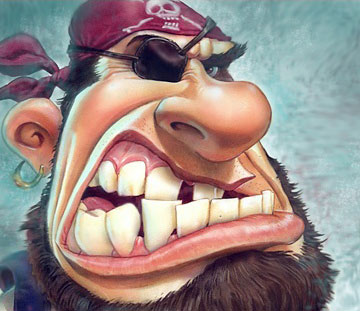
There is a style in illustration, particularly advertising illustration, in which exaggerated, cartoon-like drawings are rendered in detailed style usually applied to more realistic images. It’s a nice idea that is harder than it looks and consequently rarely done well.Gary Locke is one of the few illustrators who gets it right. His wonderfully exaggerated figures, usually in comically theatrical poses, have just the right degree of distortion, rendering and draftsmanship to gel into a whole that works. He even gets me to enjoy the big head/small body caricature style, a form I usually dislike.
If you read mainstream comic books, you’ve probably seen his Coke ads, often portraying sports figures grinning their way through impossible situations, distorted Coke bottles in hand.
His site features several ways to view his images by category, including advertising, editorial, animals, character development, caricature and sports. Some of these overlap; character development, for example, features many of his wonderful cartoony animal characters.
There is also a sketchbook section, with more quickly rendered drawings that let you see the draftsmanship that underpins his more rendered images. The more finished images are created in watercolor and “mixed media” (I suspect gouache among other things).
His advertising clients include 7-UP, Pepsi, Warner Bros., Coca-Cola, RadioShack and Fisher-Price and he has done editorial illustration for publications like Time, Sports Illustrated, Sporting News and U.S. News and World Report.
Note: After being off-line for several days from, ironically, the morning of the post, Locke’s site is up and running again.
Categories:
-
Mark Zug
 Early in his career illustrator Mark Zug got what he considered a dream job, illustrating Harlan Ellison’s I, Robot: The Illustrated Screenplay (out of print but can still be found). Since then he has illustrated numerous science fiction and fantasy novels, done editorial illustration for magazines like Popular Science, Amazing Stories, TSR’s Dragon and Dungeon and other gaming magazines.
Beyond that he has focused on paintings for fantasy game products, creating memorable illustrations for Magic: The Gathering in particular. He received the Jack Gaughan Award for Best Emerging Artist in 2001, and a Chesley Award for Best Gaming Related Illustration in 2005.
His paintings have a muscular feeling to them, both in the physical characteristics of the heroes, demons monsters and mages he portrays, and in the handling of the paint. His combination of tactile textures and color contrasts give his images a bold physical presence that makes them pop and seems particularly suited to the subject matter.
You’ll find both newer and older work in his online galleries, including his interpretation of Frank Herbert’s classic Dune. My favorites are in the Magic and Zbooks sections (image at left Claidi’s Journal).
Categories:
-
“Painting a Day” Blogs (Round 5)
 I will often, if not always, try to mention Duane Keiser in my posts about Painting a Day blogs, because he started the idea back in December of 2004 (followed shortly by Julian Merrow-Smith). I originally posted about Keiser in October of 2005. Keiser is still at it; he has allowed himself to be more relaxed about his schedule after keeping it faithfully of over two years. He still keeps painting and posting at close to a painting a day, however, and now has a second blog called On Painting, in which he comments on the process and the phenomenon that he started as well as covering topics of interest to painters in general.
http://duanekeiser.blogspot.com/
http://keiseronpainting.blogspot.com/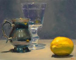 I’ve posted about longtime painting blogger Jeff Hayes and his blog State of the Art before, here and here. Jeff has been posting his immediate, intimate and often theatrically lit still lifes for some time, as well as small landscapes.
To my eye his still life paintings are becoming increasingly more refined in the application of color, in particular reflected color bounced between objects and their surroundings. He has pushed his output up a notch and has been doing a painting a day since August. It is also worth going through Jeff’s site for his commentary on painting techniques.
http://jeffhayesfinearts.blogspot.com/
 Hall Groat II, who has been a working artist for 20 years and is also an Associate Professor at Broome Community College in New York, has been posting his small paintings, as well as larger works, in a blog titled Painting Eight Days a Week.
His subjects include the small still lifes of fruit, eggs, vases and other traditional still life subjets as well as brightly colored candies, mixed drinks in stemware, musical instruments, antique jewelry and perfume bottles. His colors often move away from natural color to brightly pushed expressionistic hues. He uses textures both to define objects and as painting elements in themselves.
 Susan Martin Spar has worked for 20 years in graphic arts, but her gallery style paintings reflect her interest in Dutch and Renaissance painting. Her A Painting a Day blog showcases her small daily paintings of still life and landscape subjects.
I particularly enjoy her fascination with reflective objects like vases, jugs and tureens whose metallic surfaces reflect fruit or other objects in her still life arrangements, or even an image of the artist herself, reflected as she paints.
http://susanmartinspar.blogspot.com/
 Texas based painter Carol Marine is a relative newcomer to the painting a day ranks, starting in October of this year with her blog Carol Marine’s Painting a Day. Her work stands out, however.
Her subjects are often the still life staples of fruit, dishes, jars and vases that lend themselves well to small immediate works, but her handling of them is striking, with strong painterly textures and bright, pastel-like colors, at times contained in Cezanne-like bits of outline. Her bold compositions and daring sense of color contrast make her a painter to watch.
http://carolmarine.blogspot.com/
 Blogger and painter Micah R. Condon is attempting to collect many of the Painting a Day bloggers’ images each day and aggregate them on his Daily Painters Gallery, which features small images from each of the listed painters each day, linked to their sites. Condon also offers a Yahoo! Widget that displays the daily painters.
A Note: One paradigm I’m not fond of is the tendency for some painting a day artists to arrange their blog posts so that the link from the posted image is not directly to a larger image, but to their eBay store, from which you must often click on another preview image to get to the larger image. (Even Duane Keiser does this, but that doesn’t mean it’s a good idea.)
A suggestion: if we have to go through that process every time we want to look at an image closer, we may get tired and click away to another site. You may also make people feel like you’re “pushing” them to buy. Have a clear “Click here to bid” or “Click here to buy” text link, but link the thumbnail to a larger image on your blog. Hook us with the full size image, then take us to the store.
More to come. I have many daily painters and not quite daily painters that I would like to feature on lines and colors, but these “painting a day” features are more work intensive than even my usually loquacious posts, so it may take a little while to get to them.
Addendum: After going back and forth with a few painting a day painters about my comments above, I’ll proffer the following advice to painters who are offering their paintings for sale on their blogs; take it as you will.
Supplement the image posted in the blog with a larger one. Offer clear and consistent text links to both the larger image and the purchase or bid link (eBay or whatever). Link the blog image itself to either (though I recommend the enlarged image). My thought about the size of the larger image would be to provide something that is large enough to see the painting in detail, but that can be viewed inside a browser window at the most common monitor resolution of 1024×768 without scrolling, i.e. a maximum of about 980×640.
Categories:
-
August Hall
August Hall is a California based illustrator and concept artist. He has done work for Industrial Light and Magic, Pixar Animation, and Dreamworks. He has also done covers for DC Comics’ Vertigo line. That’s about the extent of what I know about him except that I like what I’ve seen of his work. The one online collection of his work that I’ve found is on Allen Spiegel Fine Arts, which is apparently a rep for several sci-fi and comics artists.The work in that gallery, though not identified by project, seems to be mostly book or editorial illustration, with a few pieces that feel like movie concept art.
Allen Spiegel Fine Arts apparently publishes books with work from the artists they represent, Hall is represented in a compendium of work from many artists called asfa presents 108 drawings. He is the author and illustrator of a children’s book called Song and Juniper and the illustrator of When I Met the Wolf Girls by Deborah Noyes.
Some of his illustrations have a children’s book sensibility, some are much darker. There is a wider variety of stylistic approach. All of them though, are imaginative and engaging. One element that seems to weave its way through all of his work is a fascination with textures. His images are rich with a tactile sense of stone, fabrics, skin, and natural elements like foliage and rain that are represented more as textures than objects.
Categories:
-
Jack Davis
 Jack Davis, along with Will Elder and Wally Wood, formed a triumvirate of great comics artists who worked with demented genius comic writer Harvey Kurtzman to create some of the funniest and best drawn humor comics ever created, the Mad comic books from the middle of the last century.
If you have never seen reprints of the Mad comics from the ’50s and your picture of Mad is from the current day magazine, you have no idea what you’re missing. In reaching for a comparison I was tempted to say that it’s like comparing the warmed over yogurt of the past decade’s Saturday Night Live shows to the comic brilliance of that show’s hilarious and ground breaking first three seasons, but a more apt comparison might be the unmatched comic genius of Ernie Kovacs, whose surreal and incredibly imaginative skit comedy established a standard for television comedy that has never been matched.
Similarly, the genius of the original mad comics has never been matched, although it has been the inspiration for subsequent generations of irreverent, “thumbed nose in the face of society” comics like the underground comix of the sixties, independents of the ’80s and many of the more adventurous web comics of the 90’s and beyond.
Davis, although not possessed of Wood’s level of draftsmanship or Elder’s manic sense of comic detail and command of facial expression, was the one who stretched the limits of comic drawing to a previously unknown degree. His outlandishly loopy characters, drawn with a flurry of energetic lines, projected an incredible sense of comic movement and riotous glee in their impossible contortions.
In addition to his terrific Mad work, which kept up into the comic’s transition into a black and white magazine (the first few years of which maintained a high level of the original quality), Davis worked with Kurtzman subsequently in his other humor magazines, Help, Trump and Humbug and assisted Kurtzman and Elder on Playboy’s Little Annie Fannie (see my post on Elder). Davis became known for his wonderfully fun portrayals of monsters and did work for all of E.C’s horror comics, as well as humorous monsters for posters and trading cards. There is a web archive of his monster trading card series You’ll Die Laughing.
Davis also did work for Mad imitators like Cracked, Crazy and Panic, as well as creating artwork (usually with caricatures) for movie posters and magazines like TV Guide, Time and Esquire as well as a roster of advertising clients.
Davis received the National Cartoonist’s Society’s Milton Caniff Lifetime Achievement Award in 1996, their Ruben Award for Best Cartoonist of the Year in 2000, and was inducted into the Comic Book Hall of Fame (The Eisner Award) in 2003 and The Society of Illustrators Hall of Fame in 2005.
Art of Jack Davis is out of print, but you can still find it used. You can also find his horror comics work in reprints of the EC Comics like The EC Archives: Shock Suspenstories Volume 1 (and similar titles) and his wonderful Mad stuff in Mad About the Fifties, along with brilliant work by Wood and Elder.
Categories:


Charley’s Picks
Bookshop.org
(Bookshop.org affilliate links; sales benefit independent bookshop owners; I get a small percentage to help support my work on Lines and Colors)

John Singer Sargent: Watercolors


Urban Sketching: Understanding Perspective


Charley’s Picks
Amazon
(Amazon.com affiliate links; sales go to a larger yacht for Jeff Bezos; but I get a small percentage to help support my work on Lines and Colors)
John Singer Sargent: Watercolors
Urban Sketching: Understanding Perspective