
Categories
- 3d CGI
- Amusements
- Animation
- Anime & Manga
- Art Materials
- Art Videos
- Blogroll
- Cartoons
- Color
- Comics
- Concept & Visual Dev.
- Creativity
- Digital Art
- Digital Painting
- Displaying Art on the Web
- Drawing
- Eye Candy for Today
- Gallery and Museum Art
- High-res Art Images
- Illustration
- Motion Graphics & Flash
- Museums
- Online Museums
- Outsider Art
- Painting
- Painting a Day
- Paleo Art
- Pastel, Conté & Chalk
- Pen & Ink
- Prints and Printmaking
- Reviews
- Sc-fi and Fantasy
- Sculpture & Dimensional
- Site Comments
- Sketching
- Storyboards
- Tools and Techniques
- Uncategorized
- Vector Art
- Videos & Podcasts
- Vision and Optics
- Watercolor and Gouache
- Webcomics
Archives
- June 2026
- May 2026
- April 2026
- March 2026
- February 2026
- January 2026
- December 2025
- November 2025
- October 2025
- September 2025
- August 2025
- July 2025
- June 2025
- May 2025
- January 2025
- December 2024
- November 2024
- October 2024
- September 2024
- August 2024
- June 2024
- April 2024
- March 2024
- February 2024
- January 2024
- December 2023
- November 2023
- October 2023
- September 2023
- August 2023
- July 2023
- May 2023
- April 2023
- March 2023
- February 2023
- January 2023
- December 2022
- November 2022
- September 2022
- August 2022
- July 2022
- June 2022
- May 2022
- April 2022
- March 2022
- February 2022
- January 2022
- December 2021
- November 2021
- October 2021
- September 2021
- August 2021
- July 2021
- June 2021
- May 2021
- April 2021
- March 2021
- February 2021
- January 2021
- December 2020
- November 2020
- October 2020
- September 2020
- August 2020
- July 2020
- June 2020
- May 2020
- April 2020
- March 2020
- February 2020
- January 2020
- December 2019
- November 2019
- October 2019
- September 2019
- August 2019
- July 2019
- June 2019
- May 2019
- April 2019
- March 2019
- February 2019
- January 2019
- December 2018
- November 2018
- October 2018
- September 2018
- August 2018
- July 2018
- June 2018
- May 2018
- April 2018
- March 2018
- February 2018
- January 2018
- December 2017
- November 2017
- October 2017
- September 2017
- August 2017
- July 2017
- June 2017
- May 2017
- April 2017
- March 2017
- February 2017
- January 2017
- December 2016
- November 2016
- October 2016
- September 2016
- August 2016
- July 2016
- June 2016
- May 2016
- April 2016
- March 2016
- February 2016
- January 2016
- December 2015
- November 2015
- October 2015
- September 2015
- August 2015
- July 2015
- June 2015
- May 2015
- April 2015
- March 2015
- February 2015
- January 2015
- December 2014
- November 2014
- October 2014
- September 2014
- August 2014
- July 2014
- June 2014
- May 2014
- April 2014
- March 2014
- February 2014
- January 2014
- December 2013
- November 2013
- October 2013
- September 2013
- August 2013
- July 2013
- June 2013
- May 2013
- April 2013
- March 2013
- February 2013
- January 2013
- December 2012
- November 2012
- October 2012
- September 2012
- August 2012
- July 2012
- June 2012
- May 2012
- April 2012
- March 2012
- February 2012
- January 2012
- December 2011
- November 2011
- October 2011
- September 2011
- August 2011
- July 2011
- June 2011
- May 2011
- April 2011
- March 2011
- February 2011
- January 2011
- December 2010
- November 2010
- October 2010
- September 2010
- August 2010
- July 2010
- June 2010
- May 2010
- April 2010
- March 2010
- February 2010
- January 2010
- December 2009
- November 2009
- October 2009
- September 2009
- August 2009
- July 2009
- June 2009
- May 2009
- April 2009
- March 2009
- February 2009
- January 2009
- December 2008
- November 2008
- October 2008
- September 2008
- August 2008
- July 2008
- June 2008
- May 2008
- April 2008
- March 2008
- February 2008
- January 2008
- December 2007
- November 2007
- October 2007
- September 2007
- August 2007
- July 2007
- June 2007
- May 2007
- April 2007
- March 2007
- February 2007
- January 2007
- December 2006
- November 2006
- October 2006
- September 2006
- August 2006
- July 2006
- June 2006
- May 2006
- April 2006
- March 2006
- February 2006
- January 2006
- December 2005
- November 2005
- October 2005
- September 2005
- August 2005
Relevant Blogs
Art, Painting & Sketch
- Gurney Journey
- Underpaintings
- Art and Influence
- Painting Perceptions
- Oil Painters of America
- Vasari Paint POV
- Flying Fox
- Urban Sketchers
- Bento (Smithsonian)
- Art Inconnu
- The Hidden Place
- Still Life
- Making a Mark
- The Art of the Landscape
- Exploring Color & Creativity
- Art Contrarian
- Artist A Day
- beinArt Surreal Art Collective
- Eye Level
- David Dunlop
- p.i.g.m.e.n.t.i.u.m
- CultureGrrl
- Joaquín Sorolla blog
- Artists in Pastel
“Painting a Day”
- A Painting a Day (Keiser)
- On Painting (Keiser)
- Julian Merrow-Smith
- Karen Jurick
- Jeffrey Hayes
- Carol Marine
- Abbey Ryan
- Daily Paintworks
Other Painting Blogs
- Virtual Gouache Land
- Neil Hollingsworth
- Marc Hanson
- Kevin Menck
- Marc Dalessio
- Larry Seiler
- Stapleton Kearns
- Colin Page
- Roos Schuring
- Hans Versfelt
- Titus Meeuws
- Régis Pettinari
- René Plein Air
- Belinda Del Pesco
- Robin Weiss
- Nathan Fowkes (Land Sketch)
- William Wray
- Frank Serrano
- Stephen Magsig
- Michael Chesley Johnson
- Twice a Week
- Sarah Wimperis
- Rob Adams
- Michael Cole Manley
- The Dirty Palette Club
- Mike Manley’s Draw!
Gallery Art & Illustration mix
Illustration
- Howard Pyle
- 100 Years of Illustration
- BibliOdyssey
- Illustration Art
- Today’s Inspiration
- Illustration Mundo
- Little Chimp Society
- Danny Gregory
- R D (John Martz
- Illustration Friday blog
- Monster Brains
- Illustrators & Illustrations (RU)
- Elwood H. Smith
- DaniDraws.com
- Designers Who Blog
- iSpot Blog
Sci-Fi & Fantasy
Illustration & Comics
Comics & Cartoons
- Comics Beat
- Robot 6
- Newsarama Blog
- Comic Vine
- Comics Alliance
- Forbidden Planet Int.
- Paolo Rivera
- Bolt City
- Flight
- Scott McCloud
- The Comics Journal
- Comixpedia
- Funnybook Babylon
- James Baker
- Middleton’s Sketchbook
- Boneville
- The Hotel Fred
- Paul Rivoche
- Daily Cartoonist
- Mad About Cartoons (William Wray)
- Digital Strips
Illustration & Concept
Animation & Concept
- Cartoon Brew
- Animation Blog
- Cold Hard Flash
- Concept Art World
- The CAB
- FY Concept Art
- Concept Ships
- Concept Robots
- John Nevarez
- Armand Serrano
- Marcos Mateu-Mestre
- all kinds of stuff (Kricfalusi)
- Yacin the faun (Man Arenas)
- Kelsey Mann
- Cre8tivemarks Blog
- Ice-Cream Monster Toon Cafe
- AAU Character & Creature Design
- AAU Animation Notes
- Articles and Texticles
Paleo & Scientific
Tools & Techniques
Other
Lists of Art Blogs
Art Image Resource Links
Historic Art Images
- Wikimedia Commons: Paintings
- Wikimedia Commons: Drawings
- The Athenaeum
- WikiArt (WikiPaintings)
- Google Art Project: Artists
- Google Art Project: Collections (Museums)
- ArtCyclopedia
- Web Gallery of Art
- Art Renewal Center
- Web Gallery of Impressionism
Auction Consolidation sites
Auction sites
- Sotheby’s
- Bonham’s
- Christies
- Heritage Auctions: Fine Art
- Heritage Auctions: Illustration
- Freeman’s Auctions
- Bukowskis
- Shannon’s
Image Search
Reverse Image Search (search by image)
- Tin Eye
- RevImg
- Google Image Search (camera icon)
- Bing Image Search (camera icon)
Promoting some friends and some clients of my website design business
- Twin Willows T’ai Chi studio in Wilmington DE. Taiji classes with Bryan Davis.
- Ray Hayward, Inspired Teacher of T’ai Chi ( Taiji ) in Minneapolis, Founder of Mindful Motion Tai Chi Academy
- OldHead Tattoo studio and Art Gallery in Wilmington DE. Tattoos and paintings by Bruce Gulick
- Sharon Domenico Art, pet portrait oil paintings
- Platinum Paperhanging, wallpaper hanging, Main Line and Philadelphia, PA
- Lisa Stone Design, interior designer, Main Line and Philadelphia, PA
- Studio12KPT, original art, prints, calendars and other custom printed items by Van Sickle & Rolleri
-
The Triplets of Belleville
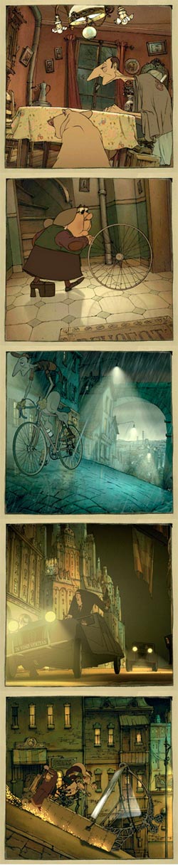 Now that the U.S. animation studios have largely abandoned cell animation in favor of the hyper-kinetic slickness of computer graphics, we must look elsewhere for the joys to be found in hand-drawn animation.
The most prominent of those delights is the obvious and simple visual charm of drawings that move; a charm that is most powerful when the drawings are left to look like drawings, with attention paid to the presence and quality of line.
For a delightful (in it’s true sense, full of delights) example of that we turn not to Japan, as many of you may have been expecting me to say, but to France, the third largest producer of animation in the world (see my posts about the yearly introductions to the Annecy Film Festival by students a the Gobelins School).
The Triplets of Belleville (original title Les Triplettes de Belleville, also called Belleville Rendez-Vous in the UK) is a feature length tour-du-force of hand drawn animation, in which the Tour de France plays an integral part. It was written and directed by Sylvain Chomet, co-produced by companies in France, Belgium, the UK and Canada, and released in 2003.
A champion bicycle rider had been kidnapped, you see, and his astonishingly indefatigable grandmother must find him, against odds, but with the assistance of wonderful oddballs.
As much as I rail about the unimaginative formulas in American animated features (Pixar notwithstanding), the story is really not the point here. It’s basically an extended version of the kind of quirky little story you get in animated film festivals. Like many of those films, Triplets is essentially without dialog, but the timing, sound artistry and skillful visual storytelling make that a moot (mute?) point. The essence of the film is the settings and characters, and, of course, the moving painted drawings, rich with line and artfully applied color.
The film has the character of the kind of wonderful concept art drawing that is usually lost in the translation to film, but in this case is retained and brought to life.
Even where they have used bits of computer animation to aid in things that are difficult and highly time consuming to portray in hand drawn animation, they have retained the essence of the drawn line and blended it well with the rest of the scene (for the most part, there are some awkward moments, but insignificant in the grand whole).
The scenes range from rural france to the metropolis of Belleville, a thinly veiled mash-up of New York and Paris in the early part of the 20th Century. The harsh caricature of obese, rude and unkind Americans is balanced by the equally unflattering portrayal of the French gangsters and wine merchants. The settings, however, are lavished with affection.
The Sony Pictures official site is unfortunately flawed (of course, it’s Sony, a corporation that seems to be devoted to doing things wrong in so many ways). The Flash interface has a lazily programmed Flash detection that tells Mac users they don’t have the plug-in (you do, click on the bottom link); and the interface navigation, despite the designers’ attempt to capture some of the visual charm of the film, is cramped and requires slow scrolling to access anything. Worst of all, they cut corners and linked to the trailer on the Apple trailers site instead of hosting it on their own site; and, of course, it’s no longer available there. You can see a rather grainy (from being up-sized) version of it on YouTube.
The original French web site fares much better and has a better trailer (fourth knob over on the TV set).
The Triplets of Belleville is quite unlike anything from animation studios in either the U.S. or Japan. If you like being charmed by drawings that move, The Triplets of Belleville will do that nicely.
Categories:
-
Luke Jerram

Luke Jerram is a UK artist who creates sculptures, installations and art events.In his Glass Microbiology project he has created a series of glass sculptures of viral structures, to, in his words, “contemplate the global impact of each disease and to consider how the doctoring of scientific imagery affects our visualisation of phenomena”.
The sculptures are of viruses that are associated with particularly virulent and well known diseases, Smallpox, HIV, SARS, Swine Flu and, in the case of the image above (with detail below), E. coli.
The fact that the virus sculptures are made of glass, a transparent substance which, in its most basic form, has no color of its own, is indicative of the second aspect of Jerram’s investigation, the suggestion that the coloring of scientific images carries implications beyond conveying information.
It’s common for scientific images to be given false colors for the purpose of clarity, or easy perception of information that may be hard to glean in the images’ “true” state. An example of this might be the application of false colors to astronomical images to display the structure of nebulae or the light from infrared or radio sources.
It is also common to color images of viruses; in fact a majority of illustrations and images of viruses that are not the original electron micrographs seem to be intensely colored. Jerram speculates that as a result, most non-scientists might assume that real viruses are actually brightly colored.
He further speculates that the practice can promote a sense of wonder and and make the images more impressive (possibly intentionally), as well as carrying an emotional tone, perhaps one of menace.
The glass sculptures neatly obviate the effect of color (except for one that was deliberately colored by a photographer, though it acts as a contrast), and reduce the viral shapes to just that: their shapes.
Jerram has another interest in removing the effects of color and judging the effect on perception; he himself is colorblind (an awkward term that might more accurately be called limited spectrum color vision), though I don’t know in what range his limitation extends.
The play of light on these sculptures, however, is still beautiful, and the perception of the shapes is heightened by the refractive characteristics of glass (something I respond to as strongly visually appealing); so I have to submit that Jerram has removed one source of intentional visual appeal only to substitute another.
However, as sculptures they work wonderfully. The shapes of viruses are particularly fascinating forms. I also find it compelling that microscopic structures capable of being deadly on a devastating scale can be represented with such beauty.
Jerram’s glass sculptures will be highlighted in a solo show at Smithfield Gallery, London from 22 September to 3 October, 2009.
[Via MetaFilter]
Categories:
-
Myke Amend
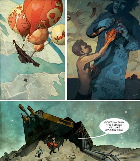
Myke Amend is an illustrator who focuses on steampunk and gothic horror themes, stemming largely from traditions grounded in the literary work of Jules Verne and H.P. Lovecraft.These two traditions dovetail in Amend’s series of paintings “Airships and Tentacles” which feature detailed, highly textured images of, well… just that. Amend works these images in a nicely retro manner, with a subdued palette and atmospheric lighting.
Amend works primarily in acrylic, with occasional paintings in oil and a variety of drawing media, including a series of engravings. Some of his other subject matter is handled in a breezier, almost cartoonlike style.
His galleries are in the Gallery & eCards section of his site, though the largest images are in the Desktop Wallpapers section. There are also pieces scattered around the rest of the site.
The home page of his site acts as a blog, though he seems to maintain a second blog on LiveJournal. You can also find his work on deviantART and MySpace.
[Via Dark Roasted Blend]
Categories:
-
Sterling Clinton Hundley: emergent
Sterling Hundley is a Virginia based painter and illustrator whose award winning illustrations were the subject of a previous Lines and Colors post in 2007.Hundley has embarked on a new direction as a gallery artist, the initial debut of which will be a solo show at Ghostprint Gallery in Richmond from September 4th to 26th, 2009.
The title of the show, “emergent” is taken from the scientific principle of emergence, which describes that way complex systems emerge from a multitude of simpler interactions.
The reference is to Hundley’s process for these works, in which he begins with small (3×3″, 7.6×7.6cm) monotypes on mounted panels, which he assembles into larger arrangements, which are then assembled into yet larger arrangements, eventually arriving as a final composition in which Hundley says “I navigate the gauntlet of abstraction to arrive just this side of representational.”
Hundley’s illustration, though distinctly (and wonderfully) stylized, is representational in approach, and the new work is a distinct departure for him.
On his blog, Hundley has been chronicling not only the process of creating the works, from receiving shipments of the image blocks to the final assembly of the larger works, but also, as the date approaches, the process of preparing for the show.
The opening is this Friday, September 4, 2009.
Categories:
-
Kurt Huggins and Zelda Devon
Kurt Huggins and Zelda Devon, collectively known as Teetering Bulb, are a an illustrator team living in Brooklyn. Their clients include Realms of Fantasy, Dover Publishing, Wizards of the Coast, Honest Tea and Tor.com.They are also creators of webcomics; and Tor.com, home of Tor publishing (se my post on Tor.com) is hosting their short story webcomic, The Dreaded Question, as well as a new fantasy story King of an Endless Sky (image above, bottom), which has just started.
The latter, presumably because it only has two episodes, is still lacking page to page navigation. [Addendum: this has been addressed (see this post’s comments), and the complete story is available from this page. As of this writing there are three pages, with new updates every Thursday.]
Their comics approach has a nice painted feeling, while still working within the traditional comics framework of color filled line drawings. Their illustration is more painterly, but still has a graphic, linear quality that gives it a particular visual charm.
Their blog features many of their works in various stages of creation, in addition to sketches, studies, anatomy drawings, and finished illustrations.
Their portfolio is basically a subset of blog posts, as are listings in the right hand column for sketchbooks and prints.
[Via LCSV4]
Categories:
-
A.D. – New Orleans After the Deluge
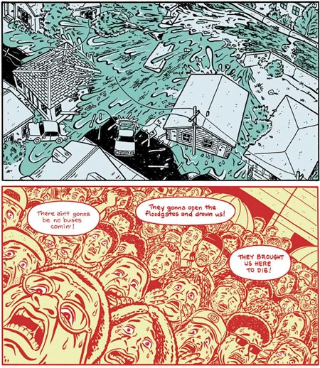
Though it’s been commonly accepted in Europe and Japan for may years, it’s finally creeping into common knowledge here in the U.S. that the medium of comics, or “graphic stories”, is not limited to — a: an audience of kids, and b: stories about steroid disasters in leotards grimacing and punching each other.
Comics is simply a medium, one that can be used to convey or talk about essentially anything, including reportage.
A.D. New Orleans After the Deluge is a graphic story about the disaster (both natural and political) of Hurricane Katrina and its aftermath.
The story is published by Smith Magazine and written and drawn by Josh Neufeld, a member of the ACT-I-VATE comics collective and author of The Vagabonds, with consulting and editing from Jeff Newlet and Miles VanMeter.
A.D. was initially published as a webcomic, which you can still read online at Smith Magazine, and has now been released in book format.
There is a video interview on the making of the story on YouTube.
[Via Salon]
Categories:


Charley’s Picks
Bookshop.org
(Bookshop.org affilliate links; sales benefit independent bookshop owners; I get a small percentage to help support my work on Lines and Colors)

John Singer Sargent: Watercolors


Urban Sketching: Understanding Perspective


Charley’s Picks
Amazon
(Amazon.com affiliate links; sales go to a larger yacht for Jeff Bezos; but I get a small percentage to help support my work on Lines and Colors)
John Singer Sargent: Watercolors
Urban Sketching: Understanding Perspective