
Categories
- 3d CGI
- Amusements
- Animation
- Anime & Manga
- Art Materials
- Art Videos
- Blogroll
- Cartoons
- Color
- Comics
- Concept & Visual Dev.
- Creativity
- Digital Art
- Digital Painting
- Displaying Art on the Web
- Drawing
- Eye Candy for Today
- Gallery and Museum Art
- High-res Art Images
- Illustration
- Motion Graphics & Flash
- Museums
- Online Museums
- Outsider Art
- Painting
- Painting a Day
- Paleo Art
- Pastel, Conté & Chalk
- Pen & Ink
- Prints and Printmaking
- Reviews
- Sc-fi and Fantasy
- Sculpture & Dimensional
- Site Comments
- Sketching
- Storyboards
- Tools and Techniques
- Uncategorized
- Vector Art
- Videos & Podcasts
- Vision and Optics
- Watercolor and Gouache
- Webcomics
Archives
- July 2026
- June 2026
- May 2026
- April 2026
- March 2026
- February 2026
- January 2026
- December 2025
- November 2025
- October 2025
- September 2025
- August 2025
- July 2025
- June 2025
- May 2025
- January 2025
- December 2024
- November 2024
- October 2024
- September 2024
- August 2024
- June 2024
- April 2024
- March 2024
- February 2024
- January 2024
- December 2023
- November 2023
- October 2023
- September 2023
- August 2023
- July 2023
- May 2023
- April 2023
- March 2023
- February 2023
- January 2023
- December 2022
- November 2022
- September 2022
- August 2022
- July 2022
- June 2022
- May 2022
- April 2022
- March 2022
- February 2022
- January 2022
- December 2021
- November 2021
- October 2021
- September 2021
- August 2021
- July 2021
- June 2021
- May 2021
- April 2021
- March 2021
- February 2021
- January 2021
- December 2020
- November 2020
- October 2020
- September 2020
- August 2020
- July 2020
- June 2020
- May 2020
- April 2020
- March 2020
- February 2020
- January 2020
- December 2019
- November 2019
- October 2019
- September 2019
- August 2019
- July 2019
- June 2019
- May 2019
- April 2019
- March 2019
- February 2019
- January 2019
- December 2018
- November 2018
- October 2018
- September 2018
- August 2018
- July 2018
- June 2018
- May 2018
- April 2018
- March 2018
- February 2018
- January 2018
- December 2017
- November 2017
- October 2017
- September 2017
- August 2017
- July 2017
- June 2017
- May 2017
- April 2017
- March 2017
- February 2017
- January 2017
- December 2016
- November 2016
- October 2016
- September 2016
- August 2016
- July 2016
- June 2016
- May 2016
- April 2016
- March 2016
- February 2016
- January 2016
- December 2015
- November 2015
- October 2015
- September 2015
- August 2015
- July 2015
- June 2015
- May 2015
- April 2015
- March 2015
- February 2015
- January 2015
- December 2014
- November 2014
- October 2014
- September 2014
- August 2014
- July 2014
- June 2014
- May 2014
- April 2014
- March 2014
- February 2014
- January 2014
- December 2013
- November 2013
- October 2013
- September 2013
- August 2013
- July 2013
- June 2013
- May 2013
- April 2013
- March 2013
- February 2013
- January 2013
- December 2012
- November 2012
- October 2012
- September 2012
- August 2012
- July 2012
- June 2012
- May 2012
- April 2012
- March 2012
- February 2012
- January 2012
- December 2011
- November 2011
- October 2011
- September 2011
- August 2011
- July 2011
- June 2011
- May 2011
- April 2011
- March 2011
- February 2011
- January 2011
- December 2010
- November 2010
- October 2010
- September 2010
- August 2010
- July 2010
- June 2010
- May 2010
- April 2010
- March 2010
- February 2010
- January 2010
- December 2009
- November 2009
- October 2009
- September 2009
- August 2009
- July 2009
- June 2009
- May 2009
- April 2009
- March 2009
- February 2009
- January 2009
- December 2008
- November 2008
- October 2008
- September 2008
- August 2008
- July 2008
- June 2008
- May 2008
- April 2008
- March 2008
- February 2008
- January 2008
- December 2007
- November 2007
- October 2007
- September 2007
- August 2007
- July 2007
- June 2007
- May 2007
- April 2007
- March 2007
- February 2007
- January 2007
- December 2006
- November 2006
- October 2006
- September 2006
- August 2006
- July 2006
- June 2006
- May 2006
- April 2006
- March 2006
- February 2006
- January 2006
- December 2005
- November 2005
- October 2005
- September 2005
- August 2005
Relevant Blogs
Art, Painting & Sketch
- Gurney Journey
- Underpaintings
- Art and Influence
- Painting Perceptions
- Oil Painters of America
- Vasari Paint POV
- Flying Fox
- Urban Sketchers
- Bento (Smithsonian)
- Art Inconnu
- The Hidden Place
- Still Life
- Making a Mark
- The Art of the Landscape
- Exploring Color & Creativity
- Art Contrarian
- Artist A Day
- beinArt Surreal Art Collective
- Eye Level
- David Dunlop
- p.i.g.m.e.n.t.i.u.m
- CultureGrrl
- Joaquín Sorolla blog
- Artists in Pastel
“Painting a Day”
- A Painting a Day (Keiser)
- On Painting (Keiser)
- Julian Merrow-Smith
- Karen Jurick
- Jeffrey Hayes
- Carol Marine
- Abbey Ryan
- Daily Paintworks
Other Painting Blogs
- Virtual Gouache Land
- Neil Hollingsworth
- Marc Hanson
- Kevin Menck
- Marc Dalessio
- Larry Seiler
- Stapleton Kearns
- Colin Page
- Roos Schuring
- Hans Versfelt
- Titus Meeuws
- Régis Pettinari
- René Plein Air
- Belinda Del Pesco
- Robin Weiss
- Nathan Fowkes (Land Sketch)
- William Wray
- Frank Serrano
- Stephen Magsig
- Michael Chesley Johnson
- Twice a Week
- Sarah Wimperis
- Rob Adams
- Michael Cole Manley
- The Dirty Palette Club
- Mike Manley’s Draw!
Gallery Art & Illustration mix
Illustration
- Howard Pyle
- 100 Years of Illustration
- BibliOdyssey
- Illustration Art
- Today’s Inspiration
- Illustration Mundo
- Little Chimp Society
- Danny Gregory
- R D (John Martz
- Illustration Friday blog
- Monster Brains
- Illustrators & Illustrations (RU)
- Elwood H. Smith
- DaniDraws.com
- Designers Who Blog
- iSpot Blog
Sci-Fi & Fantasy
Illustration & Comics
Comics & Cartoons
- Comics Beat
- Robot 6
- Newsarama Blog
- Comic Vine
- Comics Alliance
- Forbidden Planet Int.
- Paolo Rivera
- Bolt City
- Flight
- Scott McCloud
- The Comics Journal
- Comixpedia
- Funnybook Babylon
- James Baker
- Middleton’s Sketchbook
- Boneville
- The Hotel Fred
- Paul Rivoche
- Daily Cartoonist
- Mad About Cartoons (William Wray)
- Digital Strips
Illustration & Concept
Animation & Concept
- Cartoon Brew
- Animation Blog
- Cold Hard Flash
- Concept Art World
- The CAB
- FY Concept Art
- Concept Ships
- Concept Robots
- John Nevarez
- Armand Serrano
- Marcos Mateu-Mestre
- all kinds of stuff (Kricfalusi)
- Yacin the faun (Man Arenas)
- Kelsey Mann
- Cre8tivemarks Blog
- Ice-Cream Monster Toon Cafe
- AAU Character & Creature Design
- AAU Animation Notes
- Articles and Texticles
Paleo & Scientific
Tools & Techniques
Other
Lists of Art Blogs
Art Image Resource Links
Historic Art Images
- Wikimedia Commons: Paintings
- Wikimedia Commons: Drawings
- The Athenaeum
- WikiArt (WikiPaintings)
- Google Art Project: Artists
- Google Art Project: Collections (Museums)
- ArtCyclopedia
- Web Gallery of Art
- Art Renewal Center
- Web Gallery of Impressionism
Auction Consolidation sites
Auction sites
- Sotheby’s
- Bonham’s
- Christies
- Heritage Auctions: Fine Art
- Heritage Auctions: Illustration
- Freeman’s Auctions
- Bukowskis
- Shannon’s
Image Search
Reverse Image Search (search by image)
- Tin Eye
- RevImg
- Google Image Search (camera icon)
- Bing Image Search (camera icon)
Promoting some friends and some clients of my website design business
- Twin Willows T’ai Chi studio in Wilmington DE. Taiji classes with Bryan Davis.
- Ray Hayward, Inspired Teacher of T’ai Chi ( Taiji ) in Minneapolis, Founder of Mindful Motion Tai Chi Academy
- OldHead Tattoo studio and Art Gallery in Wilmington DE. Tattoos and paintings by Bruce Gulick
- Sharon Domenico Art, pet portrait oil paintings
- Platinum Paperhanging, wallpaper hanging, Main Line and Philadelphia, PA
- Lisa Stone Design, interior designer, Main Line and Philadelphia, PA
- Studio12KPT, original art, prints, calendars and other custom printed items by Van Sickle & Rolleri
-
Stapleton Kearns
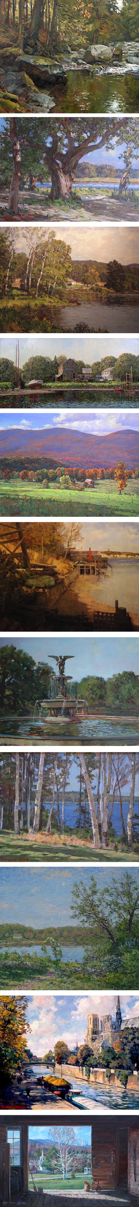
Stapleton Kearns is a landscape painter based in New England.When I first encountered his work some years ago (it can take me a while to get to these posts, folks), I felt it had a nice feeling of being influenced by early 20th century American landscape painters like John Fabian Carlson and, to a lesser extent, Emile Gruppe — painters who, while not American Impressionists, carried forward their bright colors and immediate brushwork, along with a solid underpinning of realist tradition in draftsmanship and composition.
It was later, on reading his blog, that I found Kearns mention his admiration for another artist with whom I was only passingly familiar, Aldro Hibbard. In the process it led me to a better appreciation of Hibbard’s work (likely the subject of a future post — here is a search for Aldro Hibbard on Kearns’ blog).
Kearns studied in the studios of R.H. Ives Gammell, a painter who championed the traditions of academic and classical realism in the face of the wave of modernism that acted to suppress them in the early to mid 20th century. Gammell was himself a student of the great American painter Edmund Tarbell.
In addition to his own blog, Kearns contributes to the group blog, The Boston School of Painting, devoted to artists in that lineage.
Though certainly worth checking out, Kearns’ own website is unfortunately not the showcase for his work that it might be; the portfolio is somewhat awkwardly arranged and the images are frustratingly small (there are some larger ones on the Ella Walton Richardson Fine Art gallery site).
It’s unfortunate, in that Kearn’s paintings, in those few examples I’ve seen in higher resolution, have a wonderful surface quality, as well as details of color variation and paint handling that would make larger images rewarding.
Even in the smaller images, however, you can see his strong sense of composition, economy of notation, harmonious application of color and dedication to capturing the light of his scene on location.
Though his website feels like it hasn’t received much attention for a while, Kearns’ blog is another story, and has evidently received much of his attention over several years. It is nothing short of a treasure trove.
Not only can you find some of his work reproduced larger (by searching for the label “my paintings“), you will also find a wealth of other topics accessible by the labels toward the bottom of the right hand column for topics like “art technique”, “art history”, “color”, “painting outside” and many others; as well as by simply looking back through his posts.
Kearns, both as a teacher of workshops and classes and through the blog, is handing down much of what he has learned from the lineage of his training, his interest in art history and his own experience as a painter. There is even a feature called “Ask Stape” (which is essentially an email contact), in which he writes or appends posts in response to reader questions.
The combination of personal experience, articles on artists from history and musings on aspects of art and painting like color, composition, materials and other topics puts me in mind of James Gurney’s remarkable blog, Gurney Journey (which I have written about previously).
Here, for example, is a terrific Kearns post in which he talks about dealing with summer greens and “smuggling red”.
When looking through the blog I find myself constantly making bookmarks and going off on searches related to topics or artist names he brings, up, some familiar, some new and some, like Hibbard, marginally familiar but to which I have not paid enough attention.
The latest of these has given me renewed awareness and enthusiastic appreciation of the work of Edward Seago, a brilliant English painter who will undoubtedly be the subject of a post in the near future (here is a search for Edward Seago on Kearn’s blog).
I find it particularly rewarding to use the blog’s search feature (upper left), searching, for example, for terms like “color palette“.
There is such a backlog of fascinating information on Kearns’ blog (not to mention strong opinions and amusing snarkiness from “Stape”, as he is called) that I’ll do something rarely called for in a post about an individual artist, and issue my Time Sink Warning. Enjoy.
Categories:
-
Eye Candy for Today: View of the Hague, and study by Cornelis Springer
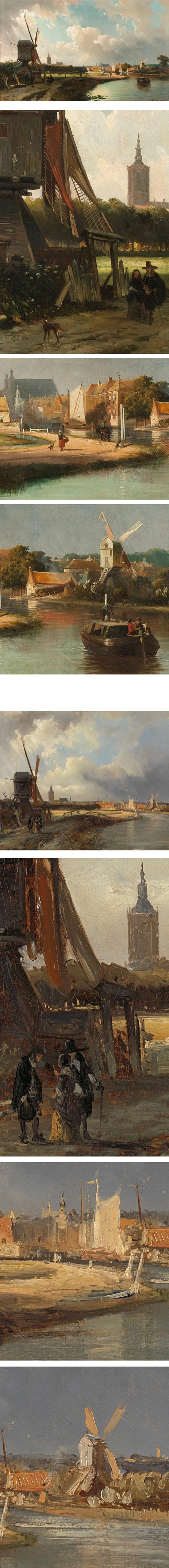
by Cornelis Springer, and .In the Rijksmuseum; original pages and .
In many ways, I like the wonderfully painterly study more than the finished painting, though both are beautiful.
Categories:
-
Anna and Elena Balbusso

Anna and Elena Balbusso are illustrators based in Milan, Italy.They are twins and create their work as a team. There is a page on their website devoted to their working process.
Both studied at the Academy of Fine Arts “Brera” of Milan, and the University of Milan. Their work has appeared in numerous publications in Italy, France, the UK, Korea and the U.S. They have received recognition from the Society of Illustrators, Communication Arts, American Illustration Applied Arts, Print, and other publications and artists organizations.
The portfolios on their website are organized by “Graphic Style”, “Painterly Style” and “Children’s Books”. Within each category you will find both a variety of approaches and repeated stylistic elements.
Their work shows a firm grounding in the traditions of European art history as well as a sharply modern design sensibility, and the two are skillfully blended into a visually captivating whole.
I particularly admire their use of contrastingly muted and vibrantly rich colors, and the wonderful textural quality of their “painterly” style, as well as the strong design evident in all of their compositions.
You can find additional galleries of their illustrations on Shannon Associates, the iSpot, Behance and on Tor.com, which is where I found their work by way of Irene Gallo.
Their illustration accompanies the new story Men Who Wish to Drown by Elizabeth Fama on the Tor website.
There is also a selection of their illustrations for The Handmaid’s Tale on The Guardian.
You can find additional resources on their links page.
Categories:
-
Eye Candy for Today: Bierstadt’s California Spring

California Spring by Albert Bierstadt.On Google Art Project, click image for zoom controls.
Original is in de Young Museum in San Francisco.
Categories:
-
Björn Hurri (update)

Björn Hurri is a concept artist working in the gaming industry, He has worked for companies like NCsoft, Catalyst Game Labs and SEGA and is currently the Lead Artist for Opus Artz, a production design agency based in London.When I wrote about his work back in 2008, I highlighted his fun and, at the time, lightly sketched illustrations for steam punk versions of characters from Star Wars.
Since then, Hurri has expanded the project into a longer series of more finished illustrations (image above, top), with more elaborate interpretations of the characters.
His other work for gaming projects ranges from historical through science fiction subjects, and frequently displays Hurri’s skill at conveying texture and atmosphere.
I particularly enjoy his playful take on John Bauer’s wonderful big-nosed trolls (above, bottom).
Though his website is currently unavailable, you can find a portfolio of his work, along with some relevant information about the artist, on CGHub.
Hurri is also a contributor to the Gorilla Artfare group blog.
Categories:
-
Eye Candy for Today: Jan Jansz Treck still life

Still Life with a Pewter Flagon and Two Ming Bowls, Jan Jansz Treck.Faded, but still beautiful.
The bowls are an odd color because the artist used a type of smalt (cobalt glass) blue that was not lightfast.
In the National Gallery, London. Use fullscreen and zoom icons to right of the image.
Categories:


Charley’s Picks
Bookshop.org
(Bookshop.org affilliate links; sales benefit independent bookshop owners; I get a small percentage to help support my work on Lines and Colors)

John Singer Sargent: Watercolors


Urban Sketching: Understanding Perspective


Charley’s Picks
Amazon
(Amazon.com affiliate links; sales go to a larger yacht for Jeff Bezos; but I get a small percentage to help support my work on Lines and Colors)
John Singer Sargent: Watercolors
Urban Sketching: Understanding Perspective