
Categories
- 3d CGI
- Amusements
- Animation
- Anime & Manga
- Art Materials
- Art Videos
- Blogroll
- Cartoons
- Color
- Comics
- Concept & Visual Dev.
- Creativity
- Digital Art
- Digital Painting
- Displaying Art on the Web
- Drawing
- Eye Candy for Today
- Gallery and Museum Art
- High-res Art Images
- Illustration
- Motion Graphics & Flash
- Museums
- Online Museums
- Outsider Art
- Painting
- Painting a Day
- Paleo Art
- Pastel, Conté & Chalk
- Pen & Ink
- Prints and Printmaking
- Reviews
- Sc-fi and Fantasy
- Sculpture & Dimensional
- Site Comments
- Sketching
- Storyboards
- Tools and Techniques
- Uncategorized
- Vector Art
- Videos & Podcasts
- Vision and Optics
- Watercolor and Gouache
- Webcomics
Archives
- June 2026
- May 2026
- April 2026
- March 2026
- February 2026
- January 2026
- December 2025
- November 2025
- October 2025
- September 2025
- August 2025
- July 2025
- June 2025
- May 2025
- January 2025
- December 2024
- November 2024
- October 2024
- September 2024
- August 2024
- June 2024
- April 2024
- March 2024
- February 2024
- January 2024
- December 2023
- November 2023
- October 2023
- September 2023
- August 2023
- July 2023
- May 2023
- April 2023
- March 2023
- February 2023
- January 2023
- December 2022
- November 2022
- September 2022
- August 2022
- July 2022
- June 2022
- May 2022
- April 2022
- March 2022
- February 2022
- January 2022
- December 2021
- November 2021
- October 2021
- September 2021
- August 2021
- July 2021
- June 2021
- May 2021
- April 2021
- March 2021
- February 2021
- January 2021
- December 2020
- November 2020
- October 2020
- September 2020
- August 2020
- July 2020
- June 2020
- May 2020
- April 2020
- March 2020
- February 2020
- January 2020
- December 2019
- November 2019
- October 2019
- September 2019
- August 2019
- July 2019
- June 2019
- May 2019
- April 2019
- March 2019
- February 2019
- January 2019
- December 2018
- November 2018
- October 2018
- September 2018
- August 2018
- July 2018
- June 2018
- May 2018
- April 2018
- March 2018
- February 2018
- January 2018
- December 2017
- November 2017
- October 2017
- September 2017
- August 2017
- July 2017
- June 2017
- May 2017
- April 2017
- March 2017
- February 2017
- January 2017
- December 2016
- November 2016
- October 2016
- September 2016
- August 2016
- July 2016
- June 2016
- May 2016
- April 2016
- March 2016
- February 2016
- January 2016
- December 2015
- November 2015
- October 2015
- September 2015
- August 2015
- July 2015
- June 2015
- May 2015
- April 2015
- March 2015
- February 2015
- January 2015
- December 2014
- November 2014
- October 2014
- September 2014
- August 2014
- July 2014
- June 2014
- May 2014
- April 2014
- March 2014
- February 2014
- January 2014
- December 2013
- November 2013
- October 2013
- September 2013
- August 2013
- July 2013
- June 2013
- May 2013
- April 2013
- March 2013
- February 2013
- January 2013
- December 2012
- November 2012
- October 2012
- September 2012
- August 2012
- July 2012
- June 2012
- May 2012
- April 2012
- March 2012
- February 2012
- January 2012
- December 2011
- November 2011
- October 2011
- September 2011
- August 2011
- July 2011
- June 2011
- May 2011
- April 2011
- March 2011
- February 2011
- January 2011
- December 2010
- November 2010
- October 2010
- September 2010
- August 2010
- July 2010
- June 2010
- May 2010
- April 2010
- March 2010
- February 2010
- January 2010
- December 2009
- November 2009
- October 2009
- September 2009
- August 2009
- July 2009
- June 2009
- May 2009
- April 2009
- March 2009
- February 2009
- January 2009
- December 2008
- November 2008
- October 2008
- September 2008
- August 2008
- July 2008
- June 2008
- May 2008
- April 2008
- March 2008
- February 2008
- January 2008
- December 2007
- November 2007
- October 2007
- September 2007
- August 2007
- July 2007
- June 2007
- May 2007
- April 2007
- March 2007
- February 2007
- January 2007
- December 2006
- November 2006
- October 2006
- September 2006
- August 2006
- July 2006
- June 2006
- May 2006
- April 2006
- March 2006
- February 2006
- January 2006
- December 2005
- November 2005
- October 2005
- September 2005
- August 2005
Relevant Blogs
Art, Painting & Sketch
- Gurney Journey
- Underpaintings
- Art and Influence
- Painting Perceptions
- Oil Painters of America
- Vasari Paint POV
- Flying Fox
- Urban Sketchers
- Bento (Smithsonian)
- Art Inconnu
- The Hidden Place
- Still Life
- Making a Mark
- The Art of the Landscape
- Exploring Color & Creativity
- Art Contrarian
- Artist A Day
- beinArt Surreal Art Collective
- Eye Level
- David Dunlop
- p.i.g.m.e.n.t.i.u.m
- CultureGrrl
- Joaquín Sorolla blog
- Artists in Pastel
“Painting a Day”
- A Painting a Day (Keiser)
- On Painting (Keiser)
- Julian Merrow-Smith
- Karen Jurick
- Jeffrey Hayes
- Carol Marine
- Abbey Ryan
- Daily Paintworks
Other Painting Blogs
- Virtual Gouache Land
- Neil Hollingsworth
- Marc Hanson
- Kevin Menck
- Marc Dalessio
- Larry Seiler
- Stapleton Kearns
- Colin Page
- Roos Schuring
- Hans Versfelt
- Titus Meeuws
- Régis Pettinari
- René Plein Air
- Belinda Del Pesco
- Robin Weiss
- Nathan Fowkes (Land Sketch)
- William Wray
- Frank Serrano
- Stephen Magsig
- Michael Chesley Johnson
- Twice a Week
- Sarah Wimperis
- Rob Adams
- Michael Cole Manley
- The Dirty Palette Club
- Mike Manley’s Draw!
Gallery Art & Illustration mix
Illustration
- Howard Pyle
- 100 Years of Illustration
- BibliOdyssey
- Illustration Art
- Today’s Inspiration
- Illustration Mundo
- Little Chimp Society
- Danny Gregory
- R D (John Martz
- Illustration Friday blog
- Monster Brains
- Illustrators & Illustrations (RU)
- Elwood H. Smith
- DaniDraws.com
- Designers Who Blog
- iSpot Blog
Sci-Fi & Fantasy
Illustration & Comics
Comics & Cartoons
- Comics Beat
- Robot 6
- Newsarama Blog
- Comic Vine
- Comics Alliance
- Forbidden Planet Int.
- Paolo Rivera
- Bolt City
- Flight
- Scott McCloud
- The Comics Journal
- Comixpedia
- Funnybook Babylon
- James Baker
- Middleton’s Sketchbook
- Boneville
- The Hotel Fred
- Paul Rivoche
- Daily Cartoonist
- Mad About Cartoons (William Wray)
- Digital Strips
Illustration & Concept
Animation & Concept
- Cartoon Brew
- Animation Blog
- Cold Hard Flash
- Concept Art World
- The CAB
- FY Concept Art
- Concept Ships
- Concept Robots
- John Nevarez
- Armand Serrano
- Marcos Mateu-Mestre
- all kinds of stuff (Kricfalusi)
- Yacin the faun (Man Arenas)
- Kelsey Mann
- Cre8tivemarks Blog
- Ice-Cream Monster Toon Cafe
- AAU Character & Creature Design
- AAU Animation Notes
- Articles and Texticles
Paleo & Scientific
Tools & Techniques
Other
Lists of Art Blogs
Art Image Resource Links
Historic Art Images
- Wikimedia Commons: Paintings
- Wikimedia Commons: Drawings
- The Athenaeum
- WikiArt (WikiPaintings)
- Google Art Project: Artists
- Google Art Project: Collections (Museums)
- ArtCyclopedia
- Web Gallery of Art
- Art Renewal Center
- Web Gallery of Impressionism
Auction Consolidation sites
Auction sites
- Sotheby’s
- Bonham’s
- Christies
- Heritage Auctions: Fine Art
- Heritage Auctions: Illustration
- Freeman’s Auctions
- Bukowskis
- Shannon’s
Image Search
Reverse Image Search (search by image)
- Tin Eye
- RevImg
- Google Image Search (camera icon)
- Bing Image Search (camera icon)
Promoting some friends and some clients of my website design business
- Twin Willows T’ai Chi studio in Wilmington DE. Taiji classes with Bryan Davis.
- Ray Hayward, Inspired Teacher of T’ai Chi ( Taiji ) in Minneapolis, Founder of Mindful Motion Tai Chi Academy
- OldHead Tattoo studio and Art Gallery in Wilmington DE. Tattoos and paintings by Bruce Gulick
- Sharon Domenico Art, pet portrait oil paintings
- Platinum Paperhanging, wallpaper hanging, Main Line and Philadelphia, PA
- Lisa Stone Design, interior designer, Main Line and Philadelphia, PA
- Studio12KPT, original art, prints, calendars and other custom printed items by Van Sickle & Rolleri
-
John Jude Palencar

Many artists try to flood their images with light; others allow intermittent bursts of it within a framework of darkness. In John Jude Palencar’s fantasy themed illustrations, light seeps in, like some kind of oily liquid making its way through forgotten cracks. Once light has found its way into his images, it simmers and squirms as if skittering across frying pan. Even his brightest lights feel like they’re being held back by some secret force, a hidden gravity.His images are steeped in atmospheric effects that feel more like emotional density then mere mist or haze. Carefully chosen colors and tones pull you inexorably toward whatever point of focus Pallencar intends, the eye is helpless to resist.
But light and color are not the real spell being cast here. Through all of his work, under it, over it and pervading it like a scent, is texture. Texture is everywhere, no surface is without it, the air seems textured. You begin feel that Palencar’s light itself is textured.
Palencar’s remarkably evocative paintings can veer from the horrific to the beautiful, and often embrace both artistic deities simultaneously. Central in subject is the human form, often isolated or even floating above a surface, wrapped in light and texture, as solidly three dimensional as a stone in your hand, as ethereal as an idea.
His gallery paintings are in a similar style, tempered with an enigmatic choice of subject matter. There is certainly a hint of Dali in his work, but it’s not the overt “strangeness” that some painters are quick to be influenced by; in Palencar’s case, it seems he sees through Dali’s lens to his influences, and dips back into the rich well of Valezquez and the visionary and disturbing paintings of Bosch and Breugel. There is also a touch of Arthur Rackham and perhaps a dash of Howard Pyle as well, a bit of heroic monumentality about his weirdling souls.
Rather than delineate Palencar’s long list of credits and recognition, I’ll point you to a nicely summarized description on Irene Gallos’ always terrific blog, The Art Department, in which she profiles Palencar as part of her coverage of five top Pro Artist Hugo Award nominees. (The other four are Donato Giancola, John Picacio, Bob Eggleton and Stephen Martiniere; all of whom I’ve also featured on lines and colors in the past with the exception of Palencar. My posts: Donato Giancola, John Picacio, Bob Eggleton and Stephen Martiniere.)
I haven’t covered Palencar until now because I’ve been waiting for a while for his new web site to go live. It has (I’m not certain just how long it’s been up), and I’m pleased to see it not only includes a good selection of his illustrations and gallery art, but drawings as well, including preliminary sketches for some of his paintings.
A collection of Palencar’s work, Origins: The Art of John Jude Palencar was released earlier this year. Irene Gallo also has a nice post about the book here, with some shots of the pages.
You’ll find numerous references to Palencar’s work around the web, including many to the book Eragon, within which the young author Christopher Paolini named one of his key mythical places Palencar Valley, well before the artist was called on to do the cover.
Categories:
-
Antoni Gaudí

The Art Nouveau style that flourished around the turn of the 20th Century was notable not only for its international reach, but for its influence across many areas of artistic endeavor. The style is familiar in paintings and graphics like those of Alfons Mucha, but was also expressed in murals, mosaics, furniture, glassware, stained glass, jewelry, interior furnishings, and dramatically, wonderfully, in architecture.Antoni Gaudí, whose full name was Antoni Gaudí i Cornet and is sometimes referred to as Antonio Gaudí, was an architect from Catalonia (an autonomous region in Spain), who can be categorized as Art Nouveau, but whose individualistic style and dramatically different approach can also put him outside the reach of any easy classification and into the realm of the unique.
Gaudí infused his buildings with the graceful curves, parabolas, hyperbolas, flowing style and rich decorative elements in common with other Art Nouveau structures, but went beyond that into an amazing expression of artistic enthusiasm that merged into the surreal. The Surrealists, in fact. felt a kinship with Gaudí, as they did with many artists and architects whose work they felt embodied their search for inspiration in dreams and the subconscious. Dali, in particular, is closely associated with Gaudí and was also a native of Catalonia.
Gaudí’s buildings, though often reviled during his early years (his multi-story Casa Milà was called “La Pedrera” – “the quarry”), are now among the most popular attractions in that region and in Barcelona, where he found patrons for his eccentric designs. His original style developed out of gothic revival, and his most dramatic work, the unfinished basilica known as La Sagrada Família (“The Holy Family”, image above left top and bottom), is an astonishing sculptural monument of gothic cathedral meets Art Nouveau by way of Surrealist hallucination.
His apartment buildings and multi family residences are perhaps less dramatic, but no less amazing for their remarkable originality and strikingly expressive decoration.
One of the sources I’ll point you to for an appreciation of Gaudi’s work is the Great Buildings Online site, which has a good selection of photographs not only for Sagrada Famillia, but for residence buildings like Casa Batlo (image above, upper right). and Casa Milà (“La Pedrera”, image above, lower right).
The thing that sparked me to dig out and complete this post was a MetaFilter post about a couple of YouTube vids of walk-throughs of Gaudí structures here and here.
Gaudi is quite popular and there are a number of beautiful books devoted to his work.
Interestingly, one of the solutions put forward for the new structures at the site of the World Trade Center was a large scale revival of Gaudí’s proposal from almost 100 years ago for a hyperboloid skyscraper in New York called “Hotel Attraction” (post on mirage.studio.7 blog). How cool would it be to replace a monument to commerce, felled by an example of the horrifying impulse to destroy that lurks in the darks of the human mind, with a beautiful, giant inhabitable sculpture, a tribute to imagination and the human desire to create.
Categories:
-
Scott Altmann

Here we go again, another intriguing young (I presume) illustrator who provides little background information on his own site, so I’ve dug around for what I could find.Altmann graduated from the Illustration department of the School of Visual Arts in New York. He lists his favorite comics artists as Winsor McCay, Geof Darrow and Frezzato, and his favorite non-comics artists as Rembrandt, Klimt, Dewing, Mucha, Nerdrum and Dean Cornwell.
He works in oil for his illustrations, but likes to work in digitally for some pieces, and has a gallery on the CGSociety site. His clients include Wizards of the Coast, UpperDeck Entertainment and Green Ronin Publishing.
He also does work for Fantasy Flight games, including the cover for the Grimm roleplaying game for which there are discussions of his working process in the form of PDF files here and here.
Altmann divides his time between illustration and gallery work and exhibits at the Roq la Rue gallery.
Altmann’s web site, which is subtitled “Illustrations and Hauntings”, has sections for Illustrations, Sketches and Personal Work. He has a blog called Bad Dreams Good Nightmares..
Categories:
-
The Center for Cartoon Studies

Cartooning and comic book creation have been working their way into the curriculums of mainstream colleges and universities, and there are now two (as far as I know) schools devoted entirely to the field.Unlike the long-established Joe Kubert School of Cartoon and Graphic Art, a three-year school in New Jersey which concentrates on preparing its students to compete in the market for mainstream comic books and graphic design, the relatively new Center for Cartoon Studies in Vermont is a two-year school that focuses on preparing students for creating comics with an emphasis on the even riskier, but very worthwhile, path of independent creation and self-publishing, particularly in the “graphic novel” form.
The Center boasts an impressive roster of resident and visiting faculty, comprised of professionals in the field, and has been getting good press notice. Names associated with the school in various capacities include Steve Bissette, Denis Kitchen, Eric Reynolds of Fantagraphics, William Horberg of Wonderland Films, Diana Schutz of Dark Horse Comics, Skip Morrow, James Kochalka and before his untimely death, Will Eisner. Visiting lecturers have included Allison Bechdel, Bill Griffith, Harry Bliss, Ed Koren, Jason Little, Seth, Brian Walker, and Chris Ware.
The Center for Cartoon Studies was founded in 2004 by James Sturm, an award winning cartoonist noted for his series The Cereal Killings and his graphic novel The Golem’s Mighty Swing, which was named “Best Comic 2001” by Time magazine, and Michelle Ollie, who is experienced in the business side of art schools from her association with the Minneapolis College of Art and Design and the New York Institute of Technology.
There is an illustrated article by Sturm on Slate about the founding of the school. There in also an interesting recent article in the Christian Science Monitor that gives a nice overview of the school as well as a more personal picture of it from a student point of view.
Notice is expanding on the web and you can also find accounts of the Center from the point of view of students like Josie Whitmore (on Kochalkaholic), and visiting lecturers like Alec Longstreth. There is also a description of the center from Publisher’s Weekly.
The school offers a one-year and two year course of study that look as though they focus on grounding the student in some of the traditional basics necessary to understand and create effective works in the medium of comics, including some knowledge of graphic design and publishing.
The school has just released the first publication under it’s own auspices, Houdini: The Handcuff King by Sturm, Jason Lutes and Nick Bertozzi (more info here), the first in a series of graphic novels for young readers.
There is also a fascinating book called A Guidebook to The Center for Cartoon Studies by James Sturm and Kevin Huizenga, from which the image above has been cropped (review here on PopSyndicate), that serves as an introduction to the school and is, of course, in the form of a graphic story.
Addendum: Filmaker Tara Wray (â€Manhattan, Kansasâ€) is currently filming a documentary called Cartoon College, about a year in the life of the school. There is a trailer online on the Center’s web site.
Categories:
-
Daisuke “Dice” Tsutsumi

I could have done a post on Daisuke Tsutsumi in any of several different genres of artwork — illustration, comics, painting or movie concept art. Though his primary occupation is as a film concept artist, Tsutsumi, or “Dice” as he is called, continues to pursue his interest in the other forms.As a concept artist, he has worked on films like Ice Age, Robots (image above, lower left), and the upcoming Horton Hears a Who. It was his illustration work that first caught my eye when I came across the image at top in the Spectrum 13 collection of contemporary fantastic art. I then noticed that he has done a graphic story called Noche Y Dia as a part of the Out of Picture anthology (preview here) that is being published by Villard, the same division of Random House that is publishing the Flight comics anthologies.
I subsequently checked out the Film section of his site, which contains his concept art, and was eventually surprised and delighted to find that Tsutsumi is an avid plein air painter. His painting section contains many oil sketches done on location, of which I’m particularly fond of the series from the Village in NY (image above, lower right), and you will also find on location paintings in the Trip section, done during his travels to Europe and South America.
Through all of his work, you will find a strong color sense, even when his work takes on a monochromatic character, and an interesting range of approaches to value, from high contrast to low. Tsutsumi works digitally for his concept art and in oil and watercolor for his location paintings. There are also ink sketches, and mixtures of medium employed in his continued exploration of approaches and genres.
Categories:
-
Edward Hopper
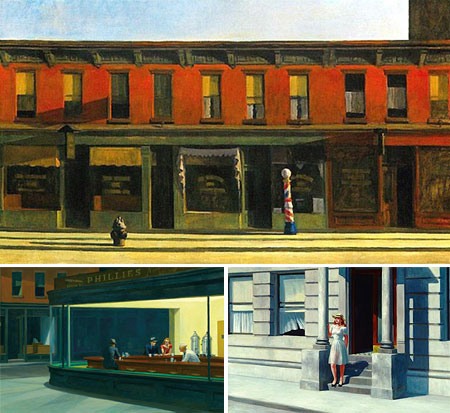
Edward Hopper found stillness in motion and geometry in light. His simultaneously strong and subtle images of houses, streets and intimate rooms invite us to quiet our minds and open our eyes to the beauty of the commonplace as revealed by shadow, sun and the warmth or artificial lights.Hopper takes us down city streets, past rows of shops waiting to open, into cafes and diners, past intimate scenes on porches and stoops and lets us peer voyeuristically into windows. He doesn’t just leave us in front of his images, he guides our eye, saying look, look how the shadows show you this form, look how the sunlight makes this space reveal itself, look at the inside and the outside of this architectural form at the same time. Look.
Hopper, in addition to his fascination with shadow and light, had a fascination with architecture, not in the sense of advanced designs, history or monuments, but in the streets and houses and buildings we encounter every day. His fascination is in the corner of a storefront, the edge of an office building, the porch of a house or the corner of a room.
Hopper takes particular delight in showing us windows, all manner of windows, from the inside looking out, whether from quiet cafes or intimate bedrooms, or from the outside looking in, particularly in night scenes where the inside reveals itself more brightly in the surrounding darkness, or even in his famous Nighthawks diner scene where outside and inside are separated more by the presence of light than by the physical barrier of glass.
Hopper’s technique is deceptively simple, There is no great flourish of painterly display, or dazzling realist detail, he paints directly, almost brusquely, with little regard for anything but conveying the scene and, in particular, the geometry of the scene, all of the planes and angles and intersecting forms. Even his images of people are geometrically composed. A friend of mine recently remarked that Hopper paints his people exactly the same way he paints his architecture.
This becomes particularly apparent in an image like Summertime, in the collection of The Delaware Art Museum (above, lower right), in which the young woman almost appears to be part of the building, her red skin mirrored by the reds in the doorway, her white dress matching the facade of the building and its columns, and the translucent folds of which are echoes of the windblown curtains in the open window.
I think geometry is the key, whether Hopper ever thought of it that way or not, geometry, and his deep, vibrant colors, give his quiet paintings of unassuming scenes a remarkable strength.
Hopper started his career with a correspondence course with the Correspondence School of Illustrating in 1900. He later attended the New York School of Art, where he studied with William Merrit Chase, Robert Henri and Kenneth Hayes Miller. He supported himself for many years as an illustrator, but was not satisfied with that field and kept pursuing gallery representation unsuccessfully until the age of 40. Since then he has become one of the major figures of American art and his work has been the subject of major exhibitions at the Museum of Modern Art and the Whitney.
There is a terrific opportunity for those on the Boston, D.C. and Chicago areas to see major retrospective of Hopper’s work this year and next. The show, simply titled “Edward Hopper”, is at the Museum of Fine Arts, Boston, from now to August 19, 2007. It then moves to the National Gallery of Art in Washington D.C., where I hope to see it, for a run from September 16, 2007 to January 21, 2008, and finishes at the Art Institute of Chicago from February 16 to May 11, 2008.
The exhibit includes many of Hopper’s “greatest hits”, including Summertime, Chop Suey, Early Sunday Morning, New York Movie and Nighthawks.
The Museum of Fine Arts, Boston has a special feature devoted to the exhibit that includes an interactive tour of some of the works in the exhibition, though the images are small.
For a better overview of Hopper’s work on the web, try Bert Christensen’s Cyberspace Gallery, Art Renewal Center, or the other resources I’ve gathered for you below. Art Renewal probably has the largest reproductions, and perhaps the greatest number, as well as including some of Hopper’s etchings, but the color in their images of the paintings often look off to my eye. The reproductions in Bert Christensen’s Cyberspace Gallery are smaller, but their color is truer and he presents a nice selection.
Hopper, who struggled for years to sell a painting, is one of the most popular American artists and there are numerous reproductions and books of his work.
Categories:


Charley’s Picks
Bookshop.org
(Bookshop.org affilliate links; sales benefit independent bookshop owners; I get a small percentage to help support my work on Lines and Colors)

John Singer Sargent: Watercolors


Urban Sketching: Understanding Perspective


Charley’s Picks
Amazon
(Amazon.com affiliate links; sales go to a larger yacht for Jeff Bezos; but I get a small percentage to help support my work on Lines and Colors)
John Singer Sargent: Watercolors
Urban Sketching: Understanding Perspective