
Categories
- 3d CGI
- Amusements
- Animation
- Anime & Manga
- Art Materials
- Art Videos
- Blogroll
- Cartoons
- Color
- Comics
- Concept & Visual Dev.
- Creativity
- Digital Art
- Digital Painting
- Displaying Art on the Web
- Drawing
- Eye Candy for Today
- Gallery and Museum Art
- High-res Art Images
- Illustration
- Motion Graphics & Flash
- Museums
- Online Museums
- Outsider Art
- Painting
- Painting a Day
- Paleo Art
- Pastel, Conté & Chalk
- Pen & Ink
- Prints and Printmaking
- Reviews
- Sc-fi and Fantasy
- Sculpture & Dimensional
- Site Comments
- Sketching
- Storyboards
- Tools and Techniques
- Uncategorized
- Vector Art
- Videos & Podcasts
- Vision and Optics
- Watercolor and Gouache
- Webcomics
Archives
- May 2026
- April 2026
- March 2026
- February 2026
- January 2026
- December 2025
- November 2025
- October 2025
- September 2025
- August 2025
- July 2025
- June 2025
- May 2025
- January 2025
- December 2024
- November 2024
- October 2024
- September 2024
- August 2024
- June 2024
- April 2024
- March 2024
- February 2024
- January 2024
- December 2023
- November 2023
- October 2023
- September 2023
- August 2023
- July 2023
- May 2023
- April 2023
- March 2023
- February 2023
- January 2023
- December 2022
- November 2022
- September 2022
- August 2022
- July 2022
- June 2022
- May 2022
- April 2022
- March 2022
- February 2022
- January 2022
- December 2021
- November 2021
- October 2021
- September 2021
- August 2021
- July 2021
- June 2021
- May 2021
- April 2021
- March 2021
- February 2021
- January 2021
- December 2020
- November 2020
- October 2020
- September 2020
- August 2020
- July 2020
- June 2020
- May 2020
- April 2020
- March 2020
- February 2020
- January 2020
- December 2019
- November 2019
- October 2019
- September 2019
- August 2019
- July 2019
- June 2019
- May 2019
- April 2019
- March 2019
- February 2019
- January 2019
- December 2018
- November 2018
- October 2018
- September 2018
- August 2018
- July 2018
- June 2018
- May 2018
- April 2018
- March 2018
- February 2018
- January 2018
- December 2017
- November 2017
- October 2017
- September 2017
- August 2017
- July 2017
- June 2017
- May 2017
- April 2017
- March 2017
- February 2017
- January 2017
- December 2016
- November 2016
- October 2016
- September 2016
- August 2016
- July 2016
- June 2016
- May 2016
- April 2016
- March 2016
- February 2016
- January 2016
- December 2015
- November 2015
- October 2015
- September 2015
- August 2015
- July 2015
- June 2015
- May 2015
- April 2015
- March 2015
- February 2015
- January 2015
- December 2014
- November 2014
- October 2014
- September 2014
- August 2014
- July 2014
- June 2014
- May 2014
- April 2014
- March 2014
- February 2014
- January 2014
- December 2013
- November 2013
- October 2013
- September 2013
- August 2013
- July 2013
- June 2013
- May 2013
- April 2013
- March 2013
- February 2013
- January 2013
- December 2012
- November 2012
- October 2012
- September 2012
- August 2012
- July 2012
- June 2012
- May 2012
- April 2012
- March 2012
- February 2012
- January 2012
- December 2011
- November 2011
- October 2011
- September 2011
- August 2011
- July 2011
- June 2011
- May 2011
- April 2011
- March 2011
- February 2011
- January 2011
- December 2010
- November 2010
- October 2010
- September 2010
- August 2010
- July 2010
- June 2010
- May 2010
- April 2010
- March 2010
- February 2010
- January 2010
- December 2009
- November 2009
- October 2009
- September 2009
- August 2009
- July 2009
- June 2009
- May 2009
- April 2009
- March 2009
- February 2009
- January 2009
- December 2008
- November 2008
- October 2008
- September 2008
- August 2008
- July 2008
- June 2008
- May 2008
- April 2008
- March 2008
- February 2008
- January 2008
- December 2007
- November 2007
- October 2007
- September 2007
- August 2007
- July 2007
- June 2007
- May 2007
- April 2007
- March 2007
- February 2007
- January 2007
- December 2006
- November 2006
- October 2006
- September 2006
- August 2006
- July 2006
- June 2006
- May 2006
- April 2006
- March 2006
- February 2006
- January 2006
- December 2005
- November 2005
- October 2005
- September 2005
- August 2005
Relevant Blogs
Art, Painting & Sketch
- Gurney Journey
- Underpaintings
- Art and Influence
- Painting Perceptions
- Oil Painters of America
- Vasari Paint POV
- Flying Fox
- Urban Sketchers
- Bento (Smithsonian)
- Art Inconnu
- The Hidden Place
- Still Life
- Making a Mark
- The Art of the Landscape
- Exploring Color & Creativity
- Art Contrarian
- Artist A Day
- beinArt Surreal Art Collective
- Eye Level
- David Dunlop
- p.i.g.m.e.n.t.i.u.m
- CultureGrrl
- Joaquín Sorolla blog
- Artists in Pastel
“Painting a Day”
- A Painting a Day (Keiser)
- On Painting (Keiser)
- Julian Merrow-Smith
- Karen Jurick
- Jeffrey Hayes
- Carol Marine
- Abbey Ryan
- Daily Paintworks
Other Painting Blogs
- Virtual Gouache Land
- Neil Hollingsworth
- Marc Hanson
- Kevin Menck
- Marc Dalessio
- Larry Seiler
- Stapleton Kearns
- Colin Page
- Roos Schuring
- Hans Versfelt
- Titus Meeuws
- Régis Pettinari
- René Plein Air
- Belinda Del Pesco
- Robin Weiss
- Nathan Fowkes (Land Sketch)
- William Wray
- Frank Serrano
- Stephen Magsig
- Michael Chesley Johnson
- Twice a Week
- Sarah Wimperis
- Rob Adams
- Michael Cole Manley
- The Dirty Palette Club
- Mike Manley’s Draw!
Gallery Art & Illustration mix
Illustration
- Howard Pyle
- 100 Years of Illustration
- BibliOdyssey
- Illustration Art
- Today’s Inspiration
- Illustration Mundo
- Little Chimp Society
- Danny Gregory
- R D (John Martz
- Illustration Friday blog
- Monster Brains
- Illustrators & Illustrations (RU)
- Elwood H. Smith
- DaniDraws.com
- Designers Who Blog
- iSpot Blog
Sci-Fi & Fantasy
Illustration & Comics
Comics & Cartoons
- Comics Beat
- Robot 6
- Newsarama Blog
- Comic Vine
- Comics Alliance
- Forbidden Planet Int.
- Paolo Rivera
- Bolt City
- Flight
- Scott McCloud
- The Comics Journal
- Comixpedia
- Funnybook Babylon
- James Baker
- Middleton’s Sketchbook
- Boneville
- The Hotel Fred
- Paul Rivoche
- Daily Cartoonist
- Mad About Cartoons (William Wray)
- Digital Strips
Illustration & Concept
Animation & Concept
- Cartoon Brew
- Animation Blog
- Cold Hard Flash
- Concept Art World
- The CAB
- FY Concept Art
- Concept Ships
- Concept Robots
- John Nevarez
- Armand Serrano
- Marcos Mateu-Mestre
- all kinds of stuff (Kricfalusi)
- Yacin the faun (Man Arenas)
- Kelsey Mann
- Cre8tivemarks Blog
- Ice-Cream Monster Toon Cafe
- AAU Character & Creature Design
- AAU Animation Notes
- Articles and Texticles
Paleo & Scientific
Tools & Techniques
Other
Lists of Art Blogs
Art Image Resource Links
Historic Art Images
- Wikimedia Commons: Paintings
- Wikimedia Commons: Drawings
- The Athenaeum
- WikiArt (WikiPaintings)
- Google Art Project: Artists
- Google Art Project: Collections (Museums)
- ArtCyclopedia
- Web Gallery of Art
- Art Renewal Center
- Web Gallery of Impressionism
Auction Consolidation sites
Auction sites
- Sotheby’s
- Bonham’s
- Christies
- Heritage Auctions: Fine Art
- Heritage Auctions: Illustration
- Freeman’s Auctions
- Bukowskis
- Shannon’s
Image Search
Reverse Image Search (search by image)
- Tin Eye
- RevImg
- Google Image Search (camera icon)
- Bing Image Search (camera icon)
Promoting some friends and some clients of my website design business
- Twin Willows T’ai Chi studio in Wilmington DE. Taiji classes with Bryan Davis.
- Ray Hayward, Inspired Teacher of T’ai Chi ( Taiji ) in Minneapolis, Founder of Mindful Motion Tai Chi Academy
- OldHead Tattoo studio and Art Gallery in Wilmington DE. Tattoos and paintings by Bruce Gulick
- Sharon Domenico Art, pet portrait oil paintings
- Platinum Paperhanging, wallpaper hanging, Main Line and Philadelphia, PA
- Lisa Stone Design, interior designer, Main Line and Philadelphia, PA
- Studio12KPT, original art, prints, calendars and other custom printed items by Van Sickle & Rolleri
-
David Leffel

David A. Lefffel is highly regarded and influential contemporary painter of still life and figurative works.There is something about his still life paintings in particular that makes him one of my favorite contemporary artists. Leffel has an extraordinary sensitivity to edges, texture, color harmony and value relationships, that makes his still life subjects simultaneously lively and deeply contemplative.
His mastery of chiaroscuro is an immediate clue to the high regard he holds for the work of the Baroque masters, and his portraiture is infused with a love of Rembrandt in particular.
Leffel studied at the Parsons School of Design and Fordham University, and at the Art Students League in New York, where he encountered Frank Mason, a well known 20th century painter and teacher whose regard for the old masters was second to none.
Leffel went on to teach at the Art Students League himself for 25 years. In both his teaching and his published instructional materials, as well as his own work, he has influenced a number of contemporary artists. If you’re not aware of Leffel, but his style and approach look familiar to you, it’s likely because you’ve encountered one of the numerous artist who have been been so enamored of his work that they have tried to adopt overt characteristics of his style.
Some of those who have been influenced by Leffel have gone on to be superb painters in their own right, developing out of his techniques a mature individual style of their own. One in particular is Sherrie McGraw, another of my personal favorites among contemporary still life painters. McGraw is Leffel’s partner both in life and in a joint venture of Bright Light Publishing and Bright Light Fine Art.
Bright Light Publishing publishes books and instructional DVDs by Leffel and McGraw (as well as a few titles on Nicolai Fechin —see my post on Fechin’s drawings).
Bright Light Fine Art is a newer collaborative venture, along with still life painter Jacqueline Kamin, that provides instructional materials by all three artists by subscription/membership in the Artists Guild. I’ve recently signed up, and will try to provide a review in a subsequent post.
Leffel’s own website features galleries of his work as well publications and listings of workshops. Of the two main books available that feature Leffel’s work and teaching methods, one is specifically about his remarkable series of Self-Portraits, the other is more general and is titled An Artist Teaches.
I have not yet gotten my copy of An Artist Teaches, but I have a copy of an older book, Oil Painting Secrets by a Master by Linda Catura. In it, Catura, former student of Leffel’s at the Art Students league, has taken quotes from Leffel’s lectures and put them together with images of his work. A nice idea, but the book is severely flawed by several of the reproductions being of unacceptably poor quality. Apparently, the book was not proofed before going to print, either originally or in reprint. It’s still worthwhile for fans of Leffel’s work, but I would go with one of the newer books first. (If you happen to order your paint from Vasari Oil Colors, as I do, you can order Leffel’s two main titles, and one of McGraw’s, through them as well.)
You can find some clips from various videos of Leffel teaching by searching on YouTube.
David Leffel’s work will be on display in an exhibition at George Stern Fine Arts in West Hollywood, CA, until November 9, 2013.
Several of the works shown above (though not all) are part of the show. There is a review of the show on Fine Art Connoisseur. A new catalog, Life and Still Life, is available through Leffel’s website.
Categories:
-
Eye Candy for Today: Samuel Palmer graphite drawing

Ancient Trees, Lullingstone Park, Samuel PalmerGraphite on cream wove paper, 10×15″ (26x37cm)
In the collection of the Yale Center for British Art. In addition to a zoom, the museum’s page includes a download link from which you can download medium-resolution (1mb) and high-resolution (18mb) versions of the image.
Also available on the Google Art Project and Wikimedia Commons (hi-res 6mb).
In the midst of all of the options for traditional and digital media available today, it’s sometimes easy to overlook the wonders of the humble pencil.
See my previous posts on Samuel Palmer and Pencils.
Categories:
-
Mike Yamada
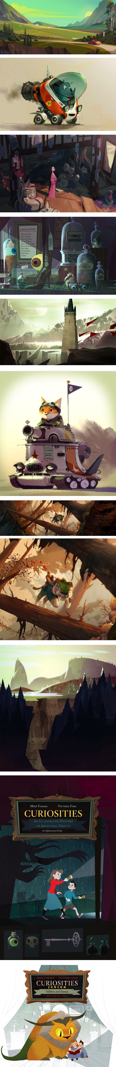
Mike Yamada is a visual development artist at Dreamworks Animation, whose credits include Kung Fu Panda, How to Train Your Dragon, Bee Movie and Monsters vs. Aliens, among others.Most of the work on his blog is from personal projects, or demos done for his classes at the Art Center College of Design. A number of the pieces are from book projects and are collaborative with his partner, artist Victoria Ying. The two share a design studio called Extracurricular Activities, which is also the name Yamada has taken for his blog.
Yamada’s work ranges from moody and detailed in some of the earlier visual development pieces, to light, whimsical and delightfully stylized. He and Ying seem to have nicely combined the two approaches in the storybook project, Curiosities.
Categories:
-
Belinda Del Pesco drypoint prints with acrylic sheets
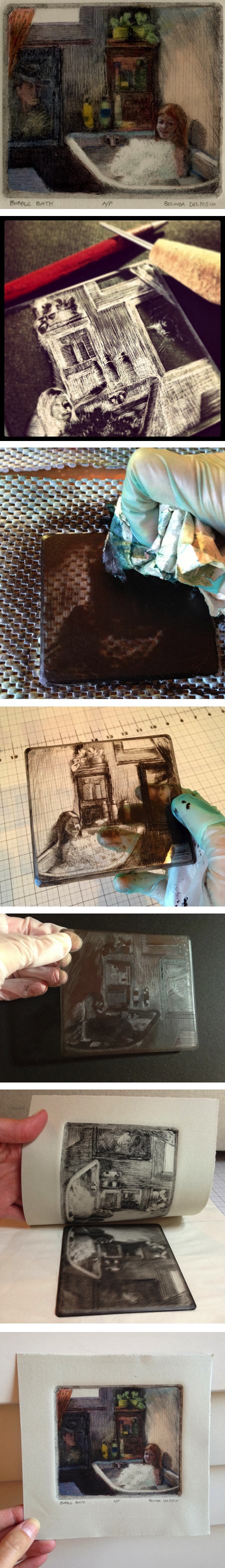
Belinda Del Pesco has some fascinating posts about making drypoint prints using sheets of acrylic — commonly known under brand names like Plexiglas or Lexan — as the plates, instead of traditional metal plates.Drypoint has long been an alternative or addition to traditional etching techniques. It is advantageous in that scratching the lines directly into the plate, rather than scraping away an acid resistant coating to allow an acid bath to etch the lines, is a simpler and less demanding process. It also produces a different character of line, with slightly raised edges above the cut lines giving the final inked and printed lines a softer, more informal character.
I wasn’t aware of using the process on non-metal plates, however, and was fascinated by the idea when I came across Del Pesco’s mention of it, and her tutorial-like demonstrations of the process on her blog:
“Drypoint Engraving: Bubble Bath”
“Dry Point on Plexi with Watercolor: Asleep in Rome”
“Drypoint on Plexi (Artist’s Proof): Book Escape” and
“Dry Point on Plexiglass with Watercolor: Just Feel the Sun“.Del Pesco frequently combines her printmaking techniques with final applications of watercolor. The use of the softer plastic plates, which have more limited print runs than metal ones, seems to work fairly well into the idea of more limited runs of the hand-painted prints.
I wrote to Del Pesco and she was kind enough to respond with some additional information on the process (and limitations) of drypoint on acrylic sheets:
“I think the first time I ever used plexi was in the early 80’s in a printmaking class at Santa Barbara City College. It’s an excellent way to make intaglio prints if you don’t have access to acids, or you’re into conducting your art-making in a “green” studio. (No acid, water based inks, no solvents, etc.) If you’re searching for images and ideas online, keep in mind that plexiglass is just one of the trademarked names for the stuff, and it’s also called lucite, perspex, optix (what my local hardware store carries), acrylic, petg (a bit softer) and lexan (a bit harder than plexi), etc., depending on where you are on the globe.
“If you give it a go, whatever you’re using to engrave the surface (make sure it’s good and sharp) will kick up a burr, and that little flap of plastic – which helps hold your ink and print a somewhat feathery line, is flexible and somewhat fragile. The process of inking, wiping and then a trip through the press will – over a short time – flatten the burrs, and squash out details, making it necessary to go back into the plate to re-touch, and as a result, each print has variations in lights and darks. If you like editions that vary, that’s okay, but some folks wants consistency, and for those artists, it might be best to stick with metal plates.”
Categories:
-
Eye Candy for Today: Gao Yan landscape

Clear Streams in a Summer Ravine, Gao YanOn Google Art. Original is in the Hong Kong Museum of Art. Ink on paper 15×69″ (38x175cm)
A beautiful ink painting from the late Ming Dynasty (17th century).
Categories:
-
Vermeer, Rembrandt and Hals at the Frick in NY

Just a reminder to those on the east coast of the U.S. that several superb masterpieces from the Mauritshuis are currently on this side of the Atlantic, including Vermeer’s iconic Girl with a Pearl Earring.Vermeer, Rembrandt, and Hals: Masterpieces of Dutch Painting from the Mauritshuis just opened at the Frick Collection in New York, where it will be on display until January 19, 2014.
For more details, see my article on the exhibition from May, when the show made its U.S. debut at the De Young Museum in San Franscisco.
The Frick website doesn’t give a preview of the exhibition, so refer to the De Young site for that.
For more on Girl with a Pearl Earring, see the Essential Vermeer website.
Many of the images of Vermeer’s painting (like many paintings on the web) are wildly inaccurate in color. The color on Essential Vermeer is likely pretty good. If you see reproductions in which her turban is a bright, saturated blue, that’s clue of an inaccurate reproduction. Ironically, the turban was more brilliantly blue when Vermeer painted it — in genuine Ultramarine Blue, which was made from the semi-precious stone lapis lazuli ground to a powder. The pigment is fading in some of Vermeer’s paintings (as well as others) due to interaction with atmospheric pollutants and other factors that are only now being understood by conservators.
There is a large image on the NPR site, though it is lit in a way that emphasizes the unfortunate fact that the surface of the painting has also cracked over time.
I still hope to be able to get to see the painting before it, and the other stunning works from the Mauritshuis, travel back to The Hague in January.
Categories:


Charley’s Picks
Bookshop.org
(Bookshop.org affilliate links; sales benefit independent bookshop owners; I get a small percentage to help support my work on Lines and Colors)

John Singer Sargent: Watercolors


Urban Sketching: Understanding Perspective


Charley’s Picks
Amazon
(Amazon.com affiliate links; sales go to a larger yacht for Jeff Bezos; but I get a small percentage to help support my work on Lines and Colors)
John Singer Sargent: Watercolors
Urban Sketching: Understanding Perspective