
Categories
- 3d CGI
- Amusements
- Animation
- Anime & Manga
- Art Materials
- Art Videos
- Blogroll
- Cartoons
- Color
- Comics
- Concept & Visual Dev.
- Creativity
- Digital Art
- Digital Painting
- Displaying Art on the Web
- Drawing
- Eye Candy for Today
- Gallery and Museum Art
- High-res Art Images
- Illustration
- Motion Graphics & Flash
- Museums
- Online Museums
- Outsider Art
- Painting
- Painting a Day
- Paleo Art
- Pastel, Conté & Chalk
- Pen & Ink
- Prints and Printmaking
- Reviews
- Sc-fi and Fantasy
- Sculpture & Dimensional
- Site Comments
- Sketching
- Storyboards
- Tools and Techniques
- Uncategorized
- Vector Art
- Videos & Podcasts
- Vision and Optics
- Watercolor and Gouache
- Webcomics
Archives
- April 2026
- March 2026
- February 2026
- January 2026
- December 2025
- November 2025
- October 2025
- September 2025
- August 2025
- July 2025
- June 2025
- May 2025
- January 2025
- December 2024
- November 2024
- October 2024
- September 2024
- August 2024
- June 2024
- April 2024
- March 2024
- February 2024
- January 2024
- December 2023
- November 2023
- October 2023
- September 2023
- August 2023
- July 2023
- May 2023
- April 2023
- March 2023
- February 2023
- January 2023
- December 2022
- November 2022
- September 2022
- August 2022
- July 2022
- June 2022
- May 2022
- April 2022
- March 2022
- February 2022
- January 2022
- December 2021
- November 2021
- October 2021
- September 2021
- August 2021
- July 2021
- June 2021
- May 2021
- April 2021
- March 2021
- February 2021
- January 2021
- December 2020
- November 2020
- October 2020
- September 2020
- August 2020
- July 2020
- June 2020
- May 2020
- April 2020
- March 2020
- February 2020
- January 2020
- December 2019
- November 2019
- October 2019
- September 2019
- August 2019
- July 2019
- June 2019
- May 2019
- April 2019
- March 2019
- February 2019
- January 2019
- December 2018
- November 2018
- October 2018
- September 2018
- August 2018
- July 2018
- June 2018
- May 2018
- April 2018
- March 2018
- February 2018
- January 2018
- December 2017
- November 2017
- October 2017
- September 2017
- August 2017
- July 2017
- June 2017
- May 2017
- April 2017
- March 2017
- February 2017
- January 2017
- December 2016
- November 2016
- October 2016
- September 2016
- August 2016
- July 2016
- June 2016
- May 2016
- April 2016
- March 2016
- February 2016
- January 2016
- December 2015
- November 2015
- October 2015
- September 2015
- August 2015
- July 2015
- June 2015
- May 2015
- April 2015
- March 2015
- February 2015
- January 2015
- December 2014
- November 2014
- October 2014
- September 2014
- August 2014
- July 2014
- June 2014
- May 2014
- April 2014
- March 2014
- February 2014
- January 2014
- December 2013
- November 2013
- October 2013
- September 2013
- August 2013
- July 2013
- June 2013
- May 2013
- April 2013
- March 2013
- February 2013
- January 2013
- December 2012
- November 2012
- October 2012
- September 2012
- August 2012
- July 2012
- June 2012
- May 2012
- April 2012
- March 2012
- February 2012
- January 2012
- December 2011
- November 2011
- October 2011
- September 2011
- August 2011
- July 2011
- June 2011
- May 2011
- April 2011
- March 2011
- February 2011
- January 2011
- December 2010
- November 2010
- October 2010
- September 2010
- August 2010
- July 2010
- June 2010
- May 2010
- April 2010
- March 2010
- February 2010
- January 2010
- December 2009
- November 2009
- October 2009
- September 2009
- August 2009
- July 2009
- June 2009
- May 2009
- April 2009
- March 2009
- February 2009
- January 2009
- December 2008
- November 2008
- October 2008
- September 2008
- August 2008
- July 2008
- June 2008
- May 2008
- April 2008
- March 2008
- February 2008
- January 2008
- December 2007
- November 2007
- October 2007
- September 2007
- August 2007
- July 2007
- June 2007
- May 2007
- April 2007
- March 2007
- February 2007
- January 2007
- December 2006
- November 2006
- October 2006
- September 2006
- August 2006
- July 2006
- June 2006
- May 2006
- April 2006
- March 2006
- February 2006
- January 2006
- December 2005
- November 2005
- October 2005
- September 2005
- August 2005
Relevant Blogs
Art, Painting & Sketch
- Gurney Journey
- Underpaintings
- Art and Influence
- Painting Perceptions
- Oil Painters of America
- Vasari Paint POV
- Flying Fox
- Urban Sketchers
- Bento (Smithsonian)
- Art Inconnu
- The Hidden Place
- Still Life
- Making a Mark
- The Art of the Landscape
- Exploring Color & Creativity
- Art Contrarian
- Artist A Day
- beinArt Surreal Art Collective
- Eye Level
- David Dunlop
- p.i.g.m.e.n.t.i.u.m
- CultureGrrl
- Joaquín Sorolla blog
- Artists in Pastel
“Painting a Day”
- A Painting a Day (Keiser)
- On Painting (Keiser)
- Julian Merrow-Smith
- Karen Jurick
- Jeffrey Hayes
- Carol Marine
- Abbey Ryan
- Daily Paintworks
Other Painting Blogs
- Virtual Gouache Land
- Neil Hollingsworth
- Marc Hanson
- Kevin Menck
- Marc Dalessio
- Larry Seiler
- Stapleton Kearns
- Colin Page
- Roos Schuring
- Hans Versfelt
- Titus Meeuws
- Régis Pettinari
- René Plein Air
- Belinda Del Pesco
- Robin Weiss
- Nathan Fowkes (Land Sketch)
- William Wray
- Frank Serrano
- Stephen Magsig
- Michael Chesley Johnson
- Twice a Week
- Sarah Wimperis
- Rob Adams
- Michael Cole Manley
- The Dirty Palette Club
- Mike Manley’s Draw!
Gallery Art & Illustration mix
Illustration
- Howard Pyle
- 100 Years of Illustration
- BibliOdyssey
- Illustration Art
- Today’s Inspiration
- Illustration Mundo
- Little Chimp Society
- Danny Gregory
- R D (John Martz
- Illustration Friday blog
- Monster Brains
- Illustrators & Illustrations (RU)
- Elwood H. Smith
- DaniDraws.com
- Designers Who Blog
- iSpot Blog
Sci-Fi & Fantasy
Illustration & Comics
Comics & Cartoons
- Comics Beat
- Robot 6
- Newsarama Blog
- Comic Vine
- Comics Alliance
- Forbidden Planet Int.
- Paolo Rivera
- Bolt City
- Flight
- Scott McCloud
- The Comics Journal
- Comixpedia
- Funnybook Babylon
- James Baker
- Middleton’s Sketchbook
- Boneville
- The Hotel Fred
- Paul Rivoche
- Daily Cartoonist
- Mad About Cartoons (William Wray)
- Digital Strips
Illustration & Concept
Animation & Concept
- Cartoon Brew
- Animation Blog
- Cold Hard Flash
- Concept Art World
- The CAB
- FY Concept Art
- Concept Ships
- Concept Robots
- John Nevarez
- Armand Serrano
- Marcos Mateu-Mestre
- all kinds of stuff (Kricfalusi)
- Yacin the faun (Man Arenas)
- Kelsey Mann
- Cre8tivemarks Blog
- Ice-Cream Monster Toon Cafe
- AAU Character & Creature Design
- AAU Animation Notes
- Articles and Texticles
Paleo & Scientific
Tools & Techniques
Other
Lists of Art Blogs
Art Image Resource Links
Historic Art Images
- Wikimedia Commons: Paintings
- Wikimedia Commons: Drawings
- The Athenaeum
- WikiArt (WikiPaintings)
- Google Art Project: Artists
- Google Art Project: Collections (Museums)
- ArtCyclopedia
- Web Gallery of Art
- Art Renewal Center
- Web Gallery of Impressionism
Auction Consolidation sites
Auction sites
- Sotheby’s
- Bonham’s
- Christies
- Heritage Auctions: Fine Art
- Heritage Auctions: Illustration
- Freeman’s Auctions
- Bukowskis
- Shannon’s
Image Search
Reverse Image Search (search by image)
- Tin Eye
- RevImg
- Google Image Search (camera icon)
- Bing Image Search (camera icon)
Promoting some friends and some clients of my website design business
- Twin Willows T’ai Chi studio in Wilmington DE. Taiji classes with Bryan Davis.
- Ray Hayward, Inspired Teacher of T’ai Chi ( Taiji ) in Minneapolis, Founder of Mindful Motion Tai Chi Academy
- OldHead Tattoo studio and Art Gallery in Wilmington DE. Tattoos and paintings by Bruce Gulick
- Sharon Domenico Art, pet portrait oil paintings
- Platinum Paperhanging, wallpaper hanging, Main Line and Philadelphia, PA
- Lisa Stone Design, interior designer, Main Line and Philadelphia, PA
- Studio12KPT, original art, prints, calendars and other custom printed items by Van Sickle & Rolleri
-
Eye Candy for Today: Anton Pieck’s The Roof Painter


The Roof Painter, Anton Pieck
20th century Dutch illustrator, printmaker and gallery artist Anton Pieck was noted for his charming winter scenes. Here, he shows an artist, perhaps meant to be a representation of Pieck himself, finding a view of the town that requires him to climb to a roof peak. A boy brings him hot soup while a cat casually takes in the activity.
This was one of a series of graphics sometimes referred to as his Christmas Cards, that were actually intended as New Year’s cards.
Categories:
-
Ernst Grillhiesl (“ErnstG”)
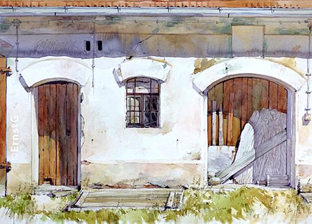

Ernst Grillhiesl, who signs his work “ErnstG”, is a contemporary German painter who works in watercolor. His landscape subjects usually include architectural elements, often set almost on the horizon with a deep but de-emphasized foreground.
Grillhiesl’s style is a combination of crisp, precise rendering of buildings and other artificial objects and a looser, somewhat softer approach to trees and shrubbery. The result is a visually appealing blend of accuracy and freedom.
He appears to live in a part of Bavaria where many of the houses and other buildings have red roofs, and a number of his compositions have a nicely subdued complementary color relationship in the setting of red roofs among the greens of summer grasses and foliage.
Though he has a websiite that includes images of his work, it’s not easy to navigate, particularly for non-German speakers. It’s much easier to view his work on his blog, which is arranged as a website with multiple image galleries.
The tagline on his blog, as translated by Google Translate, reads: “Everyday life brought to paper with a brush and paint”.
I have not been able to find much information on either location about how large his paintings are or whether they are for sale.
Categories:
-
Eye Candy for Today: Klimt’s Portrait of Adele Bloch-Bauer


Portrait of Adele Bloch-Bauer I (also sometimes called “Woman in Gold” or “Lady in Gold”), Gustav Klimt; gold leaf, silver leaf, and oil on canvas; 55 x 55 inches (140 x 140 cm); in the collection of the Neue Galerie, New York.
Link is to the file page for the Neue Galerie version of the image on Wikimedia Commons.
This and The Kiss are the most widely recognized works by 19th century Austrian symbolist painter Gustav Klimt.
Both paintings are from Klimt’s “Golden Phase”, in which — inspired by the use of gold leaf in Byzantine mosaics in Venice and Ravenna — he began to incorporate gold leaf into his paintings. This is the most elaborate of his works from the period, incorporating not only the metal leaf, but bas-relief created with dimensional applications of gesso.
It is titled “Portrait of Adele Bloch-Bauer I” because Klimt painted a second, much less complex and dramatic portrait of her.
There is a Wikipedia page devoted to the painting that goes into more detail, including the sexual subtext of its imagery and the story of its disposition and seizure by the Nazi regime.
You will find many images of this work that are much brighter, more saturated and shifted in hue — even on the Wikipedia article about the painting.
However, if you follow that link to Wikimedia Commons, as I did, you will find a very different, darker and considerably more subdued version of the image as supplied by the Neue Galerie. The Wikimedia editors indicate the Neue Galerie image has superseded the brighter version as the recommended version of the image.
The bright version looks to me like it suffers — as do so many online art images — from someone throwing the image into Photoshop and cranking up the brightness and saturation because the more faithful image isn’t “pretty” enough.
However, at the risk of being hoist on my own petard, I have slightly increased the exposure on the version of the Neue Galerie’s image that I’m showing here.
it has been my experience in regard to images with which I’m personally familiar, that many museums and galleries post images of works in their collections that are darker than the real object. (Why this is so still eludes me.)
I have not had the pleasure of seeing this painting in person, but my guess is that the appearance of the real work is somewhere between the two versions, and closer to the Neue Galerie version. If someone who has seen the work in person can correct me, please do. I’ve based my adjustment on images of other works by Klimt from the same time period.
Categories:
-
Charles Leickert (revisited)


Belgian born 19th century painter Charles Henri Joseph Leickert spent most of his career living and painting in the Netherlands. He is noted for his winter scenes, particularly of activity on frozen rivers, and his cityscapes, rich with the textures of brick and stone.
When I first featured Leickert on Lines and Colors back in 2009, there were fewer images available of his work on the web, and I was also not including as many images in my posts as I am now.
Categories:
-
Eye Candy for Today: Robert Spear Dunning still life
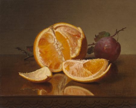

Still life with Orange and Plum, Robert Spear Dunning; oil on canvas, roughly 8 x 10″ (20 x 25 cm); link is to image file page on Wikimedia Commons; as far as I know, the original is in a private collection.
19th century American painter Robert Spear Dunning gives us an elegantly simple painting of an orange and a plum. His exposure of the interior of the orange, and his meticulous eye for texture and color, lend the painting a feeling of complexity comparable to a more elaborate composition.
Though he also painted landscapes, Dunning’s primary subjects were arrangements of fruits or vegetables, occasionally augmented with dishware.
Dunning was sometimes criticized for continuing traditions from the middle of the century into a later period when they had fallen out of favor, a characteristic for which I admire him.
Categories:
-
Adrian Tomine


Originally from California, Adrian Tomine is an illustrator and cartoonist living and working in Brooklyn, NY. Tomine has taken to his adopted city so well that he has become a reader favorite contributor to the New Yorker.
His New Yorker covers, as well as many of his other illustrations and drawings, have that wonderful combination of evocative artwork and wry observation that exemplify the best of the magazine’s cover art. His artwork uses a streamlined line and color fill approach, reminiscent of the European ligne claire style of comics art.
As a case in point, his cover for the new December 7, 2020 issue of the New Yorker (images above, top) pretty well catches the whimsical side of the 2020 zeitgeist.
The New Yorker has a wonderful new online feature called Cover Story in which they give you background on the creation of the current issue’s cover; here is the one for Tomine’s December 7, 2020 cover.
Tomine is the author/illustrator of a number of books of drawings and comics, many of which are published by Drawn & Quarterly, and the latest of which is The Loneliness of the Long-Distance Cartoonist (Bookshop.org link).
There is a video overview of some of his titles by “panellogy 080” on YouTube.
Tomine’s website contains examples of his illustrations and information about his books and comics, as well as offering prints and original art for sale.
Unfortunately, his online gallery is of the wearisome “pop up and close, pop up and close” variety, which discourages casual browsing, and the images offered are small. You might find it helpful to augment your visit to his website with this Google image search I’ve set up for Tomine’s work on newyorker.com.
Categories:


Charley’s Picks
Bookshop.org
(Bookshop.org affilliate links; sales benefit independent bookshop owners; I get a small percentage to help support my work on Lines and Colors)

John Singer Sargent: Watercolors


Urban Sketching: Understanding Perspective


.jpg)
Charley’s Picks
Amazon
(Amazon.com affiliate links; sales go to a larger yacht for Jeff Bezos; but I get a small percentage to help support my work on Lines and Colors)
John Singer Sargent: Watercolors
Urban Sketching: Understanding Perspective