
Categories
- 3d CGI
- Amusements
- Animation
- Anime & Manga
- Art Materials
- Art Videos
- Blogroll
- Cartoons
- Color
- Comics
- Concept & Visual Dev.
- Creativity
- Digital Art
- Digital Painting
- Displaying Art on the Web
- Drawing
- Eye Candy for Today
- Gallery and Museum Art
- High-res Art Images
- Illustration
- Motion Graphics & Flash
- Museums
- Online Museums
- Outsider Art
- Painting
- Painting a Day
- Paleo Art
- Pastel, Conté & Chalk
- Pen & Ink
- Prints and Printmaking
- Reviews
- Sc-fi and Fantasy
- Sculpture & Dimensional
- Site Comments
- Sketching
- Storyboards
- Tools and Techniques
- Uncategorized
- Vector Art
- Videos & Podcasts
- Vision and Optics
- Watercolor and Gouache
- Webcomics
Archives
- April 2026
- March 2026
- February 2026
- January 2026
- December 2025
- November 2025
- October 2025
- September 2025
- August 2025
- July 2025
- June 2025
- May 2025
- January 2025
- December 2024
- November 2024
- October 2024
- September 2024
- August 2024
- June 2024
- April 2024
- March 2024
- February 2024
- January 2024
- December 2023
- November 2023
- October 2023
- September 2023
- August 2023
- July 2023
- May 2023
- April 2023
- March 2023
- February 2023
- January 2023
- December 2022
- November 2022
- September 2022
- August 2022
- July 2022
- June 2022
- May 2022
- April 2022
- March 2022
- February 2022
- January 2022
- December 2021
- November 2021
- October 2021
- September 2021
- August 2021
- July 2021
- June 2021
- May 2021
- April 2021
- March 2021
- February 2021
- January 2021
- December 2020
- November 2020
- October 2020
- September 2020
- August 2020
- July 2020
- June 2020
- May 2020
- April 2020
- March 2020
- February 2020
- January 2020
- December 2019
- November 2019
- October 2019
- September 2019
- August 2019
- July 2019
- June 2019
- May 2019
- April 2019
- March 2019
- February 2019
- January 2019
- December 2018
- November 2018
- October 2018
- September 2018
- August 2018
- July 2018
- June 2018
- May 2018
- April 2018
- March 2018
- February 2018
- January 2018
- December 2017
- November 2017
- October 2017
- September 2017
- August 2017
- July 2017
- June 2017
- May 2017
- April 2017
- March 2017
- February 2017
- January 2017
- December 2016
- November 2016
- October 2016
- September 2016
- August 2016
- July 2016
- June 2016
- May 2016
- April 2016
- March 2016
- February 2016
- January 2016
- December 2015
- November 2015
- October 2015
- September 2015
- August 2015
- July 2015
- June 2015
- May 2015
- April 2015
- March 2015
- February 2015
- January 2015
- December 2014
- November 2014
- October 2014
- September 2014
- August 2014
- July 2014
- June 2014
- May 2014
- April 2014
- March 2014
- February 2014
- January 2014
- December 2013
- November 2013
- October 2013
- September 2013
- August 2013
- July 2013
- June 2013
- May 2013
- April 2013
- March 2013
- February 2013
- January 2013
- December 2012
- November 2012
- October 2012
- September 2012
- August 2012
- July 2012
- June 2012
- May 2012
- April 2012
- March 2012
- February 2012
- January 2012
- December 2011
- November 2011
- October 2011
- September 2011
- August 2011
- July 2011
- June 2011
- May 2011
- April 2011
- March 2011
- February 2011
- January 2011
- December 2010
- November 2010
- October 2010
- September 2010
- August 2010
- July 2010
- June 2010
- May 2010
- April 2010
- March 2010
- February 2010
- January 2010
- December 2009
- November 2009
- October 2009
- September 2009
- August 2009
- July 2009
- June 2009
- May 2009
- April 2009
- March 2009
- February 2009
- January 2009
- December 2008
- November 2008
- October 2008
- September 2008
- August 2008
- July 2008
- June 2008
- May 2008
- April 2008
- March 2008
- February 2008
- January 2008
- December 2007
- November 2007
- October 2007
- September 2007
- August 2007
- July 2007
- June 2007
- May 2007
- April 2007
- March 2007
- February 2007
- January 2007
- December 2006
- November 2006
- October 2006
- September 2006
- August 2006
- July 2006
- June 2006
- May 2006
- April 2006
- March 2006
- February 2006
- January 2006
- December 2005
- November 2005
- October 2005
- September 2005
- August 2005
Relevant Blogs
Art, Painting & Sketch
- Gurney Journey
- Underpaintings
- Art and Influence
- Painting Perceptions
- Oil Painters of America
- Vasari Paint POV
- Flying Fox
- Urban Sketchers
- Bento (Smithsonian)
- Art Inconnu
- The Hidden Place
- Still Life
- Making a Mark
- The Art of the Landscape
- Exploring Color & Creativity
- Art Contrarian
- Artist A Day
- beinArt Surreal Art Collective
- Eye Level
- David Dunlop
- p.i.g.m.e.n.t.i.u.m
- CultureGrrl
- Joaquín Sorolla blog
- Artists in Pastel
“Painting a Day”
- A Painting a Day (Keiser)
- On Painting (Keiser)
- Julian Merrow-Smith
- Karen Jurick
- Jeffrey Hayes
- Carol Marine
- Abbey Ryan
- Daily Paintworks
Other Painting Blogs
- Virtual Gouache Land
- Neil Hollingsworth
- Marc Hanson
- Kevin Menck
- Marc Dalessio
- Larry Seiler
- Stapleton Kearns
- Colin Page
- Roos Schuring
- Hans Versfelt
- Titus Meeuws
- Régis Pettinari
- René Plein Air
- Belinda Del Pesco
- Robin Weiss
- Nathan Fowkes (Land Sketch)
- William Wray
- Frank Serrano
- Stephen Magsig
- Michael Chesley Johnson
- Twice a Week
- Sarah Wimperis
- Rob Adams
- Michael Cole Manley
- The Dirty Palette Club
- Mike Manley’s Draw!
Gallery Art & Illustration mix
Illustration
- Howard Pyle
- 100 Years of Illustration
- BibliOdyssey
- Illustration Art
- Today’s Inspiration
- Illustration Mundo
- Little Chimp Society
- Danny Gregory
- R D (John Martz
- Illustration Friday blog
- Monster Brains
- Illustrators & Illustrations (RU)
- Elwood H. Smith
- DaniDraws.com
- Designers Who Blog
- iSpot Blog
Sci-Fi & Fantasy
Illustration & Comics
Comics & Cartoons
- Comics Beat
- Robot 6
- Newsarama Blog
- Comic Vine
- Comics Alliance
- Forbidden Planet Int.
- Paolo Rivera
- Bolt City
- Flight
- Scott McCloud
- The Comics Journal
- Comixpedia
- Funnybook Babylon
- James Baker
- Middleton’s Sketchbook
- Boneville
- The Hotel Fred
- Paul Rivoche
- Daily Cartoonist
- Mad About Cartoons (William Wray)
- Digital Strips
Illustration & Concept
Animation & Concept
- Cartoon Brew
- Animation Blog
- Cold Hard Flash
- Concept Art World
- The CAB
- FY Concept Art
- Concept Ships
- Concept Robots
- John Nevarez
- Armand Serrano
- Marcos Mateu-Mestre
- all kinds of stuff (Kricfalusi)
- Yacin the faun (Man Arenas)
- Kelsey Mann
- Cre8tivemarks Blog
- Ice-Cream Monster Toon Cafe
- AAU Character & Creature Design
- AAU Animation Notes
- Articles and Texticles
Paleo & Scientific
Tools & Techniques
Other
Lists of Art Blogs
Art Image Resource Links
Historic Art Images
- Wikimedia Commons: Paintings
- Wikimedia Commons: Drawings
- The Athenaeum
- WikiArt (WikiPaintings)
- Google Art Project: Artists
- Google Art Project: Collections (Museums)
- ArtCyclopedia
- Web Gallery of Art
- Art Renewal Center
- Web Gallery of Impressionism
Auction Consolidation sites
Auction sites
- Sotheby’s
- Bonham’s
- Christies
- Heritage Auctions: Fine Art
- Heritage Auctions: Illustration
- Freeman’s Auctions
- Bukowskis
- Shannon’s
Image Search
Reverse Image Search (search by image)
- Tin Eye
- RevImg
- Google Image Search (camera icon)
- Bing Image Search (camera icon)
Promoting some friends and some clients of my website design business
- Twin Willows T’ai Chi studio in Wilmington DE. Taiji classes with Bryan Davis.
- Ray Hayward, Inspired Teacher of T’ai Chi ( Taiji ) in Minneapolis, Founder of Mindful Motion Tai Chi Academy
- OldHead Tattoo studio and Art Gallery in Wilmington DE. Tattoos and paintings by Bruce Gulick
- Sharon Domenico Art, pet portrait oil paintings
- Platinum Paperhanging, wallpaper hanging, Main Line and Philadelphia, PA
- Lisa Stone Design, interior designer, Main Line and Philadelphia, PA
- Studio12KPT, original art, prints, calendars and other custom printed items by Van Sickle & Rolleri
-
Faye F. Vander Veer

My recent post on the Philadelphia First Friday gallery walk reminded me that there was another recent art event in Philadelphia that I had meant to write about. The Rittenhouse Square Fine Art Show, which started life 75 years ago as the “Rittenhouse Square Clothesline Show”, is the oldest organized outdoor art show in the U.S. It has traditionally been held the first week in June, but two years ago, they added a Fall edition.In this juried, art-only (no crafts) show, there is almost always something of interest in addition to the beautiful urban park setting for the show.
This time around, one of the artists I noticed was Faye F. Vander Veer, a painter from Virginia who seems to have some connection with Philadelphia, even if it is simply participation in this show.
Her paintings are straightforward, painterly observations of city scenes in Virginia, Philadelphia and Europe, as well as landscapes of rural Virginia and occasionally farther afield in Maine and elsewhere.
Her European section showcases work inspired by her travels to Rome, Venice, Paris and the South of France.
Her still life section contains nicely immediate small scale still lifes, and the figure section features informal observations of people in social situations, galleries and cafes. I particularly like the cafe and nightlife themes there and in the European section.
It’s worth noting that though the images above the gallery sections are not linked (only the text), once you get into the thumbnails for an individual section, the paradigm is reversed and the image is linked, not the text. When viewing the larger images, there is a convenient previous and next navigation, but it’s easy to miss the fact that clicking on the image at that point is a link to a larger version.
Categories:
-
J.C. Leyendecker: America’s “Other” Illustrator

J.C Leyendecker: America’s “Other” Illustrator is the title of an exhibition organized by the Haggin Museum in Stockton, California and currently on view at the City of Fullerton Museum in Fullerton, CA.I’ve raved about Leyendecker before, and will continue to do so; both because I can’t resist the opportunity to post more of his amazing work, and because I continue to be baffled by the fact that his name is not a household word and that our kitchens are not lined with his calendars and our coffee tables not weighted down with mammoth books showcasing his work.
The obvious comparison is with Norman Rockwell, of course; and, while I certainly admire Rockwell, I hold Leyendecker in even higher esteem, and feel that his relative obscurity is a monumental oversight; as if, among Surrealists, Magritte was famous and Dali unknown. Rockwell himself was tremendously influenced by Leyendecker, and referred to him as “one of my gods”, setting him up as the mark for which he aimed his own accomplishments.
Sadly, the bookstore shelves are not bending under the weight of Leyendecker books, as they should be. There isn’t even a major one in print, though you can find some older ones if you search.
Exhibitions of Leyendecker’s work have been rare, but more attention is being paid to him lately, and shows like this one are welcome events. The exhibit started at the Haggin, traveled to the R.W. Norton Art Gallery and is now at the Fullerton. Unfortunately, I haven’t been able to find out where it will go next or if there are any scheduled stops on the East coast. (If anyone knows, I would appreciate the information.)
The Haggin’s own collection of over 50 original Leyendeckers, the largest collection of his works held by any museum, includes many uncommon subjects and unusual pieces, such as ink and wash drawings, military portraits and recruitment posters, and a wonderful assortment of kids eating Kellog’s cereal (image above).
I don’t know how much of the Haggin’s collection is included in the traveling exhibit, but you can see some of it displayed on their site, along with a more detailed description of the exhibition and an overview of the artist and his work. The site also includes a Quicktime Movie of an illustrated lecture about the artist by the museum’s director, Tod Ruhstaller (linked under the box containing the photo of Joe and Frank Leyendecker in Paris).
There is also a description and overview on Traditional Fine Arts Organization.
Unfortunately (perhaps deliberately), the images on the Haggin site are shot with odd angles and lenses, leaving them out of square, as in the image above.
Any Leyendecker is good Leyendecker, however, and I’ll continue to find any excuse I can to post his beautiful illustrations.
For more on Leyendecker, and links to other resources, see my previous articles listed below.
[Link via ASIFA-Hollywood Animation Archive]
Categories:
-
First Fridays: Philadelphia Gallery Walk and Wilmington Art Loop
Like many cities, Philadelphia has a “gallery walk” (two of them in fact), in which galleries within close proximity of one another arrange simultaneous openings and encourage an evening of gallery-hopping.The one in Philadelphia’s Old City neighborhood is one of the longest running organized gallery walk events that I’m aware of, having started in 1991. It was preceded by an “Art Loop” in nearby Wilmington, Delaware, that started in 1988. That event, in turn, was based on a “Music Loop”, an series of actual bar hopping events back in the mid 80’s, arranged between bars and clubs with bands playing on the First Friday of the month in a effort to revive nightlife in a small city that, like so many others, had gone dead after dark.
The Wilmington music loop was successful for a few years, but had a spotty history afterward. The Art Loop, however, continued. Renamed as Art on the Town, it continues today. The Wilmington event has been a bit overshadowed, however, by the larger event in Philadelphia, both of which are held on the first Friday of the month.
Philadelphia has a thriving art gallery area in a section called “Old City”, so named because it is part of the original colonial city on the Delaware River that was integral to the country’s early history. Situated near the galleries are such historic sites as the Betsy Ross House and Elfreth’s Alley.
In an area that had inexpensive storefront rentals among commercial lighting and restaurant supply houses, small new galleries sprang up, supported by their own number and proximity, and enabled by the less expensive rents to be more free with their showings than the established galleries in the posh Rittenhouse Square area. Patterned on the Wilmington event, the First Fridays gallery walk was a natural outgrowth of the concentration of numerous galleries within a few blocks, and it became a distinct success.
The older, more established galleries in the Rittenhouse Square area, who might turn up their noses at some of the young artists featured in the Old City venues, couldn’t ignore the success of the idea, and followed suit several years later with a Center City Gallery Night. This event, though less street festival lively than the one in Old City, is still very worthwhile. It doesn’t have a dedicated web site, but the event is usually listed in the Philly Fun Guide.
The interesting point, of course, for those of you in other parts of the country and the world, is that this kind of event is becoming common in many cities and even smaller towns.
What is not often discussed, and may go unrealized even by praticipating gallery owners and artists, is that this is an amazingly good idea in more ways than one. Not only does it increase foot traffic into the galleries on the night of the event and expose the artists’ works to a larger number of prople, it accomplishes something on larger scale that is even more important and remarkable.
I think many gallery owners and artists would be surprised at the number of potential art buyers who are intimidated by galleries.
Unlike normal stores, in which you feel free to come and go while “browsing”, galleries often have a aura of societal stratification. This is intentional in many cases, to appeal to the exclusivity that is so attractive to the moneyed classes who can afford expensive art, in part specifically to display their wealth and “taste”; but it can impose a barrier of discomfort at the lower end of the art buying spectrum.
Inexperienced individuals can feel put off by the library-like stillness and frequent emptiness of galleries; in which you’re often in an intimate space with whoever is tending the gallery, and the resultant feeling of scrutiny or expectation that you may not be welcome if you’re not a “serious buyer”.
Few city galleries have the casual feeling of a traditional shop for, say antiques or furniture, and that “exclusive restaurant” kind of social barrier, and the “if you need to ask you can’t afford it” pretensions of some galleries can definitely be off-putting.
Gallery walks present art in a festive, come and go as you please, mingle with the crowd, kind of event that breaks down those barriers and makes it easy for young, inexperienced buyers to view art, and the galleries themselves, in a non-threatening atmosphere.
This is one of the advantages of outdoor art fairs as well, but quality is often an issue there. It is, however, one of the best things about artists and galleries presenting work on the web, the ultimate non-threatening, comfort of your own home, way to view anything.
It sometimes comes as a surprise to young people that they can buy good original art, often by young artists who are very talented but not well established yet, where they might have thought their budget limited them to posters or reproductions.
As always, of course, quality and taste vary, but that’s another of the great things about gallery walks, you’re deliberately going from gallery to gallery sampling a wide variety of artists and styles.
On either of the Philadelphia events (as well as the Wilmington one) I almost always find something of interest. Yesterday, for example, I discovered an entirely new gallery, the Qbix Gallery, that is devoted to fantasy art (something Philadelphia hasn’t had since the Michelle and Carl Lundgren’s gallery in Old City folded years ago). Qbix even publishes a small magazine, Q Magazine, which has its own site. Yesterday, the gallery was featuring the Surrealist-inspired work of Ken Vallario.
I even found a new, and quite good, comic book store, Brave New Worlds Comics amid the galleries, always a plus. Independent bookstores have also moved into the area.
At F.A.N. Gallery, I found the landscapes, figure paintings and drawings of Serge Zhukov.
At Artists House gallery, I found the work of several artists who were trained at the Pennsylvania Academy of the Fine Arts. (As a fellow Academy student Bob Walters once told me, “you can always spot an ex-Academy student – if nothing else, they’re drastically competent”.) I was particularly pleased with the still life paintings of Dori Spector (personal site here), and the shadow-crossed landscapes of Scott Jackson (personal site here).
As usual, I took some notes and I’ll write in more detail about some of the artists in the future.
In the meanwhile, see if there is an organized gallery walk in your town, if not, maybe it’s time to start one.
(Image above, clockwise from upper left: Ken Vallario, Scott Jackson, Serge Zhukov, Dori Spector)
Categories:
-
Patrick Woodroffe

Patrick Woodroffe is a British artist noted for his his illustrations in the fantasy and science fiction field. His work, however, often bears less conceptual and visual relation to the images normally found in that genre than it does to Surrealism, Symbolism, contemporary visionary painters and the work of 16th Century artists like Bosch and Bruegel.Woodroffe takes those influences and incorporates then into images that are stylistically diverse, richly imaginative and intricately detailed.
He has illustrated a number of fantasy and science fiction books by well known authors, created album art for bands like Judas Priest and The Strawbs, collaborated with musicians Dave Greenslade and Mike Batt on art/music projects, and created sculpture for Gruyeres Castle in Switzerland.
Woodroffe works in a variety and mixture of traditional media, including an unusual method of coloring etchings or ink drawings with oil paint.
Unfortunately the images on his own site are too small to get a real feeling for the appeal of his work, though he does give you a few detail images that hint at it. There is a bio and gallery here, and unofficial galleries here and here (pop-up warning on the latter two) that have larger reproductions.
There is a collection of his work, Mythopoeikon and a book of technique, A Closer Look – At the Art Techniques of Patrick Woodroffe, that are out of print, but you may be able to find used copies through Amazon or other sources. Word on his site is that some of his older books may be republished eventually, and his work should be included in the upcoming title: Dreamscape II: The Best of Imaginary Realism.
Categories:
-
Albert Bierstadt
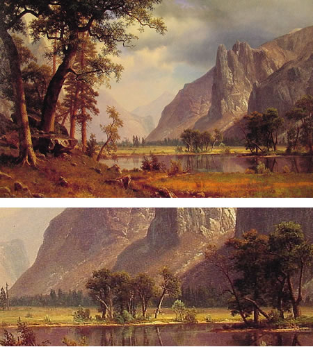
By the time Albert Bierstadt began painting his dramatic landscapes in the middle of the 19th Century, the mountains of New York’s Hudson valley, once the epitome of the American wilderness, had been widely portrayed by two generations of painters, from Thomas Cole and Asher Durand to Frederick Church, John Frederick Kensett and the Luminists.Church himself would travel to South America in search of even more dramatic and unspoiled wilderness, but Bierstadt found his calling in the still wild American west.
Bierstadt was brought to America at the age of two when his parents emigrated here from Germany. Little is known about his early artistic training, it may have consisted only of resources available in and around the tiny town of New Bedford, Massachusetts where his parents had settled. In his early 20’s, Bierstadt traveled back to Germany to study in Dusseldorf, returning a few years later to paint scenes of New England and the mountains of New York.
In search of ever more wild and dramatic vistas, Bierstadt took several journeys west, one of them on the wagon train sent to chart a path for the Transcontinental Railroad. He would return to a studio in New York, a studio with exceptionally high ceilings that would accommodate his enormous canvasses, and he would translate his sketches and small paintings into grandly dramatic scenes that proved to be tremendously popular.
Bierstadt was tremendously impressed by the grandeur of the Rockies, which he felt bested even the Alps for drama, and was particularly struck by the Yosemitie Valley, which became the subject of numerous paintings. The image above (with detail at bottom) is simply titled Yosemitie Valley, and is not one of his larger paintings (60″ by 38″, 152cm x 96cm, larger version here).
I’ll suggest again, as I did in my post on Church, that I think it’s hard for us, jaded as we are by lifelong exposure to billboards, movie screens and other large scale images, to appreciate how much of a dazzling “special effect” was created at the time by large scale paintings like his, many of which were 8 foot by 10 foot (2.4m x 3m).
Bierstadt was often put down by critics of his day (and is still looked down on by contemporary critics) for the overly dramatic nature of his work. While I’ll admit that he didn’t pull any punches when it came to dazzling viewers with exaggeratedly rugged and “scenic” vistas, theatrical light, clouds, mist, shadow and other visual effects, in addition to the sheer size of his monumental canvasses, I don’t think that takes away from the enjoyment of his paintings.
In fact those elements are the great thing about his paintings, drama is the point (but of course, “serious” critics aren’t allowed to put their blessing on anything fun). Bierstadt had the last laugh, though, as his work sold for enormous sums. His paintings are still popular today (another problem for critics) and are widely reproduced. Many are readily available online and you’ll find his paintings in numerous books.
If you can, try to see one of Bierstadt’s large scale works in person to get the real effect. The Artcyclopedia has links to some museums with his work in their collections (and online).
Anyone interested in dramatic contemporary matte painting who is not familiar with Bierstadt will find in his work a textbook for how to paint dramatic landscape. The rest of us can just enjoy the journey across the great rugged face of the American west, oohing and aahing along the way.
Categories:
-
Rick Griffin

As I mentioned in my article about Peter Max, there were several less widely known artists who were actually much more instrumental in the creation of that unique blend of Op, Pop, Surrealism, Dada and Art Nouveau that came to be known as Psychedelic Art in the 1960’s.Rick Griffin was one of the major contributors to this style, and is considered one of the “big five” along with Alton Kelley, Stanley “Mouse” Miller, Wes Wilson and Victor Moscoso.
The canvases of the psychedelic artists were concert posters, record album covers and comix (underground comics). Griffin was a standout in all three areas.
Griffin came out of the California surfer culture and created an influential comic strip character called Murphy, whose adventures he chronicled in Surfer magazine.
In Los Angeles he fell in with a group of artists and musicians called the Jook Savages, and was a participant in the legendary Watts Acid Test held by writer and psychedelic pioneer Ken Kesey and his Merry Pranksters.
At the time LSD was legal, and the influence of psychedelic (meaning “mind manifesting”) drugs was integral to the explosion of artistic and musical experimentation and creativity that marked the era. (To separate the impact of consciousness altering chemicals on creative individuals from the anti-drug hysteria that followed, see Aldous Huxley’s The Doors of Perception.)
Influenced by the radical new poster art of Wilson and, in particular, Kelley and Mouse, Griffin moved to San Francisco and joined them in creating posters for the burgeoning rock concert scene, working for promoters like Chet Helms and Bill Graham.
Wilson and Kelly created their poster designs largely with typography and collage [I stand corrected, see the comment on this post from Wes Wilson], but Mouse and Griffin could draw like gangbusters and sparked the art of the poster, which was undergoing a revival in America in the 1960’s that rivaled its impact in the Europe before the turn of the 20th Century, to new levels of experimentation and dazzle. Like his contemporaries, Griffin was influenced by Victorian and Art Nouveau typography and took the styles to wonderful graphic extremes. The type in psychedelic posters was deliberately exclusionary; if you didn’t “get it”, you didn’t need to read it.
Griffin became associated with the Grateful Dead and created some of their most recognized posters and album covers. The image above was used both for posters and for the cover of their palindrome-titled Aoxomoxoa LP. Griffin’s art rewards close inspection. The image above, despite the overt skull and crossed bones, is full of symbols of fertility, conception and birth (or re-birth). Take a close look at the “sun”.
Griffin was also a major presence in the underground comix scene, appearing in early issues of Robert Crumb’s ground-breaking Zap Comix, which set the standard for a subsequent wave of outside-the-box experimentation and wild abandon that expanded the boundaries of the medium (and laid the groundwork for the web comics of the 90’s). Griffin also created his own Tales from the Tube psychedelic surfer comix.
For several years the main presence on the web for Griffin’s art has been the Rick Griffin Galleries maintained by Tim Stephenson. The site has recently been redesigned and improved and features galleries of Griffin’s posters, album covers, comix, early surfer art and the Christian art that marked his devotion to Christianity in the 1970’s. There is also an excellent bio, page of remembrances, and list of links to other web resources about Griffin.
There is now an “official” site maintained by Griffin’s family, that also has galleries arranged by topic, a short bio and list of links.
There is an extensive selection of actual posters from Wolfgang’s Vault.
I’m remiss in not timing this post better, in that an exhibition of Griffin’s work, titled Heart and Torch: Rick Griffin’s Transcendence has just ended at the Laguna Art Museum. There is a MySpace blog created to accompany the exhibit.
Additionally published to accompany the exhibit is a beautiful new large format book, also titled Heart and Torch: Rick Griffin’s Transcendence, written by Doug Harvey. An earlier, and also excellent book, simply titled Rick Griffin, by Gordon McClelland has been republished. You can also find his work in Psychedelia: The Classic Poster Book by John Platt and Off the Wall: Psychedelic Rock Posters from San Francisco from Thames and Hudson; and, of course, in reprints of Zap Comix, and, if you can find it, Tales from the Tube.
Griffin designed the poster for the “Human Be-in”, a watershed counterculture event in January of 1967. The brilliant colors and mandala-like repetition of elements in his poster and album cover art were influential on many artists of the time and in later generations. The psychedelic artists of the 1960’s had a profound influence not only on subsequent visionary artists and the recent wave of so-called “Pop Surrealism”, but on the digital artists of the 1990’s and beyond.
(“…if six turned out to be nine, I don’t mind…“)
Categories:


Charley’s Picks
Bookshop.org
(Bookshop.org affilliate links; sales benefit independent bookshop owners; I get a small percentage to help support my work on Lines and Colors)

John Singer Sargent: Watercolors


Urban Sketching: Understanding Perspective


Charley’s Picks
Amazon
(Amazon.com affiliate links; sales go to a larger yacht for Jeff Bezos; but I get a small percentage to help support my work on Lines and Colors)
John Singer Sargent: Watercolors
Urban Sketching: Understanding Perspective