
Categories
- 3d CGI
- Amusements
- Animation
- Anime & Manga
- Art Materials
- Art Videos
- Blogroll
- Cartoons
- Color
- Comics
- Concept & Visual Dev.
- Creativity
- Digital Art
- Digital Painting
- Displaying Art on the Web
- Drawing
- Eye Candy for Today
- Gallery and Museum Art
- High-res Art Images
- Illustration
- Motion Graphics & Flash
- Museums
- Online Museums
- Outsider Art
- Painting
- Painting a Day
- Paleo Art
- Pastel, Conté & Chalk
- Pen & Ink
- Prints and Printmaking
- Reviews
- Sc-fi and Fantasy
- Sculpture & Dimensional
- Site Comments
- Sketching
- Storyboards
- Tools and Techniques
- Uncategorized
- Vector Art
- Videos & Podcasts
- Vision and Optics
- Watercolor and Gouache
- Webcomics
Archives
- April 2026
- March 2026
- February 2026
- January 2026
- December 2025
- November 2025
- October 2025
- September 2025
- August 2025
- July 2025
- June 2025
- May 2025
- January 2025
- December 2024
- November 2024
- October 2024
- September 2024
- August 2024
- June 2024
- April 2024
- March 2024
- February 2024
- January 2024
- December 2023
- November 2023
- October 2023
- September 2023
- August 2023
- July 2023
- May 2023
- April 2023
- March 2023
- February 2023
- January 2023
- December 2022
- November 2022
- September 2022
- August 2022
- July 2022
- June 2022
- May 2022
- April 2022
- March 2022
- February 2022
- January 2022
- December 2021
- November 2021
- October 2021
- September 2021
- August 2021
- July 2021
- June 2021
- May 2021
- April 2021
- March 2021
- February 2021
- January 2021
- December 2020
- November 2020
- October 2020
- September 2020
- August 2020
- July 2020
- June 2020
- May 2020
- April 2020
- March 2020
- February 2020
- January 2020
- December 2019
- November 2019
- October 2019
- September 2019
- August 2019
- July 2019
- June 2019
- May 2019
- April 2019
- March 2019
- February 2019
- January 2019
- December 2018
- November 2018
- October 2018
- September 2018
- August 2018
- July 2018
- June 2018
- May 2018
- April 2018
- March 2018
- February 2018
- January 2018
- December 2017
- November 2017
- October 2017
- September 2017
- August 2017
- July 2017
- June 2017
- May 2017
- April 2017
- March 2017
- February 2017
- January 2017
- December 2016
- November 2016
- October 2016
- September 2016
- August 2016
- July 2016
- June 2016
- May 2016
- April 2016
- March 2016
- February 2016
- January 2016
- December 2015
- November 2015
- October 2015
- September 2015
- August 2015
- July 2015
- June 2015
- May 2015
- April 2015
- March 2015
- February 2015
- January 2015
- December 2014
- November 2014
- October 2014
- September 2014
- August 2014
- July 2014
- June 2014
- May 2014
- April 2014
- March 2014
- February 2014
- January 2014
- December 2013
- November 2013
- October 2013
- September 2013
- August 2013
- July 2013
- June 2013
- May 2013
- April 2013
- March 2013
- February 2013
- January 2013
- December 2012
- November 2012
- October 2012
- September 2012
- August 2012
- July 2012
- June 2012
- May 2012
- April 2012
- March 2012
- February 2012
- January 2012
- December 2011
- November 2011
- October 2011
- September 2011
- August 2011
- July 2011
- June 2011
- May 2011
- April 2011
- March 2011
- February 2011
- January 2011
- December 2010
- November 2010
- October 2010
- September 2010
- August 2010
- July 2010
- June 2010
- May 2010
- April 2010
- March 2010
- February 2010
- January 2010
- December 2009
- November 2009
- October 2009
- September 2009
- August 2009
- July 2009
- June 2009
- May 2009
- April 2009
- March 2009
- February 2009
- January 2009
- December 2008
- November 2008
- October 2008
- September 2008
- August 2008
- July 2008
- June 2008
- May 2008
- April 2008
- March 2008
- February 2008
- January 2008
- December 2007
- November 2007
- October 2007
- September 2007
- August 2007
- July 2007
- June 2007
- May 2007
- April 2007
- March 2007
- February 2007
- January 2007
- December 2006
- November 2006
- October 2006
- September 2006
- August 2006
- July 2006
- June 2006
- May 2006
- April 2006
- March 2006
- February 2006
- January 2006
- December 2005
- November 2005
- October 2005
- September 2005
- August 2005
Relevant Blogs
Art, Painting & Sketch
- Gurney Journey
- Underpaintings
- Art and Influence
- Painting Perceptions
- Oil Painters of America
- Vasari Paint POV
- Flying Fox
- Urban Sketchers
- Bento (Smithsonian)
- Art Inconnu
- The Hidden Place
- Still Life
- Making a Mark
- The Art of the Landscape
- Exploring Color & Creativity
- Art Contrarian
- Artist A Day
- beinArt Surreal Art Collective
- Eye Level
- David Dunlop
- p.i.g.m.e.n.t.i.u.m
- CultureGrrl
- Joaquín Sorolla blog
- Artists in Pastel
“Painting a Day”
- A Painting a Day (Keiser)
- On Painting (Keiser)
- Julian Merrow-Smith
- Karen Jurick
- Jeffrey Hayes
- Carol Marine
- Abbey Ryan
- Daily Paintworks
Other Painting Blogs
- Virtual Gouache Land
- Neil Hollingsworth
- Marc Hanson
- Kevin Menck
- Marc Dalessio
- Larry Seiler
- Stapleton Kearns
- Colin Page
- Roos Schuring
- Hans Versfelt
- Titus Meeuws
- Régis Pettinari
- René Plein Air
- Belinda Del Pesco
- Robin Weiss
- Nathan Fowkes (Land Sketch)
- William Wray
- Frank Serrano
- Stephen Magsig
- Michael Chesley Johnson
- Twice a Week
- Sarah Wimperis
- Rob Adams
- Michael Cole Manley
- The Dirty Palette Club
- Mike Manley’s Draw!
Gallery Art & Illustration mix
Illustration
- Howard Pyle
- 100 Years of Illustration
- BibliOdyssey
- Illustration Art
- Today’s Inspiration
- Illustration Mundo
- Little Chimp Society
- Danny Gregory
- R D (John Martz
- Illustration Friday blog
- Monster Brains
- Illustrators & Illustrations (RU)
- Elwood H. Smith
- DaniDraws.com
- Designers Who Blog
- iSpot Blog
Sci-Fi & Fantasy
Illustration & Comics
Comics & Cartoons
- Comics Beat
- Robot 6
- Newsarama Blog
- Comic Vine
- Comics Alliance
- Forbidden Planet Int.
- Paolo Rivera
- Bolt City
- Flight
- Scott McCloud
- The Comics Journal
- Comixpedia
- Funnybook Babylon
- James Baker
- Middleton’s Sketchbook
- Boneville
- The Hotel Fred
- Paul Rivoche
- Daily Cartoonist
- Mad About Cartoons (William Wray)
- Digital Strips
Illustration & Concept
Animation & Concept
- Cartoon Brew
- Animation Blog
- Cold Hard Flash
- Concept Art World
- The CAB
- FY Concept Art
- Concept Ships
- Concept Robots
- John Nevarez
- Armand Serrano
- Marcos Mateu-Mestre
- all kinds of stuff (Kricfalusi)
- Yacin the faun (Man Arenas)
- Kelsey Mann
- Cre8tivemarks Blog
- Ice-Cream Monster Toon Cafe
- AAU Character & Creature Design
- AAU Animation Notes
- Articles and Texticles
Paleo & Scientific
Tools & Techniques
Other
Lists of Art Blogs
Art Image Resource Links
Historic Art Images
- Wikimedia Commons: Paintings
- Wikimedia Commons: Drawings
- The Athenaeum
- WikiArt (WikiPaintings)
- Google Art Project: Artists
- Google Art Project: Collections (Museums)
- ArtCyclopedia
- Web Gallery of Art
- Art Renewal Center
- Web Gallery of Impressionism
Auction Consolidation sites
Auction sites
- Sotheby’s
- Bonham’s
- Christies
- Heritage Auctions: Fine Art
- Heritage Auctions: Illustration
- Freeman’s Auctions
- Bukowskis
- Shannon’s
Image Search
Reverse Image Search (search by image)
- Tin Eye
- RevImg
- Google Image Search (camera icon)
- Bing Image Search (camera icon)
Promoting some friends and some clients of my website design business
- Twin Willows T’ai Chi studio in Wilmington DE. Taiji classes with Bryan Davis.
- Ray Hayward, Inspired Teacher of T’ai Chi ( Taiji ) in Minneapolis, Founder of Mindful Motion Tai Chi Academy
- OldHead Tattoo studio and Art Gallery in Wilmington DE. Tattoos and paintings by Bruce Gulick
- Sharon Domenico Art, pet portrait oil paintings
- Platinum Paperhanging, wallpaper hanging, Main Line and Philadelphia, PA
- Lisa Stone Design, interior designer, Main Line and Philadelphia, PA
- Studio12KPT, original art, prints, calendars and other custom printed items by Van Sickle & Rolleri
-
Craig Phillips
So I was on Netdiver (see yesterday’s post) and who comes up as the first illustrator on the first page in the Illustration category but Craig Phillips, a terrific illustrator from New South Wales in Australia.Phillips works in a pleasing line and color style that carries some of the fresh, open feeling of European comic art. He uses a bright color palette, often punched up with complimentaries and sharp value contrasts.
I was particularly struck by his series of covers for a new Tom Swift Series (image above, right). Tom Swift is a juvenile adventure character, in existence in one form or another since the early part of the 20th Century, whose stories focused on his prowess as a boy genius inventor and whose books had wonderful titles like Tom Swift and His Triphibian Atomicar or Tom Swift and his Ultrasonic Cycloplane. Great stuff for 12 year old proto-geeks. Nice to see them being continued as a new series, and with great covers from Phillips to boot.
The Tom Swift covers are for Simon and Schuster. Some of Phillips’ other clients include Penguin, TOR, Wizards of the Coast, SPIN magazine, Rolling Stone and Oxford University Press. He’s also created rock posters for groups like Queens of the Stone Age, The Hives and Foo Fighters.
His web site galleries include covers, editorial illustration, black and white book interiors, promotional and personal work, including pages from a self-published comic book called Finch. I can’t give you direct links because the site (for reasons, as usual, that are beyond my comprehension) is in frames.
Don’t miss the subtle “next” buttons at the bottom right of the initial gallery pages that lead to more images.
Categories:
-
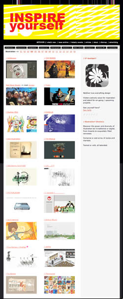
Netdiver
 I hope today is a good day for you to get lost in a time-sink, because here’s another major one.
Netdiver is a site that collects and displays links to websites that the author, Carole Guevin, aided by her techie co-founder Jean-François Simard, has selected as particularly appealing and well done. The overall emphasis of the site is on design, but Guevin has devoted an extensive section to the display of web sites by illustrators, as well has having sections of Photography sites and other Portfolios (largely designers).
There is also a section dedicated to Flash sites, Industrial, Powagirrrls, video and animation and a category for “Imaginative” (as though the rest of them weren’t).
In addition, there’s news, articles and a substantial and highly useful Toolbox for graphic and digital designers. The Sitemap will give you an overview of the available goodies on this extensive site.
The home page is somewhat blog-like, though without dated posts, with items of interest pulled to the fore.
When you enter an individual category you’re dropped on the most recent page of many, e.g. page 16 in the Illustration category. The numerical links to previous pages are arranged across the top of the page under the general navigation.
Guevin definitely has a point of view and specific range of styles in the sites and artists she selects, but it’s wide enough that you may find it accommodates work and designs appealing to a variety of tastes.
Don’t blame me if you look up and find out half your day has disappeared. I warned you.
Categories:
-
Peter Max

Peter Max rose to fame at a pop artist and poster artist associated with the mass media image of the 1960’s psychedelic art movement.Max took his influences from the underground psychedelic concert posters and album art of the time, and the graphically simplified echoes of that art pioneered by Heinz Edelmann and Milton Glaser, and refined them into a cheerful, less threatening version that became wildly popular.
Max applied his version of the style to a line of very successful silkscreen posters posters and moved it into advertising design, clothing, and various kinds of marketing and product design, even to busses, large scale murals and the painted fuselage of one of Continental Airline’s Boeing 777’s.
His work became synonymous with 60’s “psychedelic art”, though to my mind he was less of an innovator than people like Stanley Mouse, Victor Moscoso, Rick Griffin, Wes Wilson and Anton Kelly. Fame wins out, however, and Max’s psychedelic lite version became a pop culture icon while the originators faded into obscurity. (I’ll do my best to introduce you to them in future posts.) Heinz Edelmann carried his style into the design for the influential animated feature Yellow Submarine, which is often wrongly attributed to Max.
The path of influences is difficult to sort out, however, and you can see the influence of Max and his progenitors and contemporaries on modern retro-60’s style, European comics artists like Moebius and Bati, and album cover art through the intervening years.
If my tone makes you think I don’t appreciate Peter Max, I’m remiss, because I actually do like him when he’s at his art-deco kaleidoscopic best, I just lament the obscurity of other artists who pioneered this style.
Max himself moved his style into a kind of neo-expressionism, often mixed with the pop psychedelia of his poster art. He expanded his working methods into a number of media and remains active today, creating posters, magazine covers, limited edition prints and gallery paintings.
His work is full of the vibrantly intense color relationships associated with psychedelic and op art, in which high-value, high-saturation colors are frequently juxtaposed with their compliments, causing an increased intensity and optical “vibration” from the way the brain processes color.
His web site has a small selection of his 60’s work. The gallery is the “Shop” (which tells you something), look in the “Vintage Poster” section. There are also interesting works in the contemporary “Posters”, particularly under “Misc.” I can’t give you direct links because the site is in frames.
A collection of his work, The Art of Peter Max, was published in 2002.
There is an exhibition called Peter Max and the Summer of Love at the de Young museum in San Francisco from now till October 28, 2007, supposedly in celebration of the 40th anniversary of the “Summer of Love” in 1967.
I’m not exactly sure what Peter Max actually has to do with the “Summer of Love”, except that they both marked the explosion of the 60’s counterculture into mainstream culture, which was, of course, its death knell. The establishment brownshoes who got so uptight at the rise of the “dirty hippies” who wanted to subvert the authoritarian consumerist conformity they desperately wanted to maintain just didn’t have enough faith in American Popular Culture, which, like a cosmic game of Katamari Damacy, can absorb anything.
Far out, man.
[Exhibition listing via Art Knowledge News, photo of Peter Max mural on Atlantic City boardwalk (image top, enlargement here) from Flickr set by iirraa, I’ve taken the liberty of cropping it and adjusting levels. Note the size of the passer-by on the boardwalk.]
Categories:
-
Preparing images for the web
How to Display Your Art on the Web: Part 6
[This is part of a series of articles for which the introduction and list of articles is here. If you haven’t read the introduction yet, it would be helpful to read it first.]


Atoms to bits
Unless you work digitally, in order to get your artwork from the easel/drawing table to the web, it needs to be translated from physical atoms to bits of digital information (as Scott McCloud points out), i.e. photographed or scanned to a digital image file. That file will then be used to create the final resized and compressed image file that is displayed on your site or blog.If you work digitally, you probably know a good bit of what’s in this article already, and can go surf YouTube while the rest of the class catches up.
Photographing your work
This is an area were I don’t have a lot of personal experience, as I largely work digitally, but there are many resources on the web (and in print) from “those who know” (see my list of resources below).You’ll find some conflicting information here and there, particularly in terms of digital vs. film. If you’re preparing a portfolio for galleries, many of whom still want submissions as transparencies (slides), then slide film is the obvious choice. You’ll still have to scan the slides for the web, which requires a slide capable scanner; and it may be just as easy, if not easier, to take an alternate set of digital photos at the same time, specifically for the web.
Hiring a professional
You may want to take a stab at doing it yourself, but be critical. If you can’t get the results your work deserves, consider hiring a professional photographer. Find one who lists the photography of artwork specifically as one of their specialties. There’s a big difference between photographing a cute, drooling baby and a painting of a cute, drooling baby.Scanning your work
If you your artwork is flat, on paper, illustration board or the back of a napkin, and is small enough, you might consider scanning; but for good results that don’t require a lot of color correction, you’ll want a graphic arts quality scanner (or access to one). Even though images for the web are prepared at low resolutions, scan at 200 ppi or better to give yourself some leeway. It’s always easy to scale down in image editing software, you can’t scale up. If you’re scanning for print too, scan at 300 or higher.Again, try it with what you have, but be critical of the results and consider the option of a professional service bureau if the scans don’t look right. I turn off all the scanning “helpers” and image correction options, scan as raw as possible and do any corrections in Photoshop.
Image editing software
Once your artwork has been converted from atoms to bits, you may need to make adjustments to the color or straighten off-square photos or scans; and you will certainly need to use image editing software to create the final resized and compressed image files for display on the web. (Plus you always need something on your computer that will let you put the President’s head on Arnold Schwarzenegger’s body to amuse your friends.)
Adobe Photoshop is the industry standard professional image editor, if you have that and know how to use it, you’re ahead of the game. If you don’t have it, Photoshop is expensive (around $600) and can be more than you need to simply prepare a few images for the web; kind of like buying a Porsche Carrerra to drive to the train station. (I know, you told your wife/husband that a 2-seater would save on gas.)
If you are a full or part time student anywhere, you are eligible, as I advise the students in my Flash classes, for academic discounts that make things like Photoshop remarkably cheap (about the price of an upgrade package). Academic software is the same as the commercial versions, but it has some restrictions, (can’t be upgraded in the future, requires that you wear horn rimmed glasses and a pocket protector). See this description of academic software from About.com. Beware of cheap software scams in this area. (i.e. all those emails you get promising Adobe Photoshop for $29.95!) As a teacher, I can also get the real discounts; when I use them I usually buy from Academic Superstore. You have to produce proof that you are a student or teacher for the real academic discounts, but part time and continuing education classes usually qualify (and it doesn’t have to be art classes). Talk to the coordinator at the school.
Photoshop Elements (Mac & Win) is a lower priced (around $100) consumer version of Photoshop without the gee-whiz, super-duper, hyper special pro features (that let you put the President’s head on Arnold Schwarzenegger’s body and make it believable enough to fool Associated Press). You can read a comparison of the two on Graphic-Design.com and a review on CreativePro.com.
GIMP (The GNU Image Manipulation Program) is a free, open source image editor for Mac, Windows and other platforms, that some genius programmers with too much time on their hands created on all those Friday nights when they didn’t have dates and Stargate SG-1 was in reruns; and is in some ways comparable to Photoshop (and in many other ways, not). Installing and using it requires a degree in particle physics and a black belt in computer graphics, but it’s very capable (and pretty amazing for free software). Again, despite having the “right price” it may be the equivalent of using a bulldozer to turn over your backyard garden (which, granted, can be fun) because of the learning curve. It will also let you put the President’s head on Arnold Schwarzenegger’s body and make believable enough to fool USA Today (not that that takes much). See the description on Wikipedia. Some other geeks have spent their Friday nights putting together GIMPshop, a modification designed to make it more like Photoshop and easier to use.
Graphic Converter is a Mac only shareware application ($40) that is the universal can opener of graphics applications. It has an amazing ability to open and save in almost any image format known to man and computerkind (and some that no one’s ever heard of). Graphic Converter has good basic image editing tools and you can try it as long as you want for free, (but you should pay the modest asking price if you keep and continue to use it).
iPhoto® is the image cataloging application that ships free with iLife® as part of the Mac® OS X® computer® operating® system® from Apple®. It has basic image editing tools that may be sufficient for prepping your images for the web.
Windows Photo Gallery (Wikipedia description) is basically Microsoft’s version of iPhoto, and also has some basic editing tools. Previous versions were called Mocrosoft Picture It! (Wikipedia description). Like all Microsoft applications, to use this application you must click on a button to agree that Microsoft owns your immortal soul, and all reproduction rights thereto, in perpetuity and in all media, physical, electronic and ethereal, in current use, yet to be created, or ever to be imagined by the mind of any sentient being in any plane of existence. Other than that, it’s free.
Paint Shop Pro is a Windows only image editor that has its adherents and detractors. I mention it because it’s popular and relatively inexpensive ($60), and in some ways more powerful than Photoshop Elements; but take the “Pro” part with a grain of salt. If you’re a “pro”, you use Photoshop. See the description on Wikipedia.
About.com has a couple of handy lists: Free Photo Editors for Windows, and Free and Budget Photo Editors for Mac. Turn your sound down and be ready to duck the annoying talking ads for SitePal.
The big list. Here’s a long list of available raster graphics image editors from Wikipedia, most of the items are linked to more detailed descriptions. More than you ever cared to know about.
There are also some online image editors. The idea seems kind of foreign to me and I don’t know much about them, but who knows?. Here is a list of free Online Photo Editors from ExtremeTech. If anybody has tried these, let me know how you like them.
What’s the format, Kenneth?
Web browsers can generally display three kinds of images, news, comics and por… er, I mean GIF, JPEG and PNG. They all use some method of compression to reduce the file size of images so they can be transmitted over the web without taking a week to download.
GIF (Graphics Interchange Format) can be pronounced with either a hard or soft “G”, but the originators of the format say choosy artists choose “jif”. GIF was the original format back in the early days, when the web was 5 steam-powered computers hooked together with Radio Shack speaker wire across the MIT campus. GIF is really only suitable for images with a limited color range (256 colors) and flat areas of color. The GIF format can produce images with a small file size and can be good for some things, like simple, flat-color comics, typography and cartoons of the President’s head on Arnold Schwarzenegger’s body.
JPEG (Joint Photographic Experts Group) is pronounced “jay-peg”. JPEG images are by far the most common image format on the web, and are usually the format you will use to reproduce your art for the web. They support the full range of millions of colors. Used correctly, JPEG compression can compress images to to a remarkable degree without losing apparent image quality. Used incorrectly, it can turn your images into a grunky mess that looks like the cat threw up in your digital camera.
JPEG is a “lossy” compression method, meaning it throws away image data that the algorithm has determined you won’t miss; kind of like your wife cleaning out your studio when you’re not home. If you compress a JPEG too far, however, or re-compress an existing JPEG, you can wind up with dirty looking “artifacts” in the image. This is where is pays to have an image editor that gives you a preview, like Photoshop’s “Save for Web” feature, that shows you an approximation of how your image will look as you choose the compression level. You want the smallest file size possible without seeing any artifacts – dirty, squarish roughness in areas of the image (see the JPEG image above with the compression level of “10”). The stronger the level of compression, the lower the file size; but also the more image data that is thrown away. Always keep copies of your original files; and let your wife know that you really did buy 2 copies of Uncanny X-Men 96 on purpose.
As a general rule don’t re-save a JPEG as a JPEG; create a fresh one from the original file. Re-compression throws away more image data. JPEG’s that are originally saved with minimal compression, however, like those from a digital camera, can be used to make new JPEGs. Not much image data has been discarded. JPEGs saved for the web, though, are generally “pushed to the edge” and compressed as hard as possible without looking bad; re-saving those will make your images look like spoiled peaches.
PNG (Portable Network Graphics) is, the originators insist, pronounced “ping”, though you will hear “pee en gee” in certain circles. PNG images combine some of the characteristics of GIF and JPEG. Like GIF they are a lossless image format and support transparency. Like JPEG they support the full color range millions of colors. The main disadvantage is that their lossless compression method is not as efficient as JPEG’s lossy compression, and they make images with larger file sizes for the same level of apparent image quality.
The emails were right: size matters
Image size
In addition to file size you need to be concerned with image dimensions. You will need to determine how your images will display within your interface design, and how much room you have in your design area, before you resize them and save them out as final files for the web. I’ll be covering the design of online galleries and portfolios in a future post.Once you know how the images will be displayed, you will probably be making more than one version of each image. Depending on your gallery design, you might be making:
a thumbnail and a full size image,
a thumbnail, medium size preview image, and full size image,
a thumbnail, full size image and jumbo, extra large, Grade-A, hi-res detail image,
a cropped detail close-up,
and/or all of the above.If you’re clever and persistent, and not doing anything on Friday nights, you may be able to figure out how to have your image editing software save out several size versions simultaneously, for an entire folder full of files, using batch processing.
Resolution, or dpi and ppi, FYI, QED
Resolution in print is measured in “dots per inch” (dpi), or “lines per inch” (lpi), and on the computer is measured in “pixels per inch” (ppi) (or pixels per centimeter for those of you in the rest of the civilised world). While this matters in print, or when scanning or working in Photoshop, image resolution does not matter on the web. What matters is the dimension in pixels.If a 2″ by 2″ (5cm x 5cm) image has a resolution of of 100ppi (i.e 100 pixels per inch), it will be 200 pixels by 200 pixels. If the 2″ image has a resolution of 300ppi, it will be 600 pixels by 600 pixels. Both of those images will print at the same size, 2″; the higher resolution one will have more detail.
Web browsers, however, are rather narrow-minded and don’t understand or care about image resolution. All they understand is dimensions in pixels. So the first image will display much smaller on screen than the second. (Unless you learned “new math” in the 60’s, in which case 5 images + 5 images = 12 images.)
This concept is made additionally complicated by the fact that computer monitors can be adjusted to display at different resolutions, so “pixels per inch” is actually a relative term. When someone says “on the web it’s all 72 ppi”, they are referring to a default resolution.
Monitors come in different sizes. 1024 x 768 is the default resolution for a 17 inch monitor, and it’s 1280 x 1024 for 19 or 20 inch monitors (with other varistions for “widescreen” monitors). If you have your own monitor set to a higher resolution than the default, it will display more pixels per physical inch, and images will appear smaller onscreen to you than they might to other computer users (and vice-versa if you set your resolution lower than the default).
If you get lost, try a bit of the cake that says “Eat me” (hmmm… or is it the bottle that says “Drink me”?)
Putting it in the browser
OK, you digital artists in the back row who were surfing YouTube can pay attention now.
Embedding images in HTML
Images aren’t actually “in” the HTML page the way words are, they are “referred to” by the IMG tag, which basically tells the browser “Go get this image from this location and stick it here in the page.” The IMG tag can also tell the browser what the size of the image is (in pixels by pixels), which helps the browser leave a place for the image while it’s downloading so it can render the page faster. You can artificially force an image to display at a different size this way, and some HTML editing software will give you the impression this is a fine thing to do. It’s not. It will make your image display poorly. Prepare your images at the size they will display, and don’t trust advice from strange HTML editors to whom you have not been properly introduced in the course a chaperoned social occasion.Displaying images in Flash
If you are preparing your images for display in a Flash-based gallery or slideshow, save them out as JPEG images, compressed just as if you were going to place them directly in a web page. Dedicated image editors do a much better job of image compression than Flash does. Flash won’t re-compress an imported JPEG unless you tell it to. Flash is considerate that way.“Protecting” your images
You can’t.
Clever tricks that don’t work very well
Many people try various tricks to keep their images from being easily downloaded, like disabling right-click with JavaScript, placing a transparent GIF over the image in a CSS layer, putting the image in a Flash file, adding a sound file that screams “Don’t touch that!” whenever someone chooses “download image”, etc. They can all be gotten around in one way or another. All of them, in fact, can be defeated by simply using a third party screen capture utility (which is why, of course, all software from companies with less than a $4 billion market cap should be illegal, or at least that’s what Steve Ballmer tells me).Watermarks and other ways to ruin your image
I should be clear here that by “watermark” I mean a word or symbol, sometimes partially transparent, that is laid over an image in an attempt to render it useless to someone who wants to download and “repurpose” it. The problem, of course, is that this also renders the image useless for showing your artwork as anything but a hideous, insulting joke. You can also choose to display your images so painfully small that they have the same results. See my rant on “How Not to Display Your Artwork on the Web“.Bylines and credit markings
On the other hand, marking your image with a small, innocuous signature or byline, crediting you as the creator of the image, perhaps with a copyright mark and/or listing your web site’s URL, is a fine idea, as long at it’s done without making your image look bad. If you’re going to be displaying your images against a known background color and you are comfortable that the color won’t change in the future, you can add an additional band of that color to the bottom of each image (by adding to the “canvas size”), and add your byline there without intruding on the image area at all.Keep it in focus
Unless you’re putting your images up for the benefit of your mom and Aunt Joan (it’s so lifelike!), your purpose here is to have the images on the site present the best representation possible of your work. That’s the end goal for all this fuss. As Fernando sez, you want them to look mahvellous!Next: Gallery and portfolio design
Resources
Photographing your work
A Short Tutorial from Art Link Swap
How to Photograph Artwork from The Artists Web (images missing, still useful)
List of Resources on Photographing Artwork from Catherine Jo Morgan
How to Photograph Art from Dallas Arts Review
Photographing Your Artwork by Russell Hart and Nan Starr (Amazon link)
Other books (Amazon)
Photographing Small Paintings for “painting a day” blogs from Jeff HayesScanning your work
Scanning Artwork from The Artists Web
How to Scan Artwork from Treelight StudiosImage editing software
Photoshop (Adobe: Mac & Win) (Amazon Mac & Win)
Academic software dicsounts – info from About.com
Photoshop Elements (Adobe Mac & Win) (Amazon: Mac & Win) Comparison on GraphicDesign.com
GIMP, description on Wikipedia, GIMPshop
Graphic Converter
Paint Shop Pro (Win), description on Wikipedia
Free and Cheap Photo Editors for Windows and Mac, (About.com)
Big list of raster image editors from Wikipedia
Free Online Photo Editors from ExtremeTechFormats
JPEG, GIF and PNG on Wikipedia
JPEG artifacts and Pitfalls of JPEG Compression on About.comResolution
DPI and PPI Explained on tildefrugal.net
Display, Printing, dpi and ppi on Photo.net
Categories:
-
Cover Browser

Covers of comic books, pulp magazines, and for that matter, magazines and books of any kind, have one purpose — to make you pick that sucker up and run home with it in your sweaty hands after plunking down your hard earned dimes.Cover art, particularly from the lower part of the periodical pool, can be so wonderfully lurid, fantastic and outrageous that it’s Amazing (or Astonishing, or Astounding or Uncanny or Shocking or Spectacular, or,… well, you get the idea.)
I just love the stuff, and some of is is actually wonderfully illustrated in addition to the having the above characteristics.
By pulling from various sources around the web, Philipp Lenssen has put together a gallery (or more accurately a collection of galleries) of more than 100,000 covers from comic book series and pulp magazines, augmented with smaller selections of games, DVD, record or mainstream magazine covers.
The comic book covers are the star attraction here, and you’ll find many series. Lenssen has gone for depth rather than breadth, so you may not find your favorite title (no Strange Tales for me), but the series that are covered are often represented with a remarkably complete run of covers.
I might wish for a better index page (like a hierarchical list; boring, I know, but very usable). The gallery is arranged in an alphabetical paragraph of links, some larger than others, almost like a tag cloud. The listing of titles is actually much more extensive than it appears at first, as many of the links are headings with subcategories (indicated by double arrows) that expand when clicked on. The heading for “Batman” for example, expands to reveal 20 or so titles that featured the character.
Most of the pulps are under the heading of “Magazine”, “Manga” expands to 50 or 60 titles and “Games” expands into several sub-categories by platform.
Just cruising through the titles can be entertaining, particularly the early comics from the 40’s and 50’s, and you will find some real gems of comic book and pulp magazine illustration, like the early Mad comics covers (under “Magazines”), early Creepy and Vampirella covers by Frank Frazetta, the great Kirby covers for Fantastic Four, Will Eisner’s covers for the Kitchen Sink Spirit collections, the wonderful old Dell Turok: Son of Stone painted comic covers with their dramatic dinosaur scenes, Heavy Metal covers by Moebius and Bilal, and the still funny National Lampoon covers.
The magazine section contains titles you wouldn’t expect in this context, like The New Yorker, Rolling Stone, Vogue, and Esquire in addition to the more expected Fantasy and Science Fiction, Astounding Stories and Popular Mechanics.
Unfortunately, some of the images, like Brian Bolland’s wonderful Animal Man covers, are over-compressed and blurred with JPEG artifacts, but I think some of the assembly of the site is automated and Lenssen has limited control over the images from his sources.
The About section describes the sources of the images, and gives a picture of how the covers are distributed by type.
The Labs section (an easy-to-miss link a the top of the main page) is to extra features and amusements like the Cover Tagger Game, contributing to which helps with the site’s tag cloud, and other games and features on covers and related topics.
There’s more here, but I don’t have time to cover it all.
Categories:
-
The Barnes Foundation

Most small museums, and many major ones, started as the collection of a single individual. Most are strong in a particular area based on that collector’s preference for a genre, time or group of artists.Some collections are more idiosyncratic than others, and The Barnes Fountation, a school and museum in Upper Merion, just outside of Philadelphia, falls firmly into that category.
Dr. Albert C. Barnes was a physician who made a fortune with the development of a patented antiseptic drug. In the early 20th century he began to dedicate himself to the collection of art, assisted initially by painter William Glackens. He traveled to Europe, visited Gertrude and Leo Stein and met artists like Picasso and Matisse. He had a taste for modern (at the time) painting and was in the right place at the right time to start his collection, picking up his first Picasso, for example, for under $100.
He acquired a remarkable collection of more than 1.000 works, with notable pieces by Monet, Modigliani, Degas, Seurat, Van Gogh and other Impressionists and post Impressionists. Barnes liked Cazanne, and collected 69 of his works, and was particularly enamored of Renoir, purchasing 180 of his paintings; leading to my short phrase description of the Barnes collection as “every bad Renoir ever painted”.
I didn’t realize how many bad Renoirs there were until I visited the Barnes. (Just my opinion, of course, your mileage may vary.) I do like Renior when he’s painting at his best, and the Barnes has a couple of those, though the best ones in the area are in the Philadelphia Museum of Art.
Barnes expanded his reach into the past to works by masters like Daumier, Delacriox, Rubens, Lorrain, Tintoretto, Bosch, and even Titian, and there are some real gems sprinkled among the suffocating overload of Renoirs. My favorites are Monet’s “House Boat” (actually a boat rigged for painting excursions on the Seine, image above, bottom left), some beautiful small pieces by Corot and, in particular, a couple of great little still life paintings by Chardin that, for me, are worth the price of admission.
Barnes built a school and museum near his home in Upper Merion, on the grounds of an existing arboretum, to house his collection and make it available to the students of the school, which has classes in art, art appreciation and horticulture.
Dr. Barnes had some odd ideas about art, and arranged his collection in ways that defied all conventions for the display of collections of artwork. The paintings are arranged in a variation of Paris Salon style, i.e. wall to wall, floor to ceiling; but rather than being grouped according to time period and genre, as most collections logically are, the groupings in the Barnes are by odd criteria like the size and shape of the works and their frames, or predominant colors in the compositions, and are often displayed with objects like keys and door latches that Barnes felt contained “artistic” curves or lines, that were somehow related. Some of the groupings are arranged to form large ovals or other shapes, with the pieces chosen to accommodate their fit into the arrangement.
While amusing at first, and sometimes presenting interesting and unexpected juxtapositions, Barnes’ arrangements can stymie anyone who is actually trying to find particular works or paintings that are related.
There has been talk at times of breaking up the arrangements into something more conventional, but preservation of the arrangements is stipulated in Barnes’ will; as are a number of other issues that have been controversial over the years and are becoming news again in a city still not recovered from the disgraceful Thomas Jeffereson University Thomas Eakins debacle.
Barnes established the foundation as a school, not as a museum, and dictated that his collection remain in the building he built for it in Merion, not be loaned out or toured and that public and scholarly access be severely limited, intending that the collection existed for the benefit of the students, not the general public or the “art establishment”, which he despised. Renowned art historians and many other interested parties were turned away, sometimes with rejection letters signed by Barnes’ dog.
The collection is open to the public, but access is still limited; you need to make a reservation in advance and the galleries are only open on certain days of the week. It’s definitely worth a visit, however, if you are in the Philadelphia area.
Limited access became, and is now, the center of controversy, involving lawsuits, countersuits and even legislation. In the early 1990’s, the Barnes Foundation’s board, claiming that limited funds prohibited needed repair to the building, got a judgment breaking some of the terms of Barnes will and arranged a world tour of Impressionist works. Despite the the tour, the foundation neared bankruptcy amid allegations of missing funds.
In the meanwhile residents of the upper-crusty suburban neighborhood in which the foundation is located were up in arms about plans to increase the severely restricted admissions policy, fighting it tooth and nail with a “not in my back yard” fervor. The foundation’s board recently got a judicial ruling permitting them to move ahead with plans to move the collection to a new home on the Ben Franklin Parkway in Philadelphia, near the Philadelphia Museum of Art and the Rodin Museum, and make it publicly accessible among the city’s other great museums.
Many of those same “not in my back yard” neighbors are now up in arms again and have mounted a campaign called “Friends of the Barnes Foundation” to “save the Barnes” and keep it in it’s current home (with slight increases in access). One of the local legislators, hoping to butter his bread among these active and influential constituents, has even proposed legislation to tax away any funds raised to move the collection form its current home. On the other side, it was discovered that there was a $100 million state appropriation for construction of a new building that existed two years prior to the court ruling that would have permitted it.
As I’ve said before, you can take the art out of politics, but you can’t take the politics out of art.
[Image above: photo of a Barnes Foundation gallery by Commonwealth Media Services, from Visit PA, bottom row: Monet, Seurat, Cezanne]
Categories:


Charley’s Picks
Bookshop.org
(Bookshop.org affilliate links; sales benefit independent bookshop owners; I get a small percentage to help support my work on Lines and Colors)

John Singer Sargent: Watercolors


Urban Sketching: Understanding Perspective


Charley’s Picks
Amazon
(Amazon.com affiliate links; sales go to a larger yacht for Jeff Bezos; but I get a small percentage to help support my work on Lines and Colors)
John Singer Sargent: Watercolors
Urban Sketching: Understanding Perspective