
Categories
- 3d CGI
- Amusements
- Animation
- Anime & Manga
- Art Materials
- Art Videos
- Blogroll
- Cartoons
- Color
- Comics
- Concept & Visual Dev.
- Creativity
- Digital Art
- Digital Painting
- Displaying Art on the Web
- Drawing
- Eye Candy for Today
- Gallery and Museum Art
- High-res Art Images
- Illustration
- Motion Graphics & Flash
- Museums
- Online Museums
- Outsider Art
- Painting
- Painting a Day
- Paleo Art
- Pastel, Conté & Chalk
- Pen & Ink
- Prints and Printmaking
- Reviews
- Sc-fi and Fantasy
- Sculpture & Dimensional
- Site Comments
- Sketching
- Storyboards
- Tools and Techniques
- Uncategorized
- Vector Art
- Videos & Podcasts
- Vision and Optics
- Watercolor and Gouache
- Webcomics
Archives
- April 2026
- March 2026
- February 2026
- January 2026
- December 2025
- November 2025
- October 2025
- September 2025
- August 2025
- July 2025
- June 2025
- May 2025
- January 2025
- December 2024
- November 2024
- October 2024
- September 2024
- August 2024
- June 2024
- April 2024
- March 2024
- February 2024
- January 2024
- December 2023
- November 2023
- October 2023
- September 2023
- August 2023
- July 2023
- May 2023
- April 2023
- March 2023
- February 2023
- January 2023
- December 2022
- November 2022
- September 2022
- August 2022
- July 2022
- June 2022
- May 2022
- April 2022
- March 2022
- February 2022
- January 2022
- December 2021
- November 2021
- October 2021
- September 2021
- August 2021
- July 2021
- June 2021
- May 2021
- April 2021
- March 2021
- February 2021
- January 2021
- December 2020
- November 2020
- October 2020
- September 2020
- August 2020
- July 2020
- June 2020
- May 2020
- April 2020
- March 2020
- February 2020
- January 2020
- December 2019
- November 2019
- October 2019
- September 2019
- August 2019
- July 2019
- June 2019
- May 2019
- April 2019
- March 2019
- February 2019
- January 2019
- December 2018
- November 2018
- October 2018
- September 2018
- August 2018
- July 2018
- June 2018
- May 2018
- April 2018
- March 2018
- February 2018
- January 2018
- December 2017
- November 2017
- October 2017
- September 2017
- August 2017
- July 2017
- June 2017
- May 2017
- April 2017
- March 2017
- February 2017
- January 2017
- December 2016
- November 2016
- October 2016
- September 2016
- August 2016
- July 2016
- June 2016
- May 2016
- April 2016
- March 2016
- February 2016
- January 2016
- December 2015
- November 2015
- October 2015
- September 2015
- August 2015
- July 2015
- June 2015
- May 2015
- April 2015
- March 2015
- February 2015
- January 2015
- December 2014
- November 2014
- October 2014
- September 2014
- August 2014
- July 2014
- June 2014
- May 2014
- April 2014
- March 2014
- February 2014
- January 2014
- December 2013
- November 2013
- October 2013
- September 2013
- August 2013
- July 2013
- June 2013
- May 2013
- April 2013
- March 2013
- February 2013
- January 2013
- December 2012
- November 2012
- October 2012
- September 2012
- August 2012
- July 2012
- June 2012
- May 2012
- April 2012
- March 2012
- February 2012
- January 2012
- December 2011
- November 2011
- October 2011
- September 2011
- August 2011
- July 2011
- June 2011
- May 2011
- April 2011
- March 2011
- February 2011
- January 2011
- December 2010
- November 2010
- October 2010
- September 2010
- August 2010
- July 2010
- June 2010
- May 2010
- April 2010
- March 2010
- February 2010
- January 2010
- December 2009
- November 2009
- October 2009
- September 2009
- August 2009
- July 2009
- June 2009
- May 2009
- April 2009
- March 2009
- February 2009
- January 2009
- December 2008
- November 2008
- October 2008
- September 2008
- August 2008
- July 2008
- June 2008
- May 2008
- April 2008
- March 2008
- February 2008
- January 2008
- December 2007
- November 2007
- October 2007
- September 2007
- August 2007
- July 2007
- June 2007
- May 2007
- April 2007
- March 2007
- February 2007
- January 2007
- December 2006
- November 2006
- October 2006
- September 2006
- August 2006
- July 2006
- June 2006
- May 2006
- April 2006
- March 2006
- February 2006
- January 2006
- December 2005
- November 2005
- October 2005
- September 2005
- August 2005
Relevant Blogs
Art, Painting & Sketch
- Gurney Journey
- Underpaintings
- Art and Influence
- Painting Perceptions
- Oil Painters of America
- Vasari Paint POV
- Flying Fox
- Urban Sketchers
- Bento (Smithsonian)
- Art Inconnu
- The Hidden Place
- Still Life
- Making a Mark
- The Art of the Landscape
- Exploring Color & Creativity
- Art Contrarian
- Artist A Day
- beinArt Surreal Art Collective
- Eye Level
- David Dunlop
- p.i.g.m.e.n.t.i.u.m
- CultureGrrl
- Joaquín Sorolla blog
- Artists in Pastel
“Painting a Day”
- A Painting a Day (Keiser)
- On Painting (Keiser)
- Julian Merrow-Smith
- Karen Jurick
- Jeffrey Hayes
- Carol Marine
- Abbey Ryan
- Daily Paintworks
Other Painting Blogs
- Virtual Gouache Land
- Neil Hollingsworth
- Marc Hanson
- Kevin Menck
- Marc Dalessio
- Larry Seiler
- Stapleton Kearns
- Colin Page
- Roos Schuring
- Hans Versfelt
- Titus Meeuws
- Régis Pettinari
- René Plein Air
- Belinda Del Pesco
- Robin Weiss
- Nathan Fowkes (Land Sketch)
- William Wray
- Frank Serrano
- Stephen Magsig
- Michael Chesley Johnson
- Twice a Week
- Sarah Wimperis
- Rob Adams
- Michael Cole Manley
- The Dirty Palette Club
- Mike Manley’s Draw!
Gallery Art & Illustration mix
Illustration
- Howard Pyle
- 100 Years of Illustration
- BibliOdyssey
- Illustration Art
- Today’s Inspiration
- Illustration Mundo
- Little Chimp Society
- Danny Gregory
- R D (John Martz
- Illustration Friday blog
- Monster Brains
- Illustrators & Illustrations (RU)
- Elwood H. Smith
- DaniDraws.com
- Designers Who Blog
- iSpot Blog
Sci-Fi & Fantasy
Illustration & Comics
Comics & Cartoons
- Comics Beat
- Robot 6
- Newsarama Blog
- Comic Vine
- Comics Alliance
- Forbidden Planet Int.
- Paolo Rivera
- Bolt City
- Flight
- Scott McCloud
- The Comics Journal
- Comixpedia
- Funnybook Babylon
- James Baker
- Middleton’s Sketchbook
- Boneville
- The Hotel Fred
- Paul Rivoche
- Daily Cartoonist
- Mad About Cartoons (William Wray)
- Digital Strips
Illustration & Concept
Animation & Concept
- Cartoon Brew
- Animation Blog
- Cold Hard Flash
- Concept Art World
- The CAB
- FY Concept Art
- Concept Ships
- Concept Robots
- John Nevarez
- Armand Serrano
- Marcos Mateu-Mestre
- all kinds of stuff (Kricfalusi)
- Yacin the faun (Man Arenas)
- Kelsey Mann
- Cre8tivemarks Blog
- Ice-Cream Monster Toon Cafe
- AAU Character & Creature Design
- AAU Animation Notes
- Articles and Texticles
Paleo & Scientific
Tools & Techniques
Other
Lists of Art Blogs
Art Image Resource Links
Historic Art Images
- Wikimedia Commons: Paintings
- Wikimedia Commons: Drawings
- The Athenaeum
- WikiArt (WikiPaintings)
- Google Art Project: Artists
- Google Art Project: Collections (Museums)
- ArtCyclopedia
- Web Gallery of Art
- Art Renewal Center
- Web Gallery of Impressionism
Auction Consolidation sites
Auction sites
- Sotheby’s
- Bonham’s
- Christies
- Heritage Auctions: Fine Art
- Heritage Auctions: Illustration
- Freeman’s Auctions
- Bukowskis
- Shannon’s
Image Search
Reverse Image Search (search by image)
- Tin Eye
- RevImg
- Google Image Search (camera icon)
- Bing Image Search (camera icon)
Promoting some friends and some clients of my website design business
- Twin Willows T’ai Chi studio in Wilmington DE. Taiji classes with Bryan Davis.
- Ray Hayward, Inspired Teacher of T’ai Chi ( Taiji ) in Minneapolis, Founder of Mindful Motion Tai Chi Academy
- OldHead Tattoo studio and Art Gallery in Wilmington DE. Tattoos and paintings by Bruce Gulick
- Sharon Domenico Art, pet portrait oil paintings
- Platinum Paperhanging, wallpaper hanging, Main Line and Philadelphia, PA
- Lisa Stone Design, interior designer, Main Line and Philadelphia, PA
- Studio12KPT, original art, prints, calendars and other custom printed items by Van Sickle & Rolleri
-
Tim Hildebrandt 1939-2006

It’s difficult to separate the work of fantasy and science fiction artist Tim Hildebrandt from that of his brother Greg. For the greater part of their careers they have collaborated on most of their work.Word has gone around the web that Tim Hildebrandt died Sunday (June 11) at the age of 67 of complications from diabetes.
The Brothers Hildebrandt, as they are often referred to, have done book, magazine, game, card and calendar illustrations that are some of the most widely known in the fantasy art field. Before Peter Jackson’s movies cemented the “look” of the world and characters of Tolkien’s Lord of the Rings, the Hildebrandts created one of the more widely known visual interpretations of Tolkien’s work with their calendar illustrations in the 1970’s. They also created widely distributed illustrations for collectable cards of Star Wars themes and Marvel Comics superheroes.
Their work together was often brash, bold, in-your-face and exaggeratedly colorful. They would frequently employ the technique of juxtaposing brilliant complementary colors on the same face or figure in areas of backlighting or secondary highlights to increase the visual drama and “push” the color. (Complementary colors, such as blue and orange, are actually the inverse of one another. If you stare at a patch of light blue for 30 seconds and close your eyes or look at a white sheet, you will see orange. Many artists and illustrators know that this process is constantly occurring when you perceive colors, and the placement of a color next to its compliment will exaggerate the intensity of both colors. This is the basis of much “op art” and is particularly common in fantasy and science fiction art and comic books.)
The two brothers did go their separate ways at times. Of the two I think that Tim was perhaps more inclined to subtlety. He did a lot of science fiction illustration in which the color range was a bit more muted and atmospheric. Both brothers have been prolific and there is a good deal of their work available in books, calendars and posters.
The official Brothers Hildebrandt site has some good images. Unfortunately, a large number of them are defaced by the overzealous application of watermarking. (When will people realize that they can’t “protect” an image by limiting its size or watermarking it on the web? If the image is in print, anyone with a scanner can produce a higher-resolution version than anything you’re likely to post on the web.)
If you find the watermarking as frustrating as I do, you may want to simply do a Google image search to turn up images like the one above (larger version here), but if you’re looking for printed versions, make sure they’re the approved versions from which profit is actually going to the artists or their families.
Categories:
-
Joe Ciardiello
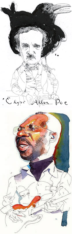 Sometimes there is a fine line, if you’ll excuse the expression, between drawing and painting.
Illustrator Joe Ciardiello manages to walk on both sides of that line at will by developing his color work out of his black and white drawing style.
His black and white drawings have a wonderfully loose and lively line quality, often mixing lightly suggested figures with more fully rendered detail in the areas of focus, usually the faces, in his drawings of well known individuals. Those drawings, themselves, straddle the line between caricatures and portraits, employing varying degrees of exaggeration.
Most interesting is the way he will render portions of a drawing in color. With deft applications of watercolor, at times sketchy and at other times as rendered as a painting, he will bring even more intense focus to the face of an individual or accent other elements in the drawing.
Ciardiello seems to choose a different point in each drawing for the balance between color and black and white elements. The result is a terrific mix that can have the rendered subtlety of a painting and the charming immediacy of a drawing in a single image.
Ciardiello has a new website (designed by Jack Harris, himself a talented illustrator) that makes an effective showcase for his work. There are sections for Illustration and more casual Drawings from sketchbooks, including travel sketches from Venice that I particularly enjoy.
The highlight, though, is the section on images of Musicians, an area in which Ciardiello excels. He is a musician himself, he plays drums with several groups including an all-illustrator band, the Half-Tones, and his images of greats from jazz, blues and rock reflect the touch of someone intimately familiar with these players and their music.
Ciardiello has worked for major publications like The New York Times, Rolling Stone, The Atlantic Monthly, Esquire, Jazziz, The New Yorker and others. His drawings cover a wide range of subjects from politics to sports to literature, but it is his portraits/caricatures of musicians that are most widely recognized, and they are emphasized in the prints available in the For Sale section of the site.
As you look through his work you’ll be delighted with the playfulness and visual fun of Ciardiello’s unique mixture of lines and colors.
Categories:
-
Gobelins Animation Students

France is the largest producer of animation in Europe, and the third largest in the world.Gobelins, L’Ecole De L’image (Gobelins, School of the Image), is a school in Paris that, in addition to studies in Graphic Arts, Multimedia and Photography, offers an apparently superb program in animation. I make that judgement on the basis of the quality of their animation students’ short films.
Each year since 2002, the Gobelins animation students have divided up into small teams of 4 or 5 students and created short (90 second) animations for entry in the Annecy International Animated Film Festival (English version here).
The resultant short animated films are just a treat.
There is some general information about the school in English and about their summer program, which is offered in English as well as French.
The majority of the school’s site is only available in French, but the films rely very little on words and there are links to view them in the browser as well as direct podcast “Add to iTunes” links. The clips require Quicktime, but you should have that anyway if you care about viewing quality video on the web.
The image above is from a delightful part traditional, part CGI animation called Sébastien, one of this year’s entries. I could go on about the individual entries but UK animator and designer Michael Hirsh has a good introduction to this year’s Gobelins entries on his excellent Articles and Texticles blog, which is where I learned that the current entries were available.
I give links below to the school itself as well as their previous years animation festival entries.
If you were surprised to learn that France is the third largest producer of animation worldwide, you may also be surprised an delighted to preview the next generation of French animators.
Link via Articles and Texticles.
Addendum: Michael Hirsh writes to say that one of the animations teams has created a fascinating website describing the process of creating their short, Pyrats, including background designs, character model sheets, storyboards and more. They also discuss it on their blog (English version). Michael fills you in on the details here.
Categories:
-
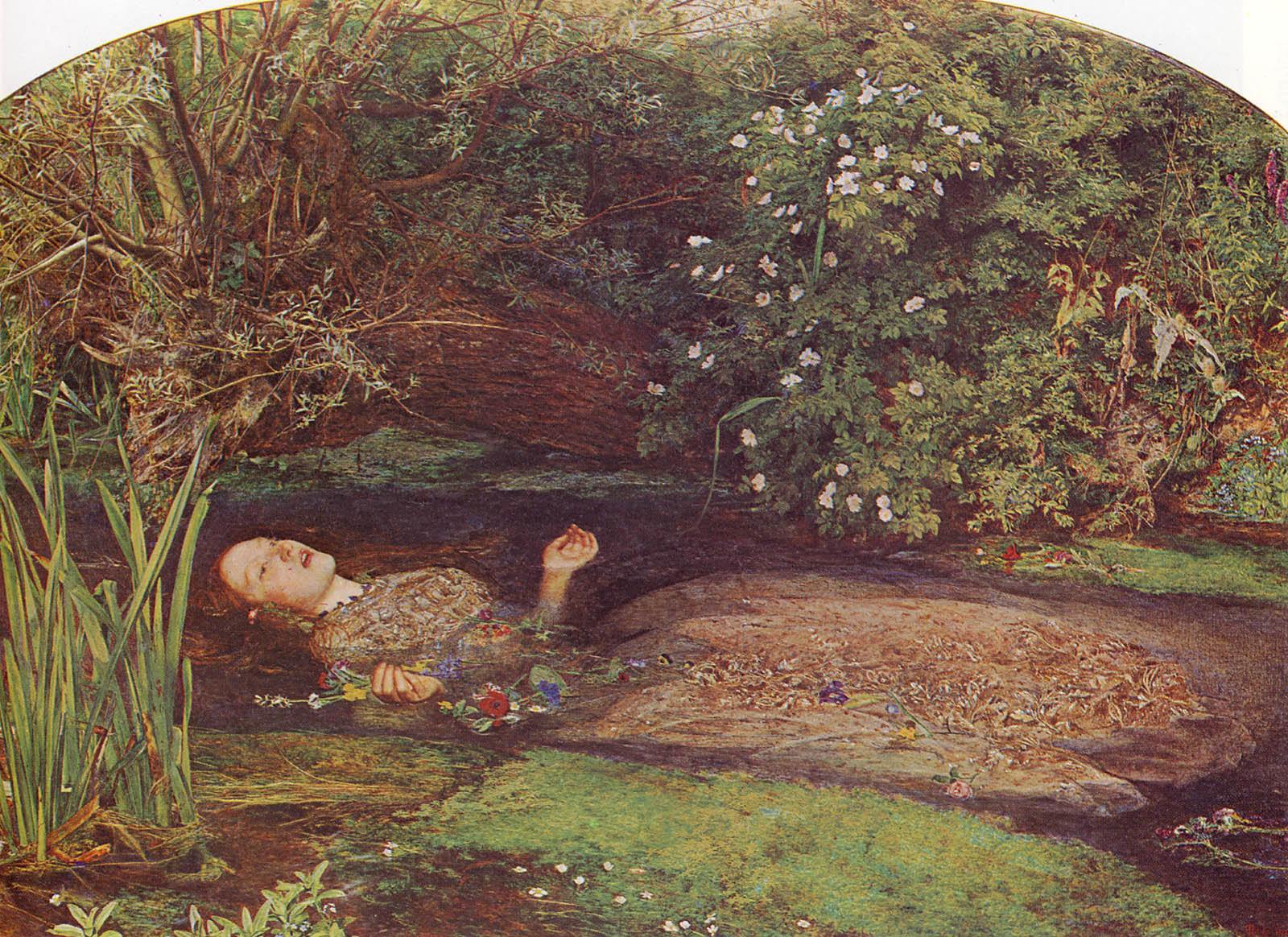
Sir John Everett Millais
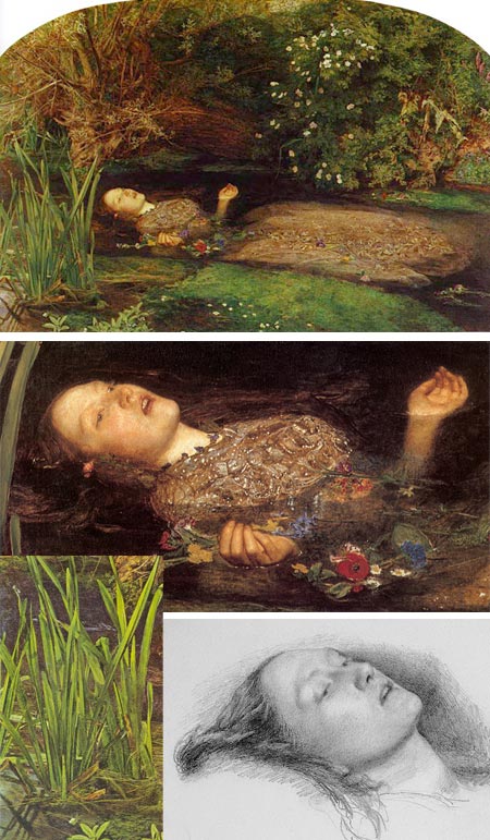
There is a willow grows aslant a brook,
That shows his hoar leaves in the glassy stream.
There with fantastic garlands did she come
Of crow-flowers, nettles, daisies, and long purples
(…)
When down her weedy trophies and herself
Fell in the weeping brook. Her clothes spread wide,
And, mermaid-like, awhile they bore her up;
–Hamlet, Act IV, Scene VIISuch is the description by the Queen of sweet, mad Ophelia’s suicide, a key scene in one of Shakespeare’s most powerful plays, and thus a perfect subject for the brush of Pre-Raphaelite master Sir John Everett Millais.
Opheila is one of the most fascinating of Shakespeare’s tragic characters. There are web sites devoted to her, organizations named for her, and many artists painted her, including other Victorian masters like John William Waterhouse (image at right in my post on Waterhouse, another version here).
Of all the depictions of her that exist, it is Millais’ striking image of Ophelia’s tragic, floating form that we remember, her beautiful face turned to heaven as if just relinquishing her spirit, and her delicate, upturned hands gone limp, releasing their grip on the earthly blossoms.
Millais, along with William Holman Hunt and Dante Gabriel Rosetti, was one of the founding members of the Pre-Raphaelite Brotherhood. True to the aims of the Brotherhood, Millais painted Ophelia’s surroundings with an an almost fanatical devotion to the true representation of nature; his plants could be used as botanical studies (high res version of Ophellia here).
Ophelia herself was modeled on Elizabeth Siddal (study at bottom), who would eventually become Dante Gabriel Rosetti’s wife and was a frequent model for several of the Pre-Raphaelite painters. She posed in a bathtub full of water for weeks on end while Millais painted Ophelia, which eventually led to an illness from which she never fully recovered.
The members of the Brotherhood were devoted to the accurate depiction of nature within the context of their literary themed paintings, in contrast to the Academic Classicism of the time. They also rejected the Academic practice of painting on dark grounds, Millais and Holman-Hunt in particular developed a method of working color directly into a wet white ground to give their work a brilliance of color for which it is treasured today (by art lovers, not by critics, most of whom still follow the modernist doctrine of denigrating any art with a “literary” component).
Millais was also an illustrator (another “sin” to modernist critics), and in his paintings often interpreted the work of Shakespeare. He made an artistic break with the Pre-Raphaelite Brotherhood itself when he moved away from the tight detail they, and their critical defender John Ruskin, admired, saying he could no longer afford to spend a whole day painting an area “no larger than a five shilling piece”. This was after he had married Ruskin’s former wife Effie and had eight children with her in short succession. Juicy details can be found in the Millais bio on Art Renewal Center.
Millais was elected President of the Royal Academy of Arts when Frederic Lord Leighton died even though Millais was quite ill at the time and lived only a year after.
Even though Millais is under-represented in the wondeful Pre-Raphaelite collection of the Delaware Art Museum (two exquisite but small oils), I had a reproduction of Ophelia on my apartment wall while I was an art student, sometimes rotated with an image of his painting of Mariana in the Moated Grange.
The collection is still traveling, by the way (I’m really beginning to miss it) and is currently at the Philbrook Museum of Art in Tulsa, OK. Millais’s Ophelia, alas, is not among that superb collection’s treasures, but the spirit of the Pre-Raphaelite art that it exemplifies is certainly there in other works, rich with color and fidelity to nature.
Ophelia is still one of the most powerful Pre-Raphaelite works. It is striking that an image of tragic death should be so rich with color and life.
Categories:
-
Dave Bruner
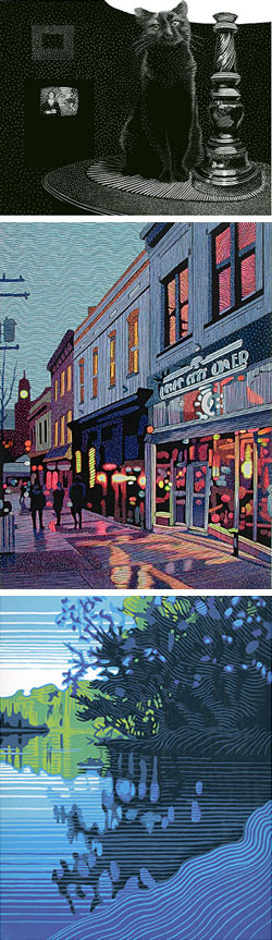 I recently attended the Rittenhouse Square Fine Arts Annual, a delightful outdoor art fair that has been happening in Philadelphia’s jewel of a city park for 75 years. I’ve been going to the show since I was a teenager, and I think of it as marking the beginning of the Summer. (Last year they added a Fall version as well.)
In spite of some rain, this year’s show, as always, made for a great afternoon’s walk through greenery, cityscape and art. There are lots of familiar faces and works, but often some standouts. This year I was struck with the work of Dave Bruner, a printmaker from Florida who does wood engravings and linoleum “reduction cuts”.
Wood engraving is not a popular medium these days. In addition to artistic skill and manual dexterity, it is demanding in terms of physical stamina. You have to push the engraver or burin repeatedly through the wood with enough force to inscribe the lines, but you also have to monitor your stroke carefully; too strong and the line is to thick, too little force and it’s too faint. If you slip an entire piece can be ruined in an instant.
Wood engraving is done on blocks of the end grain of hardwood, rather than the side grain of softer wood as is the practice for regular woodcuts (not to imply that woodcuts are not also a demanding medium). In spite of the term “engraving”, the image is printed from the raised surface that remains, not from ink in the engraved lines as is the case in regular metal plate engraving. The use of the term comes from the use of similar tools.
Wood engraving was a medium of choice for M. C. Escher, but it is most often associated with older works. It is one of the oldest forms of printmaking. Bruner’s wood engravings, however, have a decidedly modern feeling. He often portrays landscapes, street scenes, interiors and animals (top image) in compositions that have a fresh and immediate graphic sensibility. He works with very deliberate patterns and textures that simultaneously give his black and white images tone and atmosphere and also exist on their own as graphic statements.
Bruner also combines the monochromatic tones of his prints with color in hand-colored editions (middle image) in which he paints into the wood engraving block prints with acrylic. I feel some of these are more successful than others, but when the work well, they work very well, combining a uniquely graphic texture with subtle color and producing an effect that is particularly appealing.
Also fascinating are his “reduction cuts” (bottom image). This is another demanding process in which a block is cut away in designs that are a sequence of color layers for an image. Each round of cutting and printing uses less area of the total block as parts of the image are cut away, hence the term reduction cuts.
This is a difficult process to grasp. I had a little trouble getting a clear picture of it even while Bruner was explaining it to me, and once I began to grasp the process I realized it combined the kind of logistical planning necessary for multi-block printing with the color planning associated with dark-over-light watercolor into a kind of mental puzzle. The rewards, though, are a unique and striking graphic style.
Bruner does his reduction cuts in linoleum block. You can see the commonality with his black and white and color wood engravings, but the color is more of an integral element in the composition than in the hand-colored wood engravings.
All three approaches are a great combination of lines and colors.
Categories:
-
Designers who blog (update)
 Designers who blog, Catherine (cat) Morley’s terrific blog about just that, featured another post about lines and colors today (permalink here), with a focus on my post about “Painting a day” blogs.
I’ve written about Morley’s great selection of designers’ blogs before, as well as her Cat’s Fancy column for Creative Latitude in which she goes into more depth by conducting email interviews with the blog creators.
Her blog consistently showcases top notch designers, illustrators and photographers. I’ve been amazed with the number of talented and skilled designers she has found.
There’s really no excuse for bad graphic design out there, art directors could simply use Designers who blog as a Rolodex.
Categories:


Charley’s Picks
Bookshop.org
(Bookshop.org affilliate links; sales benefit independent bookshop owners; I get a small percentage to help support my work on Lines and Colors)

John Singer Sargent: Watercolors


Urban Sketching: Understanding Perspective


Charley’s Picks
Amazon
(Amazon.com affiliate links; sales go to a larger yacht for Jeff Bezos; but I get a small percentage to help support my work on Lines and Colors)
John Singer Sargent: Watercolors
Urban Sketching: Understanding Perspective