
Categories
- 3d CGI
- Amusements
- Animation
- Anime & Manga
- Art Materials
- Art Videos
- Blogroll
- Cartoons
- Color
- Comics
- Concept & Visual Dev.
- Creativity
- Digital Art
- Digital Painting
- Displaying Art on the Web
- Drawing
- Eye Candy for Today
- Gallery and Museum Art
- High-res Art Images
- Illustration
- Motion Graphics & Flash
- Museums
- Online Museums
- Outsider Art
- Painting
- Painting a Day
- Paleo Art
- Pastel, Conté & Chalk
- Pen & Ink
- Prints and Printmaking
- Reviews
- Sc-fi and Fantasy
- Sculpture & Dimensional
- Site Comments
- Sketching
- Storyboards
- Tools and Techniques
- Uncategorized
- Vector Art
- Videos & Podcasts
- Vision and Optics
- Watercolor and Gouache
- Webcomics
Archives
- June 2026
- May 2026
- April 2026
- March 2026
- February 2026
- January 2026
- December 2025
- November 2025
- October 2025
- September 2025
- August 2025
- July 2025
- June 2025
- May 2025
- January 2025
- December 2024
- November 2024
- October 2024
- September 2024
- August 2024
- June 2024
- April 2024
- March 2024
- February 2024
- January 2024
- December 2023
- November 2023
- October 2023
- September 2023
- August 2023
- July 2023
- May 2023
- April 2023
- March 2023
- February 2023
- January 2023
- December 2022
- November 2022
- September 2022
- August 2022
- July 2022
- June 2022
- May 2022
- April 2022
- March 2022
- February 2022
- January 2022
- December 2021
- November 2021
- October 2021
- September 2021
- August 2021
- July 2021
- June 2021
- May 2021
- April 2021
- March 2021
- February 2021
- January 2021
- December 2020
- November 2020
- October 2020
- September 2020
- August 2020
- July 2020
- June 2020
- May 2020
- April 2020
- March 2020
- February 2020
- January 2020
- December 2019
- November 2019
- October 2019
- September 2019
- August 2019
- July 2019
- June 2019
- May 2019
- April 2019
- March 2019
- February 2019
- January 2019
- December 2018
- November 2018
- October 2018
- September 2018
- August 2018
- July 2018
- June 2018
- May 2018
- April 2018
- March 2018
- February 2018
- January 2018
- December 2017
- November 2017
- October 2017
- September 2017
- August 2017
- July 2017
- June 2017
- May 2017
- April 2017
- March 2017
- February 2017
- January 2017
- December 2016
- November 2016
- October 2016
- September 2016
- August 2016
- July 2016
- June 2016
- May 2016
- April 2016
- March 2016
- February 2016
- January 2016
- December 2015
- November 2015
- October 2015
- September 2015
- August 2015
- July 2015
- June 2015
- May 2015
- April 2015
- March 2015
- February 2015
- January 2015
- December 2014
- November 2014
- October 2014
- September 2014
- August 2014
- July 2014
- June 2014
- May 2014
- April 2014
- March 2014
- February 2014
- January 2014
- December 2013
- November 2013
- October 2013
- September 2013
- August 2013
- July 2013
- June 2013
- May 2013
- April 2013
- March 2013
- February 2013
- January 2013
- December 2012
- November 2012
- October 2012
- September 2012
- August 2012
- July 2012
- June 2012
- May 2012
- April 2012
- March 2012
- February 2012
- January 2012
- December 2011
- November 2011
- October 2011
- September 2011
- August 2011
- July 2011
- June 2011
- May 2011
- April 2011
- March 2011
- February 2011
- January 2011
- December 2010
- November 2010
- October 2010
- September 2010
- August 2010
- July 2010
- June 2010
- May 2010
- April 2010
- March 2010
- February 2010
- January 2010
- December 2009
- November 2009
- October 2009
- September 2009
- August 2009
- July 2009
- June 2009
- May 2009
- April 2009
- March 2009
- February 2009
- January 2009
- December 2008
- November 2008
- October 2008
- September 2008
- August 2008
- July 2008
- June 2008
- May 2008
- April 2008
- March 2008
- February 2008
- January 2008
- December 2007
- November 2007
- October 2007
- September 2007
- August 2007
- July 2007
- June 2007
- May 2007
- April 2007
- March 2007
- February 2007
- January 2007
- December 2006
- November 2006
- October 2006
- September 2006
- August 2006
- July 2006
- June 2006
- May 2006
- April 2006
- March 2006
- February 2006
- January 2006
- December 2005
- November 2005
- October 2005
- September 2005
- August 2005
Relevant Blogs
Art, Painting & Sketch
- Gurney Journey
- Underpaintings
- Art and Influence
- Painting Perceptions
- Oil Painters of America
- Vasari Paint POV
- Flying Fox
- Urban Sketchers
- Bento (Smithsonian)
- Art Inconnu
- The Hidden Place
- Still Life
- Making a Mark
- The Art of the Landscape
- Exploring Color & Creativity
- Art Contrarian
- Artist A Day
- beinArt Surreal Art Collective
- Eye Level
- David Dunlop
- p.i.g.m.e.n.t.i.u.m
- CultureGrrl
- Joaquín Sorolla blog
- Artists in Pastel
“Painting a Day”
- A Painting a Day (Keiser)
- On Painting (Keiser)
- Julian Merrow-Smith
- Karen Jurick
- Jeffrey Hayes
- Carol Marine
- Abbey Ryan
- Daily Paintworks
Other Painting Blogs
- Virtual Gouache Land
- Neil Hollingsworth
- Marc Hanson
- Kevin Menck
- Marc Dalessio
- Larry Seiler
- Stapleton Kearns
- Colin Page
- Roos Schuring
- Hans Versfelt
- Titus Meeuws
- Régis Pettinari
- René Plein Air
- Belinda Del Pesco
- Robin Weiss
- Nathan Fowkes (Land Sketch)
- William Wray
- Frank Serrano
- Stephen Magsig
- Michael Chesley Johnson
- Twice a Week
- Sarah Wimperis
- Rob Adams
- Michael Cole Manley
- The Dirty Palette Club
- Mike Manley’s Draw!
Gallery Art & Illustration mix
Illustration
- Howard Pyle
- 100 Years of Illustration
- BibliOdyssey
- Illustration Art
- Today’s Inspiration
- Illustration Mundo
- Little Chimp Society
- Danny Gregory
- R D (John Martz
- Illustration Friday blog
- Monster Brains
- Illustrators & Illustrations (RU)
- Elwood H. Smith
- DaniDraws.com
- Designers Who Blog
- iSpot Blog
Sci-Fi & Fantasy
Illustration & Comics
Comics & Cartoons
- Comics Beat
- Robot 6
- Newsarama Blog
- Comic Vine
- Comics Alliance
- Forbidden Planet Int.
- Paolo Rivera
- Bolt City
- Flight
- Scott McCloud
- The Comics Journal
- Comixpedia
- Funnybook Babylon
- James Baker
- Middleton’s Sketchbook
- Boneville
- The Hotel Fred
- Paul Rivoche
- Daily Cartoonist
- Mad About Cartoons (William Wray)
- Digital Strips
Illustration & Concept
Animation & Concept
- Cartoon Brew
- Animation Blog
- Cold Hard Flash
- Concept Art World
- The CAB
- FY Concept Art
- Concept Ships
- Concept Robots
- John Nevarez
- Armand Serrano
- Marcos Mateu-Mestre
- all kinds of stuff (Kricfalusi)
- Yacin the faun (Man Arenas)
- Kelsey Mann
- Cre8tivemarks Blog
- Ice-Cream Monster Toon Cafe
- AAU Character & Creature Design
- AAU Animation Notes
- Articles and Texticles
Paleo & Scientific
Tools & Techniques
Other
Lists of Art Blogs
Art Image Resource Links
Historic Art Images
- Wikimedia Commons: Paintings
- Wikimedia Commons: Drawings
- The Athenaeum
- WikiArt (WikiPaintings)
- Google Art Project: Artists
- Google Art Project: Collections (Museums)
- ArtCyclopedia
- Web Gallery of Art
- Art Renewal Center
- Web Gallery of Impressionism
Auction Consolidation sites
Auction sites
- Sotheby’s
- Bonham’s
- Christies
- Heritage Auctions: Fine Art
- Heritage Auctions: Illustration
- Freeman’s Auctions
- Bukowskis
- Shannon’s
Image Search
Reverse Image Search (search by image)
- Tin Eye
- RevImg
- Google Image Search (camera icon)
- Bing Image Search (camera icon)
Promoting some friends and some clients of my website design business
- Twin Willows T’ai Chi studio in Wilmington DE. Taiji classes with Bryan Davis.
- Ray Hayward, Inspired Teacher of T’ai Chi ( Taiji ) in Minneapolis, Founder of Mindful Motion Tai Chi Academy
- OldHead Tattoo studio and Art Gallery in Wilmington DE. Tattoos and paintings by Bruce Gulick
- Sharon Domenico Art, pet portrait oil paintings
- Platinum Paperhanging, wallpaper hanging, Main Line and Philadelphia, PA
- Lisa Stone Design, interior designer, Main Line and Philadelphia, PA
- Studio12KPT, original art, prints, calendars and other custom printed items by Van Sickle & Rolleri
-
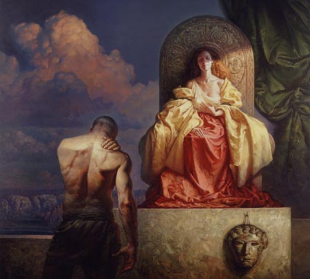
Pierre-Auguste Cot

Pierre-Auguste Cot is one of those painters known primarily by one popular image, in this case The Storm, above, a commissioned image that Cot exhibited in the Paris Salon of 1880.The painting has become part of pop high-culture (not quite pop culture) and has often been visually referenced or parodied, as in this portrait of Woody Allen and Mia Farrow by Edward Sorel.
Cot was a French Classical Academic painter, whose legacy also includes one other painting that retains popular appeal to this day, Springtime. Both of these works are of the idyllic, classical tradition in which the subjects and their surroundings are idealized. There is a Baroque feeling of fantasy/romance to them that accounts in large part for their popularity, in addition to Cot’s confident handling and strong figure work (not to mention a bit of sexy suggestion).
Cot studied under several French Academic masters, including William-Adolphe Bouguereau. As with Bouguereau, Cot’s work was very popular in his own time, but fell into disdain during the systematic disparagement of academic art by the moderninst establishment in the latter half of the 20th Century.
The Storm is in the collection of the Metropolitan Museum of Art in New York (I found a close-up of it that someone posted on Flickr). Springtime, although privately owned, was also on display there for a number of years, though I don’t know if it is still hanging at the Met.
There are also some of Cot’s other works reproduced in books and on the net, though few of the portraits that were actually his primary focus.
Categories:
-
Jamie Caliri (update)
 Though not the mini-masterpiece of its predecessor, the latest animated closing film credit from director Jamie Caliri is still a nifty piece of paper cut-out animation.
The closing credits for Madagascar: Escape 2 Africa can be viewed on a terrific site called Forget the film, watch the titles, that I’ve written about before here and here.
Caliri’s previous animated movie title sequence, the closing credits for Lemony Snicket’s Series of Unfortunate Events was one of the best short sequences of animation I’ve seen in some time; as was his wonderful ad for United Airlines called Dragon, which I wrote about in my previous post on Jamie Caliri.
There is a short on The Making of Dragon on the same page as the short itself on the United Airlines site, and some production photos and full credits on Caliri’s site.
There is also a page devoted to information about the Lemony Snicket credits.
All of them were done with paper cut-out stop-motion animation, a wonderful antidote to the overload of hyper-kinetic 3-D CGI animation that we’re being inundated with on all fronts; and a clear reminder that it’s imagination and skill that make good animation, not expensive technology.
Categories:
-
John F. Carlson
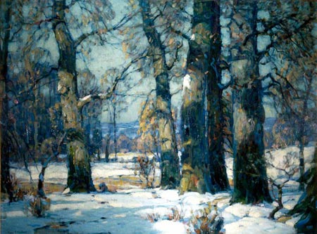
I woke up to an uncharacteristic November snow here in Philadelphia, and my mind jumped to the beautiful woodland snow scenes of John Carlson.Born in Sweden, John Fabian Carlson moved to the U.S. with his family at the age of nine. He studied art in the evenings and worked as a lithographer during the day, helping to support his family until he was 28.
He then moved to New York and attended the Art Students League on a scholarship, studying with Frank DuMond, and later with Birge Harrison at Woodstock. During his time in New York he also worked as an illustrator, but I’ve been unable to find images of his illustration work.
Carlson became associated with the Art Students League, serving as Birge Harrison’s assistant when the League began classes in Woodstock, and later succeeding him as director. He was later director of the Broadmore Art Academy in Colorado, but returned to Woodstock to found the John F. Carlson School of Landscape Painting.
Though not considered an American Impressionist, he shared their penchant for combining a strong academic foundation with free, painterly brushwork and bright, expressive color, particularly in his later work.
He became devoted to the subject of woods in winter, often in snow – a subject in abundance in Woodstock, in which he found rich variation in color, dramatic arrangements of value and composition, and subtle atmospheric effects.
It’s interesting to compare him to painters like the Pennsylvania Impressionist Edward Redfield, who pursued similar subject matter, and displayed an equally hardy devotion to winter painting out of doors.
Carlson codified some of his teachings into a book, still in print after almost 80 years, as Carlson’s Guide to Landscape Painting.
Despite the somewhat outdated tone of voice, the book is a treasure of landscape paintings fundamentals; and is one of those painting reference books that you come back to again and again, discovering more as your own understanding deepens over time.
Don’t be put off by the fact that the images are in black and white (though a color version would be a wonderful thought for some publisher to pursue), think of the book as akin to books by Hawthorne or Sloan, that are valuable without illustrations at all, and then think of the black an white images in Carlson’s book as a deluxe bonus.
The sections on atmospheric and linear perspective alone are worth the Dover paperback edition’s modest price of ten dollars.
I’ve found a scattering of Carlson’s paintings on the web. Though unfortunately none are large; they are enough to give you a taste of the beautiful atmosphere and compositional geometry that, combined with his mastery of tree forms and obvious love for his subjects, give his winter scenes deep visual and emotional warmth.
Categories:
-
Ronald Kurniawan

Ronald Kurniawan is a Los Angeles based illustrator who graduated from the Art Center College of Design in Pasadena.His highly stylized imagery combines animals and natural forms with geometric constructs, typographic elements, mechanical devices, odd characters and cultural ephemera into marvelous, collage-like visual smorgasbords.
His characters careen, gambol and fly through unlikely environments, alternately alive with insane glee or oppressed with the weight of imminent doom. Likewise his palette and textural range varies from grungy to pop-radiant, with lots of lively variations in between.
His clients include The New York Times, Time, Spectral Magazine, Men’s Health, Mother Jones, LA Weekly, INC magazine, Entertainment Weekly, Village Voice, Saatchi NY, McCann Erickson, LACMA, Sony Pictures Entertainment, Mattel Inc., Toyota, Turner Broadcasting System, Disney Consumer and Design Studio Press.
There are several sections of imagery on his site, along with sections of sketches, sculptures and available books of his work.
Kurniawan also does gallery work, and a number of his pieces will be on display as part of the upcoming Line Weight group show at Gallery Nucleus in Alhambra, CA from November 22 to December 7, 2008. Though many are already sold, there are items of his available in the gallery store.
There are interviews with Kurniawn on Websteem Art & Design and FMCS, and a profile on Illustration Mundo.
(Image above is a poster for the West Hollywood Book Fair, illustration by Ronald Kurniawan, graphic design by Ryan Ward.)
Categories:
-
Urban Sketchers

I just discovered the Urban Sketchers blog a couple of weeks ago, and it immediately became one of my favorites.I enjoy location sketches done in an urban environment, particularly travel sketches, and the blog has much of that feeling, even though the contributors are often sketching in their home city.
I came across Urban Sketchers by way of Katherine Tyrrell, who is one of the correspondents, and contributes from London (see my post on Katherine Tyrrell).
In addition to Tyrell, contributing artists that I have featured previously on Lines and Colors include Lok Jansen and Laura Frankstone.
Other contributors are from various cities in France, Spain, Italy, Denmark, Norway, Germany, Russia and other locations in Europe; a number of cities in the US, including New York, San Francisco, and Seattle, as well as cities in Canada and other parts of the globe, like Tokyo, Bangkok, Tal-Aviv and Sao Paulo. You can see the contributors listed by location in the side bar.
There is also a Meet the Correspondents page, on which some of the contributors give short profiles of themselves, their subject cities and their sketching practices.
There is a variety of approaches in medium, drawing style and subject matter, though some common themes, like the frequent use of the ubiquitous and oh-so-convenient Moleskine sketchbooks, and a consistently high level of quality.
The blog is an extension of the Urban Sketchers Flickr group started in 2007 by Seattle illustrator/journalist Gabi Campanario.
The subtitle of the blog is “See the world one drawing at a time”, and though the blog has only been up since October, with an “official” launch on November 1st, there is already a world of images posted from the multiple contributors.
Next to traveling and sketching yourself, what better way to see the world than through the eyes and pens of artists?
(Images above, left to right, top to bottom: Alessandro Andreuccetti, Rob Carey, Gabi Campanario, Lok Janssen, Laura Genz, Matthew Cenich)
Categories:
-
Petar Meseldžija
Petar Meseldžija is a Serbian artist who started in comics, publishing a comic called Krampi in the comic magazine Stripoteka and working on a short licensed Tarzan series.He then went on to study painting at the Art Academy in Novi Sad and began to take on illustration work, eventually abandoning comics for illustration and gallery painting.
Meseldžija works in a fantasy vein; his atmospheric and highly textured visions of other worlds have tactile presence and lively energy.
He frequently seems to control space with areas of the canvas, both objects and negative space, blocked out by dominant areas of color, within which there are more subtle variations.
His online galleries showcase both his illustration and gallery art.
His gallery paintings also often take on a fantasy motif, with touches of beautifully handled classical drapery and dramatic lighting. You will also find more traditional portraits and still life subjects as well as some nicely immediate and painterly landscapes.
Categories:


Charley’s Picks
Bookshop.org
(Bookshop.org affilliate links; sales benefit independent bookshop owners; I get a small percentage to help support my work on Lines and Colors)

John Singer Sargent: Watercolors


Urban Sketching: Understanding Perspective


Charley’s Picks
Amazon
(Amazon.com affiliate links; sales go to a larger yacht for Jeff Bezos; but I get a small percentage to help support my work on Lines and Colors)
John Singer Sargent: Watercolors
Urban Sketching: Understanding Perspective