
Categories
- 3d CGI
- Amusements
- Animation
- Anime & Manga
- Art Materials
- Art Videos
- Blogroll
- Cartoons
- Color
- Comics
- Concept & Visual Dev.
- Creativity
- Digital Art
- Digital Painting
- Displaying Art on the Web
- Drawing
- Eye Candy for Today
- Gallery and Museum Art
- High-res Art Images
- Illustration
- Motion Graphics & Flash
- Museums
- Online Museums
- Outsider Art
- Painting
- Painting a Day
- Paleo Art
- Pastel, Conté & Chalk
- Pen & Ink
- Prints and Printmaking
- Reviews
- Sc-fi and Fantasy
- Sculpture & Dimensional
- Site Comments
- Sketching
- Storyboards
- Tools and Techniques
- Uncategorized
- Vector Art
- Videos & Podcasts
- Vision and Optics
- Watercolor and Gouache
- Webcomics
Archives
- May 2026
- April 2026
- March 2026
- February 2026
- January 2026
- December 2025
- November 2025
- October 2025
- September 2025
- August 2025
- July 2025
- June 2025
- May 2025
- January 2025
- December 2024
- November 2024
- October 2024
- September 2024
- August 2024
- June 2024
- April 2024
- March 2024
- February 2024
- January 2024
- December 2023
- November 2023
- October 2023
- September 2023
- August 2023
- July 2023
- May 2023
- April 2023
- March 2023
- February 2023
- January 2023
- December 2022
- November 2022
- September 2022
- August 2022
- July 2022
- June 2022
- May 2022
- April 2022
- March 2022
- February 2022
- January 2022
- December 2021
- November 2021
- October 2021
- September 2021
- August 2021
- July 2021
- June 2021
- May 2021
- April 2021
- March 2021
- February 2021
- January 2021
- December 2020
- November 2020
- October 2020
- September 2020
- August 2020
- July 2020
- June 2020
- May 2020
- April 2020
- March 2020
- February 2020
- January 2020
- December 2019
- November 2019
- October 2019
- September 2019
- August 2019
- July 2019
- June 2019
- May 2019
- April 2019
- March 2019
- February 2019
- January 2019
- December 2018
- November 2018
- October 2018
- September 2018
- August 2018
- July 2018
- June 2018
- May 2018
- April 2018
- March 2018
- February 2018
- January 2018
- December 2017
- November 2017
- October 2017
- September 2017
- August 2017
- July 2017
- June 2017
- May 2017
- April 2017
- March 2017
- February 2017
- January 2017
- December 2016
- November 2016
- October 2016
- September 2016
- August 2016
- July 2016
- June 2016
- May 2016
- April 2016
- March 2016
- February 2016
- January 2016
- December 2015
- November 2015
- October 2015
- September 2015
- August 2015
- July 2015
- June 2015
- May 2015
- April 2015
- March 2015
- February 2015
- January 2015
- December 2014
- November 2014
- October 2014
- September 2014
- August 2014
- July 2014
- June 2014
- May 2014
- April 2014
- March 2014
- February 2014
- January 2014
- December 2013
- November 2013
- October 2013
- September 2013
- August 2013
- July 2013
- June 2013
- May 2013
- April 2013
- March 2013
- February 2013
- January 2013
- December 2012
- November 2012
- October 2012
- September 2012
- August 2012
- July 2012
- June 2012
- May 2012
- April 2012
- March 2012
- February 2012
- January 2012
- December 2011
- November 2011
- October 2011
- September 2011
- August 2011
- July 2011
- June 2011
- May 2011
- April 2011
- March 2011
- February 2011
- January 2011
- December 2010
- November 2010
- October 2010
- September 2010
- August 2010
- July 2010
- June 2010
- May 2010
- April 2010
- March 2010
- February 2010
- January 2010
- December 2009
- November 2009
- October 2009
- September 2009
- August 2009
- July 2009
- June 2009
- May 2009
- April 2009
- March 2009
- February 2009
- January 2009
- December 2008
- November 2008
- October 2008
- September 2008
- August 2008
- July 2008
- June 2008
- May 2008
- April 2008
- March 2008
- February 2008
- January 2008
- December 2007
- November 2007
- October 2007
- September 2007
- August 2007
- July 2007
- June 2007
- May 2007
- April 2007
- March 2007
- February 2007
- January 2007
- December 2006
- November 2006
- October 2006
- September 2006
- August 2006
- July 2006
- June 2006
- May 2006
- April 2006
- March 2006
- February 2006
- January 2006
- December 2005
- November 2005
- October 2005
- September 2005
- August 2005
Relevant Blogs
Art, Painting & Sketch
- Gurney Journey
- Underpaintings
- Art and Influence
- Painting Perceptions
- Oil Painters of America
- Vasari Paint POV
- Flying Fox
- Urban Sketchers
- Bento (Smithsonian)
- Art Inconnu
- The Hidden Place
- Still Life
- Making a Mark
- The Art of the Landscape
- Exploring Color & Creativity
- Art Contrarian
- Artist A Day
- beinArt Surreal Art Collective
- Eye Level
- David Dunlop
- p.i.g.m.e.n.t.i.u.m
- CultureGrrl
- Joaquín Sorolla blog
- Artists in Pastel
“Painting a Day”
- A Painting a Day (Keiser)
- On Painting (Keiser)
- Julian Merrow-Smith
- Karen Jurick
- Jeffrey Hayes
- Carol Marine
- Abbey Ryan
- Daily Paintworks
Other Painting Blogs
- Virtual Gouache Land
- Neil Hollingsworth
- Marc Hanson
- Kevin Menck
- Marc Dalessio
- Larry Seiler
- Stapleton Kearns
- Colin Page
- Roos Schuring
- Hans Versfelt
- Titus Meeuws
- Régis Pettinari
- René Plein Air
- Belinda Del Pesco
- Robin Weiss
- Nathan Fowkes (Land Sketch)
- William Wray
- Frank Serrano
- Stephen Magsig
- Michael Chesley Johnson
- Twice a Week
- Sarah Wimperis
- Rob Adams
- Michael Cole Manley
- The Dirty Palette Club
- Mike Manley’s Draw!
Gallery Art & Illustration mix
Illustration
- Howard Pyle
- 100 Years of Illustration
- BibliOdyssey
- Illustration Art
- Today’s Inspiration
- Illustration Mundo
- Little Chimp Society
- Danny Gregory
- R D (John Martz
- Illustration Friday blog
- Monster Brains
- Illustrators & Illustrations (RU)
- Elwood H. Smith
- DaniDraws.com
- Designers Who Blog
- iSpot Blog
Sci-Fi & Fantasy
Illustration & Comics
Comics & Cartoons
- Comics Beat
- Robot 6
- Newsarama Blog
- Comic Vine
- Comics Alliance
- Forbidden Planet Int.
- Paolo Rivera
- Bolt City
- Flight
- Scott McCloud
- The Comics Journal
- Comixpedia
- Funnybook Babylon
- James Baker
- Middleton’s Sketchbook
- Boneville
- The Hotel Fred
- Paul Rivoche
- Daily Cartoonist
- Mad About Cartoons (William Wray)
- Digital Strips
Illustration & Concept
Animation & Concept
- Cartoon Brew
- Animation Blog
- Cold Hard Flash
- Concept Art World
- The CAB
- FY Concept Art
- Concept Ships
- Concept Robots
- John Nevarez
- Armand Serrano
- Marcos Mateu-Mestre
- all kinds of stuff (Kricfalusi)
- Yacin the faun (Man Arenas)
- Kelsey Mann
- Cre8tivemarks Blog
- Ice-Cream Monster Toon Cafe
- AAU Character & Creature Design
- AAU Animation Notes
- Articles and Texticles
Paleo & Scientific
Tools & Techniques
Other
Lists of Art Blogs
Art Image Resource Links
Historic Art Images
- Wikimedia Commons: Paintings
- Wikimedia Commons: Drawings
- The Athenaeum
- WikiArt (WikiPaintings)
- Google Art Project: Artists
- Google Art Project: Collections (Museums)
- ArtCyclopedia
- Web Gallery of Art
- Art Renewal Center
- Web Gallery of Impressionism
Auction Consolidation sites
Auction sites
- Sotheby’s
- Bonham’s
- Christies
- Heritage Auctions: Fine Art
- Heritage Auctions: Illustration
- Freeman’s Auctions
- Bukowskis
- Shannon’s
Image Search
Reverse Image Search (search by image)
- Tin Eye
- RevImg
- Google Image Search (camera icon)
- Bing Image Search (camera icon)
Promoting some friends and some clients of my website design business
- Twin Willows T’ai Chi studio in Wilmington DE. Taiji classes with Bryan Davis.
- Ray Hayward, Inspired Teacher of T’ai Chi ( Taiji ) in Minneapolis, Founder of Mindful Motion Tai Chi Academy
- OldHead Tattoo studio and Art Gallery in Wilmington DE. Tattoos and paintings by Bruce Gulick
- Sharon Domenico Art, pet portrait oil paintings
- Platinum Paperhanging, wallpaper hanging, Main Line and Philadelphia, PA
- Lisa Stone Design, interior designer, Main Line and Philadelphia, PA
- Studio12KPT, original art, prints, calendars and other custom printed items by Van Sickle & Rolleri
-
Vasari Classic Artists’ Oil Colors
Most artists who work in oils recognize three general grades of oil paints. For lack of better terms, they can be called student grade, artist grade and premium grade. There are numerous levels of variation within those categories, of course, but they will do as a generalization.In student grade paints, the price is kept to a minimum and an attempt is often made to keep a level of price consistency across most colors, both by using fillers and extenders in the paints and by substituting “hues” for expensive pigments.
(When you see the word “hue” in the name of an oil paint, it means a substitute for a particular pigment, created by trying to match that pigment’s hue with other, often cheaper pigments, sometimes mixtures of two or more. For example, paint labeled “Cadmium Yellow” is made with cadmium sulfide, an expensive material that produces a beautiful color with excellent covering strength; but “Cadmium Yellow Hue” is made with materials other than cadmium, like arylide, that are modified to initially look like Cadmium Yellow out of the tube, but in use produce a weaker, less desirable color.)
Some examples of familiar student grade oil paints would be Winsor & Newtons’ “Winton” line, or Grumbacher’s “Academy” student grade paints.
The middle level, “artist grade” would correspond to Winsor & Newton’s more familiar “Artist’s” line of oil colors, or those by Gamblin or Holbein. These are noticeably more expensive than student grade paints, and within any of these lines, the range of prices for different pigments within the same brand varies more dramatically, reflecting the varying cost of the actual pigments.
These are the most familiar oil paints. They have fewer fillers or extenders than student grade paints, though there is often some adulteration to facilitate machine-filling of tubes or to maintain a price point for competition within the larger art materials market.
The third level is perhaps less familiar to some, and that is premium grade artist’s oil colors. In these, the manufacturers compete more on quality and reputation than on price, working to produce paints that are more pure combinations of pigment and oil, using higher quality materials and taking greater pains in the preparation and grinding of the pigments. Often the tubes must be filed by hand when additives intended to make machine filling practical are eschewed.
Familiar names in this category might be brands like Old Holland or Williamsburg. They sell at a premium price, often considerably more expensive than the mass market “artist’s” colors, and the difference in price between expensive and inexpensive pigments within a given brand (e.g. between cobalt colors and earth colors) is even more dramatic.
I think most experienced painters have learned that student grade paints are seldom the bargain they are positioned as, their much weaker pigments actually require more paint to produce a similar effect in mixtures, and they often evidence an overall dullness of color and less than desirable handling characteristics. “Hue” colors in particular, are usually much weaker than their nominal genuine pigment counterparts.
Many painters, though, find a similar value in using premium grade paints over the more common artists grade, with an apparently similar valuation of the latter as false economy. They find the more intensely pigmented formulations and handling characteristics of premium oil colors worth the higher initial cost.
Others will insist that the main difference in premium grade paints is just marketing and branding, and don’t see a difference in value worth the expenditure (and will sometimes be quite adamant about it).
Some will pick and choose particular colors from one range or the other, as they prefer certain colors by certain paintmakers and find them individually worth the expense. (There are also proprietary colors, mixtures formulated by particular paintmakers that are not offered by others.)
Until recently, my personal experience had been limited to the first two grades of oil colors, understanding the value of using artist grade paints over student grade, but thinking of the premium colors as an unnecessary luxury — nice if you can afford it, but not likely to make enough of a difference in the practical sense to justify the expense on my part — basically an “Audi vs. Toyota” kind of difference.
There is something to be said, however, for making your judgment after having driven an Audi and then going back to driving a Toyota. Similarly, I’ve found that having had the opportunity to work with premium artists oil paints has changed my attitude about their value.
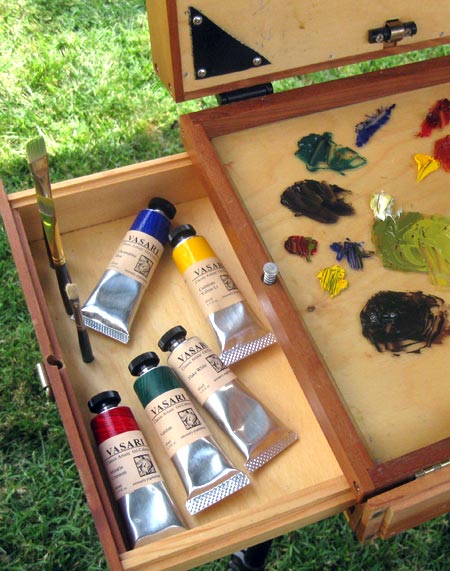
The paints I’ve had the opportunity to work with are from a small independent paintmaker called Vasari Classic Artists’ Oil Colors, and here I must make a disclaimer.
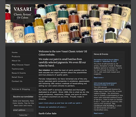
Though I was familiar with them by name, my experience in actually using Vasari’s paints came about as the result of being hired in my capacity as a website designer to design a new website for them. Their current site is the one I designed (image above). So there is, of course, no way I can claim to be impartial. They are my client.
That being said, I think most readers of Lines and Colors know that I rarely mention something in my posts unless I actually think it’s of value, and I pretty much shoot straight from the hip, so you can balance those factors out and make your own judgment.
Vasari is in many circles the highest ranked of the premium oil paint makers, commanding a premium price and available only through their website (with a $100 minimum order) or at their one retail store in NY, but not in chain stores, catalogs or online art supply companies. They are smaller than most, and devote their efforts only to making oil colors, no other art materials or types of paints.
In the course of an initial meeting with Stephen Salek, the founder and principal paintmaker behind Vasari, he asked about what paints, and specifically what colors I use. Shortly thereafter, I received a box from Vasari in which he had sent me samples of his versions of the colors in my regular palette (which are fairly common), with, I thought, the intention of seeing if they would convince me of the superior quality of his paint while I was in the process of working on his website.

So I set out my usual palette using their colors to give them a test drive. I suppose I was expecting to notice some small difference between their paint and the regular artist grade I have been used to, but I frankly wasn’t thinking it would be dramatic.
I was wrong. I was surprised. I was delighted.
The paints handle with a smooth consistency quite unlike other paints I’ve used. The colors have a vibrancy and subtle strength that kept me fascinated with them.
For the first couple of weeks, in fact, it was a bit distracting. I would be mixing colors while painting and find myself getting lost in just mixing and playing with the colors. I would be in the process of mixing a color and stop partway through, thinking “That’s not the color I’m trying to mix yet, but OMG that’s a beautiful color!”
After working with the initial set of colors for a while, I turned around and bought another box of their paint, filling out from my normal limited palette of six colors to my extended one of twelve, dying to see what their Cobalt Blue and Transparent Red Oxide were like, fascinated with my paints in a way that I haven’t experienced since I was in art school.
Since then, I have tried going back to my other paints and found it disappointing, and I have to say that I’m now rather spoiled. Not only are these paints wonderful to work with, I see a difference in the surface quality and color of my finished paintings.
Of course, using premium paint won’t necessarily make someone a better painter, any more than better brushes or higher quality canvas. A good artist can make a good painting with cheap materials — but it will be more difficult. If I have the option of using the best materials I can get, why not take advantage of them?
I’m not suggesting that everyone run out and buy premium oil paints; their relevance to any individual artist will inevitably depend on each artist’s values and personality — i.e. “Your milage may vary.” I’m just reporting on my personal experience.
Some will fall on the side of not finding the difference significant enough, but some may find the experience an eye-opener, as I did.
To be clear, I don’t mean to intimate here that regular mass market artists grade oil paints are somehow “bad” or inadequate, just that there is value in the difference found in premium paints.
I should also point out that the Vasari Classic Artists’ Oil Colors are the only premium oil paints I’ve worked with to any significant extent, so I can’t make any across the range comparisons. However, I have done some reading in artist forums and blogs about comparisons between premium brands, and have found that when Vasari is mentioned, they’re generally at the top of the list of premium artists’ oil colors.
The take-away is simply that in my experience there is a significant difference between regular artist grade oil colors and premium colors like Vasari; and that if you have the opportunity to try them (and aren’t afraid of being spoiled), they may well be worth a look.
Now, if you’ll excuse me, I want to get back to playing with these beautiful colors… oh yes, and painting.
Categories:
-
Victor Nizovtsev

Victor Nizovtsev was born in Russia and studied at the Ilia Repin Collge for Art in Chisinau, Moldavia and the Vera Muhina University for Industrial Arts in St. Petersburg. He now lives in the U.S. in Maryland.His paintings have some of the narrative character of Golden Age children’s book illustration, and draw on influences from Art Nouveau, Symbolist and other 19th century painters (in particular John Singer Sargent’s Carnation, Lily, Lily, Rose), but have a contemporary feel.
His subjects include repeated dream-like themes of mermaids, floating lanterns, colorful jesters, playing card kings and queens, storybook villages and playful children. These are arranged in seemingly narrative compositions and portrayed in vibrant color with wonderful elements of texture, at times reminiscent of Gustav Klimt’s decorative textural areas.
I haven’t been able to find a dedicated site or blog for Nizovtsev, but his work is represented by at least two galleries, and there are several mentions of his work on other blogs and art sites.
The McBride Gallery in Anapolis, MD, seems to be his primary gallery, offering both originals and giclee prints, and including some bio information on their site. There are several pages of images (though some links are broken).
His work is reproduced larger elsewhere, however, such at Tutt’ Art and Inspirations. I’ve listed what other sources I could find below.
[Suggestion courtesy of Tim Poorman]
Categories:
-
Eye Candy for Today: Tiffany’s Cairo

On the Way between Old and New Cairo, Citadel Mosque of Mohammed Ali, and Tombs of the Mamelukes by Louis Comfort Tiffany.Tiffany is better known for his stained glass and decorative works, but was a skilled painter in the orientalist vein.
In the Brooklyn Museum. Click “Download” under the image and choose a size.
See my post on Louis Comfort Tiffany.
Categories:
-
Aaron Schuerr
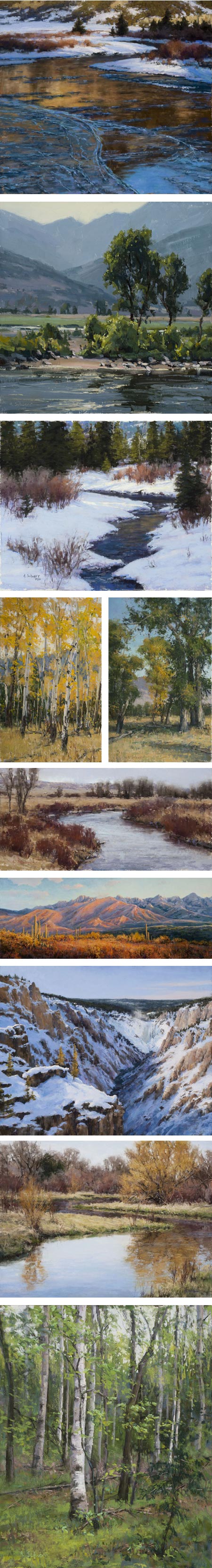
Aaron Schuerr portrays the mountains, streams and woodlands of his adopted home of Montana in both oil and pastel.His plein air works show a subtle appreciation for the fleeting effects of light, and his painterly approach demonstrates a keen awareness of the importance of edges. Though mountains are his most frequent subject, I particularly enjoy his compositions that include small streams and rivers.
When viewing the sections of work on his website for both available and archived work be aware that there are multiple pages for each, accessed from small linked dots at the bottom of the pages. yon can find additional examples of his work on his blog, and on the websites of galleries in which he is represented (listed below).
Categories:
-
David Wyatt (update)
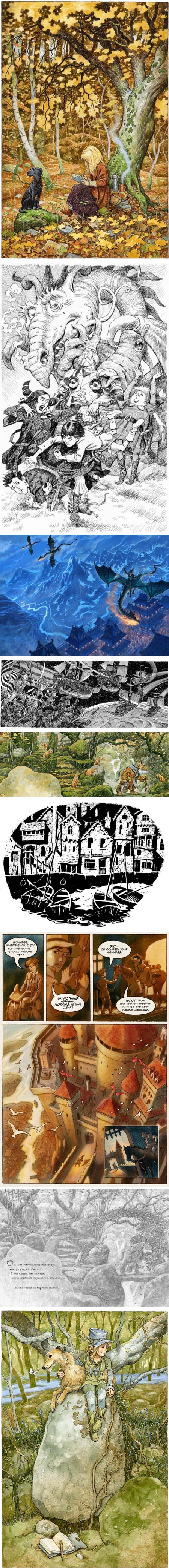
David Wyatt is a UK based illustrator working primarily in the fantasy genre for children’s books.Since I wrote about him in 2009, Wyatt has a new website and a new blog, along with, of course, lots of delightful new material online.
In many of his feature illustrations, done in watercolor, Wyatt has a richly detailed style, but manages to maintain a loose sketch-like quality that I find particularly appealing. He also nicely controls his colors, wonderfully capturing the feeling of moss lined glens and ancient stones.
He also has a texturally detailed pen and ink style, that appears to draw influence from pen and ink greats like Franklin Booth and Joseph Clement Coll (with perhaps a bit of Berni Wrightson, who drew from the same well). Wyatt also has a spare, direct chiaroscuro ink style that nicely suits interior book pages, and a pencil style that ranges from intricate to more direct.
His website has gallery sections for book covers, picture books, pen and ink and pencil. On his blog you will find additional art, works in progress, and articles on other topics of interest. In addition he maintains a gallery on deviantART, and an Etsy shop where you can find prints, cards and original artwork.
Wyatt is also the author/artist of the online graphic story SunSound (above, third from bottom).
For more, see my previous post on David Wyatt.
Categories:
-
Delbert Gish
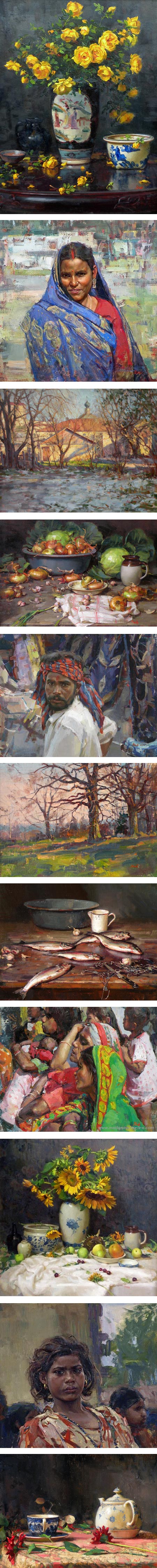
Delbert Gish is an American painter who received his master of fine arts degree from the University of Idaho, but went on from there to study with late 20th century and contemporary masters Sergei Bongart, David Leffel, Harvey Dinnerstein, Burton Silverman and Nelson Shanks.The legacy of his study with those painters is reflected in his subtle and beautifully balanced still life, incisive portraits and crisp, fresh landscapes. His figurative work and landscapes are often from his travels in Russia, India and Rwanda.
I have been unable able to find a dedicated website of blog for Gish, but his work can be seen on the site of the Mockingbird Gallery, Art Spirit Gallery and others I’ve linked below
Categories:


Charley’s Picks
Bookshop.org
(Bookshop.org affilliate links; sales benefit independent bookshop owners; I get a small percentage to help support my work on Lines and Colors)

John Singer Sargent: Watercolors


Urban Sketching: Understanding Perspective


Charley’s Picks
Amazon
(Amazon.com affiliate links; sales go to a larger yacht for Jeff Bezos; but I get a small percentage to help support my work on Lines and Colors)
John Singer Sargent: Watercolors
Urban Sketching: Understanding Perspective