
Categories
- 3d CGI
- Amusements
- Animation
- Anime & Manga
- Art Materials
- Art Videos
- Blogroll
- Cartoons
- Color
- Comics
- Concept & Visual Dev.
- Creativity
- Digital Art
- Digital Painting
- Displaying Art on the Web
- Drawing
- Eye Candy for Today
- Gallery and Museum Art
- High-res Art Images
- Illustration
- Motion Graphics & Flash
- Museums
- Online Museums
- Outsider Art
- Painting
- Painting a Day
- Paleo Art
- Pastel, Conté & Chalk
- Pen & Ink
- Prints and Printmaking
- Reviews
- Sc-fi and Fantasy
- Sculpture & Dimensional
- Site Comments
- Sketching
- Storyboards
- Tools and Techniques
- Uncategorized
- Vector Art
- Videos & Podcasts
- Vision and Optics
- Watercolor and Gouache
- Webcomics
Archives
- May 2026
- April 2026
- March 2026
- February 2026
- January 2026
- December 2025
- November 2025
- October 2025
- September 2025
- August 2025
- July 2025
- June 2025
- May 2025
- January 2025
- December 2024
- November 2024
- October 2024
- September 2024
- August 2024
- June 2024
- April 2024
- March 2024
- February 2024
- January 2024
- December 2023
- November 2023
- October 2023
- September 2023
- August 2023
- July 2023
- May 2023
- April 2023
- March 2023
- February 2023
- January 2023
- December 2022
- November 2022
- September 2022
- August 2022
- July 2022
- June 2022
- May 2022
- April 2022
- March 2022
- February 2022
- January 2022
- December 2021
- November 2021
- October 2021
- September 2021
- August 2021
- July 2021
- June 2021
- May 2021
- April 2021
- March 2021
- February 2021
- January 2021
- December 2020
- November 2020
- October 2020
- September 2020
- August 2020
- July 2020
- June 2020
- May 2020
- April 2020
- March 2020
- February 2020
- January 2020
- December 2019
- November 2019
- October 2019
- September 2019
- August 2019
- July 2019
- June 2019
- May 2019
- April 2019
- March 2019
- February 2019
- January 2019
- December 2018
- November 2018
- October 2018
- September 2018
- August 2018
- July 2018
- June 2018
- May 2018
- April 2018
- March 2018
- February 2018
- January 2018
- December 2017
- November 2017
- October 2017
- September 2017
- August 2017
- July 2017
- June 2017
- May 2017
- April 2017
- March 2017
- February 2017
- January 2017
- December 2016
- November 2016
- October 2016
- September 2016
- August 2016
- July 2016
- June 2016
- May 2016
- April 2016
- March 2016
- February 2016
- January 2016
- December 2015
- November 2015
- October 2015
- September 2015
- August 2015
- July 2015
- June 2015
- May 2015
- April 2015
- March 2015
- February 2015
- January 2015
- December 2014
- November 2014
- October 2014
- September 2014
- August 2014
- July 2014
- June 2014
- May 2014
- April 2014
- March 2014
- February 2014
- January 2014
- December 2013
- November 2013
- October 2013
- September 2013
- August 2013
- July 2013
- June 2013
- May 2013
- April 2013
- March 2013
- February 2013
- January 2013
- December 2012
- November 2012
- October 2012
- September 2012
- August 2012
- July 2012
- June 2012
- May 2012
- April 2012
- March 2012
- February 2012
- January 2012
- December 2011
- November 2011
- October 2011
- September 2011
- August 2011
- July 2011
- June 2011
- May 2011
- April 2011
- March 2011
- February 2011
- January 2011
- December 2010
- November 2010
- October 2010
- September 2010
- August 2010
- July 2010
- June 2010
- May 2010
- April 2010
- March 2010
- February 2010
- January 2010
- December 2009
- November 2009
- October 2009
- September 2009
- August 2009
- July 2009
- June 2009
- May 2009
- April 2009
- March 2009
- February 2009
- January 2009
- December 2008
- November 2008
- October 2008
- September 2008
- August 2008
- July 2008
- June 2008
- May 2008
- April 2008
- March 2008
- February 2008
- January 2008
- December 2007
- November 2007
- October 2007
- September 2007
- August 2007
- July 2007
- June 2007
- May 2007
- April 2007
- March 2007
- February 2007
- January 2007
- December 2006
- November 2006
- October 2006
- September 2006
- August 2006
- July 2006
- June 2006
- May 2006
- April 2006
- March 2006
- February 2006
- January 2006
- December 2005
- November 2005
- October 2005
- September 2005
- August 2005
Relevant Blogs
Art, Painting & Sketch
- Gurney Journey
- Underpaintings
- Art and Influence
- Painting Perceptions
- Oil Painters of America
- Vasari Paint POV
- Flying Fox
- Urban Sketchers
- Bento (Smithsonian)
- Art Inconnu
- The Hidden Place
- Still Life
- Making a Mark
- The Art of the Landscape
- Exploring Color & Creativity
- Art Contrarian
- Artist A Day
- beinArt Surreal Art Collective
- Eye Level
- David Dunlop
- p.i.g.m.e.n.t.i.u.m
- CultureGrrl
- Joaquín Sorolla blog
- Artists in Pastel
“Painting a Day”
- A Painting a Day (Keiser)
- On Painting (Keiser)
- Julian Merrow-Smith
- Karen Jurick
- Jeffrey Hayes
- Carol Marine
- Abbey Ryan
- Daily Paintworks
Other Painting Blogs
- Virtual Gouache Land
- Neil Hollingsworth
- Marc Hanson
- Kevin Menck
- Marc Dalessio
- Larry Seiler
- Stapleton Kearns
- Colin Page
- Roos Schuring
- Hans Versfelt
- Titus Meeuws
- Régis Pettinari
- René Plein Air
- Belinda Del Pesco
- Robin Weiss
- Nathan Fowkes (Land Sketch)
- William Wray
- Frank Serrano
- Stephen Magsig
- Michael Chesley Johnson
- Twice a Week
- Sarah Wimperis
- Rob Adams
- Michael Cole Manley
- The Dirty Palette Club
- Mike Manley’s Draw!
Gallery Art & Illustration mix
Illustration
- Howard Pyle
- 100 Years of Illustration
- BibliOdyssey
- Illustration Art
- Today’s Inspiration
- Illustration Mundo
- Little Chimp Society
- Danny Gregory
- R D (John Martz
- Illustration Friday blog
- Monster Brains
- Illustrators & Illustrations (RU)
- Elwood H. Smith
- DaniDraws.com
- Designers Who Blog
- iSpot Blog
Sci-Fi & Fantasy
Illustration & Comics
Comics & Cartoons
- Comics Beat
- Robot 6
- Newsarama Blog
- Comic Vine
- Comics Alliance
- Forbidden Planet Int.
- Paolo Rivera
- Bolt City
- Flight
- Scott McCloud
- The Comics Journal
- Comixpedia
- Funnybook Babylon
- James Baker
- Middleton’s Sketchbook
- Boneville
- The Hotel Fred
- Paul Rivoche
- Daily Cartoonist
- Mad About Cartoons (William Wray)
- Digital Strips
Illustration & Concept
Animation & Concept
- Cartoon Brew
- Animation Blog
- Cold Hard Flash
- Concept Art World
- The CAB
- FY Concept Art
- Concept Ships
- Concept Robots
- John Nevarez
- Armand Serrano
- Marcos Mateu-Mestre
- all kinds of stuff (Kricfalusi)
- Yacin the faun (Man Arenas)
- Kelsey Mann
- Cre8tivemarks Blog
- Ice-Cream Monster Toon Cafe
- AAU Character & Creature Design
- AAU Animation Notes
- Articles and Texticles
Paleo & Scientific
Tools & Techniques
Other
Lists of Art Blogs
Art Image Resource Links
Historic Art Images
- Wikimedia Commons: Paintings
- Wikimedia Commons: Drawings
- The Athenaeum
- WikiArt (WikiPaintings)
- Google Art Project: Artists
- Google Art Project: Collections (Museums)
- ArtCyclopedia
- Web Gallery of Art
- Art Renewal Center
- Web Gallery of Impressionism
Auction Consolidation sites
Auction sites
- Sotheby’s
- Bonham’s
- Christies
- Heritage Auctions: Fine Art
- Heritage Auctions: Illustration
- Freeman’s Auctions
- Bukowskis
- Shannon’s
Image Search
Reverse Image Search (search by image)
- Tin Eye
- RevImg
- Google Image Search (camera icon)
- Bing Image Search (camera icon)
Promoting some friends and some clients of my website design business
- Twin Willows T’ai Chi studio in Wilmington DE. Taiji classes with Bryan Davis.
- Ray Hayward, Inspired Teacher of T’ai Chi ( Taiji ) in Minneapolis, Founder of Mindful Motion Tai Chi Academy
- OldHead Tattoo studio and Art Gallery in Wilmington DE. Tattoos and paintings by Bruce Gulick
- Sharon Domenico Art, pet portrait oil paintings
- Platinum Paperhanging, wallpaper hanging, Main Line and Philadelphia, PA
- Lisa Stone Design, interior designer, Main Line and Philadelphia, PA
- Studio12KPT, original art, prints, calendars and other custom printed items by Van Sickle & Rolleri
-
In the Forest of Fontainebleau

About 55km (35 miles) Southeast of Paris is a stretch of forest that could be considered the cradle of the modern practice of painting “en plein air” (“in the plain air” or simply “outdoors”), as well as the approach to painting that came to be called the “Barbizon School” and the style derived from them that would develop into French Impressionism.Here, artists like Jean-Baptiste Camille Corot, Théodore Rousseau, Jean-Francois Millet, Charles-François Daubigny and others gathered in the unofficial artists colony in the town of Barbizon, from which they could walk into the surrounding forrest, with their newly portable painting equipment in hand, and capture the drama and beauty of the still-wild landscape.
The practice of painting on location, while not entirely new, had not been practiced to such a degree or by such a large group of painters before, and the very choice these painters had made to make nature the center and subject of their paintings, rather than a backdrop for human activity, was radical; carrying forward the emphasis placed on landscape by English artist John Constable.
They were followed by the young Impressionist painters Claude Monet, Alfred Sisley, Frédéric Bazille and Auguste Renoir, who, at the urging of atelier master Charles Gleyre, traveled to the Fontainebleau Forest from nearby Paris to also exercise this new practice of painting directly from nature.
In the Forest of Fontainebleau: Painters and Photographers from Corot to Monet is a newly opened show at the National Gallery of Art in Washington, D.C., highlighting many of these painters, as well as artists in the new medium of photography, who found similar inspiration in the dramatic scenery of the forest.
Corot and Monet are the stars here, and Corot is the master; unsurprisingly as we are in his territory. Though most of the works here are large, finished studio works, you can see where they are informed by the open-air painting that they developed from, and many small location sketches are included as well. Here is not only the direct representation of nature and natural light, but the direct, open brushwork on which Impressionism, and many related schools of painting. would be based.
Corot is a favorite of mine, and will the subject of a dedicated future post, and he is at his finest here, with his remarkable presence for the individual “personalities” of trees in the midst of broader scenes.
Monet is presented as you rarely see him, as a mature painter, but prior to the development of the “Impressionist style”. Here is Monet in dark forest glades, painting directly and without the scattering of short brushstrokes, though obviously already fascinated with effect of dappled light and shade (image above, top). Sisley and Bazille are right at home with this style, and Renoir turns in terrific pieces as well. There are some famous works, like one of Monet’s preparatory panels for his abandoned attempt at Déjeunier sur l’Herbe, and Bazille’s Improvised Field Hospital, depicting Monet in bed nursing his banged-up leg.
Richard Parkes Bonington is represented by several pieces and Theodore Rousseau, who I was not that familiar with, impressed me with superb examples.
I was struck in particular by the work of other artists with whom I was only vaguely or not at all familiar, like Théodore d’Aligny, Robert-Leopold Leprince; wonderful work by Alexandre Desgoffe and a stunning landscape painting by Rosa Bonheur (image above, bottom); who I usually associate only with depictions of animals.
The exhibition is wonderful and quite extensive. It runs at the National Gallery in Washington until June 8, 2008. It then moves to the Museum of Fine Arts, Houston for a run from July 13-October 29, 2008. There is a short slide-show of some of the works on the exhibition’s page. There is also a catalog accompanying the exhibit, In the Forest of Fontainebleau: Painters and Photographers from Corot to Monet that has reasonably good reproductions (the Amazon link I give here is to the $60 hardback, there is also a $40 paperback).
If you get to the exhibition, don’t miss the permanent display of Small French Paintings, also in the East wing, which features many of the same painters; as well as more of their work still on display in the main galleries of the permanent collection (not to mention the NGA’s other amazing treasures, like the 3 [or 4, depending on your point of view] exquisite Vermeers…, but I digress).
I’ve come away from In the Forest of Fontainebleau not only renewed in my admiration for Corot, and with a fresh view of early Impressionism, but convinced more than ever that, with all due respect to Constable, the Forest of Fontainebleau is the birthplace of modern landscape painting.
Categories:
-
American Art Collector

American Art Collector is a national art magazine that you should be able to find at larger magazine shops and bookstores in most parts of the U.S.Ostensibly for art collectors, it’s of interest to artists as well. Unlike many magazines that cover the “art scene”, American Art Collector, focuses on contemporary representational art.
Each issue features about a dozen articles on individual artists who have gallery shows running concurrently with the release dates of the issue, and another 6 or 8 group shows. (The intention, of course, is to encourage the galleries to advertise in the issue showcasing their artists and shows.)
There are also articles on galleries, usually an in-depth one and several others showcased in an article on a particular geographic region of the U.S. (The current issue, March 2008, focuses on some galleries in Washington, D.C.)
There are also articles on the display of art in galleries, notes on exhibitions and the art market in the U.S. in general (again with a focus on representational art).
There are also lots of ads for artists, galleries and individual and group shows, that are entertaining and instructive in themselves, both in terms of seeing what is selling these days, an in terms of how galleries are representing themselves and their artists in print ads. There are also lots of URLs for galleries in their ads that you can check out, and a list of artists and advertisers in the back of the magazine. (It’s interesting to note an ad for the Daily Paintworks collaborative site, most of whose members I’ve featured on lines and colors.)
One of the things I think is most useful about the magazine is the presence of price guides in the articles on individual artists and the artists participating in group shows. Often these indicate the price for a range of sizes for the artists’ works, and a comparison with the prices they were commanding for similar work a year or several years earlier.
This is very informative in terms of getting a feeling for how particular artists are selling, comparing their styles, regional differences and the change over time as an artist’s reputation and following grows.
There are also interviews with both artists and gallery owners about pricing, selection and presentation of works, and a lot of other topics of concern to artists who are selling through galleries. There is also some discussion of painting techniques and approaches, but this is not at all a “how to” magazine.
The magazine has a web site that gives you some idea of the content, though it’s not as clear as it might be. There is a sort of preview of some of the current issues pages in a little interactive feature on the home page. (Unfortunately, it’s in one of those hideously cutsie “page-turning” Flash dealybobs that people just seem to love, likely for the same reason that they love paintings of dogs playing poker.)
If you go to the page for “Issues“, you’ll see a table of contents of the current issue, from which you could do a little Googling to check out some the artists mentioned; though it would certainly be easier to simply browse the issue at a newsstand if you have that option. You can also order copies of past issues. The newsstand price is $6.95 U.S.
All in all, I think this is worth a look for anyone interested in the realist and representational art market in the U.S., whether you are a patron, gallery owner or artist. (I’m sure there must be comparable publications in Europe and other parts of the world, but we seldom see them here in the U.S.)
American Art Collector magazine often features painters I’ve written about here on lines and colors. This month’s issue, for example, includes mention of Francis Livingston (image above, top) and Thomas Paquette.
Categories:
-
Sam Weber
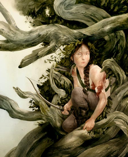
Sam Webber’s sometimes stark, sometimes lush illustrations always feel like they have hidden edge to them. In some ways they feel as though they have just been pulled back from being too edgy in some undefined way, and have been moderately groomed for mainstream acceptability; like a barbarian who has hidden his knives and washed up in order to secure lodging at the inn.Their sometimes smooth and delicately modeled passages are often contrasted with brusque forms that are dragged and scraped out of rough monochromatic textures. These sometimes have the feeling of marks made with bark dipped in ink, or an ogre’s fingerpaints. The forms he treats this way are usually those of natural elements, like tree limbs or the bodies of animals, that respond well to the suggestion of wildness and rough textures.
He will often work almost monochromatically, leaving a single color, like a pale red or pink, to punctuate the image. His conceptual framing of the illustrations, like the visual character of the drawings, encourages you to slow down, and consider what is presented with a little extra thought.
Weber was born in Alaska, grew up in Ontario and studied at the College of Art and Design in Calgary and the School of Visual Arts in New York.
His clients include The New Yorker, The New York Times, Time Magazine, Playboy, Wired Magazine, The Atlantic, The Village Voice, DC/Vertigo Comics, Scholastic, Random House and numerous other periodicals and publishers.
Weber lives in Brooklyn with illustrator Jillian Tamaki.
Weber’s online portfolio contains a number of his professional pieces as well as some personal projects and a sketchbook section.
His work looks to me like it is done with a combination of ink, ink wash and watercolor; and perhaps tree bark and ogre fingers.
Categories:
-
Patrick Arrasmith
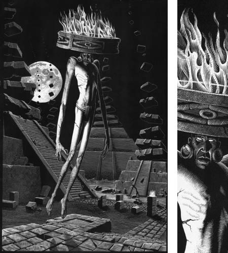
There is something particularly appealing about images created by an artist who is strongly skilled in the medium of scratchboard. This slightly arcane and quite demanding medium is the through-the-looking-glass version of pen and ink; in which black ink is taken away from the coating on a clay-surfaced board, and the image is built from lights rather than from darks.It may be the texture, the balance of dark to light, or the characteristic line work, but I often find scratchboard images particularly compelling.
Patrick Arrasmith is an accomplished illustrator who works primarily in scratchboard, and his work is an excellent case in point.
Arrasmith’s clients include The New York Times, The Wall Street Journal, The Village Voice, Entertainment Weekly, Reader’s Digest, Outside, The Weekly Standard and numerous other periodicals and book publishers.
As you look through the work on his site, you are likely to see stylistic similarities to other practitioners of the art of scratchboard that I’ve featured in the past, like Mark Summers, Scott McKowen and Elizabeth Traynor; but on further inspection you’ll see farther reaching comparisons like the amazing scratchboard/pen and ink master Virgil Finlay, and even the lithographs of M.C. Escher.
Even though you might often wish for larger images of Arrasmith’s work, the images on his site are large enough to get some idea of the total piece, and there are often detail crops that show a bit of the texture of the scratchboard technique (image above, with slice of detail image, right).
Arrasmith seems to be restlessly exploring some of the possibilities of the medium, and his portfolio includes a series of figure studies, portraits of dogs and various experiments and personal pieces. At first I assumed that, like Finlay, he was combining “pure scratchboard” with pen and ink, but my impression is the most, if not all, of the pieces are completely brought out of the blackness of the ink coating with the finely scratched white lines.
There are some color pieces, in which the scratchboard drawing has had color applied over it, presumably digitally in Photoshop. A number of these have a nice balance of black and white to color in that the color has only been applied to selected areas of the image, leaving an appealing blend between the two approaches.
In all of them, though, there is that ineffable visual magic inherent in the scratching of white lines out of the dark mysteries of a flat black page.
Categories:
-
1,000 True Fans

For those who are drawn to the siren call of “creative” endeavors, whether it be in any form of “the arts”, the process of making a living is often one of struggle, compromise and at times even desperation. Artists of all stripes are notoriously not a group associated with business acumen and across-the board financial success. Though some do extremely well, and are good at those aspects of managing their lives and careers. many are not.If your work isn’t well known to millions, or in demand in circles where it can command the highest rates, it may be difficult to work out a creative living from the traditional pathways.
But what if there were an unorthodox business model for artists, musicians, writers and other creative individuals in the modern world, that didn’t depend on the kind of large-scale acceptance often associated with success in those fields?
What if artists could make a good, ongoing living from a smaller number of people who happen to love their work? Instead of having to appeal to millions, what if they could make their living on the devoted following of just 1,000 individuals, 1,000 “True Fans”?
Some background:
Kevin Kelley helped launch Wired magazine in 1993, and served as its Executive Editor until 1999. He co-founded the WELL, one of the first online services, started in 1985, and was also the publisher and Editor of the Whole Earth Review, a “journal of unorthodox technical news”. The latter is where I first encountered him, and came to hold his knack for reviewing cool stuff in high regard; as I recommended to you in my post on Blurb and Lulu, which referenced his review of same on his high-profile Cool Tools web site.
One of Kelley’s former Wired alumni, Chris Anderson, coined the phrase The Long Tail in a 2004 Wired article, to put a name to the phenomenon of business like Amazon.com or Netflix succeeding in profiting from selling low volume items, but lots and lots of different ones, as opposed to the usual retail goal of only selling a lower selection of highly popular items. (See the article on Wikipedia.)
Kelley, no slouch when it comes to ideas and thinking through the ramifications of things, posted an article, 1,000 True Fans, yesterday on his blog/column The Technium (from which the graphic above is taken), that takes off from this premise with an unusual suggestion.
In it he has put forth the notion that the same technology that allows this kind of approach, which, by its nature seems to leave out the small seller, can in fact empower individual artists (visual, musical, literary or other), if they can culture the devotion of a certain number of True Fans.
Kelley defines a True Fan as “…someone who will purchase anything and everything you produce. They will drive 200 miles to see you sing. They will buy the super deluxe re-issued hi-res box set of your stuff even though they have the low-res version. They have a Google Alert set for your name. They bookmark the eBay page where your out-of-print editions show up. They come to your openings. They have you sign their copies. They buy the t-shirt, and the mug, and the hat. They can’t wait till you issue your next work.”
He posits that if a True Fan spends an average of one days wages per year in support of your endeavors, stating that this is probably conservative, as your Truest Fan will spend more than that, there is a certain number at which they can support the artist. If the average spending figure is $100 per year, 1,000 True Fans works out to $100,000 a year, a decent living for most people.
Kelly goes on to say: “..the actual number may vary depending on the media. Maybe it is 500 True Fans for a painter and 5,000 True Fans for a videomaker.” […] “But in fact the actual number is not critical, because it cannot be determined except by attempting it.”
The point isn’t the number: the point is that there is a number of True Fans, at which individual artists of various kinds can make a living.
He continues: “I am suggesting there is a home for creatives in between poverty and stardom. Somewhere lower than stratospheric bestsellerdom, but higher than the obscurity of the long tail.”
But he also cautions that dealing with True Fans is time and attention intensive, and that not everyone has the temperament to culture a base of True Fans. They may need someone to run interference, like an agent, a rep, an aggressively devoted gallery or other intermediary, who is willing to share the load, but must also share in the profit, hence making the “magic number” higher to support the duo.
But, if your goal is to make a living from your art, as opposed to a choice between striving for stardom or accepting poverty, perhaps it’s a viable model.
Kelley ends his article (which goes into much more depth than my skimmed description here) with a call for those who have chosen such a path to let him know. Presumably, some interesting personal stories will be added as word gets out.
[Link via BoingBoing and Waxy]
Categories:
-
James Martin

Like his friend and fellow contributor to the Paintopolis group blog, Kevin Turcotte, (who has continued to add nice small paintings to that blog since my post last week), James Martin works in the animation industry.Martin works for Dreamworks, but aside from that I can find little information about him or his professional work.
What I did find on his blog, James Martin Studio, is lots of fresh, bright, quickly realized small oils of subject matter in Souther California, presumably near where he lives or works.
Like Turcotte, he describes several of his small (often 8×6) oils as “lunchtime sketches”; which, if you think about it, is a great way to mark off a little time to paint every day.
His blog posts also include some more fully realized works, figure paintings and interior studies. All of them though, are direct, painterly and nicely unfussed-with.
Categories:


Charley’s Picks
Bookshop.org
(Bookshop.org affilliate links; sales benefit independent bookshop owners; I get a small percentage to help support my work on Lines and Colors)

John Singer Sargent: Watercolors


Urban Sketching: Understanding Perspective


Charley’s Picks
Amazon
(Amazon.com affiliate links; sales go to a larger yacht for Jeff Bezos; but I get a small percentage to help support my work on Lines and Colors)
John Singer Sargent: Watercolors
Urban Sketching: Understanding Perspective