
Categories
- 3d CGI
- Amusements
- Animation
- Anime & Manga
- Art Materials
- Art Videos
- Blogroll
- Cartoons
- Color
- Comics
- Concept & Visual Dev.
- Creativity
- Digital Art
- Digital Painting
- Displaying Art on the Web
- Drawing
- Eye Candy for Today
- Gallery and Museum Art
- High-res Art Images
- Illustration
- Motion Graphics & Flash
- Museums
- Online Museums
- Outsider Art
- Painting
- Painting a Day
- Paleo Art
- Pastel, Conté & Chalk
- Pen & Ink
- Prints and Printmaking
- Reviews
- Sc-fi and Fantasy
- Sculpture & Dimensional
- Site Comments
- Sketching
- Storyboards
- Tools and Techniques
- Uncategorized
- Vector Art
- Videos & Podcasts
- Vision and Optics
- Watercolor and Gouache
- Webcomics
Archives
- May 2026
- April 2026
- March 2026
- February 2026
- January 2026
- December 2025
- November 2025
- October 2025
- September 2025
- August 2025
- July 2025
- June 2025
- May 2025
- January 2025
- December 2024
- November 2024
- October 2024
- September 2024
- August 2024
- June 2024
- April 2024
- March 2024
- February 2024
- January 2024
- December 2023
- November 2023
- October 2023
- September 2023
- August 2023
- July 2023
- May 2023
- April 2023
- March 2023
- February 2023
- January 2023
- December 2022
- November 2022
- September 2022
- August 2022
- July 2022
- June 2022
- May 2022
- April 2022
- March 2022
- February 2022
- January 2022
- December 2021
- November 2021
- October 2021
- September 2021
- August 2021
- July 2021
- June 2021
- May 2021
- April 2021
- March 2021
- February 2021
- January 2021
- December 2020
- November 2020
- October 2020
- September 2020
- August 2020
- July 2020
- June 2020
- May 2020
- April 2020
- March 2020
- February 2020
- January 2020
- December 2019
- November 2019
- October 2019
- September 2019
- August 2019
- July 2019
- June 2019
- May 2019
- April 2019
- March 2019
- February 2019
- January 2019
- December 2018
- November 2018
- October 2018
- September 2018
- August 2018
- July 2018
- June 2018
- May 2018
- April 2018
- March 2018
- February 2018
- January 2018
- December 2017
- November 2017
- October 2017
- September 2017
- August 2017
- July 2017
- June 2017
- May 2017
- April 2017
- March 2017
- February 2017
- January 2017
- December 2016
- November 2016
- October 2016
- September 2016
- August 2016
- July 2016
- June 2016
- May 2016
- April 2016
- March 2016
- February 2016
- January 2016
- December 2015
- November 2015
- October 2015
- September 2015
- August 2015
- July 2015
- June 2015
- May 2015
- April 2015
- March 2015
- February 2015
- January 2015
- December 2014
- November 2014
- October 2014
- September 2014
- August 2014
- July 2014
- June 2014
- May 2014
- April 2014
- March 2014
- February 2014
- January 2014
- December 2013
- November 2013
- October 2013
- September 2013
- August 2013
- July 2013
- June 2013
- May 2013
- April 2013
- March 2013
- February 2013
- January 2013
- December 2012
- November 2012
- October 2012
- September 2012
- August 2012
- July 2012
- June 2012
- May 2012
- April 2012
- March 2012
- February 2012
- January 2012
- December 2011
- November 2011
- October 2011
- September 2011
- August 2011
- July 2011
- June 2011
- May 2011
- April 2011
- March 2011
- February 2011
- January 2011
- December 2010
- November 2010
- October 2010
- September 2010
- August 2010
- July 2010
- June 2010
- May 2010
- April 2010
- March 2010
- February 2010
- January 2010
- December 2009
- November 2009
- October 2009
- September 2009
- August 2009
- July 2009
- June 2009
- May 2009
- April 2009
- March 2009
- February 2009
- January 2009
- December 2008
- November 2008
- October 2008
- September 2008
- August 2008
- July 2008
- June 2008
- May 2008
- April 2008
- March 2008
- February 2008
- January 2008
- December 2007
- November 2007
- October 2007
- September 2007
- August 2007
- July 2007
- June 2007
- May 2007
- April 2007
- March 2007
- February 2007
- January 2007
- December 2006
- November 2006
- October 2006
- September 2006
- August 2006
- July 2006
- June 2006
- May 2006
- April 2006
- March 2006
- February 2006
- January 2006
- December 2005
- November 2005
- October 2005
- September 2005
- August 2005
Relevant Blogs
Art, Painting & Sketch
- Gurney Journey
- Underpaintings
- Art and Influence
- Painting Perceptions
- Oil Painters of America
- Vasari Paint POV
- Flying Fox
- Urban Sketchers
- Bento (Smithsonian)
- Art Inconnu
- The Hidden Place
- Still Life
- Making a Mark
- The Art of the Landscape
- Exploring Color & Creativity
- Art Contrarian
- Artist A Day
- beinArt Surreal Art Collective
- Eye Level
- David Dunlop
- p.i.g.m.e.n.t.i.u.m
- CultureGrrl
- Joaquín Sorolla blog
- Artists in Pastel
“Painting a Day”
- A Painting a Day (Keiser)
- On Painting (Keiser)
- Julian Merrow-Smith
- Karen Jurick
- Jeffrey Hayes
- Carol Marine
- Abbey Ryan
- Daily Paintworks
Other Painting Blogs
- Virtual Gouache Land
- Neil Hollingsworth
- Marc Hanson
- Kevin Menck
- Marc Dalessio
- Larry Seiler
- Stapleton Kearns
- Colin Page
- Roos Schuring
- Hans Versfelt
- Titus Meeuws
- Régis Pettinari
- René Plein Air
- Belinda Del Pesco
- Robin Weiss
- Nathan Fowkes (Land Sketch)
- William Wray
- Frank Serrano
- Stephen Magsig
- Michael Chesley Johnson
- Twice a Week
- Sarah Wimperis
- Rob Adams
- Michael Cole Manley
- The Dirty Palette Club
- Mike Manley’s Draw!
Gallery Art & Illustration mix
Illustration
- Howard Pyle
- 100 Years of Illustration
- BibliOdyssey
- Illustration Art
- Today’s Inspiration
- Illustration Mundo
- Little Chimp Society
- Danny Gregory
- R D (John Martz
- Illustration Friday blog
- Monster Brains
- Illustrators & Illustrations (RU)
- Elwood H. Smith
- DaniDraws.com
- Designers Who Blog
- iSpot Blog
Sci-Fi & Fantasy
Illustration & Comics
Comics & Cartoons
- Comics Beat
- Robot 6
- Newsarama Blog
- Comic Vine
- Comics Alliance
- Forbidden Planet Int.
- Paolo Rivera
- Bolt City
- Flight
- Scott McCloud
- The Comics Journal
- Comixpedia
- Funnybook Babylon
- James Baker
- Middleton’s Sketchbook
- Boneville
- The Hotel Fred
- Paul Rivoche
- Daily Cartoonist
- Mad About Cartoons (William Wray)
- Digital Strips
Illustration & Concept
Animation & Concept
- Cartoon Brew
- Animation Blog
- Cold Hard Flash
- Concept Art World
- The CAB
- FY Concept Art
- Concept Ships
- Concept Robots
- John Nevarez
- Armand Serrano
- Marcos Mateu-Mestre
- all kinds of stuff (Kricfalusi)
- Yacin the faun (Man Arenas)
- Kelsey Mann
- Cre8tivemarks Blog
- Ice-Cream Monster Toon Cafe
- AAU Character & Creature Design
- AAU Animation Notes
- Articles and Texticles
Paleo & Scientific
Tools & Techniques
Other
Lists of Art Blogs
Art Image Resource Links
Historic Art Images
- Wikimedia Commons: Paintings
- Wikimedia Commons: Drawings
- The Athenaeum
- WikiArt (WikiPaintings)
- Google Art Project: Artists
- Google Art Project: Collections (Museums)
- ArtCyclopedia
- Web Gallery of Art
- Art Renewal Center
- Web Gallery of Impressionism
Auction Consolidation sites
Auction sites
- Sotheby’s
- Bonham’s
- Christies
- Heritage Auctions: Fine Art
- Heritage Auctions: Illustration
- Freeman’s Auctions
- Bukowskis
- Shannon’s
Image Search
Reverse Image Search (search by image)
- Tin Eye
- RevImg
- Google Image Search (camera icon)
- Bing Image Search (camera icon)
Promoting some friends and some clients of my website design business
- Twin Willows T’ai Chi studio in Wilmington DE. Taiji classes with Bryan Davis.
- Ray Hayward, Inspired Teacher of T’ai Chi ( Taiji ) in Minneapolis, Founder of Mindful Motion Tai Chi Academy
- OldHead Tattoo studio and Art Gallery in Wilmington DE. Tattoos and paintings by Bruce Gulick
- Sharon Domenico Art, pet portrait oil paintings
- Platinum Paperhanging, wallpaper hanging, Main Line and Philadelphia, PA
- Lisa Stone Design, interior designer, Main Line and Philadelphia, PA
- Studio12KPT, original art, prints, calendars and other custom printed items by Van Sickle & Rolleri
-
Marc Dalessio
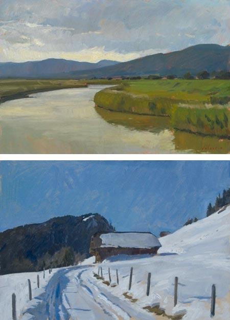
Even though it can take a long (long) time for me to get to them, I do enjoy receiving recommendations about artists I might like from others. I particularly enjoy it when a painter whose work I admire takes the time to write me with a recommendation for a painter that he admires.Such was the case when Julian Merrow-Smith, whose work I have written about here and here, was kind enough to write and suggest the work of Marc Dalessio, who he had the chance to meet last year in Florence.
Dalessio is a Los Angeles born artist, who lived in Fiji as a child, and for the last 17 years has been living and working in Florence, Italy (or more properly, Firenze – how the English made “Florence” out of “Firenze” I don’t know, but, I digress…).
In addition to pursuing his own painting, Dalessio teaches small workshops in the summer and a course in plein air landscape at the Florence Academy of Art in the Spring. In the winters he takes group painting excursions to places like Kenya, Greece, India, Morocco, and recently, Myanmar.
Dalessio excels at both figurative work and landscapes. As much as I like his strong, classically adept portraits, which simultaneously have both a modern feel and a late 19th Century sensibility, it is his landscapes that capture my attention.
As in his portraits, Dalessio brings both a contemporary sensibility and a strong undercurrent of admiration for classical painters to his landscapes. He seems largely free, however, of accepting the conventions of particular strains of art, rather taking on only their spirit. Subjects that one would expect to find dealt with in a bright palette, a garden in Sicily, St. Mark’s Basilica in Venice, are instead approached in muted muted colors on an overcast day.
His viewpoint shifts and searches, restlessly looking for a particular composition, which is seldom the one other artists might choose. There is a unique rhythm to his placement of light and dark areas, curves and geometries that defy the compositional choices one might expect from the subject.
His use of color is understated, carefully controlled and always powerful. Dalessio discusses his supplies and his palette in posts on his web site, part of which serves as a blog, and part of which is a gallery of his work.
There is an interview with Dalessio on Painting Perceptions.
There is currently a show of Dalessio’s work at the Grenning Gallery through June 21, 2009. The gallery also represents him on an ongoing basis.
The Grenning Gallery’s website, much to my mystification, does not seem to list the gallery’s location or give contact information. According to Google, they are apparently at 90 Main St, in Sag harbor, NY. Here is Dalessio’s post on the exhibit, which includes a link to a downloadable PDF catalog of the show.
Categories:
-
Jorge Colombo

Jorge Colombo is a Portuguese artist living in the U.S. who has been getting much attention lately for this week’s cover of The New Yorker, which he “fingerpainted” on his iPhone using a painting application called “Brushes“.The app lets you record the painting process and play it back, and the New Yorker article linked above includes a time laps video of his process.
I say “fingerpainted” because unlike other small mobile computing platforms, the iPhone and iPod touch is a touch-screen interface, meant to be used without a stylus, so your finger becomes the “brush”. This seems a little ungainly compared to stylus based small screen painting applicaitons, but the results indicate that you can do some interesting work with it.
Colombo did his sketch in about an hour while standing outside Madame Tussaud’s Wax Museum in Times Square.
On Colombo’s web site you will find some of his iPhone sketches, along with other done in pencil and colored digitally. He is also offering prints of some of the iPhone work.
In addition, there is a section of video and press coverage of his New Yorker iPhone sketch cover.
[Suggestion courtesy of Jack Harris]
Categories:
-
Bozeman’s Main Street: Paul Heaston
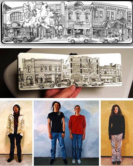
Inspired in part by Ed Ruscha’s photogrphic series of “Every Building on the Susnset Strip” and Matteo Pericoli’s panoramic drawings in his book Manhattan Unfurled, artist Paul Heaston decided to draw every building on Main Street in the historic district of his hometown of Bozeman Montana.Some of us who have never been to Bozeman think of it as a literary location, having been the setting for part of Robert Pirsig’s remarkable Zen in the Art of Motorcycle Maintenance, and a surprising number of other cultural references, including being the nominal location of the Star Trek: First Contact movie (co-written by Bozeman native Brannon Braga). It is also the site of Montana State University and is apparently rich with other colorful points of history.
Heaston focused his interest in the historic architecture of Bozeman, the town’s Main Street, from Grand to Rouse Avenues, and as a challenge to himself, drew every building on every block in that area, on both sides of the street, from direct observation in his Moleskein sketchbook (which he apparently filled exactly, without intending to). The project started in October of 2008 and just wrapped up on May 10 of this year.
It’s interesting to note that the seasons changed over the course of his project, giving it in interesting dimension of time as well as space.
Heaston’s approach, is an immediate and direct drawing in pen (that I assume is a fine point marker like a Pigma Micorn or Staedtler, though I didn’t find a mention of drawing instrument), with a casual feeling, even while enjoying the portrayal of surface textures. He even seems to have a cavalier disregard for making his architectural lines straight.
In some drawings, he winds up with what looks like curved perspective – like a photograph through a wide angle lens (which some have suggested is truer to the way we actually see than traditional “straight line” perspective).
The casual feeling of his drawings brings to mind the sketchbooks of Robert Crumb and Chris Ware.
I came across Heaston’s Bozeman Main Street Project on Urban Sketchers, where he is a correspondent. There is an article about the project, as well as one about its completion. The entire project is posted as a Flicker set.
Heaston has a web site with galleries that include other drawings and graphics, as well as his oil paintings. The latter are largely a series of gestural, painterly standing portraits, that are informal both in composition and the sitter’s (stander’s?) attire.
Heaston also maintains a blog, three letter word for art, on which you will find many other sketches and the stories behind them.
Categories:
-
Walter Crane
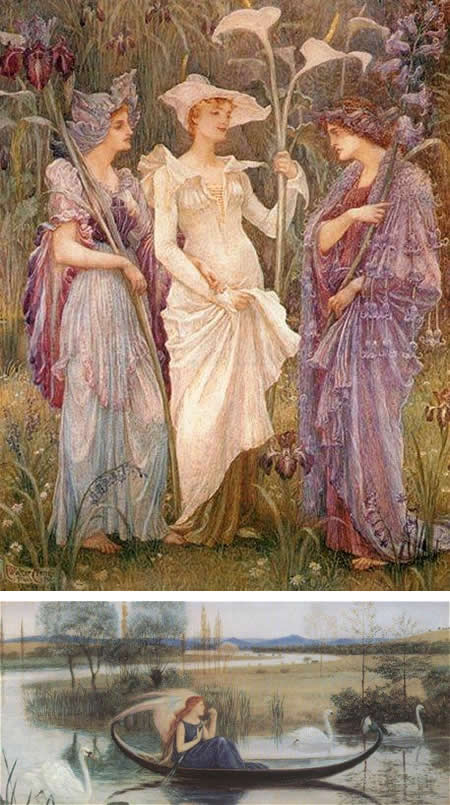
Walter Crane was one of the premiere English illustrators. He was active during the “Golden Age” of illustration, from the late 1800’s to the early 1900’s.Crane’s elegantly designed, deliberately retro illustrations for children’s books were influenced by his admiration for the work of Edward Byrne-Jones, and undoubtedly by the other Pre-Raphaelite painters, as well as by the Japanese prints that were favored in English and European society at the time.
Crane in return was also influential, both on his fellow illustrators, and on the wider Arts & Crafts Movement, with which he was integrally involved, having founded the Arts & Crafts Exhibition Society in 1888.
Crane was also a designer for textiles and wallpapers, and created gallery art, much in watercolor, and was an associate in the Water Colour Society.
His book illustrations range from graphically designed book pages, somewhat in the vein of Howard Pyle’s self-authored tales, to a more fully rendered style akin to his compatriot Arthur Rackham; though the artist who most often springs to mind for me in comparison is Edmund Dulac.
One of the best resources for Crane is the ArtMagick site, which has a bio and several pages of images. Wikimedia has quite a few book pages. You can read his entire illustrated Baby’s Own Aesop on MythFoklore.net, and a much shorter Beauty and the Beast on Bedtime Stories. Fontcraft has a font called Walter Crane, developed from examples of his hand lettering.
There are a number of books available with his illustrations and ornamentation.
Categories:
-
John Harris

UK artist John Harris began painting at the age of 14 and entered Luton College of Art at 16. His interest in space, and the portrayal of the scale of large objects and distances, led him to illustration work in the science fiction and fantasy field.He was influenced in his early paintings by the English Victorian painter John Martin, who painted large scale canvasses of large scale scenes, often dramatic depictions of Biblical disasters.
Over time, Harris moved away from the tightly painted Victorian style into the looser, more painterly and texture rich style he now employs.
He also moved away from his early experiments with techniques involving gouache and shellac inks, which, though they produced interesting effects, proved to be impermanent and fragile.
In addition to his work in publishing and advertising, his paintings are in the collections of NASA and the Smithsonian as well as numerous private collections.
Harris has a skill for using texture and color to suggest, where others might paint detail. His atmospheric otherworldly landscapes and space scenes are created from fields of multi colored and richly textured areas that in small sections might seem abstract in intent, but resolve in the eye into the feeling of more detail than is actually present (somewhat akin to the approach of John Berkey).
Harris revels in the feeling of monumental scale and often offsets his structures with suggestions of small figures.
Harris also paints traditional landscapes, though perhaps a bit non-traditional in that his personal vision often lends itself to slightly other-worldly choices of color and atmospherics.
There is a collection of his work titled Mass: The Art Of John Harris.
Categories:
-
Wayne White
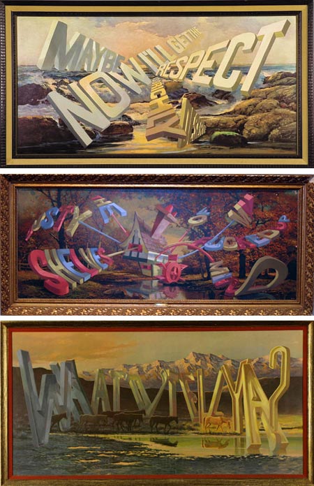
At one point Wayne White was a set designer for Pee-wee’s Playhouse, he also directed some stand-out music videos, most notably Peter Gabriel’s Big Time.In a desire to do something “180 degrees different from Pee-wee”, White decided to take up painting, with the intention of doing landscape painting, and began to teach himself traditional oil painting techniques.
But White’s weird side kept intruding, with monsters and things creeping into the landscapes, until one occasion that changed his direction in an even odder way.
He had purchased a cheap mass-produced landscape reproduction with the intention of using the frame; and on a whim, took the otherwise to be discarded reproduction and painted a phrase on it in 3-D lettering, as if the letters were physical objects in the scene.
The response from his friends and associates was so dramatic that he continued a series of similar paintings of words painted on 1960’s and 1970’s reproductions of 19th Century romantic landscapes.
Since then has become much noticed, and has had seven solo shows, many at major galleries; the latest of which is at Mirelle Mosler Ltd in New York until July 25th, 2009.
The idea of painting words into pictures isn’t new, nor is the idea of one artist painting over reproductions of other artists’ work (Duchamp’s Mona Lisa mustache, L.H.O.O.Q., springs to mind); but White’s take on it, contrasting the deliberately picturesque landscapes with angry, snarky, sad and often vulgar phrases, seems to have hit a chord.
White is originally from Chattanooga, Tennessee and now lives in Los Angeles. A collection of his work, Wayne White: Maybe Now I’ll Get the Respect I So Richly Deserve, has just been published by Ammo Books.
(Note: images may be considered NSFW for language.)
[Via Art Knowledge News]
Categories:


Charley’s Picks
Bookshop.org
(Bookshop.org affilliate links; sales benefit independent bookshop owners; I get a small percentage to help support my work on Lines and Colors)

John Singer Sargent: Watercolors


Urban Sketching: Understanding Perspective


Charley’s Picks
Amazon
(Amazon.com affiliate links; sales go to a larger yacht for Jeff Bezos; but I get a small percentage to help support my work on Lines and Colors)
John Singer Sargent: Watercolors
Urban Sketching: Understanding Perspective