
Categories
- 3d CGI
- Amusements
- Animation
- Anime & Manga
- Art Materials
- Art Videos
- Blogroll
- Cartoons
- Color
- Comics
- Concept & Visual Dev.
- Creativity
- Digital Art
- Digital Painting
- Displaying Art on the Web
- Drawing
- Eye Candy for Today
- Gallery and Museum Art
- High-res Art Images
- Illustration
- Motion Graphics & Flash
- Museums
- Online Museums
- Outsider Art
- Painting
- Painting a Day
- Paleo Art
- Pastel, Conté & Chalk
- Pen & Ink
- Prints and Printmaking
- Reviews
- Sc-fi and Fantasy
- Sculpture & Dimensional
- Site Comments
- Sketching
- Storyboards
- Tools and Techniques
- Uncategorized
- Vector Art
- Videos & Podcasts
- Vision and Optics
- Watercolor and Gouache
- Webcomics
Archives
- May 2026
- April 2026
- March 2026
- February 2026
- January 2026
- December 2025
- November 2025
- October 2025
- September 2025
- August 2025
- July 2025
- June 2025
- May 2025
- January 2025
- December 2024
- November 2024
- October 2024
- September 2024
- August 2024
- June 2024
- April 2024
- March 2024
- February 2024
- January 2024
- December 2023
- November 2023
- October 2023
- September 2023
- August 2023
- July 2023
- May 2023
- April 2023
- March 2023
- February 2023
- January 2023
- December 2022
- November 2022
- September 2022
- August 2022
- July 2022
- June 2022
- May 2022
- April 2022
- March 2022
- February 2022
- January 2022
- December 2021
- November 2021
- October 2021
- September 2021
- August 2021
- July 2021
- June 2021
- May 2021
- April 2021
- March 2021
- February 2021
- January 2021
- December 2020
- November 2020
- October 2020
- September 2020
- August 2020
- July 2020
- June 2020
- May 2020
- April 2020
- March 2020
- February 2020
- January 2020
- December 2019
- November 2019
- October 2019
- September 2019
- August 2019
- July 2019
- June 2019
- May 2019
- April 2019
- March 2019
- February 2019
- January 2019
- December 2018
- November 2018
- October 2018
- September 2018
- August 2018
- July 2018
- June 2018
- May 2018
- April 2018
- March 2018
- February 2018
- January 2018
- December 2017
- November 2017
- October 2017
- September 2017
- August 2017
- July 2017
- June 2017
- May 2017
- April 2017
- March 2017
- February 2017
- January 2017
- December 2016
- November 2016
- October 2016
- September 2016
- August 2016
- July 2016
- June 2016
- May 2016
- April 2016
- March 2016
- February 2016
- January 2016
- December 2015
- November 2015
- October 2015
- September 2015
- August 2015
- July 2015
- June 2015
- May 2015
- April 2015
- March 2015
- February 2015
- January 2015
- December 2014
- November 2014
- October 2014
- September 2014
- August 2014
- July 2014
- June 2014
- May 2014
- April 2014
- March 2014
- February 2014
- January 2014
- December 2013
- November 2013
- October 2013
- September 2013
- August 2013
- July 2013
- June 2013
- May 2013
- April 2013
- March 2013
- February 2013
- January 2013
- December 2012
- November 2012
- October 2012
- September 2012
- August 2012
- July 2012
- June 2012
- May 2012
- April 2012
- March 2012
- February 2012
- January 2012
- December 2011
- November 2011
- October 2011
- September 2011
- August 2011
- July 2011
- June 2011
- May 2011
- April 2011
- March 2011
- February 2011
- January 2011
- December 2010
- November 2010
- October 2010
- September 2010
- August 2010
- July 2010
- June 2010
- May 2010
- April 2010
- March 2010
- February 2010
- January 2010
- December 2009
- November 2009
- October 2009
- September 2009
- August 2009
- July 2009
- June 2009
- May 2009
- April 2009
- March 2009
- February 2009
- January 2009
- December 2008
- November 2008
- October 2008
- September 2008
- August 2008
- July 2008
- June 2008
- May 2008
- April 2008
- March 2008
- February 2008
- January 2008
- December 2007
- November 2007
- October 2007
- September 2007
- August 2007
- July 2007
- June 2007
- May 2007
- April 2007
- March 2007
- February 2007
- January 2007
- December 2006
- November 2006
- October 2006
- September 2006
- August 2006
- July 2006
- June 2006
- May 2006
- April 2006
- March 2006
- February 2006
- January 2006
- December 2005
- November 2005
- October 2005
- September 2005
- August 2005
Relevant Blogs
Art, Painting & Sketch
- Gurney Journey
- Underpaintings
- Art and Influence
- Painting Perceptions
- Oil Painters of America
- Vasari Paint POV
- Flying Fox
- Urban Sketchers
- Bento (Smithsonian)
- Art Inconnu
- The Hidden Place
- Still Life
- Making a Mark
- The Art of the Landscape
- Exploring Color & Creativity
- Art Contrarian
- Artist A Day
- beinArt Surreal Art Collective
- Eye Level
- David Dunlop
- p.i.g.m.e.n.t.i.u.m
- CultureGrrl
- Joaquín Sorolla blog
- Artists in Pastel
“Painting a Day”
- A Painting a Day (Keiser)
- On Painting (Keiser)
- Julian Merrow-Smith
- Karen Jurick
- Jeffrey Hayes
- Carol Marine
- Abbey Ryan
- Daily Paintworks
Other Painting Blogs
- Virtual Gouache Land
- Neil Hollingsworth
- Marc Hanson
- Kevin Menck
- Marc Dalessio
- Larry Seiler
- Stapleton Kearns
- Colin Page
- Roos Schuring
- Hans Versfelt
- Titus Meeuws
- Régis Pettinari
- René Plein Air
- Belinda Del Pesco
- Robin Weiss
- Nathan Fowkes (Land Sketch)
- William Wray
- Frank Serrano
- Stephen Magsig
- Michael Chesley Johnson
- Twice a Week
- Sarah Wimperis
- Rob Adams
- Michael Cole Manley
- The Dirty Palette Club
- Mike Manley’s Draw!
Gallery Art & Illustration mix
Illustration
- Howard Pyle
- 100 Years of Illustration
- BibliOdyssey
- Illustration Art
- Today’s Inspiration
- Illustration Mundo
- Little Chimp Society
- Danny Gregory
- R D (John Martz
- Illustration Friday blog
- Monster Brains
- Illustrators & Illustrations (RU)
- Elwood H. Smith
- DaniDraws.com
- Designers Who Blog
- iSpot Blog
Sci-Fi & Fantasy
Illustration & Comics
Comics & Cartoons
- Comics Beat
- Robot 6
- Newsarama Blog
- Comic Vine
- Comics Alliance
- Forbidden Planet Int.
- Paolo Rivera
- Bolt City
- Flight
- Scott McCloud
- The Comics Journal
- Comixpedia
- Funnybook Babylon
- James Baker
- Middleton’s Sketchbook
- Boneville
- The Hotel Fred
- Paul Rivoche
- Daily Cartoonist
- Mad About Cartoons (William Wray)
- Digital Strips
Illustration & Concept
Animation & Concept
- Cartoon Brew
- Animation Blog
- Cold Hard Flash
- Concept Art World
- The CAB
- FY Concept Art
- Concept Ships
- Concept Robots
- John Nevarez
- Armand Serrano
- Marcos Mateu-Mestre
- all kinds of stuff (Kricfalusi)
- Yacin the faun (Man Arenas)
- Kelsey Mann
- Cre8tivemarks Blog
- Ice-Cream Monster Toon Cafe
- AAU Character & Creature Design
- AAU Animation Notes
- Articles and Texticles
Paleo & Scientific
Tools & Techniques
Other
Lists of Art Blogs
Art Image Resource Links
Historic Art Images
- Wikimedia Commons: Paintings
- Wikimedia Commons: Drawings
- The Athenaeum
- WikiArt (WikiPaintings)
- Google Art Project: Artists
- Google Art Project: Collections (Museums)
- ArtCyclopedia
- Web Gallery of Art
- Art Renewal Center
- Web Gallery of Impressionism
Auction Consolidation sites
Auction sites
- Sotheby’s
- Bonham’s
- Christies
- Heritage Auctions: Fine Art
- Heritage Auctions: Illustration
- Freeman’s Auctions
- Bukowskis
- Shannon’s
Image Search
Reverse Image Search (search by image)
- Tin Eye
- RevImg
- Google Image Search (camera icon)
- Bing Image Search (camera icon)
Promoting some friends and some clients of my website design business
- Twin Willows T’ai Chi studio in Wilmington DE. Taiji classes with Bryan Davis.
- Ray Hayward, Inspired Teacher of T’ai Chi ( Taiji ) in Minneapolis, Founder of Mindful Motion Tai Chi Academy
- OldHead Tattoo studio and Art Gallery in Wilmington DE. Tattoos and paintings by Bruce Gulick
- Sharon Domenico Art, pet portrait oil paintings
- Platinum Paperhanging, wallpaper hanging, Main Line and Philadelphia, PA
- Lisa Stone Design, interior designer, Main Line and Philadelphia, PA
- Studio12KPT, original art, prints, calendars and other custom printed items by Van Sickle & Rolleri
-
Parkour Motion Reel
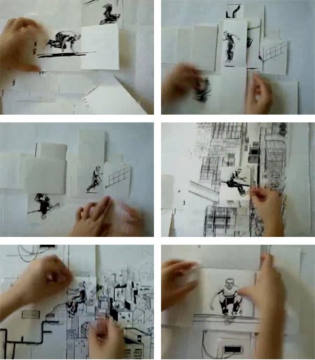
This is an amusing little animation that was made as a course assignment by a design degree student in Singapore, who goes by the handle “saggyarmpit” on Vimeo.She points out that it was done fairly quickly, the drawings illustrated with technical pen and rough around the edges, and expresses surprise at the degree of attention the piece is getting.
What’s amusing and appealing about the piece is her clever use of folded paper, flip book techniques and stop motion animation to move the character through his parkour motions.
(Parkour, or “the art of moving”, is a practice originating in France of traversing an environment, usually urban, by physically adapting to it using climbing, jumping and running skills that are honed in a way comparable to martial arts training. You may have seen it displayed in the opening of the Casino Royale James Bond film from 2006.)
Here the artist, with post production help from Noel Lee, moves the figure through the illustrated environment, her hands acting as part of the stop motion action.
“Saggyarmpit” does not have a web site yet, but promises one soon.
Categories:
-
Jules Breton
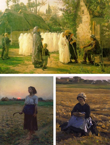
Jules Breton, whose full name is Jules Adolphe Aimé Louis Breton (what, no hyphens?), was one of the most famous and in demand academic painters of the 19th Century.He fell into disregard and semi-obscurity in the 20th Century, suffering particularly at the pens of Modernist critics who deemed him one of the terrible academic painters from which Modernism was here to “save” the spirit of pure art.
Though he started as a history painter, for the majority of his career Breton largely devoted himself to images of peasant field workers, seasonal laborers at the bottom of the social ladder, toiling in the fields.
His subjects are represented with sympathy, but his fields are idealized, glowing seas of grain bathed in late day sun. He also portrayed other elements of village life, as in The Commuincants (above, top).
He studied at the Academy of Fine Arts in Ghent, and later in Paris at the atelier of Michel Drolling.
Breton focused in later years on compositions of single female workers, posed in sunlit fields, a genre that proved highly popular with buyers in the U.S. He became highly regarded and his work in demand in the UK and the U.S. as well as his native France.
His later paintings moved from realism to a poetic vision more in keeping with Symbolism. His painting The Song of the Lark (above, bottom left) was the source of the title for Willa Cather’s famous novel.
Reportedly, Van Gogh at one point walked 85 miles to try to meet him, but was put off by Breton’s high wall and never contacted the elder artist.
Categories:
-
Your First Print: a introduction to Japanese Woodblock Printmaking

Your First Print is a rich media eBook by David Bull. Bull is an English born Canadian printmaker, now living in working in Japan, who has an extraordinary devotion to the art and craft of Japanese woodblock printing.That devotion is evident not only in his own work, but in his study of the art, and in the efforts he has made in assembling and disseminating information about the process. He has presented that information for a number of years in his extensive and highly informative website, woodblock.com, and is now extending that through a series of eBooks as part of a new publishing venture, Mokuhankan.
For background on the artist, his process and work, please see my previous post on David Bull.
Your First Print is an offshoot of the Mokuhankan venture, the primary purpose of which is to publish woodblock prints by other artists. Bull points out that though the devotion to making woodblock prints, a strong tradition in Japan, is very much alive among devotees of the art, the publication and sale of prints has faded. However, those exposed to woodblock prints for the first time are often dazzled by how beautiful they are and and how fascinating they can be.
Likewise, even those knowledgeable about western printmaking may be surprised and fascinated by the differences in the traditional methods of Japanese Woodblock printing. For example, no press is used in making an impression. The traditions of Japanese and European printmaking (which began to cross-pollinate in the 19th Century, see my post on Hokusai), have fascinating parallels as well as divergences.
Your First Print is an elegant and painstakingly crafted electronic book, in rich media PDF format, that introduces the reader to the process, providing an introduction to both those interested in pursuing the art and those who simply wish to deepen their appreciation of the process behind the art.
The eBook is divided into chapters and subchapters, taking the reader through the entire process, from selecting the materials to final printings and even troubleshooting things like misregistration and chipped or damaged blocks.
The text and photographs are supplemented with audio and video files. There are two versions. The downloadable version calls its multimedia files from the internet, the CD-ROM version is self contained. Both require version 9 of the free Adobe Reader in order to access the multimedia content (and convenient drop-down navigation). Those Mac users who, like me, prefer Preview as a PDF reader will need to use the Adobe reader if you want to access the video and audio.
There is a Sample Download PDF available (toward the bottom of this page) that gives you a preview of 24 pages from the the book (“pages” in this case actually refer to horizontal screen-wide spreads). There is also a Support Forum on the Woodblock.com site, in which readers can compare notes, ask questions and generally discuss the process of traditional Japanese printmaking.
In addition to Your First Print, there is a Catalogue of other items, with gems like classic texts by great Japanese printmakers, including Japanese Wood-Block Printing by Hiroshi Yodhida, one of my favorite printmakers.
 For more on David Bull’s own work, you can view a number of his print series on the site, including his Hanga Treasure Chest small print series and the 12 prints for My Solitdes. The latter has a fascinating companion page, in which you can view interactives that allow you to click through the stages of printing impressions for the individual pieces. It is in pieces like these that I enjoy Bull’s work most, where European and Japanese visual traditions meet and blend, as in the image at left, The Seacoast in Autumn (original here).
For more on traditional Japanese woodblock prints, see some of my previous posts on Hiroshi Yoshida, Kawase Hasui, Katsushika Hokusai, Ito Shinsui, Utagawa: Masters of the Japanese Print 1770-1900 at the Brooklyn Museum and Exquisite Visions of Japan.
Categories:
-
Jason Caffoe
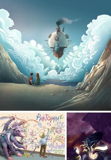
Freelance illustrator and concept artist Jason Caffoe works on a number of projects for which he can’t show or talk about his recent work, but his blog does have some work from older projects, along with engaging images from personal projects.There is one current project that he can discuss, his contributions as colorist, background painter and concept artist for the second and third books of Kazu Kibuishi’s Amulet graphic novel.
The first two books of Amulet are now available, The Stonekeeper, and The Stonekeeper’s Curse . The third book is still in production. You can see some of the pages from book 2 on this interview with Kazu Kibuishi on Newsarama that also references Caffoe’s involvement with the project. (For more see my posts on Amulet and Kazu Kibuishi.
Caffoe also did some color art for Jake Parker’s Missle Mouse (here’s my post on Jake Parker).
Among Caffoe’s personal pieces on the blog are landscape concepts, fantasy themed drawings and dinosaurs, a subject always of interest to me (grin). Though his site doesn’t include an online portfolio, one is available in PDF form from links on the splash page or sidebar.
Caffoe is a co-founder with Matt Kohr of the collaborative blog Concept CoOp.
He also contributed to the Terrible Yellow Eyes project that I reported on here, (my post included his piece for the project at top). He was included in the Gallery Nucleus show for the project.
Caffoe’s work is currently part of another group show at Gallery Nucleus, Lift Off: The Art of Airships (image above, top) that runs to February 1, 2010.
Categories:
-
Stephen Bissette

Stephen Bissette is an American comics artist known for his drawings of monsters and dinosaurs and his work on horror comics titles, in particular for several award winning series of DC Comic’s Swamp Thing with writer Alan Moore.The home page of Bissette’s site serves as a blog, though there is also a specific blog section called MYRANT, and he also maintains an archive of his old version of MYRANT.
There is a Gallery of comic pages, though they are too small to really see his drawing style unless you engage the “Full Screen” mode at lower left of the slide show. There is also a gallery of his original art for sale on ComicArtFans.com.
The current site also includes a new online comic series, King of Monster Isle, and there is a Comic Archive of some of his previous online comics and sketches.
Bissette currently teaches classes in drawing and comic art at the Center for Cartoon Studies in Vermont (see my 2007 post on the Center for Cartoon Studies).
A series of videos from two of Bissette’s CCS lecture/demos are viewable on YouTube (images above, links at the end of this post), in which he demonstrates various comic rendering and inking techniques, including markers, brush and pen. He also shows techniques for working back into inked drawings with white out dispensers and by scratching with razor blades.
The demos include segments in which Bissette works on two of his illustrations for Joseph A. Citro’s The Vermont Monster Guide (more info here). A shorter series of video demos are here on his web site.
[Video link via Lexington KY Comic Creators Group, King of Monster Isle link via Paleoblog]
Categories:
-
Gwenn Seemel

Gwenn Seemel is an Oregon based portrait artist with an unusual technique. her colorful portrait images are built up from a series of cross hatch strokes in acrylic, a process she developed from an interest in printmaking.As you can see from the demo on this page, she starts with areas of color shapes, often with a modernist, geometric feel that often carries through to the final piece, and works up the surface gradually with several passes of hatching and shape delineation.
The end result is often a very graphic surface of multiple marks, a textural array of colors that blend to form the portrait image, as in the detail image above, bottom.
Seemel works from digital photos taken during an hour long interview process in which she asks the subject to talk about themselves.
The image above, top right is a self-portrait.
[Suggestion courtesy of Karin Jurick]
Categories:


Charley’s Picks
Bookshop.org
(Bookshop.org affilliate links; sales benefit independent bookshop owners; I get a small percentage to help support my work on Lines and Colors)

John Singer Sargent: Watercolors


Urban Sketching: Understanding Perspective


Charley’s Picks
Amazon
(Amazon.com affiliate links; sales go to a larger yacht for Jeff Bezos; but I get a small percentage to help support my work on Lines and Colors)
John Singer Sargent: Watercolors
Urban Sketching: Understanding Perspective