
Categories
- 3d CGI
- Amusements
- Animation
- Anime & Manga
- Art Materials
- Art Videos
- Blogroll
- Cartoons
- Color
- Comics
- Concept & Visual Dev.
- Creativity
- Digital Art
- Digital Painting
- Displaying Art on the Web
- Drawing
- Eye Candy for Today
- Gallery and Museum Art
- High-res Art Images
- Illustration
- Motion Graphics & Flash
- Museums
- Online Museums
- Outsider Art
- Painting
- Painting a Day
- Paleo Art
- Pastel, Conté & Chalk
- Pen & Ink
- Prints and Printmaking
- Reviews
- Sc-fi and Fantasy
- Sculpture & Dimensional
- Site Comments
- Sketching
- Storyboards
- Tools and Techniques
- Uncategorized
- Vector Art
- Videos & Podcasts
- Vision and Optics
- Watercolor and Gouache
- Webcomics
Archives
- May 2026
- April 2026
- March 2026
- February 2026
- January 2026
- December 2025
- November 2025
- October 2025
- September 2025
- August 2025
- July 2025
- June 2025
- May 2025
- January 2025
- December 2024
- November 2024
- October 2024
- September 2024
- August 2024
- June 2024
- April 2024
- March 2024
- February 2024
- January 2024
- December 2023
- November 2023
- October 2023
- September 2023
- August 2023
- July 2023
- May 2023
- April 2023
- March 2023
- February 2023
- January 2023
- December 2022
- November 2022
- September 2022
- August 2022
- July 2022
- June 2022
- May 2022
- April 2022
- March 2022
- February 2022
- January 2022
- December 2021
- November 2021
- October 2021
- September 2021
- August 2021
- July 2021
- June 2021
- May 2021
- April 2021
- March 2021
- February 2021
- January 2021
- December 2020
- November 2020
- October 2020
- September 2020
- August 2020
- July 2020
- June 2020
- May 2020
- April 2020
- March 2020
- February 2020
- January 2020
- December 2019
- November 2019
- October 2019
- September 2019
- August 2019
- July 2019
- June 2019
- May 2019
- April 2019
- March 2019
- February 2019
- January 2019
- December 2018
- November 2018
- October 2018
- September 2018
- August 2018
- July 2018
- June 2018
- May 2018
- April 2018
- March 2018
- February 2018
- January 2018
- December 2017
- November 2017
- October 2017
- September 2017
- August 2017
- July 2017
- June 2017
- May 2017
- April 2017
- March 2017
- February 2017
- January 2017
- December 2016
- November 2016
- October 2016
- September 2016
- August 2016
- July 2016
- June 2016
- May 2016
- April 2016
- March 2016
- February 2016
- January 2016
- December 2015
- November 2015
- October 2015
- September 2015
- August 2015
- July 2015
- June 2015
- May 2015
- April 2015
- March 2015
- February 2015
- January 2015
- December 2014
- November 2014
- October 2014
- September 2014
- August 2014
- July 2014
- June 2014
- May 2014
- April 2014
- March 2014
- February 2014
- January 2014
- December 2013
- November 2013
- October 2013
- September 2013
- August 2013
- July 2013
- June 2013
- May 2013
- April 2013
- March 2013
- February 2013
- January 2013
- December 2012
- November 2012
- October 2012
- September 2012
- August 2012
- July 2012
- June 2012
- May 2012
- April 2012
- March 2012
- February 2012
- January 2012
- December 2011
- November 2011
- October 2011
- September 2011
- August 2011
- July 2011
- June 2011
- May 2011
- April 2011
- March 2011
- February 2011
- January 2011
- December 2010
- November 2010
- October 2010
- September 2010
- August 2010
- July 2010
- June 2010
- May 2010
- April 2010
- March 2010
- February 2010
- January 2010
- December 2009
- November 2009
- October 2009
- September 2009
- August 2009
- July 2009
- June 2009
- May 2009
- April 2009
- March 2009
- February 2009
- January 2009
- December 2008
- November 2008
- October 2008
- September 2008
- August 2008
- July 2008
- June 2008
- May 2008
- April 2008
- March 2008
- February 2008
- January 2008
- December 2007
- November 2007
- October 2007
- September 2007
- August 2007
- July 2007
- June 2007
- May 2007
- April 2007
- March 2007
- February 2007
- January 2007
- December 2006
- November 2006
- October 2006
- September 2006
- August 2006
- July 2006
- June 2006
- May 2006
- April 2006
- March 2006
- February 2006
- January 2006
- December 2005
- November 2005
- October 2005
- September 2005
- August 2005
Relevant Blogs
Art, Painting & Sketch
- Gurney Journey
- Underpaintings
- Art and Influence
- Painting Perceptions
- Oil Painters of America
- Vasari Paint POV
- Flying Fox
- Urban Sketchers
- Bento (Smithsonian)
- Art Inconnu
- The Hidden Place
- Still Life
- Making a Mark
- The Art of the Landscape
- Exploring Color & Creativity
- Art Contrarian
- Artist A Day
- beinArt Surreal Art Collective
- Eye Level
- David Dunlop
- p.i.g.m.e.n.t.i.u.m
- CultureGrrl
- Joaquín Sorolla blog
- Artists in Pastel
“Painting a Day”
- A Painting a Day (Keiser)
- On Painting (Keiser)
- Julian Merrow-Smith
- Karen Jurick
- Jeffrey Hayes
- Carol Marine
- Abbey Ryan
- Daily Paintworks
Other Painting Blogs
- Virtual Gouache Land
- Neil Hollingsworth
- Marc Hanson
- Kevin Menck
- Marc Dalessio
- Larry Seiler
- Stapleton Kearns
- Colin Page
- Roos Schuring
- Hans Versfelt
- Titus Meeuws
- Régis Pettinari
- René Plein Air
- Belinda Del Pesco
- Robin Weiss
- Nathan Fowkes (Land Sketch)
- William Wray
- Frank Serrano
- Stephen Magsig
- Michael Chesley Johnson
- Twice a Week
- Sarah Wimperis
- Rob Adams
- Michael Cole Manley
- The Dirty Palette Club
- Mike Manley’s Draw!
Gallery Art & Illustration mix
Illustration
- Howard Pyle
- 100 Years of Illustration
- BibliOdyssey
- Illustration Art
- Today’s Inspiration
- Illustration Mundo
- Little Chimp Society
- Danny Gregory
- R D (John Martz
- Illustration Friday blog
- Monster Brains
- Illustrators & Illustrations (RU)
- Elwood H. Smith
- DaniDraws.com
- Designers Who Blog
- iSpot Blog
Sci-Fi & Fantasy
Illustration & Comics
Comics & Cartoons
- Comics Beat
- Robot 6
- Newsarama Blog
- Comic Vine
- Comics Alliance
- Forbidden Planet Int.
- Paolo Rivera
- Bolt City
- Flight
- Scott McCloud
- The Comics Journal
- Comixpedia
- Funnybook Babylon
- James Baker
- Middleton’s Sketchbook
- Boneville
- The Hotel Fred
- Paul Rivoche
- Daily Cartoonist
- Mad About Cartoons (William Wray)
- Digital Strips
Illustration & Concept
Animation & Concept
- Cartoon Brew
- Animation Blog
- Cold Hard Flash
- Concept Art World
- The CAB
- FY Concept Art
- Concept Ships
- Concept Robots
- John Nevarez
- Armand Serrano
- Marcos Mateu-Mestre
- all kinds of stuff (Kricfalusi)
- Yacin the faun (Man Arenas)
- Kelsey Mann
- Cre8tivemarks Blog
- Ice-Cream Monster Toon Cafe
- AAU Character & Creature Design
- AAU Animation Notes
- Articles and Texticles
Paleo & Scientific
Tools & Techniques
Other
Lists of Art Blogs
Art Image Resource Links
Historic Art Images
- Wikimedia Commons: Paintings
- Wikimedia Commons: Drawings
- The Athenaeum
- WikiArt (WikiPaintings)
- Google Art Project: Artists
- Google Art Project: Collections (Museums)
- ArtCyclopedia
- Web Gallery of Art
- Art Renewal Center
- Web Gallery of Impressionism
Auction Consolidation sites
Auction sites
- Sotheby’s
- Bonham’s
- Christies
- Heritage Auctions: Fine Art
- Heritage Auctions: Illustration
- Freeman’s Auctions
- Bukowskis
- Shannon’s
Image Search
Reverse Image Search (search by image)
- Tin Eye
- RevImg
- Google Image Search (camera icon)
- Bing Image Search (camera icon)
Promoting some friends and some clients of my website design business
- Twin Willows T’ai Chi studio in Wilmington DE. Taiji classes with Bryan Davis.
- Ray Hayward, Inspired Teacher of T’ai Chi ( Taiji ) in Minneapolis, Founder of Mindful Motion Tai Chi Academy
- OldHead Tattoo studio and Art Gallery in Wilmington DE. Tattoos and paintings by Bruce Gulick
- Sharon Domenico Art, pet portrait oil paintings
- Platinum Paperhanging, wallpaper hanging, Main Line and Philadelphia, PA
- Lisa Stone Design, interior designer, Main Line and Philadelphia, PA
- Studio12KPT, original art, prints, calendars and other custom printed items by Van Sickle & Rolleri
-
Dave Bruner
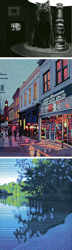 I recently attended the Rittenhouse Square Fine Arts Annual, a delightful outdoor art fair that has been happening in Philadelphia’s jewel of a city park for 75 years. I’ve been going to the show since I was a teenager, and I think of it as marking the beginning of the Summer. (Last year they added a Fall version as well.)
In spite of some rain, this year’s show, as always, made for a great afternoon’s walk through greenery, cityscape and art. There are lots of familiar faces and works, but often some standouts. This year I was struck with the work of Dave Bruner, a printmaker from Florida who does wood engravings and linoleum “reduction cuts”.
Wood engraving is not a popular medium these days. In addition to artistic skill and manual dexterity, it is demanding in terms of physical stamina. You have to push the engraver or burin repeatedly through the wood with enough force to inscribe the lines, but you also have to monitor your stroke carefully; too strong and the line is to thick, too little force and it’s too faint. If you slip an entire piece can be ruined in an instant.
Wood engraving is done on blocks of the end grain of hardwood, rather than the side grain of softer wood as is the practice for regular woodcuts (not to imply that woodcuts are not also a demanding medium). In spite of the term “engraving”, the image is printed from the raised surface that remains, not from ink in the engraved lines as is the case in regular metal plate engraving. The use of the term comes from the use of similar tools.
Wood engraving was a medium of choice for M. C. Escher, but it is most often associated with older works. It is one of the oldest forms of printmaking. Bruner’s wood engravings, however, have a decidedly modern feeling. He often portrays landscapes, street scenes, interiors and animals (top image) in compositions that have a fresh and immediate graphic sensibility. He works with very deliberate patterns and textures that simultaneously give his black and white images tone and atmosphere and also exist on their own as graphic statements.
Bruner also combines the monochromatic tones of his prints with color in hand-colored editions (middle image) in which he paints into the wood engraving block prints with acrylic. I feel some of these are more successful than others, but when the work well, they work very well, combining a uniquely graphic texture with subtle color and producing an effect that is particularly appealing.
Also fascinating are his “reduction cuts” (bottom image). This is another demanding process in which a block is cut away in designs that are a sequence of color layers for an image. Each round of cutting and printing uses less area of the total block as parts of the image are cut away, hence the term reduction cuts.
This is a difficult process to grasp. I had a little trouble getting a clear picture of it even while Bruner was explaining it to me, and once I began to grasp the process I realized it combined the kind of logistical planning necessary for multi-block printing with the color planning associated with dark-over-light watercolor into a kind of mental puzzle. The rewards, though, are a unique and striking graphic style.
Bruner does his reduction cuts in linoleum block. You can see the commonality with his black and white and color wood engravings, but the color is more of an integral element in the composition than in the hand-colored wood engravings.
All three approaches are a great combination of lines and colors.
Categories:
-
Designers who blog (update)
 Designers who blog, Catherine (cat) Morley’s terrific blog about just that, featured another post about lines and colors today (permalink here), with a focus on my post about “Painting a day” blogs.
I’ve written about Morley’s great selection of designers’ blogs before, as well as her Cat’s Fancy column for Creative Latitude in which she goes into more depth by conducting email interviews with the blog creators.
Her blog consistently showcases top notch designers, illustrators and photographers. I’ve been amazed with the number of talented and skilled designers she has found.
There’s really no excuse for bad graphic design out there, art directors could simply use Designers who blog as a Rolodex.
Categories:
-
Benoît Mandelbrot

Benoît Mandelbrot is not an artist in the usual sense of the word. He doesn’t work with oils, watercolors, pastels or colored pencils, yet he has created work of extraordinary beauty.Benoît Mandelbrot is a mathematician. He coined the term “fractal” in 1975 to describe a shape that appears similar at all levels of magnification. Fractals occur in nature. Go to Google Maps and look at the satellite photo of a large river, then zoom in on the branches of the river, then the creeks feeding those branches, and the runs feeding the creeks. The branching and convoluted shapes of the shorelines remain similar at every level. Similarly, look a a naked tree in the winter and see the relationship of large branches to smaller and smaller branches.
The nature of cloud formations, seemingly too complex for traditional geometry and mathematics to describe, is revealed to be an expression of fractal geometry. (I played with this idea in this page from my webcomic several years ago, in which the background includes “clouds” made from a fractal image, and explained the process here.)
Mandelbrot worked with this branch of math and in the process created one of those wonderfully simple and elegant mathematical expressions, like Einstein’s “E=Mc2”, that is incredibly far reaching. “Beauty” and “elegance” are terms used in mathematics to describe particularly simple yet powerful equations or expressions. Mathematical beauty can create in human beings a feeling of fascination, satisfaction and “rightness” similar to the perception of visual or musical beauty. One of the simplest expressions of Mandelbrot’s “set” is: Z = z2 +c, in which the equals sign would actually have small arrows top and bottom pointing in opposite directions.
The arrows on the equal sign indicate that the equation can be processed in either direction, and the result of one operation can become the start of the next, ad infinitum, in a process known as iteration. This process generates 2 numbers, changing over time, that can be used to plot a position on a surface, like map coordinates. If you let the process iterate and assign colors to the way the points change, you can generate an image of the Mandelbrot set (image below, top). Zoom in on that image and you descend into beautiful infinity.
The border of the Mandelbrot shape is a fractal; not only does it posses an infinity of detail as it is magnified, its length is infinite. The fractal geometry along the border of the set displays fantastic intricate patterns, and if you continue to zoom in on the image, you find endless variations of pattern and color. The image above is from Wikipedia and was generated by David R. Ingram, (high resolution version here).
Of particular fascination is the fact that as you zoom into a Mandelbrot image you will find familiar patterns, particularly smaller versions of the somewhat heart-shaped black center of the Mandlebrot itself, that repeat at various levels. (image below, left, also from Wikipedia).
 If you zoom in far enough on the edges of those mini-Mandelbrots, you will encounter a subset of smaller Mandelbrots. Zoom in on those and you will find even smaller repetitions of the set. In the mathematical cosmos of the Mandelbrot set, this goes on forever in a mind-boggling infinite “Russian nesting doll” relationship.
PBS has been running a fascinating documentary on this subject, Colors of Infinity, narrated by Arthur C. Clarke (book version here). There are also many resources on the web. Some describe the process, some are about Mandelbrot himself, some are beautiful galleries of fractal and Mandelbrot set generated images, and some are small Java applets that let you generate your own fractal and Mandelbrot images.
Many of the patterns generated by these astonishingly simple mathematical operations are hauntingly familiar. Look through a few fractal art galleries and then think of oriental rugs, Persian decorative patterns, Indian mandalas and paisleys and other patterns familiar in psychedelic art.
This raises some always fascinating questions about the nature of art and beauty. Could it be that we are hard-wired to the universe, our brains genetically tapped into Jung’s images of the “collective unconscious”, and are those hard wired images indicative of the fractal nature of the physical world? Benoit Mandelbrot has given us a beautiful clue.
Categories:
-
Toni DiTerlizzi
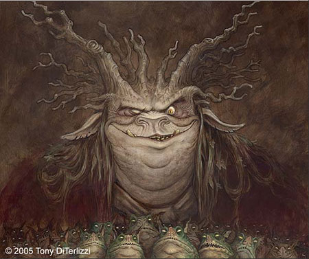
Like any artists, illustrators must choose where their work will “live” on the spectrum of styles and genres. Toni DiTerlizzi lives somewhere between adventure fantasy and children’s book whimsey, where dragons and fairies meet spiders and flies and giant pink rabbit-eared creatures appear in kids’ bedrooms. His work shows the influence of some of the classic children’s book illustrators like Arthur Rackham and perhaps John Bauer.Toni DiTerlizzi has worked for TSR, doing illustrations for Dungeons and Dragons and has created illustrations for a number of other games, including the Magic the Gathering card based game, in which the fantasy illustrations are a major appeal of the game.
After working in gaming and fantasy for a number of years, DiTerlizzi moved into children’s books, writing and drawing his own titles, Jimmy Zangwow’s Out-of-this-World Moon Pie Adventure and Ted, as well as illustrating the work of other authors including the Alien and Possum series by Tony Johnson and the Ribbiting Tales collection.
In 2003 he co-created with Holly Black The Spiderwick Chronicles, revisited in 2005 with Arthur Spiderwick’s Field Guide to the Fantastical World Around You.
DiTerlizzi’s site got a major makeover several months ago, reappearing as a spiffed-up Flash version with gallery drawers, video clips, animated hearers and a nice looking interface. Personally, I preferred the older, less polished version because I thought it was easier to see his artwork.
The new site still has plenty of DiTerlizzi’s charming artwork, however, both in galleries and as downloadable wallpaper. He works in watercolor, pastel and, by my guess, gouache and other mixed media as well. Some of the gallery selections include preliminary sketches and pencil drawings of his illustrations.
Categories:
-
Crockett Johnson

When I was about 8 years old my parents made the mistake of giving me a wonderful book.It looked like an innocent enough childrens’ book. It had a brown cover and a drawing of a young boy, who, I would soon learn, was “Harold”, and he had a large purple crayon with which he was apparently drawing large purple lines all over the cover of the book on which he resided.
The book was, in fact, called Harold and the Purple Crayon and it was indeed a dangerous thing to give to a child prone to flights of fantasy and a strong tendency to want to use his crayons “outside the lines”.
Harold, you see, has a large purple crayon with which he creates and modifies his world. The book doesn’t outline this in such fancy words, of course, it just starts out with Harold deciding, “after thinking it over for some time”, to go for a walk in the moonlight.
Inconveniently, there is no moon, so Harold draws one. He needs a path for his walk, so Harold draws one; and whatever Harold draws with his wonderful, magical purple crayon becomes the reality in which Harold lives and moves.
He draws, apparently on some kind of wall behind him, a forest (consisting of one apple tree), a dragon (to guard the apples), an ocean, a boat, a mountain and an entire city; and they all become magically real (although it all seems quite normal to Harold), and he can walk through them at will — drawing and creating his world as he goes.
Wow.
That giving a book with this radical and mind-altering concept to his impressionable young son was indeed a mistake, only dawned on my father when heard me making odd scraping noises behind the couch and, pulling the couch away from the wall, discovered that I had drawn and scribbled, with my own magical crayons, my beautiful, multi-colored crayons, my waxy, incredibly-hard-to-wash-off, paint-resistant, indelible, cling-to-your-wall-forever, hours-of-elbow-grease-to-remove crayons,… on a considerable area of the wall behind the couch.
My parents didn’t scold me though, bless their hearts forever. The were never likely to discourage me from drawing or creating in any way, but it was… strongly suggested that I use my crayons on other surfaces; and I was kept in supply with lots of coloring books (which I wasn’t all that interested in) and big sheets of inexpensive paper (much more to my liking) from which I would eventually learn to coax the magic of creating a world of my own liking by drawing what I wanted.
Categories:
-
Mathias Verhasselt
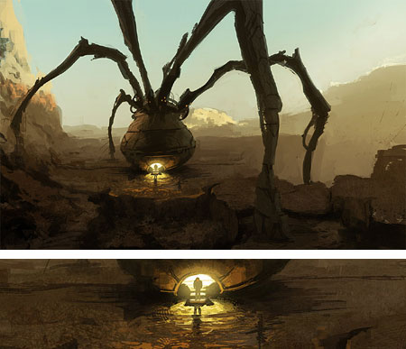
One of the interesting approaches to developing a style and warming up for larger projects that is common among digital painters, particularly those involved in concept design, is the practice of “speed painting”.The immediacy, absence of concerns with drying time and absorption of traditional materials, the ability to change brush sizes almost instantly and access to unlimited amounts of color, make it possible to apply colors to an image extremely rapidly. Concept designers and other digital painters will often practice or warm up with these very quickly rendered scenes, and sometimes engage in friendly rivalries to see who can make the most striking image in a limited amount of time.
Mathias Verhasselt is a French digital painter, illustrator, concept designer and 3-D modeler based in Paris. His web site and gallery at the Computer Graphics Society feature both examples of his speed painting and his more finished work. He creates his 2-D work in Photoshop and his images of high-tech vehicles, planes, robots and fantastic environments contrast with more naturalistic scenes of ancient battlefields and warriors.
His galleries also include some of his 3-D modeling as well as images that combine the two disciplines.
Much of his work has a fun, loose quality the speaks of the freedom and lack of restrictions many artists find so appealing in digital painting.
Categories:


Charley’s Picks
Bookshop.org
(Bookshop.org affilliate links; sales benefit independent bookshop owners; I get a small percentage to help support my work on Lines and Colors)

John Singer Sargent: Watercolors


Urban Sketching: Understanding Perspective


Charley’s Picks
Amazon
(Amazon.com affiliate links; sales go to a larger yacht for Jeff Bezos; but I get a small percentage to help support my work on Lines and Colors)
John Singer Sargent: Watercolors
Urban Sketching: Understanding Perspective