
Categories
- 3d CGI
- Amusements
- Animation
- Anime & Manga
- Art Materials
- Art Videos
- Blogroll
- Cartoons
- Color
- Comics
- Concept & Visual Dev.
- Creativity
- Digital Art
- Digital Painting
- Displaying Art on the Web
- Drawing
- Eye Candy for Today
- Gallery and Museum Art
- High-res Art Images
- Illustration
- Motion Graphics & Flash
- Museums
- Online Museums
- Outsider Art
- Painting
- Painting a Day
- Paleo Art
- Pastel, Conté & Chalk
- Pen & Ink
- Prints and Printmaking
- Reviews
- Sc-fi and Fantasy
- Sculpture & Dimensional
- Site Comments
- Sketching
- Storyboards
- Tools and Techniques
- Uncategorized
- Vector Art
- Videos & Podcasts
- Vision and Optics
- Watercolor and Gouache
- Webcomics
Archives
- May 2026
- April 2026
- March 2026
- February 2026
- January 2026
- December 2025
- November 2025
- October 2025
- September 2025
- August 2025
- July 2025
- June 2025
- May 2025
- January 2025
- December 2024
- November 2024
- October 2024
- September 2024
- August 2024
- June 2024
- April 2024
- March 2024
- February 2024
- January 2024
- December 2023
- November 2023
- October 2023
- September 2023
- August 2023
- July 2023
- May 2023
- April 2023
- March 2023
- February 2023
- January 2023
- December 2022
- November 2022
- September 2022
- August 2022
- July 2022
- June 2022
- May 2022
- April 2022
- March 2022
- February 2022
- January 2022
- December 2021
- November 2021
- October 2021
- September 2021
- August 2021
- July 2021
- June 2021
- May 2021
- April 2021
- March 2021
- February 2021
- January 2021
- December 2020
- November 2020
- October 2020
- September 2020
- August 2020
- July 2020
- June 2020
- May 2020
- April 2020
- March 2020
- February 2020
- January 2020
- December 2019
- November 2019
- October 2019
- September 2019
- August 2019
- July 2019
- June 2019
- May 2019
- April 2019
- March 2019
- February 2019
- January 2019
- December 2018
- November 2018
- October 2018
- September 2018
- August 2018
- July 2018
- June 2018
- May 2018
- April 2018
- March 2018
- February 2018
- January 2018
- December 2017
- November 2017
- October 2017
- September 2017
- August 2017
- July 2017
- June 2017
- May 2017
- April 2017
- March 2017
- February 2017
- January 2017
- December 2016
- November 2016
- October 2016
- September 2016
- August 2016
- July 2016
- June 2016
- May 2016
- April 2016
- March 2016
- February 2016
- January 2016
- December 2015
- November 2015
- October 2015
- September 2015
- August 2015
- July 2015
- June 2015
- May 2015
- April 2015
- March 2015
- February 2015
- January 2015
- December 2014
- November 2014
- October 2014
- September 2014
- August 2014
- July 2014
- June 2014
- May 2014
- April 2014
- March 2014
- February 2014
- January 2014
- December 2013
- November 2013
- October 2013
- September 2013
- August 2013
- July 2013
- June 2013
- May 2013
- April 2013
- March 2013
- February 2013
- January 2013
- December 2012
- November 2012
- October 2012
- September 2012
- August 2012
- July 2012
- June 2012
- May 2012
- April 2012
- March 2012
- February 2012
- January 2012
- December 2011
- November 2011
- October 2011
- September 2011
- August 2011
- July 2011
- June 2011
- May 2011
- April 2011
- March 2011
- February 2011
- January 2011
- December 2010
- November 2010
- October 2010
- September 2010
- August 2010
- July 2010
- June 2010
- May 2010
- April 2010
- March 2010
- February 2010
- January 2010
- December 2009
- November 2009
- October 2009
- September 2009
- August 2009
- July 2009
- June 2009
- May 2009
- April 2009
- March 2009
- February 2009
- January 2009
- December 2008
- November 2008
- October 2008
- September 2008
- August 2008
- July 2008
- June 2008
- May 2008
- April 2008
- March 2008
- February 2008
- January 2008
- December 2007
- November 2007
- October 2007
- September 2007
- August 2007
- July 2007
- June 2007
- May 2007
- April 2007
- March 2007
- February 2007
- January 2007
- December 2006
- November 2006
- October 2006
- September 2006
- August 2006
- July 2006
- June 2006
- May 2006
- April 2006
- March 2006
- February 2006
- January 2006
- December 2005
- November 2005
- October 2005
- September 2005
- August 2005
Relevant Blogs
Art, Painting & Sketch
- Gurney Journey
- Underpaintings
- Art and Influence
- Painting Perceptions
- Oil Painters of America
- Vasari Paint POV
- Flying Fox
- Urban Sketchers
- Bento (Smithsonian)
- Art Inconnu
- The Hidden Place
- Still Life
- Making a Mark
- The Art of the Landscape
- Exploring Color & Creativity
- Art Contrarian
- Artist A Day
- beinArt Surreal Art Collective
- Eye Level
- David Dunlop
- p.i.g.m.e.n.t.i.u.m
- CultureGrrl
- Joaquín Sorolla blog
- Artists in Pastel
“Painting a Day”
- A Painting a Day (Keiser)
- On Painting (Keiser)
- Julian Merrow-Smith
- Karen Jurick
- Jeffrey Hayes
- Carol Marine
- Abbey Ryan
- Daily Paintworks
Other Painting Blogs
- Virtual Gouache Land
- Neil Hollingsworth
- Marc Hanson
- Kevin Menck
- Marc Dalessio
- Larry Seiler
- Stapleton Kearns
- Colin Page
- Roos Schuring
- Hans Versfelt
- Titus Meeuws
- Régis Pettinari
- René Plein Air
- Belinda Del Pesco
- Robin Weiss
- Nathan Fowkes (Land Sketch)
- William Wray
- Frank Serrano
- Stephen Magsig
- Michael Chesley Johnson
- Twice a Week
- Sarah Wimperis
- Rob Adams
- Michael Cole Manley
- The Dirty Palette Club
- Mike Manley’s Draw!
Gallery Art & Illustration mix
Illustration
- Howard Pyle
- 100 Years of Illustration
- BibliOdyssey
- Illustration Art
- Today’s Inspiration
- Illustration Mundo
- Little Chimp Society
- Danny Gregory
- R D (John Martz
- Illustration Friday blog
- Monster Brains
- Illustrators & Illustrations (RU)
- Elwood H. Smith
- DaniDraws.com
- Designers Who Blog
- iSpot Blog
Sci-Fi & Fantasy
Illustration & Comics
Comics & Cartoons
- Comics Beat
- Robot 6
- Newsarama Blog
- Comic Vine
- Comics Alliance
- Forbidden Planet Int.
- Paolo Rivera
- Bolt City
- Flight
- Scott McCloud
- The Comics Journal
- Comixpedia
- Funnybook Babylon
- James Baker
- Middleton’s Sketchbook
- Boneville
- The Hotel Fred
- Paul Rivoche
- Daily Cartoonist
- Mad About Cartoons (William Wray)
- Digital Strips
Illustration & Concept
Animation & Concept
- Cartoon Brew
- Animation Blog
- Cold Hard Flash
- Concept Art World
- The CAB
- FY Concept Art
- Concept Ships
- Concept Robots
- John Nevarez
- Armand Serrano
- Marcos Mateu-Mestre
- all kinds of stuff (Kricfalusi)
- Yacin the faun (Man Arenas)
- Kelsey Mann
- Cre8tivemarks Blog
- Ice-Cream Monster Toon Cafe
- AAU Character & Creature Design
- AAU Animation Notes
- Articles and Texticles
Paleo & Scientific
Tools & Techniques
Other
Lists of Art Blogs
Art Image Resource Links
Historic Art Images
- Wikimedia Commons: Paintings
- Wikimedia Commons: Drawings
- The Athenaeum
- WikiArt (WikiPaintings)
- Google Art Project: Artists
- Google Art Project: Collections (Museums)
- ArtCyclopedia
- Web Gallery of Art
- Art Renewal Center
- Web Gallery of Impressionism
Auction Consolidation sites
Auction sites
- Sotheby’s
- Bonham’s
- Christies
- Heritage Auctions: Fine Art
- Heritage Auctions: Illustration
- Freeman’s Auctions
- Bukowskis
- Shannon’s
Image Search
Reverse Image Search (search by image)
- Tin Eye
- RevImg
- Google Image Search (camera icon)
- Bing Image Search (camera icon)
Promoting some friends and some clients of my website design business
- Twin Willows T’ai Chi studio in Wilmington DE. Taiji classes with Bryan Davis.
- Ray Hayward, Inspired Teacher of T’ai Chi ( Taiji ) in Minneapolis, Founder of Mindful Motion Tai Chi Academy
- OldHead Tattoo studio and Art Gallery in Wilmington DE. Tattoos and paintings by Bruce Gulick
- Sharon Domenico Art, pet portrait oil paintings
- Platinum Paperhanging, wallpaper hanging, Main Line and Philadelphia, PA
- Lisa Stone Design, interior designer, Main Line and Philadelphia, PA
- Studio12KPT, original art, prints, calendars and other custom printed items by Van Sickle & Rolleri
-
Alex Grey

There is a history of visionary or mystical devotional art, perhaps more prominently in Aisian cultures than in the West. Alex Grey has taken influences from some of those traditional art forms, including tantric art, mandalas, thangkas and other sources of imagery from India, China, Japan and Indonesia, and combined them with a very Western representation of the human body in anatomical detail, to suggest the intersection of the natural and spiritual worlds.Grey’s art has been called, visionary, spiritual and “psychedelic”, though he seems to prefer “transpersonal”. His intricate, brightly colored images often portray the human form as if the skin were transparent, showing the glowing lattices of the nervous and veinous system lying beneath, and sometimes the musculature, viscera or skeleton, as if trying to suggest a connection between our inner physical selves and our spiritual selves, and, through them, a connection to the cosmos as a whole in a visionary, spiritual sense.
The result is a wild amalgam of anatomical detail, brilliant, optically reinforced colors (lots of side-by side complementary colors for intensity), and the division of space into tessellations of op-art like patterns, visionary images like eyes and faces or sweeping radiant lines and lightning-like strokes of color suggestive of energy fields.
Figures are portrayed this way while praying, meditating, gazing at the stars, copulating, giving birth or even painting pictures.
Grey’s paintings, in oil and arcylic, are often quite large in size, which makes it all the more unfortunate that they are represented on the web in images too small to really get a good feeling for them. There are several collections of his work, including Transfigurations, Sacred Mirrors and Visions. He has also written a treatise on mysticism and art, The Mission of Art.
There is a video interview with Grey on YouTube in which you can see some of his work on gallery walls in its true scale.
The galleries on his site are divided into “Early Works”, “Sacred Mirrors” (a themed collection of several works, arranged in a special gallery called the Chapel of the Sacred Mirrors, which has it’s own site) and “Progress of the Soul”. I would start with the latter for an introduction to his work. (Sorry, I can’t give you direct links because the site is in frames.)
You will also find additional images in the Shop section of his site, particularly in the Posters and Prints sections.
Categories:
-
Steve Canyon original art

Most art done specifically for reproduction, whether it’s illustration, cartoons or comics, is drawn or painted at a different size than the printed piece, usually a bit larger. In the case of American comic books, it’s ordinarily about 1 1/2 times the printed size, but for newspaper strips it’s often 2 x the printed size (“2 up”) or larger.It’s difficult to get a feeling for this, or for the actual appearance of original comics art, unless you see the originals. Short of becoming a collector, or looking through the original art for sale at comics conventions, you can sometimes get to see original comics art posted on the web.
A rare opportunity has come up, though, to see scans of some originals of Milton Caniff’s great Steve Canyon strips, as opposed to the print versions as they appeared in preproduction. (See my recent post on Milton Caniff and the opportunity of seeing the reprinted strips posted online.)
John Ellis, who is working with Caniff’s family on a DVD release of the live action Steve Canyon TV show from the 50’s, came across an undiscovered treasure trove of originals in the family’s collection and, with their permission, has made scans of them available through the ASIFA-Hollywood Animation Archive Project (A-Haa! for short).
These strips were drawn quite large (bear in mind that newspaper strips used to be printed much larger than the postage-stamp sized blotches they’ve been reduced to today by newspaper editors determined to drive away readers), and the posted scans, though not life-sized, are large enough to get a feeling for what the original art looks like, complete with smudges, water splotches, rips and repairs.
The wonderful thing is that you can see bits of Caniff’s pencil line, corrections, and even the variations in the density of the blacks, giving you a peek at his creative process (it was all evened out by the photographic process for reproduction, in which shooting in high-contrast made the dark grays black and the light pencil lines disappear).
Even better, you can see close up, in a way impossible in the small reproductions found in printed comic strip collections, the marvelous quality of his fluid and precise brush lines. Though most comics artists use pens as their primary tool for drawing in ink, many use a sable watercolor brush with a fine point (often a #2 or #3 round) as their drawing tool, in addition to using them to fill in area of black.
The use of a brush, even more than the most flexible pen, allows comics artists and cartoonists to achieve a remarkable variation in line width within a single stroke. Variation in line is one of the characteristics that can give good comics drawing some of its liveliness and visual interest. Caniff was a master of the brush and ink drawing method and it lent itself exceptionally well to his beautiful use of chiaroscuro.
Click on the smaller images in the ASIFA blog post to see the strips close up in all their rough and tumble glory.
Link via Boing Boing
Categories:
-
Guy Rose

The influence of the radical modern art movement known as Impressionism came to the U.S in two waves. The first, logically enough, crested on the east coast and produced a number of remarkable American painters, many of whom were in a group of artists in New York and Boston known as “The Ten American Painters”, while others, like Daniel Garber, were centered around an artists colony in New Hope, just north of Philadelphia, and became known as Pennsylvania Impressionists.In the second, slightly later wave, around the turn of the 20th Century, the influence spread to California, a part of the country that was still remote and difficult reach at the time. (The Transcontinental Railroad wasn’t completed until 1869, and the line connecting Los Angeles to Chicago was finished in 1885, leading to an influx of people, including artists, in the 1880’s.) Artists like Hanson Puthuff settled in California and found it an ideal place to practice the new school if plein air painting that was blossoming out of the influence of the Impressionists.
Guy Orlando Rose, one of the most prominent of the painters who became known as California Impressionists, was California born, but like many of his transplanted and Eastern counterparts, traveled to Europe to study at the Academie Julian; and he was the first artist from California to receive honorable mention at the influential Paris Salon.
After returning to the States, he fell victim to one of the occupational hazards of using oil paint at the time and suffered from lead poisoning (oil paints in that day were largely based on lead white), which forced him to refrain from painting for extended periods. During one of those periods he lived in New York for several years, taught drawing and portraiture at Pratt Institute and created illustrations for magazines like Harper’s, Scribner’s and Century.
In 1899, his health restored to the point where he could once again use oil paint, he returned to France with his wife, who was also an artist, and settled in Giverny, where an artist’s colony had sprung up around the imposing figure of Claude Monet. Unlike many of the artists there, Rose actually became a friend and protogé of Monet, and his work shows that influence more than any other artist in the group known as “American Impressionists”. He also adapted Monet’s practice of painting the same scene repeatedly, at different times of day, to capture the fleeting effects of changing light.
Rose eventually returned to California, where he taught and was director of the Strickney School of Art in Pasadena, and continued to paint until brought down by the continued effects of lead poisoning and a stroke. Rose is widely considered one of the best of the American Impressionist painters and is perhaps the most true to the French Impressionist style among them.
Unfortunately the only book I know of specifically on Rose, Guy Rose: American impressionist by Will South, is out of print, but you may be able to find copies through Amazon and other used book sources. You will find him mentioned prominently in books like California Impressionists, by Susan Landaurer.
Categories:
-
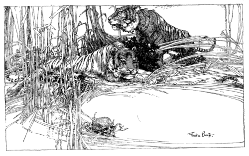
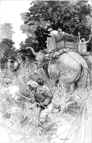
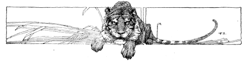
Franklin Booth
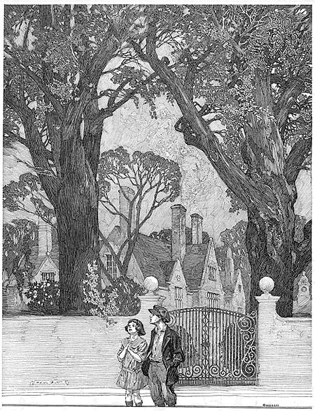
Franklin Booth owed his amazing style of pen and ink drawing to ignorance.Booth was one of the greatest American illustrators and one of the absolute masters of pen and ink drawing. His style was the result of an isolated childhood on an Indiana farm and an innocent ignorance of the printing technology of his time.
When Booth was growing up, determined to be an artist and create illustrations like the ones he saw in popular magazines of the day like Harper’s and Scribner’s, he began to teach himself to draw in pen and ink by copying the illustrations as he saw them, not realizing that the illustrations were the product of wood engravings, made by specialty engravers by copying the original artists’ works.
 In the process of unknowingly emulating the engravers’ intricate lines, Booth created a unique style of pen drawing that has since been imitated but never matched.
His drawings are marvels of tone created in line. The textures of the world, faces, clothing, atmospheric effects, sweeping skies, roiling clouds, the vibrance of forests and fields, are created from thousands of precisely placed pen lines, spaced and arranged to blend in the eye into optical tones of grays. Actually, “tones” and “grays” don’t do Booth enough credit, his black and white drawings suggest colors in the the mind, in much the same way as Van Gogh’s wonderfully textured drawings; or like the “colors” of the grays in Chinese ink painting. In fact, one of the books on Booth that I’ll recommend to you is subtitled “Painter with a Pen”.
The extraordinary power and visual force of Booth’s works were a dramatic influence on his contemporary Golden Age illustrators like Howard Pyle, 20th century artists and illustrators like Virgil Finlay, Roy Krenkel and Frank Frazetta, classic comic strip artists like Hal Foster and Alex Raymond and modern comics artists like Berni Wrightson (whose amazing Frankenstein portfolio was a homage to Booth) and Frank Cho (who will occasionally devote a whole strip to one of his pastiches of Booth’s style) .
I’ve been on the web a long time and I’ve found that if you wait long enough, resources that didn’t exist will eventually be posted. I’m still a little disappointed, though, with the small amount of online resources for brilliant artists like Franklin Booth, particularly considering that his work is in the public domain.
That being said, I have been able to dig up a few web resources for you, and, more importantly, a couple of absolutely terrific print resources. I say more importantly because to really appreciate Booth’s precise lines, magnificent scope and astonishing level of detail, you need to see his drawings in the high-resolution of print rather than the low resolution of screen images.
When I first discovered Booth, I went crazy trying to find his work in print and was sad to discover that the only major book of his work, Franklin Booth: 60 Drawings, and the Nostalgia Press reprint of it from the 70’s as The Art of Franklin Booth, were both out of print and expensive on the rare book market; but you (you luck devils) now have access to two recent, and absolutely great, collections of his drawings.
The first, Franklin Booth: Painter with a Pen from Flesk Publications, is temporarily out of print, but will be reprinted this July. The other is Franklin Booth: American Illustrator, a new release from Auad Publishing, which includes some of Booth’s rarely seen color illustrations.
There are Booth galleries on the Flesk site, and the Auad site, though the images on both are too small to get a real feeling for how amazing his drawings are when seen on the printed page. Both of the books are very reasonably priced and I can’t recommend them highly enough to anyone interested in just how amazing pen and ink illustration can be.
Categories:
-
Greg Swearingen

According to his bio, illustrator Greg Swearingen’s career started in junior high school when he was commissioned to draw a dragon for one dollar. Since then, his commissions have picked up somewhat and include clients like Random House, Simon & Schuster, Harcourt Brace, Harper Collins and Tor Books.He credits his teachers at the Columbus College of Art, who included C.F. Payne and Joe Kovach, with helping him to forge his artistic direction. He lists some of his other favorite illustrators as Andrej Dugin and Olga Dugina, Jessie Wilcox Smith, and Peter McCarty.
Swearingen’s work has been featured in Communications Arts and the Spectrum collections of contemporary fantastic art as well as a number of Society of Illustrators exhibitions.
Unfortunately, the samples on his site are much too small to get a feeling for the actual appeal of his work, which is often in the wonderful textures he creates with his mixed media approach that combines acrylic, watercolor and colored pencil.
The galleries on the site of his rep at KIDshannon are a bit larger, but still frustratingly small. Look for his work in one of the recent Spectrum collections or, better yet, of course, in one the the actual books he has illustrated.
Categories:
-
Daniel Cox
Daniel Cox is an Australian concept artist and matte painter working at Weta Digtital, the special effects house that was behind the Lord of the Rings movies and Peter Jackson’s remake of King Kong. Cox is working with them on projects like Fantastic Four 2: The Rise of the Silver Surfer, 30 Days of Night and Avatar.When he’s not drawing and painting for his job, he likes to relax and have fun by drawing and painting for his blog, a Little Golden Blog (the title graphic of which is a nice pastiche of the Little Golden Book kid’s book line).
He likes to keep his painting chops up with sketches and paintings of various playful subjects, doing his take on characters like Conan, Judge Dredd, Hellboy or Wonder Woman; or with quick studies from photographs. In particular he enjoys doing digital and traditional media paintings from promo photos or movie stills of actors like Morena Baccarin (from Serenity) or Eva Green (images above).
Cox no longer maintains a web site with a gallery of his professional work, but if you go back in the blog archives you can find some postings for production designs and matte paintings for movie projects and ad spots. Some of his cartoon-like sketches are quite funny, like his Wyle E. Cyote in 300 parody or his take on Batman’s Harley Quinn as an aging barfly.
Categories:


Charley’s Picks
Bookshop.org
(Bookshop.org affilliate links; sales benefit independent bookshop owners; I get a small percentage to help support my work on Lines and Colors)

John Singer Sargent: Watercolors


Urban Sketching: Understanding Perspective


Charley’s Picks
Amazon
(Amazon.com affiliate links; sales go to a larger yacht for Jeff Bezos; but I get a small percentage to help support my work on Lines and Colors)
John Singer Sargent: Watercolors
Urban Sketching: Understanding Perspective