
Categories
- 3d CGI
- Amusements
- Animation
- Anime & Manga
- Art Materials
- Art Videos
- Blogroll
- Cartoons
- Color
- Comics
- Concept & Visual Dev.
- Creativity
- Digital Art
- Digital Painting
- Displaying Art on the Web
- Drawing
- Eye Candy for Today
- Gallery and Museum Art
- High-res Art Images
- Illustration
- Motion Graphics & Flash
- Museums
- Online Museums
- Outsider Art
- Painting
- Painting a Day
- Paleo Art
- Pastel, Conté & Chalk
- Pen & Ink
- Prints and Printmaking
- Reviews
- Sc-fi and Fantasy
- Sculpture & Dimensional
- Site Comments
- Sketching
- Storyboards
- Tools and Techniques
- Uncategorized
- Vector Art
- Videos & Podcasts
- Vision and Optics
- Watercolor and Gouache
- Webcomics
Archives
- May 2026
- April 2026
- March 2026
- February 2026
- January 2026
- December 2025
- November 2025
- October 2025
- September 2025
- August 2025
- July 2025
- June 2025
- May 2025
- January 2025
- December 2024
- November 2024
- October 2024
- September 2024
- August 2024
- June 2024
- April 2024
- March 2024
- February 2024
- January 2024
- December 2023
- November 2023
- October 2023
- September 2023
- August 2023
- July 2023
- May 2023
- April 2023
- March 2023
- February 2023
- January 2023
- December 2022
- November 2022
- September 2022
- August 2022
- July 2022
- June 2022
- May 2022
- April 2022
- March 2022
- February 2022
- January 2022
- December 2021
- November 2021
- October 2021
- September 2021
- August 2021
- July 2021
- June 2021
- May 2021
- April 2021
- March 2021
- February 2021
- January 2021
- December 2020
- November 2020
- October 2020
- September 2020
- August 2020
- July 2020
- June 2020
- May 2020
- April 2020
- March 2020
- February 2020
- January 2020
- December 2019
- November 2019
- October 2019
- September 2019
- August 2019
- July 2019
- June 2019
- May 2019
- April 2019
- March 2019
- February 2019
- January 2019
- December 2018
- November 2018
- October 2018
- September 2018
- August 2018
- July 2018
- June 2018
- May 2018
- April 2018
- March 2018
- February 2018
- January 2018
- December 2017
- November 2017
- October 2017
- September 2017
- August 2017
- July 2017
- June 2017
- May 2017
- April 2017
- March 2017
- February 2017
- January 2017
- December 2016
- November 2016
- October 2016
- September 2016
- August 2016
- July 2016
- June 2016
- May 2016
- April 2016
- March 2016
- February 2016
- January 2016
- December 2015
- November 2015
- October 2015
- September 2015
- August 2015
- July 2015
- June 2015
- May 2015
- April 2015
- March 2015
- February 2015
- January 2015
- December 2014
- November 2014
- October 2014
- September 2014
- August 2014
- July 2014
- June 2014
- May 2014
- April 2014
- March 2014
- February 2014
- January 2014
- December 2013
- November 2013
- October 2013
- September 2013
- August 2013
- July 2013
- June 2013
- May 2013
- April 2013
- March 2013
- February 2013
- January 2013
- December 2012
- November 2012
- October 2012
- September 2012
- August 2012
- July 2012
- June 2012
- May 2012
- April 2012
- March 2012
- February 2012
- January 2012
- December 2011
- November 2011
- October 2011
- September 2011
- August 2011
- July 2011
- June 2011
- May 2011
- April 2011
- March 2011
- February 2011
- January 2011
- December 2010
- November 2010
- October 2010
- September 2010
- August 2010
- July 2010
- June 2010
- May 2010
- April 2010
- March 2010
- February 2010
- January 2010
- December 2009
- November 2009
- October 2009
- September 2009
- August 2009
- July 2009
- June 2009
- May 2009
- April 2009
- March 2009
- February 2009
- January 2009
- December 2008
- November 2008
- October 2008
- September 2008
- August 2008
- July 2008
- June 2008
- May 2008
- April 2008
- March 2008
- February 2008
- January 2008
- December 2007
- November 2007
- October 2007
- September 2007
- August 2007
- July 2007
- June 2007
- May 2007
- April 2007
- March 2007
- February 2007
- January 2007
- December 2006
- November 2006
- October 2006
- September 2006
- August 2006
- July 2006
- June 2006
- May 2006
- April 2006
- March 2006
- February 2006
- January 2006
- December 2005
- November 2005
- October 2005
- September 2005
- August 2005
Relevant Blogs
Art, Painting & Sketch
- Gurney Journey
- Underpaintings
- Art and Influence
- Painting Perceptions
- Oil Painters of America
- Vasari Paint POV
- Flying Fox
- Urban Sketchers
- Bento (Smithsonian)
- Art Inconnu
- The Hidden Place
- Still Life
- Making a Mark
- The Art of the Landscape
- Exploring Color & Creativity
- Art Contrarian
- Artist A Day
- beinArt Surreal Art Collective
- Eye Level
- David Dunlop
- p.i.g.m.e.n.t.i.u.m
- CultureGrrl
- Joaquín Sorolla blog
- Artists in Pastel
“Painting a Day”
- A Painting a Day (Keiser)
- On Painting (Keiser)
- Julian Merrow-Smith
- Karen Jurick
- Jeffrey Hayes
- Carol Marine
- Abbey Ryan
- Daily Paintworks
Other Painting Blogs
- Virtual Gouache Land
- Neil Hollingsworth
- Marc Hanson
- Kevin Menck
- Marc Dalessio
- Larry Seiler
- Stapleton Kearns
- Colin Page
- Roos Schuring
- Hans Versfelt
- Titus Meeuws
- Régis Pettinari
- René Plein Air
- Belinda Del Pesco
- Robin Weiss
- Nathan Fowkes (Land Sketch)
- William Wray
- Frank Serrano
- Stephen Magsig
- Michael Chesley Johnson
- Twice a Week
- Sarah Wimperis
- Rob Adams
- Michael Cole Manley
- The Dirty Palette Club
- Mike Manley’s Draw!
Gallery Art & Illustration mix
Illustration
- Howard Pyle
- 100 Years of Illustration
- BibliOdyssey
- Illustration Art
- Today’s Inspiration
- Illustration Mundo
- Little Chimp Society
- Danny Gregory
- R D (John Martz
- Illustration Friday blog
- Monster Brains
- Illustrators & Illustrations (RU)
- Elwood H. Smith
- DaniDraws.com
- Designers Who Blog
- iSpot Blog
Sci-Fi & Fantasy
Illustration & Comics
Comics & Cartoons
- Comics Beat
- Robot 6
- Newsarama Blog
- Comic Vine
- Comics Alliance
- Forbidden Planet Int.
- Paolo Rivera
- Bolt City
- Flight
- Scott McCloud
- The Comics Journal
- Comixpedia
- Funnybook Babylon
- James Baker
- Middleton’s Sketchbook
- Boneville
- The Hotel Fred
- Paul Rivoche
- Daily Cartoonist
- Mad About Cartoons (William Wray)
- Digital Strips
Illustration & Concept
Animation & Concept
- Cartoon Brew
- Animation Blog
- Cold Hard Flash
- Concept Art World
- The CAB
- FY Concept Art
- Concept Ships
- Concept Robots
- John Nevarez
- Armand Serrano
- Marcos Mateu-Mestre
- all kinds of stuff (Kricfalusi)
- Yacin the faun (Man Arenas)
- Kelsey Mann
- Cre8tivemarks Blog
- Ice-Cream Monster Toon Cafe
- AAU Character & Creature Design
- AAU Animation Notes
- Articles and Texticles
Paleo & Scientific
Tools & Techniques
Other
Lists of Art Blogs
Art Image Resource Links
Historic Art Images
- Wikimedia Commons: Paintings
- Wikimedia Commons: Drawings
- The Athenaeum
- WikiArt (WikiPaintings)
- Google Art Project: Artists
- Google Art Project: Collections (Museums)
- ArtCyclopedia
- Web Gallery of Art
- Art Renewal Center
- Web Gallery of Impressionism
Auction Consolidation sites
Auction sites
- Sotheby’s
- Bonham’s
- Christies
- Heritage Auctions: Fine Art
- Heritage Auctions: Illustration
- Freeman’s Auctions
- Bukowskis
- Shannon’s
Image Search
Reverse Image Search (search by image)
- Tin Eye
- RevImg
- Google Image Search (camera icon)
- Bing Image Search (camera icon)
Promoting some friends and some clients of my website design business
- Twin Willows T’ai Chi studio in Wilmington DE. Taiji classes with Bryan Davis.
- Ray Hayward, Inspired Teacher of T’ai Chi ( Taiji ) in Minneapolis, Founder of Mindful Motion Tai Chi Academy
- OldHead Tattoo studio and Art Gallery in Wilmington DE. Tattoos and paintings by Bruce Gulick
- Sharon Domenico Art, pet portrait oil paintings
- Platinum Paperhanging, wallpaper hanging, Main Line and Philadelphia, PA
- Lisa Stone Design, interior designer, Main Line and Philadelphia, PA
- Studio12KPT, original art, prints, calendars and other custom printed items by Van Sickle & Rolleri
-
Janet Hamlin
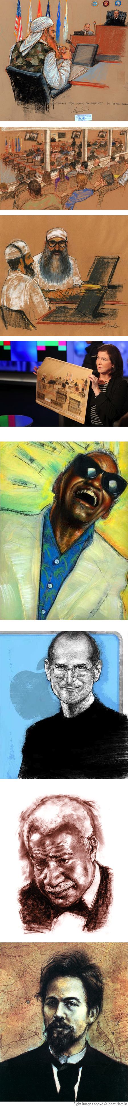
Janet Hamlin is an illustrator whose clients include Time Warner, Universal Studios, The New York Times, Wall Street Journal, IBM, HarperCollins and Associated Press.She is also a courtroom sketch artist. The latter role is one of those fascinating areas in which photography has not replaced drawing as a form of reporting, primarily because cameras are not allowed in courtrooms in many instances.
In particular, Hamlin is noted as the only sketch artist present at the military tribunals at Guantanamo Bay, Cuba, from 2008 to the present, including the trial of Khalid Sheikh Mohammed, accused mastermind of the September 11, 2001 attacks.
A number of sketches from those sessions and others have been collected in a recently released book, Sketching Guantanamo: Court Sketches of the Military Tribunals, 2006-2013 (Amazon link). There is an illustrated review on the New York Review of Books and additional information on the Fantagraphics site, including an 18 page excerpt as a PDF.
The book not only publishes 150 of her Guantanamo courtroom drawings, but delves into the process and demands of the practice. I find it interesting that the drawings are larger in format than I would have expected.
Hamlin’s website also includes several sections of her book and editorial illustrations in various categories, of which I particularly enjoy her portraits of noted figures — done in a variety of media and stylistic approaches.
She also has a portfolio on Behance, a blog devoted to her illustration work and another that features her sketches from figure drawing sessions.
[Suggestion courtesy of Daniel van Benthuysen]
Categories:
-
Antonio Mancini (update)

I’ve seen a lot paintings by quite a number of painters over time, but I don’t think I’ve ever seen anyone handle paint quite like nineteenth century phenomenon Antonio Mancini.I call him a phenomenon, both because his remarkable talent manifested itself at an early age, and because academic master Jean-Léon Gérôme called him that. John Singer Sargent reportedly called Mancini “the world’s greatest living artist”.
Mancini used paint as thin as a breath on the canvas and so thick it looks like it was laid on with a masonry trowel — often in the course of the same composition. He also juxtaposed rough chunks of paint that look like they were launched as the canvas by trebchet with passages of sublime modeling worthy of Renaissance greats. In some of his later work, he embedded bits of mirrors and broken glass, buttons, metal foil and other ephemera in his paint. He also left in the grid-lines of visualizing string grids.
I was fortunate to see the premier exhibition of Mancini’s work in the U.S., which marked the donation of 18 of his works to the Philadelphia Museum of Art in 2007. Since then, the museum usually has at least 2 Mancini’s on display, Il Saltimbanco (above top), and a rotation from among the others.
Unfortunately, I wasn’t quick at the time to pick up on the catalog, which quickly went out of print.
Contemporary painter Leo Mancini-Hresko (no relation, see my post here) happily reports that a new Antionio Mancini Catalogue Raisonné is due to be published in 2014 by Italian publisher De Luca Editori D’Arte. Whether there will be an English version, I don’t know; but I’m looking forward to it either way.
See Macncini-Hresko’s article on the book which includes Antonio Mancinci images you won’t find reproduced elsewhere on the web at the moment, as well as additional background on this remarkable painter.
For more, see my previous post on Antonio Mancini, and my “Eye Candy” post on Mancini’s Customs.
Categories:
-
Eye Candy for Today: Kroyer's roses
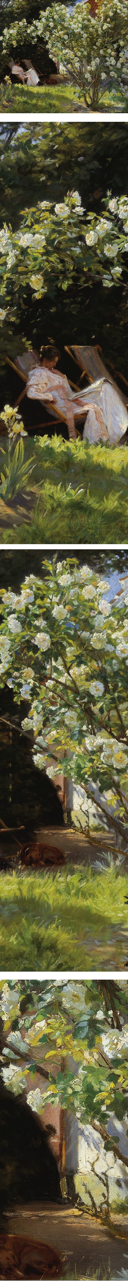
Roses. Marie Krøyer seated in the deckchair in the garden by Mrs. Bendsen’s house, Peder Severin KrøyerOn Google Art Project. Original is in the Skagens Museum.
Enjoy the roses while they last.
Categories:
-
Raphael Lacoste (update)

Raphael Lacoste is an illustrator, visual development artist and art director for the gaming and film industries.He is currently working with Ubisoft as Brand Art Director for the Assasin’s Creed franchise, which is noted for its beautiful environments.
Lacoste’s other gaming credits include: Prince of Persia: The sands of Time and Prince of Persia: The Two Thrones. He has also worked as a matte painter and designer for feature films like Terminator: Salvation, Journey to the Center of the Earth, Jupiter Ascending and Repo Men.
Lacoste’s website features galleries of his work in several areas. He works digitally, primarily in Photoshop, and his images make beautiful use of atmospheric perspective and severely limited palettes. Some of his digital paintings seem almost monochromatic when you look at them in detail, but never feel artificially restricted in color range. In others, he uses to great effect the highlighting of key elements in a semi-monochromatic composition with the scheme’s complementary color.
You can see in his work an admiration for 18th and 19th century artists like JMW Turner, Arnold Böcklin and Caspar David Friedrich.
Lacoste has an instructional DVD on Digital Environment Painting from Gnomon Workshop, also available through Amazon.
[Via CGHub]
Categories:
-
Catherine Drabkin
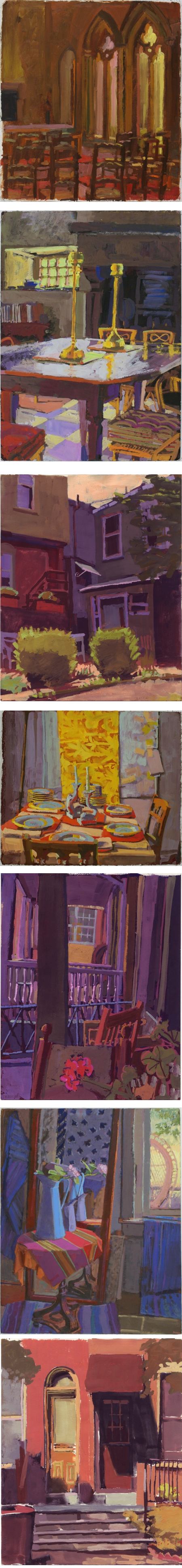
I had the opportunity over the weekend to attend a gouache workshop at the Delaware College of Art and Design (where I teach a course in Animation for the Web), conducted by Catherine Drabkin.Drabkin was a founding faculty member of the college, and has recently relocated to Pittsburgh.
Drabkin works in oil and drawing media as well as gouache, with an emphasis on the latter. She uses that often overlooked medium’s characteristics to advantage, with bright, expressively colored paintings that are simultaneously painterly and graphic in their use of flat areas of color. She breaks her forms up into geometric planes with crisp chunks of color and keeps a nice balance between simplicity and detail.
Drabkin has recently completed a new book showcasing her work inspired by her neighborhood in Wilmington while she was living there, Finding Home: an American Neighborhood. I don’t have a link for the book yet, but you can see some of her cityscapes of the area in the “Midtown Brandywine” section of her website.
Drabkin is represented by Kraushaar Galleries in New York.
Categories:
-
Dean Cornwell WWII advertising illustration study
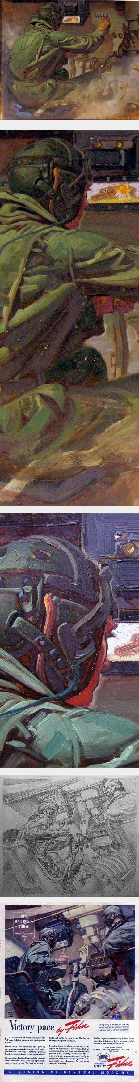
Today is Veterans Day here in the U.S.A friend of mine — painter, comics artist and animation artist Mike Manley — has this wonderful study by the great American illustrator Dean Cornwell hanging in his house.
The final was an illustration for the Fisher automotive division of General Motors, urging the public to buy war bonds during WWII, and of course, extolling the virtues of their manufacturing prowess.
In the final, the tank corps soldiers are show closing in on their target. In the study, Cornwell has focused in on one figure. The rendering is wonderfully painterly and remarkably finished for a study.
Manley has kindly shared images of the piece with us on his blog, along with a preliminary drawing that shows the final composition for the finished piece. There is a large version of that here.
James Gurney has a piece today on the same illustration on his blog Gurney Journey.
Categories:


Charley’s Picks
Bookshop.org
(Bookshop.org affilliate links; sales benefit independent bookshop owners; I get a small percentage to help support my work on Lines and Colors)

John Singer Sargent: Watercolors


Urban Sketching: Understanding Perspective


Charley’s Picks
Amazon
(Amazon.com affiliate links; sales go to a larger yacht for Jeff Bezos; but I get a small percentage to help support my work on Lines and Colors)
John Singer Sargent: Watercolors
Urban Sketching: Understanding Perspective