
Categories
- 3d CGI
- Amusements
- Animation
- Anime & Manga
- Art Materials
- Art Videos
- Blogroll
- Cartoons
- Color
- Comics
- Concept & Visual Dev.
- Creativity
- Digital Art
- Digital Painting
- Displaying Art on the Web
- Drawing
- Eye Candy for Today
- Gallery and Museum Art
- High-res Art Images
- Illustration
- Motion Graphics & Flash
- Museums
- Online Museums
- Outsider Art
- Painting
- Painting a Day
- Paleo Art
- Pastel, Conté & Chalk
- Pen & Ink
- Prints and Printmaking
- Reviews
- Sc-fi and Fantasy
- Sculpture & Dimensional
- Site Comments
- Sketching
- Storyboards
- Tools and Techniques
- Uncategorized
- Vector Art
- Videos & Podcasts
- Vision and Optics
- Watercolor and Gouache
- Webcomics
Archives
- April 2026
- March 2026
- February 2026
- January 2026
- December 2025
- November 2025
- October 2025
- September 2025
- August 2025
- July 2025
- June 2025
- May 2025
- January 2025
- December 2024
- November 2024
- October 2024
- September 2024
- August 2024
- June 2024
- April 2024
- March 2024
- February 2024
- January 2024
- December 2023
- November 2023
- October 2023
- September 2023
- August 2023
- July 2023
- May 2023
- April 2023
- March 2023
- February 2023
- January 2023
- December 2022
- November 2022
- September 2022
- August 2022
- July 2022
- June 2022
- May 2022
- April 2022
- March 2022
- February 2022
- January 2022
- December 2021
- November 2021
- October 2021
- September 2021
- August 2021
- July 2021
- June 2021
- May 2021
- April 2021
- March 2021
- February 2021
- January 2021
- December 2020
- November 2020
- October 2020
- September 2020
- August 2020
- July 2020
- June 2020
- May 2020
- April 2020
- March 2020
- February 2020
- January 2020
- December 2019
- November 2019
- October 2019
- September 2019
- August 2019
- July 2019
- June 2019
- May 2019
- April 2019
- March 2019
- February 2019
- January 2019
- December 2018
- November 2018
- October 2018
- September 2018
- August 2018
- July 2018
- June 2018
- May 2018
- April 2018
- March 2018
- February 2018
- January 2018
- December 2017
- November 2017
- October 2017
- September 2017
- August 2017
- July 2017
- June 2017
- May 2017
- April 2017
- March 2017
- February 2017
- January 2017
- December 2016
- November 2016
- October 2016
- September 2016
- August 2016
- July 2016
- June 2016
- May 2016
- April 2016
- March 2016
- February 2016
- January 2016
- December 2015
- November 2015
- October 2015
- September 2015
- August 2015
- July 2015
- June 2015
- May 2015
- April 2015
- March 2015
- February 2015
- January 2015
- December 2014
- November 2014
- October 2014
- September 2014
- August 2014
- July 2014
- June 2014
- May 2014
- April 2014
- March 2014
- February 2014
- January 2014
- December 2013
- November 2013
- October 2013
- September 2013
- August 2013
- July 2013
- June 2013
- May 2013
- April 2013
- March 2013
- February 2013
- January 2013
- December 2012
- November 2012
- October 2012
- September 2012
- August 2012
- July 2012
- June 2012
- May 2012
- April 2012
- March 2012
- February 2012
- January 2012
- December 2011
- November 2011
- October 2011
- September 2011
- August 2011
- July 2011
- June 2011
- May 2011
- April 2011
- March 2011
- February 2011
- January 2011
- December 2010
- November 2010
- October 2010
- September 2010
- August 2010
- July 2010
- June 2010
- May 2010
- April 2010
- March 2010
- February 2010
- January 2010
- December 2009
- November 2009
- October 2009
- September 2009
- August 2009
- July 2009
- June 2009
- May 2009
- April 2009
- March 2009
- February 2009
- January 2009
- December 2008
- November 2008
- October 2008
- September 2008
- August 2008
- July 2008
- June 2008
- May 2008
- April 2008
- March 2008
- February 2008
- January 2008
- December 2007
- November 2007
- October 2007
- September 2007
- August 2007
- July 2007
- June 2007
- May 2007
- April 2007
- March 2007
- February 2007
- January 2007
- December 2006
- November 2006
- October 2006
- September 2006
- August 2006
- July 2006
- June 2006
- May 2006
- April 2006
- March 2006
- February 2006
- January 2006
- December 2005
- November 2005
- October 2005
- September 2005
- August 2005
Relevant Blogs
Art, Painting & Sketch
- Gurney Journey
- Underpaintings
- Art and Influence
- Painting Perceptions
- Oil Painters of America
- Vasari Paint POV
- Flying Fox
- Urban Sketchers
- Bento (Smithsonian)
- Art Inconnu
- The Hidden Place
- Still Life
- Making a Mark
- The Art of the Landscape
- Exploring Color & Creativity
- Art Contrarian
- Artist A Day
- beinArt Surreal Art Collective
- Eye Level
- David Dunlop
- p.i.g.m.e.n.t.i.u.m
- CultureGrrl
- Joaquín Sorolla blog
- Artists in Pastel
“Painting a Day”
- A Painting a Day (Keiser)
- On Painting (Keiser)
- Julian Merrow-Smith
- Karen Jurick
- Jeffrey Hayes
- Carol Marine
- Abbey Ryan
- Daily Paintworks
Other Painting Blogs
- Virtual Gouache Land
- Neil Hollingsworth
- Marc Hanson
- Kevin Menck
- Marc Dalessio
- Larry Seiler
- Stapleton Kearns
- Colin Page
- Roos Schuring
- Hans Versfelt
- Titus Meeuws
- Régis Pettinari
- René Plein Air
- Belinda Del Pesco
- Robin Weiss
- Nathan Fowkes (Land Sketch)
- William Wray
- Frank Serrano
- Stephen Magsig
- Michael Chesley Johnson
- Twice a Week
- Sarah Wimperis
- Rob Adams
- Michael Cole Manley
- The Dirty Palette Club
- Mike Manley’s Draw!
Gallery Art & Illustration mix
Illustration
- Howard Pyle
- 100 Years of Illustration
- BibliOdyssey
- Illustration Art
- Today’s Inspiration
- Illustration Mundo
- Little Chimp Society
- Danny Gregory
- R D (John Martz
- Illustration Friday blog
- Monster Brains
- Illustrators & Illustrations (RU)
- Elwood H. Smith
- DaniDraws.com
- Designers Who Blog
- iSpot Blog
Sci-Fi & Fantasy
Illustration & Comics
Comics & Cartoons
- Comics Beat
- Robot 6
- Newsarama Blog
- Comic Vine
- Comics Alliance
- Forbidden Planet Int.
- Paolo Rivera
- Bolt City
- Flight
- Scott McCloud
- The Comics Journal
- Comixpedia
- Funnybook Babylon
- James Baker
- Middleton’s Sketchbook
- Boneville
- The Hotel Fred
- Paul Rivoche
- Daily Cartoonist
- Mad About Cartoons (William Wray)
- Digital Strips
Illustration & Concept
Animation & Concept
- Cartoon Brew
- Animation Blog
- Cold Hard Flash
- Concept Art World
- The CAB
- FY Concept Art
- Concept Ships
- Concept Robots
- John Nevarez
- Armand Serrano
- Marcos Mateu-Mestre
- all kinds of stuff (Kricfalusi)
- Yacin the faun (Man Arenas)
- Kelsey Mann
- Cre8tivemarks Blog
- Ice-Cream Monster Toon Cafe
- AAU Character & Creature Design
- AAU Animation Notes
- Articles and Texticles
Paleo & Scientific
Tools & Techniques
Other
Lists of Art Blogs
Art Image Resource Links
Historic Art Images
- Wikimedia Commons: Paintings
- Wikimedia Commons: Drawings
- The Athenaeum
- WikiArt (WikiPaintings)
- Google Art Project: Artists
- Google Art Project: Collections (Museums)
- ArtCyclopedia
- Web Gallery of Art
- Art Renewal Center
- Web Gallery of Impressionism
Auction Consolidation sites
Auction sites
- Sotheby’s
- Bonham’s
- Christies
- Heritage Auctions: Fine Art
- Heritage Auctions: Illustration
- Freeman’s Auctions
- Bukowskis
- Shannon’s
Image Search
Reverse Image Search (search by image)
- Tin Eye
- RevImg
- Google Image Search (camera icon)
- Bing Image Search (camera icon)
Promoting some friends and some clients of my website design business
- Twin Willows T’ai Chi studio in Wilmington DE. Taiji classes with Bryan Davis.
- Ray Hayward, Inspired Teacher of T’ai Chi ( Taiji ) in Minneapolis, Founder of Mindful Motion Tai Chi Academy
- OldHead Tattoo studio and Art Gallery in Wilmington DE. Tattoos and paintings by Bruce Gulick
- Sharon Domenico Art, pet portrait oil paintings
- Platinum Paperhanging, wallpaper hanging, Main Line and Philadelphia, PA
- Lisa Stone Design, interior designer, Main Line and Philadelphia, PA
- Studio12KPT, original art, prints, calendars and other custom printed items by Van Sickle & Rolleri
-
Pride of Place: Dutch Cityscapes of the Golden Age

In reviewing the exhibition currently at the National Gallery in Washington, D.C., Pride of Place: Dutch Cityscapes of the Golden Age, Blacke Gopnik writes in his Washington Post article The ‘Golden’ Compass that contemporary viewers may not know how to correctly look at classic Dutch landscapes and cityscapes.He suggests that this is more than having a background knowledge of the artists or particular paintings, and in fact has to do with physical proximity to the painting, a reference to a kind of “sweet spot” from which the painting was intended to be seen, particularly in terms of being close enough to the image for it to fill a significant part of your visual field; but also, in some cases, requiring a vantage point from one side or the other.
A case in point is Daniel Vosmaer’s Delft from an Imaginary Loggia (image above, top), which looks “off” at first, but apparently resolves into a strikingly naturalistic scene when viewed from a position close to the bottom left of the painting. Some are more natural seeming in appearance when seen from a distance or in reproduction, like Adriaensz Berckheyde’s The Grote or St. Bavokerk in Haarlem (image above, bottom), but still evidently reveal their full force only when seen up close.
Gopnik goes on to suggest that over half the paintings in the show, and many other Dutch cityscapes, interiors and even still lifes, are meant to respond to an off-center point of view.
It’s a fascinating idea, and one I hope to put to the test by traveling to see the show.
When I first looked at the slide show in the Post of images from the exhibition, I was ready to jump in the car and drive down, because it looked as if Vermeer’s beautiful View of Delft (larger image here) was among the paintings on exhibit. I saw this amazing work when it was at the wonderfully extensive Johannes Vermeer exhibition at the National Gallery back in 1995, and I have been dying to see it again since. Unfortunately, that work was only part of the current exhibition in its other venue, the Royal Picture Gallery Mauritshuis, which is home to the painting. Apparently the curators at the Maruitshuis felt it was too dangerous to allow the large painting to make the trans-Atlantic voyage again, as explained here.
Still, the current exhibit of Dutch cityscapes, from the height of their glory, should be something to see indeed. The exhibition contains 48 paintings by over 40 Dutch masters, including Gerrit Berckheyde, Aelbert Cuyp, Jan van Goyen, Jan van der Heyden, Pieter de Hooch, Hendrick Vroom, Pieter Saenredam, and Jan Steen; and is supplemented with maps, atlases, illustrated books and prints.
Pride of Place: Dutch Cityscapes of the Golden Age is on display at the National Gallery in Washington until May 3, 2009.
Categories:
-
2009 Eustace Tilley Results

The results are in for The New Yorker’s 2009 Eustace Tilley Contest. See my recent post about the 2009 Eustace Tilley Contest for an explanation.You can view the 12 winners as a slide show, or as thumbnails. You can also view all 2009 entries. You can see the original Eustace from the cover of the first issue of The New Yorker here.
I love the Watchmen graphic novel cover parody by Marcus Thiele (above, center, larger version here).
You can also view the 2008 winners (thumbnails) or all 2008 entries (on Flickr).
 Just for fun, I actually entered this year (image at left, larger version here).
My entry didn’t make the cut, but it was fun to draw; even though, with my usual insane schedule, I was working on it at the last minute (literally — I submitted it one minute before the midnight deadline); and for someone who hardly ever posts my own work on this blog, here I am doing it twice in a row.
It’s fun to look through the whole range of entries, particularly if you saw last years’, and compare some of pop culture influences relevant to the times (lots of iPhones, financial woes and Obama images this year).
See also my post on last year’s contest, The Many Faces of Eustace Tilley.
(Image at top, left to right: David Leonard, Marcus Thiele, David Cook, Adam Koford, Charlene Chua, Eric Almendral)
Categories:
-
My Pocket Rembrandt
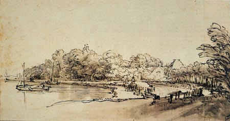
OK, I’ll explain what I mean by that.I’ve long been an admirer of Rembrandt’s drawings, particularly those done in reed pen, bistre ink and wash (e.g. the image above). (Bistre ink is made by boiling wood soot, often taken from wood-buring chimneys, in water. It produces as yellow-brown, transparent ink that was not favored for writing, but is well suited to drawings with washes.)
In attempting to emulate Rembrandt’s sketching methods (and those of other master ink and wash draughtsmen), I’ve even made my own reed pens (moderately successfully) and bistre ink (unsuccessfully); but eventually settled on modern tools, a steel nibbed pen like a Hunt/Speedball 108 and washes of modern sepia-colored drawing inks, or other brown or red-brown inks (as opposed to real cuttlefish sepia, which can be problematic).
There are more interesting drawing inks appearing in recent years, like Walnut Ink and Noodler’s Drawing Inks, but I haven’t tried them yet.
So for a while I was carrying around a sketching kit of a sketchpad, pen holders and points, a bottle of ink, a bottle of wash, a watercolor brush, rinsing water and a wiping cloth. Perhaps comparable to what the old guys carried around, but more awkward than a modern portable pocket watercolor kit.
I wanted something I could stick in my pocket and have with me to sketch at a whim, without the mess and fuss, but I still wanted to sketch in brown line and wash.
After trying various tools, I settled on a couple of Sakura Pigma Micron markers with sepia colored (brown) ink in different sizes, usually 05 and 005, and a Tombow Dual Brush-Pen, “Tan”, #942 (many of the other colors in these markers are too dark to be used for washes).

The Pigma Microns are water-fast once dry, which is almost immediately. I can wash over them at will with the Tombow, which is light enough for relatively light washes, and can be built up a bit with repeated passages. The Pigma Microns can also be used over the wash which results in an interesting bit of bleed and rough line.The result is a reasonable approximation of ink and wash, as in my drawing below (larger version here), and makes for a simple, easy to carry, no-mess sketch kit that lets me draw in ink and “wash” wherever I go (though the Tombow Brush-Pen is a bit big to casually carry in a pocket).
(BTW, I know I’ve got a lot of nerve posting one of my own drawings with a Rembrandt, but I’ve learned over time how horribly counter-productive it is to be intimidated by others’ work; so I refuse to be intimidated even by the great masters. Inspired, yes, intimidated, no.)
 For a nice off-white suface, on which the brown ink lines and washes look great, I use Strathmore Series #400 sketchpads. They have a nice paper with a slight tooth that takes light washes well, and are slim enough at 24 sheets to slip into a pocket or case easily. (I also use Moleskine Cahier softbound sketchbooks, which are even thinner, about the size and appearance of a U.S. passport.)
While I’m at it, I’ll recommend a good book on pen and ink drawing: Rendering in Pen and Ink by Arthur L. Guptill and Susan E. Meyer, and a nice inexpensive book on Rembrandt’s drawings in color (which really makes a difference) is Rembrandt Drawings: 116 Masterpieces in Original Color from Dover Books.
You can also look for Rembrandt drawings in color on the terrific web site Rembrandt van Rijn: Life and Work (see my post on author Jonathan Janson, the Rembrandt site, and the related site, Essential Vermeer).
Here is a larger version of the Rembrandt drawing at the top of the article, and another Rembrandt ink and wash drawing that I just love.
There are other variations on portable ink and wash drawing, of course; a nice fountain pen with waterproof ink and a Niji Waterbrush, in which you could carry your own mixture of wash, would be more flexible, but a bit more trouble.
I’ve been happy though, with the portability and flexibility of my “Pocket Rembrandt”, and the wonderful character halfway between drawing and painting produced when rendering with washes. If you haven’t tried it, pick up a “Pocket Rembrandt” kit and head for the marshes.
[Addendum, 11/11/2012: I’ve recently been experimenting with replacing the Tombow markers, as much as I like them, with more compact Faber-Castell Pitt artist pens (Blick link), specifically the “B” series. These are brush markers that fit more readily in a pocket than the longer Tombows.
I’m experimenting with colors like “Light Flesh” and “Sepia” to find a nice combination of two tones for my washes.]
Categories:
-
North American Reciprocal Museum Program (NARM)
Buried somewhere in the membership pages on the web sites of many small art museums and cultural centers in the U.S. and Canada, usually somewhere halfway down the page of museum membership levels, is a little perk that can sometimes make a higher level museum membership into a great deal.Over 300 smaller, “regional” museums, most of them art museums or similar cultural institutions, have made agreements to offer reciprocal membership privileges to the members of other participating museums through the North American Reciprocal Museum Program (NARM).
If, like me, you’re an inveterate museum goer, and if, like me, you’ve discovered the treasures to be found in small regional art museums in the U.S., this can be a terrific deal, particularly if the museum you get your membership from does not ask for too high a membership level for access to the reciprocal agreement status.
There is a list of participating museums here, that is linked to the sites of the museums. You can find a museum you might be inclined to join and check out their membership pages for details on their required membership level for the “perk” of the NARM sticker on your membership card.
You don’t have to join a museum in your area, most museums will gladly accept members from other states (particularly these days), and the price of the membership level varies widely. Some ask over $300, others considerably less.
Each museum also usually has a brief description of the program and it’s benefits (and also usually offer additional membership benefits at the level required). Many of them offer a downloadable PDF of the participating museum list.
The best deal I’ve found is at the Brandywine River Museum in Chadds Ford, Pa, a museum I’m inclined to be a member of anyway. They only ask for a $100 “Donor Level” membership to get the NARM sticker added to your membership card.
You can look over the list of participating museums, calculate how often you’re likely to visit some of them, and see if the cost is worth it. For me it pays for itself a couple of times over, as there are a number of museums that I visit in Pennsylvania, New Jersey, Maryland and New York that are on the list. If you’re in an area where travel to other regional museums is more difficult, it may not be as viable.
The reciprocal membership includes basic membership admission and gift shop discount privileges at the participating museums.
You may want to check the notes at the bottom of the list, however, as there are a few restrictions between certain museums (usually in the same area).
I like museum memberships anyway. They not only help support the museums and give you benefits like members’ previews and bookstore discounts, but they give you a sense of freedom about visiting frequently and dropping in on a whim, without reservations about spending enough time to make the cost of admission worthwhile.
Add to that the impetus to explore other museums on the list that are within reach or available when you travel, and you have a terrific bit of inspiration in your pocket in the form of the NARM sticker on your museum membership card.
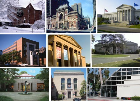
(Image above, left to right: Brandywine River Museum, Pennsylvania Academy of the Fine Arts, Minneapolis Institute of Arts, Sackler Gallery, Baltimore Art Museum, Montclair Museum, James A. Michener Art Museum, Newark Museum, Laguna Art Museum.)
Categories:
-
Aureliano de Beruete

Aureliano de Beruete y Moret was a Spanish painter active in the late 19th and early 20th centuries. He was born in Madrid and spent most of his life there, though he traveled widely.Beruete started out to be a lawyer, earned his doctorate, but at the same time studied painting with Carlos Múgica. He initially embarked on a career as a politician and became a member of of Parliment, not a career normally thought of as a cross over with painting (Winston Churchill notwithstanding), but eventually choose the artistic path and studied with Martin Rico and Carlos de Haes at Academia de Bellas Artes de San Fernando in Madrid.
Martin Rico was one of the Spanish precursors of Impressionism, and picked up some of the same influences as the French Impressionists through time spent with the Barbizon painters; and Carlos de Haes played a major role in bringing the Impressionist passion for plein air painting to Spain
They both undoubtedly had an impact on their student Beruete, who became one of the most significant Spanish exponents of the Impressionist characteristics of open brushwork and location landscape painting. His palette was a bit darker, however, and he always showed the influence of great Spanish masters of the past, including Diego Velázquez, about whom he assembled the first catalogue raisonné.
Beruete was friends with the amazing painter Joaquín Sorolla y Bastida (who painted a portrait of Beruet), though he never fully adopted his friend’s brighter palette. Both get labeled as “Spanish Impressionists”, but neither were adherents of the French painters’ theories, nor did they feel compelled to abandon academic traditions as did their French counterparts.
I associate them more with the painters who get labeled “American Impressionists”, who also adopted elements of the Impressionist style, but maintained their own independent vision and the solid underpinnings of academic realism.
Beruete is not well known to Americans (I just discovered his work recently), and it’s a real treat when you first discover his beautifully loose, confident brushwork, rich textures and sweeping compositions.
Categories:
-
Paolo Rivera

At one time the brief description line at the top of Paolo Rivera’s blog read: “I am a painter for Marvel Comics. Really, I am.”If that seems odd, you may not be aware that many comic book overs are painted (a practice that has a fairly long history) and, in recent years, an increasing number of comics stories themselves are being told in fully rendered painted panels.
I trace fully painted comic stories back to the pioneering work of Will Elder on Little Annie Fanny in the 1960’s, though perhaps there were antecedents in European comics I’m not aware of. The limiting factor in mainstream American comic books was printing technology. For a long time comics were printed by letterpress (like newspapers), and color was applied by hand-cutting stencils.
That has changed dramatically, of course, and in modern comic book printing almost anything is possible; and the main limitation on painted comic book stories is that the process can be even more work and time intensive than traditional ink outline with filled colors.
Some purists don’t like the painted approach, feeling that it’s not “comics” unless it’s black line art with color fills, but I think it works fine as long as the artist has good visual storytelling skills.
Though within the practice of painted comics stories artists can take a variety of approaches, and in the hands of some artists it can feel forced and stiff, with the visual weight of the fully painted images slowing down the pace of the story.
Rivera, I think, is an artist who has a light and varied touch to his painted interior panels, and a natural feel for this variation on the comics medium. He has an approach that flows with the story, propelling it rather than slowing it down, and providing a wonderful textural quality to the images that only painted panels can provide.
Rivera grew up around art, his parents owned an art supply store, and he started working for Marvel comics while still a junior at the Rhode Island School of Design. He found his calling in comics, particularly painted comics, when he was struck by the painted comics work of Alex Ross on Marvels.
Rivera has become well known as a painted cover artist and for his painted storytelling work on a series called Mythos as well as titles like Spectacular Spider-Man.
Lately he has been showing himself to be adept at the traditional line art style of comic storytelling, tough I hope it doesn’t mean we’ll see a lot less of his painted work.
As part of the lead-up to the New York Comic Con, coming up February 6th – 8th, where Rivera will be among the guest artists, he is giving a lecture on Comics, Color and Composition at the Brooklyn Public Library on Wednesday, February 4th, 2009.
The lecture will be at 7pm in the Dweck Center of the Central Library on Grand Army Plaza. It’s free and open to the public and will be followed by a question and answer session, so comic-artists-to-be can grill him on his drawing and painting techniques.
Categories:


Charley’s Picks
Bookshop.org
(Bookshop.org affilliate links; sales benefit independent bookshop owners; I get a small percentage to help support my work on Lines and Colors)

John Singer Sargent: Watercolors


Urban Sketching: Understanding Perspective


Charley’s Picks
Amazon
(Amazon.com affiliate links; sales go to a larger yacht for Jeff Bezos; but I get a small percentage to help support my work on Lines and Colors)
John Singer Sargent: Watercolors
Urban Sketching: Understanding Perspective