
Categories
- 3d CGI
- Amusements
- Animation
- Anime & Manga
- Art Materials
- Art Videos
- Blogroll
- Cartoons
- Color
- Comics
- Concept & Visual Dev.
- Creativity
- Digital Art
- Digital Painting
- Displaying Art on the Web
- Drawing
- Eye Candy for Today
- Gallery and Museum Art
- High-res Art Images
- Illustration
- Motion Graphics & Flash
- Museums
- Online Museums
- Outsider Art
- Painting
- Painting a Day
- Paleo Art
- Pastel, Conté & Chalk
- Pen & Ink
- Prints and Printmaking
- Reviews
- Sc-fi and Fantasy
- Sculpture & Dimensional
- Site Comments
- Sketching
- Storyboards
- Tools and Techniques
- Uncategorized
- Vector Art
- Videos & Podcasts
- Vision and Optics
- Watercolor and Gouache
- Webcomics
Archives
- April 2026
- March 2026
- February 2026
- January 2026
- December 2025
- November 2025
- October 2025
- September 2025
- August 2025
- July 2025
- June 2025
- May 2025
- January 2025
- December 2024
- November 2024
- October 2024
- September 2024
- August 2024
- June 2024
- April 2024
- March 2024
- February 2024
- January 2024
- December 2023
- November 2023
- October 2023
- September 2023
- August 2023
- July 2023
- May 2023
- April 2023
- March 2023
- February 2023
- January 2023
- December 2022
- November 2022
- September 2022
- August 2022
- July 2022
- June 2022
- May 2022
- April 2022
- March 2022
- February 2022
- January 2022
- December 2021
- November 2021
- October 2021
- September 2021
- August 2021
- July 2021
- June 2021
- May 2021
- April 2021
- March 2021
- February 2021
- January 2021
- December 2020
- November 2020
- October 2020
- September 2020
- August 2020
- July 2020
- June 2020
- May 2020
- April 2020
- March 2020
- February 2020
- January 2020
- December 2019
- November 2019
- October 2019
- September 2019
- August 2019
- July 2019
- June 2019
- May 2019
- April 2019
- March 2019
- February 2019
- January 2019
- December 2018
- November 2018
- October 2018
- September 2018
- August 2018
- July 2018
- June 2018
- May 2018
- April 2018
- March 2018
- February 2018
- January 2018
- December 2017
- November 2017
- October 2017
- September 2017
- August 2017
- July 2017
- June 2017
- May 2017
- April 2017
- March 2017
- February 2017
- January 2017
- December 2016
- November 2016
- October 2016
- September 2016
- August 2016
- July 2016
- June 2016
- May 2016
- April 2016
- March 2016
- February 2016
- January 2016
- December 2015
- November 2015
- October 2015
- September 2015
- August 2015
- July 2015
- June 2015
- May 2015
- April 2015
- March 2015
- February 2015
- January 2015
- December 2014
- November 2014
- October 2014
- September 2014
- August 2014
- July 2014
- June 2014
- May 2014
- April 2014
- March 2014
- February 2014
- January 2014
- December 2013
- November 2013
- October 2013
- September 2013
- August 2013
- July 2013
- June 2013
- May 2013
- April 2013
- March 2013
- February 2013
- January 2013
- December 2012
- November 2012
- October 2012
- September 2012
- August 2012
- July 2012
- June 2012
- May 2012
- April 2012
- March 2012
- February 2012
- January 2012
- December 2011
- November 2011
- October 2011
- September 2011
- August 2011
- July 2011
- June 2011
- May 2011
- April 2011
- March 2011
- February 2011
- January 2011
- December 2010
- November 2010
- October 2010
- September 2010
- August 2010
- July 2010
- June 2010
- May 2010
- April 2010
- March 2010
- February 2010
- January 2010
- December 2009
- November 2009
- October 2009
- September 2009
- August 2009
- July 2009
- June 2009
- May 2009
- April 2009
- March 2009
- February 2009
- January 2009
- December 2008
- November 2008
- October 2008
- September 2008
- August 2008
- July 2008
- June 2008
- May 2008
- April 2008
- March 2008
- February 2008
- January 2008
- December 2007
- November 2007
- October 2007
- September 2007
- August 2007
- July 2007
- June 2007
- May 2007
- April 2007
- March 2007
- February 2007
- January 2007
- December 2006
- November 2006
- October 2006
- September 2006
- August 2006
- July 2006
- June 2006
- May 2006
- April 2006
- March 2006
- February 2006
- January 2006
- December 2005
- November 2005
- October 2005
- September 2005
- August 2005
Relevant Blogs
Art, Painting & Sketch
- Gurney Journey
- Underpaintings
- Art and Influence
- Painting Perceptions
- Oil Painters of America
- Vasari Paint POV
- Flying Fox
- Urban Sketchers
- Bento (Smithsonian)
- Art Inconnu
- The Hidden Place
- Still Life
- Making a Mark
- The Art of the Landscape
- Exploring Color & Creativity
- Art Contrarian
- Artist A Day
- beinArt Surreal Art Collective
- Eye Level
- David Dunlop
- p.i.g.m.e.n.t.i.u.m
- CultureGrrl
- Joaquín Sorolla blog
- Artists in Pastel
“Painting a Day”
- A Painting a Day (Keiser)
- On Painting (Keiser)
- Julian Merrow-Smith
- Karen Jurick
- Jeffrey Hayes
- Carol Marine
- Abbey Ryan
- Daily Paintworks
Other Painting Blogs
- Virtual Gouache Land
- Neil Hollingsworth
- Marc Hanson
- Kevin Menck
- Marc Dalessio
- Larry Seiler
- Stapleton Kearns
- Colin Page
- Roos Schuring
- Hans Versfelt
- Titus Meeuws
- Régis Pettinari
- René Plein Air
- Belinda Del Pesco
- Robin Weiss
- Nathan Fowkes (Land Sketch)
- William Wray
- Frank Serrano
- Stephen Magsig
- Michael Chesley Johnson
- Twice a Week
- Sarah Wimperis
- Rob Adams
- Michael Cole Manley
- The Dirty Palette Club
- Mike Manley’s Draw!
Gallery Art & Illustration mix
Illustration
- Howard Pyle
- 100 Years of Illustration
- BibliOdyssey
- Illustration Art
- Today’s Inspiration
- Illustration Mundo
- Little Chimp Society
- Danny Gregory
- R D (John Martz
- Illustration Friday blog
- Monster Brains
- Illustrators & Illustrations (RU)
- Elwood H. Smith
- DaniDraws.com
- Designers Who Blog
- iSpot Blog
Sci-Fi & Fantasy
Illustration & Comics
Comics & Cartoons
- Comics Beat
- Robot 6
- Newsarama Blog
- Comic Vine
- Comics Alliance
- Forbidden Planet Int.
- Paolo Rivera
- Bolt City
- Flight
- Scott McCloud
- The Comics Journal
- Comixpedia
- Funnybook Babylon
- James Baker
- Middleton’s Sketchbook
- Boneville
- The Hotel Fred
- Paul Rivoche
- Daily Cartoonist
- Mad About Cartoons (William Wray)
- Digital Strips
Illustration & Concept
Animation & Concept
- Cartoon Brew
- Animation Blog
- Cold Hard Flash
- Concept Art World
- The CAB
- FY Concept Art
- Concept Ships
- Concept Robots
- John Nevarez
- Armand Serrano
- Marcos Mateu-Mestre
- all kinds of stuff (Kricfalusi)
- Yacin the faun (Man Arenas)
- Kelsey Mann
- Cre8tivemarks Blog
- Ice-Cream Monster Toon Cafe
- AAU Character & Creature Design
- AAU Animation Notes
- Articles and Texticles
Paleo & Scientific
Tools & Techniques
Other
Lists of Art Blogs
Art Image Resource Links
Historic Art Images
- Wikimedia Commons: Paintings
- Wikimedia Commons: Drawings
- The Athenaeum
- WikiArt (WikiPaintings)
- Google Art Project: Artists
- Google Art Project: Collections (Museums)
- ArtCyclopedia
- Web Gallery of Art
- Art Renewal Center
- Web Gallery of Impressionism
Auction Consolidation sites
Auction sites
- Sotheby’s
- Bonham’s
- Christies
- Heritage Auctions: Fine Art
- Heritage Auctions: Illustration
- Freeman’s Auctions
- Bukowskis
- Shannon’s
Image Search
Reverse Image Search (search by image)
- Tin Eye
- RevImg
- Google Image Search (camera icon)
- Bing Image Search (camera icon)
Promoting some friends and some clients of my website design business
- Twin Willows T’ai Chi studio in Wilmington DE. Taiji classes with Bryan Davis.
- Ray Hayward, Inspired Teacher of T’ai Chi ( Taiji ) in Minneapolis, Founder of Mindful Motion Tai Chi Academy
- OldHead Tattoo studio and Art Gallery in Wilmington DE. Tattoos and paintings by Bruce Gulick
- Sharon Domenico Art, pet portrait oil paintings
- Platinum Paperhanging, wallpaper hanging, Main Line and Philadelphia, PA
- Lisa Stone Design, interior designer, Main Line and Philadelphia, PA
- Studio12KPT, original art, prints, calendars and other custom printed items by Van Sickle & Rolleri
-
Qiang Huang

Qiang Huang (pronounced Chong Wong) participates in the online Daily Painters Art Gallery and is listed on Jeff Hayes’ Painting a Day Squidoo lens, along with others involved in the increasingly popular practice of “painting a day”. He is also a member of a group called Plein Air Austin, which is dedicated to outdoor alla prima painting in Austin, Texas and the surrounding area.Huang’s daily painting blog is largely dedicated to still life paintings. Where many daily painters will opt for small, single objects as the subject for these small daily studies, Huang works with more traditional still life arrangements of multiple objects.
His paintings feature bright, bold colors, a highly painterly approach with lots of visible brushstrokes and physical presence of the paint texture, and compositions with strong value contrasts.
Value is often underestimated as a quality in painting but Huang has made it a major component of his work. As an experiment, I converted a couple of his images to grayscale in Photoshop, effectively discarding the color information and leaving the image only in grays, and they read very well.
Huang has a demo video on the blog, from a demonstration he gave for the Plein Air Austin group, in which he worked on this still-life.
The demo is instructive even though it is set to an instrumental version of the Rascals’ Groovin’ rather than having an explanatory voice over. You can see, at least in this case, that he establishes his values with a low-chroma sketch before going in with his brighter colors.
The paintings on his blog are linked to nice big reproductions, close to or even larger on screen than original size; which I think is an excellent practice for a painter who is selling work directly online.
In addition to his blog, Huang also has a web site, with galleries of his more finished still life paintings, landscapes and portraits. His landscapes and portraits often use the illustrative approach of letting the edges of the image stay as rough, broad brush strokes that fade off into unpainted areas.
Categories:
-
Astrona: Space and Astronomical Art Journal
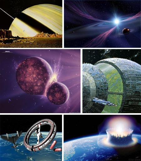
Artistic visions of “the heavens” have been with us throughout the history of art, but pictures of space and planetary bodies probably date from the late 1800’s when conjecture about flights to other spheres became the topic of popular literature.Since then artists have portrayed other worlds with varying intent and degrees of scientific accuracy, but space and astronomical art have played a vital role in our understanding of the universe beyond our little blue paradise.
Sometimes astronomical artists are called on, like paleontological life restoration artists (i.e. dinosaur artists), to construct visions that science projects, but that we cannot see directly.
Sometimes they are instrumental in envisioning the means by which humans will actually reach out into space, as in the case of Chesley Bonestell, the father of modern space art, whose visionary paintings of spacecraft, orbital platforms and moon landings, made in cooperation with Wernher von Braun, helped convince the U.S. Congress that the original space program was feasable and worth funding.
You might think that an era in which you can easily access dazzling high-resolution photographs from the Hubble Space Telescope on the internet would render astronomical art less relevant, but an artist’s mind can still see things even the most powerful telescope can’t
Space art continues to hold an important place in our tentative reach out into space, from projections of large scale space stations and bases on Mars, to visions of space from the surfaces of distant planets that we cannot reach.
Astrona: Space and Astronomical Art Journal is a blog-like journal of space art. Judging from the archives, it started off with a “big bang”, but has expanded more slowly since (unlike our universe, which seems to be speeding up its expansion, in apparent defiance of the laws of gravity as we know them). Later posts have expanded the definition of “space art” to include more science fiction illustration that happens to include scenes of space, spacecraft or imagined landscapes of distant worlds.
This site is a tremendous resource, and you can find lots of mind-boggling eye (and brain) candy by going through the previous posts. They are arranged by broad categories in the navigation at the top of the page, and by specific artist in the Categories listing on the right. Most of the posts are chock full of small images of yummy space art that expand into nice large images when clicked, along with a short article about the artist and links to the artist’s site or other galleries of their art.
If you go back to the first month of September, 2006, you’ll find a more concentrated selection of actual astronomical art and Space Program illustration, along with a nice introductory article on The History of Space Art. One thing I couldn’t find, however, was a credit for the site’s author.
(Image above, right to left, top to bottom: Chesley Bonestell, Gary Tonge, Joe Tucciarone, Angus McKie, Terry Sunday, Don Davis.)
[Link via Metafilter by peacay]
Categories:
-
Dean Cornwell

Dean Cornwell, often referred to with the appellation “The Dean of Illustrators” tacked on, was a second generation inheritor of the Brandywine tradition of illustration, having studied with Harvey Dunn, a student of Howard Pyle and an eminent teacher in his own right.Cornwell carried the Brandywine traditions of bold figures, bright colors and dynamic compositions forward, but blended them with influences he gathered from Frank Brangwyn, with whom he also studied, to create his uniquely powerful style.
Brangwyn, among his many talents, was a noted muralist, and Cornwell adopted the muralist technique of surrounding figures with strong outlines to great effect, both in his own murals and in his illustration work, giving it a forceful graphic framework within which he plied the lessons of the Brandywine school that he had acquired from Dunn. Cornwell said that he considered himself a “grand-student” of Pyle, and would often quote Pyle’s aphorisms about painting that he had picked up from Dunn.
Cornwell had a successful career as an illustrator but had a passion to become a muralist. At one point took three years off and traveled to England to study mural painting with Brangwyn prior to fulfilling a commission to create his now famous murals for the Los Angeles Public Library. Cornwell went on to create notable murals across the country.
Leif Peng has a good article about Cornwell’s murals for the Warwick Hotel, as well a more general article on Cornwell on his always terrific Today’s Inspiration blog; and has also generously posted a terrific Flickr set of Cornwell’s work that contains the highest resolution Cornwell images I’ve seen on the web..
The Warwick murals were restored in 2004 and have become the centerpiece for a new restaurant at the Warwick called Murals on 54. The restaurant’s site has a nice image gallery.
The murals themselves became the center of a dispute between Cornwell and William Randolph Hearst, who had commissioned the images of Sir Walter Raleigh and Queen Elizabeth I for the Raleigh Room in his new apartment hotel. The apparently bitter disagreement was over compensation for the work.
I’ll quote, as Peng has, from the history on the Murals restaurant site: Enraged and seeking revenge, Cornwell painted images, at the time considered obscene, onto the murals. Due to the controversy, one mural was covered for more than 40 years. The concealed mural included a man urinating on the queen and another man urinating on Sir Walter Raleigh. Another pictured an Indian with bare buttocks. The dispute was eventually settled and Cornwell painted out one of the obscenities but the others remained. (The page with the full story has been moved since Peng’s post and is now located here.) Hmmm… never cross a muralist while he still has access to your wall.
As an illustrator, Cornwell stands with the best of the best, and created memorable magazine, book and advertising illustrations. He was also notable as a cartoonist, with work appearing in Judge early in the 20th Century. His patriotic posters were a common sight during World War II. The American Art Archives site has an article with a number of his advertising illustrations and there is a nice post on ConceptArt.org that shows many images from various sources around the web, including many from Peng’s Flickr set. (Scroll down the long page for more images.)
Cornwell’s images can seem very controlled at times, but they resonate with a vibrant strength and sculptural dimensionality that is unique. Particularly fascinating are his drawings, which utilize a dramatic bold outline style that would be of particular interest to students of comic book art and related illustration.
The image above, Serving the Nation, isn’t Cornwell at his strongest, but seemed appropriate for Labor Day. It’s from the Pennsylvania Railroad’s 1943 Calendar. The 1944 calendar had a similar piece, Forward, in which the domestic duties of the railroad are paired with images of the the war effort. I had the pleasure of stumbling on what I assume is a preliminary study for the bottom half of that image at the Newman Galleries here in Philadelphia. I’ve also see a Cornwell study in the collection of a friend, and his work is remarkably painterly close up.
Dean Cornwell: Dean of Illustrators, the most comprehensive book on the artist, was reprinted in 2000, but is currently out of print and expensive on the used book market, particularly considering the percentage of works that are not reproduced in color. Some alert publisher out there needs to pick up on the fact that we need some new books on illustration greats like Cornwell and Leyendecker.
Categories:
-
Armand Guillaumin
It’s amazing how strongly the lens of art history suffers from tunnel vision. In any given area we hear and see a great deal about the “stars” of that genre, while countless other artists fade into obscurity at the edges of our vision.Just who is “famous”, of course, varies from place to place and from year to year, and depends strongly on who is writing the history.
Armand Guillaumin is a seldom mentioned member of the group of painters who became known as the French Impressionists. He exhibited in the Salon des Refueés, the alternate exhibitions formed by the Impressionists when their work was refused by the official Paris Salon, and most of the Impressionist group exhibitions, including the first one.
Guillaumin studied at the Académie Suisse, where he met Camille Pissarro and Paul Cézanne, with whom he would remain friends for the remainder of his life, and with whom he would exchange influence, though he never received their level of acclaim. Guillaumin was present and influential in the Impressionist circle throughout it’s extent, and later, became a friend of van Gogh and sold some of his works through Van Gogh’s brother, Theo.
While his work is not as striking or facile as some of the more noted Impressionists, Guillaumin was known for his intense colors, and his landscapes and cityscapes of Paris and the eastern Mediterranean coast of France. In his later work he pushed his color into ranges that would presage Fauvism.
Guillaumin, who lived to be 86, died in 1927, and was the last survivor of the original Impressionist circle.
Categories:
-
Rian Hughes
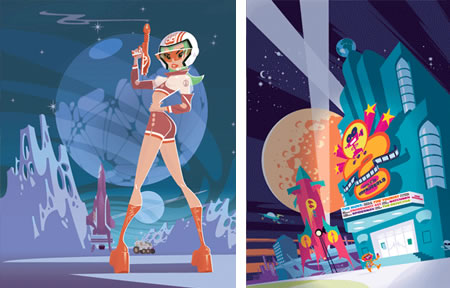
Rian Hughes is a British comics artist, illustrator, graphic designer and type designer.As a comics artist he became known for his work on Dare,, an updated version of Dan Dare, written by Grant Morrison and serialized in Revolver; as well as Robo-Hunter and number of other features for 2000AD and other titles.
At a time when highly rendered or fully painted comics were a big trend, Hughes forged a highly graphic, flat color approach in which design played almost as important a role as drawing. If not exactly in a direct lineage to the ligne claire school of illustration and comic art (see my post on Hergé), notably because of the frequent absence of lines, he was nonetheless a defender of the principles at the root of that style.
Hughes was one of the early adopters of computer graphics for illustration and comic art, using Adobe Illustrator to create images in vector shapes. His style was very influential on illustrators in the 90’s and he continues to be widely noted for his distinctive approach. He was one of the earliest and most notable proponents of the “retro-60’s” style that has become prominent in illustration and animation (see my post on Ghostbot, creators of the familiar animated eSurance commercials).
Hughes is also notable a graphic designer and typeface designer and is one of the most influential designers in comics industry. If you’ve ever noticed the high level of graphic design in DC Comics, for example, particularly as compared to the more pedestrian and cluttered design in Marvel’s books; a good bit of that influence is from Hughes. He was also instrumental in the design overhaul of a number of British publications lass familiar to American audiences. Hughes created many logos that comics fans will instantly recognize, as well logos for a variety of other clients.
Hughes has been noted as a font designer and has designed numerous inventive and stylish display fonts, many created specifically for illustration, comics or design projects he was working on. (Must be nice to be that facile. Need a font? Design one!) You can see an overview of his fonts on Identifont as well as on his own site.
Hughes’ website is called Device, (formerly Device Fonts), and features his illustration, comics work, logos, design and fonts, as well as an impressive client list and some short animations.
Hughes’ site doesn’t include much of his comic book work as many would like, (comics fans may find much recognizable material in the Logos and Design sections, though).
A new collection has just been published under the title of Yesterday’s Tomorrows (not to be confused with the book of retro-futrism titled Yesterday’s Tomorrows: Past Visions of the American Future by Joseph Corn and Brian Horrigon).
There is an illustrated article about the book on the FirstPost site, and a more detailed review on Jog – The Blog.
[Suggestion courtesy of Jack Harris]
Categories:
-
Carbonmatter (Dan Wheaton)

Carbonmatter is the web site name and professional nickname of matte painter and concept artist Dan Wheaton.Wheaton has worked as an illustrator, designer and creative director for a variety of companies in print and interactive design, but the real focus of his career has been on his love for movies and gaming, particularly those in which special effects play a significant role.
This has led to his work as a matte painter and concept artist for companies like Intelligent Creatures where he was senior matte painter for films like Babel, Stranger then Fiction and The Number 23; Ubisoft where he worked on the award winning cinematics for Prince of Persia 3; and Rocket Science vfx; as well as freelance work for companies like Pepsi. He has recently landed his “dream job” and gone on contract with Industrial Light and Magic as a Digital Matte Painter.
Wheaton’s web site has been revised and expanded since I last visited and his online gallery has a nice selection of his work from the film and gaming industries as well as some personal projects. The new additions to the gallery include some marvellously dramatic landscapes for Prince of Persia.
Wheaton really knows how to use strong contrasts in value to punch up a scene and give it focus. He has a particular facility for handling large scale scenes and dramatic landscapes. His landscapes, in fact, often show the influence of the great masters of dramatic landscapes like Frederick Church and Thomas Cole. (I can’t give you a direct link because of the way his gallery is set up, but look in the bottom row in the concept art section for his beautiful (and hilarious) Fill’er Up.)
You can also see the influence of the great futurist and concept artist Syd Mead, particularly in images like Race Day (image above, bottom). This is one of my personal favorites. Wheaton has chosen as his background two buildings on the Champs Élysées in Paris which were used by architect Horace Trumbauer (who also supervised the design of the Philadelphia Museum of Art) as models for two nearly identical buildings, The Free Library and Courthouse, on the Ben Franklin Parkway here in Philadelphia.
You can see a breakdown of steps in this painting on Wheaton’s portfolio on the CG Society site. Wheaton also has a gallery on the CG Channel.
Categories:


Charley’s Picks
Bookshop.org
(Bookshop.org affilliate links; sales benefit independent bookshop owners; I get a small percentage to help support my work on Lines and Colors)

John Singer Sargent: Watercolors


Urban Sketching: Understanding Perspective


Charley’s Picks
Amazon
(Amazon.com affiliate links; sales go to a larger yacht for Jeff Bezos; but I get a small percentage to help support my work on Lines and Colors)
John Singer Sargent: Watercolors
Urban Sketching: Understanding Perspective