
Categories
- 3d CGI
- Amusements
- Animation
- Anime & Manga
- Art Materials
- Art Videos
- Blogroll
- Cartoons
- Color
- Comics
- Concept & Visual Dev.
- Creativity
- Digital Art
- Digital Painting
- Displaying Art on the Web
- Drawing
- Eye Candy for Today
- Gallery and Museum Art
- High-res Art Images
- Illustration
- Motion Graphics & Flash
- Museums
- Online Museums
- Outsider Art
- Painting
- Painting a Day
- Paleo Art
- Pastel, Conté & Chalk
- Pen & Ink
- Prints and Printmaking
- Reviews
- Sc-fi and Fantasy
- Sculpture & Dimensional
- Site Comments
- Sketching
- Storyboards
- Tools and Techniques
- Uncategorized
- Vector Art
- Videos & Podcasts
- Vision and Optics
- Watercolor and Gouache
- Webcomics
Archives
- June 2026
- May 2026
- April 2026
- March 2026
- February 2026
- January 2026
- December 2025
- November 2025
- October 2025
- September 2025
- August 2025
- July 2025
- June 2025
- May 2025
- January 2025
- December 2024
- November 2024
- October 2024
- September 2024
- August 2024
- June 2024
- April 2024
- March 2024
- February 2024
- January 2024
- December 2023
- November 2023
- October 2023
- September 2023
- August 2023
- July 2023
- May 2023
- April 2023
- March 2023
- February 2023
- January 2023
- December 2022
- November 2022
- September 2022
- August 2022
- July 2022
- June 2022
- May 2022
- April 2022
- March 2022
- February 2022
- January 2022
- December 2021
- November 2021
- October 2021
- September 2021
- August 2021
- July 2021
- June 2021
- May 2021
- April 2021
- March 2021
- February 2021
- January 2021
- December 2020
- November 2020
- October 2020
- September 2020
- August 2020
- July 2020
- June 2020
- May 2020
- April 2020
- March 2020
- February 2020
- January 2020
- December 2019
- November 2019
- October 2019
- September 2019
- August 2019
- July 2019
- June 2019
- May 2019
- April 2019
- March 2019
- February 2019
- January 2019
- December 2018
- November 2018
- October 2018
- September 2018
- August 2018
- July 2018
- June 2018
- May 2018
- April 2018
- March 2018
- February 2018
- January 2018
- December 2017
- November 2017
- October 2017
- September 2017
- August 2017
- July 2017
- June 2017
- May 2017
- April 2017
- March 2017
- February 2017
- January 2017
- December 2016
- November 2016
- October 2016
- September 2016
- August 2016
- July 2016
- June 2016
- May 2016
- April 2016
- March 2016
- February 2016
- January 2016
- December 2015
- November 2015
- October 2015
- September 2015
- August 2015
- July 2015
- June 2015
- May 2015
- April 2015
- March 2015
- February 2015
- January 2015
- December 2014
- November 2014
- October 2014
- September 2014
- August 2014
- July 2014
- June 2014
- May 2014
- April 2014
- March 2014
- February 2014
- January 2014
- December 2013
- November 2013
- October 2013
- September 2013
- August 2013
- July 2013
- June 2013
- May 2013
- April 2013
- March 2013
- February 2013
- January 2013
- December 2012
- November 2012
- October 2012
- September 2012
- August 2012
- July 2012
- June 2012
- May 2012
- April 2012
- March 2012
- February 2012
- January 2012
- December 2011
- November 2011
- October 2011
- September 2011
- August 2011
- July 2011
- June 2011
- May 2011
- April 2011
- March 2011
- February 2011
- January 2011
- December 2010
- November 2010
- October 2010
- September 2010
- August 2010
- July 2010
- June 2010
- May 2010
- April 2010
- March 2010
- February 2010
- January 2010
- December 2009
- November 2009
- October 2009
- September 2009
- August 2009
- July 2009
- June 2009
- May 2009
- April 2009
- March 2009
- February 2009
- January 2009
- December 2008
- November 2008
- October 2008
- September 2008
- August 2008
- July 2008
- June 2008
- May 2008
- April 2008
- March 2008
- February 2008
- January 2008
- December 2007
- November 2007
- October 2007
- September 2007
- August 2007
- July 2007
- June 2007
- May 2007
- April 2007
- March 2007
- February 2007
- January 2007
- December 2006
- November 2006
- October 2006
- September 2006
- August 2006
- July 2006
- June 2006
- May 2006
- April 2006
- March 2006
- February 2006
- January 2006
- December 2005
- November 2005
- October 2005
- September 2005
- August 2005
Relevant Blogs
Art, Painting & Sketch
- Gurney Journey
- Underpaintings
- Art and Influence
- Painting Perceptions
- Oil Painters of America
- Vasari Paint POV
- Flying Fox
- Urban Sketchers
- Bento (Smithsonian)
- Art Inconnu
- The Hidden Place
- Still Life
- Making a Mark
- The Art of the Landscape
- Exploring Color & Creativity
- Art Contrarian
- Artist A Day
- beinArt Surreal Art Collective
- Eye Level
- David Dunlop
- p.i.g.m.e.n.t.i.u.m
- CultureGrrl
- Joaquín Sorolla blog
- Artists in Pastel
“Painting a Day”
- A Painting a Day (Keiser)
- On Painting (Keiser)
- Julian Merrow-Smith
- Karen Jurick
- Jeffrey Hayes
- Carol Marine
- Abbey Ryan
- Daily Paintworks
Other Painting Blogs
- Virtual Gouache Land
- Neil Hollingsworth
- Marc Hanson
- Kevin Menck
- Marc Dalessio
- Larry Seiler
- Stapleton Kearns
- Colin Page
- Roos Schuring
- Hans Versfelt
- Titus Meeuws
- Régis Pettinari
- René Plein Air
- Belinda Del Pesco
- Robin Weiss
- Nathan Fowkes (Land Sketch)
- William Wray
- Frank Serrano
- Stephen Magsig
- Michael Chesley Johnson
- Twice a Week
- Sarah Wimperis
- Rob Adams
- Michael Cole Manley
- The Dirty Palette Club
- Mike Manley’s Draw!
Gallery Art & Illustration mix
Illustration
- Howard Pyle
- 100 Years of Illustration
- BibliOdyssey
- Illustration Art
- Today’s Inspiration
- Illustration Mundo
- Little Chimp Society
- Danny Gregory
- R D (John Martz
- Illustration Friday blog
- Monster Brains
- Illustrators & Illustrations (RU)
- Elwood H. Smith
- DaniDraws.com
- Designers Who Blog
- iSpot Blog
Sci-Fi & Fantasy
Illustration & Comics
Comics & Cartoons
- Comics Beat
- Robot 6
- Newsarama Blog
- Comic Vine
- Comics Alliance
- Forbidden Planet Int.
- Paolo Rivera
- Bolt City
- Flight
- Scott McCloud
- The Comics Journal
- Comixpedia
- Funnybook Babylon
- James Baker
- Middleton’s Sketchbook
- Boneville
- The Hotel Fred
- Paul Rivoche
- Daily Cartoonist
- Mad About Cartoons (William Wray)
- Digital Strips
Illustration & Concept
Animation & Concept
- Cartoon Brew
- Animation Blog
- Cold Hard Flash
- Concept Art World
- The CAB
- FY Concept Art
- Concept Ships
- Concept Robots
- John Nevarez
- Armand Serrano
- Marcos Mateu-Mestre
- all kinds of stuff (Kricfalusi)
- Yacin the faun (Man Arenas)
- Kelsey Mann
- Cre8tivemarks Blog
- Ice-Cream Monster Toon Cafe
- AAU Character & Creature Design
- AAU Animation Notes
- Articles and Texticles
Paleo & Scientific
Tools & Techniques
Other
Lists of Art Blogs
Art Image Resource Links
Historic Art Images
- Wikimedia Commons: Paintings
- Wikimedia Commons: Drawings
- The Athenaeum
- WikiArt (WikiPaintings)
- Google Art Project: Artists
- Google Art Project: Collections (Museums)
- ArtCyclopedia
- Web Gallery of Art
- Art Renewal Center
- Web Gallery of Impressionism
Auction Consolidation sites
Auction sites
- Sotheby’s
- Bonham’s
- Christies
- Heritage Auctions: Fine Art
- Heritage Auctions: Illustration
- Freeman’s Auctions
- Bukowskis
- Shannon’s
Image Search
Reverse Image Search (search by image)
- Tin Eye
- RevImg
- Google Image Search (camera icon)
- Bing Image Search (camera icon)
Promoting some friends and some clients of my website design business
- Twin Willows T’ai Chi studio in Wilmington DE. Taiji classes with Bryan Davis.
- Ray Hayward, Inspired Teacher of T’ai Chi ( Taiji ) in Minneapolis, Founder of Mindful Motion Tai Chi Academy
- OldHead Tattoo studio and Art Gallery in Wilmington DE. Tattoos and paintings by Bruce Gulick
- Sharon Domenico Art, pet portrait oil paintings
- Platinum Paperhanging, wallpaper hanging, Main Line and Philadelphia, PA
- Lisa Stone Design, interior designer, Main Line and Philadelphia, PA
- Studio12KPT, original art, prints, calendars and other custom printed items by Van Sickle & Rolleri
-
Postcard from Provence
(Julian Merrow-Smith)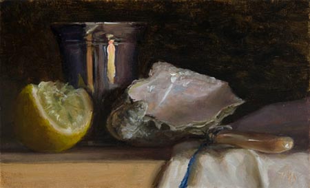
Back in 2005 I found myself writing an arts oriented blog; partly because I enjoyed writing it, and partly because in the process I was discovering terrific artists I wouldn’t have sought out or encountered otherwise.One of them was Duane Keiser, who had originated the “painting a day” blog concept; painting daily postcard-size paintings, mostly still life, and posting them to a blog called A Painting a Day. At the time, it was a novel idea.
I then discovered Julian Merrow-Smith, who was pursuing a similar process; but much to my delight, was painting not only the intimate still life subjects that lend themselves most readily to that discipline, but also beautiful small landscapes of the Provence countryside. He was posting these to his aptly named blog, Postcard from Provence.
I wrote articles on both artists; and in the subsequent years I watched the painting-a-day blog phenomenon grow from two to hundreds of daily painting blogs; many of them named for variations on “a painting a day” or “postcard from wherever”.
Over that time I’ve written articles on many of the best daily painters, as well as hundreds of other artists and topics, but I find myself coming back to Merrow-Smith’s site more frequently than the others.
 I’ve tried to pin down why, exactly. Merrow-Smith is an excellent painter, but the potential subject matter of Lines and Colors encompasses a wide range of visual art, and virtually all of art history, so it’s not like I would favor him over Sargent or Vermeer.
For someone who has been to Provence just enough to respond to images of the area with a wistful desire to return, there was an element of personal identification and visual pleasure in his interpretations of the Provence landscape; and perhaps a projection into the imagined life of a painter in the rural French countryside, evoked by his simple but intensely observed still life subjects; but there was something else that kept me checking back more frequently than to most other sites.
I knew that I particularly enjoyed looking back through his archives, noticing the sequence of his subjects, how long he would pursue a series of still life subjects, then move to landscape, interject a striking portrait, and then return to still life and then back to landscape.
Within each avenue of subject matter there were fascinating smaller cycles of variation in approach, in the type of still life, or composition and choice of landscape; each with recurring themes, like his wonderful shadow-crossed rural French roads or his shimmering views of the Rhone.
In thinking about it, and looking back over his work, I finally realized that what makes his paintings particularly compelling for me is that they represent a story.
There’s a narrative here, a chronology of artistic discovery, perseverance, discipline, economic survival, and the ongoing effort to continue to grow and learn as an artist. Postcard from Provence represents several years of the living of an artist’s life, encapsulated in a series of small paintings, each one of which seems to be a penetratingly direct and honest observation of what the artist encountered as he met his daily joining of brush and paint.
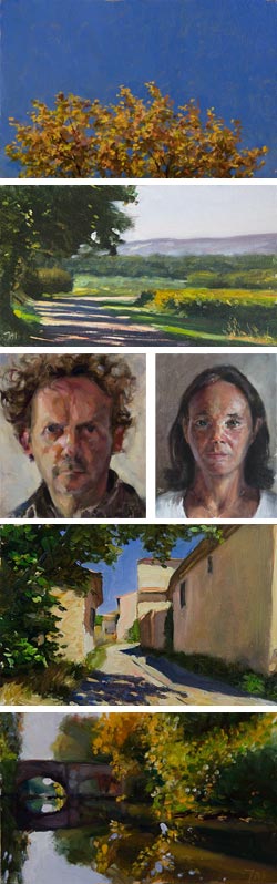
Merrow-Smith has just reached something of a landmark, posting his 1,000th Postcard painting, a beautiful still life that seems to sum up the rich contrasts of value, color and texture that have marked his study of the simple and small (image at top), followed by his 1,001st, a landscape without land, the crown of a lime tree, bright against the Provence sky, not far from the door of his home (image at left, top). I’ve added a few more of my favorites, including two portraits; the one on the left is a self-portrait.
You’ll find his archives can be viewed chronologically by month, sorted by subject; or, if you’d like to see the thumbnails of all 1,001 paintings, viewed by full archive, which gives you an overview and sense of the story that I’ve found so expressive.
The process of writing my (almost) daily blog posts has taught me a few things about creative discipline, and also; after many fallow years, inspired me to take up painting again. And there I find my other fascination with Merrow-Smith’s process and progress — as a terrific example for painters, and other artists, of how to pursue art as a daily practice.
Addendum: The other portrait shown is of Merrow-Smith’s wife, cellist Ruth Phillips. (See this post’s comments.) I wondered if that might be the case, but wasn’t certain.
Katherine Tyrrell has a nice post about his 1,000th Postcard painting, including past comments on several of his pieces and an interesting interview with him about his work and his daily painting process. (See my post about Katherine Tyrrell.)
Also, there is a nice article about Merrow-Smith and his 1,000th Postcard in The Guardian.
Categories:
-
David Cox

David Cox is best known as a superb watercolorist during what was considered the “Golden Age” of watercolor (or watercolour, if you prefer the English spelling); though he also produced many drawings, and later in his career took up oil painting in addition to watercolor.Cox was the son of a blacksmith, and would have followed his father into that profession had he not been too frail for the work. Sent to work making toys, his skill in painting miniature scenes on lockets and boxes got him noticed and sent to work as a scene painter in theaters. He went from that to landscape watercolors, moving to London the year before the Water-Colour Society was formed.
He was a prolific artist, he produced hundreds of works per year for may years, but was never paid what they were worth until late in his career, often selling them in bulk. He made his living for the most part from teaching, insisting on leaving his demonstration paintings to the students (many of which were sold in later years for high sums), and according to a biography, would frequently destroy or throw away many of his pieces, sometimes by stuffing them down storm drains.
Cox’s watercolors are now looked upon as some of the finest of his time, a time when watercolor was coming into its own as a medium, particularly in England; and he is sometimes compared to Constable as a highly regarded landscape artist who was particularly concerned with the visual effects of weather and atmosphere.
His landscape drawings in chalk and pencil have a wonderfully loose, gestural quality, almost Rembrant-like in their confident execution; and his oils show some of the light, color and attention to atmosphere that would later characterize the Impressionists.
Sun, Wind and Rain: The Art of David Cox is the title of an extensive retrospective at the Yale Center for British Art, running from now until January 4, 2009. A press release is available here.
[Exhibition link via ArtDaily.org]
Categories:
-
Björn Hurri

Björn Hurri is an artist who, according to the sparse biographical information on his web site, will “soon live in the UK” and work for the gaming company Creative Assembly.Hurri also does freelance illustration, and indulges in imaginative exercises for his own amusement; one of which is his series of steampunk versions of Star Wars characters, which he has been recently posting on his space on Gorilla Artfare (see my previous post on Gorilla Artfare).
“Steampunk”, for those unfamiliar with the term, is the fictional concept of a world in which Victorian technology is projected against modern concepts, e.g. mechanical analog computers instead of digital electronic ones, airships instead of jets, and, of course, steam power in place of internal combustion engines and electricity. (Steampunk is a literary sub-genre, in some ways related to “cyberpunk”.)
Steampunk offers a rich vein for graphic playfulness, and Hurri has obviously had fun with the mechanical apparatus, belts, hoses, valves and gears in his fanciful interpretations of Star Wars characters like C-3PO and Boba Fett (above).
If you go further into his pages on Gorilla Artfare (via the numbered navigation at the bottom of the page), you’ll find a variety of sketches, drawings and more finished works, often of imaginative designs for monsters, creatures and alien figures.
You’ll also find similar subjects in the Illustrations section of his web site. There is also a Sketchbook section, arranged by year.
Categories:
-
Pose Maniacs (update)

Pose Maniacs, which I wrote about in 2007, is a Japanese web site that features 3D models of human figures, rendered with superficial musculature, for sketching and drawing reference.A high percentage of them are in an interface that allows you to turn them 360° on their vertical axis for a complete rotation of point of view (image above, original here).
Others are animation sequences that can be stopped in a particular position, say, in the middle of a run cycle, which can be very helpful for animators.
They have continued to add to their considerable catalog of hundreds of poses; and the site, which was originally only in Japanese, has been translated into English.
Categories:
-
Lucong (Cong Hua Lu)
 Born in Shanghai, China during the “Cultural Revolution” (a time in China that could more accurately be called the “Cultural Wasteland”), Lucong (Cong Hua Lu) moved with his family to the American midwest at the age of 11. [Correction, he grew up in the period just after the Cultural Revolution, see this post’s comments.]
He was always interested in drawing and art, but in following the expectation that he would go into the sciences, his BA in art was earned at the University of Iowa while simultaneously pursuing a degree in Biology.
Lucong followed his desire to be an artist first on leaving school, moving to Denver and teaching himself to paint in oil, and achieving recognition relatively quickly.
His oil portraits have a fascinating feeling of delicacy in their Ingres-like attention to line, and the use of muted value and hue relationships within the faces. His faces are often set against a subdued background in similar tones, leaving the subjects’ hair in striking, almost graphic, contrast.
At other times, he uses more dramatic value contrasts between the face and background, but still keeps the color carefully restrained. He sometimes poses his subjects in front of other works of art.
I noticed an almost Gothic simplification of the shapes of eyes; which, along with the sometimes formal poses, gives the portraits some of the penetrating stillness found in pre-Renaissance art.
The portfolio of works on the site is divided into painting and drawings. The drawings, though apparently drawn from life, are more interpretive, almost caricatures, with heads large in proportion to bodies and a pleasantly cartoon-like handling of line.
On Lucong’s blog, you will find the works described in more detail, with dates and sizes. Clicking on the blog images reveals larger versions of the images (lacking in the regular portfolio) that let you appreciate the handling of the surface and marvelous details of the work. There are also pieces there that are not in the portfolio section.
There is a wistfulness to the expressions of his sitters, perhaps exemplifying what he describes in his statement as a longing for something undefined that can never be fully obtained.
[Contains some images that could be considered NSFW]
[Update 2014: Lucong seems to have discontinued his website and blog, and is using a new Tumblr blog: http://lucong.tumblr.com/]
Categories:
-
Evelien Lohbeck
Noteboek, an animation by Evelien Lohbeck that recently won the prize for best NOFF-film 2008 a the Netherlands Film Festival, is one of the cleverest and most amusing animations I’ve seen in a while.Taking off from the notion of a sketchbook in which a computer keyboard and screen have been drawn, it goes on to self-referentially show a hand-drawn YouTube interface on which a series of Lohbeck’s other short animations, also very clever and amusing in themselves, are shown. Several of them feature the sketchbook in other whimsical roles.
Lohbeck studied animation at the Academy of Arts, St. Joost in the Netherlands (Breda), and also studied interactive design and 3D design.
Her web site, which, in keeping with her award winning film, is designed as a hand-drawn computer interface, features her short films as well as other work. She also has a blog on which she discusses her projects and other topics of interest.
Unfortunately, the films aren’t available on her site at the moment, but you can see many of them on YouTube, including an earlier version of Noteboek.
[Via Articles & Texticles]
Categories:


Charley’s Picks
Bookshop.org
(Bookshop.org affilliate links; sales benefit independent bookshop owners; I get a small percentage to help support my work on Lines and Colors)

John Singer Sargent: Watercolors


Urban Sketching: Understanding Perspective


Charley’s Picks
Amazon
(Amazon.com affiliate links; sales go to a larger yacht for Jeff Bezos; but I get a small percentage to help support my work on Lines and Colors)
John Singer Sargent: Watercolors
Urban Sketching: Understanding Perspective