
Categories
- 3d CGI
- Amusements
- Animation
- Anime & Manga
- Art Materials
- Art Videos
- Blogroll
- Cartoons
- Color
- Comics
- Concept & Visual Dev.
- Creativity
- Digital Art
- Digital Painting
- Displaying Art on the Web
- Drawing
- Eye Candy for Today
- Gallery and Museum Art
- High-res Art Images
- Illustration
- Motion Graphics & Flash
- Museums
- Online Museums
- Outsider Art
- Painting
- Painting a Day
- Paleo Art
- Pastel, Conté & Chalk
- Pen & Ink
- Prints and Printmaking
- Reviews
- Sc-fi and Fantasy
- Sculpture & Dimensional
- Site Comments
- Sketching
- Storyboards
- Tools and Techniques
- Uncategorized
- Vector Art
- Videos & Podcasts
- Vision and Optics
- Watercolor and Gouache
- Webcomics
Archives
- June 2026
- May 2026
- April 2026
- March 2026
- February 2026
- January 2026
- December 2025
- November 2025
- October 2025
- September 2025
- August 2025
- July 2025
- June 2025
- May 2025
- January 2025
- December 2024
- November 2024
- October 2024
- September 2024
- August 2024
- June 2024
- April 2024
- March 2024
- February 2024
- January 2024
- December 2023
- November 2023
- October 2023
- September 2023
- August 2023
- July 2023
- May 2023
- April 2023
- March 2023
- February 2023
- January 2023
- December 2022
- November 2022
- September 2022
- August 2022
- July 2022
- June 2022
- May 2022
- April 2022
- March 2022
- February 2022
- January 2022
- December 2021
- November 2021
- October 2021
- September 2021
- August 2021
- July 2021
- June 2021
- May 2021
- April 2021
- March 2021
- February 2021
- January 2021
- December 2020
- November 2020
- October 2020
- September 2020
- August 2020
- July 2020
- June 2020
- May 2020
- April 2020
- March 2020
- February 2020
- January 2020
- December 2019
- November 2019
- October 2019
- September 2019
- August 2019
- July 2019
- June 2019
- May 2019
- April 2019
- March 2019
- February 2019
- January 2019
- December 2018
- November 2018
- October 2018
- September 2018
- August 2018
- July 2018
- June 2018
- May 2018
- April 2018
- March 2018
- February 2018
- January 2018
- December 2017
- November 2017
- October 2017
- September 2017
- August 2017
- July 2017
- June 2017
- May 2017
- April 2017
- March 2017
- February 2017
- January 2017
- December 2016
- November 2016
- October 2016
- September 2016
- August 2016
- July 2016
- June 2016
- May 2016
- April 2016
- March 2016
- February 2016
- January 2016
- December 2015
- November 2015
- October 2015
- September 2015
- August 2015
- July 2015
- June 2015
- May 2015
- April 2015
- March 2015
- February 2015
- January 2015
- December 2014
- November 2014
- October 2014
- September 2014
- August 2014
- July 2014
- June 2014
- May 2014
- April 2014
- March 2014
- February 2014
- January 2014
- December 2013
- November 2013
- October 2013
- September 2013
- August 2013
- July 2013
- June 2013
- May 2013
- April 2013
- March 2013
- February 2013
- January 2013
- December 2012
- November 2012
- October 2012
- September 2012
- August 2012
- July 2012
- June 2012
- May 2012
- April 2012
- March 2012
- February 2012
- January 2012
- December 2011
- November 2011
- October 2011
- September 2011
- August 2011
- July 2011
- June 2011
- May 2011
- April 2011
- March 2011
- February 2011
- January 2011
- December 2010
- November 2010
- October 2010
- September 2010
- August 2010
- July 2010
- June 2010
- May 2010
- April 2010
- March 2010
- February 2010
- January 2010
- December 2009
- November 2009
- October 2009
- September 2009
- August 2009
- July 2009
- June 2009
- May 2009
- April 2009
- March 2009
- February 2009
- January 2009
- December 2008
- November 2008
- October 2008
- September 2008
- August 2008
- July 2008
- June 2008
- May 2008
- April 2008
- March 2008
- February 2008
- January 2008
- December 2007
- November 2007
- October 2007
- September 2007
- August 2007
- July 2007
- June 2007
- May 2007
- April 2007
- March 2007
- February 2007
- January 2007
- December 2006
- November 2006
- October 2006
- September 2006
- August 2006
- July 2006
- June 2006
- May 2006
- April 2006
- March 2006
- February 2006
- January 2006
- December 2005
- November 2005
- October 2005
- September 2005
- August 2005
Relevant Blogs
Art, Painting & Sketch
- Gurney Journey
- Underpaintings
- Art and Influence
- Painting Perceptions
- Oil Painters of America
- Vasari Paint POV
- Flying Fox
- Urban Sketchers
- Bento (Smithsonian)
- Art Inconnu
- The Hidden Place
- Still Life
- Making a Mark
- The Art of the Landscape
- Exploring Color & Creativity
- Art Contrarian
- Artist A Day
- beinArt Surreal Art Collective
- Eye Level
- David Dunlop
- p.i.g.m.e.n.t.i.u.m
- CultureGrrl
- Joaquín Sorolla blog
- Artists in Pastel
“Painting a Day”
- A Painting a Day (Keiser)
- On Painting (Keiser)
- Julian Merrow-Smith
- Karen Jurick
- Jeffrey Hayes
- Carol Marine
- Abbey Ryan
- Daily Paintworks
Other Painting Blogs
- Virtual Gouache Land
- Neil Hollingsworth
- Marc Hanson
- Kevin Menck
- Marc Dalessio
- Larry Seiler
- Stapleton Kearns
- Colin Page
- Roos Schuring
- Hans Versfelt
- Titus Meeuws
- Régis Pettinari
- René Plein Air
- Belinda Del Pesco
- Robin Weiss
- Nathan Fowkes (Land Sketch)
- William Wray
- Frank Serrano
- Stephen Magsig
- Michael Chesley Johnson
- Twice a Week
- Sarah Wimperis
- Rob Adams
- Michael Cole Manley
- The Dirty Palette Club
- Mike Manley’s Draw!
Gallery Art & Illustration mix
Illustration
- Howard Pyle
- 100 Years of Illustration
- BibliOdyssey
- Illustration Art
- Today’s Inspiration
- Illustration Mundo
- Little Chimp Society
- Danny Gregory
- R D (John Martz
- Illustration Friday blog
- Monster Brains
- Illustrators & Illustrations (RU)
- Elwood H. Smith
- DaniDraws.com
- Designers Who Blog
- iSpot Blog
Sci-Fi & Fantasy
Illustration & Comics
Comics & Cartoons
- Comics Beat
- Robot 6
- Newsarama Blog
- Comic Vine
- Comics Alliance
- Forbidden Planet Int.
- Paolo Rivera
- Bolt City
- Flight
- Scott McCloud
- The Comics Journal
- Comixpedia
- Funnybook Babylon
- James Baker
- Middleton’s Sketchbook
- Boneville
- The Hotel Fred
- Paul Rivoche
- Daily Cartoonist
- Mad About Cartoons (William Wray)
- Digital Strips
Illustration & Concept
Animation & Concept
- Cartoon Brew
- Animation Blog
- Cold Hard Flash
- Concept Art World
- The CAB
- FY Concept Art
- Concept Ships
- Concept Robots
- John Nevarez
- Armand Serrano
- Marcos Mateu-Mestre
- all kinds of stuff (Kricfalusi)
- Yacin the faun (Man Arenas)
- Kelsey Mann
- Cre8tivemarks Blog
- Ice-Cream Monster Toon Cafe
- AAU Character & Creature Design
- AAU Animation Notes
- Articles and Texticles
Paleo & Scientific
Tools & Techniques
Other
Lists of Art Blogs
Art Image Resource Links
Historic Art Images
- Wikimedia Commons: Paintings
- Wikimedia Commons: Drawings
- The Athenaeum
- WikiArt (WikiPaintings)
- Google Art Project: Artists
- Google Art Project: Collections (Museums)
- ArtCyclopedia
- Web Gallery of Art
- Art Renewal Center
- Web Gallery of Impressionism
Auction Consolidation sites
Auction sites
- Sotheby’s
- Bonham’s
- Christies
- Heritage Auctions: Fine Art
- Heritage Auctions: Illustration
- Freeman’s Auctions
- Bukowskis
- Shannon’s
Image Search
Reverse Image Search (search by image)
- Tin Eye
- RevImg
- Google Image Search (camera icon)
- Bing Image Search (camera icon)
Promoting some friends and some clients of my website design business
- Twin Willows T’ai Chi studio in Wilmington DE. Taiji classes with Bryan Davis.
- Ray Hayward, Inspired Teacher of T’ai Chi ( Taiji ) in Minneapolis, Founder of Mindful Motion Tai Chi Academy
- OldHead Tattoo studio and Art Gallery in Wilmington DE. Tattoos and paintings by Bruce Gulick
- Sharon Domenico Art, pet portrait oil paintings
- Platinum Paperhanging, wallpaper hanging, Main Line and Philadelphia, PA
- Lisa Stone Design, interior designer, Main Line and Philadelphia, PA
- Studio12KPT, original art, prints, calendars and other custom printed items by Van Sickle & Rolleri
-
Mick McGinty (update)

I’ve been writing about the “painting a day” phenomenon for about three years now, along the way looking at a number of painters who aren’t trying to maintain the strict “one painting a day” routine, but are instead painting on a regular but less frequent schedule. Often, these painters can devote themselves to larger and more elaborate works than the small (usually postcard-size) paintings favored by those keeping the daily routine.A case in point is Mick McGinty, who I wrote about early in 2007.
McGinty has a blog called Twice a Week, on which he posts new paintings with about that frequecy. These are larger, and brought to a higher degree of finish, than the pieces by most of the daily painters, including many of those who are also posting on less than a daily basis. This is partly because of the less frequent schedule, and partly because of the impressive painting skills McGinty developed in his years as a professional illustrator.
His subject matter is also more complex than the often simple still life compositions that lend themselves most readily to the daily routine, varying from complex still life subjects to dramatic landscapes from the Rocky Mountains, and more intimate urban park scenes from his trips east to New York.
McGinty has a terrific command of value and atmosphere, and his tonal contrasts give his landscapes an inviting dimensionality. He also has a great ability to render and suggest textures, whether of the rough edged rocks of mountain passes, the sunlit waters of streams and lakes, or the concrete and cobblestone paths of Central Park.
Texture plays another part in painting, of course, not only the suggestions of texture in the image, but the actual texture of the painted surface. McGinty is one of the few painter/bloggers who posts images large enough to actually see the texture and brush strokes, something I’ve been recommending to other painters for a while. I think it adds considerably to the appeal of a painting to a prospective buyer, who must judge a painting without being able to see the original in person.
As with most painters offering their work for sale directly through a blog or website, McGinty places each work up for auction, in his case (as with most others) on eBay.
I recently did something I haven’t done before and bid on a painting online, one of McGinty’s landscapes, Wandering Creek (image above, with detail below, blog post here, larger version here). To my surprise, and delight, and I won the bid.
I was surprised in that my budget was quite low, as was my winning bid. Like many other painter/bloggers, McGinty has apparently decided on a relatively low minimum, perhaps with the thought that keeping the paintings selling is easier than trying to offer them for sale a second time, or leaving a backlog on eBay.
On receipt of the original, I was again surprised, as I would expect a painting of this size and quality to sell in a gallery for at least three times what I paid for it. (Some of this may also have to do with differences in expectations of gallery prices for art in different parts of the country, I don’t know. I’m on the East Coast, McGinty is in Arizona.)
I was delighted with the surface quality and painterly nature of the piece and very pleased with the color. (Though McGinty’s photographs are good, it’s always difficult to match color in an image. In this case, McGinty has balanced the tone for Windows gamma, which means that for those like myself viewing the image with a Mac, the image will appear lighter and less saturated than the original.)
I was also pleased with the little touches that often not as obvious in the online images; in this case nice little accents of red-brown on the edges of the creek and the underside of the trees where reflections from the sun picking up the color of the creek bottom throw light up under the branches and exposed roots, the subtle blue greens in the background and the varied colors in the stone of the bridge.
Even though McGinty is one of the best at presenting his work online (many suffer from too-small images or make the mistake of offering only a link to eBay, without the advantage of a preview image hosted locally on the blog), I’m still struck by the difference between an online image and the much more immediate charms of an the original work.
It makes it all the more interesting to me how artists like McGinty are to a large extent bypassing the traditional gallery structure and taking their work directly to their buyers through the web.
Categories:
-
Yutang Yang
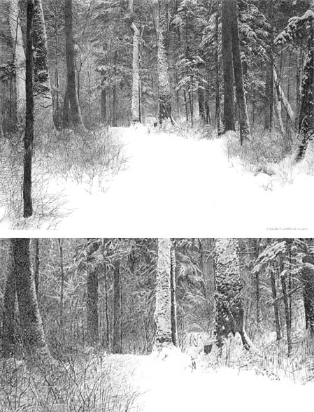
Chinese artist Yutang Yang draws intensely intricate pen and ink drawings of landscapes, in which his detailed approach creates evocative representations of the visual textures of trees, bark and grasses.This approach is particularly effective in his depictions of winter forest snow scenes, like Bewildering (image above, with detail, larger image here), in which the white of the paper becomes the smooth surface of snow covered ground.
I’m not certain I have a correct grasp of his artist’s statement about Realistic Penart, but I come away with the impression that he feels his approach has as much in common with the way paintings are composed as they do with traditional pen and ink (bringing to mind Franklin Booth’s reputation for “painting with a pen”), and holds the practice as worthy of comparison to painting.
Yutang was born in Chung-chuen in northeastern China, and though showing artistic ability at an early age, he failed the entrance exams to art college twice. He worked for a time on a farm camp during the Cultural Revolution, later went to work for a design firm; and eventually set out on his own as a freelance artist.
He went to Japan to study, was deeply impressed with the training, and delved into his intensive research in to pen art. He returned to China and began his series of drawings of the Chinese landscape. He published two books on the subject, Detailed Analysis of Penart Technique and Collection of Penart.
There is a gallery on the artist’s site, with works arranged by year. (The images are slightly marred by watermarking, but it’s not too intrusive.) There is a high resolution image on the Art Renewal Center (scroll down).
Categories:
-
Ford Madox Brown
Ford Madox Brown was a Victorian painter who is often mentioned or included in books and articles on the Pre-Raphaelites.Though he was lifelong friends with Dante Gabriel Rossetti, the leader of the Pre-aphaelite Brotherhood, and was philosophically in keeping with many of their ideals and artistic aims, he was never actually a member of the Brotherhood. He got on less well, evidently, with other members William Holman Hunt and John Everett Millais.
Brown’s artistic predilections came largely from the influence of the Nazarenes, a group of German painters, including Johann Overbeck and Peter von Cornelius, who were established prior to the Pre-Raphaelites and who shared many characteristics with them in style and artistic philosophy.
Brown was in opposition to the Royal Academy, which dictated artistic acceptance in England at the time, and was one of the first painters to mount one-man exhibitions. Rossetti was actually a student of Brown’s for a short time, but quickly changed to study under William Holman Hunt. It seemed to have little effect on their friendship.
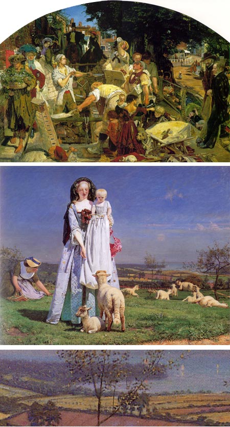
Brown’s most renowned painting, Work (image above, top, larger version here, detail here), is notable for it’s detail and technique, but to my mind is weighted down with its ambitious attempt to essentially represent all aspects of life in Victorian England. The subjects within the painting and its historical context are fascinating, though. The city of Manchester Art Gallery has an interesting interactive, aimed at grade schoolers, that examines some of the social aspects the painting.
One of the notable characteristics of Work is that it was painted in part on location, an unusual practice particularly for work of this kind. The painting took thirteen years to finish.
It was also in Manchester that Brown completed the series of murals that would be the major achievement of his later career (many are viewable on Wikimedia Commons).
Another notable painting of Brown’s was The Last of England, showing a family forced to leave the difficult conditions in England in search of a life elsewhere, a situation facing Brown himself until sale of the painting kept him afloat.
A notable earlier work is The Pretty Baa-Lambs (image above, middle with detail, bottom, large version here), which is mentioned as a pre-Pre-Raphaelaite work (if you’ll excuse the expression), debuting in 1852 and painted on a white ground, instead of the customary browns, for unusual vibrancy of color. The same painting is sometimes mentioned as a precursor to Impressionism as well, in that it was painted largely on location and with an uncanny fidelity to the look of natural daylight.
Categories:
-
Propaganda Posters

It’s commonly thought that “propaganda”, as a technique of spreading misinformation, or slanted opinions, for the purpose of manipulating opinions, has been utilized primarily by oppressive regimes like Imperial and Nazi Germany in the early part of the 20th Century or the Soviet Union or Communist China in the latter part.That in itself is a form of propaganda, which can be, and often is, utilized by Western democracies. Propaganda is simply a technique, not a set of values. It can just as easily be employed in a “good” cause as an “evil” one.
What distinguishes propaganda from information, aside from the fact that it is often disinformation, is that it is calculated to appeal to the emotions and circumvent rational judgement. One of the key features of propaganda is that it most often (almost always, in fact) taps into the power that images have to reach us on an unconscious level.
You may be familiar with propaganda’s rich cousin, advertising.
The two join forces in times of political change, i.e. elections, in the form of campaign ads. Case in point: turn the sound off on political ads and look at the images employed, the use of unflattering or even scary pictures of the untrustworthy opponent, coupled with images of suggestive associations, often designed to provoke fear or uncertainty, and the noble, shining face of the candidate being promoted (often shown in a thoughtful or heroic upshot).
The use of propaganda in times of war, both hot and cold, has long included the art of propaganda posters, used to elicit feelings of nationalism, encourage enlistment and contributions to bond and materials drives, and frequently to characterize the enemy as subhuman, often with the use of racial stereotypes.
Some of these posters, particularly in the periods around the first and second World Wars, utilized the talents of top illustrators, as exemplified by the posters in the top row above for WWI U.S. War Bonds by J.C. Leyendecker and Navy Recruitment by Howard Chandler Christy (and of course the iconic “I want you” Uncle Sam poster by James Montgomery Flagg).
The ASIFA Animation Archive has two fascinating articles based on a collection of propaganda poster images collected by Louis Van Den Ecker, a technical advisor for early 20th Century films like Beau Geste, Adventures of Robin Hood and The Three Musketeers, who was hired by the studios to ensure period accuracy. They were found in a junk shop by ASIFA director Stephen Worth and are presented in separate articles on WWI and WWII.
Wikipedia has a collection in association with their article on propaganda, and there is a collection of re-purposed propaganda posters, reworked to serve as commentary (and propaganda) on current social and political issues on AntiWarPosters.com. I’ve listed more resources below.
Some of them may seem quaint and out of touch with modern sensibilities, but others still carry an impact. As you look through them, see if you can be mindful of your emotional response, either for or against the intentions of the posters’ creators (outrage and indignation are emotions, too).
The range and visceral impact of these images point out the striking power artists have to affect emotions and elicit an unconscious response. Even those of us who consider ourselves intellectually removed and visually sophisticated are not immune to the effects of manipulative images.
Think about that as you watch ads, political or commercial, on television. How often are our impressions and opinions being shaped by images?
Categories:
-
Ah Pook is Here

Ah Pook is Here (originally Ah Puch is Here) is a collaborative graphic narrative by writer William S. Burroughs and artist Malcolm McNeill. I was tempted to say “experimental graphic narrative”, but using the word “experimental” and the name William S. Burroughs in the same sentence is redundant.Named for Ah Puch, the Mayan Death God, the never-finished book was to be part comic, part illustrated book. The comic story segments were drawn as a continuous panorama (top three images above, with detail below), a format inspired by the Mayan Codices, which can be thought of as graphic narrative or a kind of comic book.
McNeill worked on parts of the panorama out of sequence, emphasizing the non-linear narrative and in keeping with the story’s time-travel theme. (For more on McNeill and the project, see my previous post on Malcolm McNeill.)
McNeill didn’t know Burroughs or his work when they first started collaborating; initially without meeting, on a project called The Unspeakable Mr. Hart.
The story, which ran in the English magazine Cyclops until it folded, was eventually expanded into the book project. McNeill and Burroughs began collaborating directly, and worked on the “word/image novel” on and off for seven years before it was abandoned for lack of funding (in the 1970’s, “graphic novel” was a not a widely recognized term or a viable marketplace option).
Burroughs’ text was published by itself in a more conventional form as Ah Pook is Here.
A good deal of art was created for the book, however, and some of it is on display McNeill’s site and on a site devoted specifically to the Ah Pook is Here project.
There is an interview with McNeill online, conducted by Larry Sawyer, that includes larger versions of some of the images from the project, as well as some other examples of McNeill’s art.
McNeill has written an account, not yet published, of his collaboration with Burroughs titled Observed While Falling.
McNeill did a year and a half of research for the Ah Pook is Here project, combing through the Mexican Cultural Library in London and researching the artwork of Frederick Catherwood, a real-life Indiana Jones with a paint box (see my post on Frederick Catherwood).
Other artistic influences seemed to be less from mainstream or European comics and more from art history, in particular the horrific visions of Hieronymus Bosch, shadowy gothic art, mid-20th Century book illustration and the deep chiaroscuro of the Baroque, lending the panels a unique visual tone.
There will be a show of artwork from the project, The Lost Art of Ah Pook is Here, at Salomon Arts gallery in New York (Tribeca) from November 14 to December 14, 2008.
[Note: sites linked here contain some NSFW images]
Categories:
-
Andrea Mantegna

Andrea Mantegna was an influential Itallian Renaissance painter and engraver who was noted for his monumental, almost sculptural, figures, his command of perspective and his unusual, often visceral, portrayals of Biblical events.Mantegna was apprenticed at the age of 10 to Francesco Squarcione, who also legally adopted him. At the age of 17, he had advanced far enough to establish his own studio and declare his independence from Squarcione, who he accused of exploiting his abilities.
Roman sculpture was being collected in Padua during Mantegna’s time there, and the influence of those sculptors, as well as contemporary sculptors like Donatello, is evident in the sculptural (some would say stiff) qualities of his figures.
Mantegna married Nicolosia Bellini, daughter of Jacopo Bellini, one of the key figures in early Renaissance art, and brother of painters Gentile and Giovanni Bellini. Mantegna had a working relationship with Giovanni, and you can see the influence of his masterful command of landsacpe in the rocky intricate detail of the landscapes in Mantegna’s Biblical scenes (see my post on Giovanni Bellini).
Mantegna worked on monumental sized works as well as smaller, more intimate works, and was fascinated with experimental perspective and elements of architecture.
One of his most renowned pieces is La Camera degli Sposi (The Wedding Chamber) of the Mantua Palazzo; a “camera picta” (painted room), covered with illusionistic frescoes. This included his famous example of “di sotto in sú”, or illusionistic ceiling painting, depicting a false oculus in the ceiling, through which cherubs, servants and a peacock lean over a balustrade, peering down at the viewer; rendered in trompe l’oeil realism and dramatically foreshortened perspective (image above, top); the first example of this kind of ceiling effect. I love the underside of the seemingly precariously placed urn and the cherubs poking their heads through the balustrade. The perspective rendering of the geometric elements of the balustrade is astonishing.
One of his other works that incorporated illusionistic perspective and his fascination with architectural elements is his striking grand altar-piece for the Basillica di San Zeno in Verona (supposedly the setting for the marriage of Romeo and Juliet in Shakespeare’s play). Mantegna’s work for this featured a polyptych (multiple paneled painting) depicting Mary and Child in the central panel, flanked by scenes of disciples and saints, with scenes below of the prayer at the Mount of Olives, the Crucifixion and the Resurrection (image above, middle and bottom).
The upper panels, in particular, break the paradigm of such altarpieces in that the top three scenes, though depicting separate events, are joined into one by a common background. The architectural elements are rendered in dramatic perspective and with great attention to realistic texture, an effect heightened by trompe l’oeil garlands of fruit seeming to hang between the actual carved pillars on the face of the altarpiece.
Mantegna has pulled out the stops here, and used the almost magical ability of the newly popular medium of oil paint to render his subjects with extraordinary detail.
He continued to render his paintings in this kind of canvas-wide pinpoint focus, even as Leonardo and Giovanni Bellini began to move Renaissance painting toward more atmospheric effects of tonal color and sfumato.
The Louvre in Paris, which has the largest collection of Mantegna’s works outside of Italy, has mounted a major retrospective of his work. Simply titled Mantegna (1431-1506), the show contains over 190 works and and runs until January 5, 2009.
[Exhibition link via Art Knowledge News]
Categories:


Charley’s Picks
Bookshop.org
(Bookshop.org affilliate links; sales benefit independent bookshop owners; I get a small percentage to help support my work on Lines and Colors)

John Singer Sargent: Watercolors


Urban Sketching: Understanding Perspective


Charley’s Picks
Amazon
(Amazon.com affiliate links; sales go to a larger yacht for Jeff Bezos; but I get a small percentage to help support my work on Lines and Colors)
John Singer Sargent: Watercolors
Urban Sketching: Understanding Perspective