
Categories
- 3d CGI
- Amusements
- Animation
- Anime & Manga
- Art Materials
- Art Videos
- Blogroll
- Cartoons
- Color
- Comics
- Concept & Visual Dev.
- Creativity
- Digital Art
- Digital Painting
- Displaying Art on the Web
- Drawing
- Eye Candy for Today
- Gallery and Museum Art
- High-res Art Images
- Illustration
- Motion Graphics & Flash
- Museums
- Online Museums
- Outsider Art
- Painting
- Painting a Day
- Paleo Art
- Pastel, Conté & Chalk
- Pen & Ink
- Prints and Printmaking
- Reviews
- Sc-fi and Fantasy
- Sculpture & Dimensional
- Site Comments
- Sketching
- Storyboards
- Tools and Techniques
- Uncategorized
- Vector Art
- Videos & Podcasts
- Vision and Optics
- Watercolor and Gouache
- Webcomics
Archives
- April 2026
- March 2026
- February 2026
- January 2026
- December 2025
- November 2025
- October 2025
- September 2025
- August 2025
- July 2025
- June 2025
- May 2025
- January 2025
- December 2024
- November 2024
- October 2024
- September 2024
- August 2024
- June 2024
- April 2024
- March 2024
- February 2024
- January 2024
- December 2023
- November 2023
- October 2023
- September 2023
- August 2023
- July 2023
- May 2023
- April 2023
- March 2023
- February 2023
- January 2023
- December 2022
- November 2022
- September 2022
- August 2022
- July 2022
- June 2022
- May 2022
- April 2022
- March 2022
- February 2022
- January 2022
- December 2021
- November 2021
- October 2021
- September 2021
- August 2021
- July 2021
- June 2021
- May 2021
- April 2021
- March 2021
- February 2021
- January 2021
- December 2020
- November 2020
- October 2020
- September 2020
- August 2020
- July 2020
- June 2020
- May 2020
- April 2020
- March 2020
- February 2020
- January 2020
- December 2019
- November 2019
- October 2019
- September 2019
- August 2019
- July 2019
- June 2019
- May 2019
- April 2019
- March 2019
- February 2019
- January 2019
- December 2018
- November 2018
- October 2018
- September 2018
- August 2018
- July 2018
- June 2018
- May 2018
- April 2018
- March 2018
- February 2018
- January 2018
- December 2017
- November 2017
- October 2017
- September 2017
- August 2017
- July 2017
- June 2017
- May 2017
- April 2017
- March 2017
- February 2017
- January 2017
- December 2016
- November 2016
- October 2016
- September 2016
- August 2016
- July 2016
- June 2016
- May 2016
- April 2016
- March 2016
- February 2016
- January 2016
- December 2015
- November 2015
- October 2015
- September 2015
- August 2015
- July 2015
- June 2015
- May 2015
- April 2015
- March 2015
- February 2015
- January 2015
- December 2014
- November 2014
- October 2014
- September 2014
- August 2014
- July 2014
- June 2014
- May 2014
- April 2014
- March 2014
- February 2014
- January 2014
- December 2013
- November 2013
- October 2013
- September 2013
- August 2013
- July 2013
- June 2013
- May 2013
- April 2013
- March 2013
- February 2013
- January 2013
- December 2012
- November 2012
- October 2012
- September 2012
- August 2012
- July 2012
- June 2012
- May 2012
- April 2012
- March 2012
- February 2012
- January 2012
- December 2011
- November 2011
- October 2011
- September 2011
- August 2011
- July 2011
- June 2011
- May 2011
- April 2011
- March 2011
- February 2011
- January 2011
- December 2010
- November 2010
- October 2010
- September 2010
- August 2010
- July 2010
- June 2010
- May 2010
- April 2010
- March 2010
- February 2010
- January 2010
- December 2009
- November 2009
- October 2009
- September 2009
- August 2009
- July 2009
- June 2009
- May 2009
- April 2009
- March 2009
- February 2009
- January 2009
- December 2008
- November 2008
- October 2008
- September 2008
- August 2008
- July 2008
- June 2008
- May 2008
- April 2008
- March 2008
- February 2008
- January 2008
- December 2007
- November 2007
- October 2007
- September 2007
- August 2007
- July 2007
- June 2007
- May 2007
- April 2007
- March 2007
- February 2007
- January 2007
- December 2006
- November 2006
- October 2006
- September 2006
- August 2006
- July 2006
- June 2006
- May 2006
- April 2006
- March 2006
- February 2006
- January 2006
- December 2005
- November 2005
- October 2005
- September 2005
- August 2005
Relevant Blogs
Art, Painting & Sketch
- Gurney Journey
- Underpaintings
- Art and Influence
- Painting Perceptions
- Oil Painters of America
- Vasari Paint POV
- Flying Fox
- Urban Sketchers
- Bento (Smithsonian)
- Art Inconnu
- The Hidden Place
- Still Life
- Making a Mark
- The Art of the Landscape
- Exploring Color & Creativity
- Art Contrarian
- Artist A Day
- beinArt Surreal Art Collective
- Eye Level
- David Dunlop
- p.i.g.m.e.n.t.i.u.m
- CultureGrrl
- Joaquín Sorolla blog
- Artists in Pastel
“Painting a Day”
- A Painting a Day (Keiser)
- On Painting (Keiser)
- Julian Merrow-Smith
- Karen Jurick
- Jeffrey Hayes
- Carol Marine
- Abbey Ryan
- Daily Paintworks
Other Painting Blogs
- Virtual Gouache Land
- Neil Hollingsworth
- Marc Hanson
- Kevin Menck
- Marc Dalessio
- Larry Seiler
- Stapleton Kearns
- Colin Page
- Roos Schuring
- Hans Versfelt
- Titus Meeuws
- Régis Pettinari
- René Plein Air
- Belinda Del Pesco
- Robin Weiss
- Nathan Fowkes (Land Sketch)
- William Wray
- Frank Serrano
- Stephen Magsig
- Michael Chesley Johnson
- Twice a Week
- Sarah Wimperis
- Rob Adams
- Michael Cole Manley
- The Dirty Palette Club
- Mike Manley’s Draw!
Gallery Art & Illustration mix
Illustration
- Howard Pyle
- 100 Years of Illustration
- BibliOdyssey
- Illustration Art
- Today’s Inspiration
- Illustration Mundo
- Little Chimp Society
- Danny Gregory
- R D (John Martz
- Illustration Friday blog
- Monster Brains
- Illustrators & Illustrations (RU)
- Elwood H. Smith
- DaniDraws.com
- Designers Who Blog
- iSpot Blog
Sci-Fi & Fantasy
Illustration & Comics
Comics & Cartoons
- Comics Beat
- Robot 6
- Newsarama Blog
- Comic Vine
- Comics Alliance
- Forbidden Planet Int.
- Paolo Rivera
- Bolt City
- Flight
- Scott McCloud
- The Comics Journal
- Comixpedia
- Funnybook Babylon
- James Baker
- Middleton’s Sketchbook
- Boneville
- The Hotel Fred
- Paul Rivoche
- Daily Cartoonist
- Mad About Cartoons (William Wray)
- Digital Strips
Illustration & Concept
Animation & Concept
- Cartoon Brew
- Animation Blog
- Cold Hard Flash
- Concept Art World
- The CAB
- FY Concept Art
- Concept Ships
- Concept Robots
- John Nevarez
- Armand Serrano
- Marcos Mateu-Mestre
- all kinds of stuff (Kricfalusi)
- Yacin the faun (Man Arenas)
- Kelsey Mann
- Cre8tivemarks Blog
- Ice-Cream Monster Toon Cafe
- AAU Character & Creature Design
- AAU Animation Notes
- Articles and Texticles
Paleo & Scientific
Tools & Techniques
Other
Lists of Art Blogs
Art Image Resource Links
Historic Art Images
- Wikimedia Commons: Paintings
- Wikimedia Commons: Drawings
- The Athenaeum
- WikiArt (WikiPaintings)
- Google Art Project: Artists
- Google Art Project: Collections (Museums)
- ArtCyclopedia
- Web Gallery of Art
- Art Renewal Center
- Web Gallery of Impressionism
Auction Consolidation sites
Auction sites
- Sotheby’s
- Bonham’s
- Christies
- Heritage Auctions: Fine Art
- Heritage Auctions: Illustration
- Freeman’s Auctions
- Bukowskis
- Shannon’s
Image Search
Reverse Image Search (search by image)
- Tin Eye
- RevImg
- Google Image Search (camera icon)
- Bing Image Search (camera icon)
Promoting some friends and some clients of my website design business
- Twin Willows T’ai Chi studio in Wilmington DE. Taiji classes with Bryan Davis.
- Ray Hayward, Inspired Teacher of T’ai Chi ( Taiji ) in Minneapolis, Founder of Mindful Motion Tai Chi Academy
- OldHead Tattoo studio and Art Gallery in Wilmington DE. Tattoos and paintings by Bruce Gulick
- Sharon Domenico Art, pet portrait oil paintings
- Platinum Paperhanging, wallpaper hanging, Main Line and Philadelphia, PA
- Lisa Stone Design, interior designer, Main Line and Philadelphia, PA
- Studio12KPT, original art, prints, calendars and other custom printed items by Van Sickle & Rolleri
-
Tomer Hanuka

Illustrator and comics artist Tomer Hanuka was born in Israel, where he attended an art-oriented high school and developed a fascination for American comic books. After his mandatory three years of military service, he moved to New York and studied illustration at the School of Visual Arts.He came out of school and right into illustration assignments and now has a client list that includes The New York Times, The New Yorker, Rolling Stone, Spin, MTV, Warner Brothers and Saatchi & Saatchi. He has garnered awards from The Society of Illustrators and the Society of Publication Designers.
Tomer has also pursued his love of comics. He and his twin brother Asaf Hanuka self-published Bipolar in 2000. The series was then picked up by Alternative Comics, and has been nominated for the Eisner, Ignatz and Harvey awards. Tomer Hanuka has also been a regular contributor to the Meathaus comics anthology. He has also been working for DC Comics, notably on covers for The Un-Men. There is a collection of his short comics works called The Placebo Man.
His web site opens with a horizontally scrolling selection of images, not as satisfying as a full portfolio, but I’ve found some other links for you and listed them below. There is also a blog that he shares with Asaf.
Hanuka uses the line and color methods of comic book art in his illustration, filling his line work with emotionally expressive color. His drawing approach ranges from straightforward to stylized, and he often delves into the dramatically violent. His usual process is to draw in ink and brush on paper and apply color digitally.
Tomer Hanuka is the subject of an article in the January 2008 issue of Juxtapoz.
[Suggestion courtesy of Jack Harris]
Categories:
-
Carmontelle’s Transparency

Louis Carrogis, who was known as Carmontelle, was an 18th Century French painter, architect and designer.He was active at a time when the French court was eager to ease the tedium of their endless dalliances and interpersonal intrigues with new “entertainments”. Carmontelle supplied an ingenious one in a form that may be thought of as a precursor to cinema, a moving image, illuminated from behind.
As a result of his fascination with light and moving images and his skills as a painter and designer, Carmontelle was able to create a striking effect by painting a series of connected transparent watercolor and gouache paintings, on particularly transparent but strong paper, between 12 and 18″ high (30 – 45cm) and as long as 138 feet (42m).
These depicted scenes like luxurious parks filled with beautifully dressed gentry. They would be rolled up and then set in a mechanism that would allow them to be scrolled across the opening of a boxlike cabinet that was illuminated from behind by sunlight (presumably in an otherwise darkened room).
Carmontelle would display these moving images accompanied by musicians or his own narration. The effect must have been very TV-like, and particularly appealing when moving views of summer landscapes were displayed in the dead of Winter.
Carmontelle’s device was apparently not popular enough, however, to attract investors, so it went by the wayside after a while. Fewer than a dozen of his transparencies survive.
There is currently an exhibition at The Getty, which has one of his rouleaux transparents, (“rolled-up transparent drawings”) in its collection (image above, detail, with full scroll at bottom). The exhibit runs to June 16, 2008. The Getty has a page devoted to the exhibition that includes an animation of the scrolling image.
The site also includes some other drawings and paintings by the artist, and I list some additional resources below. There are also articles on Carmontelle, the transparencies and the Getty exhibition from the New York Times and the International Herald Tribune.
The Getty has published a book to accompany the exhibition, Carmontelle’s Landscape Transparencies: Cinema of the Enlightenment by Laurence Chatel de Brancion (more detail here).
So get out your transparent watercolors and rolls of acetate and see what amusements you can come up with to fill in for the TV writer’s strike.
Categories:
-
Robert Tracy

Robert Tracy is a self-trained artist who works in a variety of media — oil, watercolor, acrylic, pencil and even silverpoint. He also tackles a variety of subject matter — portraits, figures, still life and landscape. Over the years he has developed an approach he calls “romantic realism’.Unfortunately, to see much of his work you must deal with some scattered resources. His main site has selections arranged by category, though limited in number, perhaps 5 or ten in each category.
Tracy has also just produced a book of his work through Blurb (more on Blurb in a future post), and one of his sites is now devoted to the book, with previews arranged as Drawings, Paintings and Military Art, though the selections are also limited here to just a few in each category.
Tracy is a Marine Corps veteran with two tours of duty in Vietnam, and a number of his works are of soldiers and military subjects from the point of view of a soldier, not the romanticized “military art” of video games and films.
The most extensive presence for his work is his gallery on deviantART. I’m not the biggest fan of the deviantART interface, and the work here seems to be arranged without categories, leaving a scattered arrangement of work from different times, of a variety of subjects, in various degrees of finish and from differing levels of learning and accomplishment. He seems to have little concern for putting his “best foot forward” or editing the content. An early rough sketch might be next to a recent finished work, giving a rather splintered impression of his work. I might suggest jumping several pages in and looking around. There are over 400 works posted, so finding the best pieces can take some digging.
You will find some sensitive, accomplished watercolor portraits of family members and friends, landscapes and still lifes in a variety of media, as well as more concept oriented pieces and studies from the masters. Tracy indicates that he arranged his self-training around studying works of the masters.
The image above, “That Look”, is in drybrush watercolor portrait (possibly of a family member, I’m not certain). The original post is here, click on the image for the larger version.
Tracy also maintains a blog called Illustrated Ideas. Unfortunately a recent change of some kind, blog design, ISP, blogging platform or all of the above, has apparently set the blog back to zero as of this month, with no access to the extensive archives that used to be available. Hopefully this can be rectified, as there were a number of interesting posts that would be nice to have back out on the new blog.
Illustrated Ideas isn’t specifically an art blog, though that has been a strong component in the past. The masthead reads “Art, Military, Politics, Religion”, topics that are likely to rouse strong opinions, of which Tracy isn’t shy.
Whether you agree with his point of view or not, as the new blog gets underway (or if the older archives are made available) you will find his posts on art worthwhile, whether speaking to his own work, process and learning experiences, or in features, similar to those on lines and colors, in which he discusses the work of artists that he admires. (It was through Illustrated Ideas that I was introduced to the stunningly beautiful woodblock prints of Kswase Hasui.)
Categories:
-
Adoration of the Magi by Stefan Lochner

At over 8 ft by 6 ft (260cm x 185cm), this central panel of a triptych for the Altarpiece for the Saints of Cologne presented viewers with an almost life size tableau of the classic Biblical scene (large version here). It was painted in the 1440’s by the late Gothic German painter Stefan Lochner, also known as Stephan Lochner or Stephen Lochner.Lochner combines the German Gothic style with influences from the Flemish painters of his time, presenting a scene with strong naturalistic elements, brilliant colors and intense focus on detail. The kings and attendant figures are all dressed in modern (for the time) clothing, rendered with great attention to the nature of the rich fabrics, along with the detailed armor of the knights and the intricate decoration of the gifts. Lochner also devotes attention to the individual likenesses of the supporting cast (presumably of the town’s elders and wealthy).
The Madonna, her head weighted with a pretty hefty and earthly looking crown, is surrounded by dark flying figures that might at first seem oddly bat-like, but are in fact angels, painted with Lochner’s signature stunning ultramarine blue. This pigment was made from powdered lapis lazuli, an intensely blue semi-precious stone that was at the time even more precious then the pure gold Lochner used for the background. (Modern ultramarine blue, called French ultramarine, uses a synthetic pigment discovered in the 19th Century.)
The angels are also unusual in that they are “bodiless”, their blonde heads and childlike arms depicted as solid, but their remaining figures mere wisps of suggested motion.
Lochner may have absorbed influences from elsewhere; scholars suggest that his command of perspective in some images was far enough ahead of his contemporaries in Germany that he must have been exposed to the new developments in perspective that were coming out of Italy at the time.
In his Adoration, however, we are still given a scene that is on that edge where decorative devotional art meets naturalistic rendering, to remarkable effect.
Lochner intended that we, like the Magi, be stunned by the beauty of the moment.
Categories:
-
Haddon Sundblom
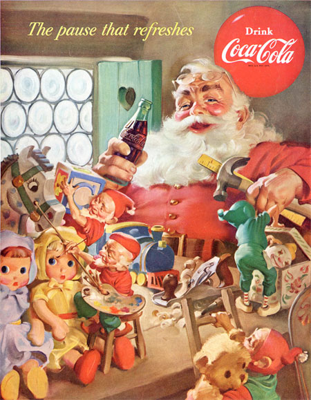
You will find many accounts that insist that Michigan illustrator Haddon Sundblom was responsible for creating the modern image of Santa Claus, providing a friendlier form for the the jolly old elf than had previously been envisioned, at the behest of the Coca-Cola company, who wanted to use him to sell more of their sugary, flavored soda water.While the latter assertion is true, the former isn’t. The modern image of Santa as a red-cheeked, morbidly obese (according the current surgeon general) and preternaturally friendly old guy in a red suit, with white fluffy beard and cuffs to match, was created by illustrator extraordinaire J.C. Leyendecker. See my previous posts on J.C. Leyendecker (also here, here and here) and Illustrators’ Visions of Santa Claus. [Correction: Actually it’s not as simple as that, as my addendum to my post on Illustrators and Santa points out, though I still feel Leyendecker is responsible for the solidification of the modern vision of Santa, and Sundblom responsible for the ultimate refinement of that image into the character as we know him.]
Sundblom, who was also a terrific and currently underappreciated illustrator active in the early and mid 20th Century, didn’t create that image but did go along way toward continuing, refining and promoting the cultural icon to the benefit of the Coca-Cola company, who wanted a family-friendly, all-occasions image for their “soft-drink”, originally thought of as an alternative for “hard” alcoholic drinks and considered suitable only for similar occasions.
Sundblom created a fresh image of Santa for Coke ads each year from 1931 to 1964, featuring the jolly old guy chugging the “not for Summer only” beverage while in his
elf labor campworkshop, leafing through the Big Book of Naughty and Nice (wouldn’t you like to see that one) or out on the road on his trans-global hypersonic toy dispersal run (in the course of which he always found time to stop and lounge on someone’s staircase, or lean against their refrigerator, to enjoy “The pause that refreshes”® in lieu of the more boring Milk and Cookies®).The Coca-Cola company has a page devoted to Sundblom’s Santa campaign, but they get it wrong too, laying claim to introducing the modern version of Santa to the world with nary a mention of Leyendecker or Rockwell, who had been doing their Santa thing in the pages of the Saturday Evening Post for years before Sundblom’s Santa Appeared. (Gee, an American food-product company making unsubstantiated and inaccurate claims? Shocking! For further reference, I point you to an excerpt from Santa Claus: A Biography by Gerry Bowler.)
None of this detracts from Sundblom, however, who made no such claims and who contributed other well known embodiments of products to the 20th Century’s cultural zeitgeist, like Aunt Jemima (who has recently gotten a political correctness makeover and modernization) and the Quaker Oats Quaker.
Sundblom’s career as an illustrator, though overshadowed by his association with the big guy, was long and influential. He provided illustrations for companies like Ford, Maxwell House and Colgate Palmolive, and publications like the Saturday Evening Post, The Ladies’ Home Journal and Woman’s Home Companion. He also did some nicely teasing “cheesecake” pin-up art (thank you, Santa) for Playboy and others.
“Sunny” Sundblom, as he was often called, was influential on a number of notable mid-20th Century illustrators, like Harry Anderson, Art Frahm, Gil Elvgren and Joyce Ballentine.
One of the best sources on Sundblom’s overall career is on the American Art Archives. Leif Peng’s Flickr set is also good.
There are a couple of books available on his Coke Santas (possibly different editions of the same book), Dream of Santa: Haddon Sundblom’s Advertising Paintings for Christmas, 1932-1964 and Dream of Santa: Haddon Sundblom’s Vision.
If you’re good, maybe Santa will bring you one.
Categories:
-
Giovanni Fattori

Giovanni Fattori was one of the leaders of the Macchiaioli, a group of Italian painters centered in Tuscany in the mid-19th Century, whose dedication to the portrayal of subjects drawn from everyday contemporary life, practice of plein-air painting, use of bright, fresh colors, and application of paint in rough dabs of color, eschewing the blended finish considered normal for acceptable paintings of the time, predated the French Impressionists by some ten years. (See my previous post on The Macchiaioli.)Like the other painters who came to be known as Macchiaioli, Fattori was influenced by the French painters of the Barbizon school, whose work they probably encountered while visiting Paris for the Exposition of 1855. The Impressionists owed much to the influence of the Barbizon painters as well; though, when asked of his view of Impressionist works later in his career, Fattori was not particularly impressed and still very much preferred the work of the Barbizon painters.
Italy was in the middle of a revolution during Fattori’s early years, and the painters of the Macchiaioli were in the thick of it, fighting to create a unified Italy with an idealism that was to be bitterly disappointed, even in victory. Many of the works from the middle of his career are of military scenes, though more of “in-between” times than of actual conflict, images of soldiers mustering, encampments, horses and wagons.
He later devoted himself more to rural and farming scenes in the Tuscany countryside around Florence, and painted sensitive portraits of his family (or families, he was married three times).
These have the fresh, brilliant colors that would be characteristic of Impressionist works, but married with a deep chiaroscuro and academic approach that was absent in their pursuit of the effects of light.
I find the proportion of Fattori’s paintings particularly fascinating, with strongly horizontal or vertical canvasses giving many of his scenes an expansiveness and visual drama not found in the more traditional formats that were common in his day; like his painting of fellow Macchiaioli painter Silvestro Lega painting en plein air at the seaside, and the calm rural scene along the Arno in the images above.
Fattori became an instructor at the Florentine Academy. One of his students was the modernist painter Amedeo Modigliani.
There is a Giovanni Fattori museum in his hometown of Livorno.
Categories:


Charley’s Picks
Bookshop.org
(Bookshop.org affilliate links; sales benefit independent bookshop owners; I get a small percentage to help support my work on Lines and Colors)

John Singer Sargent: Watercolors


Urban Sketching: Understanding Perspective


Charley’s Picks
Amazon
(Amazon.com affiliate links; sales go to a larger yacht for Jeff Bezos; but I get a small percentage to help support my work on Lines and Colors)
John Singer Sargent: Watercolors
Urban Sketching: Understanding Perspective